图表作文(范例)

宫东风老师考研英语图表作文预测及练习:第1篇
Study the following pie carefully and rite an essay in which you should
1)describe the pie,
2)interpret its meaning, and
3)suggest counter-measures.
You should write about 160—200 words neatly ANSWER SHEET 2. (20 points)
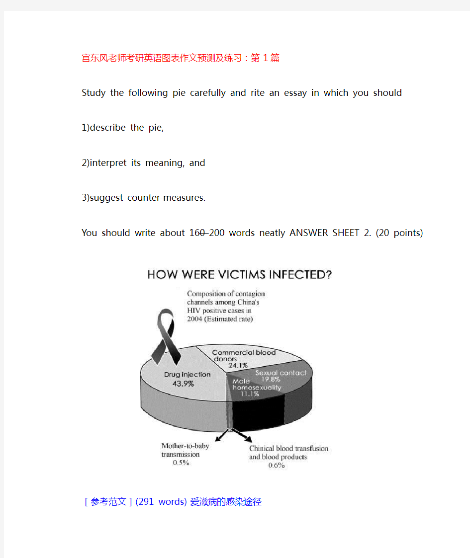
[参考范文](291 words) 爱滋病的感染途径
As is obviously betrayed in the pie above, the main contagion (接触传染) channels among China’s HIV positive cases are drug injection (43.9%), c ommercial blood donors (24.1%), and sexual contact (19.8%). The statistics have indicated the reality that we are facing and have profound implication for us in terms of AIDS control and prevention.
The implied meaning of the pie above which demonstrates how victims were usually infected in the year of 2004 is far-reaching. In the first place, the contagion channel of drug injection should be the top on our agenda. The channel of infection ranks first in the pie above currently in our society the availability of drugs are getting easier. If enough attention is not attached to the control of drug injection, China’s HIV positive cases will rocket to an alarming figure, which is bound to threaten the stability of our society.
What’s more, the contagion channels — commercial blood donors and sexual contact —should not be ignored by us. The two channels of infection rank second and third respectively. In fact, blood and sex are part of people’s life so that it is more difficul t for us to always watch out. However, constant watching-out has become a must due to the cruel reality which is
revealed in the pie above. Otherwise, everybody in our society will be in danger of being infected with HIV positive.
Counter measures must be taken in order contain the current situation. In the first place, we must offer medical treatment to those who are already infected. In the second place, we must popularize the knowledge of AIDS in our society, especially among young people. Most importantly, the idea of prevention should be the uppermost in our work and life.
宫东风老师考研英语图表作文预测及练习:第2篇
Study the following chart carefully and write an essay in which you should
1)describe the chart,
2)deduce the purpose of the painter of the chart.
You should write about 160—200 words neatly ANSWER SHEET 2. (20 points)
[参考范文]2004年不同疾病的死亡率(248 words)
As is apparently betrayed in the chart above, among the leading causes of death among 15 — 59-year-olds worldwide in the year of 2004 are HIV/AIDS, heart failure, tuberculosis and so forth, which cover both external and internal factors. What the chart reveals mirrors a social reality, which is in effect thought-provoking.
The aim of the painter of the chart is to make us have a clear understanding of the leading causes of death so as to improve our life span and the quality of life. In the first place, some diseases such as HIV/AIDS and cancer are still No. 1 enemies since we still have no better way to deal with them. Consequently, we must work hard in this aspect and try our best to find the cure as early as possible. In the second place, psychological stress on us should not be neglected in terms of leading causes of death. Causes such as heart failure and suicide are
closely related with psychological stress.
Therefore, to protect our life, we must first of all attach importance to our state of mind. Last but not least important, some leading causes such as respiratory illness is associated with our environment pollution. Therefore, the improvement of our environment can contribute to the protection of our life. In sum, the chart above reminds us that the leading causes of death result from diseases, psychological stress, and environmental pollution. In order to have a better life, something must be done in the relevant aspects mentioned above.
宫东风老师考研英语图表作文预测及练习:第3篇
Study the following chart carefully and write an essay in which you should
1)describe the chart,
2)account for the status revealed, and
3)make a relevant prediction.
You should write about 160—200 words neatly ANSWER SHEET 2. (20 points)
The number of Scientific breakthroughs over the past years in P.R. China (Estimated)
[参考范文](228 words) 从2001-2004年4年当中中国在科学成就上突破表As is apparently betrayed in the chart above, the number of scientific breakthroughs over the past years in P.R. China has been climbing and rocketed to 120 cases in the year of 2004, which is a shocking news to people both at home and abroad. People may wonder what is behind the great achievement.
The foremost reasons for the tremendous feat which is revealed in the chart above can be
illustrated as follows. To begin with, idea that science and technology are also productivity has contributed to the increase of scientific breakthrough. Over the years, more and more people realize that we are living in an era of knowledge explosion. If we want to survive and develop in the current world, we must keep pace with the development of science and technology. Thus, scientific breakthrough crop up by each p assing day. What’s more, the Opening-up and Reform has also brought about the increase of scientific breakthroughs. The Opening-up and Reform has improved the development of China’s economy, which has laid a solid foundation for the increase of scientific breakthroughs. In sum, our new idea and Opening-up and Reform are the preconditions of the tremendous increase of scientific breakthroughs.
As our country develops at a high speed, more scientific breakthroughs will come into our life since we have more solid economic foundation, advanced equipment and facilities, and super talents.
宫东风老师考研英语图表作文预测及练习:第4篇
Study the following chart carefully and write an essay to
1) describe the chart,
2) state your attitude toward the event, and
3) suggest counter-measures.
You should write about 160—200 words neatly ANSWER SHEET 2. (20 points)
[参考范文](172 words) 世界恐怖案件调查表
As is apparently betrayed in the chart above, the number of terror attacks over the past four years has been climbing and rocketed to 204 cases in the year of 2004. This is a shocking
figure to everyone and every nation in the world, which has aroused the deep concern of the international community.
In my view, terrorist offences against civilians cannot be justified in any way. Action of the kind is no doubt criminal regardless of their motivation, be it political or personal. The terror attack on children and women like the case in Russia not long ago is never forgivable. In fact, terror attack is a threat to the world peace and stability.
Counter-measures should be taken to fight against terrorism. To begin with, there is a greater and more urgent need for the international community to collabo rate now. What’s more, the legislative framework of international co-operation against terrorism should be perfected. Most importantly, the world community should carefully explore terrorism’s breading grounds while probing effective means to counter it.
宫东风老师考研英语图表作文预测及练习:第5篇
Study the following drawing carefully and write an essay to
1)describe the picture
2)deduce the reasons for the predictions revealed, and
3)put forward your suggestions.
You should write about 160—200 words neatly ANSWER SHEET 2. (20 points)
[参考范文](256 words) 预测中国人口寿命
As is apparently betrayed in the drawing above, the average life spans of the world population and China’s population w ill reach fifty years and one hundred years respectively by the year of 2300. And by then the number of people above the age of sixty will account for thirty-eight percent of the total world population. This is a great change in human history, which has made us think deeply.
The foremost reasons for the predictions which are indicated in the drawing above can be illustrated as follows. To begin with, the rapid development of the world economy has
contributed to the predictions. Over these years, the world economy is developing at a surprising speed, which has supplied people all over the world with adequate daily necessities. What’s more, the development of medical science has brought about the predictions. Over the past years, a number of medical breakthroughs have been made in the field of medical science, which has greatly protected people and improved the quality of people’s life. With the further growth of the world economy and medical science, the UN predictions will be more persuasive.
By the way, here are suggestions of mine for the predictions revealed in the drawing above. The international community including China must now make preparations for the coming of the day. Much knowledge concerning senior citizens should be popularized. More public facilities for senior citizens should be set up. More professionals on senior citizens should be strictly trained. Only in this way can we live in a peaceful and harmonious environment.
宫东风老师考研英语图表作文预测及练习:第6篇
Study the following chart carefully and write an essay in which you should
1)describe the chart,
2)deduce the purpose of the painter of the chart, and
3)suggest counter-measures.
You should write about 160—200 words neatly ANSWER SHEET 2. (20 points)
[参考范文](280 words) 关于南京大屠杀知道情况的问卷调查
As is apparently betrayed in the chart above, the number of people who know the date of the Nanjing Massacre (大屠杀) is only one out of fifteen, which is really surprising to every Chinese. The social phenomenon is not a trivial matter and should arouse the great concern of our society.
The aim of the painter of the chart is to remind us that we are forgetting what we should always keep in mind as a Chinese. Everyone in the world has his/her motherland. As a Chinese, we should have a good understanding of the history of our motherland. Without a good understanding of the history, we can not be a qualified Chinese. In the history of our nation, many significant events have ever taken place. The Nanjing Massacre is just one of them, which have left us an unforgettable memory. To forget events of the kind means that we betray our nation, that we are losing our national spirit, that we lack patriotism (爱国精神), and that we are destroying our future. The phenomenon which is revealed in the chart above is pervasive and must be curbed. Otherwise, it will impair the development of our motherland.
Counter-measures must be taken to rectify the trend of the kind revealed in the chart above. Mostly importantly, laws and regulations must be established to popularize the knowledge of the history of our motherland. Besides, activities at national level should be organized to mark the significant events in our history. In sum, we must attach more importance to our history in order to make our country become a strong and powerful nation in the world.
宫东风老师考研英语图表作文预测及练习:第7篇
Study the following chart carefully and write an essay to
1)depict the chart, and
2)deduce the reasons behind the fact.
You should write about 160—200 words neatly on NSWER SHEET 2. (20 points)
[参考范文](235 words) 考研人数从2003-2005年持续上升
As is vividly betrayed in the chart above, the number of MS/MA candidates has been climbing over the past years and rocketed to 1.3 million in the year of 2005. People at different walks of life may wonder what is behind the figure.
The foremost reasons for the great increase of MA/MS candidates over the past years can be illustrated as follows. In the first place, the idea that knowledge is power has contributed to the enormous increase of MA/MS candidates. At present, we are living in an era of knowledge explosion. If we want to survive in the current society, we must have good command of knowledge. To be exact, knowledge learning has become a life-long work.
Therefore, more and more people are content with their four-year college education and apply for MA/MS degree. In the second place, the current unsatisfactory job-hunting has resulted in the great increase of MS/MA candidates over the past years. At the moment, the supply of the college graduates overtakes the demand for the college graduates.
As a result, many college graduates can not find jobs that they really enjoy and want. Some of their jobs are even irrelevant to their majors. Therefore, they would like to conduct further study instead of doing the work that they dislike. As a consequence, more and more people apply for MA/MS degree, which has led to the great increase of MA/MS candidates.
宫东风老师考研英语图表作文预测及练习:第8篇
Study the following chart carefully and write an essay to
1)describe the chart,
2)deduce the possible reasons of the increase of the gold medals.
You should write about 160—200 words neatly on ANSWER SHEET 2. (20 points)
[参考范文]中国在奥运会上金牌逐渐上升(197 words)
As is vividly portrayed in the chart above, the number of gold medals which are snatched by P.R. China has been climbing and rocketed to 32 at the 2004 Athens Olympic Games. This is a great achievement in Chinese sports. People both at home and abroad may wonder what has brought about the great success.
The foremost reasons for the great achievement which is revealed in the chart above can be illustrated as follows. To begin with, the Opening-up and Reform has contributed to the growth of Chinese sports. The Opening-up and Reform since 1978 has improved the development of economy in China, which has laid a solid foundation for the development of sports in China.
Thus, without the Opening-up and Reform, the 32 gold medals would be a pie in the sky. What’s more, the international exchanges have brought about the growth of Chinese sports. On one hand, we sent Yao Ming to NBA and Liu Xiang to participate in international events of various kinds. On the other hand, we have invited foreign professionals to come to China and coach our national teams.
Therefore, without the international exchanges, the 32 gold medals would be an empty talk.
宫东风老师考研英语图表作文预测及练习:第9篇
Study the following chart carefully and write an essay in which you should
1)describe the chart,
2)account for the fact revealed in the chart.
You should write about 160-200 words neatly on ANSWER SHEET 2. (20 points)
[参考范文](238 words)
As is vividly betrayed in the chart above, the number of scholars returning from the overseas has been climbing over the past years and rocketed to over 50 thousand in the year of 2004. People may wonder what is behind the amazing figure.
The foremost reasons for the tremendous increase which is clearly revealed in the chart above can be illustrated as follows. To begin with, a set of preferential policies has contributed to the increase of the number. To attract the students studying overseas to return, our government has set up a suite of preferential policies in terms of salaries, residing place, housing, choice of jobs, and children’s education. Without the preferential policies, the increase of the number is out of the question.
What’s more, the rapid development of our motherland has led to the i ncrease of the number of scholars returning from overseas. Since 1978, China has carried out Opening-up and Reform, which has greatly improved the growth of China’s economy. The robust economy has laid a solid foundation for the rapid development of scientific field, which makes P.R.China a most inviting country to both Chinese at home and abroad and foreigners. Therefore, without the great leap of our motherland over the past years, the increase of the scholars returning from overseas would be impossible.
In one word, our preferential policy and rapid development of our motherland are the foundation of the increase revealed in the chart above.
图表作文10:1997年考研英语真题作文
Directions:
A. Study the following set of pictures carefully and write an essay in no less than 120 words.
B. Your essay must be written clearly on the ANSWER SHEET.
C. Your essay should cover all the information provided and meet the requirements below:
OUTLINE:
1. Interpret the following picture.
2. Predict the tendency of tobacco consumption and give your reasons.
【参考范文】
The problem of smoking has received more and more concern from all over the world. As is indicated by the pictures, smokers for nearly 20% of the world population. And tobacco has caused a loss of 200 billion U.S. dollars and claimed 3 million lives annually.
However, it is billion that the world tobacco production witnessed a decrease from 14.364 billion pounds in 1994 to 14.2 in 1995. according to this change. I confidently believe that there will be less and less tobacco consumption in the future, generally for two reasons. On the one hand, being aware of the harm of smoking, more and more people join in the fight against it. They either try their best to give up smoking or advise others not to smoke any longer.
On the other hand, many governments have attached more attention to this social hazard and take various measures to put an end to it. Therefore, I have every reason to believe that the fight against smoking will be won by us human beings at last.
图表作文写法
大学英语四级图表作文的写法: 图表作文有表格(table)、柱形图(bar chart)、饼状图(pie chart)和折线图(diagram)之分,后三种都属于图表的范畴(chart)。 写作模式:第一段:概述图表反映的主题思想第二段:分析产生的原因第三段:展望未来或提出方法或建议 有用的词 上升:increase、rise、ascend 、go up 下降: decrease、fall 、drop、descend、decline 、reduce 平稳:stable 、steady、remain/maintain/keep/be the same as/similar to 波动:fluctuate、fluctuation、rise and fall、up and down 占:occupy、take up、account for 而:while、however、whereas、on the other hand、actually/in fact 相比:by contrast、on the contrary、likewise、compared with 最高点:the highest 、the top、the summit 、the peak、the most 最低点:bottom 、less 、least 、rock bottom 平均:mean、average 趋势:tendency 、trend、inclination 预见:prediction
图表作文常用的句型 (1)常用的开篇句型(即概述图表内容时常用的表达法) ①According to the table/pie chart/bar chart/disgram, we can see/conclude that … 根据该表/图,我们可知…… ②The table/graph reveals (shows/indicates/illustrates/ represents/points out) that … 该表/图表明…… ③As we can see from the table … As can be seen from the table … As is shown (illustrated/indicated) in the pie char t … 如表/图所示,…… (2)描述增减变化常用的句型 ①The number of … gr ew/rose fr om … to … ③There was a very slight (small/slow/gradual) rise/increase in 1998 ③There was a very steady (marked/sharp/rapid/sudden/ dramatic) drop (decrease/decline/fall/reduction) in 1998/ compared with that of last year). 第一段描述数据我们要首先看看是几个变量如果只有一个变量,有三个数据,可以描述如下:From the chart we can see clearly that the average number of hours a student spends on Internet per week has increased from less than two hours in 1998 to nearly four hours in 2000, and then to 20 hours in 2004.
考研英语作文范文和模板:图表作文
考研英语作文范文和模板:图表作文 图表作文 1.写作攻略图表作文是考研英语写作中较为常见的题型之一,也是难度较大的一种写作题型。这类作文可综合提供题目、数据、图像、提纲,形式多样,但实际上只涉及5个方面:描述图表、指明寓意、分析原因、联系实际、给出建议,而每次考试只是从这5个方面的内容中选出3个结合在一起。从写作类型来看,基本上属于说明文。要求考生围绕题目将有关信息转化为文字形式,考生应该具有一定数据分析和材料归纳的能力,同时会运用一定的写作方法。考研试题一般以三段式写作方法来组织文章,第一段总结归纳信息反映的整体情况,点出主题思想,第二段回答第一段所得出的问题,对数字、数据等做出有条理的分析比较,第三段做出总结或给以简单的评论。表格和图表题型写作要点:(1)考生应仔细研究题目以及提示信息,认清图表中的数字、线条、阴影等部分的变化趋势和走向,抓住其主要特点,然后根据图表所显示的中心信息确定内容层次以及主题句。(2)考生应该仔细研究图表所给出的大量信息,从中选取最重要,最有代表性的信息,然后根据全文的主旨去组织运用所获取的关键信息。切忌简单
地罗列图表所给出的信息。(3)图表作文一般采用的时态为一般现在时,但如果图表中给出了具体时间参照,考生则应对时态进行相应的调整。(4)图表作文有一些固定句型和表达法,考生应对此融会贯通。(5)图表作文可以细分为表格,曲线图、柱形图和饼形图。除了上述共同要点,考生还应了解这四种图在写作方面的不同特点。——表格可以表示多种事物的相互关系,所以考生要对表格中所给出的大量数字进行比较分析,从中找出其变化规律。——曲线图常表示事物的变化趋势,考生应认真观察坐标系所显示的数据信息,并且密切注意交汇在坐标横轴和纵轴上的数字及单位。——柱形图用来表示各种事物的变化情况及相互关系,要求考生通过宽度相等的柱形的高度或长度差别来判断事物的动态发展趋势,因此考生应密切关注坐标线上的刻度单位及图表旁边的提示说明与文字。——饼形图表示各事物在总体中所占的比例及相互关系,旨在要求考生准确理解并阐述一个被分割成大小不等切片的饼形图所传达的信息。考生应清楚掌握部分与整体,部分与部分之间的相互关系,这种关系通常是以百分比的数字形式给出的。(6)列出各段主题句。考生可以根据所给提纲或已知信息列出每段的主题句,为全文的展开做好铺垫。(7)围绕主题句完成段落的展开。尽量做到主题明确、条理清楚、文字简练。(8)检查与修改。对图
英语作文模板图表作文
图表分析作文1 As is clearly shown in the table/ figure/ graph / chart, 图表总体描述between 年代and 年代. Especially, 突出的数据变化. There are three reasons for 具体表示急剧上升、下降或特殊现象的词. To begin with, 原因一. In addition / Moreover, 原因二. For example, 具体例证. Last but no least, 原因三. In short,总结上文. As far as I am concerned, / For my part, / As for me,作者自己的观点. On the one hand, 理由一. On the other hand, 理由二. In brief,总结上文. 图表分析作文2 The table / figure / graph / chart shows that 图表总述from 年代to年代. It is self-evident that 突出的数据变化. Three possible reasons contribute to 具体表示急剧上升、下降或特殊现象的词或代词代替上文内容. One reason is that原因一. Another reason is that原因二. For instance,举例证. What’s more原因三. As a result, 重述上文之趋势. However, in my opinion 作者观点. For one thing,理由一. For another, 理由二. To sum up,总结上文. 图表分析作文3 It can be seen from the table / figure / graph / chart that图表总述between年代and年代. Especially,突出的数据变化. Why are there such great changes during 图表涉及的年头数years? There are mainly two reasons explaining具体表示急剧上升、下降或特殊现象的词或代词代替上文内容. First,原因一. In the old days,比较法说明过去的情况. But now,说明现在的情况. Second,原因二. As a result,总结上文. In my viewpoint,作者自己的观点. On the one hand,论点一. On the other hand,论点二. 图表分析作文4 As the table / figure / graph / chart shows,图表总述in the past years年代. Obviously,突出的数据变化. Why are there such sharp contrasts during 图表涉及的年头years? Two main factors contribute to具体表示急剧上升、下降或特殊现象的词或代词代替上文内容. First of all,原因一. In the past,比较法说明过去的情况. But now 说明现在的情况. Moreover,原因二. Therefore,总结上文. As I see it,作者自己的观点. For one thing,论点一. For another,论点二. 图表作文补充句型 ?As is shown in the graph… 如图所示… ?The graph shows that… 图表显示… ?As can be seen from the table,… 从表格中可以看出… ?From the chart, we know that… 从这张表中,我们可知… ?All these data clearly prove the fact that… 所有这些数据明显证明这一事实,即… ?The increase of …. In the city has reached to 20%. ….在这个城市的增长已达到20%. ?In 1985, the number remained the same. 1985年,这个数字保持不变. ?There was a gradual decline in 1989. 1989年,出现了逐渐下降的情况.
图表作文(范例)
宫东风老师考研英语图表作文预测及练习:第1篇 Study the following pie carefully and rite an essay in which you should 1)describe the pie, 2)interpret its meaning, and 3)suggest counter-measures. You should write about 160—200 words neatly ANSWER SHEET 2. (20 points) [参考范文](291 words) 爱滋病的感染途径 As is obviously betrayed in the pie above, the main contagion (接触传染) channels among China’s HIV positive cases are drug injection (43.9%), comme rcial blood donors (24.1%), and sexual contact (19.8%). The statistics have indicated the reality that we are facing and have profound implication for us in terms of AIDS control and prevention. The implied meaning of the pie above which demonstrates how victims were usually infected in the year of 2004 is far-reaching. In the first place, the contagion channel of drug injection should be the top on our agenda. The channel of infection ranks first in the pie above currently in our society the availability of drugs are getting easier. If enough attention is not attached to the control of drug injection, China’s HIV positive cases will rocket to an alarming figure, which is bound to threaten the stability of our society. What’s more, the contagion chan nels — commercial blood donors and sexual contact —should not be ignored by us. The two channels of infection rank second and third respectively. In fact, blood and sex are part of people’s life so that it is more difficult for us to always watch out. However, constant watching-out has become a must due to the cruel reality which is
图表类英语作文范文英语作文模板(图表类的)
图表类英语作文范文英语作文模板(图表类的)这里很全 一、图表类作文常用的单词、短语和句型 1.表示数据变化的单词或短语 in the case of (在……的情况下) in terms of (在……方面) increase / raise / rise / go up(增加) decrease / grow down / drop / fall (减少) increased by (增长了) increased to (增长到) the number sharply goes up to(数字急剧上升至)
significant(重大的),steady(平稳的),gradual(逐渐的),slow(慢慢的),stable(稳定的),rapid(快速的)…… 2. 表示从图表得知的信息的句型 The table / chart / graph shows that...(这个图表告诉我们……) Aording to the table / chart /graph, we can see that...(根据图表,我们可以看出……) It can be concluded from the graph that...(从图表中可以得出……) The table shows the changes in the number of...over the period from...to...(该表格描述了在……期间……数量的变化) 二、图表类作文的模式
图表类作文中的图表主要有以下形式:柱形图类(chart)、圆饼图类(pie chart)、曲线图类(line chart)、表格类(table)。写文章时,首先要对图表加以描述,而后引出主题加以讨论,最后得出结论,也就是按照描述图表—解释原因—下结论的步骤来写。切忌对图表不作交代就直接谈论主题。 1.表格类作文的模式 表格类作文一般可以分为三段:第一段对表格中的数据进行描述,只要抓住变化规律即可,切忌一一列举数据;第二段说明变化的原因;第三段得出结论。即: (1) Studying the table carefully, we can see...(仔细研读表格,我们可以看出……) (2) In my opinion, the reasons why...are as follows. Firstly...Secondly...Thirdly...(在我看来,为什么……的原因在于以下几点:第一……第二……第三……)
图表作文写作总结
一、图表作文写作常1、图形种类及概述法: 泛指一份数据图表:a data graph/chart/diagram/illustration/table饼图:pie chart 直方图或柱形图:bar chart / histogram 趋势曲线图:line chart / curve diagram 表格图:table 流程图或过程图:flow chart / sequence diagram 程序图:processing/procedures diagram 2、常用的描述用法 The table/chart diagram/graph shows (that) According to the table/chart diagram/graph As (is) shown in the table/chart diagram/graph As can be seen from the table/chart/diagram/graph/figures, figures/statistics shows (that)…… It can be seen from the figures/statistics We can see from the figures/statistics It is clear from the figures/statistics It is apparent from the figures/statistics table/chart/diagram/graph figures (that) …… table/chart/diagram/graph shows/describes/illustrates how…… 3、雅思考试图表中的数据(Data)具体表达法 数据(Data)在某一个时间段固定不变:fixed in time 在一系列的时间段中转变:changes over time 持续变化的data在不同情况下: 增加:increase / raise / rise / go up …… 减少:decrease / grow down / drop / fall …… 波动:fluctuate / rebound / undulate / wave …… 稳定:remain stable / stabilize / level off …… 最常用的两种表达法: 动词+副词形式(Verb+Adverb form) 形容词+名词形式(Adjective+Noun form) 二、雅思图表作文相关常用词组 1、主章开头 图表类型:table、chart、diagraph、column chart、pie graph 描述:show、describe、illustrate、can be seen from、clear、apparent、reveal、represent 内容:figure、statistic、number、percentage、proportion 2、表示数据变化的单词或者词组 rapid/rapidly 迅速的,飞快的,险峻的
考研英语图表作文写作方法和模板
图表作文(一) 第一节图表作文的类型 图表作文可分为两大类:表作文和图作文。 表作文 表格(Table)可以使大量数据系统化,便于阅读、比较。表格常由标题(Title)、表头(Boxhead)(表格的第一行)、侧目(Stub)(表格左边的第一列)和主体(Body)部分(表格的其余部分)等部分组成。如下表: 用表格表达的信息具体准确,而且表格中的各项均按一定规律排列。阅读表格时要注意找出表格中各个项目的相互关系,表格中各个项目的变化规律。例如,上面的表格中的数字说明,和1978年相比,1983年大学入学的人数在增加,而小学的入学人数在减少。搞清楚这些变化规律也就读懂了表格的内容。 图作文 图作文又可分为三种:圆形图作文、曲线图作文和条状图作文。 (1) 圆形图作文 圆形图(Pie chart)也称为饼状图或圆面分割图。圆形图因为比较形象和直观,各部分空间大小差别容易分辨,所以常用来表示总量和各分量之间的百分比关系。整个圆表示总量,楔形块表示分量。有时圆形图还有数值表,两者结合可把各分量表示得更准确、清楚。例如:This is a pie chart of the average weekly expenditure of a family in Great Britain. As can be see from the chart, the main expenditure of an average British family is spent on food, which accounts for 25% of its total expenditure. The next two significant expending items are transport and housing, which are 15% and 12% respectively. If we take into account clothing and footwear, which makes up 10%, the four essentials of life, that is, food, transport, housing, and clothing and footwear, amount to 62% of the total expenditure. (2) 曲线图作文 曲线图(Line graph)也称为线性图或坐标图。曲线图最适合表示两个变量之间关系的发展过程和趋势。一般来说,曲线所呈现的形状比某一点所代表的变量的值更有意义。曲线图有横轴和纵轴。一般先看横轴所代表的数量或时间等,然后再看纵轴所显示的意义。同时必须找出线条所反映的最高或最低的变化。例如: 这个曲线图的横轴代表1990年的不同的月份,纵轴代表交通事故的数量。从交通事故曲线图上可知,前八个月的交通事故的数量有升有降。曲线图在八月份升到了最高点(39),此后一直呈下降的趋势,十二月份降到了最低点(16)。可见,1990年的交通事故的数量总体上呈下降的趋势。 (3) 条形图作文 条形图(Bar graph)也称为立柱图或圆柱图。条形图由宽度相同但长度不同的条块代表不同的量。当要比较几个项目或量时,常用不同颜色来区分。条形图主要用来表示:1)同一项目在不同时间的量;2)同一时间不同项目的量。阅读条形图时,要先看图例,再看横轴、纵横各代表什么量,每一个刻度所代表的值是多少,最后找出图中各长条所表示的数据及各长条间的相互关系。例如: 左边的条形图的横轴代表时间,纵轴代表期望寿命(Life Expectancy),这一条形图想要体现的是同一项目(期望寿命)在不同时间的量。右边的条形图的横轴也是代表时间,纵轴是代表婴儿的死亡率(Infant Mortality),这一条形图想要体现的也是同一项目(婴儿的死亡率)在不同时间的量。左边的条形图表明1990年的人均期望寿命比1960年的人均期望寿命长20岁,而1990年的婴儿死亡率比1960年的婴儿死亡率下降了50%。
雅思经典图表作文范文
# 43. You should spend about 20 minutes on this task. The table below shows CO2 emissions for different forms of transport in the European Union. The Pie Chart shows the percentage of European Union funds being spent on different forms of transport. You should write at least 150 words.
model answer: The chart shows CO2 emissions per passenger kilometre for variuos methods of transport in the European Union while the pie chart shows European Union spending on transport. Flying by air produces by far the greatest CO2 emissions, approximately three times as much as passenger cars which are the next largest producers. Very little is spent by the EU on air travel while roads make up more than half of the EU transport budget. Trains produce about three times less CO2 emissions per passenger kilometre than passenger cars and eight times less than air travel. Nearly a third of EU transport funds are spent on railways. Ships are a clean form of transport and produce about the same amount of CO2 per passenger kilometre as trains do. However, only 2 percent of EU funds are spent on ports. A further one percent is spent on inland waterways. Coaches are the cleanest form of transport. Emissions of CO2 per passenger kilometre from coaches are half those of buses. Buses emit less than half as much CO2 per passenger kilometre as cars. The European Union spends 10 percent of its transport budget on public transport, such as buses and coaches. (197 words)
图表作文写作
图表式作文写作技巧指引 一、图表类型 二、要点分析 A. 表格图 1横向比较: 介绍横向各个数据的区别,变化和趋势 2纵向比较:介绍横向各个数据的区别,变化和趋势 3无需将每一个数据分别说明,突出强调数据最大值和最小值,对比时要总结出数据对比最悬殊的和最小的 说明:考察例举数字的能力和方法。注意怎样通过举一些有代表性的数据来有效地说明问题。 B. 曲线图 1极点说明: 对图表当中最高的,最低的点要单独进行说明 2趋势说明: 对图表当中曲线的连续变化进行说明,如上升,下降,波动,持平 3交点说明: 对图表当中多根曲线的交点进行对比说明 说明:关键是把握好曲线的走向和趋势,学会general classification,即在第二段的开头部分对整个曲线进行一个阶段式的总分类,使写作层次清晰。接下来在分类描述每个阶段的specific trend,同时导入数据作为你分类的依据。注意不要不做任何说明就机械性的导入数据!可以使用一些比较native的单词和短语来描述trend。 C. 饼状图 1介绍各扇面及总体的关系 2各个扇面之间的比较,同类扇面在不同时间,不同地点的比较 3重点突出特点最明显的扇面:最大的,最小的,互相成倍的 D. 柱状图 1.比较: similarity 2.对比: difference) 3.横向总结所有柱状图表的共性特征 & 分别描写各个柱子的个性特征 E. 流程图 1.首先说明:做什么工作的过程,目的是什么 2.准备工作 3.按时间/过程先后描述
4.结果 5.简单总结(可有可无) 说明:注意流程图里的“因果关系”或每一流程的“承前启后”关系;表达每一流程的主体内容,阐明这种关系;揭示其内在联系或规律;最后,给予简要归纳和总结。 F. 实物/器具工作过程 1.实物的名称,功能 2.基本结构 3.工作过程 4.简单总结 G. 综合图 1不求甚解,不拘泥于细节 2分门别类,分段落详细介绍各个图表 3不画蛇添足,主观臆断或猜测图表之间的关系 三、框架结构 1.开头:该图阐述的是______的______.共有以下几个部分组成。 shows (that) / According to / As (is) shown in … / As can be seen from / It can be seen from /We can see from / It is clear / apparent from the figures/statistics / It is from / This …tells us the main story about / concerning / concerned with / on / related to… 2.分析:首先看到的是____, 在_____年呈现出____的趋势 / 占______; 其次,……第三[比 较分析] 1)内容:figure、statistic、number、percentage、proportion 2)用语:
英语图表作文范例
一、图表作文写作常识 1、图形种类及概述法: 泛指一份数据图表:a data graph/ch art/diagram/illustration/table 饼图:pie chart 直方图或柱形图:bar chart / histo gram 趋势曲线图:line chart / curve di agram 表格图:table 流程图或过程图:flow chart / sequ ence diagram 程序图:processing/procedures dia gram 2、常用的描述用法
The table/chart diagram/graph sho ws (that) According to the table/chart diag ram/graph As (is) shown in the table/char t diagram/graph As can be seen from the table/cha rt/diagram/graph/figures, figures/statistics shows (tha t)…… It can be seen from the figures/s tatistics We can see from the figures/stati stics It is clear from the figures/stat istics It is apparent from the figures/s tatistics
table/chart/diagram/graph figures (that)…… table/chart/diagram/graph shows/d esc ribes/illustrates how…… 3、图表中的数据(Data)具体表达法 数据(Data)在某一个时间段固定不变:fixed in time 在一系列的时间段中转变:changes o ver time 持续变化的data在不同情况下: 增加:increase / raise / rise / g o up …… 减少:decrease / grow down / drop / fall …… 波动:fluctuate / rebound / undul ate / wa ve …… 稳定:remain stable / stabilize / level off ……
图表式作文写作模板
图表式作文 It is obvious in the graph/table that the rate/number/amount of Y has undergone dramatic changes. It has gone up/grown/fallen/dropped considerably in recent years (as X varies). At the point of (接近)X1, Y reaches its peak value of …(多少). Wh at is the reason for this change? Mainly there are … (多少) reasons behind the situation reflected in the graphic/table. First of all, …(第一个原因). More importantly, …(第二个原因). Most important of all, …(第三个原因). From the above discussions, we have enough reason to predict what will happen in the near future. The trend described in the graph/table will continue for quite a long time (if necessary measures are not taken括号里的使用于那些不太好的变化趋势). (1)常用的开篇句型(即概述图表内容时常用的表达法)①According to the table/pie chart/line graph/bar graph, we can see/conclude that … 根据该表/图,我们可知…… ②The table/graph reveals (shows/indicates/illustrates/ represents/points out)
图表类作文范文
基础写作范文(图表类) 上周,我们以“谁是你的偶像”为题,在2600名学生中进行了一次调查。以下是调查数据: 写作内容:根据以上数据,写一篇短文,包括以下内容: 1.调查时间,调查问题,以及调查对象; 2.男女生在以明星为偶像方面的差异; 3.”父母”在男女生偶像中的排序差异; 4.男女生在以伟人为偶像方面的异同; 5.你的偶像及理由。 Last week,we did a survey among 2,600 students on “Who is your idol”. The survey shows that half of the girls choose film and TV stars as idols,while 48% of the boys favor sports stars. As the data shows,“parents” rank the second for the girls,but the fourth for the boys. However,the percentage of the boys choosing “great figures” is the same as that of the girls. As for myself, Thomas Edison is my idol,because his inventions have greatly changed our life. 范文二: 星期一, 我们班进行了讨论,论题“上大学是高中生唯一的出路吗?(Is it the only way out to go 根据以上图表数据, 写一篇短文, 包括以下内容; 1,时间,讨论人,论题 2, 60%学生:增长知识,提高素养(quality), 利于择业 3. 30%无所谓:成功的路不只一条. 4. 10%不上大学:学费(tuition)高,就业难. 5. 你的观点及原因. On Monday, we
英语图表作文模板
图表作文 这类作文时,注意以下几点: 第一,审题时,除了要把握好图表的表层信息外,还要分析图标的深层含义,如原因、根源、可能的发展趋势等。图表中所提供的说明文字往往是问题的切入点,一定要仔细分析。 第二,描述数据时要抓住重点,为中心服务,不必面面俱到,切忌毫无目的地罗列图表中的数据。如果数据较多,抓住图表中的极端点(如最大或最小、最多或最少,最好或最差)和基本相同进行描述。 第三,主题句应明确,最好放在文章的开头,这样会使重点突出,主题明了。 常见模板 第一段:总体描述图表,指明时间段,指出突出变化或不同 常用句型或短语: As is clearly shown in the char/ table/graph, ___________ According to the figures given in the table/chart/graph, ____________ It can be seen from the table/chart/graph, _____________________. The figures in the table/chart reflect that ________________. especially, ________________(指出突出变化) 第二段:(分析原因) There are several factors leading to this change / difference …….. There are several reasons for _____________.(引出原因) To begin with, _______(原因一) In addition, ______________(原因二0 For example, _________(举例说明) Last but not the least, __________(原因三) To sum up——————————————(简要总结) 第三段:自己的观点 As for me, ____________ On the one hand, ________ on the other, ____ In brief,_____________________. 数据变化常用句型 表示逐句增长 The number of …. has grown steadil y from … to…..in 2009. has risen from …. shows a tendency to increase climbed went sharply up soared tends to go up b/ increase There was a rapid / sharp / dramatic / gradual / slow increase / rise in the number of …. who….. The number of …. is on the rise / increase.
图表作文写作练习
Stepl.示例 例 1: Changes in the Ownership of Houses 要求:1、根据上图描述该市住房产权的变化; 2、 分析产生这些变化的原因; 3、 说明这些变化对个人和社会产生的彫响。 Step2.图表作文分析 1、 出题形式 图表作文一般给出作文的标题和一个表格,要求: 1) 用文字描述图表,客观解释图表中所传递的信息,并找出某种规律或趋势; 2) 就图表中所反映的某种趋势或问题分析其原因或后果。 写好图表作文,关键在于能否读懂图表中所提供的信息,把握各信息间的联系,用准确流畅的语 言把这一信息表达出来,并就这一信息发表自己的看法。 2、 写作步骤 1) 认真分析图表的含义,弄清所含信息及不同信息间的关系; 2) 确定主题,构思框架,筛选能说明主题的典型数据; 3) 列提纲; 4) 扩展成段落,注意段与段Z 间的衔接与过渡; 5) 检查与修改。 3、 篇章结构…三段式 第一段:分析图表中的数据变化反映什么问题或趋势,概述图表所揭示的信息。 第二段:分析产生的原因 第三段:展望未来或提出方法或建议 Step3.请你分析上面这篇作文,构思提纲 第一段: __________________________________________________________________________ 第二段: __________________________________________________________________________ 第三段: 图表作文写作练习 2015.01 ■ privet e O s t a. t oiiwae dL
英语图表作文范文
How People Spent Their Holidays As can be seen from the table, the past decade have witnessed dramatic changes in the way people spent their holiday between 1990 and 2000.In 1990, 63% of people spent their holidays at home, while the figure dropped considerably to 24% in 2000. It is obvious from the table that people tended to be more and more mobile, and they wanted to get entertainment in the outside world. What contributed to these changes? I think the reasons are as follows. To start with, with the rapid development of economy, people earn by far more money than they used to. Thus, people are able to afford traveling expenses. Secondly, people think it important to get well-informed about the outside world in this new era when everything is on the move. Traveling, of course, is a sure way to achieve this goal. What's more, in this competitive society, people are usually under great stress. However, it is not difficult to find traveling an effective way to relieve people's stress and get relaxation. Last but not least, by traveling outside, people are close to nature, which is not only beneficial to both their health and peace of mind. In conclusion, people prefer to go traveling rather than stay at home during holidays for a combination of reasons. Moreover, it seems that this trend will last in the foreseeable future. 人口增长对野生动物的影响(99年真题) [2.图画/图表描述段] From these graphs, we can draw a conclusion that, with the gro wth of human population, the number of species has decreased rapidly in America, and so me species have even vanished from our planet. [6.原因列军段]Why does this phenomenon appear? There are several possible reasons for this. Above all, as the human population grows rapidly, a growing number of people came to live where some wild species have been living. Then these species have to mov