Qt Quick 笔记
从头学QtQuick(2)--QML语法从一个简单的例子说起
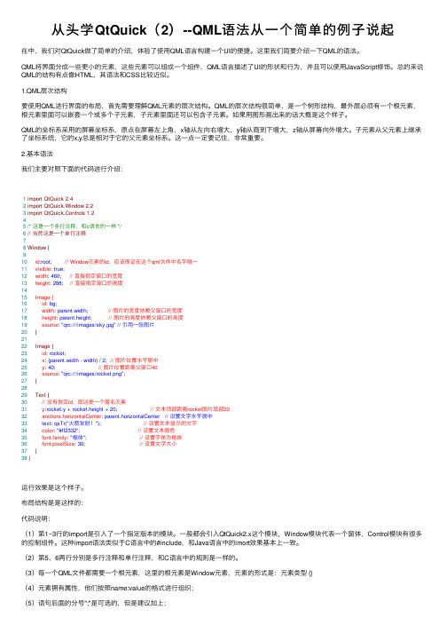
从头学QtQuick(2)--QML语法从⼀个简单的例⼦说起在中,我们对QtQuick做了简单的介绍,体验了使⽤QML语⾔构建⼀个UI的便捷。
这⾥我们简要介绍⼀下QML的语法。
QML将界⾯分成⼀些更⼩的元素,这些元素可以组成⼀个组件,QML语⾔描述了UI的形状和⾏为,并且可以使⽤JavaScript修饰。
总的来说QML的结构有点像HTML,其语法和CSS⽐较近似。
1.QML层次结构要使⽤QML进⾏界⾯的布局,⾸先需要理解QML元素的层次结构。
QML的层次结构很简单,是⼀个树形结构,最外层必须有⼀个根元素,根元素⾥⾯可以嵌套⼀个或多个⼦元素,⼦元素⾥⾯还可以包含⼦元素。
如果⽤图形画出来的话⼤概是这个样⼦。
QML的坐标系采⽤的屏幕坐标系,原点在屏幕左上⾓,x轴从左向右增⼤,y轴从商到下增⼤,z轴从屏幕向外增⼤。
⼦元素从⽗元素上继承了坐标系统,它的x,y总是相对于它的⽗元素坐标系。
这⼀点⼀定要记住,⾮常重要。
2.基本语法我们主要对照下⾯的代码进⾏介绍:1import QtQuick 2.42import QtQuick.Window 2.23import QtQuick.Controls 1.245/* 这是⼀个多⾏注释,和c语⾔的⼀样 */6// 当然这是⼀个单⾏注释78Window {910 id:root; // Window元素的id,应该保证在这个qml⽂件中名字唯⼀11 visible: true;12 width: 460; // 直接指定窗⼝的宽度13 height: 288; // 直接指定窗⼝的⾼度1415 Image {16 id: bg;17 width: parent.width; // 图⽚的宽度依赖⽗窗⼝的宽度18 height: parent.height; // 图⽚的⾼度依赖⽗窗⼝的⾼度19 source: "qrc:///images/sky.jpg" // 引⽤⼀张图⽚20 }2122 Image {23 id: rocket;24 x: (parent.width - width) / 2; // 图⽚位置⽔平居中25 y: 40; // 图⽚位置距离⽗窗⼝4026 source: "qrc:///images/rocket.png";27 }2829 Text {30 // 没有指定id,即这是⼀个匿名元素31 y:rocket.y + rocket.height + 20; // ⽂本顶部距离rocket图⽚底部2032 anchors.horizontalCenter: parent.horizontalCenter // 设置⽂字⽔平居中33 text: qsTr("⽕箭发射!"); // 设置⽂本显⽰的⽂字34 color: "#ff2332"; // 设置⽂本颜⾊35 font.family: "楷体"; // 设置字体为楷体36 font.pixelSize: 30; // 设置⽂字⼤⼩37 }38}运⾏效果是这个样⼦。
Qt Quick和Qt Quick Controls介绍

3
Qt Quick 简介
4
什么是Qt Quick
• Qt UserInterface Creation Kit • 描述性的UI开发技术 • 从Qt 4.7.0开始发布 • QML– Qt Meta-Object Language • QtDeclarative – 一个全新的Qt模块 • 功能强大的开发工具 • 提供面向触屏和面向桌面的UI解决方案
16
风格 – 实例
17
布局
• 定位器(positioner) • RowColumnGridFlow • 确定对象的位置 (管理对象的x,y坐标) • • 锚接器(anchor) • 确定对象间的位置关系(管理对象的x,y坐标,anchors.fill除外) Qt Quick布局 • 确定对象的位置和大小 (管理对象的x,y坐标,width和height) • import youts 1.0 • LayoutRowLayout ColumnLayout GridLayout
5
QML & QtDeclarative
• QML: [”Qt Meta-Object Language”] • • • • • • 通过描述性语言声明界面中的元素 具备 Qt 元对象系统的特征(属性、信号和槽) 使用JavaScript进行逻辑控制 非编译型的语言,在运行时解释执行 容易学习,不需要C++基础也可以开发
参考:/qt5-stable/qtquicklayouts/qtquicklayouts-index.html
18
对话框
• • import QtQuick.Dialog 1.0 ColorDialog FileDialog
参考:/qt5-stable/qtquick/qmlmodule-qtquick-dialogs1qtquick-dialogs-1.html
QtQML和QtQuick简介以及QML实例

QtQML和QtQuick简介以及QML实例从 Qt 4.7 开始,Qt 引⼊了⼀种声明式脚本语⾔,称为 QML(Qt Meta Language 或者 Qt Modeling Language),作为 C++语⾔的⼀种替代。
⽽ Qt Quick 就是使⽤ QML 构建的⼀套类库。
QML 是⼀种基于 JavaScript 的声明式语⾔。
在 Qt 5 中,QML 有了长⾜进步,并且同 C++ 并列成为 Qt 的⾸选编程语⾔。
也就是说,使⽤ Qt 5,我们不仅可以使⽤ C++ 开发 Qt 程序,⽽且可以使⽤ QML。
虽然 QML 是解释型语⾔,性能要⽐ C++ 低⼀些,但是新版 QML 使⽤ V8,Qt 5.2 ⼜引⼊了专为QML 优化的 V4 引擎,使得其性能不再有明显降低。
在 Nokia 发布 Qt 4.7 的时候,QML 被⽤于开发⼿机应⽤程序,全⾯⽀持触摸操作、流畅的动画效果等。
但是在 Qt 5 中,QML 已经不仅限于开发⼿机应⽤,也可以⽤户开发传统的桌⾯程序。
QML ⽂档描述了⼀个对象树。
QML 元素包含了其构造块、图形元素(矩形、图⽚等)和⾏为(例如动画、切换等)。
这些QML 元素按照⼀定的嵌套关系构成复杂的组件,供⽤户交互。
——摘⾃《Qt学习之路2》helloworld实例:新建项⽬如图:选择Qt Quick Application,组件选择Qt Quick 2.1创建项⽬成功之后,Qt会为我们⾃动⽣成⼀系列⽂件:我们真正需要关注的是:main.qml ⾥⾯的内容1 import QtQuick 2.12 import QtQuick.Window 2.034 Window {5 visible: true6 width: 3607 height: 36089 MouseArea {10 anchors.fill: parent11 onClicked: {12 Qt.quit();13 }14 }1516 Text {17 text: qsTr("Hello World")18 anchors.centerIn: parent19 }20 }如上述代码所⽰,⼀个 QML ⽂档分为 import 和 declaration 两部分。
qt学习笔记

Qt学习笔记笔记本:My Notebook创建时间:2024-02-06 17:21更新时间:2024-02-08 17:42作者:sampanQLabel 基本用法设置文本void setText(const QString &);设置大小使用父类QWidge t的方法获取文本QString text() const;设置样式表(qss)setStyleSheet设置图片void setPixmap(const QPixmap &);QLineEdit 基本用法设置文本void setText(const QString &);获取文本QString text() const;设置大小使用父类QWidget的方法QPushButton 基本用法设置文本void setText(const QString &);获取文本QString text() const;设置图片qssui.btnSet->setStyleSheet("QPushButton{background-image:url(:/TencentMeeting/resources/set.png);border:none}\QPushButton::hover{background-color:rgb(99,99,99)}");设置大小使用父类QWidget的方法打开文件对话框QFileDialog::getOpenFileNameQString fileName = QFileDialog::getOpenFileName(this, "请选择图片", "D:/", "图片(*.png *.jpg);;");获取运行路径QString path = qApp->applicationDirPath();ini文件操作QString config_path = qApp->applicationDirPath() + "/config/Setting.ini";qDebug() << config_path;std::unique_ptr<QSettings> pIniSet(new QSettings(config_path,QSettings::IniFormat));//QSettings *pIniSet = new QSettings(config_path, QSettings::IniFormat);QString lastPath = pIniSet->value("/LastPath/path").toString();int end = stIndexOf("/");QString _path = fileName.left(end);pIniSet->setValue("/LastPath/path", _path);//delete pIniSet;//pIniSet = nullptr;QLabel设置图片自适应QPixmap *pix = new QPixmap(fileName);pix->scaled(ui->label_image->size(), Qt::KeepAspectRatio);ui->label_image->setScaledContents(true);ui->label_image->setPixmap(*pix);delete pix;pix = nullptr;QString截取int end = stIndexOf("/");QString _path = fileName.left(end);槽函数写法1. connect(ui->btnOpen, SIGNAL(clicked), this, SLOT(open()));2. connect(ui->btnOpen, &QPushButton::clicked, this, &Widget::open);3. on_btnOpen_clicked();4. connect(ui->btnOpen, &QPushButton::clicked, [=]{QMessageBox::information(this, "title", "clicked lambda");});发送信号定义信号函数.h文件中signals:void sig_addOne(int value);发送信号static int value = 100;emit sig_addOne(value++);接收信号SetDialog dlg;connect(&dlg, &SetDialog::sig_addOne, [=](int value){ui->lineEdit->setText(QString::number(value));});创建线程添加c++类ChildThread,baseclass 选择QThread类重写runprotected:void run() override;调用ChildThread *ch = new ChildThread();ch->start();线程发送信号到主窗口注册信号signals:void sigScore(Score score);run中调用发送emit sigScore(s);主窗口设置槽函数void uishow(Score s);事件绑定ChildThread *ch = new ChildThread();connect(ch, &ChildThread::sigScore, this, &Widget::uishow); ch->start();线程向主窗口注册结构体类型ChildThread::ChildThread(){qRegisterMetaType<Score>("Score");}窗口设置去掉菜单栏this->setWindowFlags(Qt::FramelessWindowHint);点击程序弹窗或隐藏界面this->setWindowFlags(Qt::WindowMinMaxButtonsHint);设置窗口背景及边框this->setStyleSheet("background-color:white;border:none");toolButtonui.btnPhone->setIcon(QIcon(":/TencentMeeting/resources/phonelogin.png")); //设置背景图片ui.btnPhone->setIconSize(QSize(60, 60)); //设置尺寸ui.btnPhone->setText(u8"手机号"); //设置文字ui.btnPhone->setToolButtonStyle(Qt::ToolButtonTextUnderIcon); //设置文字在icon 下方ui.btnPhone->setStyleSheet("border:none"); //设置无边框ui.btnPhone->setCursor(QCursor(Qt::PointingHandCursor)); //设置鼠标悬浮鼠标状态菜单按钮connect(ui.btnClose, &QPushButton::clicked, [=] {close(); //关闭窗口});connect(ui.btnMin, &QPushButton::clicked, [=]{this->showMinimized(); //最小化});水平布局1. set Margin: 设置水平布局最外边界与相邻控件左上右下的间隙,这时左上右下的间隙相同, 如果想设置成不同, 可以使用setContentsMargins 方法;2. setSpacing: 设置相邻控件之间的间隙, 默认值大概是7;3. addSpacing: 在set Sp acing的基础上进行相加, 例如addSpacing(-7), 相当于两个控件之间没有距离;addSpacing(13) 相当千setSpacing(20);4. addStretch() 在水平布局时添加一个水平的伸缩空间 ( QSpacerltem ) , 在竖直布局时,添加一个竖直的伸缩空间#include <QHBoxLayout>QLabel* pPath = new QLabel(this);pPath->setObjectName("pPath");pPath->setFixedSize(40, 32);pPath->setText(u8"路径");QLineEdit* pEdit = new QLineEdit(this);pEdit->setObjectName("pEdit");pEdit->setFixedSize(100, 32);QPushButton* pBtn = new QPushButton(this);pBtn->setObjectName("pBtn");pBtn->setFixedSize(50, 32);pBtn->setText(u8"打开");QHBoxLayout* pHLay = new QHBoxLayout(this);pHLay->addStretch(); //添加弹簧pHLay->addWidget(pPath);//pHLay->setMargin(0); //设置左右距离0pHLay->setSpacing(20); //设置控件距离20qDebug() << pHLay->spacing();pHLay->addWidget(pEdit);pHLay->addWidget(pBtn);pHLay->addStretch();//pHLay->setContentsMargins(0, 100, 10, 0); //设置左上右下 margin 竖直布局#include <QVBoxlayout>QLabel* pPath = new QLabel(this);pPath->setObjectName("pPath");pPath->setFixedSize(40, 32);pPath->setText(u8"路径");QLineEdit* pEdit = new QLineEdit(this);pEdit->setObjectName("pEdit");pEdit->setFixedSize(100, 32);QPushButton* pBtn = new QPushButton(this);pBtn->setObjectName("pBtn");pBtn->setFixedSize(50, 32);pBtn->setText(u8"打开");QVBoxLayout* pVLay = new QVBoxLayout(this);pVLay->addWidget(pPath);pVLay->addSpacing(10);pVLay->addWidget(pEdit);pVLay->addSpacing(50);pVLay->addWidget(pBtn);pVLay->setContentsMargins(60, 80, 70, 50); //设置左上右下 margin 栅格布局#include <QGridlayout>this->setWindowFlags(Qt::FramelessWindowHint | Qt::WindowMinMaxButtonsHint); //头像QLabel* pImageLabel = new QLabel(this);QPixmap pixmap(":/ch23/resources/user_image.png");pImageLabel->setFixedSize(150, 150);pImageLabel->setPixmap(pixmap);pImageLabel->setScaledContents(true);//用户名QLineEdit* pUserNameLineEdit = new QLineEdit(this);pUserNameLineEdit->setFixedSize(300, 50);pUserNameLineEdit->setPlaceholderText(u8"QQ号码/手机/邮箱");QLineEdit* pPasswordLineEdit = new QLineEdit(this);pPasswordLineEdit->setFixedSize(300, 50);pPasswordLineEdit->setPlaceholderText(u8"密码");pPasswordLineEdit->setEchoMode(QLineEdit::Password);QPushButton* pForgotButton = new QPushButton(this);pForgotButton->setText(u8"找回密码");pForgotButton->setFixedWidth(80);QCheckBox* pRememberCheckBox = new QCheckBox(this);pRememberCheckBox->setText(u8"记住密码");QCheckBox* pAutoLoginCheckBox = new QCheckBox(this);pAutoLoginCheckBox->setText(u8"自动登录");QPushButton* pLoginButton = new QPushButton(this);pLoginButton->setFixedHeight(48);pLoginButton->setText(u8"登录");QPushButton* pRegisterButton = new QPushButton(this);pRegisterButton->setFixedHeight(48);pRegisterButton->setText(u8"注册账号");QGridLayout* pGridLay = new QGridLayout(this);pGridLay->addWidget(pImageLabel, 0, 0, 3, 1);pGridLay->addWidget(pUserNameLineEdit, 0, 1, 1, 2);pGridLay->addWidget(pPasswordLineEdit, 1, 1, 1, 2);pGridLay->addWidget(pForgotButton, 2, 1, 1, 1);pGridLay->addWidget(pRememberCheckBox, 2, 2, 1, 1, Qt::AlignLeft| Qt::AlignVCenter);pGridLay->addWidget(pAutoLoginCheckBox, 2, 2, 1, 1, Qt::AlignRight| Qt::AlignVCenter);pGridLay->addWidget(pLoginButton, 3, 1, 1, 2);pGridLay->addWidget(pRegisterButton, 4, 1, 1, 2);pGridLay->setHorizontalSpacing(20);pGridLay->setVerticalSpacing(20);pGridLay->setContentsMargins(30, 30, 30, 30);。
Qt_qml学习笔记

Qt Quick是一个用于帮助开发者设计直观,现代,流畅的用户界面的技术集,近年来被广泛应用于手机,媒体播放器,机顶盒和其他手提设备.Qt Quick中包含了大量的用户界面元素,及描述这些用户界面的陈述性(declarative)语言,和一个语言运行时.在典型的Qt应用程序中有一系列C++ API与这些高层次特性整合.Qt Creator2.1的整合开发环境(IDE)包含了开发Qt Quick应用程序的必要工具.声明元素时要带有名称和两个花括号.元素可能被嵌入到其他元素中,从而在两个元素间创建了父子关系.基本QML元素▪Item -被其他QML元素继承的基本项Basic item element inherited by QML elements▪Component - 导入时封装了QML元素Encapsulates QML elements during importing▪QtObject - 仅容纳一个objectName属性的基本元素Basic element containing only the objectName property图形▪Rectangle - 一个矩形元素A rectangle element▪Image -屏幕上的一个位图For incorporating bitmaps into a scene▪BorderImage - 可使用图片作为边缘Allows the use of images as borders▪AnimatedImage - 未播放动画而存储的一系列帧For playing animations stored ina series of frames▪Gradient - 定义颜色渐变For defining a color gradient▪GradientStop - 为Gradient定义一个颜色Used to define a color withina Gradient▪SystemPalette - 提供访问Qt调色板的接口Provides access to the Qt palettes文字处理▪Text - 向屏幕上插入格式化的文字For inserting formatted text into a scene▪TextInput - 获取用户键盘输入Captures user key input▪TextEdit - 显示多行可编辑的格式化文本Displays multiple lines of editable formatted text▪IntValidator - 验证整数Validates values as integers▪DoubleValidator - 验证实数Validates real values▪RegExpValidator - 字符串正则表达式验证器Validator for string regular expressions▪FontLoader - 按名称或URL加载字体Loads fonts by name or URL鼠标和交互区域▪MouseArea - 设置一块用于鼠标交互的区域Sets up an area for mouse interaction▪Keys - 提供一个带有附加属性的组件用于处理键盘输入Provides components with attached properties to handle key input.▪FocusScope - 传递键盘焦点变化的元素Element that mediate keyboard focus changes▪Flickable - 提供实现"flicked"(弹性)效果的表面组件Provides a surface that can be "flicked"▪Flipable - 提供处理”flipping”(翻转)效果的表面组件Provides a surface that produces "flipping" effects▪PinchArea - 简单的挤压手势处理Enables simple pinch gesture handling定位器和重复器(Repeater)▪Column - 垂直排列子元素Arranges its children vertically▪Row - 水平排列子元素Arranges its children horizontally▪Grid - 在网格中定位子元素Positions its children in a grid▪Flow - 按坐标定位子元素Positions its children with wrapping support▪Repeater - 使用一个模型创建多个组件Uses a model to create multiple components转换Transformations▪Scale - 设置item的缩放行为Assigns item scaling behaviors▪Rotation - 设置item的选择行为Assigns item rotation behaviors▪Translate - 设置item的移动行为Assigns item translation behaviors状态States▪State - 定义对象和属性的一系列配置值Defines sets of configurations of objects and properties▪PropertyChanges - 描述在状态中的属性变化Describes property changes withina state▪StateGroup - 包含一系列的状态和状态变换Contains a set of states and state transitions▪StateChangeScript - 时脚本绑定到一个状态上Allows script binding in a state ▪ParentChange - 在状态改变时重定义item的父项Re-parent an Item in a state change▪AnchorChanges - 在状态中改变item的描点Change the anchors of an item in a state动画和过度(Transitions)▪Transition - 状态改变时动画的过度Animates transitions during state changes ▪SequentialAnimation - 顺序执行动画Runs animations sequentially▪ParallelAnimation - 并行执行动画Runs animations in parallel▪Behavior - 为属性变换指定默认动画Specifies a default animation for property changes▪PropertyAction - 在动画中设置直接的属性变化Sets immediate property changes during animation▪PauseAnimation - 暂停动画Introduces a pause in an animation▪SmoothedAnimation - 使属性平滑的到达指定值Allows a property to smoothly track a value▪SpringAnimation - 使属性向弹簧效果一样达到指定值Allows a property to track a value in a spring-like motion▪ScriptAction - 动画时执行脚本Runs scripts during an animation基于数据类型的元素动画属性 Elements that animate properties based on data types▪PropertyAnimation - 基于属性变化的动画Animates property changes▪NumberAnimation - 基于greal类型属性的动画Animates properties of type qreal ▪Vector3dAnimation - 基于QVector3d类型属性的动画Animates properties of type QVector3d▪ColorAnimation - 基于颜色属性的动画Animates color changes▪RotationAnimation - 基于旋转的动画Animates rotations▪ParentAnimation - 基于parent属性变化的动画Animates parent changes▪AnchorAnimation - 基于描点变化的动画Animates anchor changes模型和数据处理 Models and Data Handling▪ListModel - 定义数据列表Defines a list of data▪ListElement - 在ListModel中定义数据项Defines a data item in a ListModel▪VisualItemModel - 包含定义在其可视化代理中的项Contains items that already defines its own visual delegate▪VisualDataModel - 封装一个模型和一个代理Encapsulates a model and a delegate▪XmlListModel - 使用XPath表达式指定一个模型Specifies a model using XPath expressions▪XmlRole - 为XmlListModel指定一个角色Specifies a role for an XmlListModel ▪Binding - 在任意属性上绑定任意值Binds any value to any property▪Package - 可在不同视图中共享的项的集合Collection that enables sharing of items within different views视图Views▪ListView - 提供一个可视化列表模型Provides a list visualization of a model▪GridView - 提供一个可视化网格模型Provides a grid visualization of a model ▪PathView - 假设模型的内容中含有一个路径.更多信息见Path Elements.Visualizesa model's contents along a path. See Path Elements for more information.路径定义Path Definition▪Path - 使用PathView定义一个路径Defines a path used by PathView▪PathLine - 在Path中定义一条线Defines a line in Path▪PathQuad - 在Path中定义一条二次方的贝塞尔曲线Defines a quadratic Bezier curve in a Path▪PathCubic - 在Path中定义一条三次方的贝塞尔曲线Defines a cubic Bezier curve in a Path▪PathAttribute - 允许设置Path的属性Allows the setting of attributes along a Path ▪PathPercent - 修改Path中item的分布Modifies the item distribution along a Path功能Utility▪Connections - 显示连接信号和槽Explicitly connects signals and signal handlers ▪Timer - 提供定时器Provides timed triggers▪Qt - QML中全局的Qt对象提供Qt中有用的枚举类型和函数.The QML global Qt object provides useful enums and functions from Qt.▪WorkerScript - 可在QML中使用线程Enables the use of threads in QML▪Loader - 控制item或组件的加载Controls the loading of items or components ▪LayoutItem - 允许在Qt的Graphics View布局中声明UI元素Allows declarative UI elements inside Qt's Graphics View layouts图像效果 Graphical Effects▪粒子(Particles) - 生成并播放粒子动画Generates and animates particles▪ParticleMotionLinear - 向粒子增加直线运动行为Adds linear motion behavior to Particles▪ParticleMotionGravity - 向粒子增加自由落体运动行为Adds gravitational motion to Particles▪ParticleMotionWander - 向粒子增加不同的运动行为Adds varied motions to Particles▪ShaderEffectItem - 允许在QML中使用OpenGL Shading Language(OpenGL阴影描述语言) Enables the use of OpenGL Shading Language together with QML ▪ShaderEffectSource - 封装QML对象树作为ShaderEffectItem 的元item Encapsulates QML item tree as a source item for ShaderEffectItem扩展元素 Add-On Elements这些元素不包括在QtQuick1.0模块中.要使用他们必须先获取并安装.These elements are not included in the QtQuick 1.0 module. Their respective QML bindings should first be obtained and installed.▪QtWebKit QML模块 - WebView元素 - 显示web内容▪Mobility QML Plugins▪Qt Quick Components“property 类型名称”来自定义新的属性。
千峰教育qt笔记

千峰教育qt笔记
千峰教育qt笔记是一款专为学生和职场人士设计的学习工具。
它集合了笔记、时间管理、任务提醒、备忘录等功能于一体,为用户提供了高效的学习和工作助手。
首先,千峰教育qt笔记的界面简洁明了,操作非常便捷。
用户可以根据不同的学习和工作内容创建相应的笔记,方便整理和查找。
同时,它支持多种笔记格式,包括文字、图片、音频、视频等,满足了用户对于多样化学习内容的需求。
其次,千峰教育qt笔记还提供了强大的时间管理功能。
用户可以设定学习和工作计划,制定详细的任务清单和提醒,让自己的学习和工作更加有序和高效。
而且,它还支持多设备同步,让用户可以随时随地查看和修改自己的笔记和计划。
此外,千峰教育qt笔记还具有智能化的提醒功能。
它可以根据用户的学习和工作情况,提供个性化的学习建议和时间提醒,帮助用户更好地掌控自己的学习和工作节奏。
总的来说,千峰教育qt笔记是一款非常实用的学习工具。
它不仅简化了用户的学习和工作流程,还提升了用户的学习和工作效率。
值得一提的是,它的安全性也非常高,用户的笔记和个人信息都会得到很好的保护。
因此,如果你是一个学生或者职场人士,正在寻找一款高效的学习和工作助手,不妨试试千峰教育qt笔记,相信它一定会给你带来意想不到的惊喜。
qtquick_module_002

All properties not expressed will be the same as the base state
Making things move
The purpose of creating States
It is easy to change from one state to another
Item { id: myItem width: 400 height: 400 Image { id: spaceship source: "images/spaceship.png" x: 10 y: 50 } states: [ State { name: "leftXMove" PropertyChanges { target: spaceship x: 200 } } ] }
Using “when” method. It will change the property but inside the state element
Making things move
The purpose of creating States
This is the result ...
See video: addon/module-002/videos/spaceship-no-motion.mov
Making things move
The purpose of creating States
... but this one is much more interesting
See video: addon/module-002/videos/spaceship-motion.mov
Making things move
QT学习笔记_体会篇

QT学习笔记(初识)2020-05-21 11:13QT学习笔记(初识)查看RedHat自带QT库途径:/usr/lib/,查看目录qt3-1下是不是有13个文件,假设没有,那么需要安装。
主菜单-系统设置-添加程序-选中KDE软件开发-更新。
在Linux下做一个五子棋的小游戏。
在/home/下创建目录qt,编写一个小程序的C++文件。
下面介绍源程序:#include <>#include <> /bin里寄放的是QT库的利用手册;/lib下寄放的是库文件,即由原库文件生成目标文件*.o;/include下寄放的是各库文件的声明。
因此,在编译时,编译器找不到正确的文件,因此必需对环境变量做修改。
方式一:敲入命令,如此能够临时修改环境变量,设定其查找途径,但并非能保留修改,在下一次开机后,需要从头设置。
1)#g++ –o hello –lq t –I/usr/lib/include2)#export CPLUS_INCLUDE_PATH=/usr/lib/include#g++ –o hello –lqt以上两种方式等价。
再次编译后仍旧有错,找不到库文件。
指定库途径:1)#g++ –o hello –lqt –L/usr/lib/lib2)#export LIBRARY_PATH=/usr/lib/lib#g++ –o hello –lqt最终生成可执行文件hello。
其中,-lqt是连接QT库的参数语句,-lqt等价于,它是一个动态库,它包括了众多库文件,链接时只会把所需库文件链接进来,如此就可不能使最终生成的文件过大。
知识点:gcc -I +头文件途径-L +库文件途径-l +链接库方式二:将环境变量添加到/etc/profile/内,它是一个类似脚本的文件,每次开机都会执行里面的语句,即系统在开机时自动执行改变途径的命令,来修改环境变量。
添加内容:CPLUS_INCLUDE_PATH=/usr/lib/includeLIBRARY_PATH=/usr/lib/libexport CPLUS_INCLUDE_PATH LIBRARY_PATH编译C++常常利用命令:(源文件)#qmake –v 可查看qt版本#qmake –project 产生一个工程文件#qmake 产生Makefile文件Makefile#make 生成目标文件和可执行文件、qt。
- 1、下载文档前请自行甄别文档内容的完整性,平台不提供额外的编辑、内容补充、找答案等附加服务。
- 2、"仅部分预览"的文档,不可在线预览部分如存在完整性等问题,可反馈申请退款(可完整预览的文档不适用该条件!)。
- 3、如文档侵犯您的权益,请联系客服反馈,我们会尽快为您处理(人工客服工作时间:9:00-18:30)。
第三章QML语言基础1、通过id值来引用一个对象。
2、属性名一般都以小写开始的,如果属性名为多个单词表示的时候,第二个以及以后的单次首字母要大写。
例如:width,implicitWidth3、列表属性:列表是包含在方括号内,以逗号分隔多个元素第四章Qt Quick快速入门1、一个qml文档有两部分组成:import语句和QML对象树。
除Window以及派生类外,QML中其他的可见元素大多数是Item的派生类。
Item及其派生类可以作为QML文档的根对象。
2、两种方法启动Qt Quick App:1)QQMLApplicationEngine搭配Window。
利用此方法显示QML,QML文档拥有窗口的完整控制权。
2)QQuickView搭配Item。
利用此方法显示QML,文档对窗口的控制权(比如:设置窗口标题、大小等等)在C++代码。
3、细说Window(要使用Window对象需要加入代码:import QtQuick.Window 2.2)Window对象的visible属性用来设置这个窗口的显示状态。
取值可以为:Window.Windowed只有支持同时显示多窗口时才有效。
Window.Minimized/Maximized/FullScreen/Automatic Visibilitycolor属性来设置窗口的颜色。
opacity设置窗口的透明度。
title设置窗口的标题。
activeFocusItem属性类型为Item,保存窗口中拥有活动焦点的Item。
一个QtQuick应用可能会有多个窗口,窗口之间由modality(模态)属性决定,一个模态的窗口会阻止其他窗口获取输入事件。
4、ApplicationWindow是Window的派生类,需要引入代码:import QtQuick.Controls 2.2.。
ApplicationWindow类似于QMainWindow,有menuBar、toolBar、statusBar属性分别设置菜单、工具栏和状态栏。
5、基本元素:一、Rectange属性:width和height属性、color制定填充颜色,gradient用来设置渐变色供填充使用。
如果color的属性为transparent则只绘制边框而不填充。
border.width设置边框的宽度,border.color设置边框的颜色。
若要绘制圆角矩形,则设置radius属性即可。
二、颜色属性:color有r、g、b、a四个属性:分别表示一个颜色的值red、green、blue、alpha三、渐变色:QML渐变色的类型是Gradient,渐变色通过两个或多个颜色值来指定。
Gradient使用GradientStop来指定颜色值和他的位置。
(取值在0.0到1.0之间)。
代码可以为:gradient:Gradient{GradientStop{position:0.0;color:“#202020”;}GradientStop{position:0.33;color:“blue”;}}在Qt5.0中只有垂直方向的线性渐变可以用于Item,不过其他方向的可以通过Rectangle指定rotation属性来实现。
四、Item。
是一个可视元素的基类。
它定义了绘制图元所需要的大部分通用属性,比如x、y、width、height、锚定(anchoring)和按键处理。
Item属性除了x、y还有Z属性,指定图元在场景中的Z序。
z属性的类型是real,数值越小图元就越垫底(离我们越远)Item的属性opacity指定一个图元的透明度。
(取值在0.0-1.0之间)Item的clip属性是根据自己的位置和大小来裁剪自己以及孩子的显示范围。
分组后可以通过Item的children或visibleChildren属性来访问孩子元素。
通过x、y、width、height可以完成界面的布局但是这是采用绝对坐标的布局方式,不太适用于可变大小的窗口。
下面采用全新的布局属性:锚定属性五、锚布局属性。
anchors可以通过指定一个元素与其他元素的关系来确定元素在界面的位置。
每个Item都有7条不可见的锚线:左、右、上、下、水平中心、垂直中心、基线。
对于没有文本的图元基线和上是一致的。
还可以指定上下左右的留的空白。
Item的anchor属性还包括:centerIn表示将Item居中放在另一个Item中,anchors.centerIn:parent;fill表示充满这个Item,anchors.fill:parent。
六、响应按键。
Item通过附加属性Keys来处理按键。
如果一个按键被处理了则event.accepted应该设置为true,以免继续被其他值传递。
七、Textfont.bold:true; // 黑体font.pixelSize:24; // 像素font.Raised/Sunken:true; //字体上浮或下沉font.Pointsize:24Text元素的style属性提供了几种文字风格:Text:Outline,Text:Raised,Text:Sunken使文字有点特别的效果。
Text.wrapMode;将确定字体需要的空间Text.elide;当在有限的空间内显示一行长文本,显示不下的时候省略处理,就可以设置elide属性。
八、Button。
需要引入import QtQuick.Controls1.1点击按钮都会触发一个clicked()信号。
text属性指定按钮文字checked属性设置Button是否可选;iconName属性指定图标的名字;iconSource则通过URL的方式指定icon的位置。
isDefault属性指定按钮是否为默认按钮;pressed属性保存了按钮的按下状态。
menu属性允许给按钮设置一个菜单;action属性允许你设定按钮的action,action可以定义按钮的checked、text、tooltip、iconSource等属性,还可以绑定按钮的clicked信号。
activeFocusOnPress属性指定按钮被按下时是否获得焦点。
style来定制按钮的风格,与之对应的是ButtonStyle属性九、ButtonStyle 需要引入import QtQuick.Controls.Styles 1.1它含有三个属性:background、control、labelBackground和label属性的类型为Component。
Control属性指向使用ButtonStyle的按钮对象,可以用它来访问按钮的各种状态。
十、Image可以显示一张图片,只显示静态图片。
动态图片的显示可以使用AnimatedSprite或者AnimatedImage。
Image可以设置图片的大小,如果设置了width和height那么图片就可以被拉伸来适应这个尺寸。
fillMode属性可以设置图片的填充模式,支持Image.Stretch(拉伸)、PreserveAspectFit(等比缩放)、PerserveAspectCrop(等比缩放最大化的填充Image)、Image.Tile在水平和垂直方向两个方向平铺。
Image.Pad保持图片鸳鸯不变。
Image会默认的阻塞加载图片,对于分辨率高的图片问题就会很大,需要设置asynchronous属性为true来开启一步加载模式。
,此时Image会使用一个线程加载图片十、BusyIndictor 用来显示一个等待单元,在进行一些耗时操作时可以用来缓解用户的焦躁情绪。
只有两个属性:running和style两个属性但是它是从Item继承而来的,可以直接使用Item属性十一、FileDialog 文件对话框,可以用来选择已有的文件、文件夹、支持单选和多选。
第五章ECMAScrip初探1、QML有三个核心:ECMAScrip、Qt对象系统、Qt Quick 标准库。
一、语法:变量、函数名、运算符以及其他一切东西都是区分大小写的。
语句后的分号可有可无。
二、变量使用var运算符声明变量。
变量的命名规则:第一个字符必须是字母、下划线或美元符号($);剩下可以为字母、下划线或美元符号($)或数字。
但是一般还是采用每个单词首字母大写的规则。
关键字和保留字都不能作为变量名。
变量可以存放两种类型的值:原始值和引用值。
原始值放在栈中,引用值是一个指针指向存储在堆中的对象。
变量存储在堆上会提高变量查找和访问速度。
三、原始数据:有五种原始类型Undefined、Null、Boolean、Number、String。
通过typeof运算符来判断一个值的类型,如果是原始值类型则返回具体的类型名字;如果是引用值则统一返回“Object”作为类型的名字。
“undefined”变量为Undefined类型;“boolean”变量为Boolean类型;“number”变量为Number类型;“string”变量为String类型;“object”变量为引用类型或Null类型;Undefined类型:当声明的变量未初始化时,返回类型默认为Undefined。
未初始化的变量也有固定的初始值,我们可以将一个变量和undefined进行逻辑比较。
当函数没有明确的返回值时,返回类型也是Undefined。
Null类型:可以显示地将一个变量初始化为null;Boolean类型;是最常用的类型之一。
Number类型是最特殊的既可以表示32位整数还可以表示为64位浮点数。