图表描述英文表达 PPT
如何用英文分析各种图表PPT课件

Frankly speaking, the user of the fixed telephone is decreasing. On contrast, the user of mobile phone is creasing .It shows that the devolpment of our country and the addition of our income. At the same time, it makes our life more convenient.
management.
第9页/共12页
From the graph, we can see that there were two peaks of accidents in 2006. One was in Feb with the number of 32.The other was in August with the number of 39, which was the highest point of the distribution line. From August, the number of car accident had been decreasing till it reached the lowest point of the year in December. Two peaks occurred in spring and summer,The two seasons which had most of the year's rain. Driving tends to be more dangerous in rainy days. Maybe the weather is the most important reason for car accidents. Be
英语图表类的描述模板
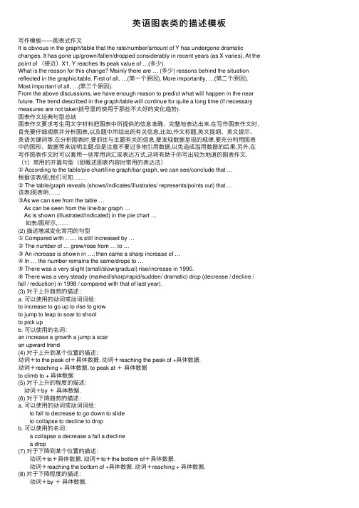
英语图表类的描述模板写作模板——图表式作⽂It is obvious in the graph/table that the rate/number/amount of Y has undergone dramatic changes. It has gone up/grown/fallen/dropped considerably in recent years (as X varies). At the point of (接近)X1, Y reaches its peak value of …(多少).What is the reason for this change? Mainly there are … (多少) reasons behind the situation reflected in the graphic/table. First of all, …(第⼀个原因). More importantly, …(第⼆个原因). Most important of all, …(第三个原因).From the above discussions, we have enough reason to predict what will happen in the near future. The trend described in the graph/table will continue for quite a long time (if necessary measures are not taken括号⾥的使⽤于那些不太好的变化趋势).图表作⽂经典句型总结图表作⽂要求考⽣⽤⽂字材料把图表中所提供的信息准确、完整地表达出来.在写作图表作⽂时,⾸先要仔细观察并分析图表,以及题中所给出的有关信息,⽐如,作⽂标题,英⽂提纲、英⽂提⽰、英语关键词等.在分析图表时,要抓住与主题有关的信息,要发现数据呈现的规律,要充分利⽤图表中的图形、数据等来说明主题.但是注意不要过多地引⽤数据,以免造成滥⽤数据的后果.另外,在写作图表作⽂时可以套⽤⼀些常⽤词汇或表达⽅式,这将有助于你写出较为地道的图表作⽂.(1)常⽤的开篇句型(即概述图表内容时常⽤的表达法)① According to the table/pie chart/line graph/bar graph, we can see/conclude that …根据该表/图,我们可知 ……② The table/graph reveals (shows/indicates/illustrates/ represents/points out) that …该表/图表明……③As we can see from the table … As can be seen from the line/bar graph … As is shown (illustrated/indicated) in the pie chart … 如表/图所⽰,……(2) 描述增减变化常⽤的句型① Compared with …… is still increased by …② The number of … grew/rose from … to …③ An increase is shown in …; then came a sharp increase of …④ In … the number remains the same/drops to …⑤ There was a very slight (small/slow/gradual) rise/increase in 1990.⑥ There was a very steady (marked/sharp/rapid/sudden/ dramatic) drop (decrease / decline / fall / reduction) in 1998 / compared with that of last year).(3) 对于上升趋势的描述:a. 可以使⽤的动词或动词词组:to increase to go up to rise to growto jump to leap to soar to shootto pick upb. 可以使⽤的名词:an increase a growth a jump a soaran upward trend(4) 对于上升到某个位置的描述:动词+to the peak of+具体数据. 动词+reaching the peak of +具体数据.动词+reaching + 具体数据. to peak at +具体数据to climb to + 具体数据(5) 对于上升的程度的描述: 动词+by +具体数据.(6) 对于下降趋势的描述:a. 可以使⽤的动词或动词词组: to fall to decrease to go down to slide to collapse to decline to dropb. 可以使⽤的名词: a collapse a decrease a fall a decline a drop(7) 对于下降到某个位置的描述: 动词+to+具体数据. 动词+to+the bottom of+具体数据. 动词+reaching the bottom of +具体数据. 动词+reaching + 具体数据.(8) 对于下降程度的描述: 动词+by +具体数据.(9) 对于平稳的趋势的描述: 可以使⽤的动词或动词词组: to hardly change to have little change to keep steady to level off to remain constant to stay the same(10) 表⽰程度的副词: 1. 程度较⼤: considerably dramatically greatly markedly obviously quickly rapidly sharply significantly suddenly 2. 程度较⼩: slightly gradually slowly steadily(11) 时间的嵌⼊ 嵌⼊时间时所使⽤的介词和介词词组: from……to…… between…….and…… during……and……at the start of …… by the end of …… over ……at the end of …… throughout ……(12) 上升和下降趋势的组合描述1. 先上升后下降的句型:... increased slowly during… and … but fell sharply in …A steady fall in …… during …… and …… followed the sharp increase in …….2. 先下降后上升的句型:… fell before …… began to make a recovery ……… continue the recovery, climbing to ……… dropped during …… but increased again in ……… fell and then pick up during ……… collapsed before rising to ……at the end of ……3. 起伏波动的句型:… fluctuated sharply all through ……4. 波动不⼤的句型:… hardly changed through the period between …and …。
四级英语写作应用文写作(图表-漫画)公开课获奖课件百校联赛一等奖课件

2) 描述详细数据变化
•
increase/decrease by...
•
increase from ... to...
•
increase steadily from...
•
There was a marked increase
in ...
•
There has been a rapid
increase in ...
hand, ...On the other hand, ...
•
The rapid growth of ... owes much to...
•
lie in
• (2) In recent years, the time students using computers has increased greatly. (2023.6 CET-4)
• 第二段分析引起变化旳原因,主题句一般表达引起这种变化旳 原因有几点.例如:
•
(1) There are many factors that have stimulated this huge
place in ...
•
From the above table it can be seen that...
•
As it is shown in the table,...
•
According to the graph, ...
•
It is clear from the table that ...
increased 4%.
•
总之,挑选有说服力旳数据,主要是首尾两端数字或其增减值.
3. 强调数据间旳关系,突出变化
• 发觉数据旳变化规律,引用了经典数据,还须进一 步强调突出这种变化,使论证更有力.以 "Student Use of Computer"为例,有学生写到:But in 2023, students spent nearly 20 hours per week on the computer. This number was ten times that of 1990 and five times that of 1995. 像这么用倍数或百分 比更能阐明问题,给人留下深刻印象.
如何用图表说话PPT课件

1993年-1998年销售额
1994年
1995年
1996年
1997年
销售额 1998年
主题信息确定
同样的数据, 得出不同的主 题,是强调排 名还是强调所 占份额,由你 来决定,你决 定的就是你的 主题。
小结
1、了解了数据类、非数据类各种图表类型; 2、使用图表的目的:关键在于简洁、越简洁越好。 3、成功的图表必须具备以下几个关键要素: 每张图表都传达一个明确的信息、清晰易读、格式简单明了并 且前后连贯、图表与标题相辅相成; 4、好图表的标准的格式:信息标题、图表标题、脚注、标签、 图例、资料来源; 5、什么时侯不适合用图表表达: 图表太简单,完成可以用文字描述; 或者用图表来表示某种精确的内容可能产生误导。 习惯了一种固定的表达方式,用图表表达则容易造成混乱。
练习一:项目的五个阶段
I.初次接触
IV.提出 III. 制定解 建议 II. 项目 决方案 启动
V. 实施改革
5. 实施 改革
1. 初次 接触
I. 初次 接触
II. 项目 启动
III. 制定解 决方案
IV. 提出 建议
4. 提出 建议
3. 制定解 决方案
2. 项目 启动
V. 实施改革
练习二:图表运用
非临沂市非山东籍
41%
7%
2%
婚姻状况
50%
66%
34%
未婚管理人员 男
已婚管理人员 女
己婚员工
ThemeGallery is a Design Digital Content & Contents mall developed by Guild Design Inc.
•2006 statistics title
图表描述英文表达44页PPT

Tables
These can sometimes be tricky as they provide a lot of information and it is often awkward and difficult to describe every piece of information. You have to decide and describe the values and sections that are the most significant.
图表描述英文表达
Describing and Analysing
GRAPHS AND CHARTS
Bar Charts
Hopefully you will have described the title of the bar chart in your introduction so you can go straight into the description.
Fluctuate, vary, upward/downward trend Remain stable (at);Remain steady (at);Stay (at);
Stay constant (at);Maintain the same l Adverbs
Decrease; descend; fall; go down, slide; slip; decline; reduce; drop; dip;shrink; dwindle; be halved; tumble; plummet; plunge; collapse; slump; diminish; bottom out
Basically, with a bar chart, you need to describe the bars and their values. When describing a bar chart you first have to decide in what order to describe the bars, highest value to lowest value or lowest value to highest value. It may be a mixture of this.
各类图表英文描述

各类图表英文描述1.Map(地图、天体图、布局图、专用图、图谱)Battle map 作战地图Highway map 公路图Genetic map 基因图谱2.Figure(图形、平面图)Geometric(al) figure 几何图形Dimension figure 尺寸图Plane figure 平面图3.Pattern(图案、图型、图样)Checkboard pattern 棋盘型图案Recording pattern 录像图型Circular pattern 圆形图样4.Sketch(草图、略图、简图)Eye sketch 目测草图Topographic sketch 地形略图Dimensional sketch 尺寸简图5.Scheme/shematic(图解、示意图、流程图、电路图)Flow scheme 流程图Induction scheme 感应电路图6.Draft(草图)Chisel draft 雕刻前在石头上画出边缘轮廓草图7.Curve(曲线图表)Algebraic curve 代数曲线Comfort curve 湿度舒适曲线8.Graph(曲线图表)Funtional graph 函数图(亦称plot)Bar graph 条形图(也称chart)9.View(视图)Plane view 平面视图10.Geometry(几何图)Plane geometry 平面几何Solid geometry 立体几何图11.Chart(航海图、图表)Aeronautical chart 领航图Demographic data chart 人口统计图表Pie chart 饼图Bar chart 柱图12.Drawing(工程图、插图)Drawing 建筑图Explanatory drawing 说明(插)图/doc/ec18558506.html,yout(布局图、规划图)1、图形种类及概述法:泛指一份数据图表:a data graph(曲线图)/chart/diagram/illustration/table饼图:pie chart直方图或柱形图:bar chart/histogram趋势曲线图:line chart/curve diagram表格图:table流程图或过程图:flow chart/sequence diagram程序图:processing/procedures diagram2、常用的描述用法The table/chart diagram/graph shows (that)According to the table/chart diagram/graphAs (is)shown in the table/chart diagram/graphAs can be seen from the table/chart/diagram/graph/figures,figures/statistics shows (that)……It can be seen from the figures/statisticsWe can see from the figures/statisticsIt is clear from the figures/statisticsIt is apparent from the figures/statisticstable/chart/diagram/graph figures (that)……table/chart/diagram/graph shows/describes/illustrates3、图表中的数据(Data)具体表达法数据(Data)在某一个时间段固定不变:fixed in time在一系列的时间段中转变:changes over time持续变化的data在不同情况下:增加:increase/raise/rise/go up ……减少:decrease/grow down/drop/fall ……波动:fluctuate/rebound/undulate/wave ……稳定:remain stable/stabilize/level off ……二、相关常用词组1、主章开头图表类型:table(表格)、chart(图表)、diagram(图标)、graph (多指曲线图)、column chart(柱状图)、pie graph(饼图)、tree diagram(树形图)描述:show、describe、illustrate、can be seen from、clear、apparent、reveal、represent内容:figure、statistic、number、percentage、proportion 2、表示数据变化的单词或者词组rapid/rapidly 迅速的,飞快的,险峻的dramatic/dramatically 戏剧性的,生动的significant/significantly 有意义的,重大的,重要的sharp/sharply 锐利的,明显的,急剧的steep/steeply 急剧升降的steady/steadily 稳固的,坚定不移的gradual/gradually 渐进的,逐渐的。
最全经典PPT模板及图表集合(英文版).pptx
31
Click to add Title
2
Click to add Title
3
Click to add Title
4
Click to add Title
锐普PPT论坛chinakui收集
Block Diagram
Add your Title Add Your Text
Text in here
ThemeGallery
is a Design Digital Content & Contents mall developed by Guild Design Inc.
ThemeGallery
is a Design Digital Content & Contents mall developed by Guild Design Inc.
锐普PPT论坛chinakui收集
Diagram
Add Your Title Text
•Text 1 •Text 2 •Text 3 •Text 4 •Text 5
Text
Text Text Text
Text
Add Your Title Text
•Text 1 •Text 2 •Text 3 •Text 4 •Text 5
Add Your Text
Add Your Text
Add Your Text
Title
Add Your Text
Add Your Text
Add Your Text
锐普PPT论坛chinakui收集
Diagram
1
ThemeGallery is a Design Digital Content & Contents mall developed by Guild Design Inc.
英文图表描述课件

Table
Summary
A table is a tool used to display structured data.
Detailed description
Tables display data in the form of rows and columns, and can contain various types of data, such as numbers, text, dates, etc. Tables can provide detailed numerical data and statistical information, and support various data operations and analysis, such as sorting, filtering, and calculation.
Scatter Plot
Summary
A scatter plot is a type of chart used to display the relationship between two variables.
Detailed description
A scatter plot displays the relationship between two variables by representing data points as points on a plane. It can be used to explore the correlation, trend, and distribution between variables, as well as to identify outliers and outliers.
- 1、下载文档前请自行甄别文档内容的完整性,平台不提供额外的编辑、内容补充、找答案等附加服务。
- 2、"仅部分预览"的文档,不可在线预览部分如存在完整性等问题,可反馈申请退款(可完整预览的文档不适用该条件!)。
- 3、如文档侵犯您的权益,请联系客服反馈,我们会尽快为您处理(人工客服工作时间:9:00-18:30)。
To describe the movement, there is some language which will always be useful. There is a list of words/phrases you can use.
As you will see, there are a number of words which are similar in meaning. This means that you will be able to use a variety of vocabulary which gives a good impression to the examiner who will read and mark your writing. The words below are particularly useful for line graphs but they can also be used where appropriate to describe the other types of graph.
This pie chart shows the percentages of different types of energy consumed in the US in 2007.
Most of the energy, 39.24%, came from petroleum. The next largest source of energy is …...
BEC Higher (the 3rd version) P44: Exam format Approach
DESCRIBING GRAPHS AND CHARTS:Pie Charts
Pie charts are relatively straightforward as they only usually have a few sections though this is not always the case. You need to describe the segments and their values.
If there are very many then just describe the ones that are the most significant. The values are often expressed in percentages but not always so be careful what scale you are using.
It is interesting to note that renewable energy, which is healthier for the environment and sustainable, accounts for the smallest percent of the consumption.
Bar Charts
Hopefully you will have described the title of the bar chart in your introduction so you can go straight into the description.
Basically, with a bar chart, you need to describe the bars and their values. When describing a bar chart you first have to decide in what order to describe the bars, highest value to lowest value or lowest value to highest value. It may be a mixture of this.
If there are very many bars, you can sometimes group together for description 1 or 2 or 3 bars which have similar or the same values.
If there are very many and you can't group them, then just describe the ones that are the most significant.
Describing and Analysing
GRAPHS AND CHARTS
Graphs & charts
Pie chart Bar chart (histogram) Table Line chart (graph)
BEC Higher Writing Test: Part One
Hale Waihona Puke Line graph The function of a line graph is to describe a TREND. You therefore should try and describe the trend in it.
If there are many lines in the graph(s), then just generally describe the trend. If there is only one or two, then use more detail. So, describe the movement of the line(s) of the graph giving numerical detail at the important points of the line.
Tables
These can sometimes be tricky as they provide a lot of information and it is often awkward and difficult to describe every piece of information. You have to decide and describe the values and sections that are the most significant.