使用H5搭建webapp主页面
使用H5搭建webapp主页面
前言:
在一个h5和微信小程序火热的时代,作为安卓程序员也得涉略一下h5了,不然就要落后了,据说在简历上可以加分哦,如果没有html和css和js基础的朋友,可以自行先学习一下,很简单的。推荐0基础能力一般的,我建议可以看传智播客的韩顺平老师的视频或者毕向东老师的视频,能力强的同学可以在w3c文档自学。
主页面搭建
思路分析:
Meta标签中的ViewPort属性:ViewPort是承载代码层的一个View视图,而手机浏览器看到网页是承载ViewPort视图。因此,手机看到的层级关系,从上到下:代码View视图->ViewPort视图->浏览器视图。
所以我们只需要修改ViewPort这一层的属性,比如缩放等,即可对手机进行响应式布局,即安卓的自适应布局。
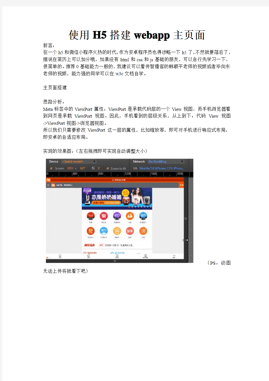
实现的效果图:(左右拖拽即可实现自动调整大小)
(PS:动图无法上传将就看下吧)
步骤三:由于每个浏览器的默认边距,默认属性的不同,我们需要全部初始化一遍,达到适应不同浏览器。
编写我们的common.css文件,记得在index.html中导入
[css] view plain copy 在CODE上查看代码片派生到我的代码片
*,
::after,
::before{
margin: 0;
padding: 0;
/*当用户点击iOS的Safari浏览器中的链接或JavaScript的可点击的元素时,覆盖显示的高亮颜色*/
-webkit-tap-highlight-color: transparent;
/*设置所有是以边框开始计算宽度百分比*/
-webkit-box-sizing:border-box;
box-sizing: border-box;
}
body{
font-size: 14px;
font-family: "Microsoft YaHei","sans-serif";
color: #333;
}
a{
color: #333;
text-decoration: none;
}
a:hover{
text-decoration: none;
}
input{
border: none;
outline: none;
/*清除移动端默认的表单样式*/
-webkit-appearance:none;
}
li{
list-style: none;
}
步骤四:编写index.html文件
[html] view plain copy 在CODE上查看代码片派生到我的代码片
步骤五:编写index.css,来对这个layout类进行布局
[css] view plain copy 在CODE上查看代码片派生到我的代码片.layout{
width: 100%;
max-width: 640px;
min-width: 320px;
height: 1000px;
margin: 0 auto;
background: #ff0000;
}
实现效果图:
轮播图和导航栏的搭建
思路分析:
1、导航栏实现:导航栏使用css的position=fixed和z-index=1000,使它固定在顶部并在网页的最上层,左边的icon和右边登陆按钮使用绝对位置来调整距离左边右边上边的距离,而中间的form表单只要Padding-Left和Padding-Right就可以随屏幕伸缩。
2、自动轮播效果实现:这里使用了jQuery的一个js开源库unslider。
3、十个选项按钮实现:使用一个列表,设置每一个li为块元素,宽度为20%,并且让10个选项左浮动,就可以自动排好两行。
实现的效果图:
导航栏实现
步骤一:编写html文件,将导航栏做成一个盒子,并放置需要的组件,并为它们取好类名,方便css的编写
[html] view plain copy 在CODE上查看代码片派生到我的代码片
步骤二:编写css文件,将放置的东西设置好宽高,宽用百分比可以自适应,高度则是自己测量
[css] view plain copy 在CODE上查看代码片派生到我的代码片
/*nav*/
.nav_header{
position: fixed;
height: 40px;
width: 100%;
top: 0;
left: 0;
z-index: 1000;
}
.nav_header> .nav{
width: 100%;
height: 40px;
max-width: 640px;
min-width: 320px;
margin: 0 auto;
background:rgba(201,21,35,0.00);
position: relative;
}
.nav_header> .nav> .nav_logo{
width: 80px;
height: 30px;
position: absolute;
background: url("../img/top_logo.png") no-repeat;
background-size: 80px 20px;
top: 10px;
left: 0;
}
.nav_header> .nav> .nav_login{
width: 50px;
height: 40px;
line-height: 40px;
text-align: center;
position: absolute;
right: 0;
top: 0;
color: white;
font-size: 15px;
}
.nav_header> .nav> form{
width: 100%;
padding-left: 85px;
padding-right: 50px;
height: 40px;
}
.nav_header> .nav> form> input{
width: 100%;
height: 30px;
border-radius: 15px;
margin-top: 5px;
padding-left: 30px;
}
.nav_header> .nav >form >.nav_search_icon{
height: 20px;
width: 20px;
background:url("../img/top_search.png");
background-size: 20px 20px;
position: absolute;
left: 90px;
top: 10px;
}
自动轮播实现
步骤一:根据官网编写自动轮播html文件
[java] view plain copy 在CODE上查看代码片派生到我的代码片


步骤二:根据官网导入js文件,需要下载unslider.js,它是基于JQuery.js的,所以需要下载2个,导入到项目中
[java] view plain copy 在CODE上查看代码片派生到我的代码片
步骤三:为了使图片能让我们手动滑动,还需要导入2个JQuery的库,导入之后就能手动滑动了
[html] view plain copy 在CODE上查看代码片派生到我的代码片
步骤四:为了让图片能刚好100%显示出来,并且实现自动轮播导航圆点,需要在css中加入实现
[css] view plain copy 在CODE上查看代码片派生到我的代码片
/*banner*/
.banner ul li a img{
width: 100%;
}
.unslider {
overflow: auto;
margin: 0;
padding: 0;
/*Added*/
position: relative;
}
.unslider-nav{
position: absolute;
width: 100%;
bottom: 2%;
}
十个选项按钮实现
步骤一:编写html文件
[html] view plain copy 在CODE上查看代码片派生到我的代码片


步骤二:编写css文件
[css] view plain copy 在CODE上查看代码片派生到我的代码片/*item*/
.item{
width: 100%;
height: 180px;
background: #fff;
margin-top: -4px;
border-bottom: 1px solid #e0e0e0;
}
.item> ul{
width: 100%;
}
.item> ul> li{
width: 20%;
float: left;
}
.item> ul> li> a{
width: 100%;
display: block;
padding-top: 20px;
}
.item> ul> li> a> img{
width: 40px;
height: 40px;
display: block;
margin: 0 auto;
}
.item> ul> li> a> p{
text-align: center;
color: #666;
}
商品区块的搭建
思路分析:
1、秒杀模块:可以分为头部的倒计时和内容部分三个li存放三个图,并且右边界为1px。
2、左一大图、右两小图:这里使用模块化开发,在css写好width=50%、左右两边1px的border和左浮动右浮动的类,直接在html创建好后使用即可。左大图采用左浮动,右小图采用右浮动,大小都为50%。
3、左两小图、右一大图:左小图采用左浮动,右大图采用有浮动。
实现的效果图:
准备工作
编写common.css,用于模块化开发,只要在class里面放置需要的类名即可:
[css] view plain copy 在CODE上查看代码片派生到我的代码片
.fl{
float: left;
}
.fr{
float: right;
}
.m_l10{
margin-left: 10px;
}
.m_r10{
margin-right: 10px;
}
.m_b10{
margin-bottom: 10px;
}
.m_t10{
margin-top: 10px;
}
.b_l1{
border-left: 1px solid #e0e0e0;
}
.b_r1{
border-right: 1px solid #e0e0e0;
}
.b_b1{
border-bottom: 1px solid #e0e0e0;
}
.w_50{
width: 50%;
display: block;
}
.w_50 >img{
width: 100%;
display: block;
}
.clearfix::before,
.clearfix::after{
content: "";
height: 0;
line-height: 0;
display: block;
visibility: hidden;
clear: both;
}
秒杀区块、左大图右小图、左小图右大图
步骤一:编写html文件
[html] view plain copy 在CODE上查看代码片派生到我的代码片
掌上秒杀
0
0
:
0
0
:
0
0

¥10.00
¥100.00

¥10.00
¥100.00
¥10.00
¥100.00
京东超市


京东超市


京东超市
步骤二:编写css文件
[css] view plain copy 在CODE上查看代码片派生到我的代码片
/*shopItem*/
.shopItem{
padding: 0 5px;
}
.shopItem> .shop_box{
width: 100%;
margin-top: 10px;
background: #fff;
box-shadow: 0 0 1px #e0e0e0;
}
.shopItem> .shop_box> .shop_box_tit{
width: 100%;
height: 32px;
line-height: 32px;
border-bottom: 1px solid #e0e0e0;
}
.shopItem> .shop_box> .shop_box_tit.no_border{
border-bottom: none;
}
.shopItem> .shop_box> .shop_box_tit> h3{
padding-left: 18px;
font-size: 15px;
color: #666;
font-weight: normal;
position: relative;
}
.shopItem> .shop_box> .shop_box_tit> h3::before{ content: "";
width: 3px;
position: absolute;
top: 10px;
left: 10px;
height: 12px;
background: #d8505c;
}
.shop_box_sk{
}
/*秒殺*/
.sk_l> .sk_l_icon{
background: url("../img/sk_icon.png") no-repeat;
background-size: 16px 20px;
float: left;
width: 16px;
height: 20px;
margin-top: 6px;
}
.sk_l> .sk_l_name{
font-size: 15px;
color: #d8505c;
float: left;
}
.sk_l> .sk_l_time{
margin-top: 10px;
float: left;
}
.sk_l> .sk_l_time> span{
float: left;
width: 15px;
line-height: 15px;
height: 15px;
text-align: center;
background: #333;
color: #fff;
margin-left: 3px;
}
.sk_l> .sk_l_time> span:nth-child(3n){ color: #333;
background: #fff;
width: 5px;
}
.sk_con> ul{
width: 100%;
margin: 8px 0;
}
.sk_con> ul> li{
width: 33.33%;
float: left;
}
.sk_con> ul> li> a{
display: block;
width: 100%;
margin: 0 auto;
border-right: 1px solid #e0e0e0; }
.sk_con> ul> li:last-child> a{
border-right:0;
}
.sk_con> ul> li> a> img{
width: 67%;
margin: 0 auto;
display: block;
}
.sk_con> ul> li> p{
text-align: center;
}
.sk_con> ul> li> p:first-of-type{
color: #d8505c;
}
.sk_con> ul> li> p:last-of-type{
font-size: 12px;
color: #666;
text-decoration:line-through;
}