雅思小作文曲线图写作技巧
雅思小作文曲线图写作技巧
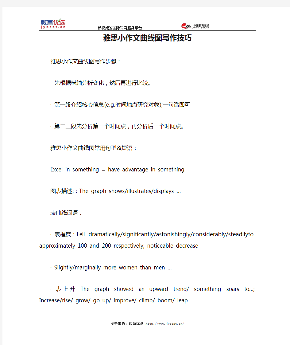
雅思小作文曲线图写作步骤:
·先根据横轴分析变化,然后再进行比较。
·第一段介绍核心信息(e.g.时间地点研究对象);一句话即可
·第二三段先分析第一个时间点,再分析后一个时间点。
雅思小作文曲线图常用句型&短语:
Excel in something = have advantage in something
图表描述::The graph shows/illustrates/displays …
表曲线词语:
·表程度:Fell dramatically/significantly/astonishingly/considerably/steadilyto approximately 100 and 200 respectively; noticeable decrease
· Slightly/marginally more women than men …
·表上升The graph showed an upward trend/ something soars to…; Increase/rise/ grow/ go up/ improve/ climb/ boom/ leap
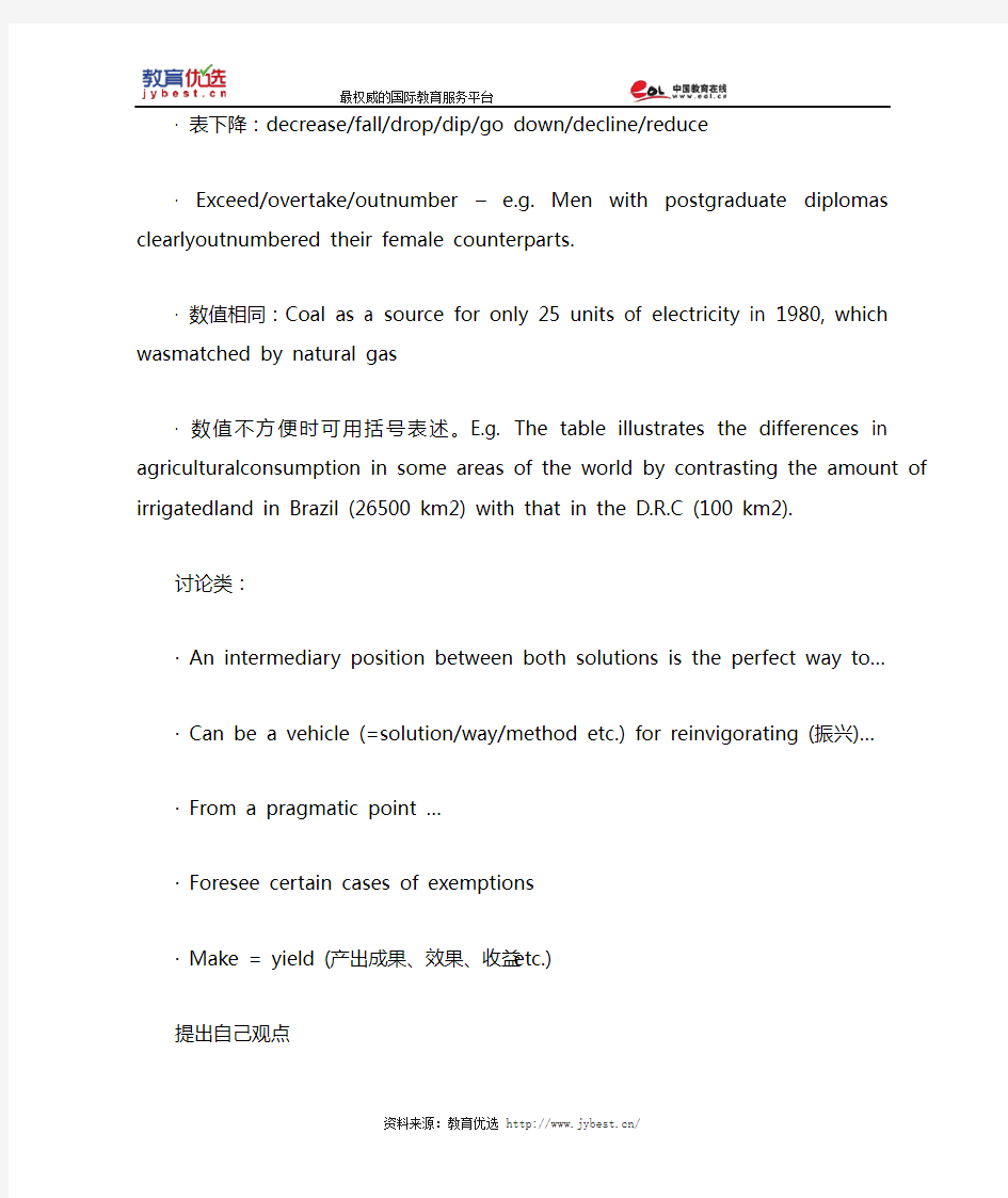
·表下降:decrease/fall/drop/dip/go down/decline/reduce
· Exceed/overtake/outnumber – e.g. Men with postgraduate diplomas clearlyoutnumbered their female counterparts.
·数值相同:Coal as a source for only 25 units of electricity in 1980, which wasmatched by natural gas
·数值不方便时可用括号表述。E.g. The table illustrates the differences in agriculturalconsumption in some areas of the world by contrasting the amount of irrigatedland in Brazil (26500 km2) with that in the D.R.C (100 km2).
讨论类:
· An intermediary position between both solutions is the perfect way to…
· Can be a vehicle (=solution/way/method etc.) for reinvigorating (振兴)…
· From a pragmatic point …
· Foresee certain cases of exemptions
· Make = yield (产出成果、效果、收益etc.)
提出自己观点
· While I admit that…/I am convinced that…
其他
· Beyond our wildest expectations
· Inevitable = inescapable
· Underground railway systems = subway networks
· Genetic factors & environment / nature & nurture
雅思小作文柱状图Bar类解析
雅思小作文柱状图Bar类解析 关于柱状图我们主要分两种写法: 1.如果横轴有明显的时间推移的话,烤鸭们应连接柱子顶点,重在描述柱子的升降起伏,写法类似于线状图。 2.如果无时间推移,则写法和饼状图一样。即按照各比较对象所占比例的高低写,同时要注意各所占比例之间的比较。 可以用到的词汇有: 1.表示“占多少”的动词 Account for Take up Make up Contribute to Have Represent 2.表示“最高级”和“比较级” 第一/最小the largest/biggest proportion of 第二the second/next largest/expensive(+ 形容词的最高级) 第三followed closely by 最低/最小the smallest percent of all 3.表示“相同比例” 即在饼状图中遇到了比例相同或者差不多的饼,如有A B两个比较对象。 A accounts for the same percentage as B . The proportion of A is as high as B A and B contributed equally/evenly to (all ) 在观察柱形图的时候首先要留意横轴的数据,若横轴为时间轴或者是年龄趋势,那么我们在主体段写作时候的基本思路就为从左到右;若横轴数据为具体专有名词诸如地点,交通工具等时,主体段的写作思路就可能是按照柱形的长度排列。本文根据上述的分析做以下的总结: 一、按照横轴从左到右排列数据: 1. 两根柱且趋势截然相反 在这种写法中,我们要注意观察2根柱的上升/下降的幅度。以下我们就来看一个例子:
Simon雅思小作文真题范文 Task 1: table essay
The table below shows changes in the numbers of residents cycling to work in different areas of the UK between 2001 and 2011. The table compares the numbers of people who cycled to work in twelve areas of the UK in the years 2001 and 2011. Overall, the number of UK commuters who travelled to work by bicycle rose considerably over the 10-year period. Inner London had by far the highest number of cycling commuters in both years. In 2001, well over 43 thousand residents of inner London commuted by bicycle, and this figure rose to more than 106 thousand in 2011, an increase of 144%. By contrast, although outer London had the second highest number of cycling commuters in each year, the percentage change, at only 45%, was the lowest of the twelve areas shown in the table. Brighton and Hove saw the second biggest increase (109%) in the number of residents cycling to work, but Bristol was the UK’s second city in terms of total numbers of cycling commuters, with 8,108 in 2001 and 15,768 in 2011. Figures for the other eight areas were below the 10 thousand mark in both years. (172 words, band 9)
雅思小作文地图题
雅思小作文题型多样,其中就包括地图题,本文将详细讲解雅思小作文地图题写作技巧。评分标准 ?TA – Task Achievement 任务完成情况 ?CC – Coherence and Cohesion 意合与形合 ?LR – Lexical Resource 词汇资源 ?GRA – Grammatical Range and Accuracy 语法广度与精确度 审题 The map below shows the development of the village of Ryemouth between 1995 and present. 文章结构 第一段 交待写作目的 第二段 描述1995年的地图 第三段
拿现在的地图和95年的做对比 第四段 总结全文 第一段 This report compares how the village of Ryemouth has developed and changed since the year of 1995. 题目:The map below shows the development of the village of Ryemouth between 1995 and present. 第二段 As is clearly described in the first picture, Ryemouth was a coastal city which was divided into three parts by two roads. In the southern part, there was a fishing port on the sea, with a fish market located in the north and a coffee shop in the north-east. A block of shops was situated on the opposite side of the market… 第三段 In the second picture, the village changed a lot. The fishing port has been removed and the fish market is replaced by apartments. Several restaurants also occupy the place of the shops on the roadside. Moreover, a parking lot is newly built on the east of the hotel. In addition, … 第四段 Overall, based on the brief description above, it is clear that the general layout of the village does not change a lot, while some newly-built facilities and housing has ornamented the small village.
作文范文之雅思小作文真题
作文范文之雅思小作文真题
雅思小作文真题 【篇一:雅思作文题目汇总】 一、教育 1、教育应该包括哪些内容? 母题:it is generally believed that education is of vital importance to the development of individuals and the well-being of societies. what should education consist of to fulfil both these functions? (050312) 提示:本题围绕教育的两大功能来展开(个人与社会),准备好这篇文章,即可应付教育类话题中的最大分支—教育的功能,做到以不变应万变。对于社会角度,可以从促进经济发展、增加社会流动性(social mobility)、维护社会稳定这几个方面来展开,对于个人,可以写改变思维模式、有利于就业和便利生活来写。 子题:大学应当教授理论知识还是实践技能?大学的是应当把学生培养成合格的公民还是让他们自己得益?准备未来职业最好的方法是上大学还是尽快离校积累工作经验?大学要不要扩招?中学阶段应当提供通才教育还是专才教育?要不要延长义务教育年限?要不要让农村地区的学生更容易上学?老师要教学生如何判断是非吗? 2、学校的科目谁来选择?(060916) 母题:some people think that the government should decide which subjects students should study at the university, while others think that students should be allowed to apply for the subject they prefer. discuss the two views and give your opinion. 提示:这类题目采取的策略就是“双批判”,因为题目中提供的两种选择往往都是错误的。
雅思写作小作文范文 雅思写作折线图(线状图) 公司垃圾数量.doc
雅思写作小作文范文雅思写作折线图(线状图)公司垃圾数量 今天我们雅思写作小作文范文的文章来研究下折线图(线状图)。该图表的内容为三家公司(A, B, C)从2000年到2015年间所产生的垃圾数量。其中公司A的垃圾数量一直在下降,公司B的数量先是一波上升,然后进一步下降。公司C的垃圾数量则是一直在上升。虽然图表比较简单,但基本概括了折线图的精髓,并涵盖了各种变化。小编搜集了一篇相应的考官范文,以供大家参考。 雅思写作小作文题目 The graph below shows the amounts of waste produced by three companies over a period of 15 years. Summarise the information by selecting and reporting the main features, and make comparisons where relevant. 雅思写作小作文范文 The line graph compares three companies in terms of their waste output between the years 2000 and 2015. 线状图比较了三个公司从2000年到2015年期间的垃圾产出量。 It is clear that there were significant changes in the amounts of waste produced by all three companies shown on the graph. While companies A and B saw waste output fall over the 15-year period, the amount of waste produced by company C increased considerably. 很明显,图表中所显示的三家公司的垃圾产量都有巨大的变化。尽管公司A和公司B的垃圾产量在这15年间有所下降,公司C的垃圾产量却有巨大的上升。 In 2000, company A produced 12 tonnes of waste, while companies B and C produced around 8 tonnes and 4 tonnes of waste material respectively. Translation from Laokaoya website. Over the following 5 years, the waste output of companies B and C rose by around 2 tonnes, but the figure for company A fell by approximately 1 tonne. 2000年,公司A产生12吨的垃圾,而公司B和C则各自生产大约8吨和4吨的垃圾。在接下来的5年里,公司B和公司C的垃圾产量上升了大约2吨,但公司A的垃圾产量下降了1吨左右。 From 2005 to 2015, company A cut waste production by roughly 3 tonnes, and company B reduced its waste by around 7 tonnes. By contrast, company C saw an increase in waste production of approximately 4 tonnes over the same 10-year period. By 2015, company C’s waste output had risen to 10 tonnes, while the respective amounts of
Simon雅思小作文真题范文 Task 1: 'waste table' essay
The table below shows the amount of waste production (in millions of tonnes) in six different countries over a twenty-year period. The chart compares the amounts of waste that were produced in six countries in the years 1980, 1990 and 2000. In each of these years, the US produced more waste than Ireland, Japan, Korea, Poland and Portugal combined. It is also noticeable that Korea was the only country that managed to reduce its waste output by the year 2000. Between 1980 and 2000, waste production in the US rose from 131 to 192 million tonnes, and rising trends were also seen in Japan, Poland and Portugal. Japan’s waste output increased from 28 to 53 million tonnes, while Poland and Portugal saw waste totals increase from 4 to 6.6 and from 2 to 5 million tonnes respectively. The trends for Ireland and Korea were noticeably different from those described above. In Ireland, waste production increased more than eightfold, from only 0.6 million tonnes in 1980 to 5 million tonnes in 2000. Korea, by contrast, cut its waste output by 12 million tonnes between 1990 and 2000.
雅思图表作文经典套句50句-题
雅思图表作文经典套句50句1.该表格描述了在…年之…年间…数量的变化。 2.该柱状图展示了… 3.该图为我们提供了有关…有趣数据。 4.该图向我们展示了… 5.该圆形图揭示了… 6.这个曲线图描述了…的趋势。 7.数据(字)表明… 8.该树型图向我们揭示了怎样… 9.该数据(字)可以这样理解… 10.这些数据资料令我们得出结论… 11.如图所示… 12.根据这些表(数字)… 13.如表格所示… 14.从图中可以看出,…发生了巨大变化。 15.从图表我们可以很清楚(明显)看到… 16.这个图表向我们展示了… 17.该表格描述了…年到…年间a与b的比例关系。 18.该图以圆形图形式描述了…总的趋势。
19.这是个柱型图,描述了… 20.如图所示,两条曲线描述了…的波动情况。 21.在…至…期间,…基本不变。 22.在…年到…期间… 23. 1995年至1998三年里… 24.从那时起… 25.…月(年)至…月(年)…的数量基本不变。 26.数字急剧上升至… 27.…至…期间…的比率维持不变。 28.…的数目在…月(年)达到顶点,为… 29.比率维持在… 30.…的比例比…的比例略高(低)。 31.…与…的区别不大。 32.该图表表明…的数目增长了三倍。 33…逐年减少,而…逐步上升。 34.…的情况(局势)到达顶(高)点,为…百分点。 35.数字(情况)在…达到底部。 36.数字(情况)达到底部(低谷)。
37. a是b的…倍。 38. a增长了… 39. a增长到… 40.比例高(低) 41.…数字呈上升趋势。 42. …到…发生急剧上升。 43.从…到…,下降速率减慢。 44.从这年起,…逐渐下降至… 45.与…相似 46.与…相同 47.…与…之间有许多相似(不同)之处 48. a于b有共同之处。 49. a与b之间的差别在于… 50.…年…急剧上升。
雅思小作文之图表作文
二.雅思图表作文 1.企业垃圾(线性图) 题目:The graph below shows the amounts of waste produced by three companies over a period of 15 years. 范文:The line graph compares three companies in terms of their waste output between the years 2000 and 2015. It is clear that there were significant changes in the amounts of waste produced by all three companies shown on the graph. While companies A and B saw waste output fall over the 15-year period, the amount of waste produced by company C increased considerably. In 2000, company A produced 12 tonnes of waste, while companies B and C produced around 8 tonnes and 4 tonnes of waste material respectively. Over the following 5 years, the waste output of companies B and C rose by around 2 tonnes, but the figure for company A fell by approximately 1 tonne. From 2005 to 2015, company A cut waste production by roughly 3 tonnes, and company B reduced its waste by around 7 tonnes. By contrast, company C saw an increase
雅思小作文真题范文-Process diagram answer
题目: The diagrams below show the stages and equipment used in the cement-making process, and how cement is used to produce concrete for building purposes. 范文: The first diagram illustrates the process of cement manufacture, and the second diagram shows the materials that go into the production of concrete. It is clear that there are five stages in the production of cement, beginning with the input of raw materials and ending with bags of the finished product. To produce concrete, four different materials are mixed together. At the first stage in the production of cement, limestone and clay are crushed to form a powder. This powder is then mixed before it passes into a rotating heater. After heating, the resulting mixture is ground, and cement is produced. Finally, the cement is packaged in large bags. Cement is one of the four raw materials that are used in the production of concrete, along with gravel, sand and water. To be exact, concrete consists of 50% gravel, 25% sand, 15% cement and 10% water. All four materials are blended together in a rotating machine called a concrete mixer. (160 words, band 9)
雅思小作文图表作文数据写法
1.介词 From..to.. - The number of divorces increased from 1m in 1970 to almost 1.5m. by, of(表示数值变化差,搭配from/to) 趋势动词+by -The proportion of married people decreased by 11% to about 59%. 趋势名词+of -The proportion of married people underwent a decrease of 11%. at(表示在某一点) -The number of marriages leveled off at 2.5 million during the first decade. -The minutes of local fixed line calls reached the peak at around 90 billion. With(带一个或几个静止的数值) - In 1979, beef was the most popular of these food, with about 225 grams per person per week. - Three of these countries shared similar figures with6.63% in Turkey, 6.51% Spain and 6.43% in Ireland. 2.括号 带静止数据 - Specifically, deforestation was the number one murder (9.8%), followed by over-cultivation and over-grazing (7.7% and 5.5% respectively). 带动态数据 - There was an overall slight increase in both nuclear and solar/wind (up by 3q and 2q respectively). - Both nuclear power and oil went up during the period, although the rise of oil was not as dramatic as that of nuclear power (from 15, 20 to 126, 25 respectively). 3.从句
2011雅思小作文 最全万能模板
2011雅思小作文写作万能模板 1、通过第一个曲线图,我们可以知道____,也说明了结果是___ According to the first graph, it can be seen that ______________, it can also be concluded from it that ______________. 2、一张有趣、有教育意义的、(内容)的图片(这句模板在雅思小作文中的应用非常的广泛。) There is an interesting and instructive picture which goes like this: __________. 3、当前有一张涉及______的增长曲线图,许多人______,然而其他人倾向于___ Nowadays there is a growing concern over ______________. Many people like ______________, while others are inclined to ______________. 4、目前,共同之处是_________,许多人喜欢______因为_______除此之外还由于_____ Nowadays, it is common to ______________. Many people like______________ because ______________. Besides, ______________. 5、(图表所示)_____,就像许多其他事物,被____更加喜爱,然而这一观点正被________所抨击,一些人认为_________,他们指出___________ ______________, just like many other things, are preferred by ____________. While being attacked by the idea that ______________, some people consider ______________. They point that ______________. 6、每种事物都有两面性和________,是没有异议的,包括利和弊 Everything has two sides and ______________ is not an exception, it has both advantages and disadvantages. 7、_____作为_____被观察了许多年,但是人们现在像发现新大陆一样注视着它 For years ______________ had been viewed as ______________. But people are taking a fresh look at it now. 8、政府保证________,对于这份保证,大多数人做出了强烈地回应,因为_____ It has stipulated by the government that ______________. To this stipulation, many people respond actively because ______________. 9、_______出现在我们日常生活中是很平常的,无论我们做什么,_______都是不可避免的______________ is a common occurrence in our daily life. Whatever we do, ______________ can't be avoided. 10、_____在人群中已经成为热门话题,特别是在年轻人中,激烈的争论无休止______________ has become a hot topic among people, especially among the young, and heated debates are right on their way. 1 according to the chart```
雅思图表作文TASK1精讲精练
雅思图表作文TASK1精讲精练
雅思图表作文TASK1精讲精练 A理论部分: 雅思小作文概论 1、文章结构:主要分三部分:i。introductory sentence;ii。body paragraph;iii。Concluding sentence 具体讲:第一段introductory sentence只要写一句话,交待图形(如the line graph, pie chart等等),描述对象(如图表描述的是the number of tourists visiting England),地点(如the US, the UK等)以及时间(如between 1988 and 1997等等);另外要注意的就是第一段不能和图表上方已给的句子太过相似!否则,会失分的! 第二部分一般写1~3段,这要视情况而定。这部分主要就是对比不同的数据,如相似或相同的数据;某个数据是另一个数据的2倍;某个数据所占比例最大或最小等等。 最后一段concluding sentence也只要写一句话,
主要是总结图表的整个趋势。 2。文章的效果。很多学生会发现小作文的例文特别简单(特别是剑桥书里提供的)。原因很简单,这个report的目的就是要让university lecturer了解某个事物的发展趋势,因此写出来的文章必须结构清晰、易懂,绝对不能太复杂,也不要把每个数据都描写出来,只要描写有代表性的,重要的数据即可。 以下为雅思小作文的四个基本步骤 第一步:改写题目 经过同义词转换在短短的1分钟内就写好作文的第一段。 举例:The graph below shows the percentage of people unable to find work in three major countries from 1983 to 1992. 题目中划线的单词都能够进行同义转换: graph—figure, show—illustrate, percentage—proportion, major—key, from…to…—between…and…, 第二步:分析时态
【优质】雅思小作文真题范文:咖啡的制作-优秀word范文 (1页)
【优质】雅思小作文真题范文:咖啡的制作-优秀word范文 本文部分内容来自网络整理,本司不为其真实性负责,如有异议或侵权请及时联系,本司将立即删除! == 本文为word格式,下载后可方便编辑和修改! == 雅思小作文真题范文:咖啡的制作 The diagram shows the stages in the process of making chocolate . Chocolate comes from the cacao tree , which is grown in parts of South America , Africa and Indonesia . The tree produces large red pods which contain white cocoa beans . Firstly , when the pods are ripe , they are harvested , the beans are removed and they are fermented for several days in large wooden boxes . During the fermenting process , the beans turn brown . Next , the brown beans are spread in the sun to dry . They are then put in large sacks and transported by train or lorry . After this , the beans are taken to a chocolate factory where they are roasted in an oven at temperatures of between 250 and 350 degree Celsius . After being roasted , the beans are crushed and the outer shell is removed . This part is not needed for making chocolate . Finally , the inner part of the bean is pressed and liquid chocolate is produced .
【2019最新】雅思小作文攻略+范文:曲线图-word范文模板 (1页)
【2019最新】雅思小作文攻略+范文:曲线图-word范文模板 本文部分内容来自网络整理,本司不为其真实性负责,如有异议或侵权请及时联系,本司将立即删除! == 本文为word格式,下载后可方便编辑和修改! == 雅思小作文攻略+范文:曲线图 下面雅思为大家整理了雅思小作文攻略+范文:曲线图,供考生们参考,以下是详细内容。 曲线图范文 1: 【第一句】 The curve illustrates the number of cases of A - type crimes committed in the UK between the years 1990 and 201X.【第二句】 It can be seen that A - type crimes decreased dramatically to 200 cases around the middle of the 1990 s and then increased to 201X before the year 201X. 范文 2: From the graph , we can see clearly that in the early morning , at 6 a . m ., few people watch TV . However , from this time onwards , the number of TV audience is on the rise . At noon , the people watching TV account for about 8% of the total population . In the period between 12:00 and 2:00 p . m ., the TV audience experiences a sharp increase from 8% to approximately 18%. From 2:00 p . m . to 4:00 p . m ., the figure remains constant at about 18%, then balloons to the peak of the day , reaching approximately 50%. The number of TV audiences drops dramatically from 10 p . m . till it reaches its bottom at 3 p . m . On the other hand , there is a sharp increase in radio audience from 6. a . m to 9 a . m ., peaking at about 28% at 8:30 a . m . However , from this point onwards , it declines gradually for the rest of the day , bottoming out at 4:00 a . m . the next day . In brief , the number of TV and radio audiences varies according to different phases of time probably due to the different features of these two media .
雅思小作文折线图
Writing task one: single line graph You will be given a graph with a single line. Your task is to write a 150 word report to describe the information given in the graph. You are not asked to give your opinion. You should spend around twenty minutes on the task. Task one is not worth as many marks as task two and so you should make sure that you keep within the recommended twenty minute time frame. What is being tested is your ability to: ?objectively describe the information given to you ?report on a topic without the use of opinion ?use suitable language to describe the graph Sample task You should spend about 20 minutes on this task. Write a report for a university lecturer describing the information in the graph below. Write at least 150 words. When you’ve f inished the task How good is your answer? Check the guidelines bellow and read the sample answer. Guidelines for a good answer Does the report have a suitable structure? ?Does it have an introduction, body and conclusion? ?Does it include connective words to make the writing cohesive within sentences and paragraphs? Does the report use suitable grammar and vocabulary? ?Does it include a variety of sentence structures? ?Does it include a range of appropriate vocabulary? Does the report meet the requirements of the task? ?Does it meet the word limit requirements? ?Does it describe the whole graph adequately? ?Does it focus on the important trends presented in the graphic information? Sample answer The graph shows the number of cases of X disease in Someland between the years 1960 and 1995. As an overall trend, it is clear that the number of cases of the disease increased fairly rapidly until the mid seventies, remained constant for around a decade at 500 cases before dropping to zero in the late 80s.
老外的标准雅思小作文范文(分享)
老外写的小作文范文,比较直观~~ 第一篇 作文题目 第一篇范文参考 model answer: The two graphs show that oil was the major energy source in the USA in both 1980 and 1990 and that coal, natural gas and hydroelectric power remained in much the same proportions. On the other hand, there was a dramatic rise in nuclear power, which doubled its percentage over the ten years. Oil supplied the largest percentage of energy, although the percentage decreased from 42% in 1980 to 33% in 1990. Coal in 1990 was the second largest source of energy, increasing its proportion to 27% from 22% in the previous decade. Natural gas, the second largest source in 1980 at 26%, decreased its share very slightly to provide 25% of America’s energy ten years later. There was no change in the percentage supplied by hydroelectric power which remained at 5% of the total energy used. Nuclear power the greatest change: in 1990 it was 10%, twice that of the 1980s. (152 words)