雅思小作文范文
小作文
折线
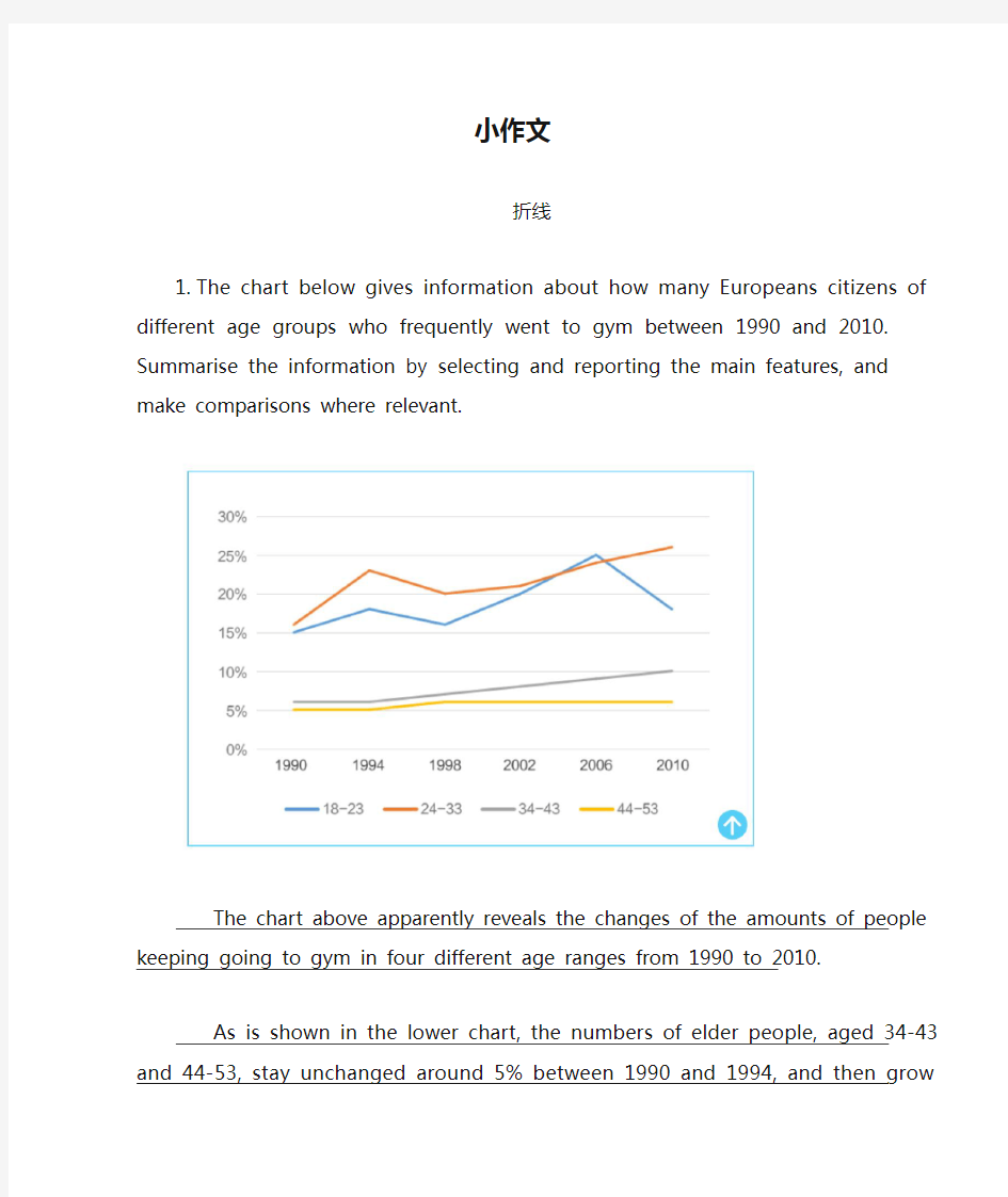
1.The chart below gives information about how many Europeans citizens of different age
groups who frequently went to gym between 1990 and 2010. Summarise the information by selecting and reporting the main features, and make comparisons where relevant.
The chart above apparently reveals the changes of the amounts of people keeping going to gym in four different age ranges from 1990 to 2010.
As is shown in the lower chart, the numbers of elder people, aged 34-43 and 44-53, stay unchanged around 5% between 1990 and 1994, and then grow slowly before 1998. After 1998, however, the number of 34-43-year-old people stablily increases upto 10% while that of the eldest group stays the same. Furthermore, according to the upper chart, numbers of younger groups going to gym oftentimes including 18-23 and 24-33 ages fluctuate similarly in the range of 15%-25% with the latter one in a more dramatic manner until 2006. In addition, the latter one is caught up during 2002 to 2006. In the last four-year, the number of people in youngest group suddenly dropped off below 20% while the other group, in the contrary, increases continuously and finally exceeds 25%.
To summarize, the number of people going to gym frequently in the 4 type ages all present the tendency to rise in whole except the eldest group, aging 44-53, which stay the same almost all the time.
2.The chart below shows three different crimes and the number of cases committed in 1970
and 2005 in England and Wales. Summarise the information by selecting and reporting the main features, and make comparisons where relevant.
The chart provided illustrates a brief picture of the types of crimes and the number of cases in the course of 35 years in two regions—England and Wales.
Among the three types of crimes committed, car theft had taken up the majority in virtually all the years; except for in 1980, it was slightly exceeded by house burgling. The number of cases of car theft, starting at 0.40 million in 1970, steadily increased for the next twenty years and saw a spectacular surge during the period of 1990 to 1995, eventually peaking at 1.60 million, after which it started to gradually drop, ending up at 1.00 million in 2005.
The number of cases of house burgling had been the most fluctuant throughout the 35 years.
Accounting for only half of the number of cases of car theft in 1970, it peaked to the point of roughly 0.90 million in 1980, surpassing that of car theft. Afterwards, it went through a fluctuating trend up until 2005, never straying too far away from the point of 0.60 million.
The most sedentary of the three was the number of crimes of street robbery, with an almost indistinguishable change from 1970 all the way to 1995, never exceeding 0.20 million, after which it presented a slightly upward trend and peaked at 0.40 million in 2005.
饼图
1.The charts show different kinds of pollutants entering a particular area of ocean in 1997 and
2007. Summarise the information by selecting and reporting the main features, and make comparisons where relevant.
The two pie charts given present the proportion of various types of pollutants influencing a certain area in the ocean both in 1997 and 2007.
The percentage of pollutants from air, though making up the majority both in 1997 and 2007, presented a noticeable decrease, from 50% in 1997 to 38% in 2007. Similarly, the proportion of industrial waste and marine transport waste, accounting for roughly 1/6 and 1/4 respectively in 1997, saw an obvious downward trend ten years later, to merely 7% and 8% respectively.
On the contrary, offshore oil and domestic sewage demonstrated a considerable increase over the course of 10 years, surging from 5% and 18% respectively in 1997 to 15% and 32% in 2007.
Other types of pollutants, farm waste and litter, negligible in the first place, shrank and even went off the picture in 2007.
2.The charts below show the number of reasons why some people leave UK and why some
people choose to stay. Summarise the information by selecting and reporting the main features, and make comparisons where relevant.
The two pie charts given present the proportion of various reasons for people’s decision to stay in or leave UK.
In both charts, “quality of life” ranks the highest in all the five reasons, accounting for 34% for people leaving UK and 40% for those staying. Similarly, two reasons—“employment”and “join family and friends” are relatively close as reasons to leave and to stay in two charts, making up nearly 1/7 and 1/10 in both charts.
The most striking and interesting distinction is the proportion of the reason—“weather”, which accounts for 22% of the reasons for people’s leaving UK yet only 7% of the reasons for people’s staying. Besides, 20% of all the people leaving the UK believe that it was because of “financial resources”, which, by contrast, accounts for up to 30% of people’s decisions of staying in UK.
3.The charts below show the result of surveys asking undergraduates and postgraduates why
they choose Vaster university. Summarise the information by selecting and reporting the main features, and make comparisons where relevant.
The two charts provided illustrate the preferences of undergraduates and postgraduates respectively for choosing Vaster University. A glance of the distinction provides some interesting facts.
Clearly, “reputation of university” ranks the highest as a criterion for both groups of students, making up 30% of the reasons provided by undergraduates and even 42% for postgraduates.
After that, the second highest reason is the same for both groups—24% undergraduates and 36% postgraduates choose Vaster University based on the consideration for “cost”, which is probably where the similarities come to an end.
Subsequent in the ranking are “location”, occupying 10% for undergraduates and 6% for postgraduates, “other”, accounting for 6% and 7% respectively, and “availability of accommodation”, 9% in undergraduates and negligible 3% in postgraduates. 7% postgraduates choose the university because of “personal recommendation”, which is a bsent as a reason for undergraduates’ choices.
柱状
1.The chart below shows the number of international applicants from four countries that a
European university had from 2004 –2008. Summarise the information by selecting and reporting the main features, and make comparisons where relevant.
The bar graph given provides information on the number of international applicants for a European university from four different countries in the course of 5 years.
It is obvious that the number of Chinese applicants, though being the highest among that of applicants from the other three countries for 4 straight years from 2004 to 2007, presents a discernible downward trend. In 2004, more than 25000 applicants come from China, which, however, dropped to merely 15000 in 2008. By contrast, the number of applicants from Japan, constantly ranking the third among the 4 countries steadily increased from only 5000 in 2004 to 10000 in 2008.
The other two countries saw a relatively dramatic fluctuation during 5 years, particularly America, which provided only 10000 students in 2007, the lowest during the period of 5 years, yet peaked at more than 25000 in 2008. Applicants from Russian kept account for the lowest proportion among the 4 countries in all 5 years, at only roughly 1000 in 2004 and 8000 in 2007, though already at its peak.
2.The chart below shows the women aged from 16 to 25 in a particular country who prefer to
watch or participate in a variety of sports. Summarise the information by selecting and reporting the main features, and make comparisons where relevant.
The bar graph given presents the preference for watching or participating in various sports of women aged 16 to 25 in a particular country.
It is obvious that in some sports, these women show an obvious will to merely watch instead of participating in themselves. In particular, roughly 60 women like to watch tennis, but only half of them are motivated to take part in the sport. The similar phenomenon can be seen in gymnastics, with 20 women willing to watch but fewer than 10 willing to get involved themselves, which is even more distinct in horse riding and racing, with 5 women like to watch yet only 1 is willing to ride.
When it comes to basketball, the distinction of numbers of women who like to watch and those who participate in the sport is almost indiscernible, both at roughly 50.
By contrast, speaking of badminton and golf, these surveyed women display a clear will to participate in the sports instead of merely watching. Only 5 and 10 people like to watch badminton and golf respectively, yet up to 12 and 30 are motivated to get involved actively.
3.The chart below shows the percentage of health spending among GDP in five countries in
2002. Summarise the information by selecting and reporting the main features, and make comparisons where relevant.
The chart given compares the percentage of health spending among GDP in Japan, Italy, France, Germany, and USA in 2002.
In terms of the total spending, Japan clearly allocated the highest part—15%—of its GDP for health among the 5 countries; following Japan were USA, Germany, and France, assigning a bit more than 10% of their total GDP for health. Italy ranked the lowest, with only 9% spent on healthcare.
The percentages of public spending of the 5 countries were almost in correspondence with those of the total spending. Japan spent nearly 10%, ranking the first, whereas Italy spent only 5%, being the last.
When it comes to the private spending, USA, instead of Japan, came to the top, spending 12% of its GDP on healthcare; meanwhile, the lowest percentage of private spending, instead of Italy, was from France, making up only 2% of its GDP. Similarly, the private spending of Italy, Germany, and Japan was not much higher than that of France, no more than 5%.
表格
1.The table below show the income and expenditure of Harckley Hall, a public place for hiring
over the period of three years. Summarise the information by selecting and reporting the main features, and make comparisons where relevant.
The table provided presents the income and expenditure of a public place for hiring, Harckley Hall, over the period of three years.
Clearly, income of hiring room made up the majority of the total income in all three years. It contributed 34000, 35000, and 32000 pounds respectively, consistently constituting almost 40% of the total income during the three years. Compared with that, income of Café was way less, amounting to 3500, 3000, and 4000 relatively in the three years, making up a negligible proportion of the total income.
When it comes to funding, local council steadily contributed roughly 22000 pounds, and funding from other courses was increasing, from 24000 pounds in the first year and 27000 pounds in the third year.
The total income in three years, though with a little fluctuation, amounted to roughly 84000 pounds, whereas expenditure kept going up, from 56000 pounds in the first year to 62000 in the third year, which inevitably led to a decreasing trend of final profit, from 27500 pounds in year 1 to 22000 in year 3.
2.The table below shows the employment rate and average annual salary of graduates in
different fields from an Australian university.
The table given provides information on the employment rate and annual salary of graduates in 6 different fields from an Australian university.
Compared the other five fields, health majors clearly enjoyed the highest employment rate, 91%, which, however, led to an unmatched, if not the lowest, annual salary of 42000 dollars, ranking the last but one among the annual salary of the other five fields. At the other end of spectrum of the employment rate, graduate students from the field of social found it hardest to find employment, with the lowest employment rate, at 67%. They correspondingly obtained the lowest annual salary of only 38000 dollars among the 6 fields.
Following the field of health was the employment rates of law, 88%, and the graduates enjoyed the highest annual salary of 59000 dollars. Similarly, graduate students of engineering and IT enjoyed both the second highest employment rate of 85% and the second highest annual salary of 56000 dollars.
Arts and science graduates had similar employment rates of 72% and 75% respectively and close annual salaries of 42000 dollars and 43000 dollars respectively.
3.The charts below show the number of international students in Canada and USA in 2002 and
2003, also the changes of the increase in student population over the two years. Summarise the information by selecting and reporting the main features, and make comparisons where relevant.
The chart given provides information on the number and changes of international students in Canada and USA over the period from 2002 to 2003.
For both Canada and USA, the number of international students from outside North America, namely China and India, presented a spectacularly upward trend. The number of Chinese students in Canada increased by 27%, from 3100 in 2002 and 3956 in the following year; a similar increase of 33% was seen in the number of Chinese students in USA, from 5650 in 2002 and 7545 in the next year. Also, Indian students, though not the majority in sheer number of international students in Canada, presented an obvious surge, increasing by 50% in 2003 and a similarly impressive 29% in USA.
Interestingly, students from both Canada and USA showed a decreasing will to study in the other country in 2003. 2243 students from USA decided to pursue education in Canada in 2002, but the next year, the number dropped by 6%, to 2101. The phenomenon was even more severe in USA, which was the choice for 6852 Canadian students in 2002 yet only 5214 Canadian students in the next year, decreasing by 23%.
混合图
1.The charts below show the number of university students in a particular country and how
much the government spent on each student between 1984 and 2009 as well as the financial condition of student’s families. Summarise the information by selecting and reporting the main features, and make comparisons where relevant.
The three charts given provide information on the number of college students in a country, governmental spending per student and the financial conditions of these students’ families between 1984 and 2009.
Speaking of the number of college students, it generally presented a steady upward trend, from a little more than 150000 in 1984 to 400000 in 2009, except for a mild drop from 250000 in 1989 to roughly 230000 in 1994.
As for how much the government spent on each student, in 1984, it was the highest, roughly 14500 dollars, which fluctuated and decreased to only 11000 in 2004. After that, however, it demonstrated a spectacular rebound to 12000 dollars in 2009.
When it comes to the economic backgrounds of students’ families, more than half of the students came from middle income families, while at the two ends of the spectrum, low income families and high income families account for roughly 1/4 and 1/5 respectively.
2.The charts below show the amount of financial aid that four countries received and how the
money was spent on 1974 and 2014. Summarise the information by selecting and reporting the main features, and make comparisons where relevant.
The chart given illustrate the amount of financial aid for four different countries and the distribution of the monetary support in 1974 and 2004. It is clear that both the total amount and the distribution of the financial support showed an obvious decline over the period of 40 years.
Speaking of the amount of financial support, in 1974, all the four countries enjoyed a considerably high standard, among which South Africa received 65 million, ranking the highest, and Thailand received 48 million, being the lowest. However, they all witnessed a dramatic decrease 40 years later, particularly China, whose financial support dropped to merely 6 million. The other three countries, too, decreased by roughly half in 2014.
As for what aspects these financial aids were spent on, in 1974, catering, medicine, and finance were almost equally important, receiving approximately 70 to 80 million. On the contrary, the proportion dramatically changed: financial support on medicine and finance slightly dropped to roughly 60 million, whereas those on catering saw a striking decrease to only 15 million, being the most obvious decline.
3.The line chart below shows the percentage of population aged under 5 years old and aged 65
years old or above in the world since 1950 with projections until 2040. The table below shows the projections of the percentage of the population aged 65 and above in 2020 and 2040 in different regions. Summarise the information by selecting and reporting the main features, and make comparisons where relevant.
The line graph given provides information on the percentage of population under the age of
5 and over the age of 65 from 1950 and 2040, and table shows the expectancy of the senior
citizens in 2020 and 2040 in various regions.
It is clear from the line graph that the percentage of population under 5 years old and that over 65 years old showed completely opposite trends. The former, starting and peaking at 30% in 1950, kept decreasing steadily, up until a little more than 10% in 2030, with a mild rebound in the following 10 years. On the contrary, the latter, beginning at the lowest rate of merely 5%, gradually went up to roughly 15% in 2010, went through a series of mild fluctuations, and finally peaked at a little more than 15% in 2040.
As for the projections of senior citizens, aged over 65 and above, Asia, Latin America, North America, North Africa, and Western Europe all have to deal with the ever more severe aging of the population in 2040, compared with that in 2020. Only Sub-Sahara presented a mild decrease from 5% to 3%.
4.The charts below show the average temperatures in 12 months in three cities and how many
hours of sunshine these cities have in a year. Summarise the information by selecting and reporting the main features, and make comparisons where relevant.
The line graph gives information on the average temperatures throughout a year and the hours of sunshine annually in London, New York, and Sydney.
In Northern Hemisphere, average monthly temperatures in London and New York presented similar trends, both peaking at roughly 25℃in July or August and reaching the lowest at 5℃in January. The average temperature in New York is a little higher than that in London for most of the months, except for the period from December to March. Clearly, the temperature in New York is more fluctuant than that in London all through the year. Sydney, located in the other hemisphere, displayed a completely opposite picture, peaking at 30℃in January and reaching the lowest at 15℃in July.
When it comes to the total annual hours of sunshine, New York enjoyed the highest of 2633 hours, followed by 2520 hours in Sydney. At the other extreme, however, hours of sunshine in London didn’t even make up half of those in the other two cities.
(完整版)剑桥英语10雅思考官范文(大作文小作文)
剑10 1-2 It is important for children to learn the difference between right and wrong at an early age. Punishment is necessary to help them learn this distinction. To what extent do you agree or disagree with this opinion? What sort of punishment should parents and teachers be allowed to use to teach good behavior to children? One important stage in a child 'gsr owth is certainly the development of a conscience, which is linked to the ability to tell right from wrong. This skill comes with time and good parenting, and my firm conviction is that punishment does not have much of a role to play in this. Therefore I have to disagree almost entirely with the given statement. To some extent the question depends on the age of the child. To punish a very young child is both wrong and foolish, as an infant will not understand what is happening or why he or she is being punished. Once the age of reason is reached however, a child can be rewarded for good behavior and discouraged from bad. This kind but firm approach will achieve more than harsh punishments, which might entail many negative consequences unintended by the parents. To help a child learn the difference between right and wrong, teachers and parents should firstly provide good role modelling in their own behavior. After that, if sanctions are needed, the punishment should not be of a physical nature, as that merely sends the message that it is acceptable for larger people to hit smaller ones-an outcome which may well result in the child starting to bully others. Nor should the punishment be in any way cruel. Rather, teachers and parents can use a variety of methods to discipline their young
雅思6.5分 小作文范文参考
●批改By Will 本次批改严格按照ILETS小作文评分标准进行。ILETS小作文评分项:TA (内容的完整性), CC (连贯性及一致性), GRA (语法范围及精准度), LR (词汇资源)。文末会进行总评及打分。 ●文中标识: 用词不当逻辑错误语法错误修改添加 The graph provides the information concerning the average temperatures on a month basis in three major cities.(介于有两张图,都要提一下。此后可加一句:In addition, clearly demonstrated in the table are the time of sunshine on an annual base.) (补充:在下一段看到了你对于后一张图的总结,这样的话建议你在开头强调一下“the first graph”) As can be seen from the graph, there is a similar trend in terms of average monthly temperature between London and New York during the period from January to December. (可加入连接词:To be specific) The average temperature in London (介于你后面写的是两个城市的数据,这里改为:for both of the cities) gradually rises from January to July both in London and new york, reaching a peak at 25 degrees and 20 degrees respectively. After that, the following 4 months witness a dramatic decrease both in London and new york. In comparison (这里不妨分段), an opposite trend is found in Sydney. It (这是悉尼的第一句,建议写出来具体的量词至少:The temperature) keeps stable at 25 degrees from January to march, after which the average temperature undergoes a considerable descent, reaching the bottom point at approximately 15 degrees, before there is (there is 没必要了,可以去除) a steady ascent by 10 degrees. It is obvious that the table depicts the average number of hours of sunshine per year in three major cities. As we can see from the statistics, when it comes to the total annual hours of sunshine, new york ranks first, followed by Sydney ,London lies last. Specifically, people who live in new york enjoy 2,353 hours of sunshine every year, which is similar to people living in London with 2,473 hours (不是人和人像,是时间长短像,改为:which is similar to the amount of sunshine for those in London). However, only 1,180 hours of sunshine are found in London annually. 总评6.5(TA6.5 CC6.5 LR6.5 GRA7.0) 1.语法变化上从句数量可以了,分词的使用还可以多一些。偶尔试试一到两句倒装,如我在开头给你的那个。 2.趋势等词汇变化可以,试着多换换题目话题词汇,如people=residents=citizens
作文范文之雅思小作文真题
作文范文之雅思小作文真题
雅思小作文真题 【篇一:雅思作文题目汇总】 一、教育 1、教育应该包括哪些内容? 母题:it is generally believed that education is of vital importance to the development of individuals and the well-being of societies. what should education consist of to fulfil both these functions? (050312) 提示:本题围绕教育的两大功能来展开(个人与社会),准备好这篇文章,即可应付教育类话题中的最大分支—教育的功能,做到以不变应万变。对于社会角度,可以从促进经济发展、增加社会流动性(social mobility)、维护社会稳定这几个方面来展开,对于个人,可以写改变思维模式、有利于就业和便利生活来写。 子题:大学应当教授理论知识还是实践技能?大学的是应当把学生培养成合格的公民还是让他们自己得益?准备未来职业最好的方法是上大学还是尽快离校积累工作经验?大学要不要扩招?中学阶段应当提供通才教育还是专才教育?要不要延长义务教育年限?要不要让农村地区的学生更容易上学?老师要教学生如何判断是非吗? 2、学校的科目谁来选择?(060916) 母题:some people think that the government should decide which subjects students should study at the university, while others think that students should be allowed to apply for the subject they prefer. discuss the two views and give your opinion. 提示:这类题目采取的策略就是“双批判”,因为题目中提供的两种选择往往都是错误的。
雅思写作-小作文范文-柱状图
雅思经典小作文柱状图4篇范文+写作要点分析 C1T3 题目 The chart below shows the amount of money per week spent on fast foods in Britain. The graph shows the trends in consumption of fast foods. Write a report a university lecturer describing the information shown below. The chart shows that high income earners consumed considerably more fast foods than the other income groups, spending more than twice as much on hamburgers (43 pence per person per week) than on fish and chips or pizza (both under 20 pence). Average income earners also favored hamburgers, spending 33 pence per person per week, followed by fish and chips at 24 pence, then pizza at 11 pence. Low income earners appear to spend less than other income groups on fast foods, though fish and chip remains their most popular fast food, followed by
雅思写作大作文范文
雅思写作大作文范文 在英文写作中,逻辑关系至关重要。所以在实际教学中我们都会把逻辑关系作为一个很重要的内容来教授。这些逻辑关系主要涉及:并列或递进关系、让步或转折关系、因果关系和举例等。其中举例论证是一种很常用的论证方式,因为举例论证运用具体实例来论证观点,所以更具信服力,也更易于读者理解,因此受到作者及读者的普遍欢迎。下面专家将通过它的连接方式与您共同探讨一下举例论证以及如何举例子。 一、外显连接 如:it is undeniable that mobile phones have facilitated our lives in many different ways. For example, when an emergency ours, such as a traffic aident or a violent crime, mobile phones can help the victims to call the police or an ambulance immediately for help. 本例中,for example 引出例子论证“mobile phones have facilitated our lives in many different ways.”而后面的such as 则引出emergency 的具体形式。For instance 与它的用法完全相同,即后面要接句子例证。 Like, such as, take…as 等
直接名词(或相当于名词的词)。由于这些都是基本常识,这里不再赘述。 为了使连接词多样化,建议考生运用下面的一些短语(或句式)连接论点和论据:…is a case in point; …serve as a typical example;…can be taken as an example; one example is that… another one is that等。 如:Working part time when you are studying in university is beneficial to your life. I myself is a case in point(or ‘my experiences serve as a typical example’). Through those experiences, I have learned to be independent and responsible. 二、内化连接 实际上,大家看原汁原味的文英文文章会发现有些信息的连接不用外显式,而是通过某些特定的词或者特定的方式给读者以清晰的层次感,从而使文章信息传递更通畅。 下面我们来看一下哪些例证可以省去连接词,实现内化连接。
2019年雅思小作文范文:剑桥雅思5册29页作文-范文模板 (1页)
2019年雅思小作文范文:剑桥雅思5册29页作文-范文模板 本文部分内容来自网络整理,本司不为其真实性负责,如有异议或侵权请及时联系,本司将立即删除! == 本文为word格式,下载后可方便编辑和修改! == 雅思小作文范文:剑桥雅思5册29页作文 This line chart shows the changes in the proportion of the elderly people in three countries from 1940 till today . Moreover , it offers predictions for a period to 2040. 注意趋势描述的语言,对照对比的点和表达方式 During the three score years , the USA generally outweighed Sweden in terms of the proportion of those aged 65 and over . But the gaps between have never been remarkable . In stark contrast , Sweden strikingly eclipsed Japan in this aspect evidenced by the fact that in 1940 the proportion for the USA was about 9%, clearly higher than 5% for Japan . Whereas Japan experienced declines from 5% to 3% , both Sweden and the USA climbed . Put it in detail , by the year 1983, the figures have peaked at 15% and 13% in the USA and Sweden respectively . Noticeably , in 1997 the proportion in the USA was equal to that in Sweden . According to the forecast , from now on , all of the three countries will skyrocket although exceptions might happen . However , by 2040 the proportion will have peaked at 27%, 25%, and 23% in Japan , Sweden , and the USA respectively . In sum , the three countries are different in the field under study .
雅思小作文及范文汇总
101. You should spend about 20 minutes on this task. The line graph below gives information about the number of visitors to three London museums between June and September 2013. Summarise the information by selecting and reporting the main features, and make comparisons where relevant. Write at least 150 words. Test Tip Check the horizontal axis to find whether the graph refers to past, present, future or all three. We use the present simple to describe the graph: The graph shows… , We can see… If the graph refers to past period of time, we use the past simple, and if the graph includes future times, we use will or it is predicted that. Look at the line graph and complete the text with the correct forms of the verbs in brackets and the correct prepositions.
雅思写作小作文范文118篇之范文14
雅思写作小作文范文118篇之范文14 以下是三立在线雅思网给大家分享的雅思写作小作文范文118篇:范文14。希望对大家的雅思备考有所帮助,更多雅思备考资料欢迎大家随时关注三立在线雅思网。 范文14 The computer is widely used in education,and some people think teachers do not play important roles in the classroom. To what extend do you agree or disagree? In this period of communication,computer has been used in all kinds of fields widely, and plays a particular role in our lives. Especially computer has become more and more important in educational field, therefore dozens of people considered teachers could be replaced computers that will go with the current of the times. The above point is certainly wrong; this essay will outline three reasons. The main reason is that people’s brain better than computer. Firstly, people design all kinds of computer’s programs. Secondly, computer doesn’t have logistic ideation. Computer only can defend on that designer inputted computer’s programs to judge a question’s right or wrong. In other words, computer can’t defend on thinking that computer independently analyzes a question’s right or wrong. In case, designer inputted programs that are wrong. Computer output the result that also will be wrong. If this kind of problem happened in classroom, students would be infused plenty of wrong information.
雅思写作考试大作文范文多版本汇总
2016年4月30日雅思写作考试大作文范文多版本汇总 4月30日雅思写作大作文考得是shopping habits (购物习惯)与agegroup(年龄段)之间的关系。也就是说,人们的购物习惯到底是由什么决定的?是年龄决定的,还是其他因素决定的?原题观点是:人的购物习惯更多是由年龄决定的。你也许同意这个观点,然后提出原因,给出例证;你也许不同意这个观点,那么你就得提出并论证什么因素决定了人们的购物习惯。一起来看看关于这个话题,各机构的范文都是怎么写的吧! >>>4月雅思考试真题写作范文全汇总(多版本+语料),速速查看 Task:生活类题材 People’s shopping habits depend more on the age group they belong to than any other factor. To what extent do you agree or disagree? 和其他任何因素比起来,人们的购物习惯更多的取决于他们所在的年龄层,你在多大程度上同意或不同意? Sample answers(点击标题查看) 1. 雅思哥版(260 words) 2016年4月30日雅思写作真题大作文参考范文(1) 核心观点句: Some people think that age is the main factor that affects people’s shopping habits but I think this is only true in some cases. 一些人认为年龄是影响人们消费习惯的主要因素,但我认为这仅仅在某些情况下上是正确的. 2. 新东方版(294 words) 2016年4月30日雅思写作真题大作文参考范文(2) 核心观点句: I tend to hold the view that age group is one of the many effects imposed on how people consume. 我倾向于认为,年龄层是对影响人们如何消费的众多因素之一。
剑桥雅思1-4 Writing_Task_1小作文范文
剑一--Test 3—Task1 (bar chart combined with line graph) The chart below shows the amount of money per week spent on fast foods in Britain. The graph shows the trends in consumption of fast-foods. Write a report for a university lecturer describing the information shown below. (Model answer 165 words) The chart shows that high income earners consumed considerably more fast foods than the other income groups, spending more than twice as much on hamburgers (43 pence per person per week) than on fish and chips or pizza(both under 20 pence). Average income earners also favoured hamburgers,spending 33 pence per person per week, followed by fish and chips at 24 pence,then pizza at 11 pence. Low income earners appear to spend less than otherincome groups on fast foods, though fish and chips remains their most popularfast food, followed by hamburgers and then pizza. From the graph we can see that in 1970, fish and chips were twice as popular
雅思大作文写作范文精选
雅思大作文写作范文精选 多看,多练,多积累,写作能力才会提高,今天和同学们来分享一下雅思大作文范文,希望能够帮助到大家,下面就和大家分享,来欣赏一下吧。 雅思大作文写作范文——大学是否应该同时进行行为习惯的教育? 题目: Some people think schools should teach students to form good behavior in addition to providing formal education. To what extent do you agree or disagree? 大学是否应该在教授知识的同时进行行为习惯的教育? 范文: It is often argued that teachers should be accountable for their student’s good and bad conducts as they are responsible for teaching them the morality of their children. Others, on the other hand, opi ne that educators’ role should be limited to imparting academic (educational) curriculum among students. This essay will discuss both points of view and argue that instructors can share the
responsibility for inculcating socially acceptable manners in students along with academic course training, followed by a reasoned conclusion. 人们常说,教师应该对学生的好与坏行为负责,因为他们有责任教导他们的孩子的道德。另一方面,另一些人则认为教育者的角色应该局限于向学生传授学术(教育)课程。这篇*将讨论这两种观点,并认为教师可以分担责任,在进行学术课程培训的同时,向学生灌输社会可接受的礼仪,然后得出一个合理的结论。 Many support the teacher’s role in students’ behaviour modification. Firstly they think that students spend much more time with their educators in school than with their parents. So it is easy for the trainers to develop a good interpersonal relationship with students and, thereby, can have a great influence on their trainees. In addition, they can give moral lessons through moral classes. Moreover, most of the students find their teachers as their role model. So the students accept the instructions of their professors’ than anyone else. 许多人支持教师在学生行为矫正中的作用。首先,他们认为学生在学校花更多的时间和老师在一起,而不是和父母在一起。因此,培训师很容易与学生建立良好的人际关系,从而对他们的学员产生很大的影响。此外,他们可以通过道德课进行道德教育。
剑桥雅思大作文A类题目
剑桥雅思作文题目-大作文 目录 IELTS 8 ............................................................. Test 1.......................................................... Test 2.......................................................... Test 3.......................................................... Test 4.......................................................... IELTS 7............................................................. Test 1.......................................................... Test 2 P165..................................................... Test 3 P167..................................................... Test 4.......................................................... IELTS 6............................................................. Test 1.......................................................... Test 2.......................................................... Test 3.......................................................... Test 4 P99 P168................................................. IELTS 5............................................................. Test 1.......................................................... Test 2.......................................................... Test 3.......................................................... Test 4 P99 P169................................................. IELTS 4............................................................. Test 1.......................................................... Test 2.......................................................... Test 3.......................................................... Test 4.......................................................... IELTS 3............................................................. Test 1.......................................................... Test 2.......................................................... Test 3.......................................................... Test 4.......................................................... IELTS 8 Test 1 Task 1 Pie chart Table Task 2 Some people think that parents should teach children how to be good members of society. Others, however, believe that school is the place to learn this. Discuss both these views and give your own opinion. Test 2
剑桥英语10雅思考官范文(大作文+小作文)
剑桥英语10雅思考官范文(大作文+小作文)
剑10 1-2 It is important for children to learn the difference between right and wrong at an early age. Punishment is necessary to help them learn this distinction. To what extent do you agree or disagree with this opinion? What sort of punishment should parents and teachers be allowed to use to teach good behavior to children? One important stage in a child’s growth is certainly the development of a conscience, which is linked to the ability to tell right from wrong. This skill comes with time and good parenting, and my firm conviction is that punishment does not have much of a role to play in this. Therefore I have to disagree almost entirely with the given statement. To some extent the question depends on the age of the child. To punish a very young child is both wrong and foolish, as an infant will not understand what is happening or why he or she is being punished. Once the age of reason is reached however, a child can be rewarded for good behavior and discouraged from bad. This kind but firm approach will achieve more than harsh punishments, which might entail many negative consequences unintended by the parents. To help a child learn the difference between right and wrong, teachers and parents should firstly provide good role modelling in their own behavior. After that, if sanctions are needed, the punishment should not be of a physical nature, as that merely sends the message that it is acceptable for larger people to hit smaller ones-an outcome which may well result in the child starting to bully others. Nor should the punishment be in any way cruel.
英语考试作文-9分雅思图表写作范文全集之地图篇 学校变迁
英语考试作文 9分雅思图表写作范文全集之地图篇学校 变迁 9分雅思图表小作文范文全集之地图学校变迁The diagrams below show the site of a school in 2004 and the plan for changes to the school site in 2024. 真题传送门:2017全年雅思写作真题范文大汇总(第一时间更新) 范文集结:全部9篇9分雅思写作地图范文汇总放送 范文 The two pictures compare the layout of a school as it was in the year 2004 with a proposed site design for the year 2024. It is clear that the main change for 2024 involves the addition of a new school building. The school will then be able to accommodate a considerably larger number of students. In 2004, there were 600 pupils attending the school,
and the two school buildings were separated by a path running from the main entrance to the sports field. By 2024, it is expected that there will be 1000 pupils, and a third building will have been constructed. Furthermore, the plan is to join the two original buildings together, creating a shorter path that links the buildings only. As the third building and a second car park will be built on the site of the original sports field, a new, smaller sports field will need to be laid. A new road will also be built from the main entrance to the second car park. Finally, no changes will be made to the main entrance and original car park. (183 words, band 9)