CSS动画实例:10个有关五角星的动画特效
CSS动画实例:10个有关五角星的动画特效
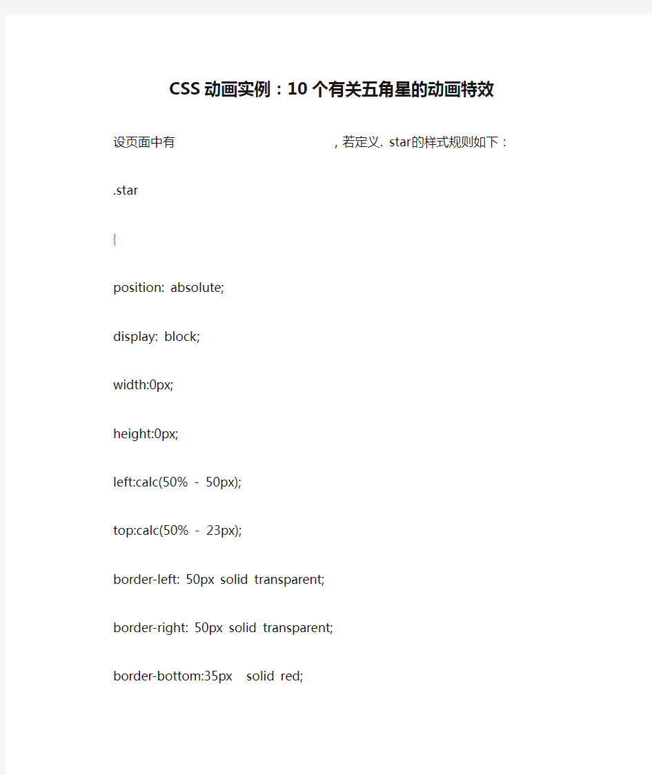
设页面中有
,若定义. star的样式规则如下:.star
{
position: absolute;
display: block;
width:0px;
height:0px;
left:calc(50% - 50px);
top:calc(50% - 23px);
border-left: 50px solid transparent;
border-right: 50px solid transparent;
border-bottom:35px solid red;
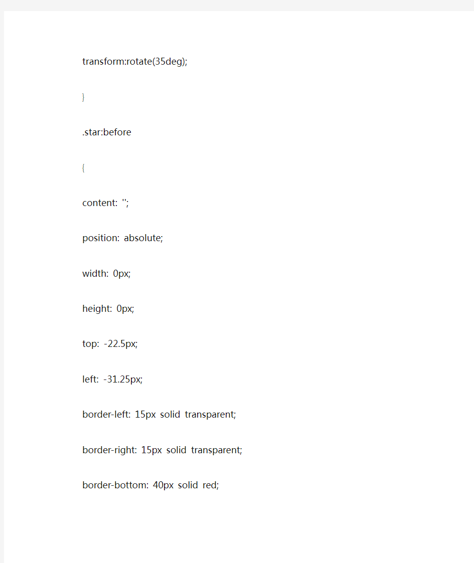
transform:rotate(35deg);
}
.star:before
{
content: '';
position: absolute;
width: 0px;
height: 0px;
top: -22.5px;
left: -31.25px;
border-left: 15px solid transparent;
border-right: 15px solid transparent;
border-bottom: 40px solid red;
transform: rotate(-35deg);
}
.star:after
{
content: '';
position: absolute;
width: 0px;
height: 0px;
top: 1.5px;
left: -52.5px;
border-left: 50px solid transparent;
border-right: 50px solid transparent;
border-bottom: 35px solid red;
transform:rotate(-70deg);
}
可在页面中绘制出如图1所示的五角星。
图1 五角星
下面将1个或多个如图1所示的五角星作为基本动画元素,为它们定义关键帧,使这些五角星产生动画效果。
1.大小五角星切换
在页面中放置两个
,定义关键帧,使得一个五角星放大倍数更大些,且在放大过程中,透明度也发生改变;另一个五角星放大倍数小些,在放大过程中透明度不变,从而呈现出大小两个五角星切换的效果。编写的HTML文件如下。
在浏览器中打开包含这段HTML代码的html文件,可以呈现出如图2所示的动画效果。
图2 大小五角星切换
2.五角星分开与合拢
在页面中放置四个五角星,初始时4个五角星在同一个位置重叠起来,之后各五角星分别向上下左右四个方向移动,4个五角星分开,分开后又移动回到初始的中间位置而合拢。
编写的HTML文件如下。
在浏览器中打开包含这段HTML代码的html文件,可以呈现出如图3所示的动画效果。
图3 五角星分开与合拢
3.同行五角星缩放
在页面一行中放置4个五角星,每个五角星按给定延迟进行缩放,在缩放的同时透明度发生变化。
编写的HTML文件如下。
在浏览器中打开包含这段HTML代码的html文件,可以呈现出如图4所示的动画效果。
图4 同行五角星的缩放
4.成圆周分布五角星的缩放
在页面一行中放置8个五角星,使这8个五角星成圆周分布,每个五角星按给定延迟进行缩放,在缩放的同时透明度发生变化。
编写的HTML文件如下。
在浏览器中打开包含这段HTML代码的html文件,可以呈现出如图5所示的动画效果。
图5 圆周分布的五角星缩放
5.五角星旋转展开与收缩
在页面中放置一个五角星(
)和一个圆周(),为五角星定义关键帧,使得五角星在旋转的同时缩放,为圆周定义关键帧,使得圆周在放大的同时,通过阴影的方式在圆周上绘制16个大小相间隔的实心圆。两者配合起来,呈现出五角星旋转展开与收缩的动画效果。编写的HTML文件如下。
在浏览器中打开包含这段HTML代码的html文件,可以呈现出如图6所示的动画效果。
图6 五角星旋转展开与收缩
6.五角星旋转放光芒
还是在页面中放置一个五角星(
)和一个圆周(),为五角星定义关键帧,使得五角星进行旋转;圆周通过圆点边框的方式绘制,为圆周定义关键帧,使得圆周放大。两者配合起来,呈现出五角星旋转放光芒的动画效果。编写的HTML文件如下。
在浏览器中打开包含这段HTML代码的html文件,可以呈现出如图7所示的动画效果。
图7 五角星旋转放光芒
7.旋转的五角星链
用6个五角星组成一个五角星链,让这个五角星链旋转起来,旋转的过程中,6个五角星还会收缩成一个五角星。
编写的HTML文件如下。