英语图表型作文
纵观近几年高考,英语书面表达大致分为材料作文、图表作文和开放作文。且材料作文逐渐被图表作文取代,图表分析作文就是将数据、图像所包含的信息,转化为表意的说明文字。图表分析作文通常比较复杂,学生不仅要弄清提示,还要看懂所给的图表和数据。由于这类试题提示内容少,信息点分散,审题时一定要领会作者的出题意图,弄清主题再动笔:1.单纯描述解释图表信息,按图表所示内容如实表达,不加评论。2.通过叙述图表(或图画)中的内容和数字变化来分析原因,发表议论。
(一) 柱状图(BAR CHART)
人们日常生活中事物的变化情况通常可以用宽度相等的柱状图形来表示,柱状图的高度差别用来说明事物的动态发展趋势,同时要注意图例说明和坐标刻度所提示的信息。
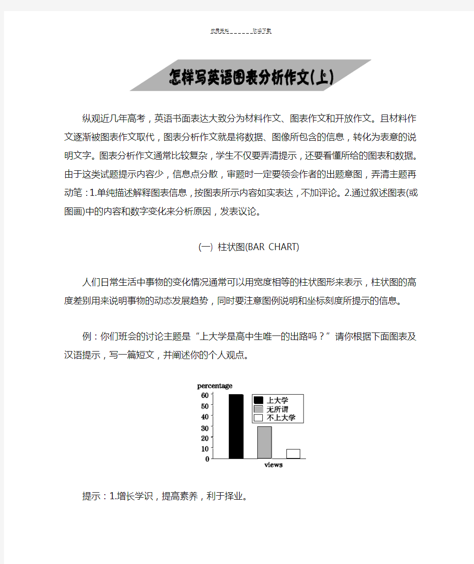
例:你们班会的讨论主题是“上大学是高中生唯一的出路吗?”请你根据下面图表及汉语提示,写一篇短文,并阐述你的个人观点。
提示:1.增长学识,提高素养,利于择业。
2.成功的路不只一条。
3.学费高,就业难。
要求:1.词数:100~120左右。
2.开头语已为你写好(不计入词数)。
3.参考词汇:tuition n.学费qualities n.素养
【解题分析】
柱状图是高中英语课本中常见的图形,要求学生通过柱状图图中数据和提示内容写一短文,属于比较、对照类。也可根据提示写为议论文。通常我们采取三段式写法:第一段:描述图表,得出结论。
第二段:紧扣主题,根据图表比较分析原因,论证结论。
第三段:发表议论,提出自己的看法。
【提炼要点】
分析柱状图数据信息。从图中可看出,黑色代表想上大学,占大多数,约60%;浅黑色代表无所谓,占约30%;白色代表不想上大学,占约10%。
One possible version
Is It The Only Way Out To Go To College?
We had a discussion about whether it is the only way out for senior students to go to college.Views vary from person to person.
The majority of us consider it very necessary to go to college.They think it can widen their
knowledge and improve their qualities.Only in this way can they find better jobs after graduation.Very few students,that is about ten percent of the students,think it no use going university,because the tuition is too high for their family to afford.What's more,it's rather hard for college graduates to seek satisfactory jobs.Thirty percent of the students,however,believe “All roads lead to Rome.” Therefore it doesn't make any difference whether they go to college or not.
In my opinion,we can receive a better education at college so that we can serve our motherland.
【语言亮点】
①词汇。如:consider,widen,afford,seek,satisfactory。
②句式。如:形式宾语:The majority of us consider it very necessary to go to college.
倒装:Only in this way can they find better jobs after graduation.
主语从句:it's rather hard for college graduates to seek satisfactory jobs.
谚语:All roads lead to Rome.
③过渡词。如:that is about ten percent of the students,what's more,however,in my opinion。
【技巧点拨】
1.读懂柱状图坐标刻线及图例说明与文字,比较柱状高低和颜色表示内容及数据。
2.学会看趋势、找规律,从整体看图表有何发展变化,找出特点、规律。
3.引用图表包含信息,使你的文章“由图而发”,言之有据。
【常用句式】
1. As can be seen from the chart,...As is shown in the chart,...
2. The chart shows that about 60 percent of students want to go to college...
3. From the graph/data/results/information above,it can be seen/concluded/shown /estimated...
4.The graph shows the changes in the number of...over the period from...to...
https://www.360docs.net/doc/8914435432.html,pared with...,the number of the students of...
实战演练
观察下列图表,请以“Changes in the Ownership of House”为主题,为校报写一篇短文。
注意:短文应包括以下内容:
1.根据图示描述该市住房产权的变化。
2.分析产生这些变化的原因。
3.说明这些变化对个人和社会产生的影响。
要求:1.首句已经为你写好。
2.词数100左右。
One possible version
Ownership of Houses in a Big City in China
As can be seen from the chart,ownership of houses in a big city in China changed in the past ten years. In 1995,75 percent of the houses were state-owned. Five years later,the rate of state-owned houses to private ones was 3 to 2. But from then on,the ownership of houses changed rapidly and so far 80 percent of houses have been private.
What caused the changes?There might have been two main reasons. First,from 1995 up to now,the people's living standards have been improving. Most of them can afford to buy the houses. Second,most people do not save a lot of money in the bank for their children as their parents did in the past. They want to have their own home and enjoy life.
Such changes have had a great effect on the development of society. It does good to both the citizens and the government.
真题体验
(2006湖北)受某英文报的委托,你最近对高中生的英语阅读兴趣做了一次调查。请根据以下信息,用英语为该报写一篇100词左右的短文。短文的标题及首句已为你写好。
调查内容:在新闻、故事、科普、学习方法四种英文文章中,学生最喜欢哪一种
调查范围:湖北省的10所中学
调查对象:高中生
调查人数:1,000
调查方式:访谈
调查结果:(见下图)
One possible version
Reading Interests of Senior
Middle School Students
Recently,a survey has been done to find out the reading interests of senior middle school students. In this survey,one thousand senior middle school students from ten schools in Hubei Province were interviewed. They were asked which they liked reading most among the four categories of English articles,news,stories,popular science articles and articles about learning methods.
The survey shows that more than half of the students like to read news most. Twenty-six percent of the students say that English stories are their favorite. Only seven percent of the students are most interested in reading articles about learning methods. However,the number of students who enjoy reading popular science articles doubles that of those who prefer reading articles about learning methods.
(二) 曲线图(LINE GRAPH)
曲线图常用来表示事物的变化趋势。常分为带时间参照和不带时间参照两种。曲线图的
特点是信息集中,一目了然。
例:下面的曲线图是我国2006年不同月份汽车事故分布示意图,请以“The number of car accidents in 2006”为题写一篇文章。要求:
1.描述不同月份汽车事故分布(distribution)及总趋势。
2.描述汽车事故的可能原因和对策。
3.参考词汇:peak 顶点,高峰。词数:100~120 。
【解题分析】
英语曲线图作文实际是一篇“解说词”,即通过曲线图提供的信息,分析图中数据,综合出文章的主题。可采取三段式写法:
第一段:用简短的几个句子简述图表。
第二段:根据图表分类,概括性地描述曲线内容。
第三段:对文章整体内容进行结论性总结。
【提炼要点】
分析曲线图数据信息。从图中可看出,曲线图的横轴代表2006年的不同的月份,纵轴代表交通事故的数量。从交通事故曲线图上可知,前八个月的交通事故的数量有升有降。曲线图在八月份升到了最高点(39),此后一直呈下降的趋势,十二月份降到了最低点(16)。可见,2006年的交通事故的数量总体上呈下降的趋势。
One possible version
The Number of Car Accidents in 2006
From the graph,we can see that there were two peaks of accidents in 2006. One was in Feb with the number of 32.The other was in August with the number of 39,which was the highest point of the distribution line. From August,the number of car accident had been decreasing till it reached the lowest point of the year in December. Two peaks occurred in spring and summer,the two seasons which had most of the year's rain. Driving tends to be more dangerous in rainy days. Maybe the weather is the most important reason for car accidents. Be careful,when you drive a car in rainy days.
【语言亮点】
①词汇。如:peak,point,distribution,decrease,reach,occur,tend to。
②句式。如:宾语从句:we can see that there were two peaks of accidents in 2006.
定语从句:which was the highest point of the distribution line.
状语从句:...till it reached the lowest point of the year in December.
...when you drive a car in rainy days.
【技巧点拨】
1.认真观察坐标系信息,抓住曲线图变化趋势,结合提供的时间和数据参照寻求切入点。
2.根据曲线图的变化过程,尽可能利用所给的文字信息进行分类,比较,总结。
3.写作过程中不必要将图中全部数据信息加以描述,只需将典型内容作以分析。
4.注意根据有无时间参照确定整篇文章时态。
【常用句式】
1.As can be seen from the graph,the line shows that...
2.According to the graph,we can see/conclude that...
3.This is a line graph which describes the trend of...
4.The number sharply went up to...
5.The percentage of...stayed the same between...
6.The figures reached the peaks/bottom...
实战演练
1.根据下面曲线图,以Car Explosion in China为题,描述我国近10年来私人拥有小汽车情况,说明人们生活的水平的变化和你的看法。短文开头已给出,不计入总词数。词数:100左右。
One possible version
Car Explosion in China
As is vividly described in the table above,great changes in car ownership have taken place in China over past decade. The number of private cars has accordingly increased nearly 7 times from more than 2 million in 1996 to over 14 million in 2006. What's the reason?
There are two main factors for these changes. To begin with,development in economy plays a vital role in these years. The higher incomes results in Chinese people's owning private cars. What's more,in modern society,time means money,many Chinese need a car to do business on time.
In my view,however,the car explosion will constantly increase year by year,a large number of social problems such as traffic jams,among other things,are turning up nearly every city in China.
2.自1970年至1990年,中国农民个人收入稳步增长,特别是改革开放政策大大促进了农村经济发展。请你根据下面图表及汉语提示,写一篇短文,描述其变化,并简述其原因。
提示:1. 根据图表,简析近20年农民平均个人收入情况。
2. 简析上述变化的原因。
3. 谈谈你的看法。
注意:1. 词数100左右。
2. 参考词汇:图表graph
改革开放reform and opening up
One possible version
According to the figures given by the graph,the Chinese farmers' personal income rose steadily from 1970 to 1990. In the middle of 1970's their income was rather low. Their annual personal income was about 180 yuan. But in 1980 the average personal income increased to 270 yuan. As is shown by the graph,in 1985 their income doubled up to 540 yuan. After that their income are growing sharply. In a word,during the period of 20 years the farmers' income had gone up rapidly.
There were many reasons for it. Mainly the Chinese government had been carrying out a reform and opening policy,which resulted in the steady growth of farmers' income.
I believe that with a series of agricultural policies being carried out,there is no doubt that
the farmers' living standard will be improved to the fullest.
英语图表作文范例
图表作文写作指导 图表作文至少包含描述图表与解释原因两个部分,而当前的图表作文大多还有第三个段落。图表作文的规律性很强,不像图画式作文那样富于变化。 1.首段的写作 图表作文有表格(table)、柱形图(bar chart)、饼状图(pie chart)和折线图(diagram)之分,后三种都属于图表的范畴(chart)。不管是chart还是table,都需要进行描述,一般放在文章的第一部分,长度宜适中。描述数据我们要首先看看是几个变量(A),每个变量有几个数据(B),不妨以A*B表示。 如果只有一个变量,有三个数据,可以描述如下: From the chart we can see clearly that the average number of hours a student spends on Internet per week has increased from less than two hours in 1998 to nearly four hours in 2000, and then to 20 hours in 2004. 如果是最常见的是2*3的情形,可以描述如下: From the chart, we can see clearly that in a big city in China, state-owned houses declined from 75% in 1990 to 60% in 1995 and then to 20% in 2000, while private houses rose from 25% to 40% and then to 80% during the same period. 这里用了while引起从句来突显对比,是一种非常好的办法,如果用两句话来描述,也完全可以。 如果是1*n(n>3)的情形,将头与尾描述出来即可,比较好的方法就是在句中描述最后一个与第一个相比变化了多少。 碰到多变量、每个变量多数据的情形,大家应首先进行分类,分成上升、下降两类,或者上升、下降、不变三类,这样问题就迎刃而解了。 2.第二段的写作 第二段是解释原因的段落。我们谈谈两个问题。 首先是过渡句这个问题。这里不大可能放在第一段,因为第一段不可能像某些命题作文那样简洁(如只有一句)——例如提纲式作文中的批驳类文章中除第二段首句批驳之外还有首段末句批驳,效果很强烈。 其次就是此段的主题句(topic sentence)的问题。此句或主观或客观,并无拘束,只要上下文风格统一即可。 主观:We believe that three reasons can account for this phenomenon. I believe that three reasons can account for this phenomenon. In my mind, the reasons why the overseas students are on the rise are as follows. 主观之变体(使用插入语,突显主语):Three reasons, we believe, can account for this phenomenon. Three reasons, I believe, can account for this phenomenon. Three reasons, I firmly believe, can account for this phenomenon. 注意:插入语的使用属于看似平淡却极富功力的技巧,可以达到很好的效果。
图表类英语作文范文英语作文模板(图表类的)
图表类英语作文范文英语作文模板(图表类的)这里很全 一、图表类作文常用的单词、短语和句型 1.表示数据变化的单词或短语 in the case of (在……的情况下) in terms of (在……方面) increase / raise / rise / go up(增加) decrease / grow down / drop / fall (减少) increased by (增长了) increased to (增长到) the number sharply goes up to(数字急剧上升至)
significant(重大的),steady(平稳的),gradual(逐渐的),slow(慢慢的),stable(稳定的),rapid(快速的)…… 2. 表示从图表得知的信息的句型 The table / chart / graph shows that...(这个图表告诉我们……) Aording to the table / chart /graph, we can see that...(根据图表,我们可以看出……) It can be concluded from the graph that...(从图表中可以得出……) The table shows the changes in the number of...over the period from...to...(该表格描述了在……期间……数量的变化) 二、图表类作文的模式
图表类作文中的图表主要有以下形式:柱形图类(chart)、圆饼图类(pie chart)、曲线图类(line chart)、表格类(table)。写文章时,首先要对图表加以描述,而后引出主题加以讨论,最后得出结论,也就是按照描述图表—解释原因—下结论的步骤来写。切忌对图表不作交代就直接谈论主题。 1.表格类作文的模式 表格类作文一般可以分为三段:第一段对表格中的数据进行描述,只要抓住变化规律即可,切忌一一列举数据;第二段说明变化的原因;第三段得出结论。即: (1) Studying the table carefully, we can see...(仔细研读表格,我们可以看出……) (2) In my opinion, the reasons why...are as follows. Firstly...Secondly...Thirdly...(在我看来,为什么……的原因在于以下几点:第一……第二……第三……)
图表作文大学英语
Statistics of Family Expenses in Shanghai As is shown in the table above, dramatic changes have taken place in family expenses in the City of Shanghai within two decades (from 1984 to 2004). The most obvious change is in expense on food and clothing, which has dropped by 48%; while those on recreation, education and health care have increased respectively by 5%, 16% and 10%. Expenses on other things keep rising from 17% to 35%. The statistics of rise and fall seem to exist in isolation but are in fact closely related to one another. The most likely factors accounting for these changes are as follows: Development in economy is the fundamental one. The increased income results in the lowering percentage of
图表的英文描述
图表的英文描述: 图表的种类: 饼状图 pie chart/pie graph segment 柱形图 bar chart/bar graph bar 线型/曲线图 line chart/line graph line线条实线solid line 虚线dotted line 横轴 horizontal axis竖轴vertical axis 表格 table行row 列column 常用的表达: 比例percentage percent 5% five percent 数量 number 趋势 trend 关系 relation This is a pie chart/bar chart/line chart/table of_________. 这是一个关于________的饼状图/柱形图/线型图/表格。 This pie chart/bar chart/line chart/table shows________ 这张图展示了___________. From this pie chart/bar chart/line chart/table, we can see/ know that_____________. 从这张图中,我们知道___________. As we can see from the pie chart/bar chart/line chart/table, ____________________. 我们可以从这张图中知道,________________________________. 在这张曲线图中,横轴代表_________________,竖轴代表___________________. In this line chart, the horizon tal axis stands for_________, the vertical axis stands for _____________. 比较:比较级+than 大 big/large 更大 bigger/larger 最大the biggest/largest 多 more 快 fast/rapid 更快faster/more rapidly 最快the fastest/the most rapid 高 high 更高 higher 最高the highest 好 good 更好 better 最好 the best Compared with_______, ___________________________. 同_______相比,________________. 例:同A相比,B的数量比A更多。Compared with A, the number of B is larger than the number of A. 同A相比,B增长得更快。Compared with A, B increases faster. 变化: 变化速度:快地fast/rapidly 慢地slowly 稳定地stably 变化程度:大(剧烈)dramatic ally 小(轻微)s light ly 改变change 增加 grow/increase/ go up 减少decrease/go down 无变化 have no change/ stay the same 描述、分析图表的主要步骤:
英语图表类作文表达法集锦
图表写作表达法集锦 I.Introduction 1.This diagram unfolds a clear comparison between Florida, a state of the United States, and the United States as a whole in four aspects, namely, registered engineers, the civilian labor force, manufacturing employment and hi-tech employment, from 1978 to 1987. 2.There were many significant changes in modes of transport used by city dwellers from 1950 to 1990. The following paragraphs will identify and discuss the trends in the accompanying graph. 3.The chart below displays the average earnings per week, in pounds sterling, of people of different levels of education living in the UK between the years 1965 and 1995. 4.The chart indicates the subjects studied by university students in Australia during the latter of last century. 5.The chart shows the number of road accidents in Britain over a period of six years. 6.The line graph reveals the amount of fast food consumed by Australia teenagers over a 25-year period between 1975 and 2000. 7.The bar chart illustrates the percentage of employees in different occupations absent from work in a giver week in 2001. 8.Indicators of economic and social conditions in four countries, Canada, Japan, Peru and Zaire, in 1994, complied by the UN, reflect the great difference that exist between wealthier and poorer nature. 9.The graph compares the number of deaths caused buy six diseases in Erewhom in 1990 with the amount of research funding allocated to each of those diseases. It can be clearly seen that the amount of research funding in many cases did not correlate with the seriousness of the disease in terms of numbers of deaths. 10.The three graphs provide an overview of the types of music people purchase in the UK.At first glance .we see that classical music is far less popular than pop or rock music. https://www.360docs.net/doc/8914435432.html,parison △The Same 1.The difference in earnings of people with different levels of education is very small. 2.The situation in Australia and New Zealand was similar in that the imprisonment rates from 1930 to 1980 remained stable. 3. A similar trend was seen in Asia. 4.The difference in earnings between high school leavers and university graduates diminished after 1995.average 5.By 1999, coffee consumption in China stood at 992 million cups, almost equal that of America, which stood at 1,090 million cups per year. 6.The trend was virtually mirrored by study of the arts, which increased significantly from 20% in 1950-59, through 25% ten years later, finally reaching 38% by 1990-99. 7.During the first period of each year, the figures averaged out to around 300,000 to 350,000 accidents. 8. A similar pattern is also recorded for both the finance /banking and defense –related public sectors. △Large Difference 1.There is a significant difference between all three countries. 2.In the highest executive position (Grade A), women represent only about 85 of the workers. This stands in marked contrast to the 92% of men represented in this job category.
英语图表作文范例
一、图表作文写作常识 1、图形种类及概述法: 泛指一份数据图表:a data graph/ch art/diagram/illustration/table 饼图:pie chart 直方图或柱形图:bar chart / histo gram 趋势曲线图:line chart / curve di agram 表格图:table 流程图或过程图:flow chart / sequ ence diagram 程序图:processing/procedures dia gram 2、常用的描述用法
The table/chart diagram/graph sho ws (that) According to the table/chart diag ram/graph As (is) shown in the table/char t diagram/graph As can be seen from the table/cha rt/diagram/graph/figures, figures/statistics shows (tha t)…… It can be seen from the figures/s tatistics We can see from the figures/stati stics It is clear from the figures/stat istics It is apparent from the figures/s tatistics
table/chart/diagram/graph figures (that)…… table/chart/diagram/graph shows/d esc ribes/illustrates how…… 3、图表中的数据(Data)具体表达法 数据(Data)在某一个时间段固定不变:fixed in time 在一系列的时间段中转变:changes o ver time 持续变化的data在不同情况下: 增加:increase / raise / rise / g o up …… 减少:decrease / grow down / drop / fall …… 波动:fluctuate / rebound / undul ate / wa ve …… 稳定:remain stable / stabilize / level off ……
各类图表英文描述
1.Map(地图、天体图、布局图、专用图、图谱)Battle map 作战地图 Highway map 公路图 Genetic map 基因图谱 2.Figure(图形、平面图) Geometric(al) figure 几何图形 Dimension figure 尺寸图 Plane figure 平面图 3.Pattern(图案、图型、图样) Checkboard pattern 棋盘型图案 Recording pattern 录像图型 Circular pattern 圆形图样 4.Sketch(草图、略图、简图) Eye sketch 目测草图 Topographic sketch 地形略图 Dimensional sketch 尺寸简图 5.Scheme/shematic(图解、示意图、流程图、电路图)Flow scheme 流程图 Induction scheme 感应电路图 6.Draft(草图) Chisel draft 雕刻前在石头上画出边缘轮廓草图 7.Curve(曲线图表) Algebraic curve 代数曲线 Comfort curve 湿度舒适曲线 8.Graph(曲线图表) Funtional graph 函数图(亦称plot) Bar graph 条形图(也称chart) 9.View(视图) Plane view 平面视图 10.Geometry(几何图) Plane geometry 平面几何 Solid geometry 立体几何图 11.Chart(航海图、图表) Aeronautical chart 领航图 Demographic data chart 人口统计图表 Pie chart 饼图 Bar chart 柱图 12.Drawing(工程图、插图) Drawing 建筑图 Explanatory drawing 说明(插)图 https://www.360docs.net/doc/8914435432.html,yout(布局图、规划图) 1、图形种类及概述法: 泛指一份数据图表:
图表类英语作文范文
图表类英语作文范文 图表类型的英语写作如果不擅于观察漫画的话,作文写出来可能会偏题。下面是小编给大家带来图表类英语作文,供大家参阅! 图表类英语作文范文篇1第一段:说明图表 开篇句:As the bar chart shows, ____ during the years of ____to____. 扩展句:1、As early as _____. 2、Then _____ years later, ____. 3、And arriving in the year ____, ____. 第二段:解释图表变化原因 主题句:Several factors contribute to _____. 扩展句:1、______. (原因1) 2、And ______.(原因2) 3、Furthermore, ______ (原因3) 4、All these result in ____. 第三段:提出解决办法 结尾句:However, ____ is faced with some problems. 扩展句:1、With _____, ____, the effect of which is not only discouraging, but also challenging. 2、So my principle is to pay due attention to ___, but not
justto____. 示范 第一段:说明图表 开篇句:As the bar chart shows, the number of people below the poverty line decreased dramatically during the years of 1978 to1997. 扩展句:1、As early as 1978, about 250 million people were under the poverty line. 2、Then seven years later, the number became three fifths thatof1978. 3、And arriving in the year 1997, the number was reduced to50millions. 第二段:解释图表变化原因 主题句:Several factors contribute to the sharp decrease of the below-poverty population. 扩展句:1、The reform and opening following 1978 enabled the peasants to become much better off. (原因1) 2、And with the development of Chinese economy, that policy also improved city dwellers lives greatly. (原因2) 3、Furthermore, the high-tech introduced made it possible for the countrys economy as a whole to take off. (原因3) 4、All these result in the great fall of the
英语作文图表类提纲类作文写作实用模板
第一部分、写作模板——图表式作文 It is obvious in the graphic/table that the rate/number/amount of Y has undergone dramatic changes. It has gone up/grown/fallen/dropped considerably in recent years (as X varies). At the point of X1, Y reaches its peak of …(多少). What is the reason for this change? Mainly there are …(多少) reasons behind the situation reflected in the graphic/table. First of all, …(第一个原因). More importantly, …(第二个原因). Most important of all, …(第三个原因). From the above discussions, we have enough reason to predict what will happen in the near future. The trend described in the graphic/table will continue for quite a long time (if necessary measures are not taken括号里的使用于那些不太好的变化趋势). 第二部分、写作模板——提纲式作文 一、说明原因型 模块(一) Nowadays , there are more and more XX in some big cities . It is estimated that ( 1 ). Why have there been so many XX ? Maybe the reasons can be listed as follows. The first one is that ( 2 ) .Besides, ( 3 ) . The third reason is ( 4 ). To sum up , the main cause of XX is due to ( 5 ) . It is high time that something were done upon it. For one thing , ( 6 ). On the other hand , ( 7 ). All these measures will certainly reduce the number of XX . 注释: (1)用具体数据说明XX现象; (2)原因一; (3)原因二; (4)原因三 (5)指出主要原因;
英文图表作文分析
英文图表作文分析 1.图表分析作文的种类 图表就是数字、图像传达信息的一种形式,图表分析作文就是将这些数字、图像所包含的信息转换成传神表意的说明文字。 图表的种类很多,一般把各种数字资料,按照一定的顺序,通过表格形式表现出来的叫表(table),利用点、线、图等把信息资料通过图像表现出来的叫图(graph或chart),常用的图形有柱形图(bar graph),曲线图(line graph),圆形图(circular graph),图解图(diagram),饼形或百分比图(pie or percentage graph),象形图(pictorial graph),流程图(flow chart)等等。 2.图表分析作文的写作要领 2.1. 读懂标题,然后根据主题进行分析。虽然文章的中心思想和细节是通过图表来表示的,但同一张图表,如果命题不同,作者观察、分析问题的角度就有所不同,写出的短文也可能完全不同。请看下面两个圆形图: 上面两张图如果命题为“The Similarities and Differences of the Two Marketing Concepts”,本文可以首先对两张图分别进行说明,对两种观念的异同进行比较,然后得出结论;如果命题为“The Development of Marketing Concept”,本文的重点则偏重于市场营销观念的变化及其变化的原因。写作时可首先指出两种观念的重点虽然明显不同,但后者显然脱胎于前者,然后再分析这种观念变化的原因。请比较下面两篇文章: 例文①: The Similarities and Differences of the Two Marketing Concepts Let us take a look at the two circular graphs and compare the similarities and differences of the two marketing concepts. The concepts illustrated in Fig.1and Fig.2 are roughly the same in their main business mentality and tactics.Both are new and advanced concepts in business administration.Moreover,
大学英语图表作文写作
?先一句话引出图表总体内容The above bar chart clearly shows us … ?然后具体描述现象We see that…。 ?最后用for instance引出一些具体数据来例证现象。对于柱状图,抓住横抽和纵轴之间的关系,对数字的变化趋势进行总体描述即可。 图表作文写作常识 1、各种图表的名称 1)泛指一份数据图表:a data/ graph/chart/diagram/illustration/table 2)饼图:pie chart 3)直方图或柱形图:bar chart / histogram 4)趋势曲线图:line chart / curve diagram 5)表格图:table 6) 流程图或过程图:flow chart / sequence diagram 7)程序图:processing/procedures diagram 2、常用的描述用法 1)The table/chart diagram/graph shows (that) 2)According to the table/chart diagram/graph 3)As (is) shown in the table/chart diagram/graph 4)As can be seen from the table/chart/diagram/graph/figures, 5)Figures/Statistics shows(that)…… It can be seen from the figures/statistics We can see from the figures/statistics It is clear from the figures/statistics It is apparent from the figures/statistics table/chart/diagram/graph figures (that) …… 3、图表中数据的具体表达法 ?数据(Data)在某一个时间段固定不变:fixed in time ?在一系列的时间段中转变:changes over time ?持续变化的data在不同情况下: ?增加:increase / raise / rise / go up …… ?减少:decrease / grow down / drop / fall …… ?波动:fluctuate / rebound / undulate / wave …… ?稳定:remain stable / stabilize / level off…… ?上升:increase/ rise /go up /climb /mount /level up ?下降: decrease/ fall /drop /decline /reduce ?平稳:remain/maintain/keep/be the same as/similar to ?相比:by contrast/ on the contrary/ likewise/ compared with ?最高点:the highest /the top /the summit /the peak /the most ?最低点:bottom/ less/ least /rock/bottom ?平均:mean /average ?趋势:tendency/ trend/ inclination ?达到顶峰: mount to ?在***中占***:***gain the percentage of
英语作文模板图表作文
图表分析作文1 As is clearly shown in the table/ figure/ graph / chart, 图表总体描述between 年代and 年代. Especially, 突出的数据变化. There are three reasons for 具体表示急剧上升、下降或特殊现象的词. To begin with, 原因一. In addition / Moreover, 原因二. For example, 具体例证. Last but no least, 原因三. In short,总结上文. As far as I am concerned, / For my part, / As for me,作者自己的观点. On the one hand, 理由一. On the other hand, 理由二. In brief,总结上文. 图表分析作文2 The table / figure / graph / chart shows that 图表总述from 年代to年代. It is self-evident that 突出的数据变化. Three possible reasons contribute to 具体表示急剧上升、下降或特殊现象的词或代词代替上文内容. One reason is that原因一. Another reason is that原因二. For instance,举例证. What’s more原因三. As a result, 重述上文之趋势. However, in my opinion 作者观点. For one thing,理由一. For another, 理由二. To sum up,总结上文. 图表分析作文3 It can be seen from the table / figure / graph / chart that图表总述between年代and年代. Especially,突出的数据变化. Why are there such great changes during 图表涉及的年头数years? There are mainly two reasons explaining具体表示急剧上升、下降或特殊现象的词或代词代替上文内容. First,原因一. In the old days,比较法说明过去的情况. But now,说明现在的情况. Second,原因二. As a result,总结上文. In my viewpoint,作者自己的观点. On the one hand,论点一. On the other hand,论点二. 图表分析作文4 As the table / figure / graph / chart shows,图表总述in the past years年代. Obviously,突出的数据变化. Why are there such sharp contrasts during 图表涉及的年头years? Two main factors contribute to具体表示急剧上升、下降或特殊现象的词或代词代替上文内容. First of all,原因一. In the past,比较法说明过去的情况. But now 说明现在的情况. Moreover,原因二. Therefore,总结上文. As I see it,作者自己的观点. For one thing,论点一. For another,论点二. 图表作文补充句型 ?As is shown in the graph… 如图所示… ?The graph shows that… 图表显示… ?As can be seen from the table,… 从表格中可以看出… ?From the chart, we know that… 从这张表中,我们可知… ?All these data clearly prove the fact that… 所有这些数据明显证明这一事实,即… ?The increase of …. In the city has reached to 20%. ….在这个城市的增长已达到20%. ?In 1985, the number remained the same. 1985年,这个数字保持不变. ?There was a gradual decline in 1989. 1989年,出现了逐渐下降的情况.
级常考图表分析型英语作文
图表分析型英语作文Sample 1 More Candidates for Civil Servants 1.根据下图描述报考公务员人数变化的趋势 2.分析导致这种趋势的原因 3.你的建议 1,000,000 2003 2004 2005 As is shown in the bar chart, the number of applicants for civil servants has increased abruptly—by about 10 times, from 100,000 in 2003 to 1,000,000 in 2005. Several factors may contribute to the rush. First and foremost, working as civil servants in China is relatively stable, and Chinese people have a traditional preference for maintaining a life-long career. The rising interest could also be attributed to the unique social status. Comparatively speaking , civil servants are generally highly respected by common people in China. Last, we should not neglect the benefits such as the welfare in government departments. Compared with the striking number of applicants for becoming civil servants, the vacancies issued by the government are scarce. Thus, it is suggested that applicants should weigh their own advantages and
英语图表作文范文
1. The charts below show the percentage of their food budget the average family spent on restaurant meals in different years. The graph shows the number of meals eaten in fast food restaurants and sit-down restaurants. You should write at least 150 words. Give reasons for your answer and include any relevant examples from your own knowledge or experience.
Over the past 30 years, the average family has dramatically increased the number of meals that they eat at restaurants. The percentage of the family's food budget spent on restaurant meals steadily climbed. Just 10 percent of the food budget was spent on restaurant meals in 1970, and 15 percent in 1980. That percentage more than doubled in 1990, to 35 percent, and rose again in 2000 to 50 percent. Where families eat their restaurant meals also changed during that 30-year period. In 1970, families ate the same number of meals at fast food and sit-down restaurants. In 1980, families ate slightly more frequently at sit-down restaurants. However, since 1990, fast food restaurants serve more meals to the families than do the sit-down restaurants. Most of the restaurant meals from 2000 were eaten at fast food restaurants. If this pattern continues, eventually the number of meals that families eat at fast food restaurants could double the number of meals they eat at sit-down restaurants. (164 words) 2. The table below shows the sales at a small restaurant in a downtown business district. Summarize the information by selecting and reporting the main features, and make comparisons where relevant. You should write at least 150 words. Give reasons for your answer and include any relevant examples from your own knowledge or experience.