雅思 条形图小作文
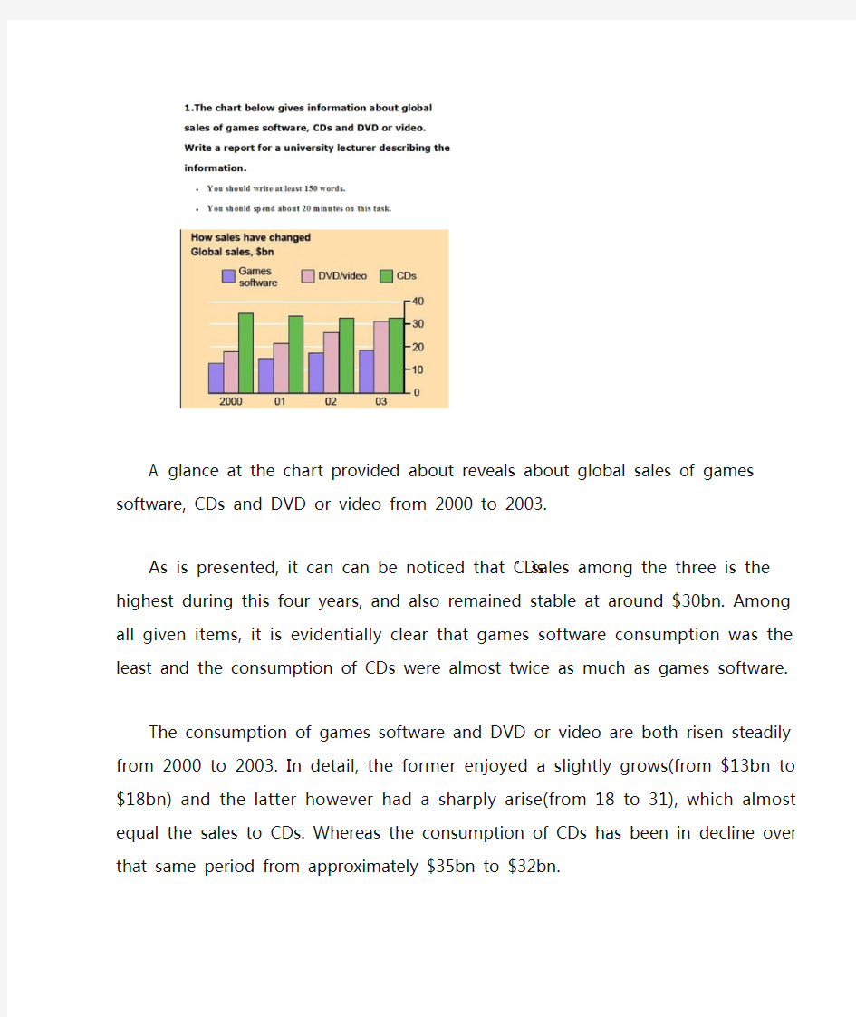

A glance at the chart provided about reveals about global sales of games software, CDs and DVD or video from 2000 to 2003.
As is presented, it can can be noticed that CDs’sales among the three is the highest during this four years, and also remained stable at around $30bn. Among all given items, it is evidentially clear that games software consumption was the least and the consumption of CDs were almost twice as much as games software.
The consumption of games software and DVD or video are both risen steadily from 2000 to 2003. In detail, the former enjoyed a slightly grows(from $13bn to $18bn) and the latter however had a sharply arise(from 18 to 31), which almost equal the sales to CDs. Whereas the consumption of CDs has been in decline over that same period from approximately $35bn to $32bn.
Overall, CDs’sales took a domainate role among the three selling market.
雅思写作Task1曲线图考官范文(5)
雅思写作Task1曲线图考官范文(5) 本文为大家收集整理了雅思写作Task1曲线图考官范文(5)。认真研读一定的雅思范文及作文模板可以帮助我们检验自己的写作水平,并能很好地吸收和应用优秀范文里的优秀内容。 The chart and graph below give information about sales and share prices for Coca-Cola. Write a report for a university lecturer describing the information shown below. Sample Answer: The given pie chart and line graphs show the data on sales volume and share price of Coca-Cola. As is given in the illustration, in the year 2000, Coca-Cola was sold most in America where it had more than 55% sales volume. The share price of Coca-Cola was highest in 1998 and reached to around 55 in 2001 with some fluctuation.
As is presented in the pie chart, in 2000, Coca-Cola had more than 55% sales in Latin and North America. In Europe it had more than 20% sales volume, in Asia 16.45% and in Africa it had 7% sales volume. This indicates that American continent has the largest market for Coca-Cola while this market is least in African Continent. Again, the share price of Coca-Cola was only $ 33 in 1996 and this price increased to $ 68 in 1997. The price reached to the highest in 1998 when it was $ 80 per share. The price then started dropping and with some fluctuations it reached it around $ 60 in 2001. In summary, the American Continent was the largest market for Coca-Cola in 2000 and the average share price of it is $60 though this price varies year to year. (Approximately 202 words)
雅思写作小作文范文 雅思写作折线图(线状图) 公司垃圾数量.doc
雅思写作小作文范文雅思写作折线图(线状图)公司垃圾数量 今天我们雅思写作小作文范文的文章来研究下折线图(线状图)。该图表的内容为三家公司(A, B, C)从2000年到2015年间所产生的垃圾数量。其中公司A的垃圾数量一直在下降,公司B的数量先是一波上升,然后进一步下降。公司C的垃圾数量则是一直在上升。虽然图表比较简单,但基本概括了折线图的精髓,并涵盖了各种变化。小编搜集了一篇相应的考官范文,以供大家参考。 雅思写作小作文题目 The graph below shows the amounts of waste produced by three companies over a period of 15 years. Summarise the information by selecting and reporting the main features, and make comparisons where relevant. 雅思写作小作文范文 The line graph compares three companies in terms of their waste output between the years 2000 and 2015. 线状图比较了三个公司从2000年到2015年期间的垃圾产出量。 It is clear that there were significant changes in the amounts of waste produced by all three companies shown on the graph. While companies A and B saw waste output fall over the 15-year period, the amount of waste produced by company C increased considerably. 很明显,图表中所显示的三家公司的垃圾产量都有巨大的变化。尽管公司A和公司B的垃圾产量在这15年间有所下降,公司C的垃圾产量却有巨大的上升。 In 2000, company A produced 12 tonnes of waste, while companies B and C produced around 8 tonnes and 4 tonnes of waste material respectively. Translation from Laokaoya website. Over the following 5 years, the waste output of companies B and C rose by around 2 tonnes, but the figure for company A fell by approximately 1 tonne. 2000年,公司A产生12吨的垃圾,而公司B和C则各自生产大约8吨和4吨的垃圾。在接下来的5年里,公司B和公司C的垃圾产量上升了大约2吨,但公司A的垃圾产量下降了1吨左右。 From 2005 to 2015, company A cut waste production by roughly 3 tonnes, and company B reduced its waste by around 7 tonnes. By contrast, company C saw an increase in waste production of approximately 4 tonnes over the same 10-year period. By 2015, company C’s waste output had risen to 10 tonnes, while the respective amounts of
两个雅思写作小作文饼图练习题
两个雅思写作小作文饼图练习题 雅思小作文饼图是所有图表中出现次数最多的一个,所以需要大家更为关注。下面为大家搜集整理了雅思写作小作文饼图的练习题,共有两个,都是比较简单的两个饼图,大家在备考的时候,注意结构和顺序的描写。 1. The following pie charts illustrate the energy use in the USA. Write a report for a u niversity lecturer describing the information given in the pie charts below. 2. The following two pies show the average family income of New Zealand in 1990 and 2000 and the way people spend their income. Write a report for a university lecturer describing the information given in the pie charts below.
以上就是这两个雅俗写作小作文饼图练习题的全部内容,包括了美国的能源使用和新西兰的平均家庭收入两个话题。大家在备考雅思写作小作文饼图的时候,可以适当的练习一下上面的这两个题目。 雅思小作文图表描述方式小结 雅思小作文的图表描述是有自己的方式和特点的,掌握了这个方式可以让大家的小作文备考更快也更加贴近考试的要求。下面就为大家整理了雅思小作文图表描述的方式,供大家参考。 1. 与趋势有关的词语: 上升(v.):increase, rise, climb, ascend, surge, shoot up 下降(v.):decrease, decline, drop, fall, descend, plunge 持平(v.):remain stable, keep constant, level off, flatten out 波动(v.):fluctuate, wave, go up and down
雅思图表作文经典套句50句-题
雅思图表作文经典套句50句1.该表格描述了在…年之…年间…数量的变化。 2.该柱状图展示了… 3.该图为我们提供了有关…有趣数据。 4.该图向我们展示了… 5.该圆形图揭示了… 6.这个曲线图描述了…的趋势。 7.数据(字)表明… 8.该树型图向我们揭示了怎样… 9.该数据(字)可以这样理解… 10.这些数据资料令我们得出结论… 11.如图所示… 12.根据这些表(数字)… 13.如表格所示… 14.从图中可以看出,…发生了巨大变化。 15.从图表我们可以很清楚(明显)看到… 16.这个图表向我们展示了… 17.该表格描述了…年到…年间a与b的比例关系。 18.该图以圆形图形式描述了…总的趋势。
19.这是个柱型图,描述了… 20.如图所示,两条曲线描述了…的波动情况。 21.在…至…期间,…基本不变。 22.在…年到…期间… 23. 1995年至1998三年里… 24.从那时起… 25.…月(年)至…月(年)…的数量基本不变。 26.数字急剧上升至… 27.…至…期间…的比率维持不变。 28.…的数目在…月(年)达到顶点,为… 29.比率维持在… 30.…的比例比…的比例略高(低)。 31.…与…的区别不大。 32.该图表表明…的数目增长了三倍。 33…逐年减少,而…逐步上升。 34.…的情况(局势)到达顶(高)点,为…百分点。 35.数字(情况)在…达到底部。 36.数字(情况)达到底部(低谷)。
37. a是b的…倍。 38. a增长了… 39. a增长到… 40.比例高(低) 41.…数字呈上升趋势。 42. …到…发生急剧上升。 43.从…到…,下降速率减慢。 44.从这年起,…逐渐下降至… 45.与…相似 46.与…相同 47.…与…之间有许多相似(不同)之处 48. a于b有共同之处。 49. a与b之间的差别在于… 50.…年…急剧上升。
雅思写作Task1曲线图考官范文(1)
雅思写作Task1曲线图考官范文(1) 这是一篇雅思写作Task1曲线图考官范文。认真研读一定的雅思范文及作文模板可以帮助我们检验自己的写作水平,并能很好地吸收和应用优秀范文里的优秀内容。 The graphs below show the numbers of male and female workers in 1975 and 1995 in several employment sectors of the republic of Freedonia. Write a report for a university teacher describing the information shown.
Sample Answer: The provided line graphs compare the employment history of men and women in 1975 and 1995 dividing in six major sectors namely: manufacturing, communications, finance/ banking, wholesale & retail trade, non-defence public sectors and defence public sectors. As is observed from the given illustration, significant changes have been made in women's employment and women appear to have made remarkable improvements in almost the entire job sectors in Freedonia and in some sectors women went well ahead of men. Initially in 1975, men were notably ahead of women in every sector of employment. For example, in communication sector about 260 men worked against 220 women in every thousand employees. Twenty years later, though the number of men remained unchanged, the number of women rose to over 550 in one thousand. A similar trend can be seen in the wholesale and retail trade sector, where the number of women rose from about 550 to almost 800 in every 1000 employees of this sector two decades later. The number of men in this sector remained stable over the period, at around 700 / thousand.
(完整版)雅思小作文:饼图写法全解析
雅思小作文:饼图写法全解析 朗阁雅思考试研究中心 在雅思的学术类小作文中我们经常会遇到饼状图写作,不要看着一张一张的图,就退缩了,但是相对来说,这个题型还是比较容易写的一种图形,不过学生们也一定不要当做这是一件简单的事情,想要拿高分还是需要努力的,千万不能掉以轻心,否则不要就是因为这部分得分的不达标而影响到最后的综合得分。那么下面的文章中,朗阁雅思考试研究中心写作组的专家将要探讨的是饼图中静态数据和动态数据写法中的一些区别,并且将会从高分的角度来对各种写法作一汇总,希望对大家考试的准备有一定的帮助。 首先我们必须搞清楚什么是静态什么是动态数据的饼图: 当我们在考试中看到这个图示上的数据都是固定的,没有发生任何变化的时候,那么就能够认定这属于静态数据,搞清楚之后我们就能够开始写作了。 图二:
不要以为这里有很多的数据就属于动态的,其实这个图示还是表示是静态的,因为我们看到在途中的各项比重相对来说也是比较稳定的,因此这个饼图的数据也是属于静态的,那么究竟哪种数据属于动态的呢? 图三:
这个就是动态的图示,为什么这么说呢,因为两张图种的占比数据上出现了很大的差异,这是两个年份的数据,但是各自的所占比重有所不同,所以是动态的数据。 由此,我们可以得出结论,如果我们看到的是一张饼图,而且描述的是一段时间之内比较稳定的数据,那么我们就能基本上断定那就是静态的数据,但是我们如果看到的时候两张饼图,在两个时间段时间的对比,数据出现了明显的变化,那么就能够基本上断定这张图表示的就是动态的题型。
一、静态数据饼图的主体段写作理论 朗阁雅思考试研究中心建议考生可先按照扇形面积大小从大到小排列数据,若遇到饼图中有总数的描述,宜在开头先写。主体段在描写各个扇形数据的时候,要注意详略,即最大和第二大的扇形要重点描述。下面我们先以图一作为例子来详细解读这种写作套路: 首先,我们可以看到,在图中央有一个总数,因此我们先在开头段将其预先作交代:Overall, Coca-cola sold a total of 17.1 billion cases of their fizzy drink product worldwide in the year 2000. 或者我们还可以这样写: Overall, a total of 17.1 billion cases of Coca-cola fizzy drink were sold worldwide in the year 2000. 接着,我们就可以直接来写主体段了: The largest consumer was North America, where 30.4 percent of the total volume was purchased. The second biggest consume r was Latin America, taking up slightly over a quarter. Europe and Asia purchased 20.5 and 16.4 percent of the total volume respectively while Africa and the Middle East remained fairly small consumers at 7 percent of the total volume of sales. 以下我们来解读一下这种写法:图中一共有5块扇形区域,最大和第二大的扇形区域我们分别使用主系表的简单句引导数据的含义,请大家注意划线的部分。其中,两个句子的主语和表语其实都是可以互换的,这个可以让句子成分再多变些,另外,两个句子后面接续的数据描写的句型我们也要做到不同,比如第1个句子后面我们用的是定语从句,而第2个句子后面我们就用分词结构来描写了。接下来第3大的数据由于处于中间的位置,既非最大也非最小,不是很重要,因此就直接用简单句描写了。最小的那块扇形面积可以和前面的连起来组合成一个并列句,也可以单独写,若是单独写的话还可以用主系表的简单句引导,但是表语一般用insignificant,如:The figure for Africa and Middle East was insig nificant,…后面再接续数据即可。 在描写最大的两块扇形面积区域的时候,我们也是用相似的句式,即主系表来描述,然后接续定语从句或者介宾短语来说明数据。饼图中所占份额相对较小的我们就采用略写的方式交
2011雅思小作文 最全万能模板
2011雅思小作文写作万能模板 1、通过第一个曲线图,我们可以知道____,也说明了结果是___ According to the first graph, it can be seen that ______________, it can also be concluded from it that ______________. 2、一张有趣、有教育意义的、(内容)的图片(这句模板在雅思小作文中的应用非常的广泛。) There is an interesting and instructive picture which goes like this: __________. 3、当前有一张涉及______的增长曲线图,许多人______,然而其他人倾向于___ Nowadays there is a growing concern over ______________. Many people like ______________, while others are inclined to ______________. 4、目前,共同之处是_________,许多人喜欢______因为_______除此之外还由于_____ Nowadays, it is common to ______________. Many people like______________ because ______________. Besides, ______________. 5、(图表所示)_____,就像许多其他事物,被____更加喜爱,然而这一观点正被________所抨击,一些人认为_________,他们指出___________ ______________, just like many other things, are preferred by ____________. While being attacked by the idea that ______________, some people consider ______________. They point that ______________. 6、每种事物都有两面性和________,是没有异议的,包括利和弊 Everything has two sides and ______________ is not an exception, it has both advantages and disadvantages. 7、_____作为_____被观察了许多年,但是人们现在像发现新大陆一样注视着它 For years ______________ had been viewed as ______________. But people are taking a fresh look at it now. 8、政府保证________,对于这份保证,大多数人做出了强烈地回应,因为_____ It has stipulated by the government that ______________. To this stipulation, many people respond actively because ______________. 9、_______出现在我们日常生活中是很平常的,无论我们做什么,_______都是不可避免的______________ is a common occurrence in our daily life. Whatever we do, ______________ can't be avoided. 10、_____在人群中已经成为热门话题,特别是在年轻人中,激烈的争论无休止______________ has become a hot topic among people, especially among the young, and heated debates are right on their way. 1 according to the chart```
雅思小作文饼状图写作范例、思路、常用句式
雅思小作文:饼状图一例 Many women want or need to continue working after they have children. The chart below shows the working after they have children. The chart below shows the working pattern of mothers with young children. 作文写作要点: 介绍各扇面及总体的关系。 各个扇面之间的比较,同类扇面在不同时间、不同地点的比较。 重点突出特点最明显的扇面:最大的、最小的、互相成倍的。 The basic trends of the four charts: Just after bearing children, back to work. The older child…the more… Most part-time during child 5~9 Child 10+, full time double, part-time less the introduction can be written like this: Even just after having a child, a large number women return to work. As the child grows older, the percentage of mothers who choose or need to continue working rises. At least until the child is ten, the larger number of working mothers take part-time occupations. When the child is ten years or older, the number of the full-timers more than doubles while that of the part-timers decrease. Each chart entails / contains instruction, which illustrates what the chart involves rather than the over trends. Writing Paragraphs: Information analyzed according to the pie charts. Child 0~2, 30% back to work (19p.t., 11f.t.)
【2019最新】雅思小作文攻略+范文:曲线图-word范文模板 (1页)
【2019最新】雅思小作文攻略+范文:曲线图-word范文模板 本文部分内容来自网络整理,本司不为其真实性负责,如有异议或侵权请及时联系,本司将立即删除! == 本文为word格式,下载后可方便编辑和修改! == 雅思小作文攻略+范文:曲线图 下面雅思为大家整理了雅思小作文攻略+范文:曲线图,供考生们参考,以下是详细内容。 曲线图范文 1: 【第一句】 The curve illustrates the number of cases of A - type crimes committed in the UK between the years 1990 and 201X.【第二句】 It can be seen that A - type crimes decreased dramatically to 200 cases around the middle of the 1990 s and then increased to 201X before the year 201X. 范文 2: From the graph , we can see clearly that in the early morning , at 6 a . m ., few people watch TV . However , from this time onwards , the number of TV audience is on the rise . At noon , the people watching TV account for about 8% of the total population . In the period between 12:00 and 2:00 p . m ., the TV audience experiences a sharp increase from 8% to approximately 18%. From 2:00 p . m . to 4:00 p . m ., the figure remains constant at about 18%, then balloons to the peak of the day , reaching approximately 50%. The number of TV audiences drops dramatically from 10 p . m . till it reaches its bottom at 3 p . m . On the other hand , there is a sharp increase in radio audience from 6. a . m to 9 a . m ., peaking at about 28% at 8:30 a . m . However , from this point onwards , it declines gradually for the rest of the day , bottoming out at 4:00 a . m . the next day . In brief , the number of TV and radio audiences varies according to different phases of time probably due to the different features of these two media .
雅思小作文曲线图写作技巧
雅思小作文曲线图写作技巧 雅思小作文曲线图写作步骤: ·先根据横轴分析变化,然后再进行比较。 ·第一段介绍核心信息(e.g.时间地点研究对象);一句话即可 ·第二三段先分析第一个时间点,再分析后一个时间点。 雅思小作文曲线图常用句型&短语: Excel in something = have advantage in something 图表描述::The graph shows/illustrates/displays … 表曲线词语: ·表程度:Fell dramatically/significantly/astonishingly/considerably/steadilyto approximately 100 and 200 respectively; noticeable decrease · Slightly/marginally more women than men … ·表上升The graph showed an upward trend/ something soars to…; Increase/rise/ grow/ go up/ improve/ climb/ boom/ leap ·表下降:decrease/fall/drop/dip/go down/decline/reduce · Exceed/overtake/outnumber – e.g. Men with postgraduate diplomas clearlyoutnumbered their female counterparts.
·数值相同:Coal as a source for only 25 units of electricity in 1980, which wasmatched by natural gas ·数值不方便时可用括号表述。E.g. The table illustrates the differences in agriculturalconsumption in some areas of the world by contrasting the amount of irrigatedland in Brazil (26500 km2) with that in the D.R.C (100 km2). 讨论类: · An intermediary position between both solutions is the perfect way to… · Can be a vehicle (=solution/way/method etc.) for reinvigorating (振兴)… · From a pragmatic point … · Foresee certain cases of exemptions · Make = yield (产出成果、效果、收益etc.) 提出自己观点 · While I admit that…/I am convinced that… 其他 · Beyond our wildest expectations · Inevitable = inescapable · Underground railway systems = subway networks · Genetic factors & environment / nature & nurture
雅思小作文折线图
Writing task one: single line graph You will be given a graph with a single line. Your task is to write a 150 word report to describe the information given in the graph. You are not asked to give your opinion. You should spend around twenty minutes on the task. Task one is not worth as many marks as task two and so you should make sure that you keep within the recommended twenty minute time frame. What is being tested is your ability to: ?objectively describe the information given to you ?report on a topic without the use of opinion ?use suitable language to describe the graph Sample task You should spend about 20 minutes on this task. Write a report for a university lecturer describing the information in the graph below. Write at least 150 words. When you’ve f inished the task How good is your answer? Check the guidelines bellow and read the sample answer. Guidelines for a good answer Does the report have a suitable structure? ?Does it have an introduction, body and conclusion? ?Does it include connective words to make the writing cohesive within sentences and paragraphs? Does the report use suitable grammar and vocabulary? ?Does it include a variety of sentence structures? ?Does it include a range of appropriate vocabulary? Does the report meet the requirements of the task? ?Does it meet the word limit requirements? ?Does it describe the whole graph adequately? ?Does it focus on the important trends presented in the graphic information? Sample answer The graph shows the number of cases of X disease in Someland between the years 1960 and 1995. As an overall trend, it is clear that the number of cases of the disease increased fairly rapidly until the mid seventies, remained constant for around a decade at 500 cases before dropping to zero in the late 80s.
雅思小作文饼图写法全解析
雅思小作文饼图写法全解析
雅思小作文:饼图写法全解析 朗阁雅思考试研究中心 在雅思的学术类小作文中我们经常会遇到饼状图写作,不要看着一张一张的图,就退缩了,可是相对来说,这个题型还是比较容易写的一种图形,不过学生们也一定不要当做这是一件简单的事情,想要拿高分还是需要努力的,千万不能掉以轻心,否则不要就是因为这部分得分的不达标而影响到最后的综合得分。那么下面的文章中,朗阁雅思考试研究中心写作组的专家将要探讨的是饼图中静态数据和动态数据写法中的一些区别,而且将会从高分的角度来对各种写法作一汇总,希望对大家考试的准备有一定的帮助。 首先我们必须搞清楚什么是静态什么是动态数据的饼图:
当我们在考试中看到这个图示上的数据都是固定的,没有发生任何变化的时候,那么就能够认定这属于静态数据,搞清楚之后我们就能够开始写作了。 图二:
不要以为这里有很多的数据就属于动态的,其实这个图示还是表示是静态的,因为我们看到在途中的各项比重相对来说也是比较稳定的,因此这个饼图的数据也是属于静态的,那么究竟哪种数据属于动态的呢? 图三:
这个就是动态的图示,为什么这么说呢,因为两张图种的占比数据上出现了很大的差异,这是两个年份的数据,可是各自的所占比重有所不同,因此是动态的数据。 由此,我们能够得出结论,如果我们看到的是一
张饼图,而且描述的是一段时间之内比较稳定的数据,那么我们就能基本上断定那就是静态的数据,可是我们如果看到的时候两张饼图,在两个时间段时间的对比,数据出现了明显的变化,那么就能够基本上断定这张图表示的就是动态的题型。 一、静态数据饼图的主体段写作理论 朗阁雅思考试研究中心建议考生可先按照扇形面积大小从大到小排列数据,若遇到饼图中有总数的描述,宜在开头先写。主体段在描写各个扇形数据的时候,要注意详略,即最大和第二大的扇形要重点描述。下面我们先以图一作为例子来详细解读这种写作套路: 首先,我们能够看到,在图中央有一个总数,因此我们先在开头段将其预先作交代: Overall, Coca-cola sold a total of 17.1 billion cases of their fizzy drink product worldwide in the year . 或者我们还能够这样写:Overall, a total of 17.1 billion cases of Coca-cola fizzy drink were sold worldwide
雅思小作文笔记
线图: 例:Direction: You should spend no more than 20 minutes on this task. The graph contains information about the price in US dollars of a barrel of oil from 1995 with predictions to 2015. Summarize the main features and make comparisons where relevant. 开头段:转述原题+时态永远是一般现在时 ?改变关键词的词性 ?改变关键词的位置 ?同义词替代 ?灵活加入图表中的其它文字信息 The graph provides information about the changes of crude oil price per barrel in US dollars since 1995 and predicts the tendency of the oil price till 2015. 开头段常用词汇: ?The graph / the chart / the line graph shows … ?The graph give past and future data concerning… ?The graph demonstrates trends in/ an overview of/ trends in …Shows: indicates/ unfolds/ displays/ reveals/ reflects/ relates/ illustrates/ demonstrates/ describes/ depicts/ portray/ outlines/ provide an overview of…例:The graphs below show the enrolments of overseas students and local students in Britain’s universities. The graphs provide information about the proportions of overseas students and local students enrolled in Britain’s Universities from 1989 to 1999. 主体部分1+X句:第一句总结总体趋势,之后分步描述(起点,极值,终点)。总体趋势: Overall, oil prices increased by nearly four hundred percent from 1995 to
雅思小作文总结
雅思小作文总结 一、评分标准 (1)任务完成情况:趋势描写,数据支持,不要画蛇添足 (2)关联词大量而准确地使用(连贯) (3)词汇 (4)句子结构 二、写作要求 (1)客观性 不能有想象成分,总结归纳要符合逻辑。 (2)准确性 数据要求精确(不抄错),可以合理目测(大概数值)。 (3)详尽性 4类特征数据一定介绍:最大值(maximum),最小值(minimum),交叉点(intersection),变化趋势(trend)。 三、作文类型 Line graph Pie chart Bar chart 70% Table Flow graph/process diagram 20% Others 10% 四、解题技巧 A. 表格图 1横向比较: 介绍横向各个数据的区别,变化和趋势2纵向比较:介绍横向各个数据的区别,变化和趋势3无需将每一个数据分别说明,突出强调数据最大值和最小值,对比时要总结出数据对比最悬殊的和最小的 说明:考察例举数字的能力和方法。注意怎样通过举一些有代表性的数据来有效地说明问题。 B.线图 1极点说明: 对图表当中最高的,最低的点要单独进行说明 2趋势说明: 对图表当中曲线的连续变化进行说明,如上升,下降,波动,持平 3交点说明: 对图表当中多根曲线的交点进行对比说明 说明:关键是把握好曲线的走向和趋势,学会general classification,即在第二段的开头部分对整个曲线进行一个阶段式的总分类,使写作层次清晰。接下来在分类描述每个阶段的specific trend,同时导入数据作为你分类的依据。注意不要不做任何说明就机械性的导入数据! C. 饼状图 1介绍各扇面及总体的关系2各个扇面之间的比较,同类扇面在不同时间,不同地点的比较3重点突出特点最明显的扇面:最大的,最小的,互相成倍的 D. 柱状图 1.比较: similarity 2.对比: difference) 3.横向总结所有柱状图表的共性特征 & 分别描写各个柱子的个性特征 4,有年份的可按照线图的写作方法。 E. 流程图 1.首先说明:做什么工作的过程,目的是什么2.准备工作3.按时间/过程先后描述4.结果5.简单总结