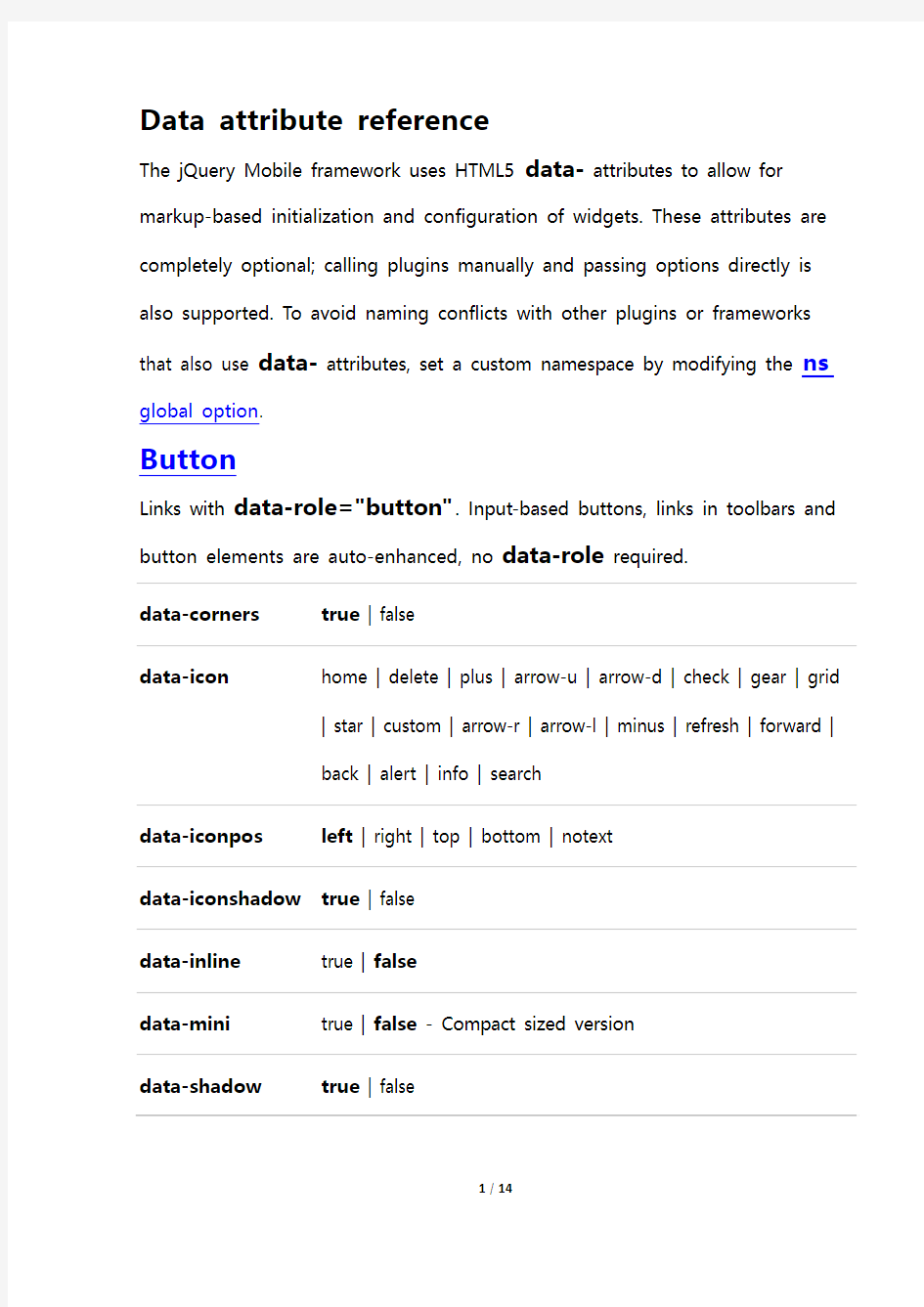
The jQuery Mobile framework uses HTML5 data- attributes to allow for markup-based initialization and configuration of widgets. These attributes are completely optional; calling plugins manually and passing options directly is also supported. To avoid naming conflicts with other plugins or frameworks that also use data- attributes, set a custom namespace by modifying the ns global option.
Button
Links with data-role="button". Input-based buttons, links in toolbars and button elements are auto-enhanced, no data-role required.
data-corners true | false
data-icon home | delete | plus | arrow-u | arrow-d | check | gear | grid
| star | custom | arrow-r | arrow-l | minus | refresh | forward |
back | alert | info | search
data-iconpos left | right | top | bottom | notext
data-iconshadow true | false
data-inline true | false
data-mini true | false - Compact sized version
data-shadow true | false
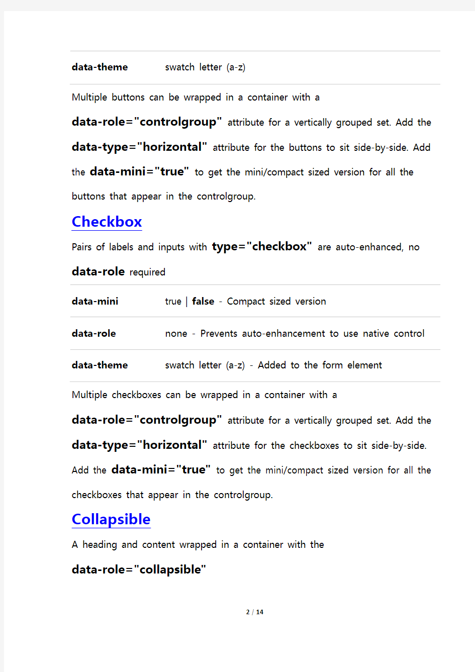
data-theme swatch letter (a-z)
Multiple buttons can be wrapped in a container with a
data-role="controlgroup" attribute for a vertically grouped set. Add the data-type="horizontal" attribute for the buttons to sit side-by-side. Add the data-mini="true" to get the mini/compact sized version for all the buttons that appear in the controlgroup.
Checkbox
Pairs of labels and inputs with type="checkbox" are auto-enhanced, no data-role required
data-mini true | false - Compact sized version
data-role none - Prevents auto-enhancement to use native control data-theme swatch letter (a-z) - Added to the form element
Multiple checkboxes can be wrapped in a container with a
data-role="controlgroup" attribute for a vertically grouped set. Add the data-type="horizontal" attribute for the checkboxes to sit side-by-side. Add the data-mini="true" to get the mini/compact sized version for all the checkboxes that appear in the controlgroup.
Collapsible
A heading and content wrapped in a container with the
data-role="collapsible"
data-collapsed true | false
data-collapsed-icon home | delete | plus | arrow-u | arrow-d | check | gear |
grid | star | custom | arrow-r | arrow-l | minus | refresh |
forward | back | alert | info | search
data-content-theme swatch letter (a-z)
data-expanded-icon home | delete | plus | arrow-u | arrow-d | check | gear |
grid | star | custom | arrow-r | arrow-l | minus | refresh |
forward | back | alert | info | search
data-iconpos left | right | top | bottom
data-inset true | false
data-mini true | false - Compact sized version
data-theme swatch letter (a-z)
Collapsible set
A number of collapsibles wrapped in a container with the
data-role="collapsible-set"
data-collapsed-icon home | delete | plus | arrow-u | arrow-d | check | gear |
grid | star | custom | arrow-r | arrow-l | minus | refresh |
forward | back | alert | info | search
data-content-theme swatch letter (a-z) - Sets all collapsibles in set
data-expanded-icon home | delete | plus | arrow-u | arrow-d | check | gear |
grid | star | custom | arrow-r | arrow-l | minus | refresh |
forward | back | alert | info | search
data-iconpos left | right | top | bottom | notext
data-inset true | false
data-mini true | false - Compact sized version
data-theme swatch letter (a-z) - Sets all collapsibles in set Content
Container with data-role="content"
data-theme swatch letter (a-z)
Controlgroup
DIV or FIELDSET container with data-role="controlgroup". Visually integrate multiple button-styled inputs of a single type (checkboxes, link-based buttons, radio buttons, selects) into a group. For grouping form checkboxes and radio buttons, the fieldset container is recommended inside a div container with the data-role="fieldcontain", to improve label styling. data-mini true | false - Compact sized version for all items in the
controlgroup
data-type horizontal | vertical - For horizontal or vertical item
alignment
Dialog
Container with data-role="dialog" or linked to with
data-rel="dialog" on the anchor.
data-close-btn-text string - Text for the close button, dialog only
data-dom-cache true | false
data-overlay-theme swatch letter (a-z) - Overlay theme when the page is
opened in a dialog
data-theme swatch letter (a-z)
data-title string - Title used when page is shown Enhancement
Container with data-enhance="false" or data-ajax="false"
data-enhance true | false
data-ajax true | false
Any DOM elements inside a data-enhance="false" container, save for data-role="page|dialog" elements, will be ignored during initial enhancement and subsequent create events provided that the
$.mobile.ignoreContentEnabled flag is set prior to the enhancement (eg in a mobileinit binding).
Any link or form element inside data-ajax="false" containers will be ignored by the framework's navigation functionality when
$.mobile.ignoreContentEnabled is set to true.
Field container
Container with data-role="fieldcontain" wrapped around label/form element pair
Fixed Toolbar
Container with data-role="header" or data-role="footer" plus the attribute data-position="fixed"
data-disable-page-zoom true | false - User-scaling-ability for pages with
fixed toolbars
data-fullscreen true | false - Setting toolbars over the
page-content
data-tap-toggle true | false - Ability to toggle toolbar-visibility on
user tap/click
data-transition slide | fade | none - Show/hide-transition when a
tap/click occurs
data-update-page-padding true | false - Have the page top and bottom
padding updated on resize, transition,
"updatelayout" events (the framework always
updates the padding on the "pageshow" event). data-visible-on-page-show true | false - Toolbar-visibility when parent page
is shown
Flip toggle switch
Select with data-role="slider" and two option element
data-mini true | false - Compact sized version
data-role none - Prevents auto-enhancement to use native control data-theme swatch letter (a-z) - Added to the form element
data-track-theme swatch letter (a-z) - Added to the form element Footer
Container with data-role="footer"
data-id string - Unique ID. Required for persistent footers
data-position fixed
data-fullscreen true | false - Used in conjunction with fixed toolbars data-theme swatch letter (a-z)
Header
Container with data-role="header"
data-id string - Unique ID. Required for persistent headers
data-position fixed
data-fullscreen true | false - Used in conjunction with fixed toolbars
data-theme swatch letter (a-z)
Link
Links, including those with a data-role="button", and form submit buttons share these attributes
data-ajax true | false
data-direction reverse - Reverse transition animation (only for page or
dialog)
data-dom-cache true | false
data-prefetch true | false
data-rel back - To move one step back in history
dialog - To open link styled as dialog, not tracked in history
data-position-to origin - Centers the popup over the link that opens it
jQuery selector - Centers the popup over the specified
element
window - Centers the popup in the window
Note: option only available when used with popups. See
also: popup options.
Listview
OL or UL with data-role="listview"
data-autodividers true | false
data-count-theme swatch letter (a-z) - Default "c"
data-divider-theme swatch letter (a-z) - Default "b"
data-filter true | false
data-filter-placeholder string
data-filter-theme swatch letter (a-z)
data-header-theme swatch letter (a-z)
data-inset true | false
data-split-icon home | delete | plus | arrow-u | arrow-d | check | gear
| grid | star | custom | arrow-r | arrow-l | minus |
refresh | forward | back | alert | info | search
data-split-theme swatch letter (a-z) - Default "b"
data-theme swatch letter (a-z)
Listview item
LI within a listview
data-filtertext string - Filter by this value instead of inner text
data-icon home | delete | plus | arrow-u | arrow-d | check | gear | grid
| star | custom | arrow-r | arrow-l | minus | refresh | forward |
back | alert | info | search | false
data-role list-divider
data-theme swatch letter (a-z)
The data-icon attribute is only applicable for a listview item if it contains a link.
Navbar
A number of LI s wrapped in a container with data-role="navbar"
data-iconpos left | right | top | bottom | notext
To add icons to the navbar items, the data-icon attribute is used, specifying a standard mobile icon for each item.
Navbars inherit the theme-swatch from their parent container. Setting the data-theme attribute to a navbar is not supported. The data-theme attribute can be set individually to the links inside a navbar.
Page
Container with data-role="page"
data-add-back-btn true | false - Auto add back button, header only
data-back-btn-text string
data-back-btn-theme swatch letter (a-z)
data-close-btn-text string - Text for the close button, dialog only
data-dom-cache true | false
data-fullscreen true | false - Used in conjunction with fixed toolbars
Deprecated in 1.1 - use on header and footer instead. data-overlay-theme swatch letter (a-z) - Overlay theme when the page is
opened in a dialog
data-theme swatch letter (a-z) - Default "c"
data-title string - Title used when page is shown
data-url url - Value for updating the URL, instead of the url used
to request the page
Popup
Container with data-role="popup"
data-corners true | false
data-overlay-theme swatch letter (a-z) - Default "null" (transparent
Pairs of labels and inputs with type="radio" are auto-enhanced, no
data-role required
data-mini true | false - Compact sized version
data-role none - Prevents auto-enhancement to use native control data-theme swatch letter (a-z) - Added to the form element
Multiple radion buttons can be wrapped in a container with a
data-role="controlgroup" attribute for a vertically grouped set. Add the data-type="horizontal" attribute for the radio buttons to sit side-by-side. Add the data-mini="true" to get the mini/compact sized version for all the radio buttons that appear in the controlgroup.
Select
All select form elements are auto-enhanced, no data-role required
data-icon home | delete | plus | arrow-u | arrow-d | check | gear |
grid | star | custom | arrow-r | arrow-l | minus | refresh |
forward | back | alert | info | search | false
data-iconpos left | right | top | bottom | notext
data-inline true | false
data-mini true | false - Compact sized version
data-native-menu true | false
data-overlay-theme swatch letter (a-z) - Overlay theme for non-native selects data-placeholder true | false - Can be set on option element of a
non-native select
data-role none - Prevents auto-enhancement to use native control data-theme swatch letter (a-z) - Added to the form element Multiple selects can be wrapped in a fieldset with a
data-role="controlgroup" attribute for a vertically grouped set. Add the data-type="horizontal" attribute for the selects to sit side-by-side. Slider
Inputs with type="range" are auto-enhanced, no data-role required data-highlight true | false - Adds an active state fill on track to handle data-mini true | false - Compact sized version
data-role none - Prevents auto-enhancement to use native control data-theme swatch letter (a-z) - Added to the form element
data-track-theme swatch letter (a-z) - Added to the form element
Text input & Textarea
Input type="text|number|search|etc." or textarea elements are auto-enhanced, no data-role required
data-mini true | false - Compact sized version
data-role none - Prevents auto-enhancement to use native control data-theme swatch letter (a-z) - Added to the form element