图表作文写作技巧 - 描述数据变化的高分句型(图表写作重在比较)
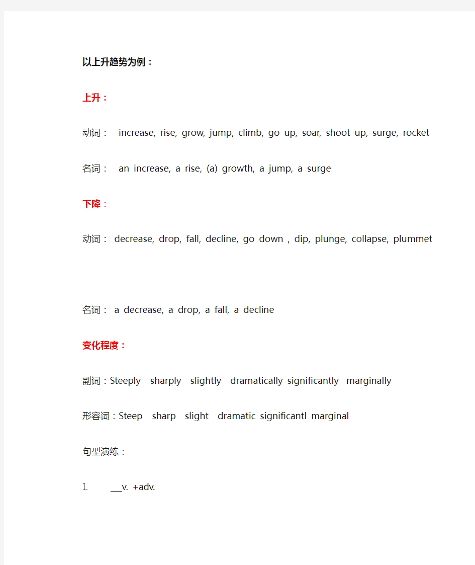

以上升趋势为例:
上升:
动词:increase, rise, grow, jump, climb, go up, soar, shoot up, surge, rocket
名词: an increase, a rise, (a) growth, a jump, a surge
下降:
动词: decrease, drop, fall, decline, go down , dip, plunge, collapse, plummet
名词: a decrease, a drop, a fall, a decline
变化程度:
副词:Steeply sharply slightly dramatically significantly marginally
形容词:Steep sharp slight dramatic significantl marginal
句型演练:
1.___v. +adv.
例如:The house price increased sharply.
2.There be a/an adj. n. in ________.
例如:There was a sharp increase in the house price.
3.________ experience/ see/ show/ undergo/ witness a/an adj. n. .
例如:The house price experienced a sharp increase.
雅思小作文柱状图Bar类解析
雅思小作文柱状图Bar类解析 关于柱状图我们主要分两种写法: 1.如果横轴有明显的时间推移的话,烤鸭们应连接柱子顶点,重在描述柱子的升降起伏,写法类似于线状图。 2.如果无时间推移,则写法和饼状图一样。即按照各比较对象所占比例的高低写,同时要注意各所占比例之间的比较。 可以用到的词汇有: 1.表示“占多少”的动词 Account for Take up Make up Contribute to Have Represent 2.表示“最高级”和“比较级” 第一/最小the largest/biggest proportion of 第二the second/next largest/expensive(+ 形容词的最高级) 第三followed closely by 最低/最小the smallest percent of all 3.表示“相同比例” 即在饼状图中遇到了比例相同或者差不多的饼,如有A B两个比较对象。 A accounts for the same percentage as B . The proportion of A is as high as B A and B contributed equally/evenly to (all ) 在观察柱形图的时候首先要留意横轴的数据,若横轴为时间轴或者是年龄趋势,那么我们在主体段写作时候的基本思路就为从左到右;若横轴数据为具体专有名词诸如地点,交通工具等时,主体段的写作思路就可能是按照柱形的长度排列。本文根据上述的分析做以下的总结: 一、按照横轴从左到右排列数据: 1. 两根柱且趋势截然相反 在这种写法中,我们要注意观察2根柱的上升/下降的幅度。以下我们就来看一个例子:
雅思小作文地图题
雅思小作文题型多样,其中就包括地图题,本文将详细讲解雅思小作文地图题写作技巧。评分标准 ?TA – Task Achievement 任务完成情况 ?CC – Coherence and Cohesion 意合与形合 ?LR – Lexical Resource 词汇资源 ?GRA – Grammatical Range and Accuracy 语法广度与精确度 审题 The map below shows the development of the village of Ryemouth between 1995 and present. 文章结构 第一段 交待写作目的 第二段 描述1995年的地图 第三段
拿现在的地图和95年的做对比 第四段 总结全文 第一段 This report compares how the village of Ryemouth has developed and changed since the year of 1995. 题目:The map below shows the development of the village of Ryemouth between 1995 and present. 第二段 As is clearly described in the first picture, Ryemouth was a coastal city which was divided into three parts by two roads. In the southern part, there was a fishing port on the sea, with a fish market located in the north and a coffee shop in the north-east. A block of shops was situated on the opposite side of the market… 第三段 In the second picture, the village changed a lot. The fishing port has been removed and the fish market is replaced by apartments. Several restaurants also occupy the place of the shops on the roadside. Moreover, a parking lot is newly built on the east of the hotel. In addition, … 第四段 Overall, based on the brief description above, it is clear that the general layout of the village does not change a lot, while some newly-built facilities and housing has ornamented the small village.
IELTS套句式写作大全
IELTS套句式写作大全 第一部分:TASK1图表写作套句精选 1.the table shows the changes in the number of...over the period from...to... 该表格描述了在...年之...年间...数量的变化。 2.the bar chart illustrates that... 该柱状图展示了... 3.the graph provides some interesting data regarding... 该图为我们提供了有关...有趣数据。 4.the diagram shows (that)... 该图向我们展示了... 5.the pie graph depicts (that).... 该圆形图揭示了... 6.this is a cure graph which describes the trend of... 这个曲线图描述了...的趋势。 7.the figures/statistics show (that)... 数据(字)表明... 8.the tree diagram reveals how... 该树型图向我们揭示了如何... 9.the data/statistics show (that)... 该数据(字)可以这样理解... 10.the data/statistics/figures lead us to the conclusion that... 这些数据资料令我们得出结论... 11.as is shown/demonstrated/exhibited in the diagram/graph/chart/table... 如图所示... 12.according to the chart/figures... 根据这些表(数字)... 13.as is shown in the table... 如表格所示... 14.as can be seen from the diagram,great changes have taken place in... 从图中可以看出,...发生了巨大变化。 15.from the table/chart/diagram/figure,we can see clearly that...or it is clear/apparent from the chart that... 从图表我们可以很清楚(明显)看到... 16.this is a graph which illustrates... 这个图表向我们展示了... 17.this table shows the changing proportion of a & b from...to... 该表格描述了...年到...年间a与b的比例关系。 18.the graph,presented in a pie chart, shows the general trend in... 该图以圆形图形式描述了...总的趋势。 19.this is a column chart showing... 这是个柱型图,描述了... 20.as can be seen from the graph,the two curves show the flutuation of... 如图所示,两条曲线描述了...的波动情况。 21.over the period from...to...the...remained level. 在...至...期间,...基本不变。 22.in the year between...and... 在...年到...期间... 23.in the 3 years spanning from 1995 through 1998... 1995年至1998三年里... 24.from then on/from this time onwards... 从那时起... 25.the number of...remained steady/stable from (month/year) to (month/year). ...月(年)至...月(年)...的数量基本不变。 26.the number sharply went up to... 数字急剧上升至...
英语图表作文常用句型
1 起伏不定go up and down / fluctuate/ be unstable/ be in flexible 2 The first point to note is the huge increase in the number of 需要注意的第一点就是…的急剧增 长 3 The statistics show that 这些数据表明 4 占百分之几 Form/comprise/make up/constitute/ account for ….percent 5 This graph describes the trend of 该图描述了…的趋势
6 The statistics lead us to the conclusion that 由这些数据,我们可以做出如下结论 8 增加:Increase / raise / rise / go up/ soar/ ascend/ mount/ climb 9 减少:Decrease / go down / drop / fall/ reduce/ descend/ shrink /decline/sink 10 稳定:Remain stable / stabilize / level off/ remain unchanged 11 It can be seen from the table that 由表格我们可以看出 12 The table shows the changes in the number of… over the period from…to… 该表格展示了从…到…数据的变化
图表作文写作句型汇总
雅思基础班图表作文期末汇总卷 Part One 图表作文各部分句型总结: 开头段句型总结: 1. This is a diagram/ chart /figure which shows how people obtain water in the wild in order to survive. 2. This is a chart which shows the trend of oil supply and dema nd. 3. This is a colu mn chart show ing … 4. The diagram illustrates /describes/ depicts the cha nges in nu mber of male teachers from 1998 to 1999 5. The bar chart illustrates the nu mber of overseas stude nts from five develop ing coun tries. 6. The graph, prese nted in a pie form, shows the gen eral trend in … 基本句型: shows /show nu mber 定语从句 betwee n and . 过去分词 + over a spa n of years/ mon ths 现在分词 in the year and . (修饰语/定语) procedure 等 类似句型: The chart + is/are + the proporti on of + A/B + from to . Diagram reflects /reflect average in come Graph states /state sales volume bar chart illustrates/illustrate perce ntages table displays /display expe nse two pie charts compares /compare in come A and B reveals /reveal 等 cha nges/ freque ncy
考研英语图表类作文常用词汇及句型
考研英语图表类作文常用词汇及句型 2015-09-22屠屠英语 1、主章开头 图表类型:table、chart、diagram、graph、column chart、pie graph 描述:show、describe、illustrate、can be seen from、clear、apparent、reveal、represent 内容:figure、statistic、number、percentage、proportion 2、表示数据变化的单词或词组 rapid/rapidly 迅速的,飞快的,险峻的dramatic/dramatically 戏剧性的,生动的 significant/significantly 有意义的,重大的,重要的sharp/sharply 锐利的,明显的,急剧的steep/steeply 急剧升降的steady/steadily 稳固的,坚定不移的 gradual/gradually 渐进的,逐渐的 slow/slowly 缓慢的,不活跃的 slight/slightly 轻微的、略微地stable/stably 稳定的 3、图表中的数据(Data)具体表达法 数据(Data)在某一个时间段固定不变:fixed in time 在一系列的时间段中转变:changes over time 持续变化的data在不同情况下: 增加:increase / raise / rise / go up …… 减少:decrease / grow down / drop / fall …… 波动:fluctuate / rebound / undulate / wave …… 稳定:remain stable / stabilize / level off …… 最常用的两种表达法:动词+副词形式(Verb+Adverb form)形容词+名词形式(Adjective+Noun form) 4、其它在描述中的常用到的词 significant changes 图中一些较大变化noticeable trend 明显趋势during the same period 在同一时期 grow/grew 增长 distribute 分布,区别unequally 不相等地in the case of adv. 在……的情况下 in terms of / in respect of / regarding 在……方面 in contrast 相反,大不相同
图表类英语四级作文常用句型
图表类英语四级作文常用句型 开篇句式 1)According to the figures given in the table,+ 主题句(the world population is increasing rapidly. 2)The table(pie chart, line graph, bar graph) shows( indicates, illustrates, makes it clear) that +主题句(One’s income is closely linked to one’s age and education) 3) It can be seen from (It is clear from, It is evident from, It is illustrated from the table that + 主题句(the better one is educated , the higher his income is) 4) As the bar chart shows, the number of people below poverty line decreased dramatically during the years of 1978 to 1998. 图表式作文模板 写作模板——图表式作文 It is obvious in the graphic/table that the rate/number/amount of Y has undergone dramatic changes. It has gone up/grown/fallen/dropped considerably in recent years (as X varies). At the point of X1, Y reaches its peak value of …(多少). What is the reason for this change? Mainly there are … (多少)reasons behind the situation reflected in the graphic/table. First of all, …(第一个原因). More importantly, …(第二个原因). Most important of all, …(第三个原因). From the above discussions, we have enough reason to predict what will happen in the near future. The trend described in the graphic/table will continue for quite a long time (if necessary measures are not taken括号里的使用于那些不太好的变化趋势). 1.the table sho ws the changes in the number of……over the period from……to…… 该表格描述了在……年之……年间……数量的变化。 2.the bar chart illustrates that…… 该柱状图展示了…… 3.the graph provides some interesting data regarding…… 该图为我们提供了有关……有趣数据。 4.the diagram shows (that)…… 该图向我们展示了…… 5.the pie graph depicts (that)…… 该圆形图揭示了…… 6.this is a cure graph which describes the trend of……
考研英语图表作文写作方法和模板
图表作文(一) 第一节图表作文的类型 图表作文可分为两大类:表作文和图作文。 表作文 表格(Table)可以使大量数据系统化,便于阅读、比较。表格常由标题(Title)、表头(Boxhead)(表格的第一行)、侧目(Stub)(表格左边的第一列)和主体(Body)部分(表格的其余部分)等部分组成。如下表: 用表格表达的信息具体准确,而且表格中的各项均按一定规律排列。阅读表格时要注意找出表格中各个项目的相互关系,表格中各个项目的变化规律。例如,上面的表格中的数字说明,和1978年相比,1983年大学入学的人数在增加,而小学的入学人数在减少。搞清楚这些变化规律也就读懂了表格的内容。 图作文 图作文又可分为三种:圆形图作文、曲线图作文和条状图作文。 (1) 圆形图作文 圆形图(Pie chart)也称为饼状图或圆面分割图。圆形图因为比较形象和直观,各部分空间大小差别容易分辨,所以常用来表示总量和各分量之间的百分比关系。整个圆表示总量,楔形块表示分量。有时圆形图还有数值表,两者结合可把各分量表示得更准确、清楚。例如:This is a pie chart of the average weekly expenditure of a family in Great Britain. As can be see from the chart, the main expenditure of an average British family is spent on food, which accounts for 25% of its total expenditure. The next two significant expending items are transport and housing, which are 15% and 12% respectively. If we take into account clothing and footwear, which makes up 10%, the four essentials of life, that is, food, transport, housing, and clothing and footwear, amount to 62% of the total expenditure. (2) 曲线图作文 曲线图(Line graph)也称为线性图或坐标图。曲线图最适合表示两个变量之间关系的发展过程和趋势。一般来说,曲线所呈现的形状比某一点所代表的变量的值更有意义。曲线图有横轴和纵轴。一般先看横轴所代表的数量或时间等,然后再看纵轴所显示的意义。同时必须找出线条所反映的最高或最低的变化。例如: 这个曲线图的横轴代表1990年的不同的月份,纵轴代表交通事故的数量。从交通事故曲线图上可知,前八个月的交通事故的数量有升有降。曲线图在八月份升到了最高点(39),此后一直呈下降的趋势,十二月份降到了最低点(16)。可见,1990年的交通事故的数量总体上呈下降的趋势。 (3) 条形图作文 条形图(Bar graph)也称为立柱图或圆柱图。条形图由宽度相同但长度不同的条块代表不同的量。当要比较几个项目或量时,常用不同颜色来区分。条形图主要用来表示:1)同一项目在不同时间的量;2)同一时间不同项目的量。阅读条形图时,要先看图例,再看横轴、纵横各代表什么量,每一个刻度所代表的值是多少,最后找出图中各长条所表示的数据及各长条间的相互关系。例如: 左边的条形图的横轴代表时间,纵轴代表期望寿命(Life Expectancy),这一条形图想要体现的是同一项目(期望寿命)在不同时间的量。右边的条形图的横轴也是代表时间,纵轴是代表婴儿的死亡率(Infant Mortality),这一条形图想要体现的也是同一项目(婴儿的死亡率)在不同时间的量。左边的条形图表明1990年的人均期望寿命比1960年的人均期望寿命长20岁,而1990年的婴儿死亡率比1960年的婴儿死亡率下降了50%。
雅思A类图表作文常用句型
2 The first point to note is the huge increase in the number of 需要注意的第一点就是…的急剧增长 3 The statistics show that 这些数据表明 4 占百分之几Form/comprise/make up/constitute/ account for ….percen t 5 This cure graph describes the trend of 该曲线图描述了…的趋势 6 The statistics lead us to the conclusion that 由这些数据,我们可以做出如下结论 7 As can be seen from the line graph, 由线状图我们可以看出 8 增加:Increase / raise / rise / go up/ soar/ ascend/ mount/ climb 9 减少:Decrease / grow down / drop / fall/ reduce/ descend/ shrink to/decline 10 稳定:Remain stable / stabilize / level off/ remain unchanged 11 It can be seen from the table that 由表格我们可以看出 12 The table shows the changes in the number of… over the period from…to…该表格展示了从…到…数据的变化 13 The table provides some data of 该表格提供了有关…的数据 14 As can be seen clearly from the table, 从表格中我们可以清楚地看出, 15 As can be seen from the table, great changes have taken place in... 从表格中可以看出,...发生了巨大变化 16 This table illustrates the changing proportion of A and B from...to... 该表格描述了...年到...年间a与b的比例关系 17 急剧地sharply, steeply, dramatically, drastically, suddenly 18 显著地,considerably, significantly, noticeably, remarkably, rapidly 19 稳步地, 逐渐地steadily, moderately, gradually, smoothly 20 轻微地, 缓慢地slightly, slowly, mildly, moderately 21 The following diagram shows the structure of...... 以下的图展示了...的结构 22 The picture illustrates...... 该图展示了... 23 It mainly consists of following steps. 它主要包括以下步骤 24 The whole procedure can be divided into...stages. 整个的过程可以分为...步 25 The first step is to 第一步是...
雅思小作文之图表作文
二.雅思图表作文 1.企业垃圾(线性图) 题目:The graph below shows the amounts of waste produced by three companies over a period of 15 years. 范文:The line graph compares three companies in terms of their waste output between the years 2000 and 2015. It is clear that there were significant changes in the amounts of waste produced by all three companies shown on the graph. While companies A and B saw waste output fall over the 15-year period, the amount of waste produced by company C increased considerably. In 2000, company A produced 12 tonnes of waste, while companies B and C produced around 8 tonnes and 4 tonnes of waste material respectively. Over the following 5 years, the waste output of companies B and C rose by around 2 tonnes, but the figure for company A fell by approximately 1 tonne. From 2005 to 2015, company A cut waste production by roughly 3 tonnes, and company B reduced its waste by around 7 tonnes. By contrast, company C saw an increase
雅思小作文图表作文数据写法
1.介词 From..to.. - The number of divorces increased from 1m in 1970 to almost 1.5m. by, of(表示数值变化差,搭配from/to) 趋势动词+by -The proportion of married people decreased by 11% to about 59%. 趋势名词+of -The proportion of married people underwent a decrease of 11%. at(表示在某一点) -The number of marriages leveled off at 2.5 million during the first decade. -The minutes of local fixed line calls reached the peak at around 90 billion. With(带一个或几个静止的数值) - In 1979, beef was the most popular of these food, with about 225 grams per person per week. - Three of these countries shared similar figures with6.63% in Turkey, 6.51% Spain and 6.43% in Ireland. 2.括号 带静止数据 - Specifically, deforestation was the number one murder (9.8%), followed by over-cultivation and over-grazing (7.7% and 5.5% respectively). 带动态数据 - There was an overall slight increase in both nuclear and solar/wind (up by 3q and 2q respectively). - Both nuclear power and oil went up during the period, although the rise of oil was not as dramatic as that of nuclear power (from 15, 20 to 126, 25 respectively). 3.从句
英语作文万能模板及万能句型汇总
中考英语作文万能模板及万能句型汇总 作文万能模板 一、阐述主题题型 要求从一句话或一个主题出发,按照提纲的要求进行论述. 1.阐述名言或主题所蕴涵的意义.2.分析并举例使其更充实. 二、解决方法题型 要求考生列举出解决问题的多种途径 1.问题现状2.怎样解决(解决方案的优缺点) In recent days,we have to face a problem-----A,which is becoming more and more serious. First,------------(说明A的现状).Second,---------------(举例进一步说明现状)Confronted with A,we should take a series of effective measures to cope with the situation. For one thing,---------------(解决方法一)。For another -------------(解决方法二)。Finally,--------------(解决方法三)。 Personally,I believe that -------------(我的解决方法)。Consequently,I’m confident that a bright future isawaiting us because --------------(带来的好处)。 三、说明利弊题型 这种题型往往要求先说明一下现状,再对比事物本身的利弊,有时也会单从一个角度(利或弊)出发,最后往往要求考生表明自己的态度(或对事物前景提出预测) 1.说明事物现状2.事物本身的优缺点(或一方面)3.你对现状(或前景)的看法Nowadays many people prefer A because it has a significant role in our daily life. Generally,its advantages can be seen as follows. First ----------------(A的优点之一)。Besides -------------------(A的优点之二)。 But every coin has two sides. The negative aspects are also apparent. One of the important disadvantages is that ----------------(A的第一个缺点).To make matters worse,------------------(A的第二个缺点). Through the above analysis,I believe that the positive aspects overweigh the negative ones. Therefore,I would like to ---------------(我的看法).(From the comparison between these positive and negative effects of A,we should take it reasonably and do it according to the circumstances we are in. Only by this way,---------------(对前景的预测).)
图表作文常用句型
图表作文常用句型 ●表示“说明”的常用句式 在说明图表的时候,要使用下列表示“说明”的常用句式,它们可以帮助读者弄清楚所引信息的出处,有效地将你要说的话带出来。 1.As we can see from the chart/graph / table/diagram,…从图表中可以看出…… 2.The chart/graph / table/diagram shows/displays that,…如图所示…… 3.As can be shown in/According to the chart/graph / table/diagram,…如图所示……4.The figures/statistics in the chart reflect/show/reveal that… 图表中的数据表明…… 5.The chart/graph/table/diagram illustrates/describes…图表描述了…… 6.It is clear/apparent from the chart/graph / table/diagram that… 从图表我们可以清楚地看到…… ●表示“数据”的常用句式 1.…had the largest percentage/proportion of… ……在……方面具有很大的百分比。2.…account (s) for/take (s) up 10%.……占有10%。 3.Compared with A, B has a higher percentage. 与A相比,B有更高的比例。 4.On the top of the list is…, which accounts for 60%.占比重最高的是……,占60%。 5.At the b ottom is…, which takes up 20%.占最低比重的是……,占20%。 6.A is second to B. A仅次于B。 7.A is ranked/rated first, followed by B at 30%and C at 25%. A占最高比重,紧随其后的是占30%的B和占25%的C。 ●表示“数据变化”的常用句式 在描述图表的过程中,考生有必要对图表的数据进行描述,因此,掌握相应地表示变化的句式也是相当重要的。 a.表示增加、减少和波动的常用结构 1.The number of (private cars) increased/rose suddenly/rapidly/dramatically/substantially /considerably/sharply/steeply from…to…从……到……期间,(私家车)的数量有了急剧的增长。 2.There was a sudden/rapid/dramatic/substantial/considerable/sharp/steep increase/rise in the number of (pr ivate cars) from…to…从……到……期间,(私家车)的数量有了急剧的增长。 3.There was a boom in the number of (private cars) from…to… 从……到……期间,(私家车)的数量有了急剧的增长。 4.The number of (private cars) climbed/jumped/rose suddenly/went sharply up/soared to…in…在……(时间),(私家车)的数量猛增到……(辆)。 5.There was an evident/apparent/obvious increase in…from…to….从……到……期间,在……方面有明显的增长。 6.The number of (private cars) increased/rose steadily/gradually from…to…从……到……期间,(私家车)的数量有了稳定持续的增长。 7.There was a steady/gradual increase/rise in the number of (private cars) from…to… 从……到……期间,(私家车)的数量有了稳定持续的增长。 8.There was a slight/slow increase/rise in the number of (private cars) from…to…从……到……期间,’ (私家车)的数量有了稍微/缓慢的增长。 9.The number of (private cars)increased/rose slightly/slowly from…to… 从……到……期间,(私家车)的数量有了稍微/缓慢的增长。 10.The number of (private cars) decreased/fell/dropped suddenly/rapidly/dramatically/
雅思图表作文TASK1精讲精练
雅思图表作文TASK1精讲精练
雅思图表作文TASK1精讲精练 A理论部分: 雅思小作文概论 1、文章结构:主要分三部分:i。introductory sentence;ii。body paragraph;iii。Concluding sentence 具体讲:第一段introductory sentence只要写一句话,交待图形(如the line graph, pie chart等等),描述对象(如图表描述的是the number of tourists visiting England),地点(如the US, the UK等)以及时间(如between 1988 and 1997等等);另外要注意的就是第一段不能和图表上方已给的句子太过相似!否则,会失分的! 第二部分一般写1~3段,这要视情况而定。这部分主要就是对比不同的数据,如相似或相同的数据;某个数据是另一个数据的2倍;某个数据所占比例最大或最小等等。 最后一段concluding sentence也只要写一句话,
主要是总结图表的整个趋势。 2。文章的效果。很多学生会发现小作文的例文特别简单(特别是剑桥书里提供的)。原因很简单,这个report的目的就是要让university lecturer了解某个事物的发展趋势,因此写出来的文章必须结构清晰、易懂,绝对不能太复杂,也不要把每个数据都描写出来,只要描写有代表性的,重要的数据即可。 以下为雅思小作文的四个基本步骤 第一步:改写题目 经过同义词转换在短短的1分钟内就写好作文的第一段。 举例:The graph below shows the percentage of people unable to find work in three major countries from 1983 to 1992. 题目中划线的单词都能够进行同义转换: graph—figure, show—illustrate, percentage—proportion, major—key, from…to…—between…and…, 第二步:分析时态
图表作文写作
图表式作文写作技巧指引 一、图表类型 二、要点分析 A. 表格图 1横向比较: 介绍横向各个数据的区别,变化和趋势 2纵向比较:介绍横向各个数据的区别,变化和趋势 3无需将每一个数据分别说明,突出强调数据最大值和最小值,对比时要总结出数据对比最悬殊的和最小的 说明:考察例举数字的能力和方法。注意怎样通过举一些有代表性的数据来有效地说明问题。 B. 曲线图 1极点说明: 对图表当中最高的,最低的点要单独进行说明
2趋势说明: 对图表当中曲线的连续变化进行说明,如上升,下降,波动,持平 3交点说明: 对图表当中多根曲线的交点进行对比说明 说明:关键是把握好曲线的走向和趋势,学会general classification,即在第二段的开头部分对整个曲线进行一个阶段式的总分类,使写作层次清晰。接下来在分类描述每个阶段的specific trend,同时导入数据作为你分类的依据。注意不要不做任何说明就机械性的导入数据!可以使用一些比较native的单词和短语来描述trend。 C. 饼状图 1介绍各扇面及总体的关系 2各个扇面之间的比较,同类扇面在不同时间,不同地点的比较 3重点突出特点最明显的扇面:最大的,最小的,互相成倍的 D. 柱状图 1.比较: similarity 2.对比: difference) 3.横向总结所有柱状图表的共性特征& 分别描写各个柱子的个性特征 E. 流程图 1.首先说明:做什么工作的过程,目的是什么 2.准备工作 3.按时间/过程先后描述 4.结果 5.简单总结(可有可无)
说明:注意流程图里的“因果关系”或每一流程的“承前启后”关系;表达每一流程的主体内容,阐明这种关系;揭示其内在联系或规律;最后,给予简要归纳和总结。 F. 实物/器具工作过程 1.实物的名称,功能 2.基本结构 3.工作过程 4.简单总结 G. 综合图 1不求甚解,不拘泥于细节 2分门别类,分段落详细介绍各个图表 3不画蛇添足,主观臆断或猜测图表之间的关系 三、框架结构 1.开头:该图阐述的是______的______.共有以下几个部分组成。 shows (that)/ According to / As (is)shown in … / As can be seen from / It can be seen from / We can see from / It is clear / apparent from the figures/statistics / It is from / This … tells us the main story about / concerning / concerned with / on / related to… 2.分析:首先看到的是____, 在_____年呈现出____的趋势/ 占______; 其次,……第三[比较分析] 1)内容:figure、statistic、number、percentage、proportion 2)用语: