雅思线图范文
Full Model Answer:
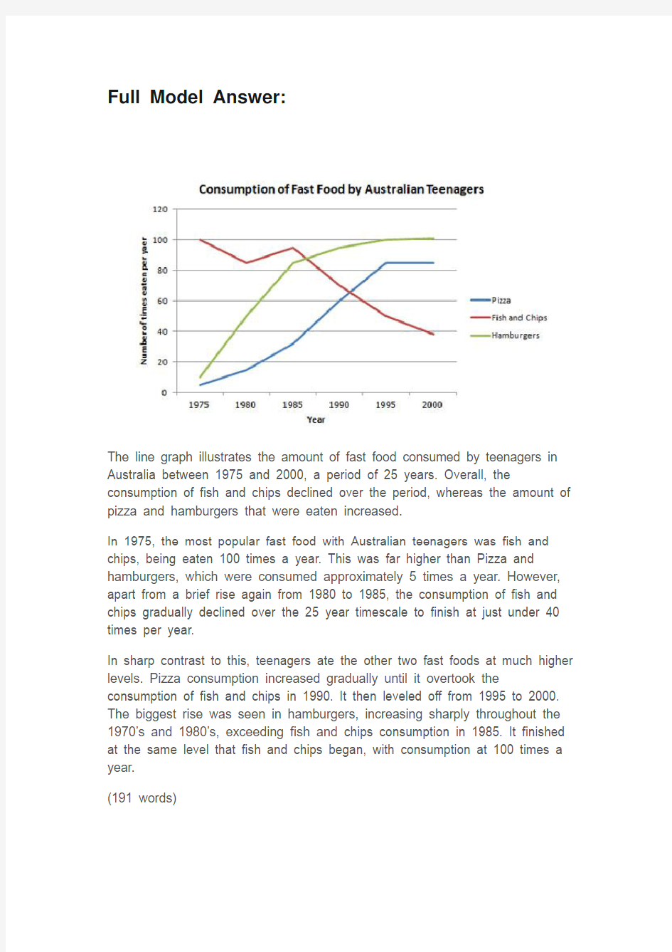
The line graph illustrates the amount of fast food consumed by teenagers in Australia between 1975 and 2000, a period of 25 years. Overall, the consumption of fish and chips declined over the period, whereas the amount of pizza and hamburgers that were eaten increased.
In 1975, the most popular fast food with Australian teenagers was fish and chips, being eaten 100 times a year. This was far higher than Pizza and hamburgers, which were consumed approximately 5 times a year. However, apart from a brief rise again from 1980 to 1985, the consumption of fish and chips gradually declined over the 25 year timescale to finish at just under 40 times per year.
In sharp contrast to this, teenagers ate the other two fast foods at much higher levels. Pizza consumption increased gradually until it overtook the consumption of fish and chips in 1990. It then leveled off from 1995 to 2000. The biggest rise was seen in hamburgers, increasing sharply throughout the 1970’s and 1980’s, exceeding fish and chips consumption in 1985. It finished at the same level that fish and chips began, with consumption at 100 times a year.
(191 words)
雅思线图写作分析
线图讲解 I.背景: A.雅思小作文主要考查两个方面的能力 1.图表分析、数据归纳总结能力 a.总体趋势 b.数据筛选 c.描述的主次、顺序 d.数据的比较 e.各图、数据间的关联 2.语言能力 a.比较:最高级、比较级、同比、对比 b.数据引用的表达方式 B.区别于其他图形的语言要求: 1.对变化的描述 II.分析、归纳能力及语言能力要求 A.图表分析、数据归纳能力 1.主要分类: a.单线图 b.多线图
c.混合图 d.类线图(随时间变化的图) 2.写作要点: a.单线:纵向变化+纵向比较 1.体现变化的点:峰值、谷值、转折点、交点、起点、终点 2.描述变化的词汇(动词、名词)
3.变化的幅度(副词、形容词)
4.描述变化的高频句型:adj. + n.; v + adv. a.练习:句型改写 5.各阶段数值的关系(比较、倍数) a.比较级、最高级 b.对比、类比 c.表达方式及连词 b.多线: 1.解题思路: a.纵向变化+纵向比较(辅)+横向比较(主);各图间的联系 b.若能相互联系则对比、归纳起来写 c.如果联系不大,则分开写,结束段将其联系起来。
d.要点及写作顺序: i.从总到分 ii.从最受欢迎到不受欢迎 iii.从上升/上涨到下降 iv.从最大值到最小值 v.从最主要特征到不重要特征 2.真题分析: 剑桥4,5 线图题 剑桥4 第二套 The graph blew shows the demand electricity in Engliand during typical days in winter and summer.The pie chart shows how electricity is used in an average English home key point: 冬天整体比夏季用电量高,冬季基本比夏季用电量多出2000,冬季的高峰在22点,夏季的高峰在14点, 2季用电低峰期都在9点左右
雅思写作线图line graph
《Line Graph》慧通养德案 【化】化德能养气度 教育目标: 本章节属于雅思写作TASK1图表题线形图这一章节。其相应课标如下:化:学生对于小作文是有一定了解的,但是并没有系统学习。基本的技巧已在暑期培训时教授,这一章节目的在于让学生真正做到会看图、会分析、会写作。 觉: 1.了解小作文文章结构 2.掌握每一部分的写法 3.掌握线图趋势描述的语言 炼:1.能够自己分析线图 2.能够对各部分进行仿写 3.能够运用所学词汇和短语、句型进行表述 悟:引导学生体悟line graph的写作规律 修:引导学生养成善于分析的能力,培养分析和解决问题的能力。 【觉】觉身智知精度 教育计划: 本章节五字导航: 化:学生对于小作文是有一定了解的,但是并没有系统学习。基本的技巧已在暑期培训时教授,这一章节目的在于让学生真正做到会看图、会分析、会写作。 觉: 1.了解小作文文章结构 2.掌握每一部分的写法 3.掌握线图趋势描述的语言 炼:1.能够自己分析线图 2.能够对各部分进行仿写 3.能够运用所学词汇和短语、句型进行表述 悟:引导学生体悟line graph的写作规律 修:引导学生养成善于分析的能力,培养分析和解决问题的能力。
本章节的课时分配方案、课型以及基本教育策略 【炼】炼命能增强度 教育行动: 课前、课中、课后教学环节设计、学生活动设计及效果预设 课前—前置性任务单 1.请同学们以小组为单位列出你们知道的有关表达线图趋势的词汇。 分别为:上升&急剧上升、下降&急剧下降、保持稳定&波动、幅度大&幅度小、极值表达&超过 2.同学们,你们知道task1文章的结构以及各部分的组成内容吗?请列出。 3.开头段如何改写? 4.同学们,line graph主体段要描写哪些细节呢?你们又是如何找出他们并进行合理描述的呢? 5.结尾段要写些什么?可以进行主观描述吗? 学习参考材料:《新东方雅思写作强化培训》(电子版通过kindle推送)、推荐网站。 课中教学—环节设计
雅思饼图小作文的高频词汇表达
雅思饼图小作文的高频词汇表达 雅思小作文是雅思作文中很多考生认为相对比较轻松的一项,但是还有相当一部分考生在这方面得分不佳,主要是一些表达非常的不专业,在词汇选择上存在很大的问题,其实这个问题并不大,天道小编觉得掌握一些基本的雅思作文词汇表达可以解决这些问题。 由于雅思小作文饼图主要以比例说明和数字列举为主,我们需要在考前准备好以下模板: ① 动词“占”的表达: account for, hold, make up, take up, constitute, comprise, represent ② 百分比的表达 percentage,proportion, share, 某些情况下可以用rate,如literacy rate ③ 约数表达 the majority of, most of, a considerable number of, a minority of , just over…, slightly more than…/less than…, nearly half… 等 ④ 确切数字表达 分数与百分比的转化:one third, two fifths,one tenth 常见表达:a quarter, a half ⑤ 句式 要灵活运用以上的词汇结合一定的句子,变换表达方式。 例:亚洲人口占世界比例近50%。 — Asia accounts for almost a half of world population. — Nearly 50% of people in the world come from Asia. — The percentage of Asian in the world population is slightly less than a half. — Asia has the largest percentage of population in the world( approximately 50%). ⑥ 排序段 在列举饼图数据时,为了防止单调枯燥,我们常常运用排序的方式进行说明,所以下面的关于排序的模板也是大家需要记忆的:
Simon考官范文-雅思写作Task 2: problem/solution(问题与解决办法) essay
题目: In the developed world, average life expectancy is increasing. What problems will this cause for individuals and society? Suggest some measures that could be taken to reduce the impact of ageing populations. 范文: It is true that people in industrialised nations can expect to live longer than ever before. Although there will undoubtedly be some negative consequences of this trend, societies can take steps to mitigate these potential problems. As people live longer and the populations of developed countries grow older, several related problems can be anticipated. The main issue is that there will obviously be more people of retirement age who will be eligible to receive a pension. The proportion of younger, working adults will be smaller, and governments will therefore receive less money in taxes in relation to the size of the population. In other words, an ageing population will mean a greater tax burden for working adults. Further pressures will include a rise in the demand for healthcare, and the fact young adults will increasingly have to look after their elderly relatives. There are several actions that governments could take to solve the problems described above. Firstly, a simple solution would be to increase the retirement age for working adults, perhaps from 65 to 70. Nowadays, people of this age tend to be healthy enough to continue a productive working life. A second measure would be for governments to encourage immigration in order to increase the number of working adults who pay taxes. Finally, money from national budgets will need to be taken from other areas and spent on vital healthcare, accommodation and transport facilities for the rising numbers of older citizens. In conclusion, various measures can be taken to tackle the problems that are certain to arise as the populations of countries grow older. (265 words, band 9)
雅思经典图表作文范文
# 43. You should spend about 20 minutes on this task. The table below shows CO2 emissions for different forms of transport in the European Union. The Pie Chart shows the percentage of European Union funds being spent on different forms of transport. You should write at least 150 words.
model answer: The chart shows CO2 emissions per passenger kilometre for variuos methods of transport in the European Union while the pie chart shows European Union spending on transport. Flying by air produces by far the greatest CO2 emissions, approximately three times as much as passenger cars which are the next largest producers. Very little is spent by the EU on air travel while roads make up more than half of the EU transport budget. Trains produce about three times less CO2 emissions per passenger kilometre than passenger cars and eight times less than air travel. Nearly a third of EU transport funds are spent on railways. Ships are a clean form of transport and produce about the same amount of CO2 per passenger kilometre as trains do. However, only 2 percent of EU funds are spent on ports. A further one percent is spent on inland waterways. Coaches are the cleanest form of transport. Emissions of CO2 per passenger kilometre from coaches are half those of buses. Buses emit less than half as much CO2 per passenger kilometre as cars. The European Union spends 10 percent of its transport budget on public transport, such as buses and coaches. (197 words)
雅思小作文之图表作文
二.雅思图表作文 1.企业垃圾(线性图) 题目:The graph below shows the amounts of waste produced by three companies over a period of 15 years. 范文:The line graph compares three companies in terms of their waste output between the years 2000 and 2015. It is clear that there were significant changes in the amounts of waste produced by all three companies shown on the graph. While companies A and B saw waste output fall over the 15-year period, the amount of waste produced by company C increased considerably. In 2000, company A produced 12 tonnes of waste, while companies B and C produced around 8 tonnes and 4 tonnes of waste material respectively. Over the following 5 years, the waste output of companies B and C rose by around 2 tonnes, but the figure for company A fell by approximately 1 tonne. From 2005 to 2015, company A cut waste production by roughly 3 tonnes, and company B reduced its waste by around 7 tonnes. By contrast, company C saw an increase
雅思写作Task1饼状图考官范文(4)
雅思写作Task1饼状图考官范文(4) 本文为大家收集整理了雅思写作Task1饼状图考官范文(4)。认真研读一定的雅思范文及作文模板可以帮助我们检验自己的写作水平,并能很好地吸收和应用优秀范文里的优秀内容。 The table below shows CO2 emissions for different forms of transport in the European Union. The Pie Chart shows the percentage of European Union funds being spent on different forms of transport. Write a report for a university lecturer describing the information in the graph below.
Sample Answer: The given graphs provide information on the amount of Carbon dioxide emission per person from different vehicles in the European Union and also show the expenditures on different modes of transportations. As is observed from the given illustration, the highest amount of CO2 per person is emitted by the Air transports and European Union spends highest percentage of funds for the road transportation system. According to the bar graph, a single passenger of a personal cars emit around 130 gm of CO2 per kilometer while a passenger in a bus contribute to 65 gm of emission per kilometer. Coaches, maritime and rail passengers emit the lowest amount of CO2which is about 50 grams per passenger in a kilometer. Finally a single passenger of airplane contributes to 370 km of CO2 per kilo which is the highest amount of CO2 emission among the given transportations. Based on the pie chart, the European Union spent the highest amount (52%) on the road transportation system while spent only 1% or 2% on ports, waterway airport
雅思写作Task1饼状图考官范文(4)
雅思写作Task1饼状图考官范文(4) The table below shows CO2 emissions for different forms of transport in the European Union. The Pie Chart shows the percentage of European Union funds being spent on different forms of transport. Write a report for a university lecturer describing the information in the graph below. Sample Answer: The given graphs provide information on the amount of Carbon dioxide emission per person from different vehicles in the European Union and also show the expenditures on different modes of transportations. As is observed from the given illustration, the highest amount of CO2 per person is emitted by the Air transports and European Union spends highest percentage of funds for the road transportation system.
两个雅思写作小作文饼图练习题
两个雅思写作小作文饼图练习题 雅思小作文饼图是所有图表中出现次数最多的一个,所以需要大家更为关注。下面为大家搜集整理了雅思写作小作文饼图的练习题,共有两个,都是比较简单的两个饼图,大家在备考的时候,注意结构和顺序的描写。 1. The following pie charts illustrate the energy use in the USA. Write a report for a u niversity lecturer describing the information given in the pie charts below. 2. The following two pies show the average family income of New Zealand in 1990 and 2000 and the way people spend their income. Write a report for a university lecturer describing the information given in the pie charts below.
以上就是这两个雅俗写作小作文饼图练习题的全部内容,包括了美国的能源使用和新西兰的平均家庭收入两个话题。大家在备考雅思写作小作文饼图的时候,可以适当的练习一下上面的这两个题目。 雅思小作文图表描述方式小结 雅思小作文的图表描述是有自己的方式和特点的,掌握了这个方式可以让大家的小作文备考更快也更加贴近考试的要求。下面就为大家整理了雅思小作文图表描述的方式,供大家参考。 1. 与趋势有关的词语: 上升(v.):increase, rise, climb, ascend, surge, shoot up 下降(v.):decrease, decline, drop, fall, descend, plunge 持平(v.):remain stable, keep constant, level off, flatten out 波动(v.):fluctuate, wave, go up and down
雅思写作Task1曲线图考官范文(1)
雅思写作Task1曲线图考官范文(1) 这是一篇雅思写作Task1曲线图考官范文。认真研读一定的雅思范文及作文模板可以帮助我们检验自己的写作水平,并能很好地吸收和应用优秀范文里的优秀内容。 The graphs below show the numbers of male and female workers in 1975 and 1995 in several employment sectors of the republic of Freedonia. Write a report for a university teacher describing the information shown.
Sample Answer: The provided line graphs compare the employment history of men and women in 1975 and 1995 dividing in six major sectors namely: manufacturing, communications, finance/ banking, wholesale & retail trade, non-defence public sectors and defence public sectors. As is observed from the given illustration, significant changes have been made in women's employment and women appear to have made remarkable improvements in almost the entire job sectors in Freedonia and in some sectors women went well ahead of men. Initially in 1975, men were notably ahead of women in every sector of employment. For example, in communication sector about 260 men worked against 220 women in every thousand employees. Twenty years later, though the number of men remained unchanged, the number of women rose to over 550 in one thousand. A similar trend can be seen in the wholesale and retail trade sector, where the number of women rose from about 550 to almost 800 in every 1000 employees of this sector two decades later. The number of men in this sector remained stable over the period, at around 700 / thousand.
雅思小作文笔记
线图: 例:Direction: You should spend no more than 20 minutes on this task. The graph contains information about the price in US dollars of a barrel of oil from 1995 with predictions to 2015. Summarize the main features and make comparisons where relevant. 开头段:转述原题+时态永远是一般现在时 ?改变关键词的词性 ?改变关键词的位置 ?同义词替代 ?灵活加入图表中的其它文字信息 The graph provides information about the changes of crude oil price per barrel in US dollars since 1995 and predicts the tendency of the oil price till 2015. 开头段常用词汇: ?The graph / the chart / the line graph shows … ?The graph give past and future data concerning… ?The graph demonstrates trends in/ an overview of/ trends in …Shows: indicates/ unfolds/ displays/ reveals/ reflects/ relates/ illustrates/ demonstrates/ describes/ depicts/ portray/ outlines/ provide an overview of…例:The graphs below show the enrolments of overseas students and local students in Britain’s universities. The graphs provide information about the proportions of overseas students and local students enrolled in Britain’s Universities from 1989 to 1999. 主体部分1+X句:第一句总结总体趋势,之后分步描述(起点,极值,终点)。总体趋势: Overall, oil prices increased by nearly four hundred percent from 1995 to
雅思写作流程图
流程图1.首段常用句子 The following diagram shows the structure of……The picture illustrates…… The whole procedure can be divided into…stages. It mainly consists of…… It works as follows. It always involves following steps. 2.描述流程/过程的常用过渡性词语 最后再总结一下流程图的特点: 特点一:现在时 特点二:定语从句 特点三:被动语态 特点四:顺序词 特点五:适当添加 特点六:无总结
题目1:玻璃的回收流程【单图】
范文1: This diagram illustrates the recycling process of glass bottles. The whole process is a cycle which can be divided into three main stages. In the first stage, used bottles are collected at a recycling point ready to be transported by a truck. The second stage starts in a cleaning plant, where these recycled bottles are sorted by color into green, brown and clear ones and washed by high-pressurized water. When the cleaning is done, the bottles are conveyed to a glass factory where they are cut into glass pieces which are then poured into a furnace. After being heated in the furnace, the broken glasses are melted into liquid, which flows into a glass mold. Here glass liquid from other sources is added and the molding process takes place. In the final stage, new, empty bottles are filled with liquid, then packed and dispatched to the supermarket ready to be picked by consumers. At this point, a cycle has been completed and a new cycle will begin.
雅思写作小作文饼图真题句子练习PieSentences
雅思写作小作文饼图真题句子练习P i e S e n t e n c e s It was last revised on January 2, 2021
P i e c h a r t In 1980 Australia used coal as the main electricity source(50 units) and the remainder was produced from natural gas, hydro power(each producing 20 units) and oil,which produced only 10 units. 在1980年,澳大利亚使用煤作为主要的电力来源(50 units),剩下的电力由天然气,氢能(两者各产生20 units)和石油,它仅仅只产生10 units。 By 2000, coal had become the fuel for more than 75% of electricity produced and only hydro continued to be another significant source supplying approximately 20%. 到了2000年,煤已经成为了产生超过75%电力的能源了,同时只有氢能继续成为另一个重要的供应来源,大约是20%。 In contrast, France used coal as a source for only 25 units of electricity in 1980, which was matched by natural gas. 相比之下,法国在1980年用煤供电只有25 units,这和天然气相同。 The remaining 40 units were produced largely from oil and nuclear power, with hydro contributing only 5 units. 剩下的40 units 主要都产生于石油和核能,其中氢能只贡献了5 units。 But by 2000 nuclear power, which was not used at all in Australia, had developed into the main source, producing almost 75% of electricity, at 126 units, while coal and oil together produced only 50 units.
雅思写作考官范文 Simon17篇
17 01. 02. 03. 04. 05. 06. 07. 08. 09. 10. 11. 12. 13. 14. 15. 16. 17.
1. Many people prefer to watch foreign ?lms rather than locally produced ?lms. Why could this be? Should governments give more ?nancial support to local ?lm industries? It is true that foreign ?lms are more popular in many countries than domestically produced ?lms. There could be several reasons why this is the case, and I believe that governments should promote local ?lm-making by subsidising the industry. There are various reasons why many people ?nd foreign ?lms more enjoyable than the ?lms produced in their own countries. Firstly, the established ?lm industries in certain countries have huge budgets for action, special effects and to shoot scenes in spectacular locations. Hollywood blockbusters like ‘Avatar’ or the James Bond ?lms are examples of such productions and the global appeal that they have. Another reason why these big-budget ?lms are so successful is that they often star the most famous actors and actresses, and they are made by the most accomplished producers and directors. The poor quality, low-budget ?lmmaking in many countries suffers in comparison. In my view, governments should support local ?lm industries ?nancially. In every country, there may be talented amateur ?lm-makers who just need to be given the opportunity to prove themselves. To compete with big-budget productions from overseas, these people need money to pay for ?lm crews, actors and a host of other costs related to producing high-quality ?lms. If governments did help with these costs, they would see an increase in employment in the ?lm industry, income from ?lm sales, and perhaps even a rise in tourist numbers. New Zealand, for example, has seen an increase in tourism related to the 'Lord of the Rings' ?lms, which were partly funded by government subsidies. In conclusion, I believe that increased ?nancial support could help to raise the quality of locally made ?lms and allow them to compete with the foreign productions that currently dominate the market. (295 words, band 9)
雅思图表作文TASK1精讲精练
雅思图表作文TASK1精讲精练 A理论部分: 雅思小作文概论 1、文章结构:主要分三部分:i。introductory sentence;ii。body paragraph;iii。Concluding sentence 具体讲:第一段introductory sentence只要写一句话,交待图形(如the line graph, pie chart 等等),描述对象(如图表描述的是the number of tourists visiting England),地点(如the US, the UK等)以及时间(如between 1988 and 1997等等);另外要注意的就是第一段不能和图表上方已给的句子太过相似!否则,会失分的! 第二部分一般写1~3段,这要视情况而定。这部分主要就是对比不同的数据,如相似或相同的数据;某个数据是另一个数据的2倍;某个数据所占比例最大或最小等等。 最后一段concluding sentence也只要写一句话,主要是总结图表的整个趋势。 2。文章的效果。很多学生会发现小作文的例文特别简单(尤其是剑桥书里提供的)。原因很简单,这个report的目的就是要让university lecturer了解某个事物的发展趋势,所以写出来的文章必须结构清晰、易懂,绝对不能太复杂,也不要把每个数据都描写出来,只要描写有代表性的,重要的数据即可。 以下为雅思小作文的四个基本步骤 第一步:改写题目 通过同义词转换在短短的1分钟内就写好作文的第一段。 举例:The graph below shows the percentage of people unable to find work in three major countries from 1983 to 1992. 题目中划线的单词都可以进行同义转换: graph—figure, show—illustrate, percentage—proportion, major—key, from…to…—between…and…, 第二步:分析时态 1. 图表小作文大部分时候使用过去时态,因为出现的数据一般都是以往的统计数据,过去的情形和现在的情形很有可能完全不一样,因此用过去时态比较恰当。 例句1: In the 2002 survey, over 75% of respondents with annual incomes above$ 100,000 considered leisure time extremely or very important.