雅思小作文组合图
组合图
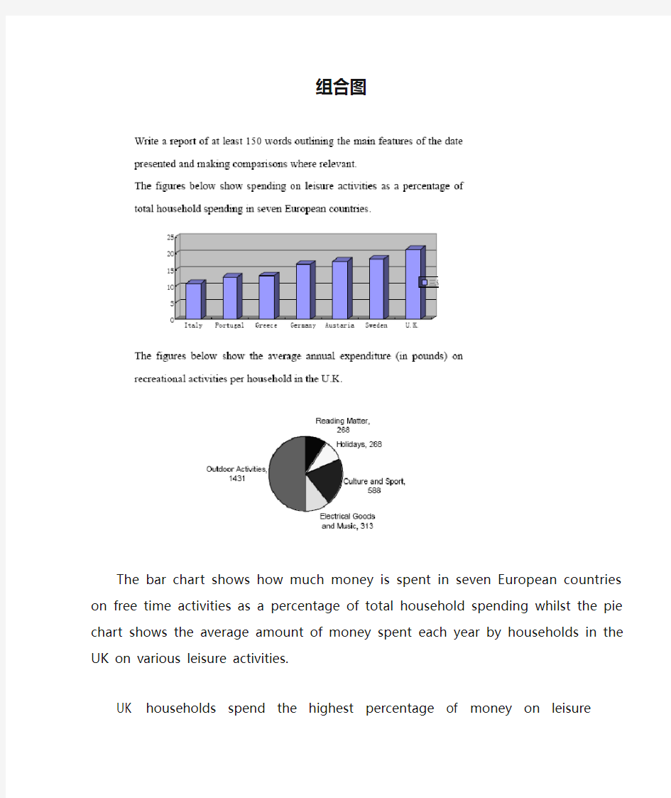
The bar chart shows how much money is spent in seven European countries on free time activities as a percentage of total household spending whilst the pie chart shows the average amount of money spent each year by households in the UK on various leisure activities.
UK households spend the highest percentage of money on leisure activities(21.3%).Those in Sweden, Austria and Germany spend similar percentages on leisure ctivities-18.4%,17.7%and 16.8% respectively. Households in Greece and Portugal spend smaller percentages-13.3% and 12.9% respectively. Those in Italy spend the lowest percentage on leisure activities at 10.9%
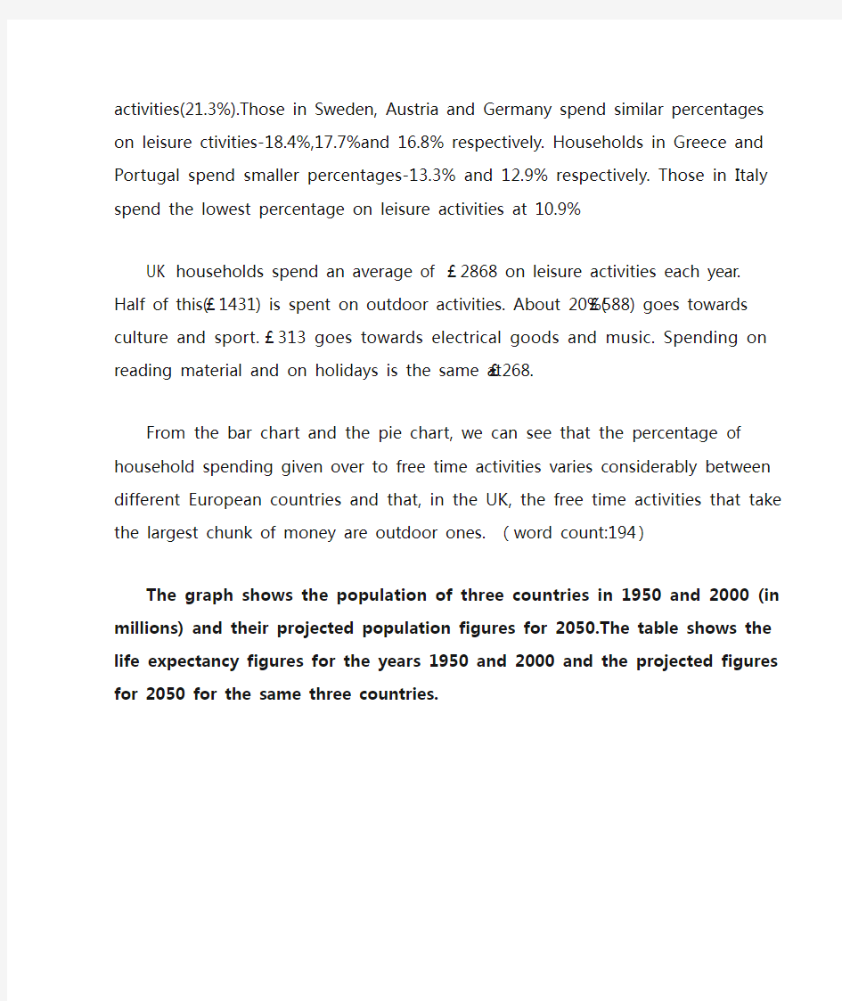
UK households spend an average of £2868 on leisure activities each year. Half of this(£1431) is spent on outdoor activities. About 20%(£588) goes towards culture
and sport. £313 goes towards electrical goods and music. Spending on reading material and on holidays is the same at £268.
From the bar chart and the pie chart, we can see that the percentage of household spending given over to free time activities varies considerably between different European countries and that, in the UK, the free time activities that take the largest chunk of money are outdoor ones. (word count:194)
The graph shows the population of three countries in 1950 and 2000 (in millions) and their projected population figures for 2050.The table shows the life expectancy figures for the years 1950 and 2000 and the projected figures for 2050 for the same three countries.
两个雅思写作小作文饼图练习题
两个雅思写作小作文饼图练习题 雅思小作文饼图是所有图表中出现次数最多的一个,所以需要大家更为关注。下面为大家搜集整理了雅思写作小作文饼图的练习题,共有两个,都是比较简单的两个饼图,大家在备考的时候,注意结构和顺序的描写。 1. The following pie charts illustrate the energy use in the USA. Write a report for a u niversity lecturer describing the information given in the pie charts below. 2. The following two pies show the average family income of New Zealand in 1990 and 2000 and the way people spend their income. Write a report for a university lecturer describing the information given in the pie charts below.
以上就是这两个雅俗写作小作文饼图练习题的全部内容,包括了美国的能源使用和新西兰的平均家庭收入两个话题。大家在备考雅思写作小作文饼图的时候,可以适当的练习一下上面的这两个题目。 雅思小作文图表描述方式小结 雅思小作文的图表描述是有自己的方式和特点的,掌握了这个方式可以让大家的小作文备考更快也更加贴近考试的要求。下面就为大家整理了雅思小作文图表描述的方式,供大家参考。 1. 与趋势有关的词语: 上升(v.):increase, rise, climb, ascend, surge, shoot up 下降(v.):decrease, decline, drop, fall, descend, plunge 持平(v.):remain stable, keep constant, level off, flatten out 波动(v.):fluctuate, wave, go up and down
雅思图表作文经典套句50句-题
雅思图表作文经典套句50句1.该表格描述了在…年之…年间…数量的变化。 2.该柱状图展示了… 3.该图为我们提供了有关…有趣数据。 4.该图向我们展示了… 5.该圆形图揭示了… 6.这个曲线图描述了…的趋势。 7.数据(字)表明… 8.该树型图向我们揭示了怎样… 9.该数据(字)可以这样理解… 10.这些数据资料令我们得出结论… 11.如图所示… 12.根据这些表(数字)… 13.如表格所示… 14.从图中可以看出,…发生了巨大变化。 15.从图表我们可以很清楚(明显)看到… 16.这个图表向我们展示了… 17.该表格描述了…年到…年间a与b的比例关系。 18.该图以圆形图形式描述了…总的趋势。
19.这是个柱型图,描述了… 20.如图所示,两条曲线描述了…的波动情况。 21.在…至…期间,…基本不变。 22.在…年到…期间… 23. 1995年至1998三年里… 24.从那时起… 25.…月(年)至…月(年)…的数量基本不变。 26.数字急剧上升至… 27.…至…期间…的比率维持不变。 28.…的数目在…月(年)达到顶点,为… 29.比率维持在… 30.…的比例比…的比例略高(低)。 31.…与…的区别不大。 32.该图表表明…的数目增长了三倍。 33…逐年减少,而…逐步上升。 34.…的情况(局势)到达顶(高)点,为…百分点。 35.数字(情况)在…达到底部。 36.数字(情况)达到底部(低谷)。
37. a是b的…倍。 38. a增长了… 39. a增长到… 40.比例高(低) 41.…数字呈上升趋势。 42. …到…发生急剧上升。 43.从…到…,下降速率减慢。 44.从这年起,…逐渐下降至… 45.与…相似 46.与…相同 47.…与…之间有许多相似(不同)之处 48. a于b有共同之处。 49. a与b之间的差别在于… 50.…年…急剧上升。
(完整版)雅思小作文:饼图写法全解析
雅思小作文:饼图写法全解析 朗阁雅思考试研究中心 在雅思的学术类小作文中我们经常会遇到饼状图写作,不要看着一张一张的图,就退缩了,但是相对来说,这个题型还是比较容易写的一种图形,不过学生们也一定不要当做这是一件简单的事情,想要拿高分还是需要努力的,千万不能掉以轻心,否则不要就是因为这部分得分的不达标而影响到最后的综合得分。那么下面的文章中,朗阁雅思考试研究中心写作组的专家将要探讨的是饼图中静态数据和动态数据写法中的一些区别,并且将会从高分的角度来对各种写法作一汇总,希望对大家考试的准备有一定的帮助。 首先我们必须搞清楚什么是静态什么是动态数据的饼图: 当我们在考试中看到这个图示上的数据都是固定的,没有发生任何变化的时候,那么就能够认定这属于静态数据,搞清楚之后我们就能够开始写作了。 图二:
不要以为这里有很多的数据就属于动态的,其实这个图示还是表示是静态的,因为我们看到在途中的各项比重相对来说也是比较稳定的,因此这个饼图的数据也是属于静态的,那么究竟哪种数据属于动态的呢? 图三:
这个就是动态的图示,为什么这么说呢,因为两张图种的占比数据上出现了很大的差异,这是两个年份的数据,但是各自的所占比重有所不同,所以是动态的数据。 由此,我们可以得出结论,如果我们看到的是一张饼图,而且描述的是一段时间之内比较稳定的数据,那么我们就能基本上断定那就是静态的数据,但是我们如果看到的时候两张饼图,在两个时间段时间的对比,数据出现了明显的变化,那么就能够基本上断定这张图表示的就是动态的题型。
一、静态数据饼图的主体段写作理论 朗阁雅思考试研究中心建议考生可先按照扇形面积大小从大到小排列数据,若遇到饼图中有总数的描述,宜在开头先写。主体段在描写各个扇形数据的时候,要注意详略,即最大和第二大的扇形要重点描述。下面我们先以图一作为例子来详细解读这种写作套路: 首先,我们可以看到,在图中央有一个总数,因此我们先在开头段将其预先作交代:Overall, Coca-cola sold a total of 17.1 billion cases of their fizzy drink product worldwide in the year 2000. 或者我们还可以这样写: Overall, a total of 17.1 billion cases of Coca-cola fizzy drink were sold worldwide in the year 2000. 接着,我们就可以直接来写主体段了: The largest consumer was North America, where 30.4 percent of the total volume was purchased. The second biggest consume r was Latin America, taking up slightly over a quarter. Europe and Asia purchased 20.5 and 16.4 percent of the total volume respectively while Africa and the Middle East remained fairly small consumers at 7 percent of the total volume of sales. 以下我们来解读一下这种写法:图中一共有5块扇形区域,最大和第二大的扇形区域我们分别使用主系表的简单句引导数据的含义,请大家注意划线的部分。其中,两个句子的主语和表语其实都是可以互换的,这个可以让句子成分再多变些,另外,两个句子后面接续的数据描写的句型我们也要做到不同,比如第1个句子后面我们用的是定语从句,而第2个句子后面我们就用分词结构来描写了。接下来第3大的数据由于处于中间的位置,既非最大也非最小,不是很重要,因此就直接用简单句描写了。最小的那块扇形面积可以和前面的连起来组合成一个并列句,也可以单独写,若是单独写的话还可以用主系表的简单句引导,但是表语一般用insignificant,如:The figure for Africa and Middle East was insig nificant,…后面再接续数据即可。 在描写最大的两块扇形面积区域的时候,我们也是用相似的句式,即主系表来描述,然后接续定语从句或者介宾短语来说明数据。饼图中所占份额相对较小的我们就采用略写的方式交
2011雅思小作文 最全万能模板
2011雅思小作文写作万能模板 1、通过第一个曲线图,我们可以知道____,也说明了结果是___ According to the first graph, it can be seen that ______________, it can also be concluded from it that ______________. 2、一张有趣、有教育意义的、(内容)的图片(这句模板在雅思小作文中的应用非常的广泛。) There is an interesting and instructive picture which goes like this: __________. 3、当前有一张涉及______的增长曲线图,许多人______,然而其他人倾向于___ Nowadays there is a growing concern over ______________. Many people like ______________, while others are inclined to ______________. 4、目前,共同之处是_________,许多人喜欢______因为_______除此之外还由于_____ Nowadays, it is common to ______________. Many people like______________ because ______________. Besides, ______________. 5、(图表所示)_____,就像许多其他事物,被____更加喜爱,然而这一观点正被________所抨击,一些人认为_________,他们指出___________ ______________, just like many other things, are preferred by ____________. While being attacked by the idea that ______________, some people consider ______________. They point that ______________. 6、每种事物都有两面性和________,是没有异议的,包括利和弊 Everything has two sides and ______________ is not an exception, it has both advantages and disadvantages. 7、_____作为_____被观察了许多年,但是人们现在像发现新大陆一样注视着它 For years ______________ had been viewed as ______________. But people are taking a fresh look at it now. 8、政府保证________,对于这份保证,大多数人做出了强烈地回应,因为_____ It has stipulated by the government that ______________. To this stipulation, many people respond actively because ______________. 9、_______出现在我们日常生活中是很平常的,无论我们做什么,_______都是不可避免的______________ is a common occurrence in our daily life. Whatever we do, ______________ can't be avoided. 10、_____在人群中已经成为热门话题,特别是在年轻人中,激烈的争论无休止______________ has become a hot topic among people, especially among the young, and heated debates are right on their way. 1 according to the chart```
雅思小作文饼状图写作范例、思路、常用句式
雅思小作文:饼状图一例 Many women want or need to continue working after they have children. The chart below shows the working after they have children. The chart below shows the working pattern of mothers with young children. 作文写作要点: 介绍各扇面及总体的关系。 各个扇面之间的比较,同类扇面在不同时间、不同地点的比较。 重点突出特点最明显的扇面:最大的、最小的、互相成倍的。 The basic trends of the four charts: Just after bearing children, back to work. The older child…the more… Most part-time during child 5~9 Child 10+, full time double, part-time less the introduction can be written like this: Even just after having a child, a large number women return to work. As the child grows older, the percentage of mothers who choose or need to continue working rises. At least until the child is ten, the larger number of working mothers take part-time occupations. When the child is ten years or older, the number of the full-timers more than doubles while that of the part-timers decrease. Each chart entails / contains instruction, which illustrates what the chart involves rather than the over trends. Writing Paragraphs: Information analyzed according to the pie charts. Child 0~2, 30% back to work (19p.t., 11f.t.)
【2019最新】雅思小作文攻略+范文:曲线图-word范文模板 (1页)
【2019最新】雅思小作文攻略+范文:曲线图-word范文模板 本文部分内容来自网络整理,本司不为其真实性负责,如有异议或侵权请及时联系,本司将立即删除! == 本文为word格式,下载后可方便编辑和修改! == 雅思小作文攻略+范文:曲线图 下面雅思为大家整理了雅思小作文攻略+范文:曲线图,供考生们参考,以下是详细内容。 曲线图范文 1: 【第一句】 The curve illustrates the number of cases of A - type crimes committed in the UK between the years 1990 and 201X.【第二句】 It can be seen that A - type crimes decreased dramatically to 200 cases around the middle of the 1990 s and then increased to 201X before the year 201X. 范文 2: From the graph , we can see clearly that in the early morning , at 6 a . m ., few people watch TV . However , from this time onwards , the number of TV audience is on the rise . At noon , the people watching TV account for about 8% of the total population . In the period between 12:00 and 2:00 p . m ., the TV audience experiences a sharp increase from 8% to approximately 18%. From 2:00 p . m . to 4:00 p . m ., the figure remains constant at about 18%, then balloons to the peak of the day , reaching approximately 50%. The number of TV audiences drops dramatically from 10 p . m . till it reaches its bottom at 3 p . m . On the other hand , there is a sharp increase in radio audience from 6. a . m to 9 a . m ., peaking at about 28% at 8:30 a . m . However , from this point onwards , it declines gradually for the rest of the day , bottoming out at 4:00 a . m . the next day . In brief , the number of TV and radio audiences varies according to different phases of time probably due to the different features of these two media .
雅思小作文饼图写法全解析
雅思小作文饼图写法全解析
雅思小作文:饼图写法全解析 朗阁雅思考试研究中心 在雅思的学术类小作文中我们经常会遇到饼状图写作,不要看着一张一张的图,就退缩了,可是相对来说,这个题型还是比较容易写的一种图形,不过学生们也一定不要当做这是一件简单的事情,想要拿高分还是需要努力的,千万不能掉以轻心,否则不要就是因为这部分得分的不达标而影响到最后的综合得分。那么下面的文章中,朗阁雅思考试研究中心写作组的专家将要探讨的是饼图中静态数据和动态数据写法中的一些区别,而且将会从高分的角度来对各种写法作一汇总,希望对大家考试的准备有一定的帮助。 首先我们必须搞清楚什么是静态什么是动态数据的饼图:
当我们在考试中看到这个图示上的数据都是固定的,没有发生任何变化的时候,那么就能够认定这属于静态数据,搞清楚之后我们就能够开始写作了。 图二:
不要以为这里有很多的数据就属于动态的,其实这个图示还是表示是静态的,因为我们看到在途中的各项比重相对来说也是比较稳定的,因此这个饼图的数据也是属于静态的,那么究竟哪种数据属于动态的呢? 图三:
这个就是动态的图示,为什么这么说呢,因为两张图种的占比数据上出现了很大的差异,这是两个年份的数据,可是各自的所占比重有所不同,因此是动态的数据。 由此,我们能够得出结论,如果我们看到的是一
张饼图,而且描述的是一段时间之内比较稳定的数据,那么我们就能基本上断定那就是静态的数据,可是我们如果看到的时候两张饼图,在两个时间段时间的对比,数据出现了明显的变化,那么就能够基本上断定这张图表示的就是动态的题型。 一、静态数据饼图的主体段写作理论 朗阁雅思考试研究中心建议考生可先按照扇形面积大小从大到小排列数据,若遇到饼图中有总数的描述,宜在开头先写。主体段在描写各个扇形数据的时候,要注意详略,即最大和第二大的扇形要重点描述。下面我们先以图一作为例子来详细解读这种写作套路: 首先,我们能够看到,在图中央有一个总数,因此我们先在开头段将其预先作交代: Overall, Coca-cola sold a total of 17.1 billion cases of their fizzy drink product worldwide in the year . 或者我们还能够这样写:Overall, a total of 17.1 billion cases of Coca-cola fizzy drink were sold worldwide
雅思小作文笔记
线图: 例:Direction: You should spend no more than 20 minutes on this task. The graph contains information about the price in US dollars of a barrel of oil from 1995 with predictions to 2015. Summarize the main features and make comparisons where relevant. 开头段:转述原题+时态永远是一般现在时 ?改变关键词的词性 ?改变关键词的位置 ?同义词替代 ?灵活加入图表中的其它文字信息 The graph provides information about the changes of crude oil price per barrel in US dollars since 1995 and predicts the tendency of the oil price till 2015. 开头段常用词汇: ?The graph / the chart / the line graph shows … ?The graph give past and future data concerning… ?The graph demonstrates trends in/ an overview of/ trends in …Shows: indicates/ unfolds/ displays/ reveals/ reflects/ relates/ illustrates/ demonstrates/ describes/ depicts/ portray/ outlines/ provide an overview of…例:The graphs below show the enrolments of overseas students and local students in Britain’s universities. The graphs provide information about the proportions of overseas students and local students enrolled in Britain’s Universities from 1989 to 1999. 主体部分1+X句:第一句总结总体趋势,之后分步描述(起点,极值,终点)。总体趋势: Overall, oil prices increased by nearly four hundred percent from 1995 to
雅思小作文总结
雅思小作文总结 一、评分标准 (1)任务完成情况:趋势描写,数据支持,不要画蛇添足 (2)关联词大量而准确地使用(连贯) (3)词汇 (4)句子结构 二、写作要求 (1)客观性 不能有想象成分,总结归纳要符合逻辑。 (2)准确性 数据要求精确(不抄错),可以合理目测(大概数值)。 (3)详尽性 4类特征数据一定介绍:最大值(maximum),最小值(minimum),交叉点(intersection),变化趋势(trend)。 三、作文类型 Line graph Pie chart Bar chart 70% Table Flow graph/process diagram 20% Others 10% 四、解题技巧 A. 表格图 1横向比较: 介绍横向各个数据的区别,变化和趋势2纵向比较:介绍横向各个数据的区别,变化和趋势3无需将每一个数据分别说明,突出强调数据最大值和最小值,对比时要总结出数据对比最悬殊的和最小的 说明:考察例举数字的能力和方法。注意怎样通过举一些有代表性的数据来有效地说明问题。 B.线图 1极点说明: 对图表当中最高的,最低的点要单独进行说明 2趋势说明: 对图表当中曲线的连续变化进行说明,如上升,下降,波动,持平 3交点说明: 对图表当中多根曲线的交点进行对比说明 说明:关键是把握好曲线的走向和趋势,学会general classification,即在第二段的开头部分对整个曲线进行一个阶段式的总分类,使写作层次清晰。接下来在分类描述每个阶段的specific trend,同时导入数据作为你分类的依据。注意不要不做任何说明就机械性的导入数据! C. 饼状图 1介绍各扇面及总体的关系2各个扇面之间的比较,同类扇面在不同时间,不同地点的比较3重点突出特点最明显的扇面:最大的,最小的,互相成倍的 D. 柱状图 1.比较: similarity 2.对比: difference) 3.横向总结所有柱状图表的共性特征 & 分别描写各个柱子的个性特征 4,有年份的可按照线图的写作方法。 E. 流程图 1.首先说明:做什么工作的过程,目的是什么2.准备工作3.按时间/过程先后描述4.结果5.简单总结
雅思写作-小作文范文-饼图
雅思考试优秀作文范文:是否禁烟? Version 122 Some people claim that using tobacco has brought severe social problems and smoking should be banned. To what extent do you agree with the above statement? Introduction (56 words) Since the discovery of tobacco related to a number of health problems, an increasing number of people have called for prohibiting smoking. It is undeniable that still a considerable amount of smokers exist in this world. I would like to examine the advantages and disadvantages of smoking cigarettes as following and then offer my own opinion. Body1(95words) There are some advantages to taking tobacco.(topic sentence) First, tobacco industry contributes a great proportion of revenue to the nation. Extremely high taxation imposed on tobacco yielding and cigarette manufacturing has released the financial burden for both the government and the individual taxpayer generation by generation. Second, the soothing effects of smoking has been confirmed by ordinary smokers; particularly those who have hard-brain-working jobs are in favor of it; they claim that smoking cigarettes can make them calm and stimulate brain cells to work more efficiently. Finally, cigarettes play an important role in social activities. Body2 (106words) On the other hand, smoking demonstrates numerous negative effects.(topic sentence) Initially, nicotine may bring takers a number of diseases. Second-hand smoking also does harm to your health. Moreover, hatred from non-smokers always grow against smokers hence some conflicts arise frequently. We then look at the statistics showing that thousands of fire accidents worldwide occur each year due to the litter of non-extinguished cigarette ends, not to mention the related deaths and losses. Last but not least, expenses have to be taken \into\ consideration. Fine cigarettes are not cheap. If you get addicted to them, your daily amount of cigarette consumption will increase inevitably, emptying your pocket money. Conclusion(88words) After all, so far no direct evidence has been provided that smoking can definitely result in takers' death of lung cancer, and those fire accidents are the result of carelessness or irresponsibility of the smokers, not tobacco to be laid blames. Also, spending pocket money can never be considered as a financial burden. In addition, I suggest more restricted smoking areas be planned so as not to violate non-smokers' rights. After weighing the pros and cons of using tobacco, I, for one, am against the act to ban smoking. 声明:本范文为赖老师专供无忧雅思作品,转载请注明作者和出处!范文仅供参考,切不可背诵,否则可能得非常低的分数,甚至0分。
雅思图表作文TASK1精讲精练
雅思图表作文TASK1精讲精练 A理论部分: 雅思小作文概论 1、文章结构:主要分三部分:i。introductory sentence;ii。body paragraph;iii。Concluding sentence 具体讲:第一段introductory sentence只要写一句话,交待图形(如the line graph, pie chart 等等),描述对象(如图表描述的是the number of tourists visiting England),地点(如the US, the UK等)以及时间(如between 1988 and 1997等等);另外要注意的就是第一段不能和图表上方已给的句子太过相似!否则,会失分的! 第二部分一般写1~3段,这要视情况而定。这部分主要就是对比不同的数据,如相似或相同的数据;某个数据是另一个数据的2倍;某个数据所占比例最大或最小等等。 最后一段concluding sentence也只要写一句话,主要是总结图表的整个趋势。 2。文章的效果。很多学生会发现小作文的例文特别简单(尤其是剑桥书里提供的)。原因很简单,这个report的目的就是要让university lecturer了解某个事物的发展趋势,所以写出来的文章必须结构清晰、易懂,绝对不能太复杂,也不要把每个数据都描写出来,只要描写有代表性的,重要的数据即可。 以下为雅思小作文的四个基本步骤 第一步:改写题目 通过同义词转换在短短的1分钟内就写好作文的第一段。 举例:The graph below shows the percentage of people unable to find work in three major countries from 1983 to 1992. 题目中划线的单词都可以进行同义转换: graph—figure, show—illustrate, percentage—proportion, major—key, from…to…—between…and…, 第二步:分析时态 1. 图表小作文大部分时候使用过去时态,因为出现的数据一般都是以往的统计数据,过去的情形和现在的情形很有可能完全不一样,因此用过去时态比较恰当。 例句1: In the 2002 survey, over 75% of respondents with annual incomes above$ 100,000 considered leisure time extremely or very important.
雅思小作文饼图写作结构解析
雅思小作文饼图写作结构解析 雅思小作文饼图写作结构一文总结了出现在雅思学术类考试的小作文中,4种不同的饼图的处理方式和写作思路。今天给大家带来了雅思小作文饼图写作结构,希望能够帮助到大家,一起来学习吧。 雅思小作文饼图写作结构 许多考生觉得饼图十分简单,也就是一些百分比及数字的列举,对该类图表不太重视,准备并不充分。笔者根据学生的日常作业来看,很多学生并没能准确把握这一图表的特征。在实际考试中,真题大多是多个饼图结合出现,如果一味地罗列数据照搬词组,不但*读起来枯燥无味,句式和词汇也缺少变化,是无法得到理想的分数的。*中,写作组的专家将对饼图的分析方法、词汇句型和写作套路进行总结和分类,以帮助考生理清写作思路,更准确地回应题目的要求。 1. 分析思路 在实际考试中,一般以三到四个饼图出现为主,最多曾出现过六个饼图的组合,但无论如何变化,多饼图一般可分为以下两种模式,笔者将举出一些实例进行分析: 1)无关型饼图
三个饼图它们分别介绍了世界上的不同花费比例,世界人口分布及资源消耗的去向,三个饼图涉及的内容和划分标准不尽相同,不可能将三者结合起来一起论述。 对于这种图表,我们的*框架架构如下: Introduction:分别概述三个饼图所说明的信息 如:The three pie charts respectively illustrate some data regarding the distribution in world spending, global population and consumption of resources. Body:分别说明各饼图的内容,辅以数据(段落层次按照个数划分即可,本题就可以分成三个段落)分别进行排序,稍后详细分析。 Conclusion(选用):说明三个饼图的相关含义,如无,可提炼一下每个饼图最典型的特征(如果已达到要求字数且充分说明内容,结尾段可以略去) 详细来看,世界花费主要支出在食物方面,交通、房产和穿着次之,其他项目合计占到总数的40%;亚洲是世界人口的主要****地,欧洲、美洲和非洲均占到10%以上,其他地区人口较少。这两个饼图都可以用“排序”的方式来列举数据,具体的写法我们会在下面详细说明。最后一个图表可以用比较的办法突出美国欧洲等发达地区耗费了世界上五分之二的资源。
雅思写作小作文范文 雅思写作折线图(线状图) 美国肉类消耗量.doc
雅思写作小作文范文雅思写作折线图(线状图)美国肉类消耗量 今天我们雅思写作小作文范文的文章来研究下折线图(线状图)。该图表来自于华盛顿邮报的网站,数据相对于真正的雅思考试而言要更多一些。因此如何挑选数据和进行对比就显得尤为重要。小编搜集了一篇考官写的范文,以供大家参考。 雅思写作小作文题目 雅思写作小作文范文 The line graph shows changes in the per capita consumption of beef, pork, broilers, and turkey in the United States between 1955 and 2012. 该折线图展示了1955年到2012年期间美国每人牛肉、猪肉、鸡肉和火鸡肉的消耗量。 It is noticeable that beef was by far the most popular of the four types of meat for the majority of the 57-year period. However, a considerable rise can be seen in the consumption of broilers, with figures eventually surpassing those for beef. 很显然,牛肉在57年中的大多数时间都是四种肉类中最受欢迎的类型。然而,鸡肉的消费量可以看到明显上升,并最终超过了牛肉的数量。 Between 1955 and 1976, US beef consumption rose from around 60 to a peak of 90 pounds per person per year. During the same period, consumption of broilers also rose, to nearly 30 pounds per person, while the figures for pork fluctuated between 50 and 40 pounds per person. Turkey was by far the least popular meat, with figures below 10 pounds per capita each year. 在1955年到1976年期间,美国牛肉的消耗量从每人每年60磅,上涨到最高点每人每年90磅。在同样的时间段里,鸡肉的消费量也在上升,到达将近每人30磅。而猪肉的消费量则在每人50磅到40磅之间徘徊。火鸡肉到目前为止是最不受欢迎的肉类,每年每人的消耗量低于10磅。 By 2012, the amount of beef consumed by the average American had plummeted to around 50 pounds, but the consumption of broilers had doubled since the 1970s, to approximately 55 pounds per capita. By contrast, there were no significant changes in the trends for pork and turkey consumption over the period as a whole. 到2012年,平均每位美国人牛肉的消耗量跌落到大约50磅,但是鸡肉的消费量上涨到了20世纪70年代的两倍,到达大约每人55磅。相比之下,猪肉和火鸡肉的消费类在整个时间段内没有太大的变化趋势。 雅思写作小作文高分范文,快速提升写作成绩
雅思作文写作Task-1第二课时—柱状图和饼状图
图表作文讲解2:柱状图和饼状图
分析思路: 1.第一幅柱状图的描述单位是百万,即人数;第二幅则是百分比。 2.第二幅柱状图仅显示了1970年和2000年的信息,而第一幅柱状图显示了1970、1980、 1990、2000年的信息。 3.由第一幅柱状图可以看出,从1980年到2000年,结婚人数和离婚人数的变化趋势相似。 4.从第二幅图可以看出,在2000年,结婚和寡居的成年人的比例有所降低而从未结婚过 和离婚的比例则有所上升。 范文分析 One chart①shows the number of marriages and divorces in the USA in 1970, 1980, 1990 and 2000.The other②shows the marital status of adult Americans in 1970 and 2000. 首段概述图表信息,对题目进行改写,注意动词的用法和时态。 ?描述类的常用词有:show/describe/illustrate/demonstrate/indicate;
分析思路 1.四个饼状图可以分为两组,一组是澳大利亚,一组是法国; 2.饼状图由五部分组成:coal, oil, natural gas, hydro power, nuclear power; 3.图中的时间是1980年和2000年 4.单位是units 范文分析 The charts①compare the sources of electricity in Australia and France in the years 1980 and 2000. Between these years electricity production almost②doubled, ③rising from 100 units to 170 in Australia, and from 90 to 180 units in France. ①对比:compare ②翻番:double ③从多少增长到多少:rise from……to…… In 1980 Australia used coal as the main electricity source (50 units) and the①remainder was produced from natural gas, hydro power (each producing 20 units) and oil (which produced only 10 units). By 2000, coal had become the fuel for more than 75% of electricity produced and only hydro②continued to be another significant