雅思写作小练习-小作文专项填空练习
雅思写作小作文练习_翻译
1. 该表格描述了在...年之...年间...数量的变化。
2. 该柱状图展示了...3. 该图为我们提供了有关...有趣数据。
4. 该图向我们展示了...5. 该线形图揭示了...6. 这个曲线图描述了...的趋势。
7. 数据(字)表明...8. 该树型图向我们揭示了如何...9. 该数据(字)可以这样理解...10. 这些数据资料令我们得出结论...11. 如图所示...12. 根据这些表(数字)...13. 如表格所示...14. 从图中可以看出,...发生了巨大变化。
15. 从图表我们可以很清楚(明显)看到...16. 这个图表向我们展示了...17. 该表格描述了...年到...年间a与b的比例关系。
18. 该图描述了...总的趋势。
19. 这是个柱型图,描述了...20. 如图所示,两条曲线描述了...的波动情况。
21. 在...至...期间,...基本不变。
22. 在...年到...的期间23. 1995年至1998三年里...24. 从那时起...25. ...月(年)至...月(年)...的数量基本不变。
26. 数字急剧上升至...27. ...至...期间...的比率维持不变。
28. ...的数目在...月(年)达到顶点,为...29. 比率维持在...30. ...的比例比...的比例略高(低)。
31. ...与...的区别不大。
32. 该图表表明...的数目增长了三倍。
33. ...逐年减少,而...逐步上升。
34. ...的情况(局势)到达顶(高)点,为...百分点。
35. 数字(情况)在...达到底部。
36. 数字(情况)达到底部(低谷)。
37. a是b的...倍。
38. a增长了...39. a增长到...40. 比低高(低)41. ...数字呈上升趋势。
42. ...到...发生急剧上升。
43. 从...到...,下降速率减慢。
44. 从这年起,...逐渐下降至...45. 与...相似46. 与...相同47. ...与...之间存在许多相似(不同)之处48. a于b有共同之处。
雅思写作考题汇总;小作文

雅思写作考题汇总版小作文雅思写作考题汇总版〔小作文〕,掌握雅思写作最新考题,提高核心备考能力+应试技巧,轻松获得雅思写作理想成绩,参加年雅思考试的同学,今天的内容一定要看。
08.04Flow ChartThe flow chart shows the process of cans recycling.07.16TableThe table below shows the results of the TV programs that were preferred by people in different age groups in one European country in .关于不同年龄段的人喜欢看不同的电视节目07.14Bar Chart六个国家年轻人在大学年和年中的比例变化。
比拟六个国家两年里的不同数据,其中有三个国家上升,一个国家下降,两个维持不变07.09Table一个国家在.年四个行业雇主发现不好找雇员的百分比06.25Bar ChartThe average number of hours of teaching by each teacher in different type of school in four countries in .06.18TableThe table shows the population in different age groups in UK in 1995, and .06.16Pie ChartThe pie charts show the reasons for migration from Europe country.06.04Bar ChartThe bar chart shows different online activities (shopping, banking, books, chatting, learning, video games, TV) in Britain in and .05.28Flow ChartThe flow chart shows the processing of cocoa beans.05.21TableThe table shows the number of international tourists visiting some areas of the world.05.19TableThe table shows some actions to reduce global warming.05.07PieThese charts below show the percentage of residental water use in five aspects in 1988 and .04.30Bar + LineThe bar chart shows the number of visitors to Australia from US, UK and Japan from 1995 to and the line graph shows the number of visitors to Australia staying ata resort and packaging in 1995, and.04.21TableThe table shows proportion of government spending on education and training, percentage of 18-24 year olds participating in these two areas.04.16TableThe table shows the different kinds of transportation and the purposes.。
雅思小作文范文表题(必备14篇)
雅思小作文范文表题(必备14篇)(经典版)编制人:__________________审核人:__________________审批人:__________________编制单位:__________________编制时间:____年____月____日序言下载提示:该文档是本店铺精心编制而成的,希望大家下载后,能够帮助大家解决实际问题。
文档下载后可定制修改,请根据实际需要进行调整和使用,谢谢!并且,本店铺为大家提供各种类型的经典范文,如工作总结、工作计划、合同协议、条据文书、策划方案、句子大全、作文大全、诗词歌赋、教案资料、其他范文等等,想了解不同范文格式和写法,敬请关注!Download tips: This document is carefully compiled by this editor. I hope that after you download it, it can help you solve practical problems. The document can be customized and modified after downloading, please adjust and use it according to actual needs, thank you!Moreover, our store provides various types of classic sample essays for everyone, such as work summaries, work plans, contract agreements, doctrinal documents, planning plans, complete sentences, complete compositions, poems, songs, teaching materials, and other sample essays. If you want to learn about different sample formats and writing methods, please stay tuned!雅思小作文范文表题(必备14篇)雅思小作文范文表题第1篇The graph below shows the amounts of waste produced by three companies over a period of 15 years.雅思小作文范文The line graph compares three companies in terms of their waste output between the years 2000 and 20XX.It is clear that there were significant changes in the amounts of waste produced by all three companies shown on the graph.While companies A and B saw waste output fall over the 15-year period, the amount of waste produced by company C increased considerably.In 2000, company A produced 12 tonnes of waste, while companies B and C produced around 8 tonnes and 4 tonnes of waste material respectively.Over the following 5 years, the waste output of companies B and C rose by around 2 tonnes, but the figure for company A fell by approXimately 1 tonne.From 2005 to 20XX, company A cut waste production by roughly 3 tonnes, and company B reduced its waste by around 7 tonnes.By contrast, company C saw an increase in waste production of approXimately 4 tonnes over the same 10-year period.By 20XX, company C’s waste output had risen to 10 tonnes,while the respective amounts of waste from companies A and B had dropped to 8 tonnes and only 3 tonnes.(192 words, band (9)雅思图表作文真题:混合图:温度与降水The climograph below shows average monthly temperatures and rainfall in the city of Kolkata.雅思小作文范文The chart compares average figures for temperature and precipitation over the course of a calendar year in Kolkata.It is noticeable that monthly figures for precipitation in Kolkata vary considerably,whereas monthly temperatures remain relatively stable.Rainfall is highest from July to August, while temperatures are highest in April and May.Between the months of January and May,average temperatures in Kolkata rise from their lowest point at around 20°C to a peak of just over 30°C.Average rainfall in the city also rises over the same period, from approXimately 20mm of rain in January to 100mm in May.While temperatures stay roughly the same for the neXt four months, the amount of rainfall more than doubles between May and June.Figures for precipitation remain above 250mm from June to September, peaking at around 330mm in July.The final threemonths of the year see a dramatic fall in precipitation, to a low of about 10mm in December,and a steady drop in temperatures back to the January average.(173 words, band (9)雅思图表作文真题:混合图:独居人口The bar chart below shows the proportions of English men and women of different ages who were living alone in 20XX.The pie chart compares the numbers of bedrooms in these one-person households.Living alone in England by age and gender, of bedrooms in one-person households (England, 20XX)雅思小作文范文The two charts give information about single-occupant households in England in the year 20XX.The bar chart compares figures for occupants age and gender, and the pie chart shows data about the number of bedrooms in these homes.Overall, females made up a higher proportion of people living alone than males, and this difference is particularly noticeable in the older age categories.We can also see that the most common number of bedrooms in a single-occupant home was two.A significant majority of the people aged 65 or over whowere living alone in England in 20XX were female.Women made up around 72% of single occupants aged 75 to 84, and 76% of those aged 85 or over.By contrast, among younger adults the figures for males were higher.For eXample, in the 35-49 age category,men accounted for nearly 65% of people living alone.In the same year, of one-person households in England had two bedrooms,while one-bedroom and three-bedroom homes accounted for 28% and of the total.Under 7% of single-occupant homes had four or more bedrooms.(189 words, band(9)以上就是雅思图表作文真题及高分范文汇总的全部内容,更多雅思小作文及图表作文真题范文,请关注小站雅思频道。
雅思小作文范文表题(必备14篇)

雅思小作文范文表题(必备14篇)雅思小作文范文表题第9篇雅思小作文范文表题第10篇Task achievement1. 文章基本呈现了图表中的全部数字。
为了避开数字过多的状况,同一学位水平中男女所占比例只消失了一个(总和为100%)。
不影响我们对图表的认知。
2. 文章结尾处总结了图表的整体特点,即文章来自老烤鸭雅思男性在高等学位和低等学位所占比例较多,而女性则在本科阶段所占比例较多。
3. 文章对数据进行了合理对比。
主体段一开头先指出男女差异最大的类别。
然后将剩余类别根据男性多于女性或者女性多于男性进行分类比较。
Coherence and Cohesion1. 文章规律结构合理。
分组之间没有消失重复的状况,而且点出了最大的差异所在。
2. 使用了各种各样的链接手段。
如其次段开头的immediately, 其次段结尾处的by contrast, 第三段开头的at the higher levels of education等。
也就是说链接手段并不肯定得是and或者however,重要的是让文章整体行文流利通常。
3. 指代方面,利用定语从句和词汇(counterpart)来避开混乱和重复。
Lexical Resource文章用词丰富,持有学位使用了held,with,reach等进行同义替换。
同时比较过程中除了使用比较级之外,还用了outnumber这样的词来展现自己的词汇积累。
Grammatical Range语法结构方面,文章虽然也有各种各样的从句,但并不是每个句子都很简单。
关键在于句子结构各不相同。
敏捷使用各种非谓语动词,状语前置来呈现句子的多样性。
雅思小作文范文表题第11篇题目:The bar chart below shows the proportions of English men and women of different ages who were living alone in 2023. The pie chart compares the numbers of bedrooms in these one-person households. Living alone in England by age and gender, 2023Number of bedrooms in one-person households (England, 2023)雅思小作文范文表题第12篇Dear Sir/ Madam,Dear Professor Moss,I am Sandy, a junior student of the Department of Electrical and Computer Engineering. I am writing to enquire about your African Literature and Culture course.Just a few days ago, I found the course when we were asked to choose optional courses for next semester. The name of African Literature and Culture aroused my great interest. Because of your reputation and my enthusiasm in literature, I hope I could study this course next semester. Except the name, however, all I know about the course is that it is atwo-hour one held every Thursday afternoon. I want to get more details of the course. First of all, I would like to know the brief outline of the course. Moreover, I wonder if there are some relevant books that you can recommend for me to read before the course.I also heard that another course of yours, Chinese Literature, is held every Friday afternoon. If the registration of this course hasn’t closed yet, I will be so glad to participate in your class.Sorry to bother you. Your help will be greatly appreciated.Yours sincerely,Sandy雅思小作文范文表题第13篇题目:The chart below shows the total number of minutes (in billions) of telephone calls in the UK, divided into three categories, from 1995-2023. Here's my suggested outline for a 4-paragraph report: Introduction: rewrite the question statement in your own words.Overview: point out which category was highest in each year, which was lowest, and which saw the biggest changes.Details: compare the 3 categories in 1995, then say what happened up until 1999.Details: notice what happened to local calls from 1999 onwards, and contrast this with the other 2 categories. Finish with a comparison of thefigures in 2023.雅思小作文范文表题第14篇The graph below shows the proportion of the population aged 65 and over between 1940 and 2040 in three different countries.雅思小作文范文:The line graph compares the percentage of people aged 65 or more in three countries over a period of 100 years.It is clear that the proportion of elderly people increases in each country between 1940 and 2040. Japan is expected to see the most dramatic changes in its elderly population.In 1940, around 9% of Americans were aged 65 or over, compared to about 7% of Swedish people and 5% of Japanese people. The proportions of elderly people in the USA and Sweden rose gradually over the next 50 years, reaching just under 15% in 1990. By contrast, the figures for Japan remained below 5% until the early 2000s.Looking into the future, a sudden increase in the percentage of elderly people is predicted for Japan, with a jump of over 15% in just 10 years from 2030 to 2040. By 2040, it is thought that around 27% of the Japanese population will be 65 years old or more, while the figures for Sweden and the USA will be slightly lower, at about 25% and 23% respectively.(178 words, band 9)。
雅思小作文练习练习

The graph shows the demand for energy and the energy available from fossil fuels in Freedonia from 1985 to 2005. Write a report for a university lecturer describing the information shown below.
ቤተ መጻሕፍቲ ባይዱ
The two pie charts, combined with the line chart, give an overview of three aspects of the energy market.
According to the first pie chart, the consumption of oil was the highest in 2005, accounting for 37%of the energy consumed worldwide, followed by coal and natural gas, taking up 28%and 23% separately. Nuclear power and hydro-electricity evenly contributed to the remaining 12%.Saudi Arabia and Canada are the two countries with the largest oil reserves-20%versus 14%. Four Mid-east countries, Iran, Iraq, Kuwait and United Arab follow behind, each having 8 to 10%of the global reserves. Venezuela,Russia and the United States are on the list as well, but account for a smaller share, 6%, 5% and 2% respectively.
雅思小作文题库练习集锦
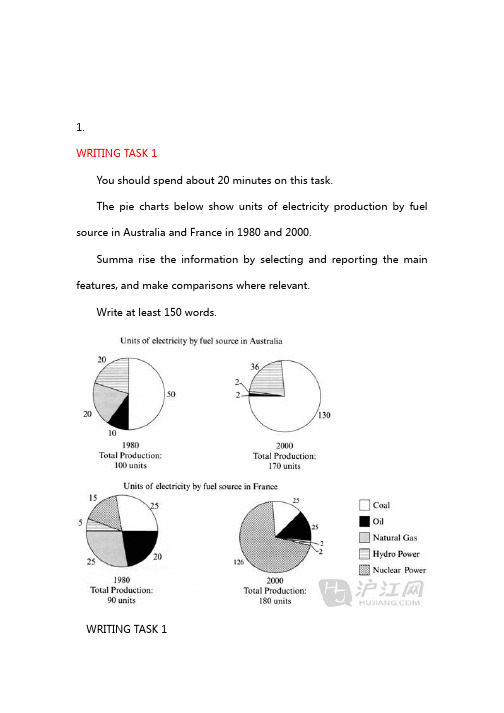
1.WRITING TASK 1You should spend about 20 minutes on this task.The pie charts below show units of electricity production by fuel source in Australia and France in 1980 and 2000.Summa rise the information by selecting and reporting the main features, and make comparisons where relevant.Write at least 150 words.WRITING TASK 1You should spend about 20 minutes on this task.The pie charts below show units of electricity production by fuel source in Australia and France in 1980 and 2000.Summa rise the information by selecting and reporting the main features, and make comparisons where relevant.Write at least 150 words.he charts compare the sources of electricity in Australia and France in the years 1980 and 2000. Between these years electricity production almost doubled, rising from 100 units to 1970 in Australia, and from 90 to 180 units in France.In 1980 Australia used coal as the main electricity source (50 units) and the remainder was produced from natural gas, hydro power (each producing 20 units) and oil (which produced only 10 units). By 2000, coal had become the fuel for more than 75% of electricity produced and only hydro continued to be another significant source supplying approximately 20%.In contrast, France used coal as a source for only 25 units of electricity in 1980, which was matched by natural gas. The remaining 40 units were produced largely from oil and nuclear power, with hydro contributing only 5 units. But by 2000 nuclear power, which was not used at all in Australia, had developed into the main source, producing almost 75% of electricity, at 126 units, while coal and oil together produced only50 units. Other sources were no longer significant.Overall, it is clear that by 20000 these two countries relied on different principal fuel sources: Australia relied on coal and France on nuclear power.这些图比较了1980年和2000年澳大利亚和法国的电的来源。
2023年英语雅思写作模拟题

2023年英语雅思写作模拟题In recent years, the IELTS Writing test has become an essential component for those seeking to study or work abroad. As the demand for English proficiency continues to rise, mastering the skills required for the IELTS Writing task is crucial. In this article, we will simulate a 2023 IELTS Writing test and provide guidance and tips on how to approach it effectively.Introduction:The IELTS Writing test is designed to assess a candidate's ability to express themselves coherently and effectively in written English. It consists of two tasks: Task 1, which focuses on describing and interpreting visual information, and Task 2, which requires writing an essay response on a given topic. Let's proceed to discuss each task in detail.Task 1: Describing Visual InformationFor this task, candidates are presented with a graph, chart, table, or diagram and are expected to summarize and interpret the information. In the exam, candidates should write a minimum of 150 words. To successfully accomplish this, it is important to adhere to the following structure:1. Introduction: Begin by paraphrasing the provided question and providing an overview of the visual information.2. Body: Describe the key features, trends, and make relevant comparisons.3. Conclusion: Summarize the key points and draw a concise conclusion based on the visual information.During the exam, remember to use a wide range of vocabulary, complex sentence structures, and appropriate connectors to enhance your writing.Task 2: Essay WritingThe second task requires candidates to write an essay response on a given topic. The essay should be a minimum of 250 words and should follow a clear structure:1. Introduction: Present the topic and provide a thesis statement that outlines your opinion or stance on the subject.2. Body: Develop your argument by providing supporting points and evidence. Dedicate one paragraph to each main idea and ensure clear topic sentences and transitions between paragraphs.3. Counter-Argument: Address a counter-argument to demonstrate a balanced approach.4. Conclusion: Recapitulate your main points and restate your opinion or provide a concluding thought.To achieve a high band score, effective use of vocabulary, proper grammar and sentence structures, and a coherent argument are necessary. Avoid repetitive language and be mindful of time management to allocate sufficient time for proofreading and editing.Exam Strategies:To ensure success in the IELTS Writing test, consider the following strategies:1. Time Management: Allocate enough time for both tasks, as both contribute equally to your final score. Aim to spend around 20 minutes on Task 1 and 40 minutes on Task2.2. Planning: Dedicate a few minutes to brainstorm and outline your essay before you start writing. This will help you structure your thoughts and ideas effectively.3. Lexical Resource: Incorporate a wide range of vocabulary and utilize appropriate synonyms throughout your writing to showcase your language proficiency.4. Coherence and Cohesion: Use appropriate transition words and phrases to create a logical flow and ensure that your ideas are connected smoothly.5. Grammar and Mechanics: Pay attention to sentence structures, grammar usage, and punctuation. Careful proofreading will help you identify and rectify any errors.Conclusion:Preparing for the IELTS Writing test can be a challenging yet rewarding experience. By practicing regularly, familiarizing yourself with the test format, and implementing effective strategies, you can improve your performance and achieve your desired band score. Remember to allocate sufficient time for practice and utilize available resources, such as sample questions and model answers, to enhance your skills. Good luck in your IELTS journey!。
雅思写作例题TASK 1-28

IELTS Writing TASK 1 28
Other sports such as tennis, basketball and martial arts have lower levels of popularity, and a significant percentage of boys and girls say they enjoy sports not referred to on the chart.
IELTS Writing TASK 1 28
You should spend about 20 minutes on this task.
The chart below gives information about the most common sports played in New Zealand in 2002.
(153 words)
Summarise the information by selecting and reporting the main features, and make comparisons where relevant.
The bar graph provides information about the most Common sports played in New Zealand in 2002. It gives figures for both boys and girls and clearly shows that their participation in sports is fairly equal. However, their sporting preferences tend to be different. According to the graph, the most popular sport among girls is netball, with participation rates reaching 25 per cent. A similar percentage of boys prefer soccer, which is clearly their favourite sport. Ten per cent of boys also enjoy playing cricket but hardly any girls take part in this game. While swimming is popular among both boys and girls, fewer boys participate in this sport - about 13 per cent compared to approximateቤተ መጻሕፍቲ ባይዱy 22 per cent of girls.