雅思写作小作文范文 雅思写作柱状图bar chart 美国心脏病患者数量.doc
雅思写作-小作文范文-柱状图
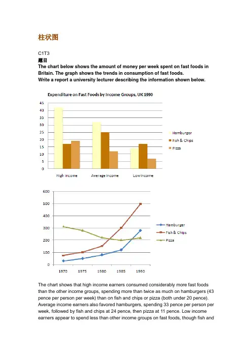
柱状图C1T3题目The chart below shows the amount of money per week spent on fast foods in Britain. The graph shows the trends in consumption of fast foods.Write a report a university lecturer describing the information shown below.The chart shows that high income earners consumed considerably more fast foods than the other income groups, spending more than twice as much on hamburgers (43 pence per person per week) than on fish and chips or pizza (both under 20 pence). Average income earners also favored hamburgers, spending 33 pence per person per week, followed by fish and chips at 24 pence, then pizza at 11 pence. Low income earners appear to spend less than other income groups on fast foods, though fish andchip remains their most popular fast food, followed by hamburgers and then pizza. From the graph we can see that in 1970, fish and chips were twice as popular as burgers, pizza being at that time the least popular fast food. The consumption of hamburgers and pizza has risen steadily over the 20 year period to 1990 while the consumption of fish and chips has been in decline over that same period with a slight increase in popularity since 1985.分析:题目The chart below shows the amount of money per week spent on fast foods in Britain. The graph shows the trends in consumption of fast foods.两句话,两个图第一段The chart shows that high income earners consumed considerably more fast foods than the other income groups, spending more than twice as much on hamburgers (43 pence per person per week) than on fish and chips or pizza (both under 20 pence).•说明了高收入人群的两个特点,第一是消耗快餐最多,第二是人群中hamburger, fish and chips, pizza的特点•spending more than twice as much on hamburgers than on fish and chip and chips or pizza 这是一句令人费解的句子,含义应为“消耗的汉堡是薯片或匹萨的两倍多”,应用的句型应当为典型的表示倍数关系的句型“n times as…as”,比如✓This airplane flies two times as fast as that one. 这家飞机的飞行速度是那架的两倍。
雅思写作小作文范文 雅思写作柱状图bar chart 大胃王比赛.doc
雅思写作小作文范文雅思写作柱状图bar chart 大胃王比赛今天我们雅思写作小作文范文的文章来研究下柱状图bar chart。
这次的图表很有意思,是某地举办的吃热狗大赛。
选手要在15分钟内尽可能的吃热狗,数量多者获胜。
图表统计了从1980年到2010年获胜者的信息,包括其记录和国籍。
小编搜集了一篇相关的考官范文,以供大家参考。
雅思写作小作文题目雅思写作小作文范文The bar chart shows the number of hot dogs and buns eaten in 15 minutes by the winners of ‘Nathan’s Hot Dog Eating Contest’ in Brooklyn, the USA between 1980 and 2010.柱状图展示了从1980年到2010年期间在美国布鲁克林举办的吃热狗大赛中获胜者在15分钟内吃掉的热狗和圆饼数量。
It is noticeable that the number of hot dogs and buns eaten by winners of the contest increased dramatically over the period shown. The majority of winners were American or Japanese, and only one woman had ever won the contest.很明显,获胜者所吃的热狗和圆饼数量在所展示的时间里急剧上升。
大部分获胜者为美国人或日本人。
只有一位女性曾经赢得过这个比赛。
Americans dominated the contest from 1980 to 1996, and the winning number of hot dogs and buns consumed rose from only 8 to around 21 during that time. 1983 and 1984 were notable exceptions to the trend for American winners. In 1983 a Mexican won the contest after eating 19.5 hot dogs, almost double the amount that any previous winner had eaten, and 1984 saw the only female winner, Birgit Felden from Germany.美国人在1980年到1996年期间主导该比赛。
雅思英语柱状图作文
雅思英语柱状图作文Title: Analyzing the Trends in [Your Topic] Through a Bar Chart.In this essay, we will delve into the intricacies of [Your Topic], examining the patterns and trends revealed through a bar chart. The chart presents valuable insights into the distribution and comparison of various categories, highlighting significant differences and similarities across the dataset.Firstly, let's take a moment to appreciate the simplicity yet effectiveness of the bar chart. It's a popular visualization tool that enables quickidentification of patterns and trends. In this case, the chart effectively illustrates the distribution of [specific data points] across [different categories or time periods]. The vertical bars represent the quantitative values, while the horizontal axis labels provide context and categorization.At first glance, the chart reveals some intriguing patterns. The tallest bar, representing [specific category or data point], stands out as the most prominent,indicating a significant concentration of [specific value or trend]. This is particularly noteworthy given the significant gap between this bar and the others, suggesting a clear leader in the dataset.Contrastingly, the shorter bars towards the left of the chart indicate lower concentrations or values in those categories. It's interesting to note that even though these categories may not be as dominant, they still play an important role in the overall distribution. They contribute to the diversity and balance of the dataset, providing valuable insights into the nuances of [Your Topic].When comparing the bars side by side, we can observe patterns and trends across categories. For instance, the steady increase in the heights of bars from left to right suggests a gradual growth or increase in [specific value or trend] over time. Conversely, a sudden dip in the barheights might indicate a sudden change or event that affected the distribution.The spacing between the bars also provides valuable insights. Wider gaps suggest larger disparities between categories, indicating that certain categories are more distinct and separate from others. Narrower gaps, on the other hand, suggest closer relationships or similarities between categories, indicating a more uniform distribution across the dataset.The color scheme chosen for the chart further enhances its readability and visual appeal. The contrasting colors make it easy to distinguish between different categories, while the neutral background does not distract from the main focus of the chart. This attention to detail ensures that the chart is both visually appealing and functionally effective.In conclusion, the bar chart presents a comprehensive overview of [Your Topic], revealing patterns and trendsthat would be difficult to discern from raw data. It allowsus to quickly identify the most prominent categories and values, while also providing insights into the relationships and similarities between different datasets. This analysis is crucial for understanding the nuances of [Your Topic] and making informed decisions based on empirical evidence.Moreover, the chart encourages further exploration and analysis. It acts as a starting point for deeper investigations into the factors that influence the distribution and trends observed. By examining the chart closely and asking pertinent questions, we can gain a deeper understanding of the underlying mechanisms and factors that shape [Your Topic].In summary, the bar chart is a powerful tool for visualizing and analyzing data. It enables us to identify patterns and trends, compare categories, and make informed decisions based on empirical evidence. By leveraging this tool effectively, we can gain a deeper understanding of [Your Topic] and use this knowledge to guide our future actions and decisions.。
雅思写作小作文范文雅思写作柱状图barchart医院急救对象.doc
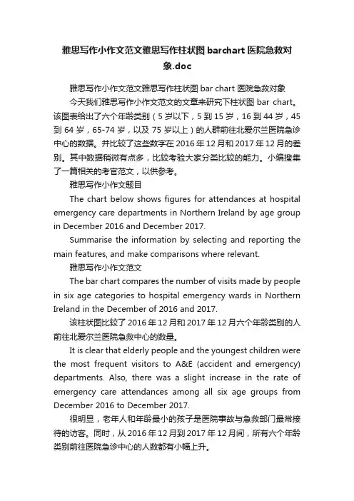
雅思写作小作文范文雅思写作柱状图barchart医院急救对象.doc雅思写作小作文范文雅思写作柱状图bar chart 医院急救对象今天我们雅思写作小作文范文的文章来研究下柱状图bar chart。
该图表给出了六个年龄类别(5岁以下,5到15岁,16到44岁,45到64岁,65-74岁,以及75岁以上)的人群前往北爱尔兰医院急诊中心的数据。
并比较了这些数字在2016年12月和2017年12月的差别。
其中数据稍微有点多,比较考验大家分类比较的能力。
小编搜集了一篇相关的考官范文,以供参考。
雅思写作小作文题目The chart below shows figures for attendances at hospital emergency care departments in Northern Ireland by age group in December 2016 and December 2017.Summarise the information by selecting and reporting the main features, and make comparisons where relevant.雅思写作小作文范文The bar chart compares the number of visits made by people in six age categories to hospital emergency wards in Northern Ireland in the December of 2016 and 2017.该柱状图比较了2016年12月和2017年12月六个年龄类别的人前往北爱尔兰医院急救中心的数量。
It is clear that elderly people and the youngest children were the most frequent visitors to A&E (accident and emergency) departments. Also, there was a slight increase in the rate of emergency care attendances among all six age groups from December 2016 to December 2017.很明显,老年人和年龄最小的孩子是医院事故与急救部门最常接待的访客。
学生近视情况柱状图英语作文
学生近视情况柱状图英语作文In recent years, the issue of student nearsightedness has garnered increasing attention. This phenomenon is not just limited to a particular region or age group but is widespread across the globe, affecting children and adolescents alike. To gain a deeper understanding of this concerning trend, let's delve into a bar chart that illustrates the prevalence of nearsightedness among students in different age groups.The bar chart, labeled "Prevalence of Nearsightedness Among Students," shows the percentage of students affected by nearsightedness in four distinct age groups: 6-8 years old, 9-11 years old, 12-14 years old, and 15-18 years old. The chart is divided into two main categories: boys and girls, with each bar representing the percentage of students with nearsightedness in the corresponding age and gender group.At first glance, it is evident that nearsightedness is a widespread issue among students, affecting both boys and girls across all age groups. However, a closer look reveals some interesting patterns.In the younger age groups of 6-8 and 9-11 years old, the percentage of boys with nearsightedness is slightly higher than that of girls. This could be attributed to several factors, such as boys spending more time outdoors playing sports or engaging in other active activities that may expose them to more risk factors for nearsightedness, such as prolonged close-up activities or poor lighting conditions.As students enter the older age groups of 12-14 and 15-18 years old, the trend reverses, with a higher percentage of girls experiencing nearsightedness. This shift could be explained by the hormonal changes girls experience during puberty, which may affect eye development and increase the risk of nearsightedness. Additionally, girls may be more prone to spending extended periods of time on electronic devices, such as computers or smartphones, which can contribute to eye strain and, ultimately, nearsightedness. Across all age groups, it's worth noting that the overall percentage of students with nearsightedness is on the rise. This upward trend is particularly concerning as it indicates that more students are being affected by thisvision condition. Several factors could be driving this trend, including increasing screen time, decreased outdoor activities, and poor eye care habits.The findings from this bar chart analysis highlight the need for a comprehensive approach to addressing student nearsightedness. Prevention strategies should target both boys and girls, with a focus on promoting healthy eye care habits, limiting screen time, and encouraging outdoor activities. Additionally, regular eye screenings should be conducted to identify and monitor nearsightedness early on, enabling timely intervention and management.In conclusion, the prevalence of student nearsightedness is a serious issue that requires urgent attention. By understanding the patterns and trends revealed through bar chart analysis, we can develop targeted interventions and strategies to mitigate this growing problem and promote better eye health among students.**学生近视情况的柱状图分析**近年来,学生近视问题备受关注。
雅思写作小作文范文 雅思写作柱状图bar chart 奖牌数量.doc
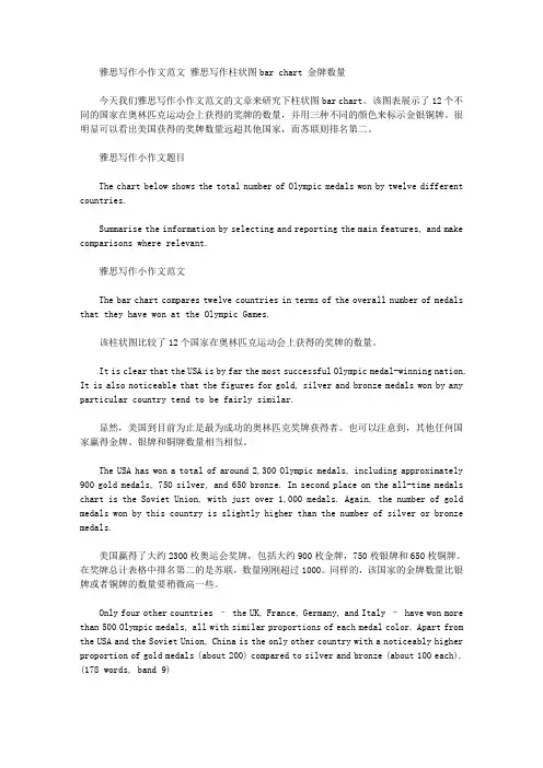
雅思写作小作文范文雅思写作柱状图bar chart 金牌数量今天我们雅思写作小作文范文的文章来研究下柱状图bar chart。
该图表展示了12个不同的国家在奥林匹克运动会上获得的奖牌的数量,并用三种不同的颜色来标示金银铜牌。
很明显可以看出美国获得的奖牌数量远超其他国家,而苏联则排名第二。
雅思写作小作文题目The chart below shows the total number of Olympic medals won by twelve different countries.Summarise the information by selecting and reporting the main features, and make comparisons where relevant.雅思写作小作文范文The bar chart compares twelve countries in terms of the overall number of medals that they have won at the Olympic Games.该柱状图比较了12个国家在奥林匹克运动会上获得的奖牌的数量。
It is clear that the USA is by far the most successful Olympic medal-winning nation. It is also noticeable that the figures for gold, silver and bronze medals won by any particular country tend to be fairly similar.显然,美国到目前为止是最为成功的奥林匹克奖牌获得者。
也可以注意到,其他任何国家赢得金牌、银牌和铜牌数量相当相似。
The USA has won a total of around 2,300 Olympic medals, including approximately 900 gold medals, 750 silver, and 650 bronze. In second place on the all-time medals chart is the Soviet Union, with just over 1,000 medals. Again, the number of gold medals won by this country is slightly higher than the number of silver or bronze medals.美国赢得了大约2300枚奥运会奖牌,包括大约900枚金牌,750枚银牌和650枚铜牌。
(完整版)雅思写作-小作文范文-柱状图
柱状图C1T3题目The chart below shows the amount of money per week spent on fast foods in Britain. The graph shows the trends in consumption of fast foods.Write a report a university lecturer describing the information shown below.The chart shows that high income earners consumed considerably more fast foods than the other income groups, spending more than twice as much on hamburgers (43 pence per person per week) than on fish and chips or pizza (both under 20 pence). Average income earners also favored hamburgers, spending 33 pence per person per week, followed by fish and chips at 24 pence, then pizza at 11 pence. Low income earners appear to spend less than other income groups on fast foods, thoughfish and chip remains their most popular fast food, followed by hamburgers and then pizza.From the graph we can see that in 1970, fish and chips were twice as popular asburgers, pizza being at that time the least popular fast food. The consumption of hamburgers and pizza has risen steadily over the 20 year period to 1990 while the consumption of fish and chips has been in decline over that same period with a slight increase in popularity since 1985.分析:题目The chart below shows the amount of money per week spent on fast foods inBritain. The graph shows the trends in consumption of fast foods.两句话,两个图第一段The chart shows that high income earners consumed considerably more fastfoods than the other income groups, spending more than twice as much onhamburgers (43 pence per person per week) than on fish and chips or pizza(both under 20 pence).说明了高收入人群的两个特点,第一是消耗快餐最多,第二是人群中hamburger, fish and chips, pizza的特点spending more than twice as much on hamburgers than on fish and chip and chips or pizza 这是一句令人费解的句子,含义应为“消耗的汉堡是薯片或匹萨的比如两倍多”,应用的句型应当为典型的表示倍数关系的句型“n times as…as”,? This airplane flies two times as fast as that one. 这家飞机的飞行速度是那架的两倍。
柱形图范文雅思写作柱状图小作文写
柱形图范文雅思写作柱状图小作文写.在雅思小作文的图表中,柱状图的出现频率非常高,而且相对来讲还是比较难的,这是因为柱状图的分析比较复杂.所以大家掌握一些雅思小作文柱状图的写作技巧还是很有必要的.柱状图的写作重点无非就是数据的描述,一般可以分为两种情况,就是根据每个组里的柱子的个数,有单柱子和多柱子.第一种情况,单柱子.这种情况好写,就是分别说一下就可以了,如果是以时间为横轴的话,就写一下趋势,如果是以组为横轴,则直接写.第二种情况,多柱子.这个情况比较麻烦,数据少比如每个组里就两个柱子,可以全写,如果数据比较多,比如每个组里有六个柱子,那就取几个最大或者最小的就行,也就是说在比较的过程中想要拿到想要的结果就要找对比鲜明的那一对就对了.把对比最鲜明的几个柱子描述清楚,其他的可以一带而过.注意:对于柱状图,数据太多,则起点,结点和数量相等点必写,倍数点必写.这是因为这些点都是非常有代表性的点,分析这些点就可以基本看出这些柱状图分析的主要结果了.以上就是关于柱状图的雅思小作文的写作技巧,而且这是最简单的技巧介绍,最适合大家记忆和应用的了.看了技巧之后,大家想要真正的掌握就必须得花一定的时间来练习了.通过上面的雅思小作文柱状图的技巧介绍,大家在写作雅思小作文的时候,可以根据不同图表的信息量的大小,重要信息点的安排等等内容进行适当的应用和借鉴,这样雅思写作柱状图小作文获得高分也就不是什么难事了.描述图表时,先把你从图中获取的东西写下来,再用图中的信息去证实它。
The bar chart shows the increase in the number of people who join in governmental employee entrance exam. Precisely, it increased steadily from 300,000 in xx to 1,030,000 by the year xx.下面为大家的是关于雅思小作文图表信息的表达方式和结构安排。
英语考试作文-10日雅思写作小作文真题范文:柱状图
英语考试作文10日雅思写作小作文真题范文:柱状图为大家带来3月10日场的雅思写作小作文真题及范文。
本场雅思小作文题目是:The chart below shows the average snow depth in Canada during the 6 months. Summarize the information by selecting and reporting the main features,and make comparisons where relevant.请看范文详情:雅思写作小作文范文The bar chart provided gives information about the changes in the snow precipitations measured in millimeters monthly (Nov. to Apr.) in three separate years.柱状图提供的信息是在3年的时间内,每月(11月至4月)的雪量变化的变化情况。
From an overall view, the depths of snow increased from late winter to early spring generally except in year three, meanwhile, this place suffered the heaviest snowstorm in the year two, especially in April.从整体上看,除第三年以外,冰雪的深度从晚冬到早春都有所增加,同时,这一地区遭遇了今年最严重的暴风雪,尤其是在4月。
Specifically, in year one and two, in November, the accumulated snow in this place was 100 millimeters (mm) and over 150 mm. both figures rose significantly during the next five months, peaking in April at 300 mm and 450mm finally.具体来说,在1、2年的11月,这个地方的积雪量是100毫米(mm)和150毫米,这两个数字在接下来的5个月里都有明显的上升,4月份达到了300毫米和450毫米的峰值。
雅思图表范文
雅思图表范文The bar chart provides information about the percentage of different age groups in the population of Australia in the years 1990, 2000, and a projection for 2030. Overall, it is clear that the proportion of people aged 65 and above is expected to increase significantly, while the younger age groups will see a decrease.In 1990, the largest percentage of the population was between the ages of 30 and 44, with 27%. This was followed by the 0-14 age group, which accounted for 25% of the population. People aged 45-64 made up 22%, while those aged 65 and above were the smallest group with only 11%. Lastly, individuals aged 15-29 accounted for 15% of the total population.Moving forward to 2000, a slight decline can be observed in the younger age groups. The percentage of people between the ages of 0-14 decreased to 23%, while those aged 15-29 dropped to 14%. On the other hand, the proportion of individuals aged 30-44 remained stable at 27%. The largest increase was seen in the 45-64 age group, which grew to 28%. The percentage of people aged 65 and above also increased slightly to 8%.According to the projection for 2030, significant changes in the age distribution are expected. The 0-14 age group is predicted to decrease to 18%, while the 15-29 age group is forecast to decline to 13%. The largest increase is anticipated in the 65 and above age group, which is projected to reach 18% from the current 8%. Additionally, the percentage of people aged 30-44 is expected to stay the same at 27%, while the 45-64 age group is predicted to decrease to 24%.In conclusion, the bar chart illustrates a shift in the age distribution of the Australian population from 1990 to 2030. A decrease in the younger age groups is expected, while the older population is projected to increase significantly.。
- 1、下载文档前请自行甄别文档内容的完整性,平台不提供额外的编辑、内容补充、找答案等附加服务。
- 2、"仅部分预览"的文档,不可在线预览部分如存在完整性等问题,可反馈申请退款(可完整预览的文档不适用该条件!)。
- 3、如文档侵犯您的权益,请联系客服反馈,我们会尽快为您处理(人工客服工作时间:9:00-18:30)。
雅思写作小作文范文雅思写作柱状图bar chart 美国心脏病患者数量
今天我们雅思写作小作文范文的文章来研究下柱状图bar chart。
该图表以每千人为单位,给出了美国男性居民和女性居民在不同年龄段患有心脏病的人数。
图中数据比较少,男性与女性之间的差别也很明显,十分容易进行分组比较。
小编搜集了一篇相关的高分范文,以供大家参考。
雅思写作小作文题目
The chart below shows information about Heart Attacks by Ages and Genders in the USA.
Summarise the information by selecting and reporting the main features, and make comparisons where relevant.
雅思写作小作文范文
The chart compares the number of people (in thousands) having heart attacks per year in the USA based on their age and gender. As a general trend, it is observed that more men suffer from heart attacks compared to women in all age groups.
该柱状图按照年龄和性别比较了美国每年心脏病患者的数量。
从整体的趋势来看,在所有年龄段中,遭受心脏病困扰的男性都要多余女性。
It is seen in the chart that the risk of having a heart attack among men increases manifold after the age of 45. As compared to 123,000 men having a heart attack in the age group of 29-44, there are 424,000 and 440,000 men who suffer from heart attacks in the age group of 45-64 and 65+ respectively. This article is from Laokaoya website. Only 3000 women suffer from heart attacks under the age of 45. The risk increases in the age group of 45-64 and reaches almost the similar rate as of men after the age of 65.
从图表中可以看出,男性患上心脏病的风险在45岁之后大幅上升。
29岁到44岁这一年龄段中,患有心脏病的男性有123000人。
而在45岁到64岁,以及64岁以上的年龄段中,男性心脏病患者的数量则分别为424000和440000人。
相比之下,45岁以下的女性中,只有3000人遭受心脏病的困扰。
该比例在45岁到64岁这一年龄段中大幅上升,并在65岁以上的人群中,达到与男性几乎相同的水平。
In summary, men are at a greater risk of having heart attacks in all age groups and the risk increases for both men and women after the age of 65.
总的来说,男性在所有年龄段中患上心脏病的可能性都要高一些。
与此同时,65岁以后,无论是男性还是女性患有心脏病的风险都大幅增加。
雅思写作小作文高分范文,快速提升写作成绩。