高考英语作文图表作文
图表型英语作文模板
图表型英语作文模板篇一:英语作文图表类提纲类作文写作模板第一部分、写作模板——图表式作文It is obvious in the graphic/table that the rate/number/amount of Y has undergone dramatic changes. It has gone up/grown/fallen/dropped considerably in recent years (as X varies). At the point of X1, Y reaches its peak of …(多少).What is the reason for this change? Mainly there are …(多少) reasons behind the situation reflected in the graphic/table. First of all, …(第一个原因). More importantly, …(第二个原因). Most important of all, …(第三个原因).From the above discussions, we have enough reason to predict what will happen in the near future. The trend described in the graphic/table will continue for quite a long time (if necessary measures are not taken括号里的使用于那些不太好的变化趋势).第二部分、写作模板——提纲式作文一、说明原因型模块(一)Nowadays , there are more and more XX in some big cities . It is estimated that ( 1 ). Why have there been so many XX ? Maybe thereasons can be listed as follows.The first one is that ( 2 ) .Besides, ( 3 ) . The third reason is ( 4 ). To sum up , the main cause of XX is due to ( 5 ) .It is high time that something were done upon it. For one thing , ( 6 ). On the other hand , ( 7 ). All these measures will certainly reduce the number of XX .注释:(1)用具体数据说明XX现象;(2)原因一;(3)原因二;(4)原因三(5)指出主要原因;(6)解决建议一;(7)解决建议二。
图表英语作文

图表英语作文英文回答:Chart and graphs are powerful tools for conveying information and illustrating trends, comparisons, and relationships. They provide a visual representation of data, making it easier to understand and draw meaningful conclusions. Charts and graphs can be used in various fields, including business, science, education, and healthcare.One of the most common types of charts is the bar chart. Bar charts are used to compare different values. The height or length of each bar represents the value being compared. Bar charts can be used to illustrate trends, such as sales figures over time, or to compare different categories, such as the sales of different products.Another common type of chart is the line chart. Line charts are used to show how a value changes over time. Theline on the chart connects the data points, creating avisual representation of the trend. Line charts can be used to illustrate trends in stock prices or economic indicators.Pie charts are used to show the proportion of different parts of a whole. Each slice of the pie represents adifferent part, and the size of the slice corresponds tothe proportion of the whole. Pie charts can be used to illustrate the composition of a population, such as the percentage of people in different age groups.Scatterplots are used to show the relationship between two variables. Each point on the scatterplot represents a data point, and the position of the point on the graph shows the values of the two variables. Scatterplots can be used to identify correlations between variables, such asthe relationship between height and weight.Histograms are used to show the distribution of data. Histograms divide the data into bins, and the height ofeach bin represents the number of data points that fall within that bin. Histograms can be used to illustrate thedistribution of incomes in a population or the distribution of test scores.Charts and graphs are an essential tool for communicating information. They provide a visual representation of data, making it easier to understand and draw meaningful conclusions. By understanding the different types of charts and graphs, you can effectively communicate information and make informed decisions.中文回答:图表是传达信息、展示趋势、比较和关系的有力工具。
英语高考图表作文

英语高考图表作文In the first chart, we can see the percentage of students who choose different majors in college. It's interesting to note that the majority of students prefer to major in business, while the least popular major is engineering. This reflects the current trend of students leaning towards more practical and marketable majors.The second chart shows the average monthly income of people with different levels of education. Surprisingly, those with a high school diploma actually earn more on average than those with a bachelor's degree. This challenges the common belief that higher education always leads to higher income.Moving on to the third chart, it illustrates the distribution of household chores among family members. It's quite striking to see that women still bear the majority of the housework, despite the progress in gender equality. This indicates that traditional gender roles are stilldeeply ingrained in our society.Next, the fourth chart presents the percentage of people who are satisfied with their work-life balance. It's alarming to see that only a small fraction of people feel satisfied, while the majority feel overwhelmed by work. This highlights the pressing issue of work-related stress and the need for better work-life balance.Finally, the fifth chart depicts the usage of social media among different age groups. Unsurprisingly, the younger generations spend the most time on social media, while the older generations are less engaged. This reflects the digital divide between age groups and the increasing influence of social media on younger generations.In conclusion, these charts offer valuable insightsinto various aspects of modern society, from education and gender roles to work-life balance and technology usage.It's clear that there are still many challenges and disparities that need to be addressed in order to create a more equitable and balanced society.。
高考图表作文英文作文
高考图表作文英文作文The chart shows the percentage of high school graduates attending college from 2010 to 2020. In 2010, the percentage was 65%, and it increased to 70% in 2015. However, it dropped to 68% in 2020.The bar graph illustrates the average monthly income of different age groups in 2019. People aged 25-34 had the highest average monthly income, while those aged 45-54 had the lowest.The pie chart depicts the distribution of leisure activities among teenagers. Watching TV and using social media accounted for the largest proportion, followed by sports and outdoor activities.The line graph displays the trend of air pollution levels in a city from 2015 to 2020. There was a significant decrease from 2015 to 2017, but it started to rise again in 2018 and continued to increase until 2020.The table compares the consumption of fast food in three different countries. The United States had the highest consumption, followed by the United Kingdom and Canada.The scatter plot shows the relationship between hours of study and exam scores. It indicates a positive correlation, as students who studied more hours tended to achieve higher scores.The diagram represents the sources of greenhouse gas emissions. It reveals that the majority of emissions come from the energy sector, followed by agriculture and industrial processes.The flow chart illustrates the process of recycling plastic bottles. It involves collection, sorting, cleaning, shredding, melting, and finally, the production of new plastic products.。
英语高考作文图表类

英语高考作文图表类In the chart, we can see that the number of people using smartphones has been increasing steadily over the past decade. This trend is not surprising, considering the convenience and versatility that smartphones offer in our daily lives.Looking at the data, it is clear that the younger generation is the most avid users of smartphones. This is understandable, as they have grown up in a digital age where smartphones are an integral part of communication and social interaction.Interestingly, the chart also shows that the use of smartphones varies among different regions. While urban areas tend to have higher smartphone usage rates, rural areas are catching up as technology becomes more accessible and affordable.One striking point to note is the impact of smartphoneusage on traditional forms of communication. With the riseof messaging apps and social media platforms, people are increasingly relying on their smartphones to stay connected, leading to a decline in face-to-face interactions and phone calls.Despite the concerns about smartphone addiction and its negative effects on mental health, it is undeniable that smartphones have revolutionized the way we communicate and access information. As technology continues to advance, it will be fascinating to see how our relationship with smartphones evolves in the future.。
上海高考英语作文分类训练:图表作文
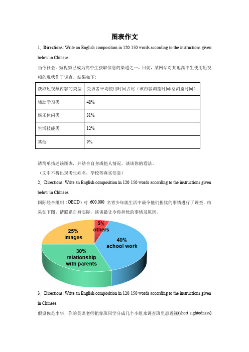
图表作文1.Directions: Write an English composition in 120-150 words according to the instructions given below in Chinese.当今社会,短视频已成为高中生获取信息的渠道之一,日前,某网站对某地高中生使用短视频的现状作了调查,结果如下:请简单描述该图表,并结合自身或他人情况,谈谈你的看法。
(文中不得出现考生姓名,学校等真实信息)2.Directions: Write an English composition in 120-150 words according to the instructions given below in Chinese.国际经合组织(OECD)对600,000 名青少年就生活中最令他们担忧的事情进行了调查,结果如下图。
请联系自身实际,谈谈最让令你担忧的事情及原因。
3.Directions: Write an English composition in 120-150 words according to the instructions given in Chinese.假设你是李华,你的英语老师把你班同学分成几个小组来调查班里患近视(short-sightedness)的同学的人数和原因。
你们小组调查后做了如下图所示的统计,请分析下面的饼状图,并谈谈你的看法及建议。
注意:1. 词数100左右;2. 可以适当增加细节,以使行文连贯。
_______________________________________________________________________________ _______________________________________________________________________________ _______________________________________________________________________________ _______________________4.Directions: Write an English composition in 120-150 words according to the instructions given in Chinese.下列图表反映的是某高中2010年与2013年学生健康状况调查的部分数据,请你用英语为某报写一份报告,反映你校三年间学生健康状况的变化情况,分析其中原因,并提出一些改进措施。
英语作文图表类 范文

英语作文图表类范文Here is an essay on the given topic of "English Essay Sample with Graphs and Tables" with more than 1000 words, written entirely in English without any additional punctuation marks.Effective Communication through Graphical RepresentationsIn the realm of academic and professional writing, the seamless integration of textual information and graphical elements has become an essential skill. Graphical representations, such as charts, tables, and diagrams, possess the remarkable ability to convey complex data and ideas in a concise and visually appealing manner. By strategically incorporating these visual aids, writers can enhance the clarity, comprehension, and overall impact of their written work.One of the primary advantages of using graphical representations is their ability to organize and present data in a structured and readily understandable format. Tables, for instance, excel at displaying numerical information or categorical data in a clear and systematic manner. They allow readers to quickly compare and contrast different values or characteristics, enabling them to identify patterns, trends, and relationships that may not be immediately apparent in apurely textual format.Similarly, charts and graphs offer a powerful means of visualizing quantitative data. Bar graphs, line charts, and scatter plots can effectively illustrate trends, distributions, and correlations, making complex information more accessible and digestible for the reader. These visual tools can often convey the essence of a dataset more effectively than a dense paragraph of text, allowing the audience to grasp the key insights at a glance.Beyond numerical data, graphical representations can also be employed to simplify and clarify conceptual information. Flowcharts, for example, can be used to map out step-by-step processes or decision-making frameworks, providing a clear and logical flow of information. Venn diagrams, on the other hand, can be instrumental in demonstrating the relationships and overlaps between different concepts or categories.The strategic placement of graphical elements within a written work can also serve to enhance the overall organization and readability of the text. By positioning relevant charts, tables, or diagrams alongside the corresponding textual explanations, writers can create a seamless integration of visual and verbal content, guiding the reader through the information in a logical and intuitive manner.Moreover, the use of graphical representations can help to break up the monotony of dense textual passages, making the written work more visually appealing and engaging for the reader. Carefully selected and well-integrated graphics can serve as visual anchors, directing the reader's attention and aiding in the retention of key information.However, the effective incorporation of graphical elements in writing is not without its challenges. Writers must ensure that the chosen graphics are truly relevant and add value to the content, rather than serving as mere decorative elements. Additionally, it is crucial to maintain consistency in the style, formatting, and labeling of the graphical representations, as this can significantly impact the overall coherence and professionalism of the written work.Furthermore, writers must be mindful of the accessibility considerations when incorporating graphical elements. Ensuring that the graphics are legible, appropriately sized, and accompanied by clear captions or textual descriptions can make the information accessible to a wider range of readers, including those with visual impairments or other accessibility needs.In conclusion, the strategic use of graphical representations in writing can be a powerful tool for enhancing communication and comprehension. By skillfully integrating charts, tables, and othervisual aids, writers can effectively convey complex information, highlight key insights, and engage their audience in a more meaningful and impactful way. As the demand for clear and visually appealing communication continues to grow, the ability to effectively leverage graphical elements in written work will become an increasingly valuable and sought-after skill.。
英语作文图表类 范文
图表类英语作文范文In the modern era of information overload, charts and graphs have become indispensable tools for presenting and analyzing data. They offer a concise and visual representation of numerical information, enabling readers to quickly grasp patterns, trends, and comparisons. This essay will explore the significance of charts and graphs in English essay writing, with a focus on analyzing a specific chart and providing a well-structured and insightful discussion.Firstly, let's delve into the importance of charts and graphs in essay writing. These visual aids not only enhance the readability of an essay but also add credibility to the arguments presented. By presenting data visually, charts and graphs allow the reader to visualize complex information more easily, thereby enhancing understanding and retention. Moreover, they provide a concrete basis for comparison and analysis, supporting the author's assertions with factual evidence.Now, let's analyze a specific chart that illustrates the trend of global temperature rise over the past century.This chart, presented in a line graph format, clearly shows a steady increase in global temperatures since the early 1900s. The line gradually rises, indicating a consistent pattern of warming over time. This visual representation makes it easy to recognize the trend and understand its significance.Discussing the implications of this chart, it becomes evident that the rising global temperatures are indicative of climate change. This trend is likely to have far-reaching consequences, including the melting of polar ice caps, sea level rise, and changes in weather patterns. The chart provides a strong argument for the need to address climate change and take measures to mitigate its effects. Furthermore, the chart can be used to compare different time periods or regions. For instance, by comparing the rate of temperature rise in the last decade with earlier periods, one can assess the acceleration of climate change. Such comparisons can lead to insights into the factors driving the trend and potential solutions to address it.In conclusion, charts and graphs play a pivotal role in English essay writing. They enhance the readability andcredibility of essays by providing a visual representation of data. The analysis of a specific chart on global temperature rise demonstrates how these visual aids can be used to support arguments and present complex information in a concise and understandable manner. By utilizing charts and graphs effectively, writers can enhance the impact and persuasiveness of their essays.**图表类英语作文范文**在当今信息爆炸的时代,图表已成为呈现和分析数据不可或缺的工具。