雅思小作文图表写作技巧PPT课件
合集下载
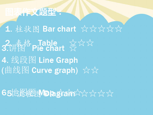
雅思小作文六大类型通用课件

建议信
建议信是向收信人提出建议或意见的信件,通常是为了帮助对方解决问题或改进工 作。
建议信的语言要客观、有理有据,表达出自己的建议和理由。
建议信的格式要规范,包括称呼、正文、结束语和署名等部分。
THANKS
感谢观看
和内容等信息。
邀请信的语言要礼貌、热情,表 达出邀请者的真诚和期待。
邀请信的格式要规范,包括称呼 、正文、结束语和署名等部分。
道歉信
道歉信是向收信人表示歉意或 道歉的信件,通常是因为自己 的过失或不当行为给对方带来 了不便或伤害。
道歉信的语言要诚恳、谦逊, 表达出自己的愧疚和后悔。
道歉信的格式要规范,包括称 呼、正文、结束语和署名等部 分。
方案评估
对解决方案进行可行性评 估,分析其优缺点及风险 。
结果预测
预测依据
预测方法
基于问题成因和解决方案,预测问题 解决的可能结果。
采用科学的方法和模型,对预测结果 进行合理推断和分析。
预测内容
预测解决方案实施后的效果、影响及 可能出现的新问题。
06 书信题
邀请信
邀请信是邀请收信人参加某个活 动或事件的信件,通常需要说明 活动或事件的时间、地点、目的
04 表格题
数据对比
总结词
在表格题中,数据对比是常见的写作手法,通过对不同数据 或指标进行比较,揭示它们之间的差异和相似之处。
详细描述
在数据对比中,考生需要关注表格中的数据变化,比较不同 数据之间的差异,并解释这些差异可能产生的原因。同时, 考生还需要注意数据的趋势和规律,以便更好地理解数据背 后的意义。
地图对比
总结词:比较两张地图的差 异,分析变化和趋势
04
比较地理特征、建筑物、道 路等方面的变化
BEC雅思图表描述写作PPT课件

• There is a sharp rise in the number of tourists to Bluebeach from the year 第11948页0/共t5o0页the year 1990 .
Practice: Line Graph
• The graph shows rates of smoking in men and women in the UK from 1960 to 2000.
第4页/共50页
Report Structure
• 1. Introduction • 2. Findings • 3. Conclusion(s) • 4. Recommendation(s)
第5页/共50页
• In writing a report, how to describe tables, figures, and charts?
is suggested that…..) ,以及参考文献(reference)。括
号中是每段开头常用的表达方式。
第2页/共50页
• BEC写作--报告样题 • You work for PJT Co. Ltd, a manufacturing
company. You need more staff in your depar tment
?右图是美国seattle市greenhall超市十一月所销售的四种皮鞋价格与数量对比图请对该图写一个简要的说明
English Practical Writing:
Writing a Report 报告及图表描述
第1页/共50页
• 英文商务报告包括Introduction (This report aims/sets out to……),Findings (It was found that), Conclusions(To conclude), Recommendations (It
雅思图表写作饼图(复习)通用课件

逻辑清晰。
练习三:分析并比较不同饼图的数据
总结词
培养数据分析能力
VS
详细描述
提供两张不同的饼图,要求学生对两张饼 图的数据进行分析和比较。学生需要识别 出两张图中各部分的比例差异,分析这些 差异产生的原因,并得出结论。此练习有 助于提高学生的数据分析能力和逻辑思维 能力。
THANKS
感谢观看
如何保证数据的准确性和客观性?
准确客观的数据来源
数据的准确性和客观性是图表写作的基础。要保证数据的准确性,需要从可靠的来源获取数据,并核 实数据的准确性。在引用数据时,需要注明数据的来源,以增加数据的可信度。同时,需要注意数据 的时效性,使用最新的数据能够更好地反映当前的情况。
如何让饼图更加直观易懂?
主题应具有实际意义 ,有助于读者了解该 领域源应具有权威性和可信 度,以确保数据的准确性和可 靠性。
数据来源应具有广泛性和多样 性,以涵盖不同方面的数据, 使饼图更加全面和客观。
数据来源应具有时效性,以确 保数据的最新性和有效性。
数据整理与分类
对数据进行清洗和整理,去除异 常值和重复值,确保数据的准确
合理使用图表元素
饼图是一种常见的图表形式,用于展示数 据的比例关系。要让饼图更加直观易懂,需 要合理使用图表元素。首先,需要选择合适 的颜色和标签,以便于区分不同的数据项。 其次,需要按照数据的大小合理安排扇区的 顺序,以便于读者比较大小关系。最后,需 要在图表中添加必要的说明和标注,帮助读
者理解图表的意义和重点。
雅思图表写作饼图(复习)通用 课件
目录
• 饼图的基本概念 • 饼图的写作技巧 • 饼图写作实例分析 • 常见问题与解答 • 练习与巩固
01
饼图的基本概念
雅思小作文写作教学全能版 ppt课件

图表作文的文章结构
一般分为三个部分 1. Introduction 引题 2.Describing the graph in details 主体
3. Concluding sentences 结尾
时态的使用(重要)
• 文章的起始句作为全文的介绍,说的是图表告诉(show, indicate, demonstrate, illustrate)我们什么,所以用现在时态;
表示变化程度很小、不明显
Adjectives Slight 轻微的 Slow 很慢的 Moderate 温和的
Steady 稳定的 Gradual 逐渐的
Adverbs Slightly Slowly Moderately
Steadily Gradually
• A decreasing trend in general
比例型(precentage)图表
• 百分比 • 除法、减法比较
• Bar chart, pie chart, table
表达比例常用句
The highest The greatest The lowest The most The smallest Sth. Is the
percentage of … Sth. +句子 proportion of… number of…
• 在文章的主体部分,时态的选择根据图表给出的时间信息 • 具体决定是一般现在时态、一般过去、还是一般将来。
表示趋势的常用表达
趋势变化 上升 下降
不变 波动
动词表达(过去) 名词表达
rose, increased, went up,
A rise, an increa ascended growth, an upward
雅思小作文图表写作技巧PPT课件

24
The graph below shows the different modes of transport used to travel to and from work in one European city in 1960, 1980 and 2000.
25
P1
The graph below shows the different modes of transport used to travel to and from work in one European city in 1960, 1980 and 2000. 题目
Represent Occupy Stand for Account for
5
2.16 派图的常用句型
◎“占”:account for, hold, make up, take up, constitute, comprise, represent ... ◎ 百分比:percentage,proportion, share ... ◎“约”:the majority of, most of, a considerable number of, a minority of , just over…, slightly more than…/less than…, nearly half… ◎ 确切数字
29
P5
The graph indicates the growing use of cars for commuting to work between 1960 2000, and the continued decline in the popularity of buses from being the most popular mode of transport in 1960 to the least popular in 2000.
雅思图表作文完全攻略素材.最全优质PPT
The vertical and horizontal axes in the graph
stand for A and B respectively.
4. 图表中的……以……为单位。
The … in the graph is measured in the unit of …
5. 在……至……期间,……基本保持不 变。 Over the period from … to …, the … basically remained level.
industry, transportation, residential and commercial.
Industry consumes the largest portion,
which accounts for 41%. Transportation ranks the second, making up 26%. The residential use and commercial use are 19% and 14% respectively.
19. 该图表表明……的数目有一个四倍 的增长。 The graph shows a fourfold increase in the number of …
形容词性“……倍的”表达公式
基数词+fold
20. 政府在2003年用于基础设施建设 的资金是2002年的两倍。
“A是B的……倍”表达公式 A + be + 基数词 + times + as much as B
with an average attendance of approximately 13,200 in the following season.
雅思小作文-线图课件
P3
In spite of some fluctuation in the expected percentages, the proportion of older people will probably continue to increase in the next two decades in the three countries. A more dramatic rise is predicted between 2030 and 2040 in Japan, by which time it is thought that the proportion of elderly people will be similar in the three countries
介绍段包括
时间段 X轴
数据形式 Y轴
研究的对象
大体描绘一下趋势
D
C
A
B
The graph below shows radio and television audiences throughout the day in 1992.
The line graph describes the percentage of radio listeners and television viewer over four years in the U.K. throughout the day from Oct to Dec in1992.
线型作文三要素
趋势
添加标题
时间
添加标题
prep
添加标题
数据
添加标题
v+adv/adj+n
添加标题
tense
添加标题
雅思写作图表题通用课件
运用比较结构(如more than, less than, as much as等)来 比较不同对象或数据点。
使用图表中给出的单位,避免 造成误解。
逻辑连贯性技巧
在段落之间建立清晰的逻辑关系 ,使文章结构清晰、条理分明。
使用转折词(如however, but 等)来连接不同观点或数据点,
增强文章的连贯性。
和推断。
问题解答
总结词
良好的语言和结构是文章清晰易懂的关 键。
VS
详细描述
首先,使用简洁明了的语言,避免复杂的 句式和生僻词汇。其次,注意段落之间的 逻辑关系,使文章层次分明。最后,可以 适当地使用转折词和连接词,以增强文章 的连贯性和流畅性。
06 总结与建议
总结图表题要点
图表类型
熟悉各种图表类型,包括柱状 图、线图、饼图和表格,了解
布局技巧
开头段
简要介绍图表的主题和目 的,概括图表反映的趋势 或比较对象。
主体段
根据图表内容,分段描述 各个比较对象或数据变化 ,使用合适的比较和对比 结构。
结尾段
总结图表的主要信息,强 调趋势或比较结果,并给 出个人观点或建议。
语言运用技巧
使用准确、具体的词汇描述图 表中的数据和趋势,如上升、 下降、平稳等。
在写作过程中注意句子之间的衔 接,使用合适的过渡词(如in addition, furthermore等)来 连接句子和段落。
03 图表题常见类型 及解析
柱状图
总结词
柱状图是展示分类数据最常用的图表类型,通过不同高度的柱子来比较不同类 别的数据。
详细描述
柱状图主要用于展示不同类别之间的比较,如时间序列数据、不同地区或不同 产品之间的比较。通过柱子的高度可以直观地看出各个类别的数值大小和差异 。
雅思写作课件 ppt
总结词
考察学生对于说明文写作的掌握程 度
详细描述
题目要求学生写一篇说明文,介绍 某项发明或技术的工作原理和使用 方法。
模拟试题三
总结词
考察学生对于图表描述的能力
详细描述
题目要求学生根据所给的饼状图描述某地区的人口职业 分布情况,并分析其优劣。
总结词
考察学生对于议论文的写作能力
详细描述
题目给出一段背景信息,要求学生针对“是否应该限制 塑料袋使用”这一话题发表观点,并进行论证。
04
雅思写作范文解析
范文一:议论文
总结词
逻辑严密,观点鲜明
详细描述
议论文是雅思写作中的常见题型,要求考生就某一话题发表自己的看法。范文一 展示了如何通过合理的论证和有力的证据支持观点,使文章逻辑严密、观点鲜明 。考生可以从范文中学习如何构建段落、使用转折词和总结句等技巧。
范文二:图表作文
总结词
内容问题
01
总结词
内容空洞、缺乏逻辑性
02 03
详细描述
考生在雅思写作中常常因为缺乏写作经验和技巧而无法有 效地展开论述,或者逻辑结构不清晰,导致文章内容空洞 、缺乏说服力。
解决方案
考生需要学习如何构建文章结构,掌握常见的论证方法和 技巧。在写作过程中,考生需要明确自己的观点和论据, 并注意逻辑的连贯性和严密性。此外,考生还可以通过模 拟练习和反馈来提高自己的写作能力和技巧。
语言表达
准确用词
句子结构多样
使用准确、具体的词汇来描述和说明 观点。
使用不同的句子结构,如简单句、复 合句和复杂句,使文章更具表现力。
语法正确
确保句子语法正确,没有拼写或语法 错误。
逻辑连贯
过渡词使用
雅思图表作文模板句型PPT课件
❖ 1965年到2005年间英国人购物时使用自带购物袋的人数在稳定下降。
❖ Eg:There was a steady fall in the number of British households using their own shopping bags when shopping between 1965 and 2005.
一般不写最后一部分,但在大作文中必须加入。
3、 题型分类:
❖ Ⅰ给出图形形式: ❖ ① Line Chart(线图) ❖ ② Pie Chart(饼图) ❖ ③ Bar Chart(柱形图) ❖ ④ Table(表格) ❖ ⑤ Map(地图) ❖ ⑥ Flow Chart(流程图)
❖ Ⅱ图形变化特征: ❖ ① Trend(动态) ❖ ② Static data(静态) ❖ ③ Mixture (Trend+Static)(混合) ❖ ④ Picture(图形)
the year of…/until…/from…to…/between…and…/over,during the period from…to… ❖ ⑶Where(地点):in Australia=in the selected/certain country——Australia. ❖ ⑷What happened(事件):participation/involvement/taking part in…/join in…
+between…and…
❖ Eg:Sales of coffee increased steadily between 2004 and 2006.
❖ ⑶There be +a/an+adj+n.+数据+时间
- 1、下载文档前请自行甄别文档内容的完整性,平台不提供额外的编辑、内容补充、找答案等附加服务。
- 2、"仅部分预览"的文档,不可在线预览部分如存在完整性等问题,可反馈申请退款(可完整预览的文档不适用该条件!)。
- 3、如文档侵犯您的权益,请联系客服反馈,我们会尽快为您处理(人工客服工作时间:9:00-18:30)。
10
P3
According to the second pie chart, it clearly shows that heating and air conditioning account for the largest proportion (62%) in the residential energy use while the small appliances makes up the least proportion (10%). The heating water and miscellaneous ( including cooking) constitutes 15% and 13% respectively.
7
8
P1
The following two pie charts illustrate the energy use in the U.S.A.
The two graphs describe the data of the energy use and the residential energy use in detail in the United States.
2. ……时间点 ,when the number/percentage reached (amounted to) to a peak of… / a high point at …
3. ……时间点,when the number/percentage bottomed out (at…)
18
趋势相同描述
Represent Occupy Stand for Account for
5
2.16 派图的常用句型
◎“占”:account for, hold, make up, take up, constitute, comprise, represent ... ◎ 百分比:percentage,proportion, share ... ◎“约”:the majority of, most of, a considerable number of, a minority of , just over…, slightly more than…/less than…, nearly half… ◎ 确切数字
The proportion/number of 对象 in the xx and xx are similar and follow the same trend. In XX the figures were xx% and xx% respectively, rising to xx% and xx% respectively in XXX ,after dipping to xx% and xx% respectively in XXX. Thereafter ...
13Leabharlann 线图的重难点 交点难掌控图内对比看不出
14
线图的常用句型
先(上升/下降)后(下降/上升),之后便平稳 对峰值和低谷的描述 趋势相同描述 对未来的表述 对波动的描述
15
先(上升/下降)后(下降/上升), 之后便平稳
1. According to the data , the years from …to…saw/witness a rise/climb/drop in the number/rate/percentage/proportion of 对象 from 数据 to 数据,which was followed by a rapid decrease/reduce/increase over the ... years
16
2. The number/rate…dropped/went up again from…in XXX year to…in XXX year and then went up/climbed gradually until XXX year ,when there was a leveling off/leveling out at 数据 for 一段时间
17
对峰值和低谷的描述
1. Also it can be noticed that in XXX year ,the number/percentage … reached the bottom . However/on the contrary, XXX year saw the peak during this period.
9
P2
It can be seen from the first pie chart that the energy is used for four purposes. Specifically, industry accounts for the largest proportion (41%) of the used energy while demand of transportation makes up 26% of the total need of energy. Residential and commercial represent 19% and 14% respectively.
小作文各图写作技巧
1
派图介绍
单派 双派 多派
2
派图的写作技巧
图中找类别 按类分段
3
派图的重难点
◎ 如何准确把握图中的信息 ◎ 如何正确转述图中的信息 ◎ 如何灵活运用词汇、短语、句型,避免用词单一、 句式表达雷同 ◎ 如何精炼语言,避免赘述、啰嗦,避免给评卷人 套模板的印象
4
2.13 派图词汇基础之占据
11
P4
From the chart, we may have a basic understanding of the situation of energy use in the United States.
12
线图解析
线图审图技巧
趋势描述 速度描述 极点交点起点重点的描述
线图的写作技巧
趋势描述多样化
(1) 分数与百分比的转化:one third, two fifths (2) 常见表达:a quarter, a half ...
6
Eg1: 整体+局部
The following two pie charts illustrate the energy use in the U.S.A.
Write a report for a university lecturer describing the information given in the pie charts below.