折线图英语作文雅思
折线图英语二作文模板

折线图英语二作文模板英文回答:How to Write a Line Graph Essay。
Introduction。
Begin with a brief introduction to the topic and the purpose of the line graph.State the independent variable (usually time) on the x-axis and the dependent variable on the y-axis.Body Paragraph 1: Describe the Overall Trend。
Discuss the general pattern of the line graph, including any trends (increasing, decreasing, stable).Use specific data points or ranges of data to support your observations.Body Paragraph 2: Analyze Specific Features。
Identify and analyze specific features of the line graph, such as points of inflection, plateaus, or significant changes in slope.Explain the possible reasons or implications of these features.Body Paragraph 3: Discuss Patterns and Relationships。
Examine any patterns or relationships between the independent and dependent variables.Consider the causes and effects of these relationships and discuss their significance.Body Paragraph 4 (Optional): Limitations and Considerations。
作文范文之雅思图表类英语作文模板
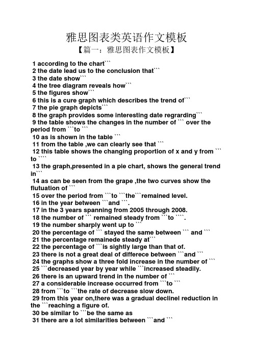
雅思图表类英语作文模板【篇一:雅思图表作文模板】1 according to the chart```2 the date lead us to the conclusion that```3 the date show```4 the tree diagram reveals how```5 the figures show```6 this is a cure graph which describes the trend of```7 the pie graph depicts```8 the graph provides some interesting date regrarding```9 the table shows the changes in the number of ``` over the period from ```to ```10 as is shown in the table ```11 from the table ,we can clearly see that ```12 this table shows the changing proportion of x and y from ``` to ````13 the graph,presented in a pie chart, shows the general trend in```14 as can be seen from the grape ,the two curves show the flutuation of ```15 over the period from ```to ```the```remained level.16 in the year between ```and ```.17 in the 3 years spanning from 2005 through 2008.18 the number of ``` remained steady from ```to ````.19 the number sharply went up to ```20 the percentage of ``` stayed the same between ``` and ```21 the percentage remainede steady at```22 the percentage of ```is sightly large than that of.23 there is not a great deal of differece between ```and ```24 the graphs show a three fold increase in the number of ```25 ```decreased year by year while ```increased steadily.26 there is an upward trend in the number of ```27 a considerable increase occurred from ```to ```28 from ```to ```the rate of decrease slow down.29 from this year on,there was a gradual declinel reduction in the ```reaching a figure of.30 be similar to ```be the same as31 there are a lot similarities between ```and ```32 the difference between x and y lies in ``para 1,两句话:第一句:this is a _____chart, which demonstrates the number of_____ from ____ to____. 如果两个图,则:there are two charts below. the _____ chart describes the number of_____, and the _____ chart illustrates the figure of ____. 第二句:(所有题目适用),from thechart we can see that the number of ______ variesconstantly/greatly in _____. )para 2, as we can see from the chart,/or it is clear from thechart that ____. 如果有两个图:则:the _____ chart shows that ______./or as we can see from the first chart, _______para 3, (如果两个图的话,) it is clear from the second chartthat ?para 4 结尾:from the figures/statistics above, we cansee/conclude/draw a conclusion that ?the bar chart indicates the current situation of the amount of money spent on fastfoods according to different income classes in britain.for those who belong to the high-income class, hamburgerhas been shown to beperson per week. by contrast fish and chips remain at a rather low level of about 16pence per person per week, and pizza, though attracts more expenses, accounts for 19pence per person per week, merely 3 pence more than that of fish and chips.as expected, low-income class spend much less in all 3 categories than high-incomeclass, with fish and chips at the top of the list at 15 pence per capital per week, andpizza at the bottom at a weekly expense of 8 pence per capital. the average income group resembles high-income class in hamburger consumptionat the largest amount of 33 per person every week, and low-income class in pizzaconsumption at the smallest amount of 11 per person every week, but amazingly, fishand chips consumed by this group leads all classes at a weekly expense of 25 penceper person.in conclusion, hamburgers, in general gain more welcome than other types of fastfood.para1. this is a table / chart / (line线状 bar柱状 pie饼状)graph which demonstrate / illustrate /reveal /depict /privide information about.............para2.(1)obvious /apparent from the graph is that ...rank thefirst/highest,while/whereas ....turn out tobe the lowest(2)it is exhibited/shown in the table that.....(3)it can be seen from the table that.....para3.(1)饼.柱图 a,which accounts for...%,ranks the first;then next is b with...%;followed byc,constituting...%;finally it comes d.e.fat...%...%and...%respectively(2)特殊变化(不变,增长或下降多的)(3)①it is worth mentioning that.... ②it must be pointed out that.... ③morestriking/suprising is that.... para4.to conclude /inconclusion/overall1. 最明显的原因__,因此___the most obvious reason for this phenomenon is that_____consequently, ____.2. 无论你喜欢与否,_____已经变得越来越流行,这是有原因的no matter you like it or not, aaa has become more and more popular and there are many reasonfor it.3. 对我们来说,改变这个不利的环境____是非常紧急的it’s an urgent task for us to change this unfavorable situation: ____.4. 这个图片会让你想起一些奇怪的东西,这种现象还是会继续存在这个社会the picture can reminds you of some strange, yet familiar phenomena existing in our society.5. 提供了大量的解决方案,一些人建议___,另一些人建议___a great number of solutions are being offered. some people suggest that ____. others argue that .6. 对于____,我们应该____confronted with aaa, we should take a serious of effective measures to cope with thesituation.7. 然而,___引起了许多为问题,however____ may cause some problems. first, it is__second, __. finally, ____. so, it is clear that__has its advantages and disadvantages.8. 虽然_____有一个__的非常大的好处,但是它不能完全__在__方面although _____ has a great advantage of _____, it cant compete with ____ in ____.9. _____也许更喜欢_____,但是_____忍受_____的不利之出_____may be preferable to ____, but it suffers from the disadvantages that___.10. _____的有利之处比____的有利之处要多,举例说明,_____the advantages of ______are much greater that thoseof____.for instance, ___.11.but i don’t think it is a very good way to solve ___. for instance, _____.worst of all,______.12.there are many ways to ______. first, _____. second, _____. third, ___.13.on the contrary, there are some people in favor of _____.14.they believe___. moreover, they think____. there are several measures for us to adopt. first,we can____, there are a number of advantages of ____. another solution is to _____.15.it is high time that something was done about it. for example,_____. in addition,_____. all these measures will certainly _.16. there are some other people, who______. their reasons are different, something for _____,sometimes for____, and sometimes simply for _____.17._____ is necessary and important to our country’s development and construction. first, ____.what’s more, ___. most important of all,___.18.however, if not managed properly, ____ can create many problems.sometimes ____.furthermore,_. therefore, ___ has been gaining public concern.19.有很多原因____,①there are probably many reasons for ____. first, ____.②second, ____. finally, ___.there are, i think, two main reasons for __. in the first place, ___. in the second place, __. therefore,③well, why is there ____? i think there might be two reasons. one is ___, and the other is _____.④why___? for one thing, ____. for another,____. perhaps the main reason is ___.⑤why_____? the first reason is that___. the second reason is ___. the third is__. for all this,the main cause of_____ is due to ____.20.it is no easy job to find the reasons for this tendency which involves several complicated factors. for some ___. for others ____.21. “why do _____?” many people often ask questions like this.22. in recent years, there is a general tendency to ___. according to a study, there is__. comparedwith __ last year. why _____?23.according to a survey, there is a growing number of ___. what brings this result? the mainreason rests with.24.①some people prefer to ___. in their opinion, ____. in addition, ____. nevertheless,nowadays, __ has become more and more common.②many people are inclined to____. in their opinion, ___.they believe that ___.25. today, there __, which have brought a lot of harms in our daily life. first, __ second, ____. what makes things worse is that ___.26.nowadays, ___ has become a problem we have to face. though it’s easier said than done, with the help of modern technology, we now have many means to solve it.27. 对于这个图,说明了_①the graph shows the general trend in _______.②according to the figures/numbers/statistics/percentages in the table/chart/bar graph/line graph, it can be seen that ___. obviously, ____, but why?③the figure indicates/shows/suggests/proves that___. there isa steady/rapid development/trend of _.④from the graph/chart, we know the statistics of __ and _. it can be seen easily that ___.⑤according to the two graphs presented, it can be observed that ___ in the left graph, __. at the same time, _ as the right graph shows.28. 现在我们经常听到_____,但是真的如此吗?①these days we are often told that ____. but is it true?②these days we often hear about ___. but is this really the case?29. 一位著名的作家曾经说过_____one of the great writers once said that _. now it still has a realistic significance.30. 回看历史,______的想法从来都没流行过,一方面_____另一方面______in our history, the idea that ____ never has been so popular. on one hand, ___, on the other hand,31. 人们中有许多像____不同的意见,一些人认为_______there are different opinions among people as to ____. some people suggest that __.32. 一些人认为__对_______来说在许多方面都是好的,然而,其他人不同意some people hold the opinion that _ is superior to __ in many ways: others, however, disagree with it.33. 现在虽然越来越多的人___,但仍有一些__的人,他们也许认为_____nowadays although more and more people __, still there are some who think __, they may think【篇二:雅思图表作文模板20篇下载】智课网ielts备考资料雅思图表作文模板20篇下载摘要:雅思图表作文模板20篇下载。
作文范文之雅思作文线状图
雅思作文线状图【篇一:雅思小作文——线形图(line graphs)】智课网ielts备考资料雅思小作文——线形图(line graphs)摘要:线形图是雅思写作task 1 里常考的图形之一,其写作非常值得我们深入研究。
现专供以下学习材料,希望能对各位“雅友”的线形图写作带去一些启发和帮助。
线形图是雅思写作task 1 里常考的图形之一,其写作非常值得我们深入研究。
现专供以下学习材料,希望能对各位“雅友”的线形图写作带去一些启发和帮助。
line graphsline graphs are more popular than all other graphs combined because their visual characteristics reveal data trends clearly and these graphs are easy to create. line graphs, especially useful in the fields of statistics and science, are one of the most common tools used to present data.a line graph is a visual comparison of how two variables—shown on the x- and y-axes—are related or vary with each other. it shows related information by drawing a continuous line between all the points on a grid. for information on the shapes of line graphs, see the organizing data chapter.line graphs compare two variables: one is plotted along the x-axis (horizontal) and the other along the y-axis(vertical). the y-axis in a line graph usually indicates quantity (e.g., dollars, litres) or percentage, while the horizontal x-axis often measures units of time. as a result, the line graph is often viewed as a time series graph. for example, if you wanted to graph the height of a baseball pitch over time, you could measure the time variable along the x-axis, and the height along the y-axis.although they do not present specific data as well as tables do, line graphs are able to show relationships more clearly than tables do. line graphs can also depict multiple series which are usually the best candidate for time series data and frequency distribution.e graphs share a similar purpose. the column graph, however, reveals a change in magnitude, whereas the line graph is used to show a change in direction.in summary, line graphsshow specific values of data wellreveal trends and relationships between datacompare trends in different groups of a variablegraphs can give a distorted image of the data. if inconsistent scales on the axes of a line graph force data to appear in a certain way, then a graph can even reveal a trend that is entirely different from the one intended. this means that the intervals between adjacent points along the axis may be dissimilar, or that the same data charted in two graphs using different scales will appear different.example 1 – plotting a trend over timefigure 1 shows one obvious trend, the fluctuation in the labour force from january to july. the number of students at andrews high school who are members of the labour force is scaled using intervals on the y-axis, while the time variable is plotted on the x-axis.the number of students participating in the labour force was 252 in january, 252 in february, 255 in march, 256 in april, 282 in may, 290 in june and 319 in july. when examined further, the graph indicates that the labour forceparticipation of these students was at a plateau for the first four months covered by the graph (january to april), and for the next three months (may to july) the number increased steadily. figure 1. labour force participation in andrews high schoolexample 2 – comparing two related variablesfigure 2 is a single line graph comparing two items; in this instance, time is not a factor. the graph compares thenumber of dollars donated by the age of the donors. according to the trend in the graph, the older the donor, the more money he or she donates. the 17-year-old donors donate, on average, $84. for the 19-year-olds, the average donation increased by $26 to make the average donation of that age group $110.figure 2. average number of dollars donated at evergreen high school, by age of donorexample 3 – using correct scalewhen drawing a line, it is important that you use the correct scale. otherwise, the lines shape can give readers the wrong impression about the data. compare figure 3 with figure 4:figure 3. number of guilty crime offenders, grishamvillefigure 4. number of guilty crime offenders, grishamvilleusing a scale of 350 to 430 (figure 3) focuses on a small range of values. it does not accurately depict the trend in guilty crime offenders between january and may since it exaggerates that trend and does not relate it to the bigger picture. however, choosing a scale of 0 to 450 (figure 4) better displays how small the decline in the number of guilty crime offenders really was.example 4 – multiple line graphsa multiple line graph can effectively compare similar items over the same period of time (figure 5).figure 5. cell phone use in anytowne, 1996 to 2002figure 5 is an example of a very good graph. the message is clearly stated in the title, and each of the line graphs is properly labelled. it is easy to see from this graph that the total cell phone use has been rising steadily since 1996,except for a two-year period (1999 and 2000) where the numbers drop slightly. the pattern of use for women and men seems to be quite similar with very small discrepancies between them.相关字搜索:雅思【篇二:线状图】如何写好开头段1表示展示,显示的单词归纳1. show. to make sth. clear; to prove sth.证明,表明v. to say what sb./sth. is like 描写,描绘;叙述揭示;揭露;暴露;泄露4. display v. /displei/ to show signs of sth., especially a quality or feeling 显示;表现;显露5. illustrate v. to use pictures, photographs, diagrams, etc. ina book, etc. (用图、实例等)说明,阐明6.demonstrate v. to show sth. clearly by giving proof or evidence 显示,表露to show sb./sth., especially in a picture 展示;描述8. indicatev. to show that sth. is true or exists 表明;象征;暗示9.unfold v. to be gradually made known; to gradually make sth. known to other people显露,表露;呈现10. exhibit v. to show signs of sth?especially a quality or feeling 表尔,显出11. depict v. to show or represent sth. in a work of art such asa drawing or painting描绘,描画;描述12. outline 描绘以上动词在语义都接近,但需注意:它们后面所跟的宾语不同总结起来就是而担其它的一般只接名词宾语!对...进行分析the table gives a breakdown of different types of family who were living in poverty in australia in 2009.提供关于...的信息the chart gives information about post-school qualifications in terms of different levels of further education reached by men and women in australia in 2009.比较the charts compare the sources of electricity in australia and france in the years 1980....a glance at the graph provided reveals some striking similarities between chinese and us birth rates during the period 1920-2000.....5.given are two graphs concerning criminality in britain.其它替换词★number 丨nambs/数字★figure 丨figa/数字★percentage百分率,百分比the percentage of aged couples who lived in poverty in australia in 1999 was 4%. ★proportion 比例,比率this bar chart indicates the proportion of medical complaints of patients visiting therapists in australia in 2012.★rate 比例,比率;率the bar chart reveals different rates of post-school qualifications in australia in 2010. ★amount. /smaunt/数量,数额(一般与不可数名词连用)theres been a great amount of research into the subject.强化练习到尼泊尔的游客来自何处)in march 2010.有多少降雨)over a year,.(3) the chart gives 混合型汽车在全球的销售)between 2006 and 2009.不同交通方式)used by overseas visitors to travel in new zealand.少图书馆的书.) over this four-year period.售) in japan, the us and the rest of the world from 2006 to 2009.2.时间的连接词练习(二选一)1.the number of students who took spanish was 150 in/on 2010.2.according to the data, mandarin decreased during/at that period.3.since/from 2000, the trends have changed greatly.4.the chart shows the number of people going abroadfrom/between 2000 and 2010.5.in general, all the figures steadily increased over/from 1911 to 2011 .6.during the period 1980 and/to 1990, there was a gradual decrease.7.i have been learning japanese for/in two years now.8.the chart shows changes in irish school eollment figures over/at a 20-year period.9.on/in may 4,2012,in plain sight concluded its fifth and final season.10.the 12th china beijing international high-tech expo will be held in/on may.11.the number started a long decline from 1930onwards/afterwards.12.the period 1250 to/and 1350 is a period of religious and secular literature in english.13.the charts indicate how much a uk school spent on different costs in/for four separate years: 1981,1991,2001 and 2011.表示连续的时间段2. during the same period3. in the no. years spanning from 19xx through 19xx4. from then on= from this time onwards= in the subsequent years.句子翻译练习1.以上的线状图表明了在英国冬季和夏季的一天中用电的需求量。
折线图英语作文中文对照

折线图英语作文中文对照英文回答:Line graphs are a commonly used type of chart in data visualization, displaying data points that are connected by straight lines or curves. They are often used to show the trends or changes in data over time, or to compare multiple data sets. Line graphs can be created using a variety of software programs, including spreadsheet applications and graphing software.The basic elements of a line graph include the following:Data points: The individual data values that are plotted on the graph.Lines: The lines or curves that connect the data points.X-axis: The horizontal axis of the graph, which typically represents the independent variable.Y-axis: The vertical axis of the graph, whichtypically represents the dependent variable.Legend: A key that explains the different lines or curves on the graph.Line graphs can be used for a wide variety of purposes, including:Showing trends over time: Line graphs can be used to show how a particular variable changes over time. For example, a line graph could be used to show the average temperature in a particular city over the past year.Comparing multiple data sets: Line graphs can be used to compare multiple data sets on the same graph. For example, a line graph could be used to compare the sales figures of two different companies over time.Identifying patterns: Line graphs can be used to identify patterns in data. For example, a line graph could be used to identify seasonal patterns in sales data.Line graphs are a powerful tool for data visualization, and they can be used to communicate complex information in a clear and concise way.中文回答:折线图是一种在数据可视化中常用的图表类型,它通过直线或曲线连接数据点来表示数据。
雅思小作文描述整个趋势的例句

雅思小作文描述整个趋势的例句好的,以下是口语化表达的雅思小作文描述整个趋势的例句:
1. 哇哦,看这柱状图,这个旅游胜地的国际游客数量五年内真
的涨得飞快啊!一开始才50万,五年后直接翻倍,破百万了!你看
这柱子一个比一个高,就知道趋势是往上涨的。
2. 哈哈,这折线图就像温度计一样,告诉我们这个城市一年里
温度是怎么变化的。
冬天冷得要命,零下好几度;夏天就热得不得了,三十来度。
这条线忽上忽下,就反映了季节变化带来的温差。
3. 瞧这饼图,消费者在不同年龄段的花钱习惯一目了然。
25
到35岁的年轻人花钱最多,其次是35到45岁的,老年人和小孩花钱最少。
看看这些饼的大小,就知道哪个年龄段的消费力最旺盛了。
4. 这散点图啊,其实就像是在看每个人的收入和幸福程度有没
有关系。
你看,收入越高的人,通常也更幸福。
这些点大都朝上斜着,说明收入和幸福程度是成正比的。
5. 面积图真是好用,一眼就能看出哪个因素对公司利润影响最
大。
一开始利润少得可怜,但后来新产品一上市,广告一打,利润就嗖嗖往上涨。
你看这面积越来越大,就知道公司在赚钱这方面越做越好了。
折线图 英文作文
折线图英文作文英文:When it comes to data visualization, one of the most commonly used types of charts is the line chart, also known as the line graph. A line chart is a graphical representation of data that displays information as a series of data points connected by straight lines. It is particularly useful for showing trends over time or comparing different sets of data.Line charts are commonly used in various fields such as finance, economics, and science. For example, in finance, line charts can be used to show the stock prices of a company over a period of time, while in science, line charts can be used to show the changes in temperature over time.One of the advantages of using a line chart is that it is easy to read and interpret. The lines connecting thedata points make it easy to see the trend and direction of the data. Additionally, line charts can be used to show multiple sets of data on the same chart, making it easy to compare them.However, there are also some limitations to using line charts. For example, line charts may not be suitable for showing data that has a lot of fluctuations or irregularities. In such cases, other types of charts such as scatter plots or bar charts may be more appropriate.Overall, line charts are a versatile and effective tool for visualizing data. By using them effectively, we can gain valuable insights and make informed decisions based on the trends and patterns that they reveal.中文:说到数据可视化,最常用的图表类型之一就是折线图,也称为折线图表。
雅思写作小作文范文 雅思写作混合图 两个国家的水消耗量water consumption.doc

雅思写作小作文范文雅思写作混合图两个国家的水消耗量water consumption今天我们雅思写作小作文范文的文章来研究下混合图。
题目由一幅折线图和一幅表格组成。
前者描述了从1900年到2000年间,全球范围内农业、工业以及家庭这三个部分的用水量变化。
后者则给出了巴西和刚果的人口、灌溉面积、以及人均用水量等数据。
小编搜集了一篇相关的高分范文,以供大家参考。
雅思写作小作文题目The graph and table below give information about water use worldwide and water consumption in two different countries.Summarise the information by selecting and reporting the main features, and make comparisons where relevant.雅思写作小作文范文The line graph and table demonstrate the trends of global water use in three different sectors from 1900 to 2000 and compares the water usage in Congo and Brazil in 2001. There was an overall upward trend in water use in these three sectors over this period. Water consumption in Brazil was much higher than that of Congo.题目中的线状图和表格展示了从1900年到2000年三个不同部门水消耗量的趋势,并且比较了2001年刚果和巴西的水用量。
三个部门的水用量在此期间整体有所上升,而巴西的水消耗量比刚果要高。
考研英语作文模板 大作文-折线图 柱状图
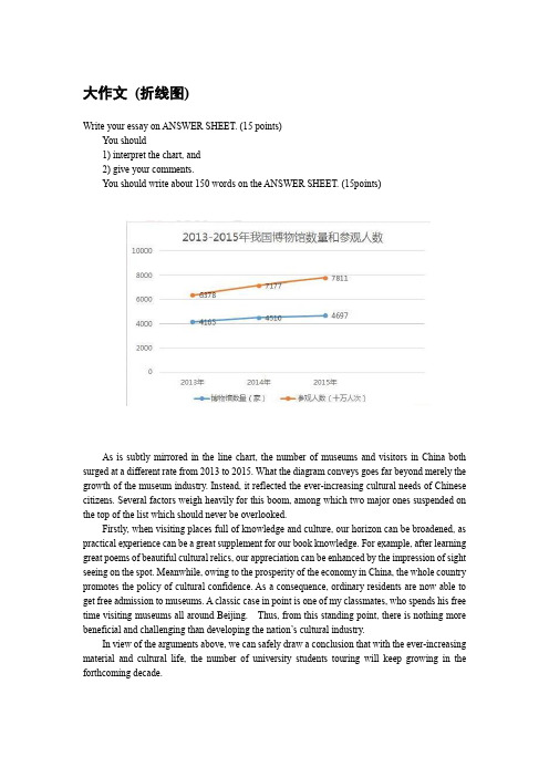
大作文(折线图)Write your essay on ANSWER SHEET. (15 points)You should1) interpret the chart, and2) give your comments.You should write about 150 words on the ANSWER SHEET. (15points)As is subtly mirrored in the line chart, the number of museums and visitors in China both surged at a different rate from 2013 to 2015. What the diagram conveys goes far beyond merely the growth of the museum industry. Instead, it reflected the ever-increasing cultural needs of Chinese citizens. Several factors weigh heavily for this boom, among which two major ones suspended on the top of the list which should never be overlooked.Firstly, when visiting places full of knowledge and culture, our horizon can be broadened, as practical experience can be a great supplement for our book knowledge. For example, after learning great poems of beautiful cultural relics, our appreciation can be enhanced by the impression of sight seeing on the spot. Meanwhile, owing to the prosperity of the economy in China, the whole country promotes the policy of cultural confidence. As a consequence, ordinary residents are now able to get free admission to museums. A classic case in point is one of my classmates, who spends his free time visiting museums all around Beijing. Thus, from this standing point, there is nothing more beneficial and challenging than developing the nation’s cultural industry.In view of the arguments above, we can safely draw a conclusion that with the ever-increasing material and cultural life, the number of university students touring will keep growing in the forthcoming decade.大作文(柱状图)Write an essay based on the chart below. In your writing, you should1)interpret the chart,and2)give your commentsYou should write about 150 words on the ANSWER SHEET.(15 points) As is subtly mirrored i n the column chart, the choices of university undergraduate upon graduation varied a lot from 2013 to 2018. What the diagram conveys goes far beyond merely changes upon graduation. Instead, it revealed the tendency for higher education. Compared to 2013, a growing number of students choose to seek higher education rather than get a job. Still, only a few of them opt to be entrepreneurs. (可写可不写)Several factors weigh heavily for this tendency, among which two major ones suspended on the top of the list which should never be overlooked.(第一段第二段都可以)In the first place, owing to the prosperity of the economy in China, the whole country promotes the policy of higher education. (论点1)Based on a most recent study,a growing body of evidence showed that most successful social elites, who seek further education, admitted that this policy is helpful for them to get the scholarship, with which they can finish their education without financial difficulty.(论据1)Meanwhile,those with a diploma of master or even doctor degree are valued in the job market with the rapid development of society. 论点 2 As a consequence,college students need to spend more time and energy in degrees than ever before.论据2 A classic case in point is one of my classmates, who goes to the postgraduate school. Thus, from this standing point, there is nothing more beneficial and challenging than advanced education__(锦上添花)__.(detrimental and harmful)In view of the arguments above, we can safely draw a conclusion that with the ever-increasing demand of society and the encouragement of the country,the proportion of university students, who(which) seek higher education, will keep growing in the forthcoming decade.(总结预测)1) interpret the chart, and2) give your comments.You should write about 150 words on the ANSWER SHEET. (15 points)As is subtly mirrored in the column, from freshman to graduate year, the proportion of college students who participated in the part time job, increased dramatically. What the diagram conveys goes far beyond merely changes in the part time job of college students. Instead, it reflected the ever-increasing needs of practical experience in the job market.Several factors weigh heavily for the phenomenon, among which two major ones suspended on the top of the list which should never be overlooked. In the first place, when doing a part time job, which is related to our major, our horizon can be broadened, as practical experience can be a great supplement for our book knowledge. Based on a most recent study, a growing body of evidence showed that most successful social elites, who did part time jobs during college, admitted that the experience is helpful. Meanwhile, owing to the prosperity of the economy in China, the whole country needs more labour with expertise.As a consequence, college students have become popular in the job market. A classic case in point is one of my classmates, who jumps on the bandwagon of the part time job and finds his expertise necessary for the job. Thus, from this standing point, there is nothing more beneficial and challenging than the part time job.In view of the arguments above, we can safely draw a conclusion that with the ever-increasing material and cultural life, the number of university students, who do the part time job during university life will keep growing in the forthcoming decade. If we try our utmost to balance it and avoid overindulgence, our future will be promising and rosy.1) interpret the chart, and2) give your comments.You should write about 150 words on the ANSWER SHEET. (15points)As is subtly mirrored in the column, from 1990 to 2010, the demography of rural areas decreased to an equal proportion of urban areas, which rocketed up during this period. What the diagram conveys goes far beyond merely changes in population structure. Instead, it reflected the ever-increasing needs of urbanization.Several factors weigh heavily for the urbanization, among which two major ones suspended on the top of the list which should never be overlooked. In the first place, owing to the prosperity of the economy in China, the whole country promotes the policy of urbanization. Based on a most recent study, a growing body of evidence showed that most new citizens, who migrated from rural or outskirts, find this policy helpful. Meanwhile, living in the urban area provides us with a safer area both in life and career. As a consequence, more residents choose to spend time and energy to seek the opportunity of living in the city. A classic case in point is one of my classmates, whose hometown is a village. He settled in the city after graduation. Thus, from this standing point, there is nothing more beneficial and challenging than moving to the city.In view of the arguments above, we can safely draw a conclusion that with the ever-increasing material and cultural life, the number of urban citizens will keep growing in the forthcoming decade.。
- 1、下载文档前请自行甄别文档内容的完整性,平台不提供额外的编辑、内容补充、找答案等附加服务。
- 2、"仅部分预览"的文档,不可在线预览部分如存在完整性等问题,可反馈申请退款(可完整预览的文档不适用该条件!)。
- 3、如文档侵犯您的权益,请联系客服反馈,我们会尽快为您处理(人工客服工作时间:9:00-18:30)。
折线图英语作文雅思
英文回答:
The line graph illustrates the number of visitors to three different national parks, namely Yosemite, Grand Canyon, and Yellowstone, over a period of five years, from 2015 to 2019.
In 2015, Yosemite National Park attracted approximately 4.5 million visitors, while Grand Canyon National Park and Yellowstone National Park received about 4 million and 3.5 million visitors, respectively. Over the next two years, the visitor count for all three parks steadily increased, with Yosemite reaching a peak of over 5 million visitors in 2017.
In 2018, however, there was a slight decline in the number of visitors to Grand Canyon and Yellowstone, while Yosemite continued to see an increase. The following year, in 2019, all three parks experienced a decline in visitors,
likely due to external factors such as the COVID-19 pandemic or natural disasters.
Overall, Yosemite National Park consistently attracted the highest number of visitors throughout the five-year period, followed by Grand Canyon and Yellowstone.
中文回答:
折线图展示了从2015年到2019年,五年间三个不同的国家公园(优胜美地、大峡谷和黄石)的游客数量。
2015年,优胜美地国家公园吸引了约450万游客,而大峡谷国家公园和黄石国家公园分别接待了约400万和350万游客。
在接下来的两年中,这三个公园的游客人数稳步增长,优胜美地公园在2017年达到500多万游客的峰值。
然而,2018年大峡谷和黄石的游客数量略有下降,而优胜美地的游客数量继续增长。
2019年,这三个公园的游客数量都出现了下降,这可能是由于新冠肺炎疫情或自然灾害等外部因素造成的。
总体而言,在五年内,优胜美地国家公园一直吸引着最多的游客,其次是大峡谷国家公园和黄石国家公园。