雅思写作小作文范文 雅思写作柱状图bar chart 文盲比例.doc
雅思小作文范文柱状图
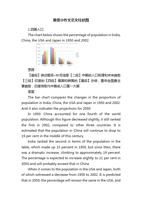
雅思小作文范文柱状图1.四国人口The chart below shows the percentage of population in India, China, the USA and Japan in 1950 and 2002.思路:【首段】转述题目+补充信息【二段】中国的人口规律和未来趋势【三段】印度的【四段】美国和韩国的【尾段】总结,重申全图最主要趋势,印度将取代中国成人口第一大国答案:The bar chart compares the changes in the proportion of population in India, China, the USA and Japan in 1950 and 2002. And it also indicates the projections for 2050.In 1950. China accounted for one fourth of the world population. Although this figure decreased slightly, it still ranked the first in 2002, compared to other three countries. It is estimated that the population in China will continue to drop to 19 per cent in the middle of this century.India ranked the second in terms of the population in the table, which made up 15 percent in 1950, but since then, there was a dramatic increase, climbing to approximately 19 percent. The percentage is expected to increase slightly to 21 per cent in 2050 and will probably exceed that in China.When it comes to the population in the USA and Japan, both of which witnessed a decrease from 1950 to 2002. It is predicted that in 2050, the percentage will remain the same in the USA, andin Japan, the percentage is likely to keep falling.Overall, it seems that India will become the country with the largest population although there is still a huge number of people in China.2.通勤工具Different modes of transport used to travel to and from work in one European city in 1960, 1980 and 2000.思路:1. 分段原则为:上升的一段,下降的一段,波动的一段。
雅思真题小作文柱形图

雅思真题小作文柱形图英文回答:The given bar chart provides a comparison of the average number of hours spent on various types of digital media by individuals in two different age groups: 18-24 and 55-64.The chart reveals that individuals in the 18-24 age group spend significantly more time on digital media than those in the 55-64 age group across all categories except watching television.Specifically, 18-24 year-olds spend an average of 3.5 hours per day on social media, compared to only 1.8 hours per day for 55-64 year-olds. Similarly, they spend an average of 2.8 hours per day on instant messaging, while55-64 year-olds spend only 1.4 hours per day on this activity. For playing video games, the difference is even more pronounced, with 18-24 year-olds spending an averageof 2.4 hours per day compared to just 0.8 hours per day for 55-64 year-olds.Interestingly, the trend reverses for watching television, with 55-64 year-olds spending an average of 2.2 hours per day on this activity, while 18-24 year-olds spend only 1.6 hours per day.Overall, the chart demonstrates a clear generational divide in digital media consumption, with younger individuals spending significantly more time on social media, instant messaging, and video games, while older individuals spend more time watching television.中文回答:根据给定的条形图,我们可以对18-24岁和55-64岁这两个年龄组的个人在不同类型数字媒体上花费的平均小时数进行比较。
雅思柱状图作文范文

雅思柱状图作文范文雅思考试中,柱状图作文是常见的题型之一。
柱状图作文要求考生根据给定的柱状图数据,进行分析和解读,并写出一篇有逻辑性、结构清晰、语言流畅的作文。
本文将为大家提供一篇雅思柱状图作文范文,帮助大家更好地理解和掌握这种题型的写作方法。
题目下面是一张柱状图,描述了2010年至2015年间,某国家城市和农村人口的变化情况。
请根据图表提供的信息,写一篇150词左右的短文,描述这些变化,并分析其原因。
柱状图柱状图范文The bar chart illustrates the changes in the population of urban and rural areas in a certain country from 2010 to 2015. Overall, the urban population increased steadily, while the rural population decreased slightly during the same period.In 2010, the urban population was 500 million, which was much higher than the rural population of 300 million. Over the next five years, the urban population increased by 50 million, reaching 550 million in 2015. In contrast, the rural population decreased by 10 million, dropping from 300 million in 2010 to 290 million in 2015.There are several reasons for these changes. Firstly, the rapid development of the economy and the improvement of living standards in urban areas have attracted a large number of people to move from rural areas to cities. Secondly, the government has implemented a series of policies to promote urbanization, such as building more affordable housing and improving public services in urban areas. Thirdly, the decline in the agricultural industry has led to a decrease in job opportunities and income in rural areas, which has also contributed to the migration of rural residents to urban areas.In conclusion, the bar chart shows that the population of urban areas in this country has been increasing steadily, while the population of rural areas has been decreasing slightly. This trend is mainly due to the rapid development ofthe economy and the implementation of urbanization policies, as well as the decline in the agricultural industry in rural areas.分析这篇范文的结构非常清晰,分为三个部分:引言、主体和结论。
雅思写作BarchartWord版

Bar chart1.The chart shows the percentage of male and female teachers in six differenttypes of educational setting in the UK in 2010.Model 1The bar chart gives information about male and female teachers in six types of educational institution in the UK in 2010. It shows what percentage of teachers was male and what percentage was female.Women predominated in schools for children. This was particularly true of schools for very young children. Over 95 percent of nursery school teachers, for example, were female. The situation was similarly one-sided in primary schools, where over 90 percent of teachers were women.Men and women were more equally represented in teaching institutions catering for for example, were 50 percent female and 50 percent male.Males held a larger share of teaching posts in higher-level institutions. This was particularly true for universities, where twice as many males were teaching staff than females.Overall, women were more likely to hold the more typically maternal role of teaching young children. Males, on the other hand, predominated in the higher status teaching role of university lecturer.Model 2The chart compares the percentage of male and female teachers in different educational settings from nursery school to university. Significant differences between men and women are evident.Women held nearly all of the teaching posts in nursery and primary schools and the majority of posts in secondary schools (approximately 56 percent). They held the same percentage of posts as did men at college level. However, a smaller proportionof women held teaching positions at training institutes, and, at universities, female lecturerswere outnumbered by males by roughly two to one.For men, the pattern of employment was the reverse. Only 2 percent of nursery school teachers and 10 percent of primary teachers were men. They were more equally represented at secondary and college level. However, a significantly higher percentage of university lecturers were male(roughly 70 percent).Overall, the figure shows that gender is a significant factor in patterns of employment within the education sector.2.The chart below shows the numbers of male and female research studentsstudying six science-related subjects at a UK university in 2009. Summarise the information by selecting and reporting the main features, and make comparisons where relevant.The bar chart shows the gender distribution of students doing scientific research across a range of disciplines at a UK university in 2009.In five of the six disciplines, males outnumbered females. Male students made up a particularly large proportion of the student group in subjects related to the study of inanimate objects and materials: physics, astronomy, and geology. The gender gap was particularly large in the field of physics, where there were five times as many male students as female students.Men and women were more equally represented in subjects related to the study of living things: biology, medicine, and veterinary medicine. In biology, there were nearly as many women (approximately 200) as men (approximately 240). This was also true of medicine. Veterinary medicine was the only discipline in which women outnumbered men (roughly 110 women vs. 90 men).Overall, the chart shows that at this university, science-related subjects continue to be male-dominated; however, women have a significant presence in fields related to medicine and the life sciences.3.The graph compares the percentage of international and the percentage of UKstudents gaining second class degrees or better at major UKUniversity.Model 1•The bar chart shows the proportion of UK students and international students achieving second class degrees or higher in seven different subjects at auniversity in the UK.•Degree results were generally good for both home and international students, with well over 50 per cent gaining a second class degree or better in all seven subjects except International law. International students tended to do betterthan UK students in technology-related subjects. This was particularly true of Information Technology. Whereas over 80 per cent of international studentsgained a good degree in IT, only about half of the UK students did so.•Degree results were similar for the two groups in Nursing and Accounting. In Arts and Social Science-related subjects, UK students tended to do better.The biggest gap in performance was in International Law, where three-quarters of UK students gained a second class degree or better. In contrast,fewer than half of the international students attained this level.•Overall, the chart suggests that international and UK students had different strengths when studying for degrees in this UK University.Model 2•The bar chart shows the percentage of home and international students in the UK achieving at least a second class degree in eight subjects in 2009.•For the UK students, over half of the degrees awarded were second class or better. The largest percentage of good passes was in Art History andSociology (80 per cent). The lowest was in Information Technology (55 percent).•For international students, the rates were similarly high, though figures for individual subjects differed. In Electrical Engineering and InformationTechnology, four out of five degrees awarded to students from abroad weresecond class or better (versus fewer than two out of three for homestudents). However, the percentage gaining good degrees in subjects such as English Literature (55 per cent) and Law (50 per cent) was lower than thecorresponding rate for home students (roughly 70 per cent).•In brief, the chart shows that home students tended to do better in Arts and Social Science-related subjects, whereas international students tended to dobetter in technology related subjects.4.The figure shows the results of a survey of 1000 adolescents in five differentcountries. The participants were asked at what age they believed certain rights and responsibilities should be granted to young people.Summarise the information by selecting and reporting the main features.•The bar chart illustrates the views of 1000 young people in five countries around the world on the most suitable age for three key rights andresponsibilities to be given to young people.•There was some variation in the views of all five nationalities for all three categories. For marriage, the minimum age identified ranged from a low ofsixteen in Egypt and Mexico to a high of twenty-two in Japan. Respondents in the UK and the US chose eighteen.• A similar pattern was seen in the results concerning voting age. Again, this was highest among the Japanese participants and lowest (16) among thosein Mexico and the UK.•Interestingly, for all of the countries surveyed, the participants set their preferred age of criminal responsibility at a lower point than eight of therights. The gap was particular wide in the US, where respondents indentified twelve as the age at which children should be held responsible for theircrimes.•Overall, the results show that adolescents in different countries have different views of when it is appropriate for young people to hold certainresponsibilities associated with adulthood.5.The figure gives information about smoking habits of the UK population by age.Summarise the information by selecting and reporting the main features, and make comparisons where relevant.•The bar chart shows information about people’s smoking behaviour by age group in the UK. Several trends are evident.•The highest proportion of those who have never smoked (nearly two-thirds) was in the 16-24 year group. The proportion tended to decrease with age.Only 40 per cent of people aged 65 to 74 had never smoked.•On the other hand, the percentage of those who had quit smoking tended to increase with age. Only 5 per cent of those in the youngest age group (16 to75.•The percentage of those classed as heavy smokers also showed a distinct pattern. People in middle age (35 to 54) tended to be the heaviest smokers –approximately 13 per cent of the total. A relatively small proportion of those in the youngest age group, and an even smaller percentage of those in the oldest group (roughly 3 per cent) smoked heavily.•Overall, age appears to be a significant factor in patterns of smoking behaviour.。
雅思小作文柱状图
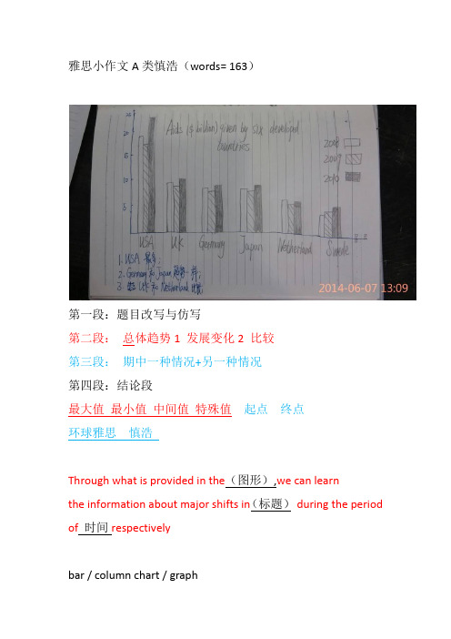
雅思小作文A类慎浩(words= 163)第一段:题目改写与仿写第二段:总体趋势1 发展变化2 比较第三段:期中一种情况+另一种情况第四段:结论段最大值最小值中间值特殊值起点终点环球雅思慎浩Through what is provided in the(图形),we can learnthe information about major shifts in(标题)during the period of时间respectivelybar / column chart / graph第一段:题目改写仿写Through what is provided in the six column charts(图形),we can learnthe information about major shifts in aids given by six developed countries(标题)during the period of2008, 2009 and 2010 respectively. =33Through prep 通过be provided in 提供Major shift n 主要的变化graph n 图形During the period of adj. 在。
的时期内Respectively adv 分别地Column chart 柱状图bar chart 柱状图Line chart 线形图pie chart 饼状图map 地图Process 流程图First and foremost Besides, in addition ,第二段句型In general, it is noticeable that the total 项目in 时间were slightly more than that in时间, being approximately数值and 数值respectively. In comparison, the 项目in时间wereconsiderably fewer, amounting to about数值.In general adv 总而言之noticeable adj 值得注意的Total adj 总数的be slightly more than adv 略微多于Approximately adv 大约respectively adv 分别地In comparison adv 与之相比considerably adv 相当地Amount to adv 到达达到第二段:总数比多/ 比少In general, it is noticeable that the total aids in 2010 were slightly more than that in 2008, being approximately 60 billion and 56 billion respectively. In comparison, the aids in 2009 were considerably fewer, amounting to about only 50 billion.封闭校区柱状图第二段:总数+ 比多+ 比少In general, it is noticeable that the total passenger kilometers in2000 were slightly more than that in 1900110billion and about 100 billion respectively. Meanwhile, the passenger kilometers in 2000 were slightly more than that in 1990in air, bus and rail. However, the converse condition was actually found in bicycle and motorbike /In comparison, the 项目in时间were considerably fewer, than 项目in 时间amounting to about数值.第二段句型In general, it is noticeable that the total 项目in 时间were slightly more than that in时间, being approximately数值and数值respectively.Meanwhile, the 主题词in 时间were slightly more than that in 时间in项目,项目,and 项目.However, the converse condition was actually found in 项目and项目.Meanwhile adv 于此同时be slightly more than vt 略微地多于Converse condition n 相反的情况be actually found in vt 在。
雅思英语柱状图作文

雅思英语柱状图作文Title: Analyzing the Trends in [Your Topic] Through a Bar Chart.In this essay, we will delve into the intricacies of [Your Topic], examining the patterns and trends revealed through a bar chart. The chart presents valuable insights into the distribution and comparison of various categories, highlighting significant differences and similarities across the dataset.Firstly, let's take a moment to appreciate the simplicity yet effectiveness of the bar chart. It's a popular visualization tool that enables quickidentification of patterns and trends. In this case, the chart effectively illustrates the distribution of [specific data points] across [different categories or time periods]. The vertical bars represent the quantitative values, while the horizontal axis labels provide context and categorization.At first glance, the chart reveals some intriguing patterns. The tallest bar, representing [specific category or data point], stands out as the most prominent,indicating a significant concentration of [specific value or trend]. This is particularly noteworthy given the significant gap between this bar and the others, suggesting a clear leader in the dataset.Contrastingly, the shorter bars towards the left of the chart indicate lower concentrations or values in those categories. It's interesting to note that even though these categories may not be as dominant, they still play an important role in the overall distribution. They contribute to the diversity and balance of the dataset, providing valuable insights into the nuances of [Your Topic].When comparing the bars side by side, we can observe patterns and trends across categories. For instance, the steady increase in the heights of bars from left to right suggests a gradual growth or increase in [specific value or trend] over time. Conversely, a sudden dip in the barheights might indicate a sudden change or event that affected the distribution.The spacing between the bars also provides valuable insights. Wider gaps suggest larger disparities between categories, indicating that certain categories are more distinct and separate from others. Narrower gaps, on the other hand, suggest closer relationships or similarities between categories, indicating a more uniform distribution across the dataset.The color scheme chosen for the chart further enhances its readability and visual appeal. The contrasting colors make it easy to distinguish between different categories, while the neutral background does not distract from the main focus of the chart. This attention to detail ensures that the chart is both visually appealing and functionally effective.In conclusion, the bar chart presents a comprehensive overview of [Your Topic], revealing patterns and trendsthat would be difficult to discern from raw data. It allowsus to quickly identify the most prominent categories and values, while also providing insights into the relationships and similarities between different datasets. This analysis is crucial for understanding the nuances of [Your Topic] and making informed decisions based on empirical evidence.Moreover, the chart encourages further exploration and analysis. It acts as a starting point for deeper investigations into the factors that influence the distribution and trends observed. By examining the chart closely and asking pertinent questions, we can gain a deeper understanding of the underlying mechanisms and factors that shape [Your Topic].In summary, the bar chart is a powerful tool for visualizing and analyzing data. It enables us to identify patterns and trends, compare categories, and make informed decisions based on empirical evidence. By leveraging this tool effectively, we can gain a deeper understanding of [Your Topic] and use this knowledge to guide our future actions and decisions.。
Bar chart 雅思写作小作文
Now take a look at a model answer:The pie charts illustrate the primary reasons that people came to and left the UK in 2007. At first glance it is clear that the main factor influencing this decision was employment.Having a definite job accounted for 30 per cent of immigration to the UK, and this figure was very similar for emigration, at 29%. A large number of people, 22%, also emigrated because they were looking for a job, though the proportion of people entering the UK for this purpose was noticeably lower at less than a fifth.Another major factor influencing a move to the UK was for formal study, with over a quarter of people immigrating for this reason. However, interestingly, only a small minority, 4%, left for this.The proportions of those moving to join a family member were quite similar for immigration and emigration, at 15% and 13% respectively. Although a significant number of people (32%) gave ‘other’ reasons or did not give a reason why they emigrated, this accounted for only 17% with regards to immigration.173 words_________________________________________As you can see, the pie chart description is easy to follow. Here are some key points in organizing your answer.Choose the most important points to write about firstThese will be the largest ones. As you can see in the model answer,definite job, looking for work, and formal study were all written about first, in order of importance, as these are the main reasons that were chosen for moving. Items such as ‘other’ are usual ly less important and account for small amounts, so can be left till the end.Make it easy to readWhen you write a task 1, you should always group information in a logical way to make it easy to follow and read.With an IELTS pie chart, the most logical thing to do is usually to compare categories together across the charts, focusing on similarities and differences, rather than writing about each chart separately.If you write about each one separately, the person reading it will have to keep looking between the paragraphs in order to see how each category differs.Vary your languageAs with any task 1, this is important. You should not keep repeating the same structures. The key language when you write about pie chartsis proportions and percentages.Common phrases to see are "the proportion of…" or "the percentage of…" However, you can also use other words and fractions. These are some examples from the model answer:A large number of peopleover a quarter of peoplea small minorityA significant number of peopleless than a fifthThis table presents some examples of how you can change percentages to fractions or ratios:This table presents some examples of how you can change percentages to other phrases:Sample Pie Chart - Model AnswerThe four pie charts compare the electricity generated between Germany and France during 2009, and it is measured in billions kWh. Overall, it can be seen that conventional thermal was the main source of electricity in Germany, whereas nuclear was the main source in France.The bulk of electricity in Germany, whose total output was 560 billion kWh, came from conventional thermal, at 59.6%. In France, the total output was lower, at 510 billion kWh, and in contrast to Germany, conventional thermal accounted for just 10.3%, with most electricity coming from nuclear power (76%). In Germany, the proportion of nuclear power generated electricity was only one fifth of the total.Moving on to renewables, this accounted for quite similar proportions for both countries, at approximately 15% of the total electricity generated. In detail, in Germany, most of the renewables consisted of wind and biomass, totaling around 75%, which was far higher than for hydroelectric (17.7%) and solar (6.1%). The situation was very different in France, where hydroelectric made up 80.5% of renewable electricity, with biomass, wind and solar making up the remaining 20%.(Words 183)You will be given one or more pie charts. You task is to describe the information given in the graph by writing a 150 word report. You are not asked to give your opinion. You should spend around 20 minutes on the task.What is being tested is your ability to:•objectively describe some graphic information•compare and contrast•report on an impersonal topic without the use of opinion•use the language of graph descriptionSample taskYou should spend about 20 minutes on this task. Write a report for a university lecturer describing the information in the two graphs below.You should write at least 150 words.Your taskComplete the task one report writing exercise above. Spend only 20 minutes. Then look at the guidelines and the sample answer below.Guidelines for a good answerDoes the report have a suitable structure?•Does it have an introduction, body and conclusion?•Does it include connective words to make the writing cohesive within sentences and paragraphs?Does the report use suitable grammar and vocabulary?•Does it include a variety of sentence structures?•Does it include a range of appropriate vocabulary?Does the report meet the requirements of the task?•Does it meet the word limit requirements?•Does it describe the whole graph adequately?•Does it focus on the important trends presented in the graphic information?Now read sample answer one. How well does it follow the guidelines?Sample answer oneThe pie charts compare the highest level of education achieved by women in Someland across two years, 1945 and 1995. It can be clearly seen that women received a much higher level of education in Someland in 1995 than they did in 1945.In 1945 only 30% of women completed their secondary education and 1% went on to a first degree. No women had completed post-graduate studies. This situation had changed radically by 1995. In 1995, 90% of women in Someland had completed secondary education and of those, half had graduated from an initial degree and 20% had gone on to postgraduate studies. At the other end of the scale we can see that by 1995 all girls were completing lower secondary, although 10% ended their schooling at this point. This is in stark contrast with 1945 when only 30% of girls completed primary school, 35% had no schooling at all and 35% only completed the third grade.In conclusion, we can see that in the 50 years from 1945 to 1995 there have been huge positive developments to the education levels of women in Someland.Teacher's comments on the sample answerHere is what an IELTS teacher said about the sample answer.The report structure is clear and well organised with an introduction, body and conclusion.The candidate uses a variety of grammatical structures and vocabulary so that the writing is not repetitive.In terms of task requirements, the report meets the word limit. Although the candidate has not included every figure presented in the charts, the answer does accurately reflect the content of the graphic material and gives a strong impression of the trend of change in the education of women which is the main point of the comparison of those particular charts.The sample answer above is therefore a very good one.Strategies for improving your IELTS scoreSelecting informationIn completing this task, it is important that you fully describe all of the graphic information given. However, this does not mean that you should note every detail. In most cases there will be too much information for you to mention each figure. You will therefore need to summarise the graph in meaningful segments. In other words, you will describe the significant trends in your report.Report structureAs in the line graphs task, your report should be structured simply with an introduction, body and conclusion. Tenses should be used appropriately.Use two standard opening sentences to introduce the graph or graphs and your report. These opening sentences should make up the first paragraph. Sentence one should define what the graph is about, that is the date, location, what is being described in the graphs etc. For example:The pie charts compare the highest level of education achieved by women in Someland across two years, 1945 and 1995.Notice that in the single line graph we said that ‘the graph shows' bu t with two charts we can more accurately say ‘the pie charts compare’.Note the tense used. Even though it describes information from the past, the graph shows the information in the present time.Notice that the sample opening sentence does not simply copy the words used on the graphic material. Copied sentences will not be assessed by the examiner and so you waste your time including them.Sentence two (and possibly three) might sum up the overall trend. For example:It can be clearly seen that women received a much higher level of education in Someland in 1995 than they did in 1945.Notice the Simple Past tense is used. Here we are talking about what happened in the past.The body of the report will describe the chart or charts in detail. You will need to decide on the most clear and logical order to present the material. In this case it might be best to work through the charts one by one.Ideally your report should end with one or two sentences which summarise your report or draw a relevant conclusion.Grammar and vocabularyYou will receive a higher mark if your writing uses a range of structures and vocabulary correctly rather than a limited number.Pie charts generally show figures in percentages and your language in writing the report should ref lect this. You will talk about ‘the percentage of graduates’ or the ‘proportion of people who completed secondary school’.Make sure that you are confident with comparatives and superlatives used to compare and contrast and the language used to describe pie charts.Comparing and contrastingOne syllableAdjectives with one syllable form their comparatives and superlatives like this:cheap cheaper cheapestlarge larger largestbright brighter brightestExceptions:good better bestbad worse worstTwo syllablesSome adjectives with two syllables form their comparatives and superlatives like this:pretty prettier prettiesthappy happier happiestBut many form their comparatives and superlatives like this:striking more striking most strikingAlthough some can form their comparatives and superlatives like this:common more common most commonclever more clever / cleverer most clever / cleverestThree or more syllablesAll adjectives with three or more syllables form their comparatives and superlatives like this:attractive more attractive most attractiveprofitable more profitable most profitableexpensive more expensive most expensiveExerciseWhat are the comparative and superlative forms of these adjectives:Describing one part of the chart Starting with the adjective:Starting with the subject:Describing two parts of the chart Starting with the adjective:Starting with the subject:。
雅思小作文-柱状图
雅思小作文–柱状图题目1:The chart below contains information provided by Australia’s tertiary institutions about the percentage of male and female students enrolled in different subjects in 1995.Summarize the information by selecting and reporting the main features, and make comparisons where relevant.范文:1/ 4题目2:The chart below contains information about USA marriage and divorce rates between 1970 and 2000, and the marital status of adult Americans in two of the years.Summarize the information by selecting and reporting the main features, and make comparisons where relevant.2/ 4读图:动态图【因为有时间】,需要描述变化趋势These two graphs illustrate the change of marital status of American between 1970 and 2000.【改写题目】According to the first graph,there were 2.5m marriages in both 1970 and 1980, and then this figure decreased gradually during the next two decades, reaching to 2m in 2000. By comparison, the number of divorces first increased from 1m in 1970 to around 1.4 in 1980 and then slowly declined back to 1m in 2000.【分类描述第一幅柱状图,时态:一般过去时】As can be seen from the second bar chart,the percentage of married American adults dropped by more than 10% , from 70% in 1970 to less than 60% in 2000. Meanwhile, the percentage of adult Americans who were never married increased from about 15% in 1970 to20% in 2000, and despite still less than 10% , the proportion of divorced adults significantly went up from 1970 to 2000. Moreover, the percentages of the widowed in 1970 and 2000 accounted for less than 10% respectively, and showed a slight drop.【分类描述第二幅柱状图,时态:一般过去时】In conclusion, marital status of Americans in 2000 was not as optimistic as that of three decades ago. (1781.如果有两幅图表,则分成2段分别一一描述2.表示数值上升下降的常用句式有:•The number of …dropped from … to …•The percentage of …increased from about … to less than…•The proportion of … significantly went up from … to …3.切忌没有结论。
(完整word版)雅思小作文柱状图Bar类解析
雅思小作文柱状图Bar类解析关于柱状图我们主要分两种写法:1。
如果横轴有明显的时间推移的话,烤鸭们应连接柱子顶点,重在描述柱子的升降起伏,写法类似于线状图。
2.如果无时间推移,则写法和饼状图一样.即按照各比较对象所占比例的高低写,同时要注意各所占比例之间的比较。
可以用到的词汇有:1.表示“占多少”的动词Account forTake upMake upContribute toHaveRepresent2.表示“最高级”和“比较级”第一/最小the largest/biggest proportion of第二the second/next largest/expensive(+ 形容词的最高级)第三followed closely by最低/最小the smallest percent of all3。
表示“相同比例”即在饼状图中遇到了比例相同或者差不多的饼,如有A B两个比较对象.A accounts for the same percentage asB .The proportion of A is as high as BA andB contributed equally/evenly to (all )在观察柱形图的时候首先要留意横轴的数据,若横轴为时间轴或者是年龄趋势,那么我们在主体段写作时候的基本思路就为从左到右;若横轴数据为具体专有名词诸如地点,交通工具等时,主体段的写作思路就可能是按照柱形的长度排列。
本文根据上述的分析做以下的总结:一、按照横轴从左到右排列数据:1. 两根柱且趋势截然相反在这种写法中,我们要注意观察2根柱的上升/下降的幅度。
以下我们就来看一个例子:The charts below show the main reasons for study among students of different age groups and the amount of support they received from employers。
雅思小作文柱形图真题
雅思小作文柱形图真题英文回答:The bar chart illustrates the percentage of people in different age groups who participated in various leisure activities in a particular country. Overall, it can be observed that younger people tend to engage in more physical activities, while older individuals prefer more sedentary leisure activities.Looking at the data in more detail, it is evident that the highest percentage of individuals participating in physical activities is in the 18-24 age group, with approximately 80% of them engaging in sports. This could be attributed to the fact that younger people are generally more energetic and physically active. For instance, many young adults enjoy playing football, basketball, or going to the gym to stay fit.In contrast, the percentage of people participating inphysical activities decreases as age increases. In the 45-54 age group, only around 50% of individuals are involved in sports. This decline could be due to various factors, such as physical limitations or work commitments. For example, middle-aged adults often have demanding jobs and less free time to dedicate to sports activities.Moving on to sedentary leisure activities, the highest percentage of individuals engaged in reading can be observed in the 55-64 age group, with approximately 70% of them reading books or magazines. This could be because older individuals have more leisure time and enjoy the relaxation and mental stimulation that reading provides. For instance, many retirees find pleasure in reading novels or keeping up with current affairs through newspapers.In conclusion, the bar chart demonstrates that younger people are more likely to participate in physical activities, while older individuals prefer sedentaryleisure activities such as reading. These findings can be attributed to factors such as age-related physical limitations, work commitments, and personal preferences. Itis important to note that these trends may vary across different countries and cultures.中文回答:这个柱状图展示了不同年龄段的人参与各种休闲活动的百分比。
- 1、下载文档前请自行甄别文档内容的完整性,平台不提供额外的编辑、内容补充、找答案等附加服务。
- 2、"仅部分预览"的文档,不可在线预览部分如存在完整性等问题,可反馈申请退款(可完整预览的文档不适用该条件!)。
- 3、如文档侵犯您的权益,请联系客服反馈,我们会尽快为您处理(人工客服工作时间:9:00-18:30)。
雅思写作小作文范文雅思写作柱状图bar chart 文盲比例
今天我们雅思写作小作文范文的文章来研究下柱状图bar chart。
该图表所显示的数据为六种国家和地区中,男性和女性文盲分别所占的比例。
可以很明显的看出从左到右,比例逐渐增加。
我们一方面可以比较各个国家的男女差异,另一方面也可以先比较它们的整体差异,然后再去研究性别。
小编搜集了一篇相关的高分范文,以供大家参考。
雅思写作小作文题目
The chart below shows estimated world illiteracy rates by region and by gender for the year 2000.
Summarise the information by selecting and reporting the main features, and make comparisons where relevant.
雅思写作小作文范文
The given bar chart shows the approximate world illiteracy rates by gender and region for the year 2000. As is observed in the given column graph, in all cases, the illiteracy rate among women was higher than men. Developed countries had almost ignorable illiteracy rate. On the contrary, about half of the population in South Asia, Arab states and Africa were illiterate.
上面的柱状图按照地区和性别展示了2000年世界文盲比例的大致数据。
正如从柱状图中看到的那样,在所有案例中,女性的文盲比例要高于男性。
发达国家的文盲比例几乎可以忽略不计。
与之相反,南亚、阿拉伯国家以及非洲的一半人口基本为文盲。
The illiteracy rate in Latin America/Caribbean and East Asia/Oceania was only 10 percent and 14 percent (approximately) respectively considering both male and female. This translation is from Laokaoya website. Sub-Saharan Africa, the Arab States, and South Asia had rates of approximately 40%, 41% and 45%. Illiterate women were higher than the illiterate men in all the given countries.
综合考虑男性和女性,拉丁美洲/加勒比地区,以及东亚/大洋洲地区的文盲比率分别为百分之十和百分之十四。
撒哈拉以南的非洲,阿拉伯国家以及南亚的文盲比例大约为百分之四十,百分之四十一和百分之四十五。
在所有给出的国家中,没有文化的女性比例要高于男性的比例。
In the developed countries, the proportion of literacy among men and female was almost similar but the differences increased for Asia, Arab states and Africa. Among the given 6 countries, the South Asian population were far more illiterate than any other country.
在发达国家中,有文化的男性和女性的比例几乎相似,但在亚洲、阿拉伯国家和非洲的
差异越来越明显。
在给出的6个国家中,南亚人口的文盲比例要明显高于其他国家。
雅思写作小作文高分范文,快速提升写作成绩。