英语图表作文
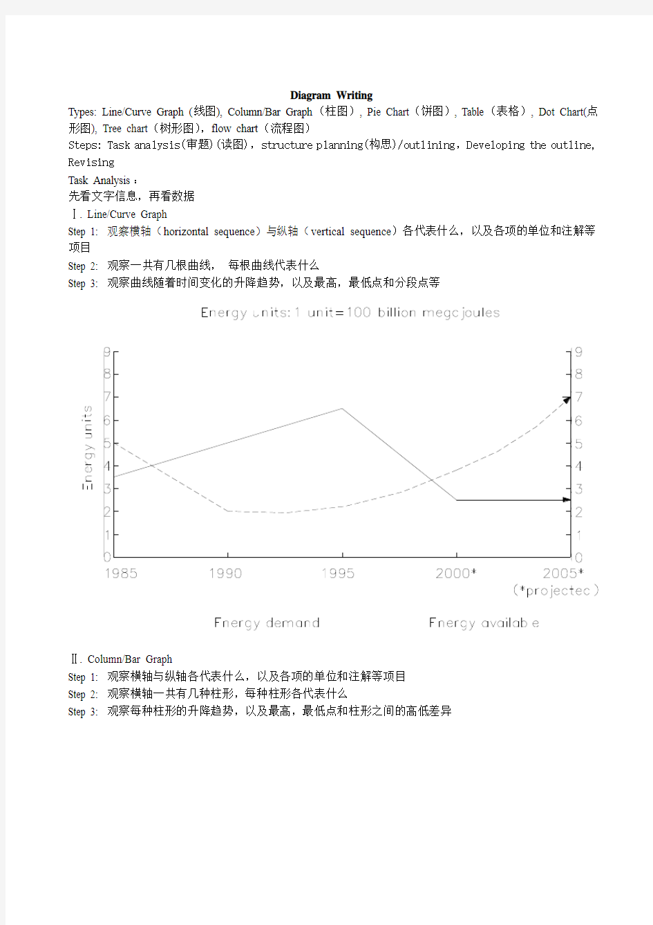
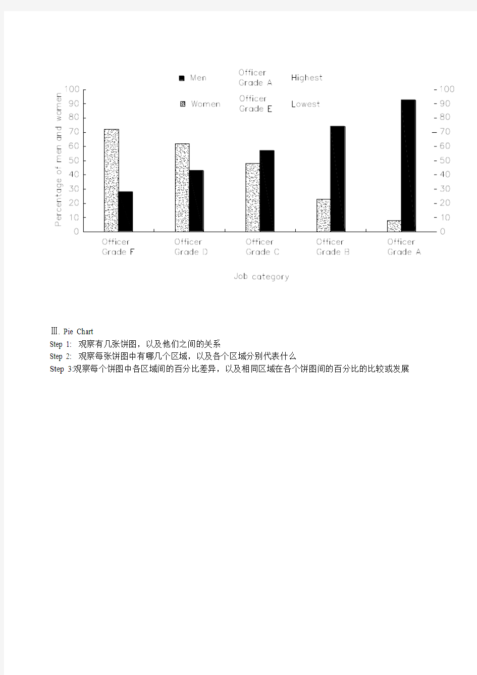
Diagram Writing
Types: Line/Curve Graph (线图), Column/Bar Graph(柱图), Pie Chart(饼图), Table(表格), Dot Chart(点形图), Tree chart(树形图),flow chart(流程图)
Steps: Task analysis(审题)(读图),structure planning(构思)/outlining,Developing the outline, Revising
Task Analysis:
先看文字信息,再看数据
Ⅰ. Line/Curve Graph
Step 1: 观察横轴(horizontal sequence)与纵轴(vertical sequence)各代表什么,以及各项的单位和注解等项目
Step 2: 观察一共有几根曲线,每根曲线代表什么
Step 3: 观察曲线随着时间变化的升降趋势,以及最高,最低点和分段点等
Ⅱ. Column/Bar Graph
Step 1: 观察横轴与纵轴各代表什么,以及各项的单位和注解等项目
Step 2: 观察横轴一共有几种柱形,每种柱形各代表什么
Step 3: 观察每种柱形的升降趋势,以及最高,最低点和柱形之间的高低差异
Ⅲ. Pie Chart
Step 1: 观察有几张饼图,以及他们之间的关系
Step 2: 观察每张饼图中有哪几个区域,以及各个区域分别代表什么
Step 3:观察每个饼图中各区域间的百分比差异,以及相同区域在各个饼图间的百分比的比较或发展
Ⅳ. Table
Step 1: 观察表格中横栏和纵栏各自是什么,以及各自的单位和包含项目
Step 2: 观察表格中的数据是否可以按照数值的大小进行分组,以便于描述
Step 3:观察以其中一个栏目作为基准,以另一个栏目为参照,数据(figures)间的比较和一些特别值得注意的数字,如最大值,最小值,零数值以及空缺位等
Ⅴ. Dot Chart
Step 1: 观察横轴与纵轴各代表什么,以及各项的单位和注解等项目
Step 2: 观察纵轴共有几种点形,每种点形各代表什么
Step 3:观察每种点形的最大值,最小值,以及点形之间的数值差异
Ⅵ.注解:不止一个图时,要判断各图之间是否有联系,如果有,就一起描述;如果没有,就分开描述;如果看不出其中的联系,考生最好也分开描述。因为牵强地联系不同图表,会造成失分。
Structure Planning
Ⅰ.The beginning part; the middle part/the main body; the ending part
Ⅱ.The middle part/the main body: giving the detailed interpretation of and the relationships between the parts and figures in the diagram. Choosing order well you are going to describe is the key step.
Two to three paragraphs
主体部分第一句话总结图中比较显著的趋势或者特征(overall trends and features)(如果有此趋势或者特征的话);其余句子参照读图的过程选择好描述的顺序(如最早时间/最高值;最低值/特色值/趋势/近似数据分组;最低数值/最后出现的数值)
Developing:
Ⅰ.The beginning part:
giving a general introduction or interpretation of the whole diagram, telling the reader what it is about.
One paragraph
Ⅱ.The middle part: 主体部分大部分句子有三个组成部分,及文字信息、数字信息和比较。例如:
A verage family size in the US has been shrinking(文字信息), from 3.3 people in 1967 to 2.6 people in 2006(数字信息), compared to 4.5 people in 1915(比较).
(比较:The average US family had 4.5 people in 1915, 3.3 in 1967 and 2.6 in 2006.)
例子2:The property crime rate in non-metropolitan countries was relatively low(文字信息), 1,250 per 100,000 people(数字信息), less than half the rate(比较)in metropolitan countries(2, 529 offenses per 100, 000 inhabitants).
比较:Non-metropolitan countries had a property crime rate of 1,250 per 100,000 people, and metropolitan countries experienced a rate of 2,529 offenses per 100,000 inhabitants.
Ⅲ.The ending part:
四个标志性词组:
In summary,…
To sum up,…
In conclusion,…
To conclude,…
常见四种模式:
A.总结要点式;
E.g.,
In conclusion, it can be seen that from the economic indicators, the four developing countries have to develop a lot more before reaching the same level of quality of life In the USA.
B.构造理论式;
例子1:在两张饼图中,我们发现有三个行业的女性比例要远低于相应的男性比例。我们可以把这种现象归纳为一种理论,即女性进入某些行业的难度要远远高于男性
In conclusion, the two charts clearly show that women do not have the same access as men to certain types of employment
例子2:在该曲线图上,我们看到三个因素在影响这曲线的发展
(1)USSR苏联Virgin Land Program
(2)Doubling of world grain prices
(3)Retrenchment节省;删除
如果把这三个因素上升到理论层面的话,因素1和因素3和政府的政策有关,因素2与市场价格有关。In summary, we can see that the area devoted to grain production was affected by both government policy and market forces.
C.指明未来式;
In conclusion, the energy demand and energy available from fossil fuels resulted in an excess amount of energy available in the 1990s in Freedonia which, perhaps, was due to the availability of alternative sources of energy. On the other hand, an energy gap that continues to widen is forecast, beginning in the late 1990s. In the future, Freedonians will have to enforce energy saving measures or look towards the use of alternatives sources of energy.
D.揭示含义式
e.g. 1,
Describe the information below and discuss the implications for dental health. 题目含有了讨论含义的写作任务,因此,可以在结尾段揭示图的内涵:
The implications, then, are that people who insist on eating sweet foods should be aware of the ingredients, and that fruit sugar or honey appears preferable to cane sugar蔗糖.
e.g. 2,
The data appear to confirm the often cited link between national wealth and health and education standards.
Useful words and phrases:
diagram, graph, chart, table
demonstrate, show, illustrate, tell us, present, represent, exhibit, compare; see, analyze, study, observe
e.g., The pie chart shows that …
As is shown in the pie chart,…
By studying/From the pie chart, we can see clearly that …
Rapid, noticeable, great, sharp, steep, remarkable, gradual, slight, little/small, slow
Rise, development, changes, increase, decrease, fall, decline, drop
Proportion, data, percentage
A is/was n times as much/many as B
A is/was n times adj.-er than B
A is/was n times that of B
Sample:
Sample One
The bar chart shows information about the areas of land damaged by human activities in four major continents of the world.
The areas of land damaged in Africa and Asia are similar, totaling approximately 1,200 million hectares for each, while in Australia and Europe the numbers are considerably lower, averaging between 300 and 400 million. Looking at the causes behind land damages, we can see that in Africa, Europe and especially Australia, breeding is the leading cause of land loss, damaging approximately 500, 100 and 400 million hectares of land respectively. Next comes tree-cutting which takes away slightly larger areas of land than farming in all the three regions.
Asia shows a slightly different picture, where tree-cutting activities have led to the largest amount of land loss (450 million hectares). Breeding and farming account for the remaining damage (380 and 420 million hectares respectively).
Overall, breeding causes the most pervasive普遍的damage to land around the world.
156 words
Sample Two:
Venezuela委内瑞拉v?n?'zwil?
Saudi Arabia沙特阿拉伯(西南亚国家)
United Arab Emirates阿拉伯联合酋长国,简称阿联酋
第一步:读题
第二步:读图里的文字信息。第一饼图里分别有石油、天然气、煤、核能和水电,是2005年的数据;第二幅图是几个石油储备国所占比例,没有说明年份;第三幅图是油价。
第三步:读图里的度量单位和其他信息。两个饼图的单位很明显是百分比,而线图的单位是每桶多少美元。第四步:开始写作。写完介绍段后,看两个饼图和线图有没有联系。可以看出,这三幅图没有任何联系,因为针对对象不同。
第五步:寻找主要规律和特征。前两幅图没有年份,从最高值开始读。线图有年份,从第一年开始读。石油】天然气还有煤是消耗最多的能源。石油储备国家很多,沙特、伊朗、伊拉克、科威特和阿联酋这些中东国家占据了世界过半的石油储备。油价方面,2005年左右到了历史最高值,自此之后滑落,在每桶50美元左右波动。
The two pie charts, combined with the line chart, give an overview of some aspects of the energy market. According to the first pie chart, the consumption of oil was the highest in 2005, accounting for 37% of the energy consumed worldwide, followed by coal and natural gas, taking up 28% and 23% separately. Nuclear power and hydro-electricity evenly contributed to the remaining 12%.
Saudi Arabia and Canada are the two countries with the largest oil reserve---20% versus 14%. Four Mid-east countries, Iran, Iraq, Kuwait and United Arab follow behind, each having 8 to 10% of the global reserves. V enezuela, Russia and the United States are on the list as well, but account for a smaller share, 6%, 5% and 2% respectively.
The line chart shows a wide variation in the world oil prices in the first decade of the 21st century. In 2000, oil cost a mere 33 dollars per barrel, or even less in the following three years. From 2003 onwards, the price had surged markedly and finally hit a peak of 60 dollars in about 2006. Since then, the oil price is expected to drop for three years or longer, down to 48 dollars in 2010 and remain at that level throughout the rest of the given period.
As suggested above, oil is very likely to remain as an important energy source, with more than half the global oil reserves being located in Mid-east countries. In the two decades to come, the oil price is unlikely to return to its low levels in the early 2000s.
常用句型:
1起伏不定go up and down/ wave/ fluctuate/ be unstable/ be in flexible
2 The first point to note is the huge increase in the number of
需要注意的第一点就是…的急剧增长
3 The statistics show that
这些数据表明
4占百分之几Form/comprise/make up/constitute/ account for ….percent
5 This cure graph describes the trend of
该曲线图描述了…的趋势
6 The statistics lead us to the conclusion that
由这些数据,我们可以做出如下结论
7 As can be seen from the line graph,
由线状图我们可以看出
8增加:Increase / raise / rise / go up/ soar/ ascend/ mount/ climb
9减少:Decrease / grow down / drop / fall/ reduce/ descend/ shrink to/decline 10稳定:Remain stable / stabilize / level off/ remain unchanged
11 It can be seen from the table that
由表格我们可以看出
12 The table shows the changes in the number of… over the period from…to…该表格展示了从…到…数据的变化
13 The table provides some data of
该表格提供了有关…的数据
14 As can be seen clearly from the table,
从表格中我们可以清楚地看出,
15 As can be seen from the table, great changes have taken place in...
从表格中可以看出,...发生了巨大变化
16 This table illustrates the changing proportion of A and B from...to...
该表格描述了...年到...年间a与b的比例关系
17急剧地sharply, steeply, dramatically, drastically, suddenly
18显著地,considerably, significantly, noticeably, remarkably, rapidly
19稳步地, 逐渐地steadily, moderately, gradually, smoothly
20轻微地, 缓慢地slightly, slowly, mildly, moderately
21 The following diagram shows the structure of...... 以下的图展示了...的结构
22 The picture illustrates......
该图展示了...
23 It mainly consists of following steps.
它主要包括以下步骤
24The whole procedure can be divided into...stages. 整个的过程可以分为...步
25 The first step is to
第一步是...
26 The next step is to
接下来的一步是...
27 The last step is to
最后的一步是...
28 The first stage involves
第一步包括...
29 In the next stage
接着,
30 In the last stage
最后,
31The bar chart illustrates that…
该柱状图展示了
32 As is shown in the bar chart,
如柱状图所示,
33It can be concluded from the bar chart that…
从该柱状图我们可以推导出
34 The bar chart presents the general trend in…
该柱状图描述了……总的趋势
35 This bar chart displays the numbers of…
该柱状图展示了…的数据
36 The number of … increased by %
…的数字上升了百分之…
37 The number of… dropped by %
…的数字下降了百分之…
38 The chart reflects several trends.
该图展示了几个趋势
39As can be seen clearly from the bar chart, the fluctuation of…took place 从该柱状图我们可以清楚地看出:…出现了波动
40 Over the period from…to…the…remained level.
在……至……期间,…基本不变
图表作文常用句型
As is shown in the graph…如图所示…
The graph shows that…图表显示…
As can be seen from the table,…从表格中可以看出…
From the chart, we know that…从这张表中,我们可知…
All these data clearly prove the fact that…
所有这些数据明显证明这一事实,即…
The increase of …. In the city has reached to 20%.
….在这个城市的增长已达到20%.
In 1985, the number remained the same.
1985年,这个数字保持不变.
There was a gradual decline in 1989.
1989年,出现了逐渐下降的情况
对于线性图表的描述
上升
1. 对于上升趋势的描述:
a. 可以使用的动词或动词词组:
to increase
to go up
to rise
to grow
to jump
to leap
to soar
to shoot
to pick up
b. 可以使用的名词:
an increase
a growth
a jump
a soar
an upward trend
2. 对于上升到某个位置的描述:
a. 1. a. 中的动词+to+具体数据。
b. 1. a. 中的动词+to+the peak of+具体数据。
c. 1. a. 中的动词+reaching the peak of +具体数据。
d. 1. a. 中的动词+reaching + 具体数据。
e. to peak at +具体数据
f. to climb to + 具体数据
3. 对于上升的程度的描述:
a. 1. a. 中的动词+by +具体数据。
b. 1. a. 中的动词+副词。(见
下降
1. 对于下降趋势的描述:
a. 可以使用的动词或动词词组:
to fall
to decrease
to go down
to slide
to collapse
to decline
to drop
b. 可以使用的名词:
a collapse
a decrease
a fall
a decline
a drop
2. 对于下降到某个位置的描述:
a. 1. a. 中的动词+to+具体数据。
b. 1. a. 中的动词+to+the bottom of+具体数据。
c. 1. a. 中的动词+reaching the bottom of +具体数据。
3. 对于下降程度的描述:
a. 1. a. 中的动词+by +具体数据。
b. 1. a. 中的动词+副词。(见
对于平稳的趋势的描述:
可以使用的动词或动词词组:
to hardly change
to have little change
to keep steady
to level off
to remain constant
to stay the same
表示程度的副词:
1. 程度较大:
considerably
dramatically
greatly
markedly
obviously
quickly
rapidly
sharply
significantly
suddenly
2. 程度较小:
slightly
gradually
slowly
steadily
时间的嵌入
嵌入时间时所使用的介词和介词词组:
in
from……to……
between…….and……
during……and……
at the start of ……
by the end of ……
over ……
at the end of ……
throughout ……
时间’s + 具体数据
上升和下降趋势的组合描述(嵌入了时间和程度之后):
1. 先上升后下降的句型:
...... increased slowly during…… and …… but fell sharply in …….
A steady fall in …… during …… and …… followed the sharp increase in …….
2. 先下降后上升的句型:
…… fell before …… began to make a recovery ……
…… continue the recovery, climbing to ……
…… dropped during …… but increased again in ……
…… fell and then pick up during ……
…… collapsed before rising to ……at the end of ……
3. 起伏波动的句型:
…… fluctuated sharply all through ……
4. 波动不大的句型:
…… hardly changed through the period between ……and ……
柱状图形的描述
转换为线形图形的描述
饼状图形的描述
对于百分比进行描述所使用的句型:
…… % the …… is/has/have/are ……
…… accounts for ……% of the total
…… takes up ……% in the whole chart
趋势的比较
1. 表示相似的句型 (实例) :
Both share prices rose sharply in January.
Neither company has made a profit yet.
Like X, Y fell in June.
X rose just as sharply as Y.
2. 表示差异的句型(实例):
X fell sharply whereas/while Y remained steady.
X fell quickly compared to Y.
Unlike Y, X rose by 10%.
X rose far more dramatically than Y.
3. 表示倍数的句型:
the …… doubled/tripled in …… compared with those in ……
4. 客观比较的句型:
…… is …… in contrast to ……
数据的修饰
1. 表示不足的词或词组:
up to
below
under
almost
nearly
2. 表示超过的词或词组:
over
more than
just over
3. 表示大约的词:
about
补充一点点:
一.主章开头
图表类型:table; chart; diagram; graph; column chart; pie graph
描述:show; describe; illustrate; can be seen from; clear; apparent; reveal; represent 内容:figure; statistic; number; percentage; proportion
二.表示数据
一般:have 10%; at 10%;over 10%
最高(低)点:peaked; reached a peak/high(point)
bottomed out; reached the bottom
变化:recover 略有回升; increase; jump; rise/rose; climb
decrease; fall/fell; drop; decline; reduce
fluctuate 浮动,摇摆不定
remained steady/stable; stay the same; little/hardly any /no change 变化程度:sudden/suddenly 突然的,意外的
rapid/rapidly 迅速的,飞快的,险峻的
dramatic/dramatically 戏剧性的,生动的
significant/significantly 有意义的,重大的,重要的
sharp/sharply 锐利的,明显的,急剧的
steep/steeply 急剧升降的
steady/steadily 稳固的,坚定不移的
gradual/gradually 渐进的,逐渐的
slow/slowly 缓慢的,不活跃的
slight/slightly轻微的、略微地
stable/stably 稳定的
表示范围:from…to… between…and… for …to …多长时间直到
表示程度:almost adv. 几乎,差不多
nearly adv. 几乎,密切地
approximately adv. 近似的,大约
about adv. 附近,大约,转向,左右,周围
just over 刚超过
over adv. 结束,越过,从头到尾
exactly adv. 正确地,严密地
precisely adv. 正好精确地;清晰地
比例:20 per cent 20%
one in three 1/3
one out of every four 1/4
三常用词
significant changes 图中一些较大变化
noticeable trend 明显趋势
during the same period 在同一时期
grow/grew 增长
distribute 分布,区别
unequally 不相等地
pronounced 明显的
average 平均
no doubt 无疑地
corresponding adj. 相应的,通讯的
represent vt. 阐述,表现
overall 总体上讲
except 除外
in the case of adv. 在…的情况下
in contrast 相反,大不相同
in conclusion adv. 最后,总之
in comparison 相比之下
inversely adv. 相反地,倒转地
in general 通常,大体上,一般而言
rang from
excessive adj. 过多的,过分的,额外
lower v.降低,跌落
elapse vi.(时间)过去,消逝
category n.种类
government policy 政府政策
market forces 市场规律
measure n. 尺寸,方法,措施 v.估量,调节
forecast n. 先见,预见 v. 预测
1.有用的词
上升:increase rise ascend core surge go up climb mount level up 下降: decrease fall drop descend decline reduce lessen level down 平稳:stable steady remain/maintain/keep/be the same as/similar to 波动:fluctuate fluctuation rise and falls up and down
占occupy take up account for gain
而:while however whereas on the other hand actually/in fact
相比:by contract on the contrary likewise compared with
最高点:the highest the top the summit the peak the most
最低点:bottom less least rock bottom
平均:mean average
趋势:tendency trend inclination
预见:prediction
达到顶峰: mount to
在***中占***:***gain the percentage of
有一个稳定的过程:a stable period can be seen
图表作文常用句型
1)It can be seen from
the chart/diagram/data/figures/graph/picture/histogram/statistics
that …
2)According to the chart/diagram/figures/graph, ...
As shown in
As indicated by
As can be seen in
3)The chart/diagram/figures/graph tells us that...
indicates
reveals
shows
conveys the messages
3) There is a minimal/slight/small/slow/s ignificant/sharp/rapid/
We notice dramatic
People find
rise/increase/decrease/decline/drop/reduction/fall/
fluctuation
4) In relation to ..., it/he/she is twice as high/tall/larg /many/much Compared with ... three times as... 5)By comparison with ...,the figure increased three times.
As against ...,percentage decreased sharply.
Compared with...,turnout fell almost two-fold.
doubled.
tripled.
6)In short , we can say that ...
In conclusion,it can be said
On the whole ,it may be stated
In a word , there is no doubt
In brief, people can say with certainty
To sum up,no one will deny
Finally,
7)As a result, it can/may/might be concluded/deduced/inferred/estimated Therefore,that...
On this basis,
Given this,
Hence,
Consequently,
英语图表作文范例
图表作文写作指导 图表作文至少包含描述图表与解释原因两个部分,而当前的图表作文大多还有第三个段落。图表作文的规律性很强,不像图画式作文那样富于变化。 1.首段的写作 图表作文有表格(table)、柱形图(bar chart)、饼状图(pie chart)和折线图(diagram)之分,后三种都属于图表的范畴(chart)。不管是chart还是table,都需要进行描述,一般放在文章的第一部分,长度宜适中。描述数据我们要首先看看是几个变量(A),每个变量有几个数据(B),不妨以A*B表示。 如果只有一个变量,有三个数据,可以描述如下: From the chart we can see clearly that the average number of hours a student spends on Internet per week has increased from less than two hours in 1998 to nearly four hours in 2000, and then to 20 hours in 2004. 如果是最常见的是2*3的情形,可以描述如下: From the chart, we can see clearly that in a big city in China, state-owned houses declined from 75% in 1990 to 60% in 1995 and then to 20% in 2000, while private houses rose from 25% to 40% and then to 80% during the same period. 这里用了while引起从句来突显对比,是一种非常好的办法,如果用两句话来描述,也完全可以。 如果是1*n(n>3)的情形,将头与尾描述出来即可,比较好的方法就是在句中描述最后一个与第一个相比变化了多少。 碰到多变量、每个变量多数据的情形,大家应首先进行分类,分成上升、下降两类,或者上升、下降、不变三类,这样问题就迎刃而解了。 2.第二段的写作 第二段是解释原因的段落。我们谈谈两个问题。 首先是过渡句这个问题。这里不大可能放在第一段,因为第一段不可能像某些命题作文那样简洁(如只有一句)——例如提纲式作文中的批驳类文章中除第二段首句批驳之外还有首段末句批驳,效果很强烈。 其次就是此段的主题句(topic sentence)的问题。此句或主观或客观,并无拘束,只要上下文风格统一即可。 主观:We believe that three reasons can account for this phenomenon. I believe that three reasons can account for this phenomenon. In my mind, the reasons why the overseas students are on the rise are as follows. 主观之变体(使用插入语,突显主语):Three reasons, we believe, can account for this phenomenon. Three reasons, I believe, can account for this phenomenon. Three reasons, I firmly believe, can account for this phenomenon. 注意:插入语的使用属于看似平淡却极富功力的技巧,可以达到很好的效果。
图表类英语作文范文英语作文模板(图表类的)
图表类英语作文范文英语作文模板(图表类的)这里很全 一、图表类作文常用的单词、短语和句型 1.表示数据变化的单词或短语 in the case of (在……的情况下) in terms of (在……方面) increase / raise / rise / go up(增加) decrease / grow down / drop / fall (减少) increased by (增长了) increased to (增长到) the number sharply goes up to(数字急剧上升至)
significant(重大的),steady(平稳的),gradual(逐渐的),slow(慢慢的),stable(稳定的),rapid(快速的)…… 2. 表示从图表得知的信息的句型 The table / chart / graph shows that...(这个图表告诉我们……) Aording to the table / chart /graph, we can see that...(根据图表,我们可以看出……) It can be concluded from the graph that...(从图表中可以得出……) The table shows the changes in the number of...over the period from...to...(该表格描述了在……期间……数量的变化) 二、图表类作文的模式
图表类作文中的图表主要有以下形式:柱形图类(chart)、圆饼图类(pie chart)、曲线图类(line chart)、表格类(table)。写文章时,首先要对图表加以描述,而后引出主题加以讨论,最后得出结论,也就是按照描述图表—解释原因—下结论的步骤来写。切忌对图表不作交代就直接谈论主题。 1.表格类作文的模式 表格类作文一般可以分为三段:第一段对表格中的数据进行描述,只要抓住变化规律即可,切忌一一列举数据;第二段说明变化的原因;第三段得出结论。即: (1) Studying the table carefully, we can see...(仔细研读表格,我们可以看出……) (2) In my opinion, the reasons why...are as follows. Firstly...Secondly...Thirdly...(在我看来,为什么……的原因在于以下几点:第一……第二……第三……)
图表的英文描述
图表的英文描述: 图表的种类: 饼状图 pie chart/pie graph segment 柱形图 bar chart/bar graph bar 线型/曲线图 line chart/line graph line线条实线solid line 虚线dotted line 横轴 horizontal axis竖轴vertical axis 表格 table行row 列column 常用的表达: 比例percentage percent 5% five percent 数量 number 趋势 trend 关系 relation This is a pie chart/bar chart/line chart/table of_________. 这是一个关于________的饼状图/柱形图/线型图/表格。 This pie chart/bar chart/line chart/table shows________ 这张图展示了___________. From this pie chart/bar chart/line chart/table, we can see/ know that_____________. 从这张图中,我们知道___________. As we can see from the pie chart/bar chart/line chart/table, ____________________. 我们可以从这张图中知道,________________________________. 在这张曲线图中,横轴代表_________________,竖轴代表___________________. In this line chart, the horizon tal axis stands for_________, the vertical axis stands for _____________. 比较:比较级+than 大 big/large 更大 bigger/larger 最大the biggest/largest 多 more 快 fast/rapid 更快faster/more rapidly 最快the fastest/the most rapid 高 high 更高 higher 最高the highest 好 good 更好 better 最好 the best Compared with_______, ___________________________. 同_______相比,________________. 例:同A相比,B的数量比A更多。Compared with A, the number of B is larger than the number of A. 同A相比,B增长得更快。Compared with A, B increases faster. 变化: 变化速度:快地fast/rapidly 慢地slowly 稳定地stably 变化程度:大(剧烈)dramatic ally 小(轻微)s light ly 改变change 增加 grow/increase/ go up 减少decrease/go down 无变化 have no change/ stay the same 描述、分析图表的主要步骤:
英语图表类作文表达法集锦
图表写作表达法集锦 I.Introduction 1.This diagram unfolds a clear comparison between Florida, a state of the United States, and the United States as a whole in four aspects, namely, registered engineers, the civilian labor force, manufacturing employment and hi-tech employment, from 1978 to 1987. 2.There were many significant changes in modes of transport used by city dwellers from 1950 to 1990. The following paragraphs will identify and discuss the trends in the accompanying graph. 3.The chart below displays the average earnings per week, in pounds sterling, of people of different levels of education living in the UK between the years 1965 and 1995. 4.The chart indicates the subjects studied by university students in Australia during the latter of last century. 5.The chart shows the number of road accidents in Britain over a period of six years. 6.The line graph reveals the amount of fast food consumed by Australia teenagers over a 25-year period between 1975 and 2000. 7.The bar chart illustrates the percentage of employees in different occupations absent from work in a giver week in 2001. 8.Indicators of economic and social conditions in four countries, Canada, Japan, Peru and Zaire, in 1994, complied by the UN, reflect the great difference that exist between wealthier and poorer nature. 9.The graph compares the number of deaths caused buy six diseases in Erewhom in 1990 with the amount of research funding allocated to each of those diseases. It can be clearly seen that the amount of research funding in many cases did not correlate with the seriousness of the disease in terms of numbers of deaths. 10.The three graphs provide an overview of the types of music people purchase in the UK.At first glance .we see that classical music is far less popular than pop or rock music. https://www.360docs.net/doc/4a12986612.html,parison △The Same 1.The difference in earnings of people with different levels of education is very small. 2.The situation in Australia and New Zealand was similar in that the imprisonment rates from 1930 to 1980 remained stable. 3. A similar trend was seen in Asia. 4.The difference in earnings between high school leavers and university graduates diminished after 1995.average 5.By 1999, coffee consumption in China stood at 992 million cups, almost equal that of America, which stood at 1,090 million cups per year. 6.The trend was virtually mirrored by study of the arts, which increased significantly from 20% in 1950-59, through 25% ten years later, finally reaching 38% by 1990-99. 7.During the first period of each year, the figures averaged out to around 300,000 to 350,000 accidents. 8. A similar pattern is also recorded for both the finance /banking and defense –related public sectors. △Large Difference 1.There is a significant difference between all three countries. 2.In the highest executive position (Grade A), women represent only about 85 of the workers. This stands in marked contrast to the 92% of men represented in this job category.
英语作文图表类提纲类作文写作实用模板
第一部分、写作模板——图表式作文 It is obvious in the graphic/table that the rate/number/amount of Y has undergone dramatic changes. It has gone up/grown/fallen/dropped considerably in recent years (as X varies). At the point of X1, Y reaches its peak of …(多少). What is the reason for this change? Mainly there are …(多少) reasons behind the situation reflected in the graphic/table. First of all, …(第一个原因). More importantly, …(第二个原因). Most important of all, …(第三个原因). From the above discussions, we have enough reason to predict what will happen in the near future. The trend described in the graphic/table will continue for quite a long time (if necessary measures are not taken括号里的使用于那些不太好的变化趋势). 第二部分、写作模板——提纲式作文 一、说明原因型 模块(一) Nowadays , there are more and more XX in some big cities . It is estimated that ( 1 ). Why have there been so many XX ? Maybe the reasons can be listed as follows. The first one is that ( 2 ) .Besides, ( 3 ) . The third reason is ( 4 ). To sum up , the main cause of XX is due to ( 5 ) . It is high time that something were done upon it. For one thing , ( 6 ). On the other hand , ( 7 ). All these measures will certainly reduce the number of XX . 注释: (1)用具体数据说明XX现象; (2)原因一; (3)原因二; (4)原因三 (5)指出主要原因;
英语图表作文范例
一、图表作文写作常识 1、图形种类及概述法: 泛指一份数据图表:a data graph/ch art/diagram/illustration/table 饼图:pie chart 直方图或柱形图:bar chart / histo gram 趋势曲线图:line chart / curve di agram 表格图:table 流程图或过程图:flow chart / sequ ence diagram 程序图:processing/procedures dia gram 2、常用的描述用法
The table/chart diagram/graph sho ws (that) According to the table/chart diag ram/graph As (is) shown in the table/char t diagram/graph As can be seen from the table/cha rt/diagram/graph/figures, figures/statistics shows (tha t)…… It can be seen from the figures/s tatistics We can see from the figures/stati stics It is clear from the figures/stat istics It is apparent from the figures/s tatistics
table/chart/diagram/graph figures (that)…… table/chart/diagram/graph shows/d esc ribes/illustrates how…… 3、图表中的数据(Data)具体表达法 数据(Data)在某一个时间段固定不变:fixed in time 在一系列的时间段中转变:changes o ver time 持续变化的data在不同情况下: 增加:increase / raise / rise / g o up …… 减少:decrease / grow down / drop / fall …… 波动:fluctuate / rebound / undul ate / wa ve …… 稳定:remain stable / stabilize / level off ……
各类图表英文描述
1.Map(地图、天体图、布局图、专用图、图谱)Battle map 作战地图 Highway map 公路图 Genetic map 基因图谱 2.Figure(图形、平面图) Geometric(al) figure 几何图形 Dimension figure 尺寸图 Plane figure 平面图 3.Pattern(图案、图型、图样) Checkboard pattern 棋盘型图案 Recording pattern 录像图型 Circular pattern 圆形图样 4.Sketch(草图、略图、简图) Eye sketch 目测草图 Topographic sketch 地形略图 Dimensional sketch 尺寸简图 5.Scheme/shematic(图解、示意图、流程图、电路图)Flow scheme 流程图 Induction scheme 感应电路图 6.Draft(草图) Chisel draft 雕刻前在石头上画出边缘轮廓草图 7.Curve(曲线图表) Algebraic curve 代数曲线 Comfort curve 湿度舒适曲线 8.Graph(曲线图表) Funtional graph 函数图(亦称plot) Bar graph 条形图(也称chart) 9.View(视图) Plane view 平面视图 10.Geometry(几何图) Plane geometry 平面几何 Solid geometry 立体几何图 11.Chart(航海图、图表) Aeronautical chart 领航图 Demographic data chart 人口统计图表 Pie chart 饼图 Bar chart 柱图 12.Drawing(工程图、插图) Drawing 建筑图 Explanatory drawing 说明(插)图 https://www.360docs.net/doc/4a12986612.html,yout(布局图、规划图) 1、图形种类及概述法: 泛指一份数据图表:
图表类英语作文范文
图表类英语作文范文 图表类型的英语写作如果不擅于观察漫画的话,作文写出来可能会偏题。下面是小编给大家带来图表类英语作文,供大家参阅! 图表类英语作文范文篇1第一段:说明图表 开篇句:As the bar chart shows, ____ during the years of ____to____. 扩展句:1、As early as _____. 2、Then _____ years later, ____. 3、And arriving in the year ____, ____. 第二段:解释图表变化原因 主题句:Several factors contribute to _____. 扩展句:1、______. (原因1) 2、And ______.(原因2) 3、Furthermore, ______ (原因3) 4、All these result in ____. 第三段:提出解决办法 结尾句:However, ____ is faced with some problems. 扩展句:1、With _____, ____, the effect of which is not only discouraging, but also challenging. 2、So my principle is to pay due attention to ___, but not
justto____. 示范 第一段:说明图表 开篇句:As the bar chart shows, the number of people below the poverty line decreased dramatically during the years of 1978 to1997. 扩展句:1、As early as 1978, about 250 million people were under the poverty line. 2、Then seven years later, the number became three fifths thatof1978. 3、And arriving in the year 1997, the number was reduced to50millions. 第二段:解释图表变化原因 主题句:Several factors contribute to the sharp decrease of the below-poverty population. 扩展句:1、The reform and opening following 1978 enabled the peasants to become much better off. (原因1) 2、And with the development of Chinese economy, that policy also improved city dwellers lives greatly. (原因2) 3、Furthermore, the high-tech introduced made it possible for the countrys economy as a whole to take off. (原因3) 4、All these result in the great fall of the
级常考图表分析型英语作文
图表分析型英语作文Sample 1 More Candidates for Civil Servants 1.根据下图描述报考公务员人数变化的趋势 2.分析导致这种趋势的原因 3.你的建议 1,000,000 2003 2004 2005 As is shown in the bar chart, the number of applicants for civil servants has increased abruptly—by about 10 times, from 100,000 in 2003 to 1,000,000 in 2005. Several factors may contribute to the rush. First and foremost, working as civil servants in China is relatively stable, and Chinese people have a traditional preference for maintaining a life-long career. The rising interest could also be attributed to the unique social status. Comparatively speaking , civil servants are generally highly respected by common people in China. Last, we should not neglect the benefits such as the welfare in government departments. Compared with the striking number of applicants for becoming civil servants, the vacancies issued by the government are scarce. Thus, it is suggested that applicants should weigh their own advantages and
英文图表作文分析
英文图表作文分析 1.图表分析作文的种类 图表就是数字、图像传达信息的一种形式,图表分析作文就是将这些数字、图像所包含的信息转换成传神表意的说明文字。 图表的种类很多,一般把各种数字资料,按照一定的顺序,通过表格形式表现出来的叫表(table),利用点、线、图等把信息资料通过图像表现出来的叫图(graph或chart),常用的图形有柱形图(bar graph),曲线图(line graph),圆形图(circular graph),图解图(diagram),饼形或百分比图(pie or percentage graph),象形图(pictorial graph),流程图(flow chart)等等。 2.图表分析作文的写作要领 2.1. 读懂标题,然后根据主题进行分析。虽然文章的中心思想和细节是通过图表来表示的,但同一张图表,如果命题不同,作者观察、分析问题的角度就有所不同,写出的短文也可能完全不同。请看下面两个圆形图: 上面两张图如果命题为“The Similarities and Differences of the Two Marketing Concepts”,本文可以首先对两张图分别进行说明,对两种观念的异同进行比较,然后得出结论;如果命题为“The Development of Marketing Concept”,本文的重点则偏重于市场营销观念的变化及其变化的原因。写作时可首先指出两种观念的重点虽然明显不同,但后者显然脱胎于前者,然后再分析这种观念变化的原因。请比较下面两篇文章: 例文①: The Similarities and Differences of the Two Marketing Concepts Let us take a look at the two circular graphs and compare the similarities and differences of the two marketing concepts. The concepts illustrated in Fig.1and Fig.2 are roughly the same in their main business mentality and tactics.Both are new and advanced concepts in business administration.Moreover,
英语作文模板图表作文
图表分析作文1 As is clearly shown in the table/ figure/ graph / chart, 图表总体描述between 年代and 年代. Especially, 突出的数据变化. There are three reasons for 具体表示急剧上升、下降或特殊现象的词. To begin with, 原因一. In addition / Moreover, 原因二. For example, 具体例证. Last but no least, 原因三. In short,总结上文. As far as I am concerned, / For my part, / As for me,作者自己的观点. On the one hand, 理由一. On the other hand, 理由二. In brief,总结上文. 图表分析作文2 The table / figure / graph / chart shows that 图表总述from 年代to年代. It is self-evident that 突出的数据变化. Three possible reasons contribute to 具体表示急剧上升、下降或特殊现象的词或代词代替上文内容. One reason is that原因一. Another reason is that原因二. For instance,举例证. What’s more原因三. As a result, 重述上文之趋势. However, in my opinion 作者观点. For one thing,理由一. For another, 理由二. To sum up,总结上文. 图表分析作文3 It can be seen from the table / figure / graph / chart that图表总述between年代and年代. Especially,突出的数据变化. Why are there such great changes during 图表涉及的年头数years? There are mainly two reasons explaining具体表示急剧上升、下降或特殊现象的词或代词代替上文内容. First,原因一. In the old days,比较法说明过去的情况. But now,说明现在的情况. Second,原因二. As a result,总结上文. In my viewpoint,作者自己的观点. On the one hand,论点一. On the other hand,论点二. 图表分析作文4 As the table / figure / graph / chart shows,图表总述in the past years年代. Obviously,突出的数据变化. Why are there such sharp contrasts during 图表涉及的年头years? Two main factors contribute to具体表示急剧上升、下降或特殊现象的词或代词代替上文内容. First of all,原因一. In the past,比较法说明过去的情况. But now 说明现在的情况. Moreover,原因二. Therefore,总结上文. As I see it,作者自己的观点. For one thing,论点一. For another,论点二. 图表作文补充句型 ?As is shown in the graph… 如图所示… ?The graph shows that… 图表显示… ?As can be seen from the table,… 从表格中可以看出… ?From the chart, we know that… 从这张表中,我们可知… ?All these data clearly prove the fact that… 所有这些数据明显证明这一事实,即… ?The increase of …. In the city has reached to 20%. ….在这个城市的增长已达到20%. ?In 1985, the number remained the same. 1985年,这个数字保持不变. ?There was a gradual decline in 1989. 1989年,出现了逐渐下降的情况.
图表类英语作文
As can be seen from the table given above, popular fiction is most popular with Chinese students, accounting for 65.9% of book circulation in the library. General Nonfiction takes up 18.2%, while books concerning science, technology and education, only 10.8%. In contrast, books of art, literature and poetry only have a circulation of 5.1%. Several reasons contribute to their reading preferences. Firstly, popular fiction is fascinating to the young students. Secondly, books about science and technology are usually too complex and difficult to read. They often contain many special terms which most students can’t understand. Finally, in today’s market economy, much more emphasis is laid on practical and vocational books rather than art or poetry. When it comes to me, poetry and art are my favorites. Such kind of books can nourish my mind, broaden my horizons and render me a fresh feeling. Reading a piece of good poetry tends to relieve my burden, and lessen my tension, making me more creative and dynamic. It gets me into an imaginary world, fresh and beautiful. I just love that feeling!(179 words) My View on Reading Extensively Nowadays few of us read extensively after we leave school. This tendency is rather disturbing, for one should know that reading extensively are no less necessary to one’s mental life than fresh air to one’s physical life. From reading extensively, we can derive companionship, experience and instruction. First and foremost, a good book is our faithful friend. It can increase our contentment when we are cheerful and happy, and lessen our pain when we are sad or lonely. Furthermore, reading extensively can also offer us a wide range of experiences. In reading we may join tourists marveling at incredible power of Niagara Falls, mingle with the happy throngs strolling in the Paris boulevards and experience the bitterness or joy of people in different lands and in different times. Few of us can travel far from home or live long over one hundred, but all of us can live many lives through the pages of books. The last but not the least, reading extensively can increase our intellectual ability, broaden our minds and make us wise. Though with the advent of TV and Internet, books are no longer read as extensively as they once were, nothing can replace the role that reading extensively plays in our lives. (206 words) It is obvious in the graph/table that the rate/number/amount of Y has undergone dramatic changes. It has gone up/grown/fallen/dropped considerably in recent years (as X varies). At the point of (接近)X1, Y reaches its peak value of …(多少). What is the reason for this change? Mainly there are … (多少) reasons behind the situation reflected in the graphic/table. First of all, …(第一个原因). More importantly, …(第二个原因). Most impo rtant of all, …(第三个原因). From the above discussions, we have enough reason to predict what will happen in the near future. The trend described in the graph/table will continue for quite a long time (if necessary measures are not taken括号里的使用于那些不太好的变化趋势). 图表作文经典句型总结