雅思图表线性图写作范文

WRITING TASK 1
You should spend about 20 minutes on this task.
The graph below gives information about cinema attendancein Australia between 1990 and the present, with projections to 2010.
Summarise the information by selecting and reporting the main features, and make comparisons where relevant.
Write at least 150 words.
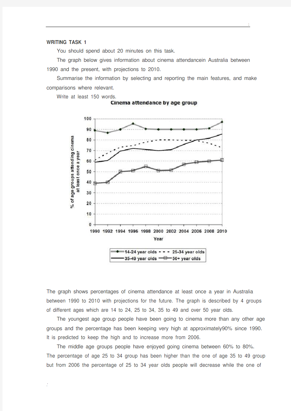
The graph shows percentages of cinema attendance at least once a year in Australia between 1990 to 2010 with projections for the future. The graph is described by 4 groups of different ages which are 14 to 24, 25 to 34, 35 to 49 and over 50 year olds.
The youngest age group people have been going to cinema more than any other age groups and the percentage has been keeping very high at approximately90% since 1990. It is predicted to keep the high and to increase more from 2006.
The middle age groups people have enjoyed going cinema between 60% to 80%. The percentage of age 25 to 34 group has been higher than the one of age 35 to 49 group but from 2006 the percentage of 25 to 34 year olds people will decrease while the one of
35 to 49 year olds people will increase and get higher than the other one.
The oldest people seem to go cinema less than the other groups but the percentageof the attendance has slightly going up by 15% from 40% to 55% between 1990 to 2004 and it will keep increasing to 60% by 2010.
Overall, it seems the younger age people, the more going to cinema.
(210 words)
【考官评语】
Band 6
This response addresses the requirements of the task and selects relevant material to describe. Key features and an overview are presented, although clearer highlighting, more support and a more comprehensive overview would be needed to reach a higher band. Information is well-organised and there is a clear overall progression in the response. There is some effective use of cohesive devices, but only limited use of reference and substitution. The range of vocabulary is not wide, but it is adequate for the task. Control of word form and spelling is consistentlygood, although there are some clumsy noun phrases that indicatelimited flexibility. The candidate attempts to use a mix of simple and complex sentences, but control is variable and grammatical errors or omissionsare quite intrusive at times. Figures are poorly integrated into sentences and indicate evident limitations.
雅思图表作文经典句型
雅思图表作文经典句型 一.上升增长 1.…add up to…增加了 e.g. The total amount of …added up to 14 billion pounds(14%) in 1994. 2.to jump to / to soar to.. 一跃达到/ 猛增到… e.g. The total working days lost soaredto 10 million in 1979. 3.…an increase of about…percent as compared with.. 与…相比大约增加了… e.g. In August as many as 39 car accidents were reported, indicating an increase of about 79% as compared with the number of January. 4.…to experience an increase/incline …有了增长 e.g. Tobacco consumption is experiencing an incline. 二.下降,减少 1.…to sink/drop/reduce to…减少到… e.g. The rate of strikes sank/dropped to the lowest point in 1979. 2.…to experience a decrease/decline …有了减少 e.g. Tobacco consumption is experiencing a decrease. 注意:
雅思经典图表作文范文
# 43. You should spend about 20 minutes on this task. The table below shows CO2 emissions for different forms of transport in the European Union. The Pie Chart shows the percentage of European Union funds being spent on different forms of transport. You should write at least 150 words.
model answer: The chart shows CO2 emissions per passenger kilometre for variuos methods of transport in the European Union while the pie chart shows European Union spending on transport. Flying by air produces by far the greatest CO2 emissions, approximately three times as much as passenger cars which are the next largest producers. Very little is spent by the EU on air travel while roads make up more than half of the EU transport budget. Trains produce about three times less CO2 emissions per passenger kilometre than passenger cars and eight times less than air travel. Nearly a third of EU transport funds are spent on railways. Ships are a clean form of transport and produce about the same amount of CO2 per passenger kilometre as trains do. However, only 2 percent of EU funds are spent on ports. A further one percent is spent on inland waterways. Coaches are the cleanest form of transport. Emissions of CO2 per passenger kilometre from coaches are half those of buses. Buses emit less than half as much CO2 per passenger kilometre as cars. The European Union spends 10 percent of its transport budget on public transport, such as buses and coaches. (197 words)
雅思图表作文-线图
Dubai Gold Sales The line graph shows estimated sales of gold in Dubai for 12 months in 2002 in millions of dirhams. There were two main seasons for gold sales. The main season for sales is in the December to May period. Sales were consistently above 200 million dirhams per month, rising sharply to a peak of 350 million dirhams in March. However, for the next four months, sales declined steadily,reaching an annual low of 120 million dirhams in July. In August, there was a sudden increase. Sales almost doubled, rising from 120 million dirhams in July to 210 million dirhams in August. This was followed by a drop in September, the July figure. From September to October, sales recovered, from 120 to 180 million. In October and November, sales r emained steady, and there was a small increase in December to 190 million dirhams. In conclusion, the main sales period is in the early part of the year, slumping in the summer, except for a sudden increase in August. Dubai Tourism, 1990-1994 The graph shows the numbers of tourists in hundreds of thousands visiting Dubai between 1990 and 1994. There are several features in the graph. First of all, the total number of tourists increased rapidly between 1990 and 1994. In 1990 there was a total of 450,000 tourists in Dubai. This rose sharply to 625,000 in 1991, an increase of more than 30%, and rose slightly again to just under 700,000 in 1992. In the following two years, the number of visitors started to pick up again and reached 1 million in 1994. This was more thandouble the figure for 1990. The second trend is that there was a huge increase in the number of tourists from Russia. In 1990, Russian tourists comprised only 20,000 or less than 5% of visitors. This number shot up to 50,000 in 1991 and doubled again to more than 100,000 in 1992. Between 1992 and 1994, the number trebled, from 110,000 to 330,000. This meant that Russian tourists made up one-third,or 33%, of Dubai’s 1 million visitors in 1994. In comparison, the number of tourists from other countries increased only slightly, from 550,000 in 1991 to 580,000 in 1994.
英语图表作文常用句型
1 起伏不定go up and down / fluctuate/ be unstable/ be in flexible 2 The first point to note is the huge increase in the number of 需要注意的第一点就是…的急剧增 长 3 The statistics show that 这些数据表明 4 占百分之几 Form/comprise/make up/constitute/ account for ….percent 5 This graph describes the trend of 该图描述了…的趋势
6 The statistics lead us to the conclusion that 由这些数据,我们可以做出如下结论 8 增加:Increase / raise / rise / go up/ soar/ ascend/ mount/ climb 9 减少:Decrease / go down / drop / fall/ reduce/ descend/ shrink /decline/sink 10 稳定:Remain stable / stabilize / level off/ remain unchanged 11 It can be seen from the table that 由表格我们可以看出 12 The table shows the changes in the number of… over the period from…to… 该表格展示了从…到…数据的变化
英语考试作文-9分雅思图表写作范文全集之地图篇 学校变迁
英语考试作文 9分雅思图表写作范文全集之地图篇学校 变迁 9分雅思图表小作文范文全集之地图学校变迁The diagrams below show the site of a school in 2004 and the plan for changes to the school site in 2024. 真题传送门:2017全年雅思写作真题范文大汇总(第一时间更新) 范文集结:全部9篇9分雅思写作地图范文汇总放送 范文 The two pictures compare the layout of a school as it was in the year 2004 with a proposed site design for the year 2024. It is clear that the main change for 2024 involves the addition of a new school building. The school will then be able to accommodate a considerably larger number of students. In 2004, there were 600 pupils attending the school,
and the two school buildings were separated by a path running from the main entrance to the sports field. By 2024, it is expected that there will be 1000 pupils, and a third building will have been constructed. Furthermore, the plan is to join the two original buildings together, creating a shorter path that links the buildings only. As the third building and a second car park will be built on the site of the original sports field, a new, smaller sports field will need to be laid. A new road will also be built from the main entrance to the second car park. Finally, no changes will be made to the main entrance and original car park. (183 words, band 9)
雅思小作文之图表作文
二.雅思图表作文 1.企业垃圾(线性图) 题目:The graph below shows the amounts of waste produced by three companies over a period of 15 years. 范文:The line graph compares three companies in terms of their waste output between the years 2000 and 2015. It is clear that there were significant changes in the amounts of waste produced by all three companies shown on the graph. While companies A and B saw waste output fall over the 15-year period, the amount of waste produced by company C increased considerably. In 2000, company A produced 12 tonnes of waste, while companies B and C produced around 8 tonnes and 4 tonnes of waste material respectively. Over the following 5 years, the waste output of companies B and C rose by around 2 tonnes, but the figure for company A fell by approximately 1 tonne. From 2005 to 2015, company A cut waste production by roughly 3 tonnes, and company B reduced its waste by around 7 tonnes. By contrast, company C saw an increase
雅思线图范文
line graph C11P77 Carbon dioxide emissions C9P101 U.S. Energy consumption C8p101 Goods transported in UK C7p53 Fish and meat consumption C6P30 Global water use C5P29 proportion of population aged 65 and over C11P77 Carbon dioxide emissions Karen’s Writing The graph compares changes in the amounts of average carbon dioxide emissions per person in four European countries from 1967 to 2007. In 1967 carbon dioxide emissions in the UK was the largest, with about 10.8 metric tonnes per person. In Sweden, Italy and Portugal, the emissions stood at 8.8,4.2 and 1.7 metric tonnes respectively. It is clear from the line graph that over the 40-year period, the emissions of carbon dioxide in the UK fell sharply to 9 metric tonnes while those in Sweden saw a small increase from 1967 to 1977, peaking at 10.2 metric tonnes. During the next 30-year period, the amounts decreased significantly to just below 6.
雅思小作文开头段
雅思小作文开头段应该如何写 在雅思写作的小作文部分里,往往我们可以采纳“老三段”式的写法,以不变应万变,不论是线图,柱图,表格,饼图,亦或是流程图,我们都可以采用此种方式完成雅思小作文的写作。 那么老三段式的经典写法中,强调着第一段“开门见山”介绍出本文讨论内容,即改写题目。将必要内容进行改写,这样可以获得高分效应。 第二段“丰实的内容”尽量多地将图表中的信息表达明确,不时的需要我们之前总结的常用表达(敬请参见前几篇文章关于雅思作文经典表达介绍文章)。第三段也就是文章的最后一段,对全文进行一个总结概括即可。 本文将着眼于介绍雅思作文开头段的常用高频高分表达,希望对同学们准备雅思有所帮助。也请同学们积极准备! 五分表达: The chart depicts (that)…该图呈现出… The chart shows (that)… The figures/statistics show (that)… The diagram reveals … The chart illustrates (that)… 六分表达: The graph provides some interesting data regarding…该图为我们提供了有关…有趣数据。 The graph describes the trend of …这个图描述了…的趋势 As is shown/demonstrated/exhibited in the chart/diagram/chart/table…如图所示… According to the chart …根据这些表格… As is shown in the table…如图所示… This table shows the changing proportion of A and B from …to …该表格描述了…年到…年之间A与B的比例关系。 This graph,presented in the chart,shows the general trend in…该图呈现了…总的趋势。
雅思图表作文数据描述例句
雅思图表作文数据描述例句 表示上升和下降的说法: 1.The proportion of the people who were divorced went up from 2.5% in 1981 to 7.5% in 1991, rising further to 8% in 2001. 2.The crop yields worldwide in 1990 were 15% up on those of 1985. 3. The number of shoppers during the Christmas period plunged by up to 23 per cent since then on. 4. After five years of steady decline, the high-school drop-out rate started to rise. 5. Oil consumption grew steadily from 1980 to 2000, apart from in 1990, when there was a drop of 5 per cent. 6. House prices fell as much as 40% between 1980 and 1985, compared with the period 1986 to 1990, when prices roughly doubled. 7. Arable land was being lost at the rate of over 38 thousand square miles per year throughout the 1980s. 8. Exports topped $10 billion in 2006, with those to Asia Pacific in excess of $2 billion. 9. The smoking rate in young girls was on the rise, similar to that among adult women. 10. Motorcycle casualities were in decline, down from a total of 54,037 in 1995 to 38,090 in 2000. 11. Gender equality would lead to 13.4 million fewer homeless children, a 13% reduction. 12. Inflation is likely to moderate through the early months of 2007. 13. The number of married couples showed a significant decline, accounting for 50.7% of the adult population, compared with 68% in 1971. 14. The smaller gap between movie-goers and television viewers reflected a 5% drop in the number of people who g to the cinema and a 1.2% increase in those who enjoy watching TV at home. 表示占据的说法: 15. Volunteers constitute nearly half of the work force of the health care sector. 16. While Asians account for 11% of the American population, Hispanics comprise 8%. 17. Women make up 52 % of the population of Britain.\18. 18. Landfill is composed of 36% municipal waste, 24% commercial and industrial waste and 40% construction waste. 表示倍数的说法: 19. Rent as a percentage of the household expenditure more than doubled between 1974 and 1998, from 5% to 12%. 20. Britons were twice as likely to die from hear attacks as Italians and three times as Chinese. 21. Women working as childminders in the under-35 age group in 1995 were almost twice as many as in 1990. 22. Television was twice as popular as washing machine in 1990, with close to 10% of households owning one TV set at home. 23. Young people used the Internet more than three times as often as the general population in 1999. 24. The study found that people who earned more than $100,000 received nearly 50% more junk mails than lower carners. 25. It also found that those on higher incomes lost on average four times more money than other victims in property-related crime. 26. China’s agricultural trade deficit against US jumped 1.5 times to $ 35 billion over the five-year period. 读数据的方法: 27. A quarter of the customers were African origin. 28. Some 700 migrants arrived to live in Australia every week in 2005. 29. Of course UK residents who traveled overseas, some 210,000 went to America. 30. The overall UK population was some 58 million in 2001, 17% higher than in 1951. 31. With an estimated 100 million international migrants worldwide, the proportion of people living outside their country of birth approached 2% of the world’s population in 2002.
(管理流程图)雅思A类图表作文各个击破(流程图、柱图、曲线、表格)免费
A类图表作文各个击破(流程图、柱图、曲线图、表格) .5.2表格 4.5.2.1解题关键 F 1表格与饼图一样,都是静态图。切入点在描述分配; F 2表格题考查列举数字的能力和方法。通过举一些有代表性的数据来说明问题; F 3横向比较。介绍横向各个数据的区别、变化和趋势; F 4纵向比较。介绍纵向各个数据的区别、变化和趋势; F 5不需要将每一个数据分别说明,突出强调数据最大值和最小值; F 6对比时要总结出数据对比最悬殊的和最小的。 4.5.2.2表格举例 Topic 4-4:The table below shows carbon dioxide emissions from transport in three European countries in 1994 and 2004.Summarise the information by selecting and reporting the main features and make comparisons where relevant.(表格贴不上,大家看附件吧~ ^_^)范文
The given table provides an overview of carbon dioxide emissions from four main transport sources (namely,road transport,railways,civil aviation and shipping) in the United Kingdom,France and Germany in 1994 and 2004. Germany,although having higher emissions than either the United Kingdom or France did,saw the amount decrease slightly from 47.2 to 46.7 million tonnes.By comparison,France recorded an increase of four million tonnes from 34.7 million in 1994,while the United Kingdom had a smaller growth,2.5 million tonnes over the same period.(纵向比较三个国家1994到2004年间二氧化碳释放量的整体趋势变化。) In all the three countries, road transport was responsible for the majority of emissions.(横向对四个二氧化碳释放源进行比较,点明最大释放源)In the United Kingdom,road transport produced emissions up to 32.6 million tonnes in 2004,2 million more than ten years earlier,while other three transport sources did not show any remarkable growth.(接着对三个国家的释放源进行描述说明,说明从1994年到2004年间的变化)A similar pattern was seen in France,where road transport added 3.6 million tonnes to the total emissions within ten
雅思写作中99%的雅思学生都会犯的图表作文问题
图表:99%的雅思学生都会犯的图表作文问题 1.一般没有had a decrease/ increase的说法,一般是saw a decrease/increase。 2. Increased, decreased, declined 这些上升和下降的词都没有被动语态。 3.当the number, the amount, the figure, the proportion做句子的主语的时候,不能用account for。 4.The proportion of 后面不能加句子,譬如说 the proportion of people worked in the healthcare sector是错的,要写成the proportion of people who worked in the healthcare sector 5.Make up, account for, constitute这些词一般只用于出现了分数或者百分比的题目,不用于描述其他数据。 6. The amount不能替换the number; the number of后面一定要加可数名词复数 7. Ratio和rate一般不能替代proportion和percentage 8. Picture 不能替换graph 或者chart 9. 不要用定语从句读数据,譬如说 the crime rate in the US was highest, which was 0.3%. 这里的which was 直接省略。 10. 结尾段一般不写in conclusion 11. 结尾段不能写数据 12. 一般是compared with,而不是comparing with 13. Followed by后面要写名词,而且这个名词要和主句的主语性质差不多 14. Reach 读数据的时候不能加to或者at, 直接加数据就可以 15. 说人年龄的时候应该是aged,譬如说people aged from 15 to 24 16. 一般不会用过去进行时态,也就是was increasing/decreasing 是错的 17. While, whereas一定要连接两个独立的句子,不能够单独存在 18. While 一般用于两个不同东西的对比,很少用于描述一个对象自己的上升和下降 19. 副词slightly不能修饰名词,应该是slight increase, drop 20. 小作文一般用不到minimum这个词,minimal的意思不是“最小的”,而是“基本上可以忽略不计的” 21. 尽量不要用套句,如果用,要注意不要写错,it is worth noting that, it should be noted that 22. 图表作文一般用不到on the contrary, 用in contrast, by contrast即可 23. 表示波动可以说fluctuated,不要写saw a fluctuation 24. Reduce和raise这两个词小作文用不到,因为是及物动词;arise也不能替代rise;“ascent/descent”不能用在小作文里。 25. remained 后面只能加形容词,也就是“remain constantly”是错的,只有“remain constant” 26. 在动态图里,一般是rose “数字”-fold,譬如说是”rose fivefold”而不是“rose five times” 27. Doubled(增长一倍)不及物动词,没有被动 28. “outnumber”的主语一般是可数名词的复数,不能是不可数名词;表示超过的时候,一般是用overtake/surpass 29. “millions”或者“thousands”在句子中出现时不能加复数,只有“数字+million or thousand”的说法 30. 动态图过分注重数据和小的波动,而忽视趋势。所谓趋势,就是一个区间内最主要的一个变化(譬如说,如果大部分时候是上升,就是上升趋势) 31. 静态图过分侧重读数据,没有将数据归类和归纳(具备类似特征的数据要放在一起) 32. 图表作文最好不要出现in addition, moreover这些连接词 33. 要么就between… and…,要么就from… to…, 没有between… to…的说法 34. 用same的时候,一般前面有一个the,譬如说the same trend;形容词或者副词最高级前面也一般都
英语考试作文-9分雅思图表写作范文全集之混合图篇 英国移民
英语考试作文 9分雅思图表写作范文全集之混合图篇英 国移民 9分雅思图表小作文范文全集之混合图题型:英国移民The chart below shows long-term international migration in UK. 范文集结:全部9篇9分雅思写作混合图范文汇总放送 真题传送门:2017全年雅思写作真题范文大汇总(第一时间更新) 范文: The chart gives information about UK immigration, emigration and net migration between 1999 and 2008. Both immigration and emigration rates rose over the period shown, but the figures for immigration were significantly higher. Net migration peaked in 2004 and 2007. In 1999, over 450,000 people came to live in the UK, while the number of people who emigrated stood at just under 300,000. The figure for net migration was around 160,000, and
it remained at a similar level until 2003. From 1999 to 2004, the immigration rate rose by nearly 150,000 people, but there was a much smaller rise in emigration. Net migration peaked at almost 250,000 people in 2004. After 2004, the rate of immigration remained high, but the number of people emigrating fluctuated. Emigration fell suddenly in 2007, before peaking at about 420,000 people in 2008. As a result, the net migration figure rose to around 240,000 in 2007, but fell back to around 160,000 in 2008.(159)
雅思图表作文TASK1精讲精练
雅思图表作文TASK1精讲精练 A理论部分: 雅思小作文概论 1、文章结构:主要分三部分:i。introductory sentence;ii。body paragraph;iii。Concluding sentence 具体讲:第一段introductory sentence只要写一句话,交待图形(如the line graph, pie chart 等等),描述对象(如图表描述的是the number of tourists visiting England),地点(如the US, the UK等)以及时间(如between 1988 and 1997等等);另外要注意的就是第一段不能和图表上方已给的句子太过相似!否则,会失分的! 第二部分一般写1~3段,这要视情况而定。这部分主要就是对比不同的数据,如相似或相同的数据;某个数据是另一个数据的2倍;某个数据所占比例最大或最小等等。 最后一段concluding sentence也只要写一句话,主要是总结图表的整个趋势。 2。文章的效果。很多学生会发现小作文的例文特别简单(尤其是剑桥书里提供的)。原因很简单,这个report的目的就是要让university lecturer了解某个事物的发展趋势,所以写出来的文章必须结构清晰、易懂,绝对不能太复杂,也不要把每个数据都描写出来,只要描写有代表性的,重要的数据即可。 以下为雅思小作文的四个基本步骤 第一步:改写题目 通过同义词转换在短短的1分钟内就写好作文的第一段。 举例:The graph below shows the percentage of people unable to find work in three major countries from 1983 to 1992. 题目中划线的单词都可以进行同义转换: graph—figure, show—illustrate, percentage—proportion, major—key, from…to…—between…and…, 第二步:分析时态 1. 图表小作文大部分时候使用过去时态,因为出现的数据一般都是以往的统计数据,过去的情形和现在的情形很有可能完全不一样,因此用过去时态比较恰当。 例句1: In the 2002 survey, over 75% of respondents with annual incomes above$ 100,000 considered leisure time extremely or very important.
雅思图表作文写作词汇
雅思图表作文写作词汇 一、图表作文写作常识 1、图形种类及概述法: 泛指一份数据图表:a data graph/chart/diagram/illustration/table 饼图:pie chart 直方图或柱形图:bar chart / histogram 趋势曲线图:line chart / curve diagram 表格图:table 流程图或过程图:flow chart / sequence diagram 程序图:processing/procedures diagram 2、常用的描述用法 The table/chart diagram/graph shows (that) According to the table/chart diagram/graph As (is) shown in the table/chart diagram/graph As can be seen from the table/chart/diagram/graph/figures,figure s/statistics shows (that)…… It can be seen from the figures/statistics We can see from the figures/statistics It is clear from the figures/statistics It is apparent from the figures/statistics
table/chart/diagram/graph figures (that) …… table/chart/diagram/graph shows/describes/illustrates how…… 3、雅思考试图表中的数据(Data)具体表达法 数据(Data)在某一个时间段固定不变:fixed in time 在一系列的时间段中转变:changes over time 持续变化的data在不同情况下: 增加:increase / raise / rise / go up …… 减少:decrease / grow down / drop / fall …… 波动:fluctuate / rebound / undulate / wave …… 稳定:remain stable / stabilize / level off …… 最常用的两种表达法: 动词+副词形式(Verb+Adverb form) 形容词+名词形式(Adjective+Noun form) 二、雅思图表作文相关常用词组 1、主章开头 图表类型:table、chart、diagramgraph、column chart、pie graph 描述:show、describe、illustrate、can be seen from、clear、apparent、reveal、represent 内容:figure、statistic、number、percentage、proportion 2、表示数据变化的单词或者词组