雅思图表作文模板
雅思图表范文

雅思图表范文In recent years, the IELTS test has become increasingly popular among people who want to study or work in English-speaking countries. One of the most challenging parts of the test is the writing section, which requires test-takers to interpret and describe visual data, such as charts and graphs. In this article, we will provide some sample responses to IELTS writing task 1, focusing on different types of charts and graphs.Line Graph:The line graph illustrates the changes in the number of visitors to a museum over a period of one year. Overall, it can be seen that there was a significant increase in visitor numbers from January to April, followed by a gradual decline in the following months.Bar Chart:The bar chart compares the percentage of male and female students enrolled in a university over a 10-year period. It is clear that there was a steady increase in the proportion of female students, while the percentage of male students remained relatively stable.Pie Chart:The pie chart displays the distribution of household expenditure in a typical family. It is evident that the largest proportion of the budget is spent on housing, followed by transportation and food.Table:The table presents data on the average monthly income of people in different age groups. It is apparent that the highest average income is earned by individuals aged 35-44, while the lowest average income is reported by those in the 18-24 age group.Combined Chart:The combined chart features a line graph and a bar chart, showing the relationship between temperature and ice cream sales in a particular city. It is notable that as the temperature rises, there is a corresponding increase in ice cream sales.In conclusion, being able to effectively describe and interpret visual data is a crucial skill for success in the IELTS writing test. By practicing with a variety of chart and graph types, test-takers can improve their ability to analyze and report on visual information accurately and coherently.。
雅思作文图表题范文(热门3篇)

雅思作文图表题范文第1篇It is said that countries are becoming similar to each other because of the global spread of the same products, which are now available for purchase almost anywhere. I strongly believe that this modern development is largely detrimental to culture and traditions worldwide.A country’s history, language and ethos are all inextricably bound up in its manufactured artefacts. If the relentless advance of international brands into every corner of the world continues, these bland packages might one day completely oust the traditional objects of a nation, which would be a loss of richness and diversity in the world, as well as the sad disappearance of the manifestations of a place’s character. What would a Japanese tea ceremony be without its specially crafted teapot, or a Fijian kava ritual without its bowl made from a certain type of tree bark?Let us not forget either that traditional products, whether these be medicines, cosmetics, toy, clothes, utensils or food, provide employment for local people. The spread of multinational products can often bring in its wake a loss of jobs, as people urn to buying the new brand, perhaps thinking it more glamorous than the one they are used to. This eventually puts old-school craftspeople out of work.Finally, tourism numbers may also be affected, as travelers become disillusioned with finding every place just the same as the one they visited previously. To see the same products in shops the world over is boring, and does not impel visitors to open their wallets in the same way that trinkets or souvenirs unique to the particular area too.Some may argue that all people are entitled to have access to the same products, but I say that local objects suit local conditions best, and that faceless uniformity worldwide is an unwelcome and dreary prospect.Heres my full answer:The line graphs show the average monthly amount that parents in Britain spent on their children’s sporting activities and the number of British children who took part in three different sports from 2008 to is clear that parents spent more money each year on their children’s participation in sports over the six-year period. In terms of the number of children taking part, football was significantly more popular than athletics and 2008, British parents spent an average of around £20 per month on their children’s sporting activities. Parents’ spending on children’s sports increased gradually over the following six years, and by 2014 the average monthly amount had risen to just over £ at participation numbers, in 2008 approximately 8 million British children played football, while only 2 million children were enrolled in swimming clubs and less than 1 million practised athletics. The figures for football participation remained relatively stable over the following 6 years. By contrast, participation in swimming almost doubled, to nearly 4 million children, and there was a near fivefold increase in the number of children doing athletics.剑桥雅思6test1大作文范文,剑桥雅思6test1大作文task2高分范文+真题答案实感。
雅思小作文范文柱状图
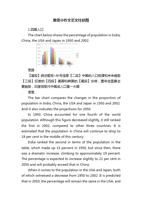
雅思小作文范文柱状图1.四国人口The chart below shows the percentage of population in India, China, the USA and Japan in 1950 and 2002.思路:【首段】转述题目+补充信息【二段】中国的人口规律和未来趋势【三段】印度的【四段】美国和韩国的【尾段】总结,重申全图最主要趋势,印度将取代中国成人口第一大国答案:The bar chart compares the changes in the proportion of population in India, China, the USA and Japan in 1950 and 2002. And it also indicates the projections for 2050.In 1950. China accounted for one fourth of the world population. Although this figure decreased slightly, it still ranked the first in 2002, compared to other three countries. It is estimated that the population in China will continue to drop to 19 per cent in the middle of this century.India ranked the second in terms of the population in the table, which made up 15 percent in 1950, but since then, there was a dramatic increase, climbing to approximately 19 percent. The percentage is expected to increase slightly to 21 per cent in 2050 and will probably exceed that in China.When it comes to the population in the USA and Japan, both of which witnessed a decrease from 1950 to 2002. It is predicted that in 2050, the percentage will remain the same in the USA, andin Japan, the percentage is likely to keep falling.Overall, it seems that India will become the country with the largest population although there is still a huge number of people in China.2.通勤工具Different modes of transport used to travel to and from work in one European city in 1960, 1980 and 2000.思路:1. 分段原则为:上升的一段,下降的一段,波动的一段。
雅思图表题作文套用模板大全
雅思图表作文模板句Para1. This is a table / chart / (line线状bar柱状pie饼状)graph which demonstrate / illustrate / reveal /depict /privide information about............. Para2. (1)Obvious /Apparent from the graph is that ...rank the first/highest,while/whereas ....turn out to be the lowest(2)It is exhibited/shown in the table that.....(3)It can be seen from the table that.....Para3.(1)饼.柱图A,which accounts for...%,ranks the first;then next is B with...%;followed by C,constituting...%;finally it comes D.E.F at...%...%and...%respectively(2)特殊变化(不变,增长或下降多的)①It is worth mentioning that....②It must be pointed out that....③More striking/suprising is that....Para4.To conclude /In conclusion/overallPara5. this is a graph which illustrates...这个图表向我们展示了...Para6 .this table shows the changing proportion of a &b from...to...该表格描述了...年到...年间a与b的比例关系。
作文范文之雅思图表类英语作文模板
雅思图表类英语作文模板【篇一:雅思图表作文模板】1 according to the chart```2 the date lead us to the conclusion that```3 the date show```4 the tree diagram reveals how```5 the figures show```6 this is a cure graph which describes the trend of```7 the pie graph depicts```8 the graph provides some interesting date regrarding```9 the table shows the changes in the number of ``` over the period from ```to ```10 as is shown in the table ```11 from the table ,we can clearly see that ```12 this table shows the changing proportion of x and y from ``` to ````13 the graph,presented in a pie chart, shows the general trend in```14 as can be seen from the grape ,the two curves show the flutuation of ```15 over the period from ```to ```the```remained level.16 in the year between ```and ```.17 in the 3 years spanning from 2005 through 2008.18 the number of ``` remained steady from ```to ````.19 the number sharply went up to ```20 the percentage of ``` stayed the same between ``` and ```21 the percentage remainede steady at```22 the percentage of ```is sightly large than that of.23 there is not a great deal of differece between ```and ```24 the graphs show a three fold increase in the number of ```25 ```decreased year by year while ```increased steadily.26 there is an upward trend in the number of ```27 a considerable increase occurred from ```to ```28 from ```to ```the rate of decrease slow down.29 from this year on,there was a gradual declinel reduction in the ```reaching a figure of.30 be similar to ```be the same as31 there are a lot similarities between ```and ```32 the difference between x and y lies in ``para 1,两句话:第一句:this is a _____chart, which demonstrates the number of_____ from ____ to____. 如果两个图,则:there are two charts below. the _____ chart describes the number of_____, and the _____ chart illustrates the figure of ____. 第二句:(所有题目适用),from thechart we can see that the number of ______ variesconstantly/greatly in _____. )para 2, as we can see from the chart,/or it is clear from thechart that ____. 如果有两个图:则:the _____ chart shows that ______./or as we can see from the first chart, _______para 3, (如果两个图的话,) it is clear from the second chartthat ?para 4 结尾:from the figures/statistics above, we cansee/conclude/draw a conclusion that ?the bar chart indicates the current situation of the amount of money spent on fastfoods according to different income classes in britain.for those who belong to the high-income class, hamburgerhas been shown to beperson per week. by contrast fish and chips remain at a rather low level of about 16pence per person per week, and pizza, though attracts more expenses, accounts for 19pence per person per week, merely 3 pence more than that of fish and chips.as expected, low-income class spend much less in all 3 categories than high-incomeclass, with fish and chips at the top of the list at 15 pence per capital per week, andpizza at the bottom at a weekly expense of 8 pence per capital. the average income group resembles high-income class in hamburger consumptionat the largest amount of 33 per person every week, and low-income class in pizzaconsumption at the smallest amount of 11 per person every week, but amazingly, fishand chips consumed by this group leads all classes at a weekly expense of 25 penceper person.in conclusion, hamburgers, in general gain more welcome than other types of fastfood.para1. this is a table / chart / (line线状 bar柱状 pie饼状)graph which demonstrate / illustrate /reveal /depict /privide information about.............para2.(1)obvious /apparent from the graph is that ...rank thefirst/highest,while/whereas ....turn out tobe the lowest(2)it is exhibited/shown in the table that.....(3)it can be seen from the table that.....para3.(1)饼.柱图 a,which accounts for...%,ranks the first;then next is b with...%;followed byc,constituting...%;finally it comes d.e.fat...%...%and...%respectively(2)特殊变化(不变,增长或下降多的)(3)①it is worth mentioning that.... ②it must be pointed out that.... ③morestriking/suprising is that.... para4.to conclude /inconclusion/overall1. 最明显的原因__,因此___the most obvious reason for this phenomenon is that_____consequently, ____.2. 无论你喜欢与否,_____已经变得越来越流行,这是有原因的no matter you like it or not, aaa has become more and more popular and there are many reasonfor it.3. 对我们来说,改变这个不利的环境____是非常紧急的it’s an urgent task for us to change this unfavorable situation: ____.4. 这个图片会让你想起一些奇怪的东西,这种现象还是会继续存在这个社会the picture can reminds you of some strange, yet familiar phenomena existing in our society.5. 提供了大量的解决方案,一些人建议___,另一些人建议___a great number of solutions are being offered. some people suggest that ____. others argue that .6. 对于____,我们应该____confronted with aaa, we should take a serious of effective measures to cope with thesituation.7. 然而,___引起了许多为问题,however____ may cause some problems. first, it is__second, __. finally, ____. so, it is clear that__has its advantages and disadvantages.8. 虽然_____有一个__的非常大的好处,但是它不能完全__在__方面although _____ has a great advantage of _____, it cant compete with ____ in ____.9. _____也许更喜欢_____,但是_____忍受_____的不利之出_____may be preferable to ____, but it suffers from the disadvantages that___.10. _____的有利之处比____的有利之处要多,举例说明,_____the advantages of ______are much greater that thoseof____.for instance, ___.11.but i don’t think it is a very good way to solve ___. for instance, _____.worst of all,______.12.there are many ways to ______. first, _____. second, _____. third, ___.13.on the contrary, there are some people in favor of _____.14.they believe___. moreover, they think____. there are several measures for us to adopt. first,we can____, there are a number of advantages of ____. another solution is to _____.15.it is high time that something was done about it. for example,_____. in addition,_____. all these measures will certainly _.16. there are some other people, who______. their reasons are different, something for _____,sometimes for____, and sometimes simply for _____.17._____ is necessary and important to our country’s development and construction. first, ____.what’s more, ___. most important of all,___.18.however, if not managed properly, ____ can create many problems.sometimes ____.furthermore,_. therefore, ___ has been gaining public concern.19.有很多原因____,①there are probably many reasons for ____. first, ____.②second, ____. finally, ___.there are, i think, two main reasons for __. in the first place, ___. in the second place, __. therefore,③well, why is there ____? i think there might be two reasons. one is ___, and the other is _____.④why___? for one thing, ____. for another,____. perhaps the main reason is ___.⑤why_____? the first reason is that___. the second reason is ___. the third is__. for all this,the main cause of_____ is due to ____.20.it is no easy job to find the reasons for this tendency which involves several complicated factors. for some ___. for others ____.21. “why do _____?” many people often ask questions like this.22. in recent years, there is a general tendency to ___. according to a study, there is__. comparedwith __ last year. why _____?23.according to a survey, there is a growing number of ___. what brings this result? the mainreason rests with.24.①some people prefer to ___. in their opinion, ____. in addition, ____. nevertheless,nowadays, __ has become more and more common.②many people are inclined to____. in their opinion, ___.they believe that ___.25. today, there __, which have brought a lot of harms in our daily life. first, __ second, ____. what makes things worse is that ___.26.nowadays, ___ has become a problem we have to face. though it’s easier said than done, with the help of modern technology, we now have many means to solve it.27. 对于这个图,说明了_①the graph shows the general trend in _______.②according to the figures/numbers/statistics/percentages in the table/chart/bar graph/line graph, it can be seen that ___. obviously, ____, but why?③the figure indicates/shows/suggests/proves that___. there isa steady/rapid development/trend of _.④from the graph/chart, we know the statistics of __ and _. it can be seen easily that ___.⑤according to the two graphs presented, it can be observed that ___ in the left graph, __. at the same time, _ as the right graph shows.28. 现在我们经常听到_____,但是真的如此吗?①these days we are often told that ____. but is it true?②these days we often hear about ___. but is this really the case?29. 一位著名的作家曾经说过_____one of the great writers once said that _. now it still has a realistic significance.30. 回看历史,______的想法从来都没流行过,一方面_____另一方面______in our history, the idea that ____ never has been so popular. on one hand, ___, on the other hand,31. 人们中有许多像____不同的意见,一些人认为_______there are different opinions among people as to ____. some people suggest that __.32. 一些人认为__对_______来说在许多方面都是好的,然而,其他人不同意some people hold the opinion that _ is superior to __ in many ways: others, however, disagree with it.33. 现在虽然越来越多的人___,但仍有一些__的人,他们也许认为_____nowadays although more and more people __, still there are some who think __, they may think【篇二:雅思图表作文模板20篇下载】智课网ielts备考资料雅思图表作文模板20篇下载摘要:雅思图表作文模板20篇下载。
雅思小作文之图表作文
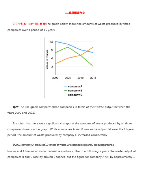
1.企业垃圾 (线性图) 题目:The graph below shows the amounts of waste produced by three companies over a period of 15 years.years 2000 and 2015.It is clear that there were significant changes in the amounts of waste produced by all three companies shown on the graph. While companies A and B saw waste output fall over the 15-year period, the amount of waste produced by company C increased considerably.In2000, company A produced12 tonnes of waste, whilecompanies B andC producedaround8tonnes and 4 tonnes of waste material respectively. Over the following 5 years, the waste output of companies B and C rose by around 2 tonnes, but the figure for company A fell by approximately 1tonne.From 2005 to 2015, company A cut waste production by roughly 3 tonnes, and company B reduced its waste by around 7 tonnes. By contrast, company C saw anincrease inwaste productionof approximately 4 tonnes over the same 10- year period. By 2015, company C’swaste output hadrisento10tonnes, while the respective amounts of waste fromcompanies A andB haddroppedto8 tonnes and only 3 tonnes.(192 words, band 9)这条线图对三家公司的废物产出从 2000 年到 2015 年进行了比较。
作文范文之雅思图表类英语作文模板
雅思图表类英语作文模板【篇一:雅思图表作文模板】1according to the chart'''2the date lead us to the conclusion that'''3the date show'''4the tree diagram reveals how'''5the figures show'''6this is a cure graph which describes the trend of'''7the pie graph depicts'''8the graph provides some interesting date regrarding'''9the table shows the changes in the number of ''' over the period from '''to '''10as is shown in the table '''11from the table ,we can clearly see that '''12this table shows the changing proportion of x and y from ''' to '''' 13the graph,presented in a pie chart, shows the general trend '''14as can be seen from the grape ,the two curves show the flutuation of '''15over the period from '''to '''the'''remained level.16in the year between '''and '''.17in the 3 years spanning from 2005 through 2008.18the number of ''' remained steady from '''to ''''.19the number sharply went up to '''20the percentage of ''' stayed the same between ''' and '''21the percentage remainede steady at'''22the percentage of '''is sightly large than that of.23there is not a great deal of differece between '''and '''24the graphs show a three fold increase in the number of '''25'''decreased year by year while '''increased steadily.26there is an upward trend in the number of '''27 a considerable increase occurred from '''to '''28from '''to '''the rate of decrease slow down.29from this year on,there was a gradual declinel reduction in the'''reaching a figure of.30be similar to '''be the same as31there are a lot similarities between '''and '''32the difference between x and y lies in ''para 1,两句话:第一句:___________ this is a c hart, which demonstrates thenumber of ______ from ____ to____ .如果两个图,则:there are two charts below. the ___chart describes the number of_____ , and the ____ chart illustrates the figure of . 第二句:(所有题目适用),f rom thechart we can see that the number of ______ variesconstantly/greatly in ____ . )para 2, as we can see from the chart,/or it is clear from thechart that __ . 如果有两个图:则:the ____ chart shows that ______ ./or as we can see from thefirst chart, ______para 3, (如果两个图的话,) it is clear from the second chartthat ?para 4 结尾:from the figures/statistics above, we cansee/conclude/draw a conclusion that ?the bar chart indicates the current situation of the amount of money spent on fastfoods according to different income classes in britain.for those who belong to the high-income class, hamburgerhas been shown to beperson per week. by contrast fish and chips remain at a ratherlow level of about 16pence per person per week, and pizza, though attracts moreexpenses, accounts for 19pence per person per week, merely 3 pence more than that of fish and chips.as expected, low-income class spend much less in all 3categories than high-incomeclass, with fish and chips at the top of the list at 15 pence percapital per week, andpizza at the bottom at a weekly expense of 8 pence per capital. the average income group resembles high-income class in hamburger consumptionat the largest amount of 33 per person every week, and low- income class in pizzaconsumption at the smallest amount of 11 per person everyweek, but amazingly, fishand chips consumed by this group leads all classes at aweekly expense of 25 penceper person.in conclusion, hamburgers, in general gain more welcomethan other types of fastfood.para1. this is a table / chart / (line 线状bar 柱状pie 饼状)graph which demonstrate / illustrate /reveal /depict /privide information about ....para2.(1)obvious /apparent from the graph is that ...rank thefirst/highest,while/whereas turn out tobe the lowest(2)it is exhibited/shown in the table that(3)it can be seen from the table thatpara3.(1) 饼.柱图a,which accounts for...%,ranks the first;then nextis b with...%;followed byc,constituting...%;finally it comes d.e.fat...%...%and...%respectively(2)特殊变化(不变,增长或下降多的)(3)① it is worth mentioning that.... ② it must be pointed outthat . ③ morestriking/suprising is that para4.to conclude /inconclusion/overall1.最明显的原因__,因此___the most obvious reason for this phenomenon is that_____ c onsequently, _____ .2.无论你喜欢与否,_____ 已经变得越来越流行,这是有原因的no matter you like it or not, aaa has become more and more popular and there are many reason for it.3.对我们来说,改变这个不利的环境____ 是非常紧急的it ’ s an urgent task for us to change this unfavorable situation:4.这个图片会让你想起一些奇怪的东西,这种现象还是会继续存在这个社会the picture can reminds you of some strange, yet familiar phenomena existing in our society.5.提供了大量的解决方案,一些人建议___, 另一些人建议___a great number of solutions are being offered. some peoplesuggest that _____ . others argue that .6.对于__ ,我们应该___confronted with aaa, we should take a serious of effectivemeasures to cope with thesituation.7.然而,___引起了许多为问题,however _____ may cause some problems. first, it is__second,__. finally, __ . so, it is clear that__has its advantages and disadvantages.8.虽然___ 有一个__的非常大的好处,但是它不能完全__在__方面although ______ h as a great advantage of ______ , it cantcompete with _____ i n ___ .9.____ 也许更喜欢 ____ _________ , 但是 __ 忍受的不利之出_____ may be preferable to ____ , but it suffers from the disadvantages that___.10.____ 的有利之处比__ 的有利之处要多,举例说明,____ the advantages of _______ are much greater that thoseof ____ .for instance, ___.11.but i don ’ t think it is a very good way to solve ___. for instance, _____ .worst of all, _____ .12.there are many ways to ______ . first, __ . second, _____ .third, ___.13.on the contrary, there are some people in favor of __ .14.they believe___. moreover, they think __ . there areseveral measures for us to adopt. first,we can _____ , there are a number of advantages of ___ .another solution is to ____ .15.it is high time that something was done about it. forexample, _______ . in addition,______ . all these measures will certainly _.16. there are some other people, who ______ . their reasons are different, something for ____ ,sometimes for _____ , and sometimes simply for ______ .17. ___ is necessary and important to our country ’ sdevelopment and construction. first, __ .what’ s more, ___. most important of all,___.18.however, if not managed properly, ___ can create manyproblems.sometimes ______ .furthermore,_. therefore, ___ has been gaining public concern.19.有很多原因___ ,???①there are probably many reasons for ___ . first, _.②second, ____ . finally, ___.there are, i think, two mainreasons for __. in the first place, ___. in the second place, __. therefore,③well, why is there __ ? i think there might be two reasons.one is ___, and the other is ___ .④why___? for one thing, ___ . for another, ___ . perhaps themain reason is ___.⑤why ______ ? the first reason is that___. the second reason is___. the third is__. for all this,the main cause of ______ is due to ___ .1..it is no easy job to find the reasons for this tendency which involves several complicated factors. for some ___. for others21.“ why do _____ ? ” many people often ask questions likethis.22.in recent years, there is a general tendency to ___. according to a study, there is__. compared with __ last year. why ?23.according to a survey, there is a growing number of ___.what brings this result? the mainreason rests with.24.① some people prefer to ___. in their opinion, _ . inaddition, ___ . nevertheless,nowadays, __ has become more and more common.② many people are inclined to __ . in their opinion, ___.theybelieve that ___.25.today, there __, which have brought a lot of harms in our daily life. first, __ second, _____ . what makes things worse isthat ___.26.nowadays, ___ has become a problem we have to face. though it ’ s easier said than done, with the help of modern technology, we now have many means to solve it.27.对于这个图,说明了_①t he graph shows the general trend in ______ .②a ccording to the figures/numbers/statistics/percentages in the table/chart/bar graph/line graph, it can be seen that ___. obviously, , but why?③t he figure indicates/shows/suggests/proves that___. there is a steady/rapid development/trend of _.④f rom the graph/chart, we know the statistics of __ and _. it can be seen easily that ___. ⑤ according to the two graphs presented, it can be observed that ___ in the left graph, __. at the same time, _ as the right graph shows.28.现在我们经常听到____ , 但是真的如此吗?①these days we are often told that _. but is it true?②t hese days we often hear about ___. but is this really the case?29.一位著名的作家曾经说过 ___one of the great writers once said that _. now it still has a realistic significance.30.回看历史,_____ 的想法从来都没流行过,一方面_____ 另一方面 ____in our history, the idea that never has been so popular.on one hand, ___, on the other hand,31.人们中有许多像___ 不同的意见,一些人认为______there are different opinions among people as to ___ . somepeople suggest that __.32.一些人认为__对 _____ 来说在许多方面都是好的,然而,其他人不同意some people hold the opinion that _ is superior to __ in many ways: others, however, disagree with it.33.现在虽然越来越多的人___, 但仍有一些__的人,他们也许认为nowadays although more and more people __, still there are some who think __, they may think【篇二:雅思图表作文模板20 篇下载】智课网ielts 备考资料雅思图表作文模板20 篇下载摘要:雅思图表作文模板20 篇下载。
雅思图表作文真题范文
雅思图表作文真题:柱状图:奥运奖牌The chart below shows the total number of Olympic medals won by twelve different countries.雅思小作文范文:The bar chart compares twelve countries in terms of the overall number of medals that they have won at the Olympic Games.It is clear that the USA is by far the most successful Olympic medal winning nation. It is also noticeable that the figures for gold, silver and bronze medals won by any particular country tend to be fairly similar.The USA has won a total of around 2,300 Olympic medals, including approximately 900 gold medals, 750 silver and 650 bronze. In second place on the all-time medals chart is the Soviet Union, with just over 1,000 medals. Again, the number of gold medals won by this country is slightly higher than the number of silver or bronze medals.Only four other countries - the UK, France, Germany and Italy - have won more than 500 Olympic medals, all with similar proportions of each medal colour. Apart from the USA and the Soviet Union, China is the only other country with a noticeably higher proportion of gold medals (about 200) compared to silver and bronze (about 100 each).(178 words, band 9)雅思图表作文真题:柱状图:学习动机The charts below show the main reasons for study among students of different groups and the amount of support they received from employers.参考雅思小作文范文The bar charts compare students of different ages in terms of why they are studying and whether they are supported by an employer.It is clear that the proportion of students who study for career purposes is far higher among the younger age groups, while the oldest students are more likely to study for interest. Employer support is more commonly given to younger students.Around 80% of students aged under 26 study to further their careers, whereas only 10% study purely out of interest. The gap between these two proportions narrows as students get older, and the figures for those in their forties are the same, at about 40%. Students aged over 49 overwhelmingly study for interest (70%) rather than for professional reasons (less than 20%).Just over 60% of students aged under 26 are supported by their employers. By contrast, the 30-39 age group is the most self-sufficient, with only 30% being given time off and help with fees. The figures rise slightly for students in their forties and for those aged 50 or more.(178 words, band 9)雅思图表作文真题:柱状图:The chart below shows numbers of incidents and injuries per 100 million passenger miles travelled (PMT) by transportation type in 2002.雅思小作文范文The bar chart compares the number of incidents and injuries for every 100 million passenger miles travelled on five different types of public transport in 2002.It is clear that the most incidents and injuries took place on demand-response vehicles. By contrast, commuter rail services recorded by far the lowest figures.A total of 225 incidents and 173 injuries, per 100 million passenger miles travelled, took place on demand-response transport services. These figures were nearly three times as high as those for the second highest category, bus services. There were 76 incidents and 66 people were injured on buses.Rail services experienced fewer problems. The number of incidents on light rail trains equalled the figure recorded for buses, but there were significantly fewer injuries, at only 39. Heavy rail services saw lower numbers of such events than light rail services, but commuter rail passengers were even less likely to experience problems. In fact, only 20 incidents and 17 injuries occurred on commuter trains.(165 words, band 9)雅思图表作文真题:柱状图:各地房价The chart below shows information about changes in average house prices in five different cities between 1990 and 2002 compared with the average house prices in 1989.雅思小作文范文:The bar chart compares the cost of an average house in five major cities over a period of 13 years from 1989.We can see that house prices fell overall between 1990 and 1995, but most of the cities saw rising prices between 1996 and 2002. London experienced by far the greatest changes in house prices over the 13-year period.Over the 5 years after 1989, the cost of average homes in Tokyo and London dropped by around 7%, while New York house prices went down by 5%. By contrast, prices rose by approximately 2% in both Madrid and Frankfurt.Between 1996 and 2002, London house prices jumped to around 12% above the 1989 average. Homebuyers in New York also had to pay significantly more, with prices rising to 5% above the 1989 average, but homes in Tokyo remained cheaper than they were in 1989. The cost of an average home in Madrid rose by a further 2%, while prices in Frankfurt remained stable. (165 words)雅思图表作文真题:饼状图:垃圾处理The pie charts below show how dangerous waste products are dealt with in three countries.雅思小作文范文:The charts compare Korea, Sweden and the UK in terms of the methods used in each country to dispose of harmful waste.It is clear that in both the UK and Sweden, the majority of dangerous waste products are buried underground. By contrast, most hazardous materials in the Republic of Korea are recycled.Looking at the information in more detail, we can see that 82% of the UK’s dangerous waste is put into landfill sites. This disposal technique is used for 55% of the harmful waste in Sweden and only 22% of similar waste in Korea. The latter country recycles 69% of hazardous materials, which is far more than the other two nations.While 25% of Sweden's dangerous waste is recycled, the UK does not recycle at all. Instead, it dumps waste at sea or treats it chemically. These two methods are not employed in Korea or Sweden, which favour incineration for 9% and 20% of dangerous waste respectively.(159)。
雅思写作八分经典范文背诵:图表作文(5)
The table below shows the consumer durables (telephone, refrigerator, etc.) owned in Britain from 1972 to 1983.Write a report for a university lecturer describing the information shown below.该图表展现的是1972-1983十一年间英国耐久消费品的拥有量。
The table indicates the consumer durables that were own in the UK over a period of 11 years from 1972 to 1983.从图表来看,英国八种耐久消费品在所标识时间段里的拥有量总体分为三种情况:中央暖气设备、电视、吸尘器、冰箱、电话、洗碗机呈现出各有特色的上升趋势;洗衣机呈现出总的上升,但中间有一次下降、放映机无从对比。
As can be seen from the table, the ownership of the eight above mentioned consumer durables in the UK during the designated period of time roughly revealed three different trends. Central heating, television, vacuum cleaner, refrigerator, telephone and dishwasher showed a trend of increase with different characteristics; Washing machine showed a trend of general rise with one fluctuation; Video had nothing to compare with.首先,中央暖气设备和电话一直处于上升态势。
雅思图表范文
雅思图表范文The bar chart provides information about the percentage of different age groups in the population of Australia in the years 1990, 2000, and a projection for 2030. Overall, it is clear that the proportion of people aged 65 and above is expected to increase significantly, while the younger age groups will see a decrease.In 1990, the largest percentage of the population was between the ages of 30 and 44, with 27%. This was followed by the 0-14 age group, which accounted for 25% of the population. People aged 45-64 made up 22%, while those aged 65 and above were the smallest group with only 11%. Lastly, individuals aged 15-29 accounted for 15% of the total population.Moving forward to 2000, a slight decline can be observed in the younger age groups. The percentage of people between the ages of 0-14 decreased to 23%, while those aged 15-29 dropped to 14%. On the other hand, the proportion of individuals aged 30-44 remained stable at 27%. The largest increase was seen in the 45-64 age group, which grew to 28%. The percentage of people aged 65 and above also increased slightly to 8%.According to the projection for 2030, significant changes in the age distribution are expected. The 0-14 age group is predicted to decrease to 18%, while the 15-29 age group is forecast to decline to 13%. The largest increase is anticipated in the 65 and above age group, which is projected to reach 18% from the current 8%. Additionally, the percentage of people aged 30-44 is expected to stay the same at 27%, while the 45-64 age group is predicted to decrease to 24%.In conclusion, the bar chart illustrates a shift in the age distribution of the Australian population from 1990 to 2030. A decrease in the younger age groups is expected, while the older population is projected to increase significantly.。
- 1、下载文档前请自行甄别文档内容的完整性,平台不提供额外的编辑、内容补充、找答案等附加服务。
- 2、"仅部分预览"的文档,不可在线预览部分如存在完整性等问题,可反馈申请退款(可完整预览的文档不适用该条件!)。
- 3、如文档侵犯您的权益,请联系客服反馈,我们会尽快为您处理(人工客服工作时间:9:00-18:30)。
1.Notably, there is (was) a marked decrease in…fromnumberintimeall the way down tonumberintime
2.As can be seen from the graph, the number of…starts (started) numberintime
According to the graphic informationin the first line/ bar/ piechart, we can discern that…
To be more precise…
As can be seen from the second chart, …
More specifically…
比较
1.The number of…far surpasses (surpassed) the number of…
2.It is evidentwhen comparing these graphs that marked growthin…have indeed occurred, especially in…
主题段句子模版(line,bar, table and piechart)
涨
1.The period between…and…experiences (experienced) a slight/ significant increase in (the number of)…, with the numberarriving at +number+time
3.If we look closer at the graph, we can discern that…was consistently higher/ lower than…. To be more precise, the number of…stood at…whilst the number of…was…
3.…experiences (experienced) a sharp decrease, arriving at the low(est) point at…
稳
1.From…to…, the number of…remains (remained) relatively stable.
2.
波动
As shown in the graph, the number of…fluctuates (fluctuated) over…
4.Consistent with the information in the graph,…is predominantly made up of…
Conclusion
Overall, it can be obviously concluded from the graph that…
占比例
1.To be specific,…accounts for the largest percentage of…
2.…make up the same proportion as do…
pared with…which makes up…of…,…only represents…of…
2.The number soars (soared) over+ time, reaching the highest point at+number+time
3.Indeed, the period betweentimeandtimeshows (showed) the most noticeable growth in…
我的模版
(找点:起点,拐点,终点,变化趋势)
(时态)
图表题
The line/ bar/ piechart describes…
According to the graphic information, we can discern that…
To bemore precise…
如果是组合图:
The first line/ bar chart describes…while the second line/ bar chart shows data related to…