【原创】R语言股票回归、时间序列分析报告论文附代码数据
【原创】R语言k-Shape时间序列聚类方法对股票价格时间序列聚类数据分析报告论文(含代码数据)

咨询QQ:3025393450有问题百度搜索“”就可以了欢迎登陆官网:/datablogR语言k-Shape时间序列聚类方法对股票价格时间序列聚类数据分析报告来源:大数据部落| 有问题百度一下“”就可以了这次,我们将使用k-Shape时间序列聚类方法检查与我们有业务关系的公司的股票收益率的时间序列。
企业对企业交易和股票价格在本研究中,我们将研究具有交易关系的公司的价格变化率的时间序列的相似性,而不是网络结构的分析。
由于特定客户的销售额与供应商公司的销售额之比较大,当客户公司的股票价格发生变化时,对供应商公司股票价格的反应被认为更大。
k-Shapek-Shape [Paparrizos和Gravano,2015]是一种关注时间序列形状的时间序列聚类方法。
在我们进入k-Shape之前,让我们谈谈时间序列的不变性和常用时间序列之间的距离。
时间序列距离测度欧几里德距离(ED)和动态时间扭曲(DTW)通常用作距离测量值,用于时间序列之间的比较。
咨询QQ:3025393450有问题百度搜索“”就可以了欢迎登陆官网:/datablog两个时间序列x =(x1,...,xm)和y =(y1,...,ym)的ED,其中m是系列的长度如下。
DTW是ED的扩展,允许局部和非线性对齐。
k-Shape提出称为基于形状的距离(SBD)的距离。
k-Shape算法k-Shape聚类侧重于缩放和移位的不变性。
k-Shape有两个主要特征:基于形状的距离(SBD)和时间序列形状提取。
SBD互相关是在信号处理领域中经常使用的度量。
使用FFT(+α)代替DFT来提高计算效率。
归一化互相关(系数归一化)NCCc是互相关系列除以单个系列自相关的几何平均值。
检测NCCc最大的位置ω。
咨询QQ:3025393450有问题百度搜索“”就可以了欢迎登陆官网:/datablogSBD取0到2之间的值,两个时间序列越接近0就越相似。
形状提取通过SBD找到时间序列聚类的质心向量有关详细的表示法,请参阅文章。
【原创】R使用LASSO回归预测股票收益论文(代码数据)

咨询QQ:3025393450有问题百度搜索“”就可以了欢迎登陆官网:/datablogR使用LASSO回归预测股票收益数据分析报告来源:大数据部落使用LASSO预测收益1.示例只要有金融经济学家,金融经济学家一直在寻找能够预测股票收益的变量。
对于最近的一些例子,想想Jegadeesh和Titman(1993),它表明股票的当前收益是由前几个月的股票收益预测的,侯(2007),这表明一个行业中最小股票的当前回报是通过行业中最大股票的滞后回报预测,以及Cohen和Frazzini (2008),这表明股票的当前回报是由其主要客户的滞后回报预测的。
两步流程。
当你考虑它时,找到这些变量实际上包括两个独立的问题,识别和估计。
首先,你必须使用你的直觉来识别一个新的预测器,然后你必须使用统计来估计这个新的预测器的质量:咨询QQ:3025393450有问题百度搜索“”就可以了欢迎登陆官网:/datablog但是,现代金融市场庞大。
可预测性并不总是发生在易于人们察觉的尺度上,使得解决第一个问题的标准方法成为问题。
例如,联邦信号公司的滞后收益率是2010 年10月一小时内所有纽约证券交易所上市电信股票的重要预测指标。
你真的可以从虚假的预测指标中捕获这个特定的变量吗?2.使用LASSOLASSO定义。
LASSO是一种惩罚回归技术,在Tibshirani(1996)中引入。
它通过投注稀疏性来同时识别和估计最重要的系数,使用更短的采样周期- 也就是说,假设在任何时间点只有少数变量实际上很重要。
正式使用LASSO意味着解决下面的问题,如果你忽略了惩罚函数,那么这个优化问题就只是一个OLS 回归。
惩罚函数。
但是,这个惩罚函数是LASSO成功的秘诀,允许估算器对最大系数给予优先处理,完全忽略较小系数。
为了更好地理解LASSO如何做到这一点,当右侧变量不相关且具有单位方差时。
一方面,这个解决方案意味着,如果OLS估计一个大系数,那么LASSO将提供类似的估计。
【原创】R语言股票时间序列分析报告代码

有问题到淘宝找“大数据部落”就可以了library(quantmod)# library(neuralnet)library(quantmod)library(plyr)library(TTR)library(ggplot2)library(scales)library(tseries)data=read.csv("600119.csv")a=data$收盘价a=diff(a)/a[-length(a)]a[a=="NaN"]=0a[a=="Inf"]=0##浏览数据data[,2]=data$日期data[,4]=c(0, a)##绘制时间序列图## 收集历史资料,加以整理,编成时间序列,并根据时间序列绘成统计图。
时间序列分析通常是把各种可能发生作用的因素进行分类,传统的分类方法是按各种因素的特点或影响效果分为四大类:(1)长期趋势;(2)季节变动;(3)循环变动;(4)不规则变动。
data=data[nrow(data):1,]plot(data[,2],data[,4])##技术指标lines( data[,2], DEMA(data[,4]) ,col="green")lines( data[,2], SMA(data[,4]) ,col="red")legend("bottomright",col=c("green","red"),legend =c("DEMA","SMA"),lty= 1,pch=1)有问题到淘宝找“大数据部落”就可以了## 从时间序列图形来看,序列有明显趋势,所以该序列一定不是平稳序列。
因为原序列为非平稳序列,所以选择一阶差分继续分析birthstimeseries=data[,4]birthstimeseries <-ts(birthstimeseries, frequency=300, start=c(1998,1 5))birthstimeseries=na.omit(birthstimeseries)## 2)Decompose the time series data into trend, seasonality and error components. (10 points)## 开始分解季节性时间序列。
【原创】在R语言中实现Logistic逻辑回归数据分析报告论文(代码+数据)

咨询QQ:3025393450有问题百度搜索“”就可以了欢迎登陆官网:/datablog在R语言中实现Logistic逻辑回归数据分析报告来源:大数据部落|原文链接/?p=2652逻辑回归是拟合回归曲线的方法,当y是分类变量时,y = f(x)。
典型的使用这种模式被预测Ÿ给定一组预测的X。
预测因子可以是连续的,分类的或两者的混合。
R中的逻辑回归实现R可以很容易地拟合逻辑回归模型。
要调用的函数是glm(),拟合过程与线性回归中使用的过程没有太大差别。
在这篇文章中,我将拟合一个二元逻辑回归模型并解释每一步。
数据集我们将研究泰坦尼克号数据集。
这个数据集有不同版本可以在线免费获得,但我建议使用Kaggle提供的数据集,因为它几乎可以使用(为了下载它,你需要注册Kaggle)。
数据集(训练)是关于一些乘客的数据集合(准确地说是889),并且竞赛的目标是预测生存(如果乘客幸存,则为1,否则为0)基于某些诸如服务等级,性别,年龄等特征。
正如您所看到的,我们将使用分类变量和连续变量。
咨询QQ:3025393450有问题百度搜索“”就可以了欢迎登陆官网:/datablog数据清理过程在处理真实数据集时,我们需要考虑到一些数据可能丢失或损坏的事实,因此我们需要为我们的分析准备数据集。
作为第一步,我们使用该函数加载csv数据read.csv()。
确保参数na.strings等于c("")使每个缺失值编码为a NA。
这将帮助我们接下来的步骤。
training.data.raw < - read.csv('train.csv',header = T,na.strings = c(“”))现在我们需要检查缺失的值,并查看每个变量的唯一值,使用sapply()函数将函数作为参数传递给数据框的每一列。
sapply(training.data.raw,function(x)sum(is.na(x)))PassengerId生存的Pclass名称性别0 0 0 0 0 年龄SibSp Parch票价177 0 0 0 0 小屋着手687 2 sapply(training.data.raw,函数(x)长度(unique(x)))PassengerId生存的Pclass名称性别891 2 3 891 2 年龄SibSp Parch票价89 7 7 681 248 小屋着手148 4对缺失值进行可视化处理可能会有所帮助:Amelia包具有特殊的绘图功能missmap(),可以绘制数据集并突出显示缺失值:咨询QQ:3025393450有问题百度搜索“”就可以了欢迎登陆官网:/datablog咨询QQ:3025393450有问题百度搜索“”就可以了欢迎登陆官网:/datablog可变机舱有太多的缺失值,我们不会使用它。
R语言数据分析回归研究案例报告 附代码数据
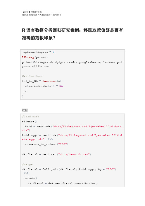
R语言数据分析回归研究案例:移民政策偏好是否有准确的刻板印象?数据重命名,重新编码,重组Group <chr> Count<dbl>Percent<dbl>6 476 56.00 5 179 21.062 60 7.063 54 6.354 46 5.41 1 27 3.18 0 8 0.94对Kirkegaard&Bjerrekær2016的再分析确定用于本研究的32个国家的子集的总体准确性。
#降低样本的#精确度GG_scatter(dk_fiscal, "mean_estimate", "dk_benefits_use",GG_scatter(dk_fiscal_sub, "mean_estimate", "dk_benefits_us e", case_names="Names")GG_scatter(dk_fiscal, "mean_estimate", "dk_fiscal", case_n ames="Names")#compare Muslim bias measures#can we make a bias measure that works without ratio scaleScore stereotype accuracy#add metric to main datad$stereotype_accuracy=indi_accuracy$pearson_rGG_save("figures/aggr_retest_stereotypes.png")GG_save("figures/aggregate_accuracy.png")GG_save("figures/aggregate_accuracy_no_SYR.png")Muslim bias in aggregate dataGG_save("figures/aggregate_muslim_bias.png")Immigrant preferences and stereotypesGG_save("figures/aggregate_muslim_bias_old_data.png") Immigrant preferences and stereotypesGG_save("figures/aggr_fiscal_net_opposition_no_SYR.png")GG_save("figures/aggr_stereotype_net_opposition.png")GG_save("figures/aggr_stereotype_net_opposition_no_SYR.pn g")lhs <chr>op<chr > rhs <chr> est <dbl> se <dbl> z <dbl> pvalue <dbl> net_opposition ~ mean_estimate_fiscal -4.4e-01 0.02303 -19.17 0.0e+00net_opposition~Muslim_frac 4.3e-02 0.05473 0.79 4.3e-01net_opposition~~net_opposition 6.9e-03 0.00175 3.94 8.3e-05dk_fiscal ~~ dk_fiscal 6.2e+03 0.00000 NA NAMuslim_frac~~Muslim_frac1.7e-01 0.0000NANAIndividual level modelsGG_scatter(example_muslim_bias, "Muslim", "resid", case_na mes="name")+#exclude Syria#distributiondescribe(d$Muslim_bias_r)%>%print()GG_save("figures/muslim_bias_dist.png")## `stat_bin()` using `bins = 30`. Pick better value with `GG_scatter(mediation_example, "Muslim", "resid", case_name s="name", repel_names=T)+scale_x_continuous("Muslim % in home country", labels=scal#stereotypes and preferencesmediation_model=plyr::ldply(seq_along_rows(d), function(rGG_denhist(mediation_model, "Muslim_resid_OLS", vline=medi an)## `stat_bin()` using `bins = 30`. Pick better value with `add to main datad$Muslim_preference=mediation_model$Muslim_resid_OLS Predictors of individual primary outcomes#party modelsrms::ols(stereotype_accuracy~party_vote, data=d)GG_group_means(d, "Muslim_bias_r", "party_vote")+ theme(axis.text.x=element_text(angle=-30, hjust=0))GG_group_means(d, "Muslim_preference", "party_vote")+#party agreement cors wtd.cors(d_parties)。
【原创】R语言线性回归案例数据分析可视化报告(附代码数据)

R语言线性回归案例数据分析可视化报告在本实验中,我们将查看来自所有30个职业棒球大联盟球队的数据,并检查一个赛季的得分与其他球员统计数据之间的线性关系。
我们的目标是通过图表和数字总结这些关系,以便找出哪个变量(如果有的话)可以帮助我们最好地预测一个赛季中球队的得分情况。
数据用变量at_bats绘制这种关系作为预测。
关系看起来是线性的吗?如果你知道一个团队的at_bats,你会习惯使用线性模型来预测运行次数吗?散点图.如果关系看起来是线性的,我们可以用相关系数来量化关系的强度。
.残差平方和回想一下我们描述单个变量分布的方式。
回想一下,我们讨论了中心,传播和形状等特征。
能够描述两个数值变量(例如上面的runand at_bats)的关系也是有用的。
从前面的练习中查看你的情节,描述这两个变量之间的关系。
确保讨论关系的形式,方向和强度以及任何不寻常的观察。
正如我们用均值和标准差来总结单个变量一样,我们可以通过找出最符合其关联的线来总结这两个变量之间的关系。
使用下面的交互功能来选择您认为通过点云的最佳工作的线路。
# Click two points to make a line.After running this command, you’ll be prompted to click two points on the plot to define a line. Once you’ve done that, the line you specified will be shown in black and the residuals in blue. Note that there are 30 residuals, one for each of the 30 observations. Recall that the residuals are the difference between the observed values and the values predicted by the line:e i=y i−y^i ei=yi−y^iThe most common way to do linear regression is to select the line that minimizes the sum of squared residuals. To visualize the squared residuals, you can rerun the plot command and add the argument showSquares = TRUE.## Click two points to make a line.Note that the output from the plot_ss function provides you with the slope and intercept of your line as well as the sum of squares.Run the function several times. What was the smallest sum of squares that you got? How does it compare to your neighbors?Answer: The smallest sum of squares is 123721.9. It explains the dispersion from mean. The linear modelIt is rather cumbersome to try to get the correct least squares line, i.e. the line that minimizes the sum of squared residuals, through trial and error. Instead we can use the lm function in R to fit the linear model (a.k.a. regression line).The first argument in the function lm is a formula that takes the form y ~ x. Here it can be read that we want to make a linear model of runs as a function of at_bats. The second argument specifies that R should look in the mlb11 data frame to find the runs and at_bats variables.The output of lm is an object that contains all of the information we need about the linear model that was just fit. We can access this information using the summary function.Let’s consider this output piece by piece. First, the formula used to describe the model is shown at the top. After the formula you find the five-number summary of the residuals. The “Coefficients” table shown next is key; its first column displays the linear model’s y-intercept and the coefficient of at_bats. With this table, we can write down the least squares regression line for the linear model:y^=−2789.2429+0.6305∗atbats y^=−2789.2429+0.6305∗atbatsOne last piece of information we will discuss from the summary output is the MultipleR-squared, or more simply, R2R2. The R2R2value represents the proportion of variability in the response variable that is explained by the explanatory variable. For this model, 37.3% of the variability in runs is explained by at-bats.output, write the equation of the regression line. What does the slope tell us in thecontext of the relationship between success of a team and its home runs?Answer: homeruns has positive relationship with runs, which means 1 homeruns increase 1.835 times runs.Prediction and prediction errors Let’s create a scatterplot with the least squares line laid on top.The function abline plots a line based on its slope and intercept. Here, we used a shortcut by providing the model m1, which contains both parameter estimates. This line can be used to predict y y at any value of x x. When predictions are made for values of x x that are beyond the range of the observed data, it is referred to as extrapolation and is not usually recommended. However, predictions made within the range of the data are more reliable. They’re also used to compute the residuals.many runs would he or she predict for a team with 5,578 at-bats? Is this an overestimate or an underestimate, and by how much? In other words, what is the residual for thisprediction?Model diagnosticsTo assess whether the linear model is reliable, we need to check for (1) linearity, (2) nearly normal residuals, and (3) constant variability.Linearity: You already checked if the relationship between runs and at-bats is linear using a scatterplot. We should also verify this condition with a plot of the residuals vs. at-bats. Recall that any code following a # is intended to be a comment that helps understand the code but is ignored by R.6.Is there any apparent pattern in the residuals plot? What does this indicate about the linearity of the relationship between runs and at-bats?Answer: the residuals has normal linearity of the relationship between runs ans at-bats, which mean is 0.Nearly normal residuals: To check this condition, we can look at a histogramor a normal probability plot of the residuals.7.Based on the histogram and the normal probability plot, does the nearly normal residuals condition appear to be met?Answer: Yes.It’s nearly normal.Constant variability:1. Choose another traditional variable from mlb11 that you think might be a goodpredictor of runs. Produce a scatterplot of the two variables and fit a linear model. Ata glance, does there seem to be a linear relationship?Answer: Yes, the scatterplot shows they have a linear relationship..1.How does this relationship compare to the relationship between runs and at_bats?Use the R22 values from the two model summaries to compare. Does your variable seem to predict runs better than at_bats? How can you tell?1. Now that you can summarize the linear relationship between two variables, investigatethe relationships between runs and each of the other five traditional variables. Which variable best predicts runs? Support your conclusion using the graphical andnumerical methods we’ve discussed (for the sake of conciseness, only include output for the best variable, not all five).Answer: The new_obs is the best predicts runs since it has smallest Std. Error, which the points are on or very close to the line.1.Now examine the three newer variables. These are the statistics used by the author of Moneyball to predict a teams success. In general, are they more or less effective at predicting runs that the old variables? Explain using appropriate graphical andnumerical evidence. Of all ten variables we’ve analyzed, which seems to be the best predictor of runs? Using the limited (or not so limited) information you know about these baseball statistics, does your result make sense?Answer: ‘new_slug’ as 87.85% ,‘new_onbase’ as 77.85% ,and ‘new_obs’ as 68.84% are predicte better on ‘runs’ than old variables.1. Check the model diagnostics for the regression model with the variable you decidedwas the best predictor for runs.This is a product of OpenIntro that is released under a Creative Commons Attribution-ShareAlike 3.0 Unported. This lab was adapted for OpenIntro by Andrew Bray and Mine Çetinkaya-Rundel from a lab written by the faculty and TAs of UCLA Statistics.。
【原创】R语言股票时间序列分析报告代码
有问题到淘宝找“大数据部落”就可以了library(quantmod)# library(neuralnet)library(quantmod)library(plyr)library(TTR)library(ggplot2)library(scales)library(tseries)data=read.csv("600119.csv")a=data$收盘价a=diff(a)/a[-length(a)]a[a=="NaN"]=0a[a=="Inf"]=0##浏览数据data[,2]=data$日期data[,4]=c(0, a)##绘制时间序列图## 收集历史资料,加以整理,编成时间序列,并根据时间序列绘成统计图。
时间序列分析通常是把各种可能发生作用的因素进行分类,传统的分类方法是按各种因素的特点或影响效果分为四大类:(1)长期趋势;(2)季节变动;(3)循环变动;(4)不规则变动。
data=data[nrow(data):1,]plot(data[,2],data[,4])##技术指标lines( data[,2], DEMA(data[,4]) ,col="green")lines( data[,2], SMA(data[,4]) ,col="red")legend("bottomright",col=c("green","red"),legend =c("DEMA","SMA"),lty= 1,pch=1)有问题到淘宝找“大数据部落”就可以了## 从时间序列图形来看,序列有明显趋势,所以该序列一定不是平稳序列。
因为原序列为非平稳序列,所以选择一阶差分继续分析birthstimeseries=data[,4]birthstimeseries <-ts(birthstimeseries, frequency=300, start=c(1998,1 5))birthstimeseries=na.omit(birthstimeseries)## 2)Decompose the time series data into trend, seasonality and error components. (10 points)## 开始分解季节性时间序列。
R语言回归模型项目分析报告论文(附代码数据)
回归模型项目分析报告论文(附代码数据)摘要该项目包括评估一组变量与每加仑(MPG)英里之间的关系。
汽车趋势大体上是对这个具体问题的答案的本质感兴趣:* MPG的自动或手动变速箱更好吗?*量化自动和手动变速器之间的手脉差异。
我们在哪里证实传输不足以解释MPG的变化。
我们已经接受了这个项目的加速度,传输和重量作为解释汽油里程使用率的84%变化的变量。
分析表明,通过使用我们的最佳拟合模型来解释哪些变量解释了MPG 的大部分变化,我们可以看到手册允许我们以每加仑2.97多的速度驱动。
(A.1)1.探索性数据分析通过第一个简单的分析,我们通过箱形图可以看出,手动变速箱肯定有更高的mpg结果,提高了性能。
基于变速箱类型的汽油里程的平均值在下面的表格中给出,传输比自动传输产生更好的性能。
根据附录A.4,通过比较不同传输的两种方法,我们排除了零假设的0.05%的显着性。
第二个结论嵌入上面的图表使我们看到,其他变量可能会对汽油里程的使用有重要的作用,因此也应该考虑。
由于simplistisc模型显示传播只能解释MPG变异的35%(AppendiX A.2。
)我们将测试不同的模型,我们将在这个模型中减少这个变量的影响,以便能够回答,如果传输是唯一的变量要追究责任,或者如果其他变量的确与汽油里程的关系更强传输本身。
(i.e.MPG)。
### 2.模型测试(线性回归和多变量回归)从Anova分析中我们可以看出,仅仅接受变速箱作为与油耗相关的唯一变量的模型将是一个误解。
一个更完整的模型,其中的变量,如重量,加速度和传输被考虑,将呈现与燃油里程使用(即MPG)更强的关联。
一个F = 62.11告诉我们,如果零假设是真的,那么这个大的F比率的可能性小于0.1%的显着性是可能的,因此我们可以得出结论:模型2显然是一个比油耗更好的预测值仅考虑传输。
为了评估我们模型的整体拟合度,我们运行了另一个分析来检索调整的R平方,这使得我们可以推断出模型2,其中传输,加速度和重量被选择,如果我们需要,它解释了大约84%的变化预测汽油里程的使用情况。
【原创】R语言回归案例报告附代码数据
data=read.table("clipboard",header=T)#在excel中选取数据,复制。
在R中读取数据apply(data,2,mean)#计算每个变量的平均值obs lnWAGE EDU WYEAR SCORE EDU_MO EDU_FA25.5000 2.5380 13.0200 12.6400 0.0574 11.5000 12.1000apply(data,2,sd) #求每个变量的标准偏差obs lnWAGE EDU WYEAR SCORE EDU_MO EDU_FA 14.5773797 0.4979632 2.0151467 3.5956890 0.8921353 3.1184114 4.7 734384cor(data)#求不同变量的相关系数可以看到wage和edu wyear score 有一定的相关关系plot(data)#求不同变量之间的分布图可以求出不同变量之间两两的散布图lm=lm(lnWAGE~EDU+WYEAR+SCORE+EDU_MO+EDU_FA,data=data)#对工资进行多元线性分析Summary(lm)#对结果进行分析可以看到各个自变量与因变量之间的线性关系并不显著,只有EDU变量达到了0.01的显著性水平,因此对模型进行修改,使用逐步回归法对模型进行修改。
lm2=step(lm,direction="forward")#使用向前逐步回归summary(lm2)可以看到,由于向前逐步回归的运算过程是逐个减少变量,从该方向进行回归使模型没有得到提升,方法对模型并没有很好的改进。
因此对模型进行修改,使用向前向后逐步回归。
lm3=step(lm,direction="both")#使用向前向后逐步回归Summary(lm3)从结果来看,该模型的自变量与因变量之间具有叫显著的线性关系,其中EDU变量达到了0.001的显著水平。
【原创】R语言经济指标回归、时间序列分析报告论文附代码数据
【原创】R语言经济指标回归、时间序列分析报告论文附代码数据
本文使用R语言对经济指标进行回归和时间序列分析,旨在探讨经济指标对GDP的影响以及GDP的未来走势。
首先,我们使用OLS回归分析了GDP与各经济指标之间的关系,并通过分析结果
得出相关结论。
接着,我们引入时间序列分析工具ARIMA模型对GDP进行预测,并对预测结果进行解读,为决策者提供参考。
除此之外,我们还附上了相关代码和数据,以便读者复现整个分析过程。
本文的主要内容包括:
1. 数据获取和处理
2. OLS回归分析
3. 时间序列分析
4. 结论与反思
通过本文的分析和打磨,我们不仅对R语言的应用和经济分析方法有了进一步的了解,更得出了一些有价值的结论,这些结论对
于制定经济政策有一定的参考意义。
同时,本文的数据和代码也可以为读者在以后的应用和研究中提供参考价值。
需要说明的是,本文中使用的数据来自官方统计机构的公开数据,数据的准确性和真实性得到了验证。
为了避免涉及版权问题,本文中没有引用其他的资料。
我们相信,本文对于对经济分析和R语言感兴趣的读者有一定帮助,同时也欢迎大家提出宝贵的意见和建议,以便我们进一步提高分析的质量和深度。
- 1、下载文档前请自行甄别文档内容的完整性,平台不提供额外的编辑、内容补充、找答案等附加服务。
- 2、"仅部分预览"的文档,不可在线预览部分如存在完整性等问题,可反馈申请退款(可完整预览的文档不适用该条件!)。
- 3、如文档侵犯您的权益,请联系客服反馈,我们会尽快为您处理(人工客服工作时间:9:00-18:30)。
论文题目:股票价格回归分析报告
摘要:主要思路为了准确的估计股票价格,了解股票的一般规律,更好的为资本市场提供参考意见和帮助股民进行投资股票作出正确的决策,本文从股票价格指数与整个经济环境角度出发,采用多元回归分析方法,应用月度时间序列数据,通过选取综合反映股票市场上所有公司股票价格整体水平的指标建立了线性回归模型,得出了股票价格趋势变动的影响因素.
关键词:回归模型;指数模型;股票价格;预测
一、引言
主要思路为了准确的估计股票价格,本文从股票价格指数与整个经济环境角度出发,采用多元回归分析方法,应用月度时间序列数据建立了线性回归模型,具体分析步骤:
1.关系分析
基于以上原理,为大致了解股票价格与诸因素之间的关系,先分别绘制股票价格与各个因素之间的散点图,并分析它们之间的关系.股价用上证A股指数来表示,这样可以减少人为因素对股票价格的影响,尽量将注意力集中在我们假设选用的自变量上.我们采用的数据是2012年和2015年上半年的月度数据,分析影响我国股市趋势的因素。
之所以选取2012年和2015年7月的统计资料是基于以下两点考虑:中国股市发展时间较短,采用年度数据会因为样本量太小而使得回归分析失去意义;数据取得的存在较大难度,因季度数据不全而只能选取月度数据.因此选取2012年和2015年7月份月度数据作为样本.
2.指数平滑时间序列预测模型
3.选择多项式回归模型
3.1变量选取通过向前向后逐步迭代回归模型筛选出显著性较强的变量进行回归建模。
3.2显著性检验根据F值和p值统计量来判断模型是否具有显著的统计意义。
3.3拟合预测使用得到的模型对实际数据进行拟合和预测。
4.分析得出结论得出各个自变量之间的关系,以及它们对因变量的影响极其经济意义。
二、获取数据及预处理
获取2012年1月到2015年7月的上证指数数据,货币供应量,消费价格指数人民币美元汇率和存款利率数据
绘制变量之间的散点图
plot(data)
par(mfrow=c(2,2))
plot(美元汇率,上证指数数据)
plot(人民币存款利率,上证指数数据)
三、指数平滑时间序列模型预测
表示时间序列
Jan Feb Mar Apr May Jun Ju l
2012 263.670 19.925 240.655 131.620 245.665 368.020
2013 -51.615 -156.545 69.235 -46.705 -329.040 -181.635 -2.555
2014 -65.535 87.565 79.200 37.740 -157.900 -118.655 59.360
2015 -50.230 142.300 -11.580 -25.710 47.830 -92.995 -115.865
Aug Sep Oct Nov Dec
2012 -130.350 -216.610 125.145 163.415 44.480
2013 145.310 5.895 236.405 97.135 -142.555
2014 -176.755 -108.775 -71.055 32.655 -149.320
2015
利用HoltWinters函数预测:
p.hw<-forecast.HoltWinters(m.hw, h=24) h=24表示预测24个值
四、进行多元回归模型并进行分析
summary(lmmod)显示回归结果
Call:
lm(formula = y ~ x1 + x2 + x3 + x4, data = data)
Residuals:
Min 1Q Median 3Q Max
-543.94 -90.09 1.69 113.01 500.68
Coefficients:
Estimate Std. Error t value Pr(>|t|)
(Intercept) -3.457e+04 9.319e+03 -3.710 0.000661 ***
x1 3.325e-03 1.369e-03 2.430 0.019950 *
x2 1.341e+01 2.663e+01 0.503 0.617562
x3 4.787e+01 1.400e+01 3.420 0.001511 **
x4 7.870e+02 3.380e+02 2.328 0.025322 *
---
Signif. codes: 0 '***' 0.001 '**' 0.01 '*' 0.05 '.' 0.1 ' ' 1 Residual standard error: 246.5 on 38 degrees of freedom。