2020年大学英语四级作文题目模板:图表图画型范文(五)
大学英语四级考试图表作文及范文

1.table(表)/graph(图表,曲线图)/diagram(图表)/chart(图表)Pie chart(饼状图)/bar graph(柱状图)/line graph(曲线图)2.开头的常用表达⑴It can be seen from the diagram that...⑵It has been shown from the figures that...⑶It is clear/ apparent from the figures/statistics that…⑷It is clear/ apparent from the table/chart/diagram/graph figures that…⑸The table/chart/diagram/graph shows that…⑹The table/chart/diagram/graph shows/describes/illustrates how…⑺According to the table/chart/diagram/graph,⑻As is shown in the table/chart/diagram/graph,⑼As is vividly betrayed in the table/chart/diagram/graph above,⑽As can be seen from the table/chart/diagram/graph that…⑾From the table/chart/diagram/graph, we can find that…⑿We can see from the chart (table/graph/figures/statistics) that...For example:⑴As is shown by the graph, there has been a rapid increase in the population of the country in the past five years.⑵It can be concluded from the graph that there has been a great decline in birth rates in China in the past five years.⑶From the statistics given in the table it can be seen that the average personal income of the Chinese people increased(grew 、rose) rapidly from 1985 to 1990.This bar chart describes significant changes in the ownership of houses in a big city in China. It can be seen from the chart that a very noticeable trend from 1990 to 2000 was the dramatic increase in the private ownership of houses as opposed to the huge drop in the state ownership of houses. In 1990, three out of four houses were state-owned. However, by 2000, the percentage of the ownership of private houses has soared to 80%.The above chart reveals that the huge expansion in the private house ownership has been accompanied by a corresponding fall in the state ownership of houses in a span of a decade. (1990-2000)As is suggested ( unfolded / demonstrated / illustrated / mirrored ) in the above chart, with the sharp rise in the private ownership of houses, the state ownership of houses has dramatically ( substantially / alarmingly ) dropped in a passage of a decade. (1990-2000)According to the above chart, there has been a drastic growth in the private ownership of houses, while the state ownership of houses has shrunk steeply over the past decade. ( 1990-2000)From the above chart, we can see distinctly that the private ownership of houses has witnessed an huge rise as distinct from ( as opposed to / in contrast to / in comparison with ) the drastic decrease in the state ownership of houses in a matter of a decade. (1990-2000)2.图表数据描述的常用表达1.上升趋势⑴The number of …has increased/rose slightly/slowly/gradually/steadily/significantly/rapidly/dramatically/steeply/suddenly…from…year to…year/ between…year and…year.⑵The number of …has soared/rocketed to/over…in …year/in the year of…⑶There was a very sudden/rapid/dramatic/significant/sharp/steady gradual/slow/slight increase/rise in the numberof …from…year to…year/ between…year and…year.For example:⑴The number of teaching staff members in this school has decreased to 700 persons.⑵The number of paticipants grew up to 300000 persons.⑶The number of colour TV sets produced by the factory increased (rose , grew , climbed) from 5000 in 1986 to 21000 in 1990.2.下降趋势The number of …has decreased/fallen/d ropped slightly/slowly/gradually/steadily/significantly/rapidly/dramatically/steeply/suddenly…from…year to…year/ between…year and…year.There was a very sudden/steep/rapid/dramatic/significant/sharp/steady gradual/slow/slight decrease /decline/reduction/fall/drop in the number of …from…year to…year/ between…year and…year.3.先上升后下降的句型:...... increased slowly during…… and …… but fell sharply in …….A steady increase in …… during …… and …… followed the sharp fall in …….4.先下降后上升的句型:…… fell before …… began to make a recovery ………… continue the recovery, climbing to ………… dropped during …… but increased again in ………… fell and then pick up during ………… collapsed before rising to ……at the end of ……5.波动There was a minor fluctuation between……remained fairly steady fluctuating between…and ……… fluctuated sharply all through ……6.稳定The number of …remained steady/stable from…year to…year/ between…year and…year.The number of…stayed the same from…year to…year/ between…year and…year.There was little change/hardly any change/no change in the number of…from…year to…year/ between…year and…year.… hardly changed through the period between ……and …3.结尾的常用表达As the report indicates…One of the most surprising finds was…Overall, the chart demonstrate that…From the dia gram it can be safely concluded that…In conclusion, …In summary, we can see that…I. 上图所示为某校大学生平均每周使用计算机的时间: 1990年(2 hours)、1995年(4 hours)、2002年(14 hours),请描述其变化;II. 请说明发生这些变化的原因(可从计算机的用途、价格或社会发展等方面加以说明);III. 你认为目前大学生在计算机使用中有什么困难或问题。
四级英语图表作文模板

四级英语图表作文模板The bar chart shows the percentage of people in different age groups who use social media. It is clear that the younger the age group, the higher the percentage of social media usage. For example, over 90% of people aged18-29 use social media, while only around 40% of those aged 65 and above use it.The line graph illustrates the trend of global temperature from 1900 to 2000. It can be seen that there is a clear upward trend in global temperature over the 100-year period. The temperature has increased by about 1 degree Celsius, with the most significant increase occurring in the last few decades.The pie chart depicts the distribution of household expenses in a typical family. It is evident that thelargest proportion of expenses goes to housing, followed by transportation and food. Other expenses, such as healthcare and entertainment, make up a smaller portion of the totalexpenses.The table presents the data on the top 10 countrieswith the highest GDP. The United States has the highest GDP, followed by China and Japan. It is interesting to note that the GDP of these countries is in the trillions of dollars, while the GDP of other countries in the top 10 is significantly lower.In conclusion, these visual representations provide valuable information on various aspects of society and the economy. They offer a clear and concise way to understand complex data and trends.。
四级作文之图表图画作文篇(整理)
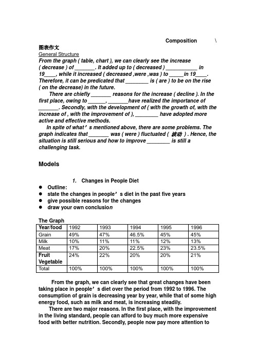
Composition \ 图表作文General StructureFrom the graph ( table, chart ), we can clearly see the increase( decrease ) of _______. It added up to ( decreased ) ___________ in19____, while it increased ( decreased ,were ,was ) to _____in 19____. Therefore, it can be predicated that ________ is ( are ) to be on the rise ( on the decrease) in the future.There are chiefly _______ reasons for the increase ( decline ). In the first place, owing to ______, _______have realized the importance of_______. Secondly, with the development of ( with the growth of, with the increase of , with the improvement of ), ________ have adopted more active and effective methods.In spite of what’s mentioned above, there are some problems. The graph indicates that _______ was ( were ) fluctuated ( 波动) . Hence, the situation is still serious and how to improve ________ is still a challenging task.Models1. Changes in People Diet●Outline:●state the changes in people’s diet in the past five years●give possible reasons for the changes●draw your own conclusio nThe GraphYear/food 1992 1993 1994 1995 1996 Grain 49% 47% 46.5% 45% 45%Milk 10% 11% 11% 12% 13%Meat 17% 20% 22.5% 23% 23.5% 24% 22% 20% 20% 21%FruitVegetableTotal 100% 100% 100% 100% 100%From the graph, we can clearly see that great changes have been taking place in people’s diet over the period from 1992 to 1996. The consumption of grain is decreasing year by year, while that of some high energy food, such as milk and meat, is increasing steadily.There are two major reasons. In the first place, with the improvement in the living standard, people can afford to buy much more expensive food with better nutrition. Secondly, people now pay more attention tothe quality of it, because they know it is of great benefit to their health to diet in a scientific way. Therefore, they try their best to improve the structure of their food.From the above, we can see that people’s living level has been rising markedly in the past five years. And it can be concluded that there will be a more prosperous future waiting for us.2. Production of Radios and TV Sets in Factory A根据左图,写一篇120字的短文。
大学英语图表作文范文

大学英语图表作文范文1. The bar chart shows the percentage of students participating in extracurricular activities in a university. It's interesting to see the variation in participationrates among different activities.2. The pie chart illustrates the distribution of majors among undergraduate students. It's clear that the majorityof students are enrolled in the business and engineering programs.3. The line graph depicts the trend of international student enrollment over the past five years. It's evident that there has been a steady increase in the number of international students studying at the university.4. The scatter plot displays the correlation between GPA and hours spent studying per week. It's apparent that students who study more hours tend to have higher GPAs, but there are also outliers that defy this trend.5. The table presents the average class sizes in various departments. It's notable that classes in the humanities department tend to be smaller compared to those in the science and technology departments.6. The heatmap indicates the peak times of library usage throughout the day. It's clear that the library is most crowded during the late afternoon and evening hours.7. The radar chart showcases the skills and competencies developed by students through internships.It's impressive to see the diverse range of skills that students have acquired in areas such as communication, problem-solving, and teamwork.8. The histogram displays the distribution of student grades in a particular course. It's evident that the majority of students fall within the average grade range, with a smaller number of students achieving high or low grades.9. The box plot illustrates the variability in student performance on a standardized test. It's interesting to see the range of scores, as well as any outliers that may indicate exceptional performance or areas for improvement.10. The area chart shows the allocation of university funding across different departments. It's clear that a significant portion of the budget is allocated to research and development, reflecting the university's commitment to academic excellence.。
英语四级作文写作模板(图表类)

英语四级作文写作模板(图表类)英语四级作文写作模板(图表类)模版一As is shown in the chart / graph / diagram / table above, __________ has charged drastically in the past _________. While ___________,now the percentage of __________ is __________. Meanwhile, the number of _________ has soared up to ________.There are mainly two possible reasons contributing to the rapid changes. The first is that _________. Secondly,__________.In my point of view, the changes have a great influence on _________. At the same time,_______. To sum up ,_________.图表所示,__________急剧充电在过去的_________。
虽然___________,现在的百分比__________是__________。
同时,已经飙升了________,_________。
主要有两个原因可能造成的快速变化。
第一是_________。
其次,__________。
在我的`角度来看,在_________的变化有很大的影响。
在同一时间,_______。
综上所述,_________。
模版二What is shown in the chart / graph / diagram / table above indicates that in recent years, more and more people pay attention to _________. The number of those who _________ has increased ________, and furthermore,____________.There are two factors responsible for the changes. In the first place,_________.Moreover,__________. Yet, it is noticeable that __________. From the analysis, we can safely draw the conclusion that__________. It is possible that in the future, the tendency will__________.在上面图表所示,表示,近年来,越来越多的人注重_________。
2020年大学英语四级考试作文万能模板:图表类
2020年大学英语四级考试作文万能模板:图表类(1)模版1According to the chart / graph / diagram / table, we clearly learn that _________. As early as_________,___________. Then,_________. Last,__________. In contrast, by _________,__________.There are many reasons accounting for _________. Firstly, _________.Secondly,__________. Finally,_________. As a result,_________.As far as I am concerned,_________. For onething,__________. For another,________. In brief, I holdthat__________.(2)模版2What is shown in the chart / graph / diagram / table above indicates that in recent years, more and more people pay attention to _________. The number of those who _________ has increased ________, and furthermore,____________.There are two factors responsible for the changes. In the first place,_________. Moreover,__________. Yet, it is noticeable that __________.From the analysis, we can safely draw the conclusionthat__________. It is possible that in the future, the tendency will__________.(3)模版3As is shown in the chart / graph / diagram / table above, __________ has charged drastically in the past _________. While ___________,now the percentage of__________ is__________. Meanwhile, the number of _________ has soared up to ________.There are mainly two possible reasons contributing to the rapid changes. The first is that _________.Secondly,__________.In my point of view, the changes have a great influence on _________. At the same time,_______. To sum up ,_________.。
专四图表作文模板

专四图表作文模板英文回答:The chart illustrates the changes in the number of students attending university in three different countries over a period of ten years, from 2010 to 2020. As can be seen from the graph, the number of students in China has significantly increased, while the number of students inthe United States and the United Kingdom has remained relatively stable.In 2010, the number of students in China was around 25 million, which was significantly lower than the number of students in the United States and the United Kingdom, which were around 30 million and 20 million respectively. However, over the next ten years, the number of students in China increased rapidly, reaching over 40 million in 2020. In contrast, the number of students in the United States and the United Kingdom only increased slightly, with the United States reaching around 32 million and the United Kingdomreaching around 22 million in 2020.There are several reasons for this trend. Firstly,China has experienced rapid economic growth over the past decade, which has led to an increase in the number of families who can afford to send their children to university. Secondly, the Chinese government has invested heavily in education, with the aim of producing more highly skilled graduates who can contribute to the country's economic development. Finally, the popularity of online education has also contributed to the increase in the number of students in China.中文回答:这张图表展示了三个不同国家在2010年至2020年期间大学生人数的变化情况。
图表类英语四级作文
图表类英语四级作文Title: The Impact of Social Media on Teenagers: A Graph Analysis。
Introduction:In recent years, the influence of social media on teenagers has become a topic of concern and debate. Withthe proliferation of social networking platforms, adolescents are spending increasing amounts of time online. This essay aims to explore the impact of social media on teenagers, using graphs to illustrate trends and statistics.Graph 1: Time Spent on Social Media Platforms by Teenagers。
The first graph depicts the average daily time spent by teenagers on various social media platforms over the past decade. From 2010 to 2020, there has been a steady increase in the time spent on social media, with peaks observed in2015 and 2019. This trend suggests a growing reliance on social media among teenagers for social interaction, entertainment, and information consumption.Graph 2: Effects of Social Media on Mental Health。
- 1、下载文档前请自行甄别文档内容的完整性,平台不提供额外的编辑、内容补充、找答案等附加服务。
- 2、"仅部分预览"的文档,不可在线预览部分如存在完整性等问题,可反馈申请退款(可完整预览的文档不适用该条件!)。
- 3、如文档侵犯您的权益,请联系客服反馈,我们会尽快为您处理(人工客服工作时间:9:00-18:30)。
2020年大学英语四级作文题目模板:图表图画型范文
(五)
四级作文题目: Health Gains in Developing Countries
It can be seen from the charts that there have been dramatic changes in life expectancy and infant mortality in developing countries in the past decades. As the chart shows, people's life expectancy soared from 40 years old to 60 years old from 1960 to 1990. Meanwhile, infant mortality declined from 200 to 150 deaths per thousand births.
The changes in the charts may be attributed to a number
of factors, but the following are the most critical ones. First, developing countries' economy has been developing at a considerably high speed in the past decades. Therefore,
people have more extra money to improve their health. Secondly, the advances in medical sciences and boom of
medical industry provide citizens with more opportunities to cure their diseases. Last but not least, people have attached greater importance to their quality of life, thus they have spent more money and time to build up their bodies.
In a word, these charts are perfect indexes of developing nations' fast expanding economy and people's rising standard
of life. Although a series of problems have arisen in the process, it is reasonable for us to believe that they can be solved in the near future with effective measures taken by
both the government and the public.
(或If this trend continues, developing countries will
soon approach the developed countries in terms of health care.
People will live longer and healthier lives. The result of this will be happier and more productive populations.)。