雅思写作小作文饼图真题句子练习PieSentences
雅思小作文 饼状图

雅思小作文饼状图英文回答:The pie chart illustrates the percentage of various sources of energy consumed in a particular region during a specific year. The data is presented in a clear and concise manner, with each slice of the pie representing a different energy source.Upon examining the pie chart, it becomes evident that non-renewable energy sources dominate the region's energy consumption. Fossil fuels, including coal, natural gas, and oil, account for a substantial 80% of the total energy usage. This heavy reliance on non-renewable resources highlights the region's dependence on finite energy sources, which raises concerns about future energy security and environmental sustainability.In contrast, renewable energy sources play a relatively minor role in the region's energy mix. Solar and wind powercombined contribute a mere 10% to the total energy consumption. This low percentage suggests a lack of investment in renewable energy infrastructure and a reluctance to transition towards cleaner and more sustainable energy sources.Hydroelectricity stands out as the most significant renewable energy source, accounting for 5% of the region's energy consumption. However, this figure is stillrelatively low compared to the potential hydroelectric resources that the region may possess. The untapped potential of hydroelectricity presents an opportunity for the region to increase its reliance on renewable energy and reduce its dependence on fossil fuels.Overall, the pie chart provides valuable insights into the region's energy consumption patterns. The dominance of non-renewable energy sources raises concerns about the region's long-term energy security and environmental sustainability. The underutilization of renewable energy sources, particularly hydroelectricity, suggests a need for increased investment and a shift towards a more sustainableenergy future.中文回答:此饼状图展示了某个地区在某一年中各种能源消耗所占的百分比。
雅思图表题作文套用模板大全
雅思图表作文模板句Para1. This is a table / chart / (line线状bar柱状pie饼状)graph which demonstrate / illustrate / reveal /depict /privide information about............. Para2. (1)Obvious /Apparent from the graph is that ...rank the first/highest,while/whereas ....turn out to be the lowest(2)It is exhibited/shown in the table that.....(3)It can be seen from the table that.....Para3.(1)饼.柱图A,which accounts for...%,ranks the first;then next is B with...%;followed by C,constituting...%;finally it comes D.E.F at...%...%and...%respectively(2)特殊变化(不变,增长或下降多的)①It is worth mentioning that....②It must be pointed out that....③More striking/suprising is that....Para4.To conclude /In conclusion/overallPara5. this is a graph which illustrates...这个图表向我们展示了...Para6 .this table shows the changing proportion of a &b from...to...该表格描述了...年到...年间a与b的比例关系。
雅思写作-小作文范文-饼图

饼图B7T4原题The pie charts below show units of electricity production by fuel source in Australia and France in 1980 and 2000.Summarize the information by selecting and reporting the main features, and make comparisons where relevant.The charts compare the sources of electricity in Australia and France in the years 1980 and 2000. Between these years electricity production almost doubled, rising from 100 units to 170 in Australia, and from 90 to 180 units in France.In 1980 Australia used coal as the main electricity source (50 units) and the remainder was produced from natural gas, hydro power (each producing 20 units) and oil (which produced only 10 units). By 2000, coal had become the fuel for more than 75% of electricity produced and only hydro continued to be another significant source supplying approximately 20%.In contrast, France used coal as a source for only 25 units of electricity in 1980, which was matched by natural gas. The remaining 40 units were produced largely from oil and nuclear power, with hydro contributing only 5 units. But by 2000 nuclear power, which was not used at all in Australia, had developed into the main source, producingalmost 75% of electricity, at 126 units, while coal and oil together produced only 50 units. Other sources were no longer significant.Overall, it is clear that by 20000 these two countries relied on different principal fuel sources: Australia relied on coal and France on nuclear power.分析:题目The pie charts below show units of electricity production by fuel source in Australia and France in 1980 and 2000.•文章谈到的四个要素:units of electricity production, fuel source, Australia and France, 1980 and 2000第一段The charts compare the sources of electricity in Australia and France in the years 1980 and 2000.•四个要素也不能少: sources, electricity, Australia and France, 1980 and 2000 •这次我们也试着将名词性短语改成一个句子, The charts indicate how many units of electricity were produced by different fuel sources in Australia and Francebetween 1980 and 2000.Between these years electricity production almost doubled, rising from 100 units to 170 in Australia, and from 90 to 180 units in France.•说明两个国家从1980到2000的总量的变化•比较一下两个double的用法Ø double [vi]: Electricity production almost doubled.Ø double [vt]: The two countries doubled their electricity production.Ø 这两种用法在雅思图表作文中都很常用,注意一下第二段In 1980 Australia used coal as the main electricity source (50 units) and the remainder was produced from natural gas, hydro power (each producing 20 units) and oil (which produced only 10 units).•说明了澳大利亚1980年情况,•注意同义表达use…as the source, be produced fromBy 2000, coal had become the fuel for more than 75% of electricity produced and only hydro continued to be another significant source supplying approximately 20%.•说明了澳大利亚2000年的情况,注意此处引用了百分数,而非绝对值•这里采用了fuel作为了表达的主语,如Coal had become the fuel, Hydro continued to be another source.第三段In contrast, France used coal as a source for only 25 units of electricity in 1980, which was matched by natural gas. The remaining 40 units were produced largely from oil and nuclear power, with hydro contributing only 5 units.•说明法国1980年的情况•类似于1980年澳大利亚的表达:use…as a source, be produced fromBut by 2000 nuclear power, which was not used at all in Australia, had developed into the main source, producing almost 75% of electricity, at 126 units, while coal and oil together produced only 50 units. Other sources were no longer significant.•说明了法国2000年的情况•类似于2000年澳大利亚的表达:nuclear had developed into the main source第四段Overall, it is clear that by 20000 these two countries relied on different principal fuel sources: Australia relied on coal and France on nuclear power.上文谈到了1980年和2000年两国的发电总量变化(年代变化),这里谈到2000年两国的主要依赖能源(国家对照)词汇句型积累雅思图表作文基本功主要考察的是同义表达,如下面的这句话,就会有多种表达•Australia used coal as the main electricity source•Coal was the main source for electricity in Australia.•The main proportion of electricity was produced from coal in Australia.•Coal became the main fuel to produce electricity in Australia.这个句子中有几个要素coal, electricity, Australia, 你只要将这几个要素所作的句子成分发生变化,句式就会呈现多样性,同义多样表达必须掌握,大家平时可以自己多做这样的练习,以便掌握好这项基本技能。
两个雅思写作小作文饼图练习题
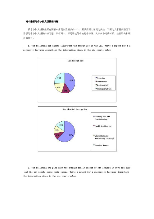
两个雅思写作小作文饼图练习题雅思小作文饼图是所有图表中出现次数最多的一个,所以需要大家更为关注。
下面为大家搜集整理了雅思写作小作文饼图的练习题,共有两个,都是比较简单的两个饼图,大家在备考的时候,注意结构和顺序的描写。
1. The following pie charts illustrate the energy use in the USA. Write a report for a u niversity lecturer describing the information given in the pie charts below.2. The following two pies show the average family income of New Zealand in 1990 and 2000 and the way people spend their income. Write a report for a university lecturer describing the information given in the pie charts below.以上就是这两个雅俗写作小作文饼图练习题的全部内容,包括了美国的能源使用和新西兰的平均家庭收入两个话题。
大家在备考雅思写作小作文饼图的时候,可以适当的练习一下上面的这两个题目。
雅思小作文图表描述方式小结雅思小作文的图表描述是有自己的方式和特点的,掌握了这个方式可以让大家的小作文备考更快也更加贴近考试的要求。
下面就为大家整理了雅思小作文图表描述的方式,供大家参考。
1. 与趋势有关的词语:上升(v.):increase, rise, climb, ascend, surge, shoot up下降(v.):decrease, decline, drop, fall, descend, plunge持平(v.):remain stable, keep constant, level off, flatten out波动(v.):fluctuate, wave, go up and down快速(adj./adv.):considerable/considerably, significant/significantly, substantial/subst antially, remarkable/remarkably, dramatic/dramatically稳步(adj./adv.):steady/steadily, stable/stably, moderate/moderately, modest/modestly缓慢(adj./adv.):slight/slightly, minimal/minimally, marginal/marginally顶点(n. /v.):peak趋势 (n.):trend/ tendency2. 与大小相关的词语:Outnumber (v.):在数量上超过The demonstrators were outnumbered by the policeExceed (v.):在数量上超过Triple (v.):变成三倍The figure has tripled.Double (v.):变成两倍The price of houses has virtually doubled over the past few years.Mount to (v.):达到Counterpart (n.):对应的另一方,比较的另一方 this product is better than its counterpart s此外,朗阁海外考试研究中心建议考生还应考虑一下题中数据和百分比有没有联系,如果有的话还应辅以一些关于比例和占据的语句。
雅思小作文_饼图
P3
• According to the second pie chart, it clearly shows that heating and air conditioning account for the largest proportion (62%) in the residential energy use while the small appliances makes up the least proportion (10%). • The heating water and miscellaneous ( including cooking) constitutes 15% and 13% respectively.
饼状图 Pie Chart 特点
• 静态数据(百分比或数字) • 除了最大最小的,还有互相成倍的,一样的
写作步骤
• 先审题,在看图
• 几张饼,几种馅
• 哪个馅儿多,哪个馅儿少
• 数字,比率
整体+局部
• The following two pie charts illustrate the energy use in the U.S.A. • Write a report for a university lecturer describing the information given in the pie charts below.
P1
• The three pie charts show how university students in three countries spent their money in the year 2003.
P2
• In general, students in country A spent slightly more than those in country B (US$5000 and US$4500 respectively). In comparison, student expenditure in country C was considerably lower, at only US$1500 per year. • 比较总体
雅思A类小作文范文 Spending and Population 饼图类

You should spend about 20 minutes on this task.The charts below give information about world spending and population.Summarise the information by selecting and reporting the main features, and make comparisons where relevant.Write at least 150 words.The pie charts compare the shares of four major items in global expenditure, as well as how global population is distributed.Overall, the largest proportion of money in the world is allocated to food, while transport, housing and clothing are other significant items. Moreover, the population of Asia is responsible for the largest group of humans.According to the first chart, the most significant amounts are paid for food (almost a quarter of global expenditure) and transport (almost 20%), while housing also accounts for a considerable proportion. The least among the four is spent on clothing (merely 6 percent) and the remaining 40% is spent on a variety of other items.The second chart shows that there is a significant difference between the population of Asia and that of other continents since approximately 3 out of every 5 human beings live in Asia. Europe and the Americas share similar proportions and together are host to roughly one-third of the world’s population, while the inhabitants of Africa form a mere one-tenth.(170 words)。
两个时间的饼图雅思小作文
两个时间的饼图雅思小作文英文回答:The two pie charts compare the distribution of time spent on different activities by men and women in a typical day. Overall, it is clear that both men and women spend the majority of their time on three main activities: work, sleep, and personal care. However, there are some notable differences between the two genders.In terms of work, men spend a significantly larger proportion of their day on this activity compared to women. The pie chart shows that men spend 45% of their time working, while women only spend 30%. This suggests that men are more likely to be employed full-time or have longer working hours compared to women.On the other hand, women allocate a larger portion of their day to personal care activities such as grooming, dressing, and taking care of household chores. The chartreveals that women spend 35% of their time on personal care, whereas men only spend 25%. This indicates that women tendto take on more responsibilities related to maintaining the household and their personal appearance.When it comes to sleep, both genders allocate a similar amount of time for rest. Men spend 30% of their day sleeping, while women spend 28%. This suggests that both men and women prioritize getting enough rest and recognize the importance of sleep for their overall well-being.中文回答:这两个饼图比较了男性和女性在一天中不同活动上所花费的时间分配。
英语考试作文-雅思写作优秀模板:饼状图

英语考试作文雅思写作优秀模板:饼状图小作文模板――饼状图1.描述It is clear that the most (adj.) xx is A, which accounts for m% of all x . B is the next largest(adj.)xx ,n% lower than A of all x and followed closely by C . The above three items of xx take uo about o% of the x%By contrast D E andF make uo the smallest percentage of total x , which are p% q% and r% ,respectively.The regions can be divided into two groups-one where … and the other where the reverse is the case.2.比较,占据,百分数Form, comprise, make up, occupyConstitute, cover, represent, account forBe shared byIn 1950, the urban population represented less than 13% of the total. It is now about 40% and is expected to reach 60% by 2030. (摘自BBC)3.比例,倍数A quarter of…Half of…A majority of…A has something in common with bA shares some similarity with bThe difference between a and b lies in…Double, triple, quadruple (v, n, adj)原来的2倍-double, 50→100原来的3倍-triple, 50→150原来的4倍-quadruple, 50→200The value of the house has increased fourfold (=it is now worth four times as much as before).…be twice as adj. as …..…more than xx times as adj. as …..。
- 1、下载文档前请自行甄别文档内容的完整性,平台不提供额外的编辑、内容补充、找答案等附加服务。
- 2、"仅部分预览"的文档,不可在线预览部分如存在完整性等问题,可反馈申请退款(可完整预览的文档不适用该条件!)。
- 3、如文档侵犯您的权益,请联系客服反馈,我们会尽快为您处理(人工客服工作时间:9:00-18:30)。
雅思写作小作文饼图真题句子练习P i e S e n t e n c e s It was last revised on January 2, 2021
P i e c h a r t In 1980 Australia used coal as the main electricity source(50 units) and the remainder was produced from natural gas, hydro power(each producing 20 units) and oil,which produced only 10 units.
在1980年,澳大利亚使用煤作为主要的电力来源(50 units),剩下的电力由天然气,氢能(两者各产生20 units)和石油,它仅仅只产生10 units。
By 2000, coal had become the fuel for more than 75% of electricity produced and only hydro continued to be another significant source supplying approximately 20%.
到了2000年,煤已经成为了产生超过75%电力的能源了,同时只有氢能继续成为另一个重要的供应来源,大约是20%。
In contrast, France used coal as a source for only 25 units of electricity in 1980, which was matched by natural gas.
相比之下,法国在1980年用煤供电只有25 units,这和天然气相同。
The remaining 40 units were produced largely from oil and nuclear power, with hydro contributing only 5 units.
剩下的40 units 主要都产生于石油和核能,其中氢能只贡献了5 units。
But by 2000 nuclear power, which was not used at all in Australia, had developed into the main source, producing almost 75% of electricity, at 126 units, while coal and oil together produced only 50 units.
但是到了2000年,在澳大利亚不会使用的核能,已经发展成为了主要能源,生产大约75%的电力,达到126 units, 相反煤和石油一共只生产 50 units。
In all three years, the greatest expenditure was on staff salaries.
在这三年中,最大的花费是在员工工资上。
But while other workers’ salaries saw a fall from 28% in 1981 to only 15% of spending in 2001,teachers’pay remained the biggest cost, reaching 50% of total spending in 1991 and ending at 45% in 2001.
但是尽管其他工人的工资见证了一个从1981年的28%到2001年仅仅15%的下降,老师的工资依然保持着最大的花费,在1991年达到了总共花费的50%和2001年结束于45%。
Expenditure on resources such as books had increased to 20% by 1991 before decreasing to only 9% by the end of the period.
在这个时期末下降到只有9%之前,在资源,比如书上面的花费到1991年上涨到了20%。
This cost decreased to only 5% of total expenditure in 1991 but rose dramatically in 2001 when it represented 23% of the school budget.
这个花费在1991年下降到只有总体花费的5%,但是在2001年剧烈上升,那个时候它占据了学校预算的23%。
Similarly, the cost of insurance saw a rising trend, growing from only 2% to 8% by 2001.
相似地,保险的花费看见了一个增长趋势,从只有2%增长到2001年的8%。
Globally, 65% of degradation is caused by too much animal grazing and tree clearance, constituting 35% and 30% respectively.
全球的,65%的土地退化是由于过度的放牧和砍伐树木,两者分别占据了35%和30%。
A further 28% of global degradation is due to over-cultivation of crops.
另外的28%全球退化是由于过度种植。
Other causes account for only 7% collectively.
其他原因占据了整体的7%。
At 36% we can see that the travel sector accounted for the majority of online sales in 2003, but this percentage had dropped to 29% by 2013.
我们可以看见在2003年旅游部分占据了网络销售量的大部分,占有36%,但是这个比例到了2013年下降到了29%。
Across the same ten-year period,as an increasing number of people chose to purchase films and music online, we can see that transactions went from just 21% to 33%, making it the retail sector with the highest overall share of the online market.
经历了同样的十年,因为越来越多的人选择网上购买电影和音乐,我们可以看见交易量从仅仅的21%上升到33%,使之零售部分占有了网络市场整体最高的份额。
In 2003, the clothing industry boasted an impressive 24% of total online sales in New Zealand.
2003年新西兰的衣服行业占有了网络销售的24%。
However, by 2013, the figure had fallen considerably to 16%.
然而,到了2013年,这个数据显着地下降到了16%。
Interestingly, online sales of books eventually overtook sales of clothes, although books still represented only 22% of the market.
有趣的是,书本的网上销售量最终超过了衣服的销售量,尽管书本依然只占有市场的22%。