origin 3D作图方法
Origin数据点画三维图
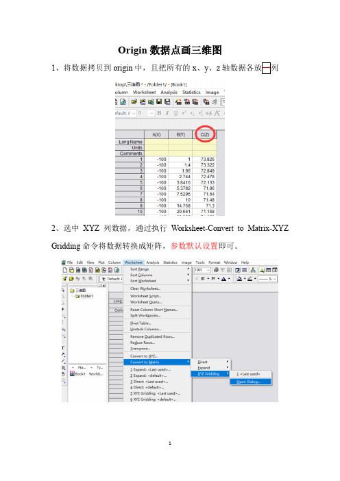
Origin数据点画三维图
1、将数据拷贝到origin中,且把所有的x、y、z
2、选中XYZ列数据,通过执行Worksheet-Convert to Matrix-XYZ Gridding命令将数据转换成矩阵,参数默认设置即可。
4、打开矩阵数据的窗口
5、Plot-3D surface-Color Map Surface
6、双击数据图,出现plot detail对话框,然后点击level,设置参数。
例如,将默认的3.7设置成0.3【数值越小,渐变效果较好】
7、双击数据,出现plot detail对话框,然后点击surface选项卡中enable grid选择none。
同时在surface/projections选项卡中勾线去掉contour line。
8、色带的legend标签上的数值会堆叠在一起,双击legend,出现color scale control对话框。
9、color scale control对话框右下角对话框labels中increment可以控制label的步长,进而控制label数量,默认是increment是1,改成20之后成为下面效果:色带标签不再堆叠。
【根据实际情况设置】。
Origin8.0 tutorial(三维图制作方法)
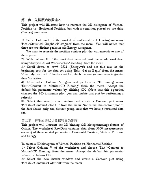
第一步,先将原始数据输入This project will illustrate how to recreate the 2D histogram of Vertical Position vs. Horizontal Position, but with a condition placed on the third (Energy) parameter.1> Select Column E of the worksheet and create a 1D histogram using 'Plot->Statistical Graphs->Histogram' from the menu. You will notice that there are two distinct peaks in this Energy histogram.We want to recreate the position contour plot that corresponds to one of these peaks.2> With column E of the worksheet selected, sort the whole worksheet using 'Analysis->Sort Worksheet->Ascending' from the menu.3> Scroll down to row# 2521 (Energy=6) and set this row as the beginning row for the data set using 'Edit->Set as Begin' from the menu. Now only that part of the data set for which the energy parameter is greater than 6 is active.4> Now select Column V again and perform a 2D binning using 'Edit->Convert to Matrix->2D Binning' from the menu. Accept the default bin parameter values by clicking OK. (Note that this operation changes the 1-D histogram plot; you can update that plot by performing a refresh)8> Select this new matrix window and create a Contour plot using 'Plot3D->Contour-Color Fill' from the menu. Notice that the contour plot of the data shows only one distinct group, now that we have a restricted data set.第二步,将生成的默认数据转置为矩阵This project will illustrate the 2D binning (2D histogramming) feature of Origin. The worksheet RawData contains data from 5000 measurements (events) of three related parameters: Horizontal Position, Vertical Position, and Energy.To create a 2D histogram of Vertical Position vs. Horizontal Position:1> Select Column V of the worksheet and choose 'Edit->Convert to Matrix->2D Binning' from the menu. Accept the default bin parameter values by clicking OK.2> Select the new matrix window and create a Contour plot using 'Plot3D->Contour->Color Fill' from the menu.Notice that the contour plot of the data shows two distinct groups.三维图的做法1> Highlight Matrix1 window and plot 3D ColorMap Surface graph2> Set Z axis scale from -999 to 36003> Bring up 'Plot Details' dialog box.4> Under the 'Surface/Projections' tab, check 'Fill Color' and 'Contour Line' boxes for the 'Bottom Contour'.5> Set 'Line Color' to black for both 'Surface' and 'Bottom Contour'6> Click on the Layer1 icon in the left panel, and select the 'Size/Speed' tab. Set 'Matrix data, maximum points per dimension' to 80 and 40 for X and Y respectively.7> Select the 'Axis' tab and set rotation angles to 7, -15 and -64 for X, Y and Z respectively.8> Select the 'Planes' tab and set YZ and ZX plane colors to 'LT Yellow' and 'Dark Yellow' respectively. Click OK.9> Change axes titles and add arrows and annotations to the bottom contour.。
origin已知方程 绘制三维曲面

origin已知方程绘制三维曲面
题目:如何绘制三维曲面?
回答:
要绘制三维曲面,我们需要先知道方程的形式。
如果已知一个方程,
则可以利用计算机软件或者在线绘图工具来绘制出其对应的三维曲面。
具体操作流程如下:
1. 找到合适的绘图工具
目前,市面上有很多种可以绘制三维曲面的软件或者在线工具。
比如,MATLAB、Maple、Wolfram Alpha、Desmos等软件都可以绘制三维曲面。
其中,Desmos这个在线绘图工具最为简单易用,适合初学
者使用。
2. 构建方程
首先,我们需要构建出我们想要绘制的曲面的方程。
方程的构建需要
根据曲面的几何特征进行推导。
例如,我们要绘制一个球面,则可以
利用球面的标准方程来构建方程。
3. 输入方程
在绘图工具中,我们需要将方程输入进去以便绘制出对应的曲面。
对于不同的绘图工具,输入方式也会有所不同。
在Desmos中,我们只需要在计算框中输入方程即可,而在其他软件中,我们需要先定义变量,然后再输入方程。
4. 设置绘图参数和样式
在绘图工具中,我们可以设置绘图的参数和样式,以让我们绘制出的曲面更加美观。
例如,我们可以调整曲面的颜色、透明度、线条粗细等参数,使得绘制出的曲面更符合我们的要求。
总之,绘制三维曲面需要以下三个步骤:找到合适的绘图工具,构建方程,输入方程,然后设置绘图参数和样式。
通过这些步骤,我们就能够绘制出我们想要的三维曲面。
Origin 三维图及等高线图.ppt

数据图定制如下。 ① 在数据点上双击或单击菜单命令【Format 】→ 【Plot. .】。 ② 在打开的【Plot Details 】对话框中设定投影点的符号及配色方案
绘制3D Trajectory 图
选中Z 列。单击菜单命令【Graph】→ 【3D XYZ 】→ 【3D Trajectory 】或3D and Contour Graphs 工具栏上的【3D Trajectory 】 按钮
设置矩阵工作表属性
① 将要设置属性的矩阵工作表设为活动工作表。 ② 单击菜单命令【Matrix 】→ 【Set Properties... 】。 ③ 在【Matrix Properties 】中设置矩阵的列宽、数值显示格式和数据类型 等
转置矩阵
示例准备: 创建一个3x3 矩阵, 手工输入矩阵数值。 ① 将要转置的矩阵工作表设为活动工作表。 ② 单击菜单命令【Matrix 】→ 【Transpose. . . 】
矩阵维 数
坐标范 围
切换显示列/行序号为XY坐标
默认状态下矩阵工作表显示的列/行序号而不是XY坐标值,因此,设置完 成只能看到维数的变化。如果需要显示坐标,则需要通过菜单命令切换显示列 /行序号为XY坐标。
打开【View 】菜单, 勾选【Show XY 】选项。要切换回显示列/行序号 方式,打开【View】,勾选【Show Column/Row 】选项
范围Row(i): "1 To 20 ", ③ 将B、C 列分别值设置为" sin(i*2*pil20)"、"sin(i*2 *pi/20) " 。
绘图步骤如下。 ①选中Z列。 ② 单击菜单命令【Graph 】→ 【3D XYZ 】→ 【3D Scatter 】或3D
origin画三维图
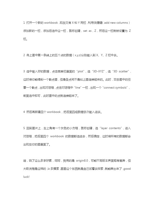
1 打开一个新的workbook,现在只有X和Y两栏,利用快捷键(add new columns)添加新的一栏,添加后选中这一栏,鼠标右键,set as,Z,然后这一栏就被设置为Z 栏。
2 将上图中第一条线上的五个点的数据(x,y,z)分别输入到X、Y、Z栏中去。
3 选中输入好的数据,点击菜单栏里面的“plot”,选“3D-XYZ”,选“3D scatter”,这时候你能得到一个散点图,但是各点间不是如上图连接起来的。
此时,双击图中的任意一个散点,出现对话框,点击对话框中“line”一栏,出现一个“connect symbols”,前面选中即可,此时图中的点就连接起来了。
4 然后再新建四个workbook,把后面四组数据依次输入进去。
5 回到图片上,左上角有一个灰色的小方框,鼠标右键,选“layer contents”,进入对话框,把后面四个workbook的数据都选进去,然后确定,这时候所有的数据都会出现在你的图里面了。
哇,码了这么多字好累,呵呵,我用的是origin8.0,可能不同版本界面略有差异,但大致流程是这样的,lz多摸索,画图这个东西就是自己试着去探索,就能弄出来了,good luck!。
Origin数据点画三维图
Origin数据点画三维图
1、将数据拷贝到origin中,且把所有的x、y、z
2、选中XYZ列数据,通过执行Worksheet-Convert to Matrix-XYZ Gridding命令将数据转换成矩阵,参数默认设置即可。
4、打开矩阵数据的窗口
5、Plot-3D surface-Color Map Surface
6、双击数据图,出现plot detail对话框,然后点击level,设置参数。
例如,将默认的3.7设置成0.3【数值越小,渐变效果较好】
7、双击数据,出现plot detail对话框,然后点击surface选项卡中enable grid选择none。
同时在surface/projections选项卡中勾线去掉contour line。
8、色带的legend标签上的数值会堆叠在一起,双击legend,出现color scale control对话框。
9、color scale control对话框右下角对话框labels中increment可以控制label的步长,进而控制label数量,默认是increment是1,改成20之后成为下面效果:色带标签不再堆叠。
【根据实际情况设置】。
如何用ORIGIN画3D图
用origin画3D图详细步骤Origin 的3D 图基本上都是从Matrix 上画的(3D Scatter 从Worksheet 画),这让很多初学者费解,因为这里涉及到Worksheet to Matrix 的转换,而转换的各种方法让人摸不到头脑。
如果用过Surfer 绘制3D 图,就能感觉到当原始的XYZ 数据点是不规则的时候,要产生规则的网格去绘制3D 图将肯定涉及到插值。
插值的好坏直接影响到图上很多细节的表达。
这里先不介绍各种插值(gridding) 的细节,只区别数据是否规则,画个粗略的3D 图。
当数据转换成Matrix 的时候,Matrix 的Cell 上只显示Z 值,XY 值在Column 和Row 的Header 上,默认情况下显示的是Index,若要看到XY 值,菜单上选View : Show XY。
(图片有缩放,点击后看大图)附件2007-9-1 01:35001.jpg(48.09 KB)直接转换-- Direct Convert (Edit : Convert to Matrix : Direct)直接转换Worksheet 数据成Matrix,各个Cell 一一对应。
当wroksheet 中不包含Matrix 的XY 信息时,转换后的Matrix 的XY 值为index:附件2007-9-1 01:37002.jpg(53.19 KB)直接转换-- Worksheet 中含有Matrix 的XY 值这里假设worksheet 数据的组织结构与Matrix 一样(X 按列排),并且X 值存在第一行,Y 值存在第一列。
注意,对于这样直接转换,X Y 的值必须时均匀间隔的。
若X 值按行排,则选择Y varies acros columns,转成的Matrix 会转置(这里有点晕哦 :-))附件2007-9-1 01:38004.jpg(57.15 KB)XYZ 数据转换成Matrix -- Regular如果是XYZ 这样的数据,则应该先考察一下数据是怎样分布的,Highlight XY column,画Scatter,若是规则的数据,则选择Edit : Comvert to Matrix : Regular 来转换。
Origin三维绘图
以图像方式显示矩 阵数据
显示矩阵的每一行、 列具体的X,Y数值
Matrix 菜单命令
设置Matrix的属性
设置Matrix的行数和列数
设置Matrix的单元格的数值
设置Matrix的属性
设置Matrix的行数和列数
设置Matrix的单元格的数值
i:行号 j:列号
Cell(i,j)=
x^2+y^2
3D Wire Frame Surface 3D线框表面图
Origin根据X, Y,Z坐标值确定点 在3D空间中的位置, 将各点以直线相连, 这些网格线就确定 了3D表面(不用颜 色填充表面)。
3D X Constant with Base Surface 3D X恒定有基线表面图
不同的X取 值确定了平行于 YZ面的一系列平 面,在每个平面 上,不同的Z值描 绘的点连成一条 曲线,所有的这 一系列曲线构成 3D表面图。
3D Color Map Surface 3D彩色映射表面图
这类图形和3D 彩色填充表面图类 似,只不过上表面 填充的颜色为与Z值 相对应的一系列变 换的颜色,并加有 白色等高线。
3D Wire Surface 3D线条表面图
根据X,Y,Z坐标 值确定点在3D空间中的 位置,将各点以直线相 连,这些线称为主线, 在相邻的主线中间插入 直线(辅线),所有这些 网格线确定了3D表面。 默认情况下,主线之间 有两条辅线。
z x, y
sin x y
2
2
x y
2
2
x, y 8,8
上机练习:用三维表面图表示电偶极子在其 所在平面的电位分布 U U U
U q q 4 0 r 1 1
U q
如何用origin画3D图
如何在Origin 画3D 图Origin 的3D 图基本上都是从Matrix 上画的(3D Scatter 从Worksheet 画),这让很多初学者费解,因为这里涉及到Worksheet to Matrix 的转换,而转换的各种方法让人摸不到头脑。
如果用过Surfer 绘制3D 图,就能感觉到当原始的XYZ 数据点是不规则的时候,要产生规则的网格去绘制3D 图将肯定涉及到插值。
插值的好坏直接影响到图上很多细节的表达。
这里先不介绍各种插值(gridding) 的细节,只区别数据是否规则,画个粗略的3D 图。
当数据转换成Matrix 的时候,Matrix 的Cell 上只显示Z 值,XY 值在Column 和Row 的Header 上,默认情况下显示的是Index,若要看到XY 值,菜单上选View : Show XY。
(图片有缩放,点击后看大图)附件2007-9-1 01:35001.jpg(48.09 KB)直接转换-- Direct Convert (Edit : Convert to Matrix : Direct)直接转换Worksheet 数据成Matrix,各个Cell 一一对应。
当wroksheet 中不包含Matrix 的XY 信息时,转换后的Matrix 的XY 值为index:附件2007-9-1 01:37002.jpg(53.19 KB)直接转换-- Worksheet 中含有Matrix 的XY 值这里假设worksheet 数据的组织结构与Matrix 一样(X 按列排),并且X 值存在第一行,Y 值存在第一列。
注意,对于这样直接转换,X Y 的值必须时均匀间隔的。
若X 值按行排,则选择Y varies acros columns,转成的Matrix 会转置(这里有点晕哦 :-))附件2007-9-1 01:38004.jpg(57.15 KB)XYZ 数据转换成Matrix -- Regular如果是XYZ 这样的数据,则应该先考察一下数据是怎样分布的,Highlight XY column,画Scatter,若是规则的数据,则选择Edit : Comvert to Matrix : Regular 来转换。
Origin教程丨如何绘制好看的3D条形图?
Origin教程丨如何绘制好看的3D条形图?Origin可以做很多非常精美的二维图谱,当然也可以做好看的3D 图。
今天我们来看看,Origin如何做3D条形图。
如下所示。
其实对于在Origin里面作图,我们只需要注意四点:· 正确的数据输入;· 合适的图形模板;· 恰当的参数调节;· 合规的图形输出。
只要能做到这些,你的图形基本上就是一幅好的图形。
软件软件:Origin 2019b 32Bit数据这是我们今天使用的数据,一共是三个指标,四个组别,以及对应的平均值和标准误。
我们需要提前在Excel或Origin将数据排列好,下面是数据格式输入的一种,大家可以参考进行作图使用。
视频教程图文教程1. 打开Origin软件,输入数据2. 选中C(Y)列,右击设置为Z列3. 选中A(X),B(Y),C(Z)数据,选择3D条形图模板4. 那么我们的基本图形就出现了调整视角1. 点击图形,会出现设置选项。
这里我再说一下四个标签的意思:(1) 选中,即可移动图形;(2) 选中,即可从各个坐标轴调整图形长宽高;(3) 选中,可以从各个坐标轴旋转图形方向;(4) 选中,即可将标签放在图中或者右上角。
2. 我们使用第三个旋转功能,将图形旋转到一个好看的视角,主要是确保我们的柱子能够不被遮挡。
如下所示:按照指标不同进行填充颜色1. 双击柱子,我们可以以指标为索引,进行填充颜色(就是说,同一个指标是一个颜色)。
2. 如下所示,边线还有黑色。
3. 再次双击,将边线也设置为同样的颜色。
或者直接将边线设置为无,为了好看一点。
或者进行组别中的颜色和图形双映射1. 双击柱子,进行设置。
我们先按照组别设置一下颜色2. 再按照组别设置一下图形映射3. 看看效果,这样我们就把颜色和图形都映射上去了。
也就是同一指标内,不同组之间的颜色和图形不一样。
误差线添加1. 双击图形,设置误差数值2. 调整误差线的参数3. 效果如下所示网格线及其颜色设置题1. 双击坐标轴,点击网格线进行设置。
- 1、下载文档前请自行甄别文档内容的完整性,平台不提供额外的编辑、内容补充、找答案等附加服务。
- 2、"仅部分预览"的文档,不可在线预览部分如存在完整性等问题,可反馈申请退款(可完整预览的文档不适用该条件!)。
- 3、如文档侵犯您的权益,请联系客服反馈,我们会尽快为您处理(人工客服工作时间:9:00-18:30)。
Basic 3D Plotting
Summary
In Origin, most 3D plots -- including 3D surface, wire frame/wire surface, 3D bar plot and 2D contour -- are created from an Origin matrix. In most cases, the raw data is XYZ data and you should convert it to a matrix first, using one of Origin's built-in gridding routines.
Minimum Origin Version Required: Origin 8.0 SR6
What you will learn
This tutorial will show you how to:
•Create a 3D graph in Origin
•Convert Worksheet data to a Matrix
•Use the layer contents dialog to add/remove dataset
•Use the Plot Details dialog to modify graph
Steps
1.Import the file \Samples\Matrix Conversion and Gridding\XYZ Random
Gaussian.dat.
2.Highlight the 3rd column, right-click, and select Set As: Z from
the context fly-out menu.
3.To convert the worksheet XYZ data into a matrix, select Worksheet:
Convert to Matrix: XYZ Gridding to bring up the XYZ Gridding dialog.
Select Mean from the drop-down list of the Replace Duplicates with item as below:
4.After that, you can see the right preview panel as below.As you can
see, the XY data are randomly distributed, so a random gridding method should be used.
e the following settings and click OK to convert the XYZ columns
of data into a matrix of data. The TPS gridding method will generate
a smooth surface.
6.Set the new generated matrix as the active window and select Plot:
3D Wires and Bars: Wire Frame from the menu to plot a 3D mesh:
7.In order to plot the original data points on the graph, you can use
the Layer Contents. Right-click on the layer icon and select Layer Contents.
In the Layer Contents dialog, select the worksheet Z column (In this example, xyzrandomgaus_c) and add it into the Layer Contents list.
After you click OK, the source data points will be added to the layer.
8.You can now use the Plot Details dialog to modify the appearance.
Double-click on the graph to bring up the Plot Details dialog. On the left panel, select the 3D scatter data:
And then go to the Symbol tab on the right panel, adjust the symbol type, size and color, etc.
Remove the drop lines on the Drop Lines panel:
9.When done, click OK to accept the modifications:。