雅思表格table写作模板
雅思写作_表格图范文

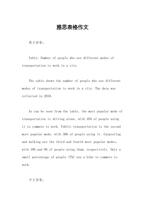
(in millions)
London
1863
1100
548
Paris
1890
594
890
Tokyo
1904
149
1434
Washington DC
1921
114
70
Kyoto
19801111源自Los Angeles2001
14
90
范文:
A glance at the table providedreveals a number of clear differences between the metro systems of the world in terms of age, scale andannualcarrying capacity.
Oneparticularly interestingfacthighlightedby the figure is that the morerecently establishedmetro systems are considerably shorter than the older pletedin 1863, the London underground is the oldest of the metro systemslistedand also the longest,extending for1100kilometres. Likewise, the second oldest system is also the second longest: built in 1890, the Paris metro is some 594 kilometres in length.In stark contrast, however, the Kyoto and Los Angeles metro systems—established in 1980 and 2001 respectively—are far shorter. The formercovers a mere11 kilometres and the latter just 14 kilometres.
雅思表格作文
雅思表格作文英文回答:Table: Number of people who use different modes of transportation to work in a city.The table shows the number of people who use different modes of transportation to work in a city. The data was collected in 2018.As can be seen from the table, the most popular mode of transportation is driving alone, with 45% of people usingit to commute to work. Public transportation is the second most popular mode, with 30% of people using it. Carpooling and walking are the third and fourth most popular modes, with 10% and 8% of people using them, respectively. Only a small percentage of people (7%) use a bike to commute to work.中文回答:表格,在城市中使用不同交通方式上班的人数。
该表格显示了在城市中使用不同交通方式上班的人数。
数据是在2018年收集的。
从表格中可以看出,最受欢迎的交通方式是独自驾车,有45%的人使用它上下班。
公共交通是第二受欢迎的交通方式,有30%的人使用它。
拼车和步行是第三和第四受欢迎的交通方式,分别有10%和8%的人使用。
只有很少一部分人(7%)使用自行车上班。
雅思图表题作文套用模板大全
雅思图表作文模板句Para1. This is a table / chart / (line线状bar柱状pie饼状)graph which demonstrate / illustrate / reveal /depict /privide information about............. Para2. (1)Obvious /Apparent from the graph is that ...rank the first/highest,while/whereas ....turn out to be the lowest(2)It is exhibited/shown in the table that.....(3)It can be seen from the table that.....Para3.(1)饼.柱图A,which accounts for...%,ranks the first;then next is B with...%;followed by C,constituting...%;finally it comes D.E.F at...%...%and...%respectively(2)特殊变化(不变,增长或下降多的)①It is worth mentioning that....②It must be pointed out that....③More striking/suprising is that....Para4.To conclude /In conclusion/overallPara5. this is a graph which illustrates...这个图表向我们展示了...Para6 .this table shows the changing proportion of a &b from...to...该表格描述了...年到...年间a与b的比例关系。
雅思图表表格写作范文

You are advised to spend a maximum 20 minutes on this task.The table below summarizes some data collected by a college bookshop for the month of February 2008.Write a report describing the sales figures of various types of publications, based on the information shown in the table.The table shows sales figures of fiction books, non-fiction books, and magazines in a college bookshop for the February 2008. The figures are divided into two groups: sales to non-Book Club members and to Book Club members.The non-Book Cub member figures comprise sales to college staff,college students, and members of the public. College staff bought 332 magazines, 44 fiction and 29 non-fiction books. College students bought 1249 magazines, 194 non-fiction and 31 fiction books. More magazines were sold to college students than to any other group of customers. Although no fiction books were sold to members of the public, they purchased 122 non-fiction books and 82 magazines.Book Club members bought more fiction(76)and non-fiction books (942) than other customers. On the other hand, magazine sales to Club members(33) were fewer than for any other type of customer.The total number of publications sold for the month was 3134( 1474 to college students, 405 to staff, 204 to the public, and 1051 to Book Club members). Of this figure, 151 items were fiction books and 1287 were non-fiction. Therefore, magazine accounted for the greatest number of sales (1696)。
雅思写作小作文范文 雅思写作表格题table 骑行上班人数.doc

雅思写作小作文范文雅思写作表格题table 骑行上班人数今天我们雅思写作小作文范文的文章来研究下表格题table。
这张表格是关于2001年和2011年两个年份中英国骑自行车上班的人的数量。
其中包含伦敦、谢菲尔德、卡迪夫、利兹等12个城市和地区。
除了两年里骑行的具体人数,它还提供了变化的比例。
可以说数字非常之多。
小编搜集了一篇相应的考官范文,大家可以参考下考官是如何选取和比较数字的。
雅思写作小作文题目The table below shows changes in the numbers of residents cycling to work in different areas of the UK between 2001 and 2011.Summarise the information by selecting and reporting the main features, and make comparisons where relevant.雅思写作小作文范文The table compares the numbers of people who cycled to work in twelve areas of the UK in the years 2001 and 2011.这张表格比较了英国12个地区在2001年和2011年骑自行车上班的人的数量。
Overall, the number of UK commuters who traveled to work by bicycle rose considerably over the 10-year period. Inner London had by far the highest number of cycling commuters in both years.整体而言,英国骑自行车上班的通勤者的数量在这10年期间显著上升。
★雅思小作文_表格(2)2022

P2
The travel modes which gained popularity in the period included cars, long distance buses, trains, taxis and others.
Cars remained top among the modes in the 15 years, with its average miles increasing considerably from 3,199 in 1985 to 4,806 in 2000.
Systems in Los Angeles’s and Kyoto’s carry fewer passengers per year (50 and 45, respectively).
Thus, it can be clearly seen from the table that the subway systems in Tokyo and Paris serves for more passengers whereas the systems in Los Angeles and Kyoto carry fewer passengers mainly because of the short route.
表格 Table MR LU
过于抽象 数字(比例)太多,难以取舍 趋势不明显
今昔对比
The table below gives information about changes in modes of travel in England between 1985 and 2000.
剑6P52
The third part is passengers per year in millions.
雅思作文模板:图表作文模板12个
雅思作文模板:图表作文模板12个雅思图表作文离不开数据的描述,所以大家如果想要在雅思图表作文当中取得好成绩,就一定要掌握一些数据描述的模板。
下面就为大家总结了12个关于数据描述的雅思图表作文模板,大家可以在备考的时候进行参考。
1.the table shows the changes in the number of...over the period from...to... 该表格描述了在...年之...年间...数量的变化。
2.the bar chart illustrates that... 该柱状图展示了...3.the graph provides some interesting data regarding... 该图为我们提供了有关...有趣数据。
4.the diagram shows (that)... 该图向我们展示了...5.the pie graph depicts (that).... 该圆形图揭示了...6.this is a cure graph which describes the trend of... 这个曲线图描述了...的趋势。
7.the figures/statistics show (that)... 数据(字)表明...8.the tree diagram reveals how... 该树型图向我们揭示了如何...9.the data/statistics show (that)... 该数据(字)可以这样理解...10.the data/statistics/figures lead us to the conclusion that... 这些数据资料令我们得出结论...11.as is shown/demonstrated/exhibited in the diagram/graph/chart/table... 如图所示...12.according to the chart/figures... 根据这些表(数字)...以上就是关于雅思图表作文数据描述的模板,大家可以看到这些雅思图表作文的模板是根据雅思图表的种类的不同而有不同的描述方法。
雅思写作小作文范文 雅思写作表格题table 时间分配.doc
雅思写作小作文范文雅思写作表格题table 时间分配今天我们雅思写作小作文范文的文章来研究下表格题table。
该表格展示了英国男性和女性一天中的时间分配。
其内容包括睡觉、休息、个人护理、吃喝、休闲娱乐、工作与学习、家务、照顾孩子、志愿工作和会议,以及旅行等。
数据很多,显得有些杂乱。
小编找到了一篇相应的考官范文,以供大家参考。
雅思写作小作文题目The chart below shows average hours and minutes spent by UK males and females on different daily activities.Summarise the information by selecting and reporting the main features, and make comparisons where relevant.雅思写作小作文范文The table compares the average amount of time per day that men and women in the UK spend doing different activities.该表格比较了英国男性和女性平均每天在不同的活动上所花费的时间。
It is clear that people in the UK spend more time sleeping than doing any other daily activity. Also, there are significant differences between the time spent by men and women on employment/study and housework.很明显,英国人在睡眠上花的时间比其他任何日常活动都多。
同时,男性和女性在工作/学习和家务上花费的时间有明显差别。
On average, men and women in the UK sleep for about 8 hours per day. Leisure takes up the second largest proportion of their time. Men spend 5 hours and 25 minutes doing various leisure activities, such as watching TV or doing sport, while women have 4 hours and 53 minutes of leisure time.平均来看,英国男性和女性一天睡觉大约8个小时。
雅思小作文静态表格图范文
雅思小作文静态表格图范文英文回答:The table provides information about the percentage of people in different age groups who participate in regular physical exercise in a certain country. It is clear that the younger age groups tend to exercise more regularly compared to the older age groups.According to the table, 85% of people aged 18-24 engage in regular physical exercise, while the percentage drops to 70% for those aged 25-34. The percentage continues to decrease as age increases, with only 50% of people aged 35-44 participating in regular exercise. The trend continues with 40% for the 45-54 age group, 30% for the 55-64 age group, and finally 20% for those aged 65 and above.It is evident that the younger age groups are more active in terms of regular physical exercise, while the older age groups are less active in this aspect.中文回答:这张表格提供了在某个国家不同年龄段参与定期体育锻炼的人群百分比信息。
表格描述英语作文
表格描述英语作文In the table below, we can see the statistics of students' performance in English writing exams. It shows the number of students who scored different grades, ranging from A to F. The table clearly indicates that a large percentage of students received grades in the C to B range, with only a small number achieving an A grade.Moving on to the next column, we can observe the distribution of scores based on gender. Interestingly, it appears that female students outperformed male students in the exam, with a higher percentage of females achieving top grades compared to their male counterparts.Looking at the third column, we can see the performance of students from different age groups. Surprisingly, it seems that older students performed better in the exam, with a higher percentage of students in the 18-24 age group achieving top grades compared to younger students.In the final column, we can see the results based onthe students' study habits. It is evident that students who reported studying for more hours tended to perform betterin the exam, with a higher percentage of high scores among those who studied for longer periods.Overall, the table provides valuable insights into the factors influencing students' performance in Englishwriting exams. It highlights the importance of study habits, age, and gender in determining success in academic assessments.。
- 1、下载文档前请自行甄别文档内容的完整性,平台不提供额外的编辑、内容补充、找答案等附加服务。
- 2、"仅部分预览"的文档,不可在线预览部分如存在完整性等问题,可反馈申请退款(可完整预览的文档不适用该条件!)。
- 3、如文档侵犯您的权益,请联系客服反馈,我们会尽快为您处理(人工客服工作时间:9:00-18:30)。
雅思表格table写作模板table表格图是雅思小作文考试中最主要的提醒之一,也是大家在备考的必须要准备的图形。
那么我们该怎么写呢?下面小编就为大家整理了雅思表格table写作模板,希望能给大家一些帮助和借鉴。
雅思图表写作模板-统计表table雅思小作文表格图写作技巧1. Paraphrasing the introduction.转述开头段。
2. Writing an overview.写出概述。
3. Make sure which tense and what grammar will be used?确定本篇小作文的时态。
4. What information stands out?找出图中数据极值(最大,最小)5. Grouping the information.信息分组。
7分以上范文1.The table below gives information about languages with the most native speakers.Languages with the most native speakersThe table illustrates the number of native speakers of six languages as well as the number of speakers of these languages as an additional language. It is noticeable that the number of speakers of Mandarin Chinese is strikingly higher than the other languages.People who speak Mandarin largely speak it as a first language (900 million). In comparison to this only 190 million people speak Mandarin Chinese as an additional language. What is remarkable about English speakers is that the number of speakers of English as an additional language is higher than that of native speakers of English (603 and 339 million respectively).While the total number of Hindi speakers (490 million) is roughly equal to that of Spanish speakers (420 million); when itcomes to speaking these languages as an additional language the number for Hindi is much higher (120 million) than that for Spanish (70 million).Native speakers of Arabic and Portuguese are similar in number with 206 million and 203 million respectively. However, the number of Arabic speakers as an additional language (24 million) is almost 2.5 times larger than speakers of Portuguese as an additional language.雅思写作表格图模板分享题目一:The table below shows the monthly expenditure of an average Australian family in 1991 and 2001. Summarize the information by selecting and reporting the main features, and make comparisons where relevant.下表显示了1991年和2001年澳大利亚普通家庭的月支出。
通过选择和报告主要特性来总结信息,并在相关的地方进行比较。
高分范文:The supplied table compares the monthly expenses of an average family of Australia for the years 1991 and 2001. As is observed from the given data, the expenses on electricity & water and non-essential goods & services had increased more than any other category while the expenses on clothing and transport decreased over the period.所提供的表格比较了澳大利亚普通家庭在1991年和2001年的月支出。
从所给的数据可以看出,在这段时间内,水电和非必需品和服务的费用比任何其他类别的费用都增加得多,而服装和运输的费用则减少了。
As is presented in the table, the average expenditure of an Australian family per month was AUD $ 715 after 10 years. This shows that the average expenditure of an average Australian family had not increase significantly. In 1991, the expenditure onnon-essential goods and services was $250 which was highest among the given categories. This reached to $270 in 2001 which was also the highest amount among the given expense categories in 2001. The expense on food & housing were $155 & 95 consecutively in 1991 and both of these expenses increased by only 5 dollars after 10 years. Interestingly the monthly amount spent on clothing and transport decreased over the 10 years and reached to $20 and $45 in the year 2001. The expenses on food, housing and electricity & water increase and the highest increase was in electricity and water.如表所示,10年后,澳大利亚家庭每月平均支出为715澳元。
这表明,一个普通的澳大利亚家庭的平均支出并没有显著增加。
1991年,非必需品商品和服务的支出为250美元,是所有类别中最高的。
这一数字在2001年达到了270美元,也是2001年给定费用类别中最高的。
在1991年,食品和住房的费用是155美元和95美元,这两项费用在10年之后只增加了5美元。
有趣的是,在服装和交通上的月支出在10年后下降了,在2001年达到了20美元和45美元。
食品、住房、水电支出增加,其中水电支出增幅最大。
In summary, the monthly expenditure by an average Australian family had not increased that much in 10 years from 1991 to 2001 and the expenses on electricity, water, housing, and non-essential goods and services increase while the expenses on clothing and transport decreased over time.总之,从1991年到2001年,澳大利亚普通家庭的月支出在10年里没有增加多少,电费、水费、住房和非必需品和服务的支出增加了,而服装和运输的支出随着时间的推移减少了。
雅思写作小作文静态图范文表格题【雅思小作文】教育问题的Tabel—20170713The table below gives information about the problems faced by children in two primary schools in 2005 and 2015.范文:The table compares two primary schools in terms of the proportions of their pupils who experienced seven different educational problems in the years 2005 and 2015.It is noticeable that school A had higher proportions of children with all seven educational difficulties in both years. However, while school A managed to reduce the incidence of most of the problems between 2005 and 2015, school B saw an overall rise in the percentage of children who were struggling.In 2005, 42% of school A’s pupils found it difficult to follow instructions, whereas only 6% of pupils in school B experienced this problem. Similarly, between 30 and 40 per cent of children attending school A had problems in the areas of spelling, listening, verbal expression and concentration in lessons, while the equivalent figures for school B stood at between 5 and 15 per cent.In 2015, the difference between the two schools was less pronounced. Notably, the proportion of children who struggled to follow instructions fell by 24% in school A, and this school also saw falls of 22%, 15%, 14% and 5% in the figures for children who had problems with concentration, listening, verbal expression and spelling. In school B, however, the proportion of children who struggled with spelling and following instructions doubled, to 10% and 12% respectively, and there was almost no change in the incidence of listening, verbal or concentration problems.雅思小作文模板:表格题1. 找出最大值,最小值,以及一般值2. 进行分析比较,找出近似值和相差很大的数值常用句式1.a is nearly /more than…times as much/many/large as b.(a是b的…倍。