how to make a histogram in excel
Excel 使用技巧(英文描述)
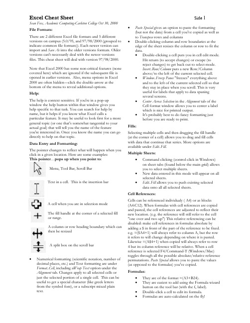
Excel Cheat SheetSide 1Sean Fox, Academic Computing-Carleton College Oct 30, 2000File Formats:There are 2 different Excel file formats and 5 different versions on campus (5.0/95, and 97/98/2000 (grouped to indicate common file formats)). Each newer version can import and Save As into the older versions formats. Older versions can't necessarily deal with the newer versions files. This cheat sheet will deal with version 97/98/2000.Note that Excel 2000 has some non-critical features (none covered here) which are ignored if the subsequent file is opened in earlier versions. Also, menu options in Excel 2000 are often hidden—click the double-arrow at the bottom of the menu to reveal additional options.Help:The help is context sensitive. If you're in a pop-up window the help button within that window gives you help specific to that task. You can search for help by name, but it helps if you know what Excel calls aparticular feature. It may be useful to look first for a more general topic (or one that's somewhat tangential to your actual goal) that will tell you the name of the featureyou're interested in. Once you know the name you can go directly to help on that topic.Data Entry and Formatting:The pointer changes to reflect what will happen when you click in a given location. Here are some examples:This pointer …pops up when you point to :Menu, Tool Bar, Scroll BarText in a cell. This is the insertion barA cell when you are in selection mode The fill handle at the corner of a selected fill or range.A column or row heading boundary which can then be resizedA split box on the scroll bar•Numerical formatting (scientific notation, number of decimal places, etc.) and Text formatting are under Format..Cell , including a Wrap Text option under the Alignment tab. Changes apply to all selected cells or just the selected portion of a single cell. This can be useful to get a special character (like greek letters from the symbol font), or a subscript mixed plain text.• Paste Special gives an option to paste the formatting (but not the data) from a cell you've copied as well as to Transpose rows and columns•Double-clicking column and row boundaries at the edge of the sheet resizes the column or row to fit the data.• Double-clicking a cell puts you in cell edit mode.Hit return (to accept changes) or escape (to reject changes) to get back out to select mode.Insert..Row/Column puts a new Row/Column above/to the left of the current selected cell.• Window..Freeze Panes "freezes" everything aboveand to the left of the current selected cell so that they stay in place when you scroll. This is very useful for labels that apply to data spaning several screens.• Center Across Selection in the Alignment tab of theCell format window allows you to center a label which is nice for printed output.• It's probably best to do fancy formatting justbefore you are ready to print.Fills:Selecting multiple cells and then dragging the fill handle (at the corner of a cell) allows you to drag and fill cells with data that continue that series. More options are available under Edit..Fill .Multiple Sheets:• Command clicking (control-click in Windows)on sheet tabs (found below the main grid) allows you to select multiple sheets.•New data entered in this mode will appear on all selected sheets.•Edit..Fill allows you to push existing selected data onto all all selected sheets.Cell References:Cells can be referenced individualy ( A4) or as blocks (A4:C12). When formulas with cell references are copied and pasted, the cell references are adjusted to reflect their new location. (e.g. the reference will still refer to the cell "one over and two up") This relative referencing can be disabled: make cell references in formulas absolute by adding a $ in front of the part of the reference to be fixed.e.g. =($A4+1) will always refer to column A, but the row it refers to will change depending on where it is pasted.Likewise =(A$4+1) when copied will always refer to row 4 but its column reference will be relative. When a cell reference is selected F4/Command-T (Windows/Mac)toggles through all the possible absolute/relative reference permutations. Paste Special allows you to paste the values (as opposed to the formulas) you've copied.Formulas:• They are of the format =(A3+B24).• They are easiest to add using the Formula wizard button on the tool bar (with the f x label).• Double-click a cell to edit its formula.•Formulas are auto-calculated on the fly!Excel Cheat Sheet Side2Sean Fox, Academic Computing-Carleton College Oct 30, 2000 Analysis Tools:•Anovas, Regressions, Histograms & more are under Tools..Data Analysis. If this option isn't onthe menu you'll need to go to Tools..Add-Ins andcheck the Analysis ToolPack check box.•The regression option includes a check box to create a corresponding chart.•The histogram option allows you to specify the "bins" into which the data is segregated bycreating a list of numbers representing the topvalue of each bin.Charts:•Use the Chart Wizard (the bar chart icon on the toolbar ).•Most chart types only allow data points with an associated label and value (blue fish, 42). If yourdata points each have two associated variables(e.g. each point has a time and temp associatedwith it, or a height and width) need to use the X-Y scatter chart type. Excel is unable to do true 3-d plots where each data point has 3 variablesassociated with it.•You can change the properties of the elements of your chart by selecting the element inquestion and double-clicking. Clicking on thedata points (which Excel calls a data series) isespecially useful in this regard.•Selecting an axis and double-clicking gets you to the Format Axis window. The Scale tab in thiswindow allows you to specify the min, max, andtick values for the axis as well as whether to uselog scaling.•Title, Axes, and Legends can be added to a chart after it's initial created by selecting the Chart andusing the relevant options in the Insert menu. Charts-Fitting Curves:•You can fit a curve (linear, log or polynomial) toa data series in an X-Y chart by selecting the dataseries and then choosing Chart...Add TrendLine.The options tab has an option to print theformula.•Another way to do the same thing is theregression option under Data Analysismentioned above.Charts-Error Bars:You can create and control error bars on most graph types. Double-click the data series and then the X or Y -Error Bars tab. Then select a standard % or value for the error or indicate columns with distinct error values for each point.Charts--Putting them into a Word document •Make sure your chart is correct in all aspects (fonts, labels, etc) within Excel before moving itto Word.•Use the Copy command to copy the chart and then Paste it directly into the Word document.•This procedure will paste the Chart as a picture.It is also possible to insert it as a live Excelspreadsheet. I don't recommend this secondapproach--it will give you nightmares.•If you need to make changes to the Chart it is almost always better to make the changes withinExcel and redo the Copy, Paste operation. Printing:•Go to Page Setup and select the Sheet tab. Select the Print Area field and then select the area onthe spreadsheet you want to print.•Select landscape or portrait from the Page tab.•You can scale the sheet down or force it to fit ona given height&width page using the Scalingoptions under this tab.•Use print preview and drag the triangles at the edges to resize rows and columns so that thingsfit.•You can force a page break (they appear asdotted lines in the main spreadsheet) by selectingthe top left cell of the new page and then usingInsert..Page Break. (Repeating removes the pagebreak).•You can add headers and footers to your printed page using Header/Footer tab in Page Setup. TheHeader and Footer menus on this window giveyou options for common choices includingnone.•If you have a Column heading or Row label that you want to appear on each printout page usethe Print Titles option in the Sheet tab of PageSetup.•The Print section under Sheet in Page Setup allows you to hide the gridlines in a printout, as well asforce the printing to be black & white (otherwisethings with a hue come out as shades of grey).•Multiple charts may be surrounded by a single boarder. This is a function of the cell formating,and not the charts themselves.Importing Data:•You can import plain text files with columns of data using the normal File...Open procedure. Thiswill start the data import wizard.•If you choose the delimiters option (eachelement in a row is separated by a space, comma,or tab). Note the useful Treat Multiple Delimiters asOne option in step two.•If you choose fixed width the 2nd step allows you to create and drag lines to indicate theboundary between columns. Be sure to scrollthrough enough of your data to be sure thatthings are ending up in the correct columns.If you Open and Save a plain text file in Word it will then be in Word format—not plain text format. Use Save..As and choose Text only as the format from within Word to convert back to plain text for importation into Excel.。
stata简明教程

几个简单的例子 di use sysuse sum scatter gen
举例:画出Y=X2的曲线图
drop _all (drop data from memory) set obs 100 (make 100 observations) gen x = _n (x = 1, 2, 3, .., 100) gen y = x^2 (y = 2, 4, 9, .., 10000) scatter y x (make a graph)
命令格式简介
stata命令格式
[by varlist:] command [varlist] [=exp] [if exp] [in range] [weight] [, options]
1。Command 命令动词,经常用缩写。 2。varlist 表示一个变量或者多个变量,多 个变量之间用空格隔开。如 sum price weight
添加标签
打开wage1数据文件。 1。为整个数据添加标签:例如,将数据命名为“工 资表”。
菜单:Data->Labels->Label dataset 命令:label data “工资表“ 2。为变量增加标签,例如,给变量wage增加标签 “年工资总额” 菜单:Data->Labels->Label variables 命令 label variable wage “年工资总额”
summarize---sum describe------des 得到正确命令缩写的简单方法:看help。
几条最简单的命令
use 打开数据文件,一般加clear选型清空 内存中现有数据。 sysuse 打开系统数据文件。 describe 描述数据 edit 利用数据编辑器进行数据编辑 list 类似于edit,但只能显示不能修改数据。
如何在Excel中使用Histogram进行频率分布分析分析

如何在Excel中使用Histogram进行频率分布分析分析Excel是一款功能强大的电子表格软件,可以用于数据处理和分析。
其中一个强大的分析工具是直方图(Histogram),它能够将数据分成不同的范围,并显示出每个范围内数据的频率分布。
使用直方图分析可以帮助我们更好地理解数据的分布情况。
本文将介绍如何在Excel中使用直方图进行频率分布分析。
1. 准备数据在Excel中,首先需要准备好要分析的数据。
假设我们要分析一家电子公司销售的产品数量,我们将产品数量的数据列放在一列中,比如A列。
2. 插入直方图在准备好数据后,我们可以开始插入直方图。
我们可以通过以下步骤来完成:a. 选择一个合适的位置,比如B列,作为直方图的放置位置。
b. 选中B列,然后点击Excel菜单栏中的“插入”选项卡,再点击“组合图表”下的“直方图”选项。
c. 弹出“直方图和密度图向导”对话框,选择“列”作为“数据输入”方式,然后点击“下一步”按钮。
d. 在“数据范围”中选择准备好的数据列,即A列,点击“下一步”按钮。
e. 在“直方图类型”选择“频率”并点击“下一步”按钮。
f. 然后点击“完成”按钮,Excel会自动在选定的位置插入直方图。
3. 格式化直方图一般情况下,插入的直方图默认样式并不美观,我们可以进行格式化来使其更易读和美观。
以下是一些建议的格式化步骤:a. 右击直方图,选择“选择数据”选项。
在“数据”选项卡中,点击“散点图”下的“编辑”按钮,选定Y轴的范围。
根据数据的范围选择合适的最小值和最大值,并点击“确定”按钮。
b. 右击Y轴,选择“格式轴”选项。
在“轴选项”中,可以调整轴线的颜色、刻度线和刻度值的样式。
c. 右击X轴,选择“调整字号”选项。
在“刻度标签”选项卡中,可以调整刻度标签的显示方式和字号。
d. 点击直方图区域,可以调整颜色、边框和填充效果等方面。
4. 分析直方图通过直方图,我们可以更清楚地了解数据的频率分布情况。
市场调查方法(英文版)第十四章

➢ Elaboration analysis: an analysis of the basic crosstabulation for each level of a variable not previously considered, such as subgroups of the sample.
Hale Waihona Puke © 2007 Thomson/South-Western. All rights reserved.
14–6
EXHIBIT 14.2 Cross-Tabulation Tables from a Survey on Ethics in America
From Roger Ricklefs, “Ethics in America,” The Wall Street Journal, October 31, 1983, p. 33, 42; November 1, 1983, p. 33; November 2, 1983, p. 33; and November 3, 1983, pp. 33, 37.
the reader to view several cross-tabulations at once
• Charts and Graphs
➢ Translate information into visual forms so that relationships may be easily grasped
Part 5 Analysis and Reporting
Chapter 14
Basic Data Analysis
3rd Edition
William G. Zikmund Barry J. Babin
ExcelSolver的用法
Excel Solver的用法电脑相关 2009-06-26, 22:13Solver是Excel一个功能非常强大的插件(Add-Ins),可用于工程上、经济学及其它一些学科中各种问题的优化求解,使用起来非常方便,Solver包括(但不限于)以下一些功能:1、线性规划2、非线性规划3、线性回归,多元线性回归可以用Origin求解,也可以用Excel的linest函数或分析工具求解。
4、非线性回归5、求函数在某区间内的极值注意:Solver插件可以用于解决上面这些问题,并不是说上面这些问题Solver 一定可以解决,而且有时候Solver给出的结果也不一定是最优的。
Solver安装方法:Solver是Excel自带的插件,不需要单独下载安装。
但Excel默认是不启用Solver的,启用方法:在"工具"菜单中点击“插件”,在Solver Add-In前面的方框中打勾,然后点OK,Excel会自动加载Solver,一旦启用成功,以后Sovler 就会在"工具"菜单中显示。
Solver求解非线性回归问题的方法:假设X和Y满足这样一个关系:Y=L(1-10-KX),实验测得一组X和Y的值如下:X Y0 00.54 1830.85 2251.50 2862.46 3803.56 4705.00 544求L和K的值。
在Excel中随便假设一组L和K的值,比如都假设为1,以这组假设的值,求出一组Y’,然后再求出一组(X-Y)2的值,再将求出的这组(X-Y)2的值用Sum函数全部加起来(下面的图中,全部加起来结果在$G$22这个单元格中)。
然后点击“工具”菜单中的Solver,将Set Target Cell设为$G$22这个单元格,将By Changing Cells设为$F$8:$F9这两个单元格,即改变L和K的值,Equal To选中Min这项,其他的选项不用理会,如下图:然后点右上角的Solver,$F$8:$F9就会改变,改变之后的值即为优化的L和K 值。
Excel Workshop
Excel WorkshopThe purpose of this workshop is to introduce you to the basics of Excel, so that you can use it to your benefit through the remainder of the course.Drag & Drop1.Open Excel. Click on any cell. Type a number. Press <Enter>.Type a word.Each cell can contain a variety of data : text, numbers, dates, time etc. To see a list of typical data types, right click on a cell and choose “Format Cells”.2.Click on a cell. Type “january”. Thena.Click on another cell or press <Enter>.b.Then click the original cell. In the lower right hand corner of the cell you will see a smallblack dot. Put the cursor exactly over this dot ( a small black crosshair will appear), leftclick and hold, and then drag down or to the right, about 15 cells. What happens?3.Do the same in another cell, but type “jan” instead of “January”.4.Now try it with “January” instead of “january”. (Capital J instead of small j)5.And next with “januari” (Dutch for January) instead of “January”.6.Now do the same, on a new cell. Type in “1”. Drag and drop. What happens?7.In the cell below the original “1”, type “2”. Select both cells. Drag and drop.8.Change 2 to 5. Drag and drop.9.Type “may2 7” in a cell. Drag and drop about 15 cells.10.Type “title 1”. Drag and drop.Now you should have a fair idea about how easy it can be to fill cells without having to type everything yourself.Moving Cells1.Select one of the columns of months already on the spreadsheet. Instead of clicking the blackdot, click and hold on the side of the column (or row) ( 4 arrows will appear). Move your mouse to another location.2.Click on one of the letters at the top of the worksheet. Right click. Choose “Insert”.3.Double-click the tab name (Sheet1) at the bottom of the screen. Change the name.Page | 1Tables1.Make the following table on a clean sheet.The formula you typed in next to “1” makes a reference to cell “A1”, and multiplies that by 3.The result is shown in the cell, but the formula you typed is shown in th e white “formula bar” at the top of the sheet. Note: instead of typing “=A1*3” you can also type “=” followed by clicking on cell A1, and then typing “*3”. This doesn’t help much here, but if you use more complicated formulas that reference more cells then it becomes much more intuitive.2.Now drag and drop cell “B1” down to cell “B10”. Click on cell “B7” and inspect the formula bar.The formula has been converted to correspond to the correct cell on the left.3.Select cells A1 to B10, and move them somewhere to columns D and E. Click on one of the cellsin column E and inspect the formula bar. You will notice that all the formulas have changed to reflect the move from A&B to D&E.4.Type the following table in somewhere on your sheet:In the cell under “period 1”, in the “Total” row type “=sum(“ ; select the cells “10,15,38” under “period 1” ; type”)” (resulting in e.g. “=sum(D5:D7)”. Press <E nter>, and the total of the column appears in the cell. Drag this formula to the rest of the cells in the “Total” row.Fill in the “Total” column on the right of the table.5.If we want to make all the tables from 1x1 up to 12x12, we could start off like this :Page | 2We could then drag the formula in cell B2 across over to cell M2, and then down to M13.Inspect the resulting formula in cell J7. What’s gone wrong?In order to rectify this, we need to fix the reference to row 1 and column A. We do this using the “$” symbol. In the first formula (=a2*b1), we fix the reference to A2 by changing the formula into “=$a2*b1”. If you then drag the formula over to cell M2, then you will see that the “$a2”hasn’t changed, and you have the correct values in the first row.Now drag cell B2 down to B13. What’s still not right here? How can you rectify this?Can you now start from scratch and make the tables 1x1 till 12x12 within 1 minute?bining Cells.In order to combine a number of cells to make one “cell” (this is especiallyuseful when making titles in tables), do the following :∙Type a sentence in a cell so t hat it doesn’t fit.∙Select the cells you want to merge (e.g. enough cells so that the sentence fits).∙Click on “Merge and Center” in the menu.7.Wrapping text. In order to make text “wrap” into a cell instead of spilling out of it or being cutoff, select th e cell, and either right click, Format Cells,Alignment, Wrap text ; or choose “Wrap Text “ from the menu.8.Copy the following table into Excel, and fill in the missing values using the different techniqueslearnt up till now. How do you make excel show, for example, a price of 0.50 instead of 0.5 ? Page | 3GraphsMake the following table :Select the cell with the formula “=rand()” and press <f1> (the help button). What does the function Rand do?. How can you make a random number between -1 and +1 ?Fill the “Y column” in with random numbers between -1 and 1.Page | 4To find the average of the values, use “=average(“ ; select the values you want to average ; type”)”<Enter>.Make two additional columns of random y-values, one column between 0 and 2, one column of your own choice.To make a graph of the x- and all the y-values, select the different values, select tab “Insert”, then “Scatter”. What’s the difference with “Line”?Right click o n one of the graph lines. Select “Add Trendline”. Then choose “Linear” and “show equation on chart”. What has Excel done for you?Play around with the different graphing options, table border options, format options etc.How old are you ?In a cell, type in “=today()”. In another cell type in your date of birth. How many days old are you? Page | 5HistogramsMake a column of 100 random numbers between 0 and 1. If you need to make a histogram of this data, then you would have to count all the numbers between certain values of class intervals. If you were to do this, and then decide to change the classes, you would have to do it all again. Obviously there must be a better way.Make a column of class values from 0 to 1 in steps of 0.1 . E.g. :Select all cells next to these class values, e.g. the cells shaded grey below :Then type the following :=frequency(Select the data column (excluding any header you may have), followed by a comma, and then select the class values (again excluding any headers). Finish off with a right bracket “)”. DO NOT press enter,Page | 6Page | 7 but use CTRL+SHIFT+ENTER. What you should then have is a frequency count of the data in the different intervals, for example :This means there are zero values before “0”, 6 values between 0 and 0.1, 5 between 0.1 and 0.2 et c.It’s now quite easy to make a Histogram :Select both columns (including headers if you have them). Tab “Insert”, Column, and select a typethat suits you. This gives you something like this :… which is not quite what you want. To make it look more like a histogram, right click on the graph, and choose “select data”. Remove “classes”, and then “Edit” the horizontal axis. Select the class column (without header). OK,OK, and you will see something similar to this :FunctionsClick on the ‘Formulas’ tab. You will see many different types of function, divided into different groups. (financial, logical, text etc). Some of these are self-explanatory, others you will learn about during the course of the bachelor. This is especially true of many of the maths functions.Choosing a function from the list provides you with a short description of the function, but you can easily find more explanation about the function by using ‘F1’.We recommend that you occasionally explore some of these functions as you come across them, or, especially for the more trivial functions, just try them out to see how they work.For example, make the following array:12345678910On the cells to the right of the array, choose a function such as HEX2BIN. In the help, you will see that this requires one argument (some functions have multiple argument). Make reference to the first cell of the array, and drag the cell down. You should see the following result:Page | 81 12 103 114 1005 1016 1107 1118 10009 100110 10000Some useful data functionsSorting data is easy.Type in:Shopping listcoffeeeggscheesebreadonionsmilkbutterteasugarSelect these cells. Choose the ‘Data’ tab, sect ‘Sort’. Select/de-select the ‘My data has headers’opt ion (what changes?). press ‘OK’. You have now put your shopping list in alphabetical order.Selecting certain types of data is also easy.Select a cell to the right of your shopping list(E4 for example). On the ‘Data’ tab, choose ‘Data Validation’. In the window that pops up, Allow: list. Then choose, in the ‘Source’ field, the items from your shopping list. Then OK.The next time you stand on the cell ‘E4’ you will see that you can choose only between the items in your shopping list. You can also drag ‘E4’ down (or up, left, right) and all the cells you dragged to are now limited to input from your shopping list.Page | 9If you have completed the tasks above, then you should have enough basic knowledge of Excel to help you throughout your study. You will probably find Excel to be an indispensible tool when analysing data, making presentations etc.Page | 10。
Stimulsoft报表用法四:创建表格报表

Stimulsoft报表用法四:创建表格报表Stimulsoft报表提供内置组件,使得开发者可以以编程的方式导出各种他们想要的报表格式。
根据我的经验,用户通常要求在网页或在一个为用户完成工作的winforms环境下有一个导出按键。
通过后台代码导出也通常需要批处理进程,它会定期通过电子邮件给用户发送报表或将其保存到网络驱动器,或者也可能被上传到 SharePoint/FTP服务器。
以下是Stimulsoft reporting本地支持的格式列表,不必使用第三方或者COM组件。
在本次教程中,我将为您展示如何创建一个简单的表格报表,如何将它展示到网页上以及如何在网页上生成一个"Export to PDF"按钮,使得用户可以下载这个PDF。
为了实现这些,我需要一个方法来调用报表的导出功能或者后台代码中的报表查看器。
创建一个交叉报表并导出PDF,Word,Excel和其他格式的必备步骤:1.所支持的导出格式2.所支持的导出设置3.添加报表到您的网页上4.添加一个新的连接到您的报表上5.添加一个数据源到您的报表上6.添加表格和页头到报表中7.添加报表到网页上8.页面加载事件9.通过单击Export按钮导出报表1、所支持的导出格式∙PDF (Adobe Portable Document Format);∙Microsoft XPS (XML Paper Specification);∙HTML (HyperText Markup Language);∙MHT;∙Text;∙Rich Text;∙Microsoft Word 2007;∙OpenDocument Writer;∙Microsoft Excel;∙Microsoft Excel XML;∙OpenDocumentCalc;∙CSV (Comma-separated values);∙dBase DBF (DataBase File);∙XML (Extensible Markup Language);∙BMP (Bitmap);∙GIF (Graphics Interchange Format);∙JPEG (Joint Photographic Experts Group);∙PCX (Pacific Exchange);∙PNG (Portable Network Graphics);∙TIFF (Tagged Image File Format);∙Windows Metafile.2、所支持的导出设置Stimulsoft Reports支持使用StiReport对象上的ExportDocument功能导出磁盘上的文件。
环境空气质量评价中利用Excel 进行百分位数的计算及百分位数矩形图的绘制

能源与环境工程环境空气质量评价中利用Excel进行百分位数的计算及百分位数矩形图的绘制吴彬(泰州市泰兴生态环境监测站江苏泰州225700)摘要:通过百分位数矩形图的绘制,可以直观了解某项指标在某一时间段中的污染物分布特征,并可以对污染变化趋势进行比较、分析。
本文介绍了如何在Excel中制作百分位数矩形图模板,只需输入原始数据即可自动生成百分位数矩形图,实现数据与图表的自动链接,确保图形的准确。
制成的模板可以反复使用,并且可以根据不同的情况灵活变换,可以提高工作效率,具有实用价值。
关键词:Excel百分位数环境空气质量制图中图分类号:X823文献标识码:A文章编号:1674-098X(2022)01(a)-0061-03The Calculation of Percentile and the Drawing of PercentileRectangle Chart in Environmental Air Quality Assessmentby Using ExcelWU Bin(Taizhou Taixing Ecological and Environmental Monitoring Station,Taizhou,Jiangsu Province,225700China)Abstract:By drawing the percentile rectangle,we can intuitively understand a pollution distribution feature of a certain indicator in a specific time period,and we can compare and analyze the changing trends of pollution status.This paper introduces how to make the creation of percentile rectangular templates in Excel,just need to enter the original data to automatically generate a percentile histogram,realize the automatic link between data and charts, and ensure the accuracy of the graph.The made template can be used repeatedly,and can be flexibly transformed according to different situations,which can improve work efficiency and have practical value.Key Words:Excel;Percentile;Ambient air quality;Mapping百分位数法是环境质量分析中的一种常用方法,一般用于分析空气中污染物的浓度和相关指标的分布状况,通过绘制百分位数图,可以直观了解某项指标在某一时间段中的污染物分布特征,并可以对污染变化趋势进行比较、分析[1]。
- 1、下载文档前请自行甄别文档内容的完整性,平台不提供额外的编辑、内容补充、找答案等附加服务。
- 2、"仅部分预览"的文档,不可在线预览部分如存在完整性等问题,可反馈申请退款(可完整预览的文档不适用该条件!)。
- 3、如文档侵犯您的权益,请联系客服反馈,我们会尽快为您处理(人工客服工作时间:9:00-18:30)。
How to create a Histogram in Excel
First, the Data Analysis "toolpak" must be installed. To do this, pull down the Tools menu, and choose Add-Ins.
You need to have a column of numbers in the spreadsheet that you wish to create the histogram from, AND you need to have a column of intervals or "Bin" to be the upper boundary category labels on the X-axis of the histogram. See example of spreadsheet below:
Pull Down the Tools Menu and Choose Data Analysis, and then choose Histogram and click OK. Enter the Input Range of the data you want (In the example above it would be C5:C29) and enter the Bin Range (E5:E14 in example above). Choose whether you want the output in a new worksheet ply, or in a defined output range on the same spreadsheet. If you choose in the example above to have the output range H5, and you clicked OK, the spreadsheet would look like this:
The next step is to make a bar chart of the Frequency column (I6:I15 in the example above). Block the frequency range, click on the graph Wizard, and choose Column Graph, click on Finish. Delete the Series legend, right click on the edge of the graph and choose Source Data , and enter the Bin frequencies (H6:H15) for the X-Axis Category labels. Notice the labels have been manually altered to represnet a range (54-56) instead of just the upper boundary (56). Right click on any of the bars and choose Format Data Series . Choose the Options tab, reduce the Gap Width to zero and click OK.
Dress up the graph by right clicking on the edge of the graph and choosing Chart Options. Enter a complete descriptive title with data source, perhaps data labels, and axes labels. You may also right click and format the color of the bars and
background. The completed Histogram should look something like this:。