Android Tips---Android平台常见属性集合
Android布局属性大全
Android布局属性大全布局:AbsoluteLayout(绝对布局):xmlns:android="/apk/res/android"style="@..."android:clipChildren="true|false"android:clipToPadding="true|false"android:layoutAnimation="@---"android:animationCache="true|false"android:persistentDrawingCache="none|animation|scrolling|all":持续高速缓存绘图android:alwaysDrawnWithCache="true|false"android:andStatesFromChildre="true|false"android:descendantFocusability="beforeDescendants|afterDescendants|bl ocksDescendants":后裔可聚焦android:id="@+id/absoluteLayout"android:tag="@---"android:android:scrollX="---"android:android:scrollY="---"android:background="@---"android:padding="----"android:paddingLeft="----"android:paddingTop="----"android:paddingRight="----"android:paddingBotton="---"android:focusable="true|false"android:focusableInTouchMode="true|false"android:visibility="visible|invisible|gone"android:fitsSystemWindows="true|false":适合系统窗口android:scrollbars="none|horizontal|vertical"android:scrollbarStyle="insideOverlay(内覆盖)|insideInset(内插图)|outsideOverlay(外覆盖)|outsideInset(外插图)"android:isScrollContainer="true|false":是一个滚动集合android:fadeScrollbars="true|false":褪色的滚动条android:scrollbarFadeDuration="---":卷轴淡出android:scrollDefaultDelayBeforeFade="---":滚动前默认延迟android:scrollbarSize="---"android:scrollbarThumbHorizontal="@----":拇指水平滚动条android:scrollbarThumbVertical="@----":拇指垂直滚动条android:scrollbarTrackVertical="@---":垂直滚动条轨道android:scrollbarTrackHorizontal="@---":水平滚动条轨道android:scrollbarAlwaysDrawHorizontalTrack="true|false":水平滚动条总是吸引轨道android:scrollbarAlwaysDrawVerticalTrack="true|false":垂直滚动条总是吸引轨道android:fadingEdge="none|horizontal|vertical":衰落的边缘android:fadingEdgeLength="---":边长衰落android:nextFocusLeft="----":下左焦点android:nextFocusUp="---":下一个重点注册android:nextFocusRight="---":正确的下一个重点android:nextFocusDown="---":下一个焦点下移android:clickable="true|false":点击android:longClickable="true|false"android:saveEnabled="true|false":启用保存android:drawingCacheQuality="auto|low|hight":绘图缓存质量android:keepScreenOn="true|false":保持屏幕android:duplicateParentState="true|false":重复父状态android:minHeight="---":android:minWidth="----":android:soundEffectEnabled="true|false":音效启用android:hapticFeedbackEnable="true|false":触觉反馈启用android:contentDescription="@---":内容概述android:onClick="@---":android:layout_gravity="top|bottom|right|left|center_vertical|center_ horizontal|fill_vertical|fill_horizontal|center|fill|clip_vertical|cl ip_horizontal":重力android:layout_width="fill_parent|match_parent|wrap_content" android:Llayout_height="fill_parent|match)parent_wrap_content" android:layout_margin="":android:layout_marginLeft=""android:layout_marginTop=""android:layout_marginRight=""android:layout_marginBottom=""DialerFilter(拨号器过滤器):ExpandableListView(可扩展的列表视图):FrameLayout(针布局):GridView(网格视图):HorizontalScrollView(水平滚动查看):ImageSwither(图像切换):LinearLayout(线性布局):ListView(列表视图):MediaController(媒体控制器):RadioGroup(单选按钮组):RelativeLayout(相对布局):ScrollView(滚动查看):SlidingDrawer(滑动抽屉):TabHost(标签主机):TabWidget(标签控件):TableLayout(表格布局):TableRow(表行):TextSwitcher(文字切换):ViewAnimator(查看动画):ViewFlipper(参看弗利珀):ViewSwitcher(查看切换):--------------------------------------------------- GestureOverlayView(手势覆盖查看):SurfaceView(表现观):View(参看):ViewStub(查看存根):WebView(WEB视图):AnalogClock(模拟时钟):AutoCompleteTextView(自动完成文本视图):Button(按钮):CheckBox(复选框):CheckedTextView(检查的文字查看):Chronometer(时计):DatePicker(日期选择器):DigitalClock(数字时钟):EditText(编辑文字):Gallery(画廊):ImageButton(图像按钮):ImageView(图像查看):MultiAutoCompleteTextView(多自动完成文本查看): ProgressBar(进度):QuickContactBadge(快速联系徽章):Radio Button(单选按钮):RatingBar(评分酒吧):SeekBar(搜索栏:即拖拉进度条):Spinner(微调):TextView(文本视图):TimePicker(时间选择器):ToggleButton(切换按钮):TwoLineListItem(两线列表项):VideoView(视频查看):ZoomButton(变焦按钮):ZoomControls(缩放控制):Include(包括):-------------------------------<merge></merge>(合并):xmlns:android="/apk/res/android"android:layout_gravity="top|bottom|left|right|center_vertical|fill_ve rtical|center_horizontal|fill_horizontal|center|fill|clip_vertical|cl ip_horizontal"android:layout_width="fill_parent|match_parent|wrap_content" android:layout_height="fill_parent|match_parent|wrap_content" android:layout_margin=""android:layout_marginLef=""android:layout_marginTop=""android:layout_marginRight=""android:layout_marginBottom=""第一类:属性值为true或falseandroid:layout_centerHrizontal 水平居中android:layout_centerVertical 垂直居中android:layout_centerInparent 相对于父元素完全居中android:layout_alignParentBottom 贴紧父元素的下边缘android:layout_alignParentLeft 贴紧父元素的左边缘android:layout_alignParentRight 贴紧父元素的右边缘android:layout_alignParentTop 贴紧父元素的上边缘android:layout_alignWithParentIfMissing 如果对应的兄弟元素找不到的话就以父元素做参照物第二类:属性值必须为id的引用名“@id/id-name”android:layout_below 在某元素的下方android:layout_above 在某元素的的上方android:layout_toLeftOf 在某元素的左边android:layout_toRightOf 在某元素的右边android:layout_alignTop 本元素的上边缘和某元素的的上边缘对齐android:layout_alignLeft 本元素的左边缘和某元素的的左边缘对齐android:layout_alignBottom 本元素的下边缘和某元素的的下边缘对齐android:layout_alignRight 本元素的右边缘和某元素的的右边缘对齐第三类:属性值为具体的像素值,如30dip,40pxandroid:layout_marginBottom 离某元素底边缘的距离android:layout_marginLeft 离某元素左边缘的距离android:layout_marginRight 离某元素右边缘的距离android:layout_marginTop 离某元素上边缘的距离EditText的android:hint 设置EditText为空时输入框内的提示信息。
Android中控件属性详细总结(转载)
Android中控件属性详细总结(转载)1、LinearLayout(线性布局):可以分为⽔平线性:android:orientation= " horizontal "和垂直线性:android:orientation= "vertical"2、RealtiveLayout(相对布局):(1)在相对布局中属性值为true或false的有:android:layout_centerHrizontal 程度居中android:layout_centerVertical 垂直居中android:layout_centerInparent 相对于⽗元素完全居中android:layout_alignParentBottom 贴紧⽗元素的下边沿android:layout_alignParentLeft 贴紧⽗元素的左边沿android:layout_alignParentRight 贴紧⽗元素的右边沿android:layout_alignParentTop 贴紧⽗元素的上边沿android:layout_alignWithParentIfMissing 若找不到兄弟元素以⽗元素做参照物(2)在相对布局中属性值必须为id的引⽤名”的有:android:layout_below 在某元素的下⽅android:layout_above 在某元素的上⽅android:layout_toLeftOf 在某元素的左边android:layout_toRightOf 在某元素的右边android:layout_alignTop 本元素的上边沿和某元素的的上边沿对齐android:layout_alignLeft 本元素的左边沿和某元素的的左边沿对齐android:layout_alignBottom 本元素的下边沿和某元素的的下边沿对齐android:layout_alignRight 本元素的右边沿和某元素的的右边沿对齐(3)在相对布局中属性值为具体的像素值的有:android:layout_marginBottom 离某元素底边沿的间隔android:layout_marginLeft 离某元素左边沿的间隔android:layout_marginRight 离某元素右边沿的间隔android:layout_marginTop 离某元素上边沿的间隔3、TableLayout(表格布局):(需和TableRow共同应⽤)android:stretchColumns="" 设置允许被拉伸的列的列序号,多个列序号之间⽤逗号隔开android:shrinkColumns="" 设置允许被收缩的列的列序号,多个列序号之间⽤逗号隔开android:collapseColumns="" 设置需要被隐藏的列的列序号,多个列序号之间⽤逗号隔开4、AbsoluteLayout (绝对布局):(⾥⾯可以放多个控件,并且可以本⾝定义控件的x,y的地位)5、FrameLayout (帧布局):在它⾥⾯的控件都是按后⾯的⼀个控件叠加在前⼀个控件上来显⽰的,所有元素都被放置在最左上⾓。
Android 最常用的属性

Android 最常用的属性Android:id ---为控件指定相应的IDandroid:text ---指定控件当中显示的文字,需要注意的是,这里尽量使用strings.xml文件当中的字符串 android:grivity ---指定控件的基本位置,比如说居中,居右等位置 这里指的是控件中的文本位置并不是控件本身。
android:textSize ---指定控件当中字体的大小android:background ---指定该控件所使用的背景色,RGB命名法android:width ---指定控件的宽度android:height ---指定控件的高度android:padding* ---指定控件的内边距,也就是说控件当中的内容android:sigleLine ---如果设置为真的话,则控件的内容在同一行中进行显示下边是相对布局属性的说明:RelativeLayoutandroid:layout_above 将该控件的底部至于给定ID控件之上android:layout_below 将该控件的顶部至于给定ID的控件之下android:layout_toLeftOf 将该控件的右边缘和给定ID的控件左边缘对齐android:layout_toRightOf 将该控件的左边缘和给定ID的控件的右边缘对齐android:layout_alignBaseline 该控件的baseline和给定ID的控件的baseline对齐android:layout_alignBottom 将该控件的底部边缘与给定ID控件的底部边缘对齐android:layout_alignLeft 将该控件的左边缘与给定ID控件的左边缘对齐android:layout_alignRight 将该控件的右边缘与给定ID控件的右边缘对齐android:layout_alignTop 将该控件的顶部边缘与给定ID控件的顶部对齐android:alignParentBottom 如果该值为true,则将该控件的底部和父控件的底部对齐android:layout_alignParentLeft 如果该值为true,则将该控件左边与父控件的左边对齐android:layout_alignParentRight 如果该值为true,则将该控件的右边与父控件的右边对齐android:layout_alignParentTop 如果该值为true,则将该控件的顶部与父控件的顶部对齐android:layout_centerHorizontal 如果为真,该控件将被至于水平方向的中央android:layout_centerInParent 如果为真, 该控件将被至于父控件水平方向和垂直方向的中央android:layout_centerVertical 如果为真,该控件将被至于垂直方向的中央android:layout_marginLeft此属性用来设置控件之间的间隙(控件和控件之间和内边距不同)android:padding="3dip"说明了四边的内边距是3dipTableLayoutJava代码:XML/HTML代码1.2.<TableLayoutxmlns:android="/apk/res/android"3.4.android:orientation="vertical"5.6.android:layout_width="fill_parent"7.8.android:layout_height="fill_parent"9.10.android:stretchColumns="0">11.12.</TableLayout>13.android:stretchColumns="0"第一列作为拉伸列填满整行EditText 属性说明android:scrollHorizontally设置文本超出TextView的宽度的情况下,是否出现横拉条。
Android 布局属性大全

RelativeLayout/view/2e39724333687e21af45a97e.html?from=related&hasrec=1 /view/d108da2fe2bd960590c677e2.html/view/53e395f8770bf78a652954ce.html?from=related&hasrec=1第一类:属性值为true可falseandroid:layout_centerHrizontal 水平居中android:layout_centerVertical 垂直居中android:layout_centerInparent 相对于父元素完全居中android:layout_alignParentBottom 贴紧父元素的下边缘android:layout_alignParentLeft 贴紧父元素的左边缘android:layout_alignParentRight 贴紧父元素的右边缘android:layout_alignParentTop 贴紧父元素的上边缘android:layout_alignWithParentlfMissing如果找不到对应的兄弟元素找不到,就以父元素做参照物。
第二类:属性值必须为id的引用名android:layout_below 在某元素的下方android:layout_above 在某元素的上方android:layout_toLeftOf 在某元素的左边Android:layout_toRightOf 在某元素的右边android:layout_alignTop 本元素的上边缘和某元素的上边缘对齐android:layout_alignLeft 本元素的左边缘和某元素的左边缘对齐android:layout_alignBottom 本元素的下边缘和某元素下边缘对齐android:layout_alignRight 本元素的右边缘和某元素右边缘对齐第三类:属性值为具体的像素值班,如30dipandroid:layout_marginBottom 离某元素底边缘的距离Android:layout_marginLeft 离某元素左边缘的的距离Android:layout_marginRight 离某元素的右边缘的距离Android:layout_marginTop 离某元素上边缘的距离android:hint 设置EditText为空时输入的提示信息android:gravity 对该view内容的限定:靠上下左右android:layout_gravity="right" 用来设置该Container(组件)的靠左靠右android:text 指定的控件当中显示的文字尽量使用string.xml文件当中的字符串Android:textSize 文字大小Android:width 控件宽度Android:height 控件高度Android:layout_width 指定Container组件的宽度Android:layout_height 指定Container组件的高度View 按比例划分空间Android:Padding* 内边距Android:singleLine 为真时,内容在同一行中进行显示Android:scaleType: 控制图片如何resized/moved来匹配ImageView的sizeImageView.ScaleType/android.scaleType值的意义区别:CENTER/center按图片的原来size居中显示,当图片长宽超过View的长宽时,截取图片的居中部分显示CENTER_CROP/centerCrop 按比例扩大图片的size居中显示,使得图片的长宽等于View的长宽CENTER_INSIDE/centerinside将图片的内容完整居中显示,通过缩小比例或原的size使得图片长宽等于或小于View的长宽FIT_CENTER/fitCenter 把图片按比例扩大/缩小到VIEW的宽度,居中显示FIT_END/fitEnd 把图片按比例扩大/缩小到VIEW的宽度,居中在VIEW的下部位置FIT_START/fitStart 把图片按比例扩大/缩小到VIEW的宽度,居中在VIEW的上部位置FIT_XY/fitXY 把图片不按比例扩大/缩小到VIEW的大小显示MATRIX/matrix 用矩阵来绘制、动态缩小放大图片来显示。
安卓各控件属性及常用快捷键(1)

安卓各控件属性及常用快捷键(1)android按钮的全部属性继承自视图视图有的属性它都能用XML属性属性名称相关的方法描述android:autoLink setAutoLinkMask(int)控制是否链接网址和电子邮件地址等自动发现并转换为可点击的链接。
android:自动图文集setKeyListener(KeyListener)如果设置,指定该TextView有一个文本输入方法和自动纠正了一些常见的拼写错误。
android:bufferTypesetText(CharSequence,T extView.BufferType)确定最低类型getText()将返回。
android:利用setKeyListener(KeyListener)如果设置,指定该TextView有一个文本输入方法和应该自动利用用户类型。
android:cursorVisible setCursorVisible(布尔)使光标可见(默认)或无形的。
android:数字setKeyListener(KeyListener)如果设置,指定该有一个数字输入方法T extView,这些特定的字符是那些将接受。
android:drawableBottom setCompoundDrawablesWithIntrinsicBounds(int,int,int,int)绘图是下面绘制文本。
android:drawableLeft setCompoundDrawablesWithIntrinsicBounds(int,int,int,int)绘图画左边的文本。
android:drawablePadding setCompoundDrawablePadding(int)填充在画板和文本。
android:drawableRight setCompoundDrawablesWithIntrinsicBounds(int,int,int,int)绘图画右边的文本。
android布局属性详解2

android布局属性详解2LinearLayout、AbsoluteLayoutAndroid的UI布局都以Layout作为容器,在上面按照规定排列控件,这方面跟JAVA的Swing和LWUIT很像。
控件跟Layout有很多属性是一样的,可以在Properties里面修改,跟.NET/Delphi等RAD类似,其中最常用的属性有以下这些:id="@+id/edtInput"ID是连接UI与代码的桥梁ravity="center",layout_width="fill_parent",自动填充至屏幕宽度,layout_height同理layout_width="wrap_content",自动填充为控件大小,layout_height同理LinearLayout很简单:在LinearLayout里面的控件,按照水平或者垂直排列:orientation="horizontal":水平排列;orientation="vertical":垂直排列当LinearLayout是horizontal,并且里面的控件使用了layout_width="fill_parent",第二组控件会挡在屏幕的右边,那也就是看不到了。
AbsoluteLayout,是一个按照绝对坐标定义的布局,由于使用绝对坐标去定位控件,因此要实现自适应界面时,应尽少使用AbsoluteLayout。
AbsoluteLayout里面的控件都以layout_x、layout_y来定义其位置:上图中的TextView01的X坐标为10px,Y坐标为10px:android:id="@+id/AbsoluteLayout01"android:layout_height ="wrap_content"android:layout_width="fill_parent">android:text="T extView01"android:id="@+id/TextView01"android:layout_height="wrap_content"android:layout_y="10px"android:layout_width="wrap_content"android:layout_x="110px">RelativeLayout、FrameLayoutRelativeLayout是一个按照相对位置排列的布局,跟AbsoluteLayout这个绝对坐标布局是个相反的理解。
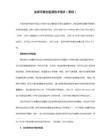
Android系统常用布局介绍
Android系统常用布局介绍Android中的布局包括线性布局,表格布局,相对布局,帧布局,绝对布局。
下面分别对每个布局进行一个介绍。
在介绍android的布局管理器之前,有必要了解android平台下的控件类。
首先要了解的是View类,该类为所有可视化控件的基类,主要提供了控件绘制和事件处理的方法。
创建用户界面所使用的控件都继承自View,如TextView,Button,CheckBox等。
补充:另外一个需要了解的是ViewGroup类,它也是View类的子类,但是可以充当其他控件的容器。
ViewGroup的子控件既可以是普通的View,也可以是ViewGroup。
Android中的一些高级控件如Gally,GirdView等都继承自ViewGroup。
一:线性布局:LinearLayout类简介线性布局是最简单的布局之一,它提供了控件水平或者垂直排列的模型。
同时,使用此布局时可以通过设置控件的weight参数控制各个控件在容器中的相对大小。
LinearLayout布局的属性既可以在布局文件(XML)中设置,也可以通过成员方法进行设置。
案例:1.在布局管理器中实现布局:在eclipse中新建一个项目。
首先打开项目文件夹下res/values目录下的string.xml,写入一下内容:<?xml version=”1.0”encoding=”utf-8”?><resources><string name=”app_name”>LinearExample</string><string name=”button”>按钮</string><string name=”add”>添加</string></resources>说明:在string.xml中主要声明了程序中要用到的字符串资源,这样将所有字符串资源统一管理有助于提高程序的可读性及可维护性。
安卓属性
android:focusableInTouchMode
设置在Touch模式下View是否能取得焦点。
android:hapticFeedbackEnabled
设置长按时是否接受其他触摸反馈事件。这里模拟器没有试出效果,难道是多点触摸?找不到资料可以找找performHapticFeedback或HapticFeedback这个关键字的资料看看。
android:layout_alignParentLeft 如果该值为true,则将该控件的左边与父控件的左边对齐
android:layout_alignParentRight 如果该值为true,则将该控件的右边与父控件的右边对齐
android:layout_alignParentTop 如果该值为true,则将空间的顶部与父控件的顶部对齐
android:id
给当前View设置一个在当前layout.xml中的唯一编号,可以通过调用View.findViewById() 或Activity.findViewById()根据这个编号查找到对应的View。不同的layout.xml之间定义相同的id不会冲突。格式如”@+id/btnName”
android:background —— 指定该控件所使用的背景色,RGB命名法
android:width —— 指定控件的宽度
android:height —— 指定控件的高度
android:padding* —— 指定控件的内边距,也就是说控件当中的内容
android:sigleLine —— 如果设置为真的话,则将控件的内容在同一行当中进行显示
如果设置此属性,将直接从父容器中获取绘图状态(光标,按下等)。 见下面代码部分,注意根据目前测试情况仅仅是获取绘图状态,而没有获取事件,也就是你点一下LinearLayout时Button有被点击的效果,但是不执行点击事件。
- 1、下载文档前请自行甄别文档内容的完整性,平台不提供额外的编辑、内容补充、找答案等附加服务。
- 2、"仅部分预览"的文档,不可在线预览部分如存在完整性等问题,可反馈申请退款(可完整预览的文档不适用该条件!)。
- 3、如文档侵犯您的权益,请联系客服反馈,我们会尽快为您处理(人工客服工作时间:9:00-18:30)。
android:phoneNumber
true/false
设置为电话号码的输入方式。
android:privateImeOptions
提供额外的输入法选项(字符串格式)。
android:scrollHorizontally
true/false
设置文本超出TextView的宽度的情况下,是否出现横拉条。
android:fadingEdgeLength
设置边框渐变的长度。
android:linksClickable
设置链接是否点击连接,即使设置了autoLink
android:maxLines
设置文本的最大显示行数,与width或者layout_width结合使用,超出部分自动换行,超出行数将不显示
android:minLines
设置文本的最小行数
android:lineSpacingExtra
android:longClickable
true/false
view是否可以对长时间的click事件作出反应。
android:focusable
view是否能响应焦点事件
android:cacheColorHint
#00000000
滚动时,列表里面的view重绘时,用的依旧是系统默认的透明色,颜色值为#FF191919,要改变这种情况,只需要调用listView的setCacheColorHint(0),颜色值设置为0或者xml文件中listView的属性Android:cacheColorHint="#00000000"即可,滚动时,重绘View的时候就不会有背景颜色。
android:cursorVisible
true/false
设定光标为显示/隐藏,默认显示。
android:digits
1234567890.+-*/%\n()
设置允许输入哪些字符。
android:drawableBottom
在text的下方输出一个drawable,如图片。如果指定一个颜色的话会把text的背景设为该颜色,并且同时和background使用时覆盖后者。
true/false
设置保存文本的内容以及光标的位置,再到相应的Activity中加上如下两个方法,实现方法网站找一下,这里不详细说明。
android:imeOptions
normal,actionUnspecified,actionNone,actionGo,actionSearch,actionSend,actionNext,actionDone,flagNoExtractUi,flagNoAccessoryAction,flagNoEnterAction
android:shadowDx
设置阴影横向坐标开始位置。
android:shadowDy
设置阴影纵向坐标开始位置。
android:textColorLink
#ffffff
文字链接的颜色.
android:maxHeight
设置文本区域的最大高度
android:minHeight
设置文本区域的最小高度
设置提示信息文字的颜色,默认为灰色
android:textScaleX
1.5
控制字与字之间的间距
android:typeface
normal/sans/serif/monospace
android:background
@null
空间背景,这里没有,指透明,将EditText自定义的背景去掉
android:layout_weight
android:selectAllOnFocus
如果文本是可选择的,让他获取焦点而不是将光标移动为文本的开始位置或者末尾位置。
android:shadowColor
指定文本阴影的颜色,需要与shadowRadius一起使用。
android:shadowRadius
设置阴影的半径。设置为0.1就变成字体的颜色了,一般设置为3.0的效果比较好。
true/false
设置文本是否包含顶部和底部额外空白,默认为true。
android:inputMethod
为文本指定输入法,需要完全限定名(完整的包名)
android:inputType
设置文本的类型,用于帮助输入法显示合适的键盘类型。有如下值设置:none、text、textCapCharacters字母大小、textCapWords单词首字母大小、textCapSentences仅第一个字母大小、textAutoCorrect、textAutoComplete自动完成、textMultiLine多行输入、textImeMultiLine输入法多行(如果支持)、textNoSuggestions不提示、textEmailAddress电子邮件地址、textEmailSubject邮件主题、textShortMessage短信息(会多一个表情按钮出来)、textLongMessage长讯息?、textPersonName人名、textPostalAddress地址、textPassword密码、textVisiblePassword可见密码、textWebEditText作为网页表单的文本、textFilte文本筛选过滤、textPhonetic拼音输入、numberSigned有符号数字格式、numberDecimal可带小数点的浮点格式、phone电话号码、datetime时间日期、date日期、time时间。
设置文字外观。如“?android:attr/textAppearanceLargeInverse”这里引用的是系统自带的一个外观,?表示系统是否有这种外观,否则使用默认的外观。
android:autoLink
none、web、email、phone、map、all
设置是否当文本为URL链接/email/电话号码/map时,文本显示为可点击的链接。
android:hint
@string
提示信息,当文本框为空的时候显示
android:numeric
integer/decimal
只能输入整数/小数
android:singleLine
true/false
设置单行输入,一旦设置为true,则文字不会自动换行
android:password
true/false
设置密码框
android:textColor
#ffffff
字体颜色
android:textStyle
bold/italic/bolditalic
设置字形[bold(粗体) 0, italic(斜体) 1,bolditalic(又粗又斜) 2] 可以设置一个或多个,用“|”隔开
android:textSize
位置
android:gravity
center/right/left/bottom/top
位置(android:gravity属性是对该view内容的限定.比如一个button上面的text.你可以设置该text在view的靠左,靠右等位置.该属性就干了这个.android:layout_gravity是用来设置该view相对与起父view的位置.比如一个button在linearlayout里,你想把该button放在靠左靠右等位置就可以通过该属性设置.)
20dip
字体大小
android:capitalize
characters
设置英文字母大写类型。此处无效果,需要弹出输入法才能看得到
android:textAlign
center/right/left
设置文字显示位置,EditText没有这个属性,但TextView有
android:autoText
设置软键盘的Enter键。可用’|’设置多个。
android:imeActionId
设置IME动作ID,在onEditorAction中捕获判断进行逻辑操作。
android:imeActionLabel
设置IME动作标签。但是不能保证一定会使用,猜想在输入法扩展的时候应该有用。
android:includeFontPadding
android:maxWidth
设置文本区域的最大宽度
android:minWidth
设置文本区域的最小宽度
android:clickable
true/false
view是否能对click事件作出反应
android:onClick
当view被click之后,view的context的哪个方法被呼叫。通常这个context是指view所在的Activity。例如:android:onClick='sayHello',则相应的Activity里面有一个方法public voidsayHello(View view)方法,当这个view被click之后,sayHello方法就会被调用。
设置text与drawable(图片)的间隔,与drawableLeft、drawableRight、drawableTop、drawableBottom一起使用,可设置为负数,单独使用没有效果。
android:editorExtras
指定特定输入法的扩展,如“com.mydomain.im.SOME_FIELD”。源码跟踪至EditorInfo.extras,暂无相关实现代码。
属性
值
说明
android:orientation
horizontal/verti来自al设置布局水平还是垂直,默认是垂直
android:checked
true/false
标记默认选中,如果是单选则选中最后一个
android:layout_gravity
center/right/left/bottom/top