(完整版)剑桥雅思小作文表格及其他类的写法归纳
雅思小作文各种图题、表格题技巧总结
雅思小作文各种图题、表格题技巧总结雅思作文Task 1受图表内容的限制,遣词造句的要求非常有限,只需针对考试,把核心表达用准用熟即可,所谓博大不如精深。
下面是威学教育雅思教研组总结的雅思小作文线图题、柱形图题、饼图题、表格题以及流程图等的写作总结!线图、柱状图、饼图,表格题介绍段introduction介绍段内容几乎完全不用创新,就是对题目文字部分的第二段做改写,paraphrase the rubric.所谓改写,要么换词,要么换句式。
例如:(I4-100)The charts below give information about travel to and from the UK and most popular countries for UK residents to visit.换词(1) 图 The charts图:chart, graph(雅思写作中完全等价,无差别)线:line / curve chart柱图:bar / column graph饼:pie chart表:table / statistics / figures(2) 动词“表明”give information about介绍段是客观描述,用一般现在时态,give information about 虽然在这篇作文中最好不再用,但是informal learning,随手学到的东东,留作其它文章再用。
替换的词语和结构很多,比如我常用的show /illustrate / demonstrate/compare,大家也可以选几个自己喜欢并且拼写准确的形成风格。
第二段其余部分的替换因题而异,比如travel换成visitthe UK换成Britain(注意不是England,英格兰只是Britain的一部分)popular换成fashionablecountry换成nationUK residents to visit换成UK tourists不过随着练习作文数量的增加,你会惊喜的发现,雅思图表作文,连描述的对象都是类似的。
剑桥雅思18写作范文
剑桥雅思18写作范文本文为您提供剑桥雅思18写作范文,旨在帮助您更好地了解考试要求和提高写作水平。
第一部分:图表描述范文一:Pie ChartsThe given pie charts illustrate the reasons why people in a particular country chose to travel abroad in the year2017. The information is divided into two categories:personal and business travel.According to the charts,personal travel accounted for the majority,with73%of respondents citing this as their reason for going abroad.Within this category,the main motivation for traveling was to'relax and take a break'at 39%.Visiting family and friends,as well as exploring new cultures,were also popular reasons at22%and12% respectively.On the other hand,only27%of the respondents traveled for business purposes.In terms of business travel,'attending conferences and meetings'was the most common reason at15%,closely followed by'visiting clients and partners'at12%.'Training and professional development'and'international assignments' accounted for8%and7%respectively.Overall,the pie charts demonstrate that the majority of people traveled abroad for personal reasons,mainly to relax and explore new cultures.However,a significant portion also traveled for business purposes,attending conferences and visiting clients.第二部分:图表分析范文二:Line GraphsThe given line graphs compare the average monthly household spending on three different categories in the United Kingdom from2010to2015.The first graph shows the trends in spending on food and drink,with a slight increase from around£200in2010to approximately£250in2015.Despite minor fluctuations,the overall trend shows a steady rise during the period.The second graph displays the changes in spending on clothing and footwear.It demonstrates a more significant increase,starting at around£100in2010and rising to nearly£150in2015.Like the previous graph,it shows some fluctuations,but the overall trend is upward.Finally,the third graph presents the variations in household spending on recreation and culture.It exhibits a similar pattern to the previous graphs,with an initialfigure of approximately£100in2010,which steadily increases to reach nearly£125in2015.In conclusion,the line graphs show that household spending on food and drink,clothing and footwear,as well as recreation and culture,all experienced an upward trend from 2010to2015.This reflects an overall increase in the average monthly expenditure in these areas.第三部分:图表讨论范文三:Bar ChartsThe provided bar charts compare the age distribution of the population in two countries:Country A and Country B.The data is categorized into five different age groups:0-14,15-24,25-64,65-79,and80+.In Country A,the age group with the highest percentageis25-64,representing over50%of the population.The0-14age group comprises around25%of the population,while the remaining three age groups each account for less than10%.On the other hand,in Country B,the age groupdistribution is more evenly spread.The25-64age group still holds the majority,but it is followed closely by the0-14 age group,both at around30%.The15-24and65-79age groups both make up approximately15%of the population,while the 80+age group has the smallest percentage at around10%.Overall,the bar charts reveal that the population age distribution in Country A is more concentrated in theworking-age group(25-64),while Country B has a more balanced distribution across all age groups,particularly with a larger portion of young people(0-14).第四部分:图表总结范文四:TableThe provided table presents the percentage of households in a particular country who own different types of electronic devices in the year2018.According to the table,the highest ownership percentage is for mobile phones,with a staggering98%of households having this device.It is followed by televisions,which are present in92%of puters,both desktops and laptops,have relatively lower ownership rates at75%and68% respectively.Other devices included in the table are tablets,with55% ownership,while gaming consoles and smart speakers have the lowest ownership percentages,both at32%.In conclusion,the table demonstrates that mobile phones and televisions are the most commonly owned electronic devices in households,with computers,tablets,gamingconsoles,and smart speakers following behind in terms of ownership rates.本文为您提供的剑桥雅思18写作范文履行了任务要求,采用准确、生动、简洁的语言表达,并且没有出现与主题无关的内容。
雅思英语图表作文范文(必备3篇)

雅思英语图表作文范文第1篇A类雅思各类图表作文要点及范文一.曲线图解题关键1曲线图和柱状图都是动态图,解题的切入点在于描述趋势。
2在第二段的开头部分对整个曲线进行一个阶段式的总分类,使写作层次清晰,同时也方便考官阅卷。
接下来再分类描述每个阶段的specifictrend,同时导入数据作为分类的依据。
3趋势说明。
即,对曲线的连续变化进行说明,如上升、下降、波动、持平。
以时间为比较基础的应抓住“变化”:上升、下降、或是波动。
题中对两个或两个以上的变量进行描述时应在此基础上进行比较,如变量多于两个应进行分类或有侧重的比较。
4极点说明。
即对图表中最高的、最低的点单独进行说明。
不以时间为比较基础的应注意对极点的描述。
5交点说明。
即对图表当中多根曲线的交点进行对比说明。
6不要不做任何说明就机械地导入数据,这不符合雅思的考试目的。
曲线图常用词汇动词—九大运动趋势一:表示向上:increase,rise,improve,grow,ascend,mount,aggrandize,goup,climb, take off, jump,shoot up暴涨,soar,rocket, skyrocket雅思英语图表作文范文第2篇It is said that countries are becoming similar to each other because of the global spread of the same products, which are now available for purchase almost anywhere. I strongly believe that this modern development is largely detrimental to culture and traditions worldwide.A country’s history, language and ethos are all inextricably bound up in its manufactured artefacts. If the relentless advance of international brands into every corner of the world continues, these bland packages might one day completely oust the traditional objects of a nation, which would be a loss of richness and diversity in the world, as well as the sad disappearance of t he manifestations of a place’s character. What would a Japanese tea ceremony be without its specially crafted teapot, or a Fijian kava ritual without its bowl made from a certain type of tree bark?Let us not forget either that traditional products, whether these be medicines, cosmetics, toy, clothes, utensils or food, provide employment for local people. The spread of multinational products can often bring in its wake a loss of jobs, as people urn to buying the new brand,perhaps thinking it more glamorous than the one they are used to. This eventually puts old-school craftspeople out of work.Finally, tourism numbers may also be affected, as travelers become disillusioned with finding every place just the same as the one they visited previously. To see the same products in shops the world over is boring, and does not impel visitors to open their wallets in the same way that trinkets or souvenirs unique to the particular area too.Some may argue that all people are entitled to have access to the same products, but I say that local objects suit local conditions best, and that faceless uniformity worldwide is an unwelcome and dreary prospect.Heres my full answer:The line graphs show the average monthly amount that parents in Britain spent on their children’s s porting activities and the number of British children who took part in three different sports from 2008 to is clear that parents spent more money each year on their children’s participation in sports over the six-year period. In terms of the number of children taking part, football was significantly more popular than athletics and 2008, British parents spent an average of around £20 per month on their children’s sporting activities. Parents’ spending on children’s sports increased gradually over the followi ng six years, and by 2014 the average monthly amount had risen to just over £ at participation numbers, in 2008 approximately 8 million British children played football, while only 2 million children were enrolled in swimming clubs and less than 1 million practised athletics. The figures for football participation remained relatively stable over the following 6 years. By contrast, participation in swimming almost doubled, to nearly 4 million children, and there was a near fivefold increase in the number of children doing athletics.剑桥雅思6test1大作文范文,剑桥雅思6test1大作文task2高分范文+真题答案实感。
雅思小作文模板
第 1 页中公留学无忧,让留学更简单小作文模板素材雅思小作文很多人不要模板, 拒绝套用雅思作文模板。
但是对于初试者, 或者目 标分是雅思 6 分的学生而言, 作文模板是必要而且也确实有效的。
关键是要有逻 辑性。
只要具备一定的逻辑性,模板一样会非常出彩!雅思小作文总体分为两种: 线状图/饼状图/柱状图/柱状图/表格题/地图题/流程 图万能开头与结尾模板:(6.0 分以下均可适用,6.5 分以上参考使用) 开头1.This graph/pie chart/table/bar chart reflects the (rate/percentage/proportion/number … ) of ( 对 象 ) in(place/country) from …to …2.According to the figure , it is not spurring findings that there was/were 总体趋势的描述(the overall trend tended to indicate …/the general trend is …/其他) 结尾1.In conclude , the overall trend tended to illustrate ……during this XX year period2.the data/statistics/figures lead us to the conclusion that ……这些数 据资料令我们得出结论……按题型类别:(提供很多句式请自选)①线状图1.先(上升/下降)后(下降/上升),之后便平稳(1)According to the data , the years from … to … saw/witness a rise/climb/drop in the number/rate/percentage/proportion of 对象 from 数据 to 数据,which was followed by a rapid decrease/reduce/increase over the **years.(2)The number/rate…dropped/went up again from…in ** year to…in ** year第 1 页第 2 页中公留学无忧,让留学更简单and then went up gradually until ** year ,when there was a leveling off/leveling out at 数据 for 一段时间。
雅思写作-小作文范文-表格
雅思小作文表格题写作技巧雅思小作文中,表格题是经常出现的一种,也是相对比较简单的一种。
那么雅思小作文表格题有哪些写作技巧呢?下面为大家整理了一种,供大家参考,希望大家能够得到帮助。
雅思小作文表格题其实分为两种情况,所以小作文表格题的写作技巧也就分成了两种。
雅思小作文表格题的第一种情况是其他图的改写,一般为曲线和柱状图,当然还有饼图题。
得剑桥系列上有一个小作文的题,就是表格题,但是里面的内容其实就是变相的柱状图,写的是两个年年代的里的各种旅行的交通工具的受欢迎程度的变化,一般来说,如果遇到这种题的话,大家应该会毫不犹豫地选择直接把数据一写,这不是不对,但是就落入下乘了,同时大家可以看看范文,看范文是怎么写的,没错,范文描绘的对象并不仅仅是表格里的数据,更多的是每种交通工具的变化的大小,幅度最大最小的那几个数据。
由此,我们可以得到这种表格题的解题方法。
1.先做出简单的四则运算,算出变化的大小。
2.排列这些大小,挑出最具代表性的对象。
3.以这些对象来写。
雅思小作文表格题第二种情况就是正儿八经的表格题,这类表格题没啥好说,直接写,也就是按照一个顺序把时间和内容交代清楚,但是记住是一个顺序,不要多个顺序,否则是写不出东西来的。
以上就是雅思小作文表格题的写作技巧的全部内容,大家可以按照上面的技巧在自己的雅思写作中予以应用,这样就可以更加提高大家的写作效率了。
关于雅思小作文-表格的答疑问题:现在有一类table对我来说是非常难的,这类table题的特点是纵列提供无关联的并且分类信息,横向几列信息有一定关联(也就是某事物的几个方面的特征),但是相互关系不那么明显,正是地铁和澳洲用水这种图。
我不容易找到重点,哪怕思考这图的用意也很难看出要侧重在哪方面,到现在我对地铁那个图的理解都不是很到位,我看您的思路很有道理,但是换成我自己再看的话,我还是找不到切入点。
不知道李老师有什么好建议?回复:关于切入点的问题,我始终认为就是在第一时间内给出这张表潜在阅读者最想要的信息。
剑桥雅思考官小作文汇总
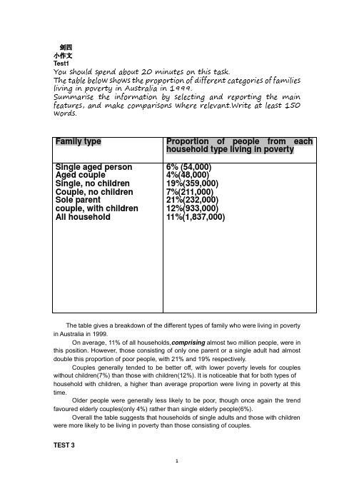
剑四小作文Test1You should spend about 20 minutes on this task.The table below shows the proportion of different categories of families living in poverty in Australia in 1999.Summarise the information by selecting and reporting the main features, and make comparisons where relevant.Write at least 150 words.The table gives a breakdown of the different types of family who were living in poverty in Australia in 1999.On average, 11% of all households,comprising almost two million people, were in this position. However, those consisting of only one parent or a single adult had almost double this proportion of poor people, with 21% and 19% respectively.Couples generally tended to be better off, with lower poverty levels for couples without children(7%) than those with children(12%). It is noticeable that for both types of household with children, a higher than average proportion were living in poverty at this time.Older people were generally less likely to be poor, though once again the trend favoured elderly couples(only 4%) rather than single elderly people(6%).Overall the table suggests that households of single adults and those with children were more likely to be living in poverty than those consisting of couples.TEST 3小作文You should spend about 20 minutes on this task.The chart below shows the different levels of post-school qualifications in Australia and the proportion of men and women who held them in 1999.Summarise the information by selecting and reporting the main features, and make comparisons where relevant.Write at least 150 words.The chart gives information about post-school qualifications in terms of the different levels of further education reached by men and women in Australia in 1999.We can see immediately that there were substantial difference in the proportion of men and women at different levels. The biggest gender difference is at the lowest post-school level, where 90% of those who held a skilled vocational diploma were men, compared with only 10% of women. By contrast, more women held undergraduate diplomas(70%) and marginally more women reached degree level(55%).At the higher levels of education, men with postgraduate diplomas clearly outnumbered their female counterpart (70% and 30%, respectively), and also constituted 60% of Master’s graduates.Thus we can see that more men than women hold qualifications at the lower and higher levels of education, while more women reach undergraduate diploma level than men. The gender difference is smallest at the level of Bachelor’s degree, however.剑桥5小作文Test 1You should spend about 20 minutes in this task.The graph below shows the proportion of population aged 65 and over between 1940 and 2040 in three different countries. Summarise the information by selecting and reporting the main features, and make comparisons where relevant.Write at least 150 words.The graph shows the increase in the ageing population in Janpan, Swden and the USA. It indicates that the percentage of elderly people in all three countries is expected to increase to alomost 25% of the respective populations by the year 2040.In 1940 the proportion of people aged 65 or more stood at only 5% in Japan, approximately 7% in Sweden and 9% in the US. However, while the figures for the Western countries grew to about 15% in around 1990, the figure for Japan dipped to only 2.5% for much of this period, before rising to almost 5% again at the present time.In spite of some fluctuation in the expected percentages, the proportion of older people will probably countries to increase in the next two decades in the three countries. A more dramtic rise is predicted between 2030 and 2040 in Japan, by which time it is thought that the proportion of elderly people will be similar in the three countries.Test 28分You should spend about 20 minutes in this task.The charts below show the main reasons for study among students of different age groups and amount of support they received from employers.Summarise the information by selecting and reporting the main features, and make comparisons where relevant.Write at least 150 words.The first graph shows that there is a gradual decrease in study for career reasons with age. Nearly 80% of students under 26 years, study for their career. This percentagegradually declines by 10-20% every decade. Only 40% of 40-49 yr olds and 18% of over 49yr olds are studying for career reasons in late adulthood.Conversely, the first graph also shows that study stemming from interest increases with age. There are only 10% of under 26 yr olds studying out of interest. The percentage increases slowly till the beginning of the fourth decade, and increases dramatically in late adulthood. Nearly same number of 40-49yr olds study for career and interest. However 70% of over 49yr olds study for interest in comparison to 18% studying for career reasons in that age group.The second graph shows that employer support is maximum(approximately 60%) for the under 26yr students. It drops rapidly to 32% up to the third decade of life, and then increases in late adulthood up to about 44%. It is unclear whether employer support is only for career-focused study, but the highest level is for those students who mainly study for career purposes.Test 3You should spend about 20 minutes in this task.The map below is of the town of Garlsdon. A new supermarket(S) is planned for the town. The map shows two possible sites for the supermarket.Summarise the information by selecting and reporting the main features, and make comparisons where relevant.Write at least 150words.The map shows two proposed locations for a new supermarket for the town ofGarlsdon.The first potential location (S1) is outside the town itself, and is sited just off the main road to the town of Hindon, lying 12 kms to the north-west. This site is in the countryside and so would be able to accommodate a lot of car parking. This would make it accessible to shoppers from both Hindon and Garlsdon who could travel by car. As it is also close to the railway line linking the two towns to Cransdon(25km to the south-east), a potentially large number of shoppers would also be able to travel by train.In contrast, the suggested location, S2, is right in the town centre, which would be good for local residents. Theoretically the store could be accessed by road or rail from the surrounding towns, including Bransdon, but as the central area is a no-traffic zone,cars would be unable to park and access would be difficult.Overall, neither site is appropriate for all the towns, but for customers in Cransdon, Hindon and Garlsdon, the out-of-town site(S1) would probably offer more advantages. Test 47分You should spend about 20 minutes in this task.The table below gives information about the underground railway systems in six cities.Summarise the information by selecting and reporting the main features, and make comparisons where relevant.Write at least 150 words.The table shows the details regarding the underground railway systems in six cities.London has the oldest underground railway systems among the six cities. It was opened in the year 1863, and it is already 140 years old. Paris is the second oldest, in which it was opened in the year 1900. This is was then followed by the opening of the railway systems in Tokyo, Washington DC and Kyoto. Los Angeles has the newest underground railway system. And was only opened in the year 2001. In terms of the size of the railway systems, London, for certain, has the largest underground railway systems. It has 394 kilometres of route in total, which is nearly twice as large as the system in Paris. Tokyo, in contrast, has the smallest system. It only has 11 kilometres of route, which is more than 30 times less than that of London.Interestingly, Tokyo, which only has 155 kilometers of route, serves the greatest number of passengers per year, at 1927 millions passengers. The system in Paris has the second greatest number of passengers, at 1191 millions passengers per year. The smallest underground railway system, Tokyo, serves the smallest number of passengers per year as predicted.In conclusion, the underground railway systems in different cities vary a lot in the size of the system, the number of passengers served per year and in the age of the system.剑六TEST1小作文You should spend about 20 minutes in this task.The graph and table below give information about water use worldwide and water consumption in two different countries.Summarise the information by selecting and reporting the main features, and make comparisons where relevant.Write at least 150 words.The graph shows how the amount of water used worldwide changed between 1900 and 2000.Throughout the century, the largest quantity of water was used for agricultural purposes, and this increased dramatically from about 500km to around 3000 km in the year 2000. Water used in the industrial and domestic sectors also increased, but consumption was minimal until mid-century. From 1950 onwards, industrial use grew steadily to just over 1000km, while domestic use rose more slowly to only 300km, both far below the levels of consumption by agriculture.The table illustrates the differences in agricultural consumption in some areas of the world by contrasting the amount of irrigated land in Brazil(26500km) with that in the D.R.C (100km). This means that a huge amount of water is used in agriculture in Brazil, and this is reflected in the figures for water consumption per person: 359m compared with only 8m in the Congo. With a population of 176 million, the figures for Brazil indicate how high agricultural water consumption can be in some countries.TEST3You should spend about 20 minutes in this task.The diagrams below show the lift cycle of the silkworm and stages in the production of silk cloth.Summarise the information by selecting and reporting the main features, and make comparisons where relevant.Write at least 150 words.The first diagram shows that there are four main stages in the life of the silkworm. First of all, eggs are produced by the moth and it takes ten days for each egg to become a silkworm larva that feeds on mulberry leaves. This stage lasts for up to six weeks until the larva produces a cocoon of silk thread around itself. After a period of about three weeks, the adult moths eventually emerge from these cocoons and the life cycle begins again.The cocoons are the raw material used for the production of silk cloth. Once selected. they are boiled in water and the threads can be separated in the unwinding stage. Each thread is between 300 and 900 metres long, which means they can be twisted together, dyed and then used to produce cloth in the weaving stage.Overall, the diagrams show that the cocoon stage of the silkworm can be used to produce silk cloth through a very simple process.剑7Test 2Writing task 1The graph below shows the consumption of fish and some different kinds of meat in a European country between 1979 and 2004.Summarise the information by selecting and reporting the main features, and make comparisons where relevant.Model answerThe graph illustrates changed in the amounts of beef, lamb, chicken and fish consumed in a particular European country between 1979 and 2004.In 1979 beef was by far the most popular of these foods, with about 225 grams consumed per person per week. Lamb and chicken were eaten in similar quantities (around 150 grams), while much less fish was consumed (just over 50 grams).However, during this 25-year period the consumption of beef and lamb fell dramatically to approximately 100 grams and 55 grams respectively. The consumption of fish also declined, but much less significantly to just below 50 grams, so although it remained the least popular food, consumption levels were the most stable.The consumption of chicken, on the other hand, showed an upward trend, overtaking that of lamb in 1980 and that of beef in 1989. By 2004 it had soared to almost 250 grams per person per week.Overall, the graph shows how the consumption of chicken increased dramatically while the popularity of these other foods decreased over the period.Test 4Writing task 1The pie charts below show units of electricity production by fuel source in Australia and France in 1980 and 2000.Summarise the information by selecting and reporting the main features, and make comparisons where relevant.Model answerThe chart compare the sources of electricity in Australia and France in the years 1980 and 2000. Between these years electricity production almost doubled, rising from 100 units to 170 in Australia, and from 90 to 180 units in France.In 1980 Australia used coal as the main electricity source (50 units) and the remainder was produced from natural gas, hydro power (each producing 20 units) and oil (which produced only 10 units). By 2000, coal had become the fuel for more than 75% of electricity produced and only hydro continued to be another significant source supplying approximately 20%.In contrast, France used coal as a source for only 25 units of electricity in 1980, which was matched by natural gas. The remaining 40 units were produced largely from oil and nuclear power, with hydro contributing only 5 units. But by 2000 nuclear power, which was not used at all in Australia, had developed into the main source, producing almost 75% of electricity, at 126 units, while coal and oil together produced only 50 units. Other sources were no longer significant.Overall, it is clear that by 2000 these two countries relied on different principal fuel sources:剑8Test 1You should spend about 20 minutes in this task.The pie chart below shows the main reasons why agricultural land becomes less productive. The table shows how these causes affected three regions of the world during the 1990s.Summarise the information by selecting and reporting the main features, and make comparisons where relevant. Write at least 150words.The pie chart shows that there are four main causes of famland becoming degraded in the world today. Globally, 65% of degradation is cause by too much animal grazing and tree clearance, constituting 35% and 30% repectively. A further 28% of global degradation is due to over-cultivation of crops. Other causes account for only 7% collectively.These causes affected different regions differently in the 1990s, with Europe having as much as 9.8% of degradation due to deforestation, while the impach land affected respectively. Europe, with the highest overall percentage of alnd degraded (23%), also suffered from over-vultivation (7.7%) and over-grazing (5.5%). In contrast, Oceania had 13% of degraded farmland and this was mainly due to over-grazing (11.3%). North America had a lower proportion of degraded land at only 5%, and the main causes of this were over-cultivation (3.3%), and , to a lesser extent, over-grazing (1.5%).Overall, it is clear that Europe suffered more form farmland degradation than the other regions, and the main causes there were deforestation and over-cultivation.Test 2You should spend about 20 minutes in this task.The three pie charts below show the changes in annual spending by a particular UK school in 1981, 1991 and 2001.Summarise the information by selecting and reporting the main features, and make comparisons where relevant. Write at least 150words.The charts show how much a Uk school spent on different running costs in three separateyears: 1981,1991 and 2001.In all three years, the greatest expenditure was on staff salaries. But while other workers’ salaries saw a fall from 28% in 1981 to only 15% of spendin g in 2001, teachers’ pay remained the biggest cost, reaching 50% of tatal spending in 1991 and ending at 45% in 2001.Expenditure on resources such as books had increased to 20% by 1991 before decreasing on only 9% by the end of the period. In contrast, the cost of furniture and equipment saw an opposite trend. This cost decreased to only 5% of total expenditure in 1991 but rose dramatically in 2001 when it represented 23%o of the school budget. Similarly, the cost of insurance saw a rising trend, growing form only 2% to 8% by 2001.Overall, teachers’ salaries constituted the largest cost to the school, and while spending increased dramatically for equipment and insurance, there were corresponding drops in expenditure on things such as books and on other workers’ salaries.Test 48分You should spend about 20 minutes in this task.The graph below shows the quantities of goods transported in the UK between 1974 and 2002 by four different modes of transport. Summarise the information by selecting and reporting the main features, and make comparisons where relevant. Write at least 150 words.The graph illustrates the quantities of goods transported in the United Kingdom by four different modes of transport between the time period of 1974 and 2002. Over this span of 28 years, the quantities of goods transported by road, water and pipeline have all increased while the quntity transported by rail has remained almost constant at about 40 million tonnes.The largest quantity of goods transported both in 1974 and 2002 was by road (20 million tonnes and 98 million tonnes respectively) while the lowest both in 1974 and 2992 was by pipeline (about 5 million tonnes and 22million tonnes repectively). The amount of goods transported by water was constant from 1974 to 1978, where it showed and exponential growth, rising to almost 60 million tonnes after wchich it plateaued for about 20 years before starting to rise gradually again.The amount of goods transported by raill is almost constant of 40 million tonnes in 1974 and 2002, with decreases in quantity in between the years. It is also interesting to note that almost all showed a decrease in 1994 in amount of goods transported except for the pipeline, which actually peaked in that year.In conclusion the road remains the most popular method of transporting goods in the UK while water and pipelines are becoming increasingly used, have not become more popular as a method of transport.。
雅思小作文表格图实例分析完整版

雅思小作文表格图实例分析HEN system office room 【HEN16H-HENS2AHENS8Q8-HENH1688】雅思小作文表格图实例分析朗阁海外考试研究中心表格图是雅思小作文的常考图形之一,也是烤鸭们在备考时必须要准备的一类题型。
那么烤鸭们具体应该如何准备表格图呢?下面,朗阁海外考试研究中心的专家将以一道具体的实例,就这一题型的解题思路和步骤做出详尽的分析和解答。
The table below shows personal savings as a percentage of personal income for selected countries in 1989, 1999 and 2009.Personal savings as a percentage of personal income一、审题,决定大体写作方式首先,读题目,了解到这幅表格图是关于“几个国家的人民个人收入中存款的百分比”以及三个时间点(据此,正文部分描述存款率是时态基调为过去时)。
表格上方的title和题目表述一样,没有额外信息,因此,读一遍即可。
然后,审具体表格,决定大致写作方向和方式,即分段方式。
表格的审图需要注意以下几个方面:横轴,纵轴和总体数据特征。
此图中的横纵轴分别是时间和7个研究对象——7个国家。
横纵轴中间有一栏为时间,那说明,此图原则上应该按曲线图原理来写——即,描述7个国家存款率上升或下降趋势;但是,经过下一步对表格中数据总体特征的总结发现:7个国家的存款率在这一段时间内总体呈现下降趋势。
这一发现说明,如果继续按照曲线图原理描述,文章会非常单调,而且对比的空间也不大;相反,同一年份里,几个国家之间的差距很大。
因此,正文部分应该按时间分成三个段落,对比同一时间内,7个国家之间的存款率的高低。
最后,审题的最后一关是总结表格中数据的明显特征。
正文主要是从时间角度,纵向对比几个国家。
但是,我们同时也需要反方向观察和对比,也就是,几个国家内部不同时间内存款率的起伏。
雅思小作文表格图攻略及范文

雅思小作文表格图攻略及范文下面新东方在线为大家整理了雅思小作文表格图攻略及范文,供考生们参考,以下是详细内容。
表格图类型:纵向比较—即自身前后的比较,具有历史性,可转为曲线图;横向比较—与其他同类事物的比较。
原则:首句永远概括全部;中间永远找最值点描述;最后总结概括1.纵向比较:题目:The table below gives information about changes in modes of travel in England between 1985 and 2000.Summarize the information by selecting and reporting the main features, and make comparisons where relevant.Write at least 150 words.范文: As can be seen from the table, walk and certain short-distance transportation, such as cycled and local bus tend to beless preferred. Of these, the local bus experienced the most dramatic decrease, from 429 miles to 274 miles within the 15-years period.By contrast, the long distance vehicle enjoyed a significant increase over the period, spanning from 1985 to 2000, although there exists some differences. T o be more specific, the number of miles that car traveled was 3,199 in 1985 and rose by 50% to 4,806 in the subsequent years. The figure by long distance bus more than doubled during the same period (54 miles vs.124 miles), while the miles by taxi trebled which were 13 miles and 42 miles respectively. Likewise, the use of other, unspecified, forms of transport also increased.Overall, there is a considerable increase in total miles by all modes of transportation, compared with the data (4,740 miles) in 1985, with the increased use of cars possibly accounting for almost all of that increase.。
- 1、下载文档前请自行甄别文档内容的完整性,平台不提供额外的编辑、内容补充、找答案等附加服务。
- 2、"仅部分预览"的文档,不可在线预览部分如存在完整性等问题,可反馈申请退款(可完整预览的文档不适用该条件!)。
- 3、如文档侵犯您的权益,请联系客服反馈,我们会尽快为您处理(人工客服工作时间:9:00-18:30)。
【表格的写法】开头段:中间段:1. 分析“行”2. 分析“列”结尾段:重述或补充说明总体特征(也可不写)*在描写行和列时注意避免重复,后写的可以概括一些The table gives a breakdown of the different marriage figures in the UK during a long period from 1950 to 2000.The number of first marriages was 330 thousand in 1950, increasing steadily for the following two decades and peaking at 389 thousand in 1970. However, from then on, it experienced a sharp fall to 180 thousand in 2000, the lowest of the whole period. Similarly, the number of re-marriages had generally increased from 78 thousand in 1950 to a peak of 140 thousand in 1980, though its lowest point (58,000) was reached in 1960.The following decade from 1990 to 2000 witnessed an insignificant decrease to 126,000. Since marriages are a sum of first marriages and re-marriages, it can e clearly seen that the trend of marriage saw an overall slump, with its record low (306,000) in 2000, about a third less than its peak (471,000) in 1970In contrast to the general downward trend of marriages, divorces had nearly tripled from 33 thousand in 1950 to 168 thousand in 1990. Despite a slight decline, the year 2000 also witnessed a high of 155 thousand.Generally speaking, the number of marriages has been descending, or even plummeted in the last decades whereas that of divorces soared surprisingly by four times.【饼图的写法】对饼状图数据进行分析之后,可将题目分为有时间跨度的动态图,和没有时间跨度的静态对比图。
中间段落:按两幅图的比较对比将数据分类,然后分段进行描写The pie charts depict the changing percentages of employees belonging to different age groups in an English company in different years.It can be seen from the chart that the proportions of both individuals of the under 21 and the 31 to 40 age group are falling, although the decrease of the latter is more than that of the former.The 21 to 30 age group has expanded its size from 22% of the work force in 1985 to 33% in 2000. The expansion is more noticeable during the second 10-year period.The change in the number of people in the 41 to 51 age group during the years is different from the other three groups. It drops from 23% in 1985 to 19% in 1990, and then the trend reverses with this age group comprising 28% of the company's employees in 2000.Finally, the senior age group, those who are over 50 years, also has experience fluctuation with 15% in 1985, 23% in 1990, and 16%in 2000.【柱状图的写法】按照不同的系列信息对柱状图进行分析之后,一般来说,可以将分析所得的数据组织如下:开头段:中间段:1. 系列信息一分析所得数据2. 系列信息二分析所得数据结尾段:重述或补充说明总体特征(也可不写)The chart gives information about the proportion of men and women who received different levels of post-school qualifications in Australia in 1999.The biggest gender difference is at the lowest post-school level, where 90% of those who held a skilled vocational diploma were men, compared with only 10% of women. The disparity at the higher levels of education is also noticeable, although not that significant, with the fact that men who successfully got postgraduate diplomas clearly outnumbered their female counterparts (70% and 30% respectively), and also comprised 60% of the Masters. In contrast, more women held undergraduate diplomas (70%) and marginally more women reached degree level (55%).Thus we can see that more men than women hold qualifications at the lowest and higher levels of education, while quite the reverse is true in the case of undergraduate diplomas. The gender difference is smallest at the level of Bachelor's degree.【综合类的写法】混合多图题是把四种类型的图表进行组合,有时是不同图形出现在同一题里,有的时候则是相同的图形。
不论哪种情况,都要注意做好多图间的比较对比,描述清楚它们之间的关系。
开头段:简介图表内容中间段:1. 一幅图的写作(总体特征及重点信息)2. 另一幅图的写作结尾段:重述两图特征(可省略)+描述两图之间可能的关系*两图间的关系可在结尾段完成,也可在写第二幅图时进行The graphs reveal that as the number of Japanese tourists travelling abroad has grown, so has Australia's share of the Japanese tourist market.In 1985, the number of Japanese travelling abroad was about five million and this tripled to about fifteen million in 1995. There were increases every year except in 1991, when the number fell by about 0.7 million compared with1990, and in 1993, when the figure remained about the same as in 1992. The biggest year-on-year rise was between 1987 and 1988, when the number of tourists increased by approximately one million.The line chart shows that the percentage of Japanese tourists visiting Australia went up quickly from 2% in 1985 to 5% in 1989, before dropping sharply to around 4% in 1990. However, the percentage climbed back quickly to 5% in 1991, followed by a further rise to a peak over the period of 6.5% in1994. Then the percentage decreased slightly to 6% in 1995.In conclusion, from 1985 to 1989, there was an increasing trend in both the number of Japanese travelling abroad and in the percentage visiting Australia. However, between 1990 and 1995, there was less of a correlation.另附一份范文【快餐】The chart shows that high income earners consumed considerably more fast foods than the other income groups, spending more than twice as much on hamburgers (43 pence per person per week) than on fish and chips or pizza (both under 20 pence). Average income earners also favored hamburgers, spending 33 pence per person per week, followed by fish and chips at 24 pence, then pizza at 11 pence. Low income earners appear to spend less than other income groups on fast foods, though fish and chips remains their most popular fast food, followed by hamburgers and then pizza.From the graph we can see that in 1970, fish and chips were twice as popular as burgers, pizza being at that time the least popular fast food. The consumption of ham6orgers and pizza has risen steadily over the 20 year period to 1990 while the consumption of fish and chips has been in decline over that same period with a slight increase in popularity since 1985.。