英语四级图表作文范文
英语四级图表类作文
英语四级图表类作文第一篇:英语四级图表类作文英语四级图表类作文模板第一段(一升一降一不变,一缓慢)WHAT?What a thought-provoking and illuminating chart/table/pie it is!As is apparently depicted in the chart/table/pie, it is obvious that(内容)soared from(数据)in(年份)to(数据)in(年份).While, as a sharp contrast,(内容)shrinked from(数据)in (年份)to(数据)in(年份).In addition,(内容)almost remained the constant in(年份)and(年份)./(There was only a gradual increase from(数据)in(年份)to(数据)in(年份))第二段(解释具体原因)WHY?Why does this phenomenon revealed in the chart above appear? Several reasons accounting for the situation can be what follows.T o begin with, I am strongly convinced that this is partly due to the undeniable fact that(原因一), In addition, it is partly because,(原因二), Last but not least, this is partly owing to the cause of(原因三).Chances are that there are some other attributions which bring about this phenomenon.Nevertheless, it is widely believed that the above mentioned reasons are commonly acceptable.第三段(发表个人观点)HOW?From the analysis made above , we may safely come to the conclusion that(结论)According to my understanding, provided that we have an appropriate attitude towards it and make good use of it,(内容)will undoubtedly benefit us in more than one way.And I am confident that my arguments are both sound and well-grounded.第二篇:图表类英语四级作文常用句型图表类英语四级作文常用句型开篇句式1)According to the figures given in the table,+ 主题句(the world population is increasing rapidly.2)The table(pie chart, line graph, bar graph)shows(indicates, illustrates, makes it clear)that +主题句(One’s income is closely linked to one’s age and education)3)It can be seen from(It is clear from, It is evident from, It is illustrated from the table that + 主题句(the better one is educated , the higher his income is)4)As the bar chart shows, the number of people below poverty line decreased dramatically during the years of 1978 to 1998.图表式作文模板写作模板——图表式作文It is obvious in the graphic/table that the rate/number/amount of Y has undergone dramatic changes.It has gone up/grown/fallen/dropped considerably in recent years(as X varies).At the point of X1, Y reaches its peak value of …(多少).What is the reason for this change? Mainly there are …(多少)reasons behind the situation reflected in the graphic/table.First of all, …(第一个原因).Mor e importantly, …(第二个原因).Most important of all, …(第三个原因).From the above discussions, we have enough reason to predict what will happen in the near future.The trend described in the graphic/table will continue for quite a long time(if necessary measures are not taken括号里的使用于那些不太好的变化趋势).1.the table shows the changes in the number of……over the period from……to…… 该表格描述了在……年之……年间……数量的变化。
图表图画型四级写作
图表图画型四级写作范文相关文章
图表图画型四级写作
图表图画型四写作范文
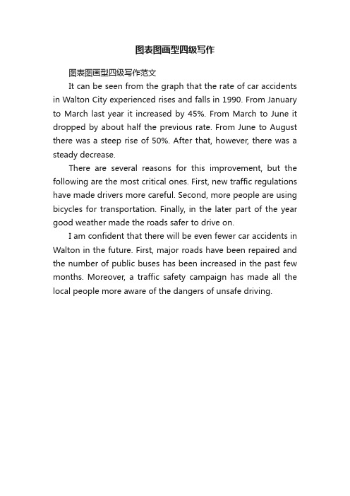
It can be seen from the graph that the rate of car accidents in Walton City experienced rises and falls in 1990. From January to March last year it increased by 45%. From March to June it dropped by about half the previous rate. From June to August there was a steep rise of 50%. After that, however, there was a steady decrease.
There are several reasons for this improvement, but the following are the most critical ones. First, new traffic regulations have made drivers more careful. Second, more people are using bicycles for transportation. Finally, in the later part of the year good weather made the roads safer to drive on.
英语四级图表类作文万能模板【优秀3篇】
英语四级图表类作文万能模板【优秀3篇】(经典版)编制人:__________________审核人:__________________审批人:__________________编制单位:__________________编制时间:____年____月____日序言下载提示:该文档是本店铺精心编制而成的,希望大家下载后,能够帮助大家解决实际问题。
文档下载后可定制修改,请根据实际需要进行调整和使用,谢谢!并且,本店铺为大家提供各种类型的经典范文,如总结报告、合同协议、规章制度、条据文书、策划方案、心得体会、演讲致辞、教学资料、作文大全、其他范文等等,想了解不同范文格式和写法,敬请关注!Download tips: This document is carefully compiled by this editor. I hope that after you download it, it can help you solve practical problems. The document can be customized and modified after downloading, please adjust and use it according to actual needs, thank you!Moreover, our store provides various types of classic sample essays, such as summary reports, contract agreements, rules and regulations, doctrinal documents, planning plans, insights, speeches, teaching materials, complete essays, and other sample essays. If you want to learn about different sample formats and writing methods, please pay attention!英语四级图表类作文万能模板【优秀3篇】英语四级考试中作文是拉分差距较大的题型,如何让自己的作文更出彩?除了考前多练笔,根据模板进行仿写也是非常实用的方法,下面是本店铺整理的英语四级图表类作文万能模板【优秀3篇】,在大家参照的同时,也可以分享一下本店铺给您最好的朋友。
四级英语图表作文模板

四级英语图表作文模板The bar chart shows the percentage of people in different age groups who use social media. It is clear that the younger the age group, the higher the percentage of social media usage. For example, over 90% of people aged18-29 use social media, while only around 40% of those aged 65 and above use it.The line graph illustrates the trend of global temperature from 1900 to 2000. It can be seen that there is a clear upward trend in global temperature over the 100-year period. The temperature has increased by about 1 degree Celsius, with the most significant increase occurring in the last few decades.The pie chart depicts the distribution of household expenses in a typical family. It is evident that thelargest proportion of expenses goes to housing, followed by transportation and food. Other expenses, such as healthcare and entertainment, make up a smaller portion of the totalexpenses.The table presents the data on the top 10 countrieswith the highest GDP. The United States has the highest GDP, followed by China and Japan. It is interesting to note that the GDP of these countries is in the trillions of dollars, while the GDP of other countries in the top 10 is significantly lower.In conclusion, these visual representations provide valuable information on various aspects of society and the economy. They offer a clear and concise way to understand complex data and trends.。
英语四级图表万能作文
英语四级图表万能作文英语四级图表万能作文英语写作中在积累和练习,下面就是店铺整理的英语四级图表万能作文,一起来看一下吧。
英语四级图表万能作文篇一According to the chart / graph / diagram / table, we clearly learn that _________. As early as _________,___________. Then,_________. Last,__________. In contrast, by _________,__________.There are many reasons accounting for _________. Firstly, _________.Secondly,__________. Finally,_________. As a result,_________.As far as I am concerned,_________. For one thing,__________. For another,________. In brief, I hold that__________.英语四级图表万能作文篇二What is shown in the chart / graph / diagram / table above indicates that in recent years, more and more people pay attention to _________. The number of those who _________ has increased ________, and furthermore,____________.There are two factors responsible for the changes. In the first place,_________. Moreover,__________. Yet, it is noticeable that __________.From the analysis, we can safely draw the conclusion that__________. It is possible that in the future, the tendency will__________.英语四级图表万能作文篇三As is shown in the chart / graph / diagram / table above, __________ has charged drastically in the past _________. While ___________,now the percentage of__________ is __________. Meanwhile, the number of _________ has soared up to ________.There are mainly two possible reasons contributing to therapid changes. The first is that _________. Secondly,__________.In my point of view, the changes have a great influence on _________. At the same time,_______. To sum up ,_________.英语四级图表万能作文篇四What is shown in the chart / graph / diagram / table above indicates that in recent years, more and more people pay attention to _________. The number of those who _________ has increased ________, and furthermore,____________.There are two factors responsible for the changes. In the first place,_________. Moreover,__________. Yet, it is noticeable that __________.From the analysis, we can safely draw the conclusion that__________. It is possible that in the future, the tendency will__________.英语四级图表万能作文篇五According to the chart / graph / diagram / table, we clearly learn that _________. As early as _________,___________. Then,_________. Last,__________. In contrast, by _________,__________.There are many reasons accounting for _________. Firstly, _________.Secondly,__________. Finally,_________. As a result,_________.As far as I am concerned,_________. For one thing,__________. For another,________. In brief, I hold that__________.英语四级图表万能作文篇六As is shown in the chart / graph / diagram / table above, __________ has charged drastically in the past _________. While ___________,now the percentage of__________ is __________. Meanwhile, the number of _________ has soared up to ________.There are mainly two possible reasons contributing to the rapid changes. The first is that _________. Secondly,__________.In my point of view, the changes have a great influence on_________. At the same time,_______. To sum up ,_________.下载全文。
英语写作图表题柱状图比较变化范文四级

英语写作图表题柱状图比较变化范文四级全文共3篇示例,供读者参考篇1Title: A Comparison of Changes in Education Spending in Different CountriesIntroduction:Education is a crucial investment in a country's future. In this report, we will analyze and compare the changes in education spending in three different countries - the United States, China, and Germany - over the past decade. By looking at the trends in education spending in these countries, we can gain insights into their priorities and policies regarding education.Data Analysis:The bar graph below illustrates the education spending as a percentage of GDP in the United States, China, and Germany from 2010 to 2020.From the graph, we can see that the United States has consistently allocated the highest percentage of its GDP to education, with spending increasing from around 4% in 2010 tonearly 6% in 2020. This demonstrates the country's commitment to investing in education as a key driver of economic growth and social mobility.In contrast, China's education spending has remained relatively stable, hovering around 3% of GDP throughout the decade. This may reflect the government's focus on other areas of development, such as infrastructure and technology, rather than prioritizing education as heavily as the United States.Meanwhile, Germany's education spending has shown a gradual decline over the past ten years, dropping from 5% of GDP in 2010 to just under 4% in 2020. This decrease could have implications for the quality of education in the country and may warrant further investigation into the reasons behind this trend.Conclusion:In conclusion, the analysis of education spending in the United States, China, and Germany reveals interesting trends and differences in the prioritization of education among these countries. While the United States has consistently increased its investment in education, China's spending has remained stable, and Germany's has decreased over the past decade. This information can be used to inform policymakers andstakeholders in each country about the importance of education funding and its impact on social and economic development.Overall, it is clear that education is a key factor in a country's prosperity and competitiveness, and investing in education is essential for building a strong and sustainable future. By understanding the trends in education spending, countries can make informed decisions about where to allocate resources and ensure that all citizens have access to quality education opportunities.篇2The bar chart below shows the changing trends in the number of mobile phone users in two different regions over a five-year period from 2015 to 2019.From the chart, it can be observed that the number of mobile phone users in Region A started at around 500 million in 2015 and increased steadily each year to reach approximately 700 million in 2019. On the other hand, the number of mobile phone users in Region B began at a lower level of around 350 million in 2015 but experienced rapid growth to surpass Region A in 2017 with approximately 800 million users. The number ofusers in Region B continued to increase steadily, reaching nearly 950 million in 2019.Overall, both regions saw an increase in the number of mobile phone users over the five-year period, but the growth rate was higher in Region B. This can be attributed to factors such as population size, economic development, and technological advancement in each region.In conclusion, the bar chart clearly illustrates the differing trends in the number of mobile phone users in Region A and Region B over the five-year period. It is evident that Region B experienced faster growth in mobile phone usage compared to Region A, highlighting the importance of understanding regional differences in technology adoption.篇3Effects of Technology on Workforce ProductivityIn today's rapidly advancing technological world, the impact of technology on workforce productivity has become a widely discussed topic. Many believe that technology has significantly increased productivity in the workplace, while others argue that it has led to job displacement and decreased overall productivity.To better understand these conflicting viewpoints, it is important to analyze the data presented in the bar chart below.The bar chart compares the productivity levels of two different companies, Company A and Company B, over afive-year period. Company A represents a traditional company that has not fully embraced technology in its operations, while Company B represents a tech-savvy company that has integrated the latest technological advancements into its workflows.As shown in the chart, Company B experienced a steady increase in productivity over the five-year period, with a significant spike in productivity in the third year. On the other hand, Company A's productivity levels remained relatively stagnant, with only minor fluctuations observed.These results indicate that technology has a direct correlation with workforce productivity. By embracing and utilizing technology in the workplace, Company B was able to streamline processes, automate tasks, and empower employees to work more efficiently. This, in turn, led to increased productivity and a competitive edge in the market.In contrast, Company A's reluctance to adopt new technologies hindered its ability to keep up with market demands and achieve higher levels of productivity. Thishighlights the importance of staying current with technological advancements in order to remain competitive in today'sfast-paced business environment.Overall, the data presented in the bar chart clearly demonstrates the positive impact of technology on workforce productivity. Companies that embrace and leverage technology are better positioned to succeed and thrive in today's highly competitive global marketplace.In conclusion, it is evident that technology plays a crucial role in driving workforce productivity. Companies that invest in technology and provide employees with the necessary tools and resources to succeed are more likely to achieve higher levels of productivity and stay ahead of the competition. As we continue to witness rapid technological advancements, it is important for businesses to adapt and evolve in order to maximize productivity and achieve long-term success.。
英语图表作文精选10篇
英语图表作文精选10篇四级英语作文图表类篇一图片模板:It seems to me that the cartoon / drawing issending a message about ____________(图画内容),which reveals ____________(稍作评价).In myperspective of view, ____________ (表明个人观点)。
Apparently, ____________(将个人观点和图片内容相结合,得出观点。
)For one thing, ____________(从社会角度论证).For another thing, ____________(从个人角度说明).For example, ____________(自己、朋友或他人,只要自己知道或听过的例子).Last but not least, ____________(从反面角度谈论).Asa result, the drawer of the illustration is urging us to _____________(建议或措施).Only inthis way can we ____________(展望结果).In conclusion / To my understanding, ____________(再次表明观点或态度).We should____________(进一步说明个人的观点).图表模板:According to the bar chart / pie chart / line graph displays the changes in the numberof____________(图表整体趋势).There was an increase in ____________(图表细节).At the point of ____________, ____________reaches its peak value of ____________(数据或变化).What has caused these changes? There are mainly three reasons.Firstly, ____________ (原因一).Secondly, ____________(原因二).The number of ____________ increased overthe period.____________ rose by _________ from ________ to ________________.Andthere were____________.Finally, ____________(最后一个原因).In conclusion / We can safely draw the conclusion that ____________(结论).Therefore, ____________(进一步谈论更多个人想法).英语四级图表类作文篇二In the morning, the clear sky, father-in-law of the sun was inlaid with a golden halo. A group of happy little magpies chirped in the branches, as if holding a singing contest, very lively!Noon is the hottest time of the day. The sun gave out a blazing light, as if to roast the earth. There was no one in the street. Everyone hid in the house to blow the air conditioner, for fear that they would be cooked outside. At this time, the little magpie on the tree also became quiet, they all hide in the deep leaves of the nap. Only the indefatigable cicada was still shouting “hot, hot.。
专四图表作文模板
专四图表作文模板英文回答:The chart illustrates the changes in the number of students attending university in three different countries over a period of ten years, from 2010 to 2020. As can be seen from the graph, the number of students in China has significantly increased, while the number of students inthe United States and the United Kingdom has remained relatively stable.In 2010, the number of students in China was around 25 million, which was significantly lower than the number of students in the United States and the United Kingdom, which were around 30 million and 20 million respectively. However, over the next ten years, the number of students in China increased rapidly, reaching over 40 million in 2020. In contrast, the number of students in the United States and the United Kingdom only increased slightly, with the United States reaching around 32 million and the United Kingdomreaching around 22 million in 2020.There are several reasons for this trend. Firstly,China has experienced rapid economic growth over the past decade, which has led to an increase in the number of families who can afford to send their children to university. Secondly, the Chinese government has invested heavily in education, with the aim of producing more highly skilled graduates who can contribute to the country's economic development. Finally, the popularity of online education has also contributed to the increase in the number of students in China.中文回答:这张图表展示了三个不同国家在2010年至2020年期间大学生人数的变化情况。
英语作文图表作文(五篇范文)
英语作文图表作文(五篇范文)第一篇:英语作文图表作文图表分析作文1As is clearly shown in the table/ figure/ graph / chart, 图表总体描述 between 年代 and 年代.Especially, 突出的数据变化.There are three reasons for 具体表示急剧上升、下降或特殊现象的词.To begin with, 原因一.In addition / Moreover, 原因二.For example, 具体例证.Last but no least, 原因三.In short,总结上文.As far as I am concerned, / For my part, / As for me,作者自己的观点.On the one hand, 理由一.On the other hand, 理由二.In brief,总结上文.图表分析作文2The table / figure / graph / chart shows that 图表总述from 年代to年代.It is self-evident that突出的数据变化.Three possible reasons contribute to 具体表示急剧上升、下降或特殊现象的词或代词代替上文内容.One reason is that原因一.Another reason is that 原因二.For instance,举例证.What’s more原因三.As a result, 重述上文之趋势.However, in my opinion 作者观点.For one thing,理由一.For another, 理由二.T o sum up,总结上文.图表分析作文3It can be seen from the table / figure / graph / chart that图表总述between年代and年代.Especially,突出的数据变化.Why are there such great changes during 图表涉及的年头数years? There are mainly two reasons explaining具体表示急剧上升、下降或特殊现象的词或代词代替上文内容.First,原因一.In the old days,比较法说明过去的情况.But now,说明现在的情况.Second,原因二.As a result,总结上文.In my viewpoint,作者自己的观点.On the one hand,论点一.On the other hand,论点二.图表分析作文4As the table / figure / graph / chart shows,图表总述in the past years年代.Obviously,突出的数据变化.Why are there suchsharp contrasts during 图表涉及的年头 years?Two main factors contribute to具体表示急剧上升、下降或特殊现象的词或代词代替上文内容.First of all,原因一.In the past,比较法说明过去的情况.But now 说明现在的情况.Moreover,原因二.Therefore,总结上文.As I see it,作者自己的观点.For one thing,论点一.For another,论点二.图表作文补充句型• As is shown in the graph…如图所示…•The graph shows that…图表显示…•As can be seen from the table,…从表格中可以看出…•From the chart, we know that…从这张表中,我们可知…• All these data clearly prove the fact that… 所有这些数据明显证明这一事实,即…• The increase of ….In the ci ty has reached to 20%.….在这个城市的增长已达到20%.• In 1985, the number remained the same.1985年,这个数字保持不变.• There was a gradual decline in 1989.1989年,出现了逐渐下降的情况.第二篇:英语图表作文图表描述专题训练(一)这类作文时,注意以下几点:第一,审题时,除了要把握好图表的表层信息外,还要分析图标的深层含义,如原因、根源、可能的发展趋势等。
专业四级看图作文-(精选5篇)
专业四级看图作文-(精选5篇)第一篇:专业四级看图作文-模板一① 总的趋势② 图表具体描述③剖析图表所揭示的含义④理由一⑤ 理由二⑥理由三⑦ 理由四⑧总结⑨ 前景预测As can be seen from the table, the past decade has witnessed dramatic changes in①______.While ②_______.It is obvious from the table that③_________.What contributed to these changes? I think the reasons are as follows.To start with, ④______.Secondly, ⑤______.What’s more, ⑥ _______.Last but not lease, ⑦________.In conclusion, ⑧_________.Moreover, ⑨ ________.模板二①描述图表②分三方面解释原因③下结论1)During the period from _______to _______, ________rose from ________to _______, while _______ decreased from _______ to _______.2)We believe that three reasons can account for this phenomenon.First,____.Second, ____.Third, _____.3)___.We are happy to see that things are becoming better and better nowadays.We can imagine that ___.模板三①描述图表②解释图表③补充解释1)During the period between _______ and ________, ________ declined abruptly from _______ to ________, while ________ increased sharply from ________ to _______.2)Several reasons can account for this pared with _________ is much cheaper and more convenient__________.Apart from that, _________.3)However, there are still a number of people who _________, generally for two reasons.On the one hand,________.On the other hand, ________. 第二篇:四级看图作文英语四级图表作文讲解及参考范文图表作文也是四(六)级考试中常见,而且被认为是一种较难的作文形式。
- 1、下载文档前请自行甄别文档内容的完整性,平台不提供额外的编辑、内容补充、找答案等附加服务。
- 2、"仅部分预览"的文档,不可在线预览部分如存在完整性等问题,可反馈申请退款(可完整预览的文档不适用该条件!)。
- 3、如文档侵犯您的权益,请联系客服反馈,我们会尽快为您处理(人工客服工作时间:9:00-18:30)。
英语四级图表作文范文
yuebanming10 2009年06月19日14:34 来源:四六级考试网点击3825次
图表作文要求考生用文字材料把图表中所提供的信息准确、完整地表达出来。
在写作图表作文时,首先要仔细观察并分析图表,以及题中所给出的有关信息,比如,作文标题,英文提纲、英文提示、英语关键词等。
在分析图表时,要抓住与主题有关的信息,要发现数据呈现的规律,要充分利用图表中的图形、数据等来说明主题。
但是注意不要过多地引用数据,以免造成滥用数据的后果。
另外,在写作图表作文时可以套用一些常用词汇或表达方式,这将有助于你写出较为地道的图表作文。
例如:
①As can be seen from the table (graph, form)...
②From the above table it can be seen (concluded) that...
③A careful study of the table shows that...
④The number (percentage) is 3 times as much as that in 2000.
⑤It has decreased (fell, dropped) about twice, compared with (as compared with, as against) that of 2000.
⑥In 2001, it increased (went up, rose) from 5 to 15 percent of the total (to 15 percent, by 15 percent).
[例]Directions: For this part, you are allowed 30 minutes to write a composition of no less than 100 words on Income Sources between Chinese and American Students. Study the following table carefully and your composition must be based on the information given in the table. Write three paragraphs to:
1. Describe the differences of the income sources between Chinese and American students.
2. Analyze possible reasons for these differences.
3. Predicate future tendency.
Source of Income Percentage of Total Income Parents Part-time job Fellowship or
Scholarship
American Students 50% 35% 15%
Chinese Students 90% 5% 5%
[范文]
Income Sources Between Chinese Students and American Students
Income sources of Chinese students are quite different from those of American students. In China, students get 90% of their money from their parents while in America, only 50% of students’ money is provided by parents. In addition, Chinese students earn only 5% of their money from part time jobs and 5% from fellowship or scholarship while income from these two resources for American students takes up 35% and 15% respectively of their total income.
I think there are probably three reasons for their differences. First, because of the influence of different social and family values, Chinese students have formed the habit of asking for money from their parents while American students have developed more sense of being financially independent. Second, most Chinese parents devote too much care to their children and they would rather save up to afford their children’s education rather than encourage them to take part-time jobs. But in America, many parents pay more attention to developing the students’ability of self-reliance, so they encourage their children to find part-time job to earn some money by themselves. Third, since America is more developed than China, it is relatively easy for students to find part time jobs. In China, such opportunities are rather rare.
I believe with the development of China, more and more Chinese students will realize and pay more attention to the necessity of self dependence. In addition, more and more opportunities will be provided for them to take part-time jobs. So more students will go out of the ivory tower to broaden their knowledge and to become the master of their own lives.
作者在这篇图表作文中很好地利用了图表以及题目中所给的提示,文章结构完整,意思表达清楚,较好地完成了一篇图表作文所应该表达的内容。