Android自定义Button按钮
Android的Button按钮,ACTION_UP事件不触发解决方案
Android的Button按钮,ACTION_UP事件不触发解决⽅案在android 编程时,有时候要实现当Button⼀直按下的时候,执⾏⼀些逻辑代码,当按钮弹起的时候,终⽌这些逻辑代码的执⾏。
⽐如在设置页⾯的滑动开关时,如果不监听ACTION_CANCEL,在滑动到中间时,如果你⼿指上下移动,就是移动到开关控件之外,就会造成开关的按钮停顿在中间位置。
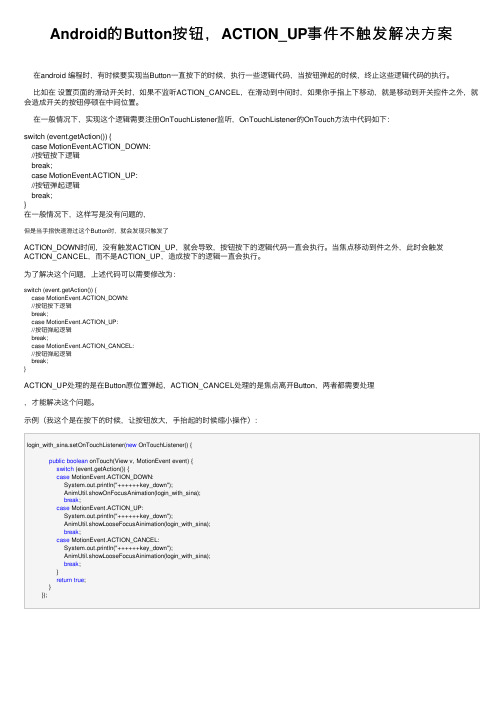
在⼀般情况下,实现这个逻辑需要注册OnTouchListener监听,OnTouchListener的OnTouch⽅法中代码如下:switch (event.getAction()) {case MotionEvent.ACTION_DOWN://按钮按下逻辑break;case MotionEvent.ACTION_UP://按钮弹起逻辑break;}在⼀般情况下,这样写是没有问题的,但是当⼿指快速滑过这个Button时,就会发现只触发了ACTION_DOWN时间,没有触发ACTION_UP,就会导致,按钮按下的逻辑代码⼀直会执⾏。
当焦点移动到件之外,此时会触发ACTION_CANCEL,⽽不是ACTION_UP,造成按下的逻辑⼀直会执⾏。
为了解决这个问题,上述代码可以需要修改为:switch (event.getAction()) {case MotionEvent.ACTION_DOWN://按钮按下逻辑break;case MotionEvent.ACTION_UP://按钮弹起逻辑break;case MotionEvent.ACTION_CANCEL://按钮弹起逻辑break;}ACTION_UP处理的是在Button原位置弹起,ACTION_CANCEL处理的是焦点离开Button,两者都需要处理,才能解决这个问题。
⽰例(我这个是在按下的时候,让按钮放⼤,⼿抬起的时候缩⼩操作):login_with_sina.setOnTouchListener(new OnTouchListener() {public boolean onTouch(View v, MotionEvent event) {switch (event.getAction()) {case MotionEvent.ACTION_DOWN:System.out.println("++++++key_down");AnimUtil.showOnFocusAnimation(login_with_sina);break;case MotionEvent.ACTION_UP:System.out.println("++++++key_down");AnimUtil.showLooseFocusAinimation(login_with_sina);break;case MotionEvent.ACTION_CANCEL:System.out.println("++++++key_down");AnimUtil.showLooseFocusAinimation(login_with_sina);break;}return true;}});。
自定义Button样式

⾃定义Button样式(注:以前不知道这⼀点,还闹个笑话,在Timers4Me中⾃定义TimePicker控件的时候,下载了相应的源码和资源,看到它的图⽚,我还很纳闷,为什么最后多了个.9,并且图⽚还有⼏条⿊线⼏个点,还特意让美⼯对图⽚做了处理,将多余的部分去掉。
)本例中,⽤到以下图⽚:* 按钮可以点击,但处于没有点击状态下的⿊⾊XX.9格式背景图⽚* 按钮可以点击,被点击下的状态的橙⾊的XX.9格式背景图⽚* 按钮不可⽤状态下的XX.9格式的背景图⽚上⾯的三张图⽚,需要放到项⽬中/res/drawables⾼中低密度中任何⼀个⽂件夹下2.下⾯我们需要定义按钮处于不同状态下的样式:在/res/drawables/⽬录下⾼中低任何⼀个⽂件夹下,新建xml⽂件,名字可以⾃⼰取,这⾥我命名为custom_button.xml,在不同的状态下会引⽤相应的图⽚:1. <?xml version="1.0" encoding="utf-8"?>2. <selector xmlns:android="/apk/res/android">3.4. <item android:state_enabled="false" android:drawable="@drawable/btn_background_red" />5. <item android:state_pressed="true" android:state_enabled="true"6. android:drawable="@drawable/btn_background_orange" />7. <item android:state_focused="true" android:state_enabled="true"8. android:drawable="@drawable/btn_background_orange" />9. <item android:state_enabled="true" android:drawable="@drawable/btn_background_black" />10. </selector>这⾥定义还是要按照规定的顺序来的,如果把最后⼀项放到第⼀条,那么只要按钮可⽤状态下,第⼀条条件成⽴,下⾯的就不会执⾏了。
Android定制RadioButton样式三种实现方法

Android定制RadioButton样式三种实现⽅法三种⽅法复制代码代码如下:<?xml version="1.0" encoding="utf-8"?><selector xmlns:android="/apk/res/android"><!-- 未选中-><itemandroid:state_checked="false"android:drawable="@drawable/tabswitcher_long" /><!--选中-><itemandroid:state_checked="true"android:drawable="@drawable/tabswitcher_short" /></selector>在布局⽂件中使⽤复制代码代码如下:<RadioGroup...><RadioButton...android:button="@null"android:background="@drawable/radio"/></RadioGroup>ndroid:button="@null" 去除RadioButton前⾯的圆点android:background="@drawable/radio" 使⽤定义的样式复制代码代码如下:@Overridepublic boolean onTouchEvent(MotionEvent event) {if(event.getActionMasked() == MotionEvent.ACTION_DOWN){this.setBackgroundResource(com.wxg.tab.R.drawable.main_bg);}else if(event.getActionMasked()== MotionEvent.ACTION_DOWN) {this.setBackgroundResource(com.wxg.tab.R.drawable.hui);}return super.onTouchEvent(event);}去除RadioButton前⾯的圆点adioButton.setButtonDrawable(android.R.color.transparent);,在JAVA代码中使⽤ radioButton.setBackgroundResource(R.drawable.radio);调⽤。
android floatingactionbutton实现原理

android floatingactionbutton实现原理在Android开发中,Floating Action Button(浮动的操作按钮)是一种非常实用的控件,它通常位于屏幕的右下角,并且在屏幕上只有一个时才会显示出来。
这种设计为应用程序提供了视觉焦点,并且使其具有独特的设计风格。
在本篇文章中,我们将探讨AndroidFloating Action Button的实现原理。
一、概述Android Floating Action Button是一种特殊的按钮,它在屏幕上只有一个时才会显示出来。
它的主要作用是吸引用户的注意力,并作为一个方便的入口,使用户可以轻松地与应用程序进行交互。
二、实现原理1. 位置设计:Android Floating Action Button通常位于屏幕的右下角,这是为了保持用户视线向右下方集中,从而增强用户的操作体验。
2. 唯一性:在同一个应用程序中,Floating Action Button是唯一的。
这意味着在同一时间,屏幕上只能有一个Floating ActionButton出现。
3. 动画效果:Floating Action Button通常具有一个漂亮的动画效果,当它显示或隐藏时,会伴随着一个非常吸引人的效果,从而增强用户的视觉体验。
4. 交互方式:Floating Action Button通常与其他按钮或文本控件结合使用,作为用户与应用程序交互的入口。
三、实现步骤1. 设计外观:确定Floating Action Button的外观,包括颜色、大小、形状等。
2. 实现布局:在XML布局文件中,添加Floating Action Button控件,并设置其在屏幕中的位置和大小。
3. 实现动画:使用Android提供的动画资源或自定义动画,以增强Floating Action Button的视觉效果。
4. 与其他控件交互:将Floating Action Button与应用程序中的其他按钮、文本控件等结合使用,作为用户与应用程序交互的入口。
android button的写法

android button的写法如何在Android中编写按钮(Button)?按钮(Button)是Android应用程序中常见的用户界面组件之一。
通过按钮,用户可以与应用程序进行交互,触发特定的操作或事件。
在Android 开发过程中,编写按钮涉及到布局文件和Java代码的编写。
本文将介绍如何在Android中编写按钮的步骤。
1. 创建一个新的Android项目在Android Studio中,点击“File”菜单,然后选择“New”和“New Project”来创建一个新的Android项目。
根据提示输入项目名称、包名和存储位置。
点击“Finish”按钮完成项目的创建。
2. 打开布局文件在Android项目的res文件夹中找到“layout”文件夹,然后打开“activity_main.xml”布局文件。
这是应用程序的主要布局文件。
3. 添加按钮组件在布局文件中,添加一个按钮组件。
可以使用XML标签<Button>来定义一个按钮,示例如下:xml<Buttonandroid:id="+id/myButton"android:layout_width="wrap_content"android:layout_height="wrap_content"android:text="Click Me" />首先,我们为按钮指定了一个唯一的ID,以便在Java代码中引用它。
然后,使用“android:layout_width”和“android:layout_height”属性来指定按钮的宽度和高度。
最后,使用“android:text”属性来设置按钮上显示的文本。
4. 处理按钮点击事件现在,我们需要在Java代码中编写按钮的点击事件处理逻辑。
打开MainActivity.java文件,找到onCreate()方法,然后在其下面添加以下代码:javaButton myButton = findViewById(R.id.myButton);myButton.setOnClickListener(new View.OnClickListener() { Overridepublic void onClick(View v) {在这里编写按钮点击事件的逻辑Toast.makeText(MainActivity.this, "Button Clicked", Toast.LENGTH_SHORT).show();}});首先,我们通过findViewById()方法获取到布局文件中的按钮实例。
Android开发之FloatingActionButton悬浮按钮基本使用、字体、颜色用法示例
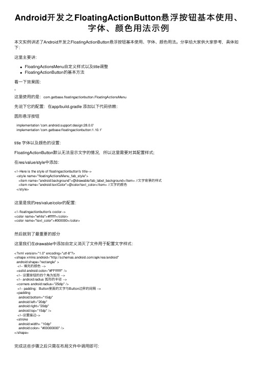
Android开发之FloatingActionButton悬浮按钮基本使⽤、字体、颜⾊⽤法⽰例本⽂实例讲述了Android开发之FloatingActionButton悬浮按钮基本使⽤、字体、颜⾊⽤法。
分享给⼤家供⼤家参考,具体如下:这⾥主要讲:FloatingActionsMenu⾃定义样式以及title调整FloatingActionButton的基本⽅法看⼀下效果图:这⾥使⽤的是:com.getbase.floatingactionbutton.FloatingActionsMenu先说下它的配置:在app/build.gradle 添加以下代码依赖:圆形悬浮按钮implementation 'com.android.support:design:28.0.0'implementation 'com.getbase:floatingactionbutton:1.10.1'title 字体以及颜⾊的设置:FloatingActionButton默认⽆法显⽰⽂字的情况,所以这⾥需要对其配置样式;在res/value/style中添加:<!--Here is the style of floatingactionbutton's title--><style name="floatingActionsMenu_fab_style"><item name="android:background">@drawable/fab_label_background</item> //⽂字背景的样式<item name="android:textColor">@color/text_color</item> //⽂字的颜⾊</style>这⾥是我的res/value/color的配置:<!--floatingactionbutton's coclor--><color name="white">#ffffff</color><color name="text_color">#000000</color>然后就到了最重要的部分这⾥我们在drawable中添加⾃定义消灭了⽂件⽤于配置⽂字样式:<?xml version="1.0" encoding="utf-8"?><shape xmlns:android="/apk/res/android"android:shape="rectangle" ><!-- 填充的颜⾊ --><solid android:color="#FFffffff" /><!-- 设置按钮的四个⾓为弧形 --><!-- android:radius 弧形的半径 --><corners android:radius="25dip" /><!-- padding:Button⾥⾯的⽂字与Button边界的间隔 --><paddingandroid:bottom="15dp"android:left="20dp"android:right="20dp"android:top="15dp" /><!--设置描边--><strokeandroid:width= "10dp"android:color= "#00000000" /></shape>完成这些步骤之后只需在布局⽂件中调⽤即可:这⾥是我的布局⽂件:<com.getbase.floatingactionbutton.FloatingActionsMenuandroid:id="@+id/multiple_actions"android:layout_width="wrap_content"android:layout_height="wrap_content"fab:fab_expandDirection="down"fab:fab_labelStyle="@style/floatingActionsMenu_fab_style"><com.getbase.floatingactionbutton.FloatingActionButtonandroid:id="@+id/action_a"android:layout_width="wrap_content"android:layout_height="wrap_content"fab:fab_size="mini"fab:fab_title="按钮⼀" /><com.getbase.floatingactionbutton.FloatingActionButtonandroid:id="@+id/action_b"android:layout_width="wrap_content"android:layout_height="wrap_content"fab:fab_size="mini"fab:fab_title="按钮⼆" /><com.getbase.floatingactionbutton.FloatingActionButtonandroid:id="@+id/action_c"android:layout_width="wrap_content"android:layout_height="wrap_content"fab:fab_size="mini"fab:fab_title="按钮三" /></com.getbase.floatingactionbutton.FloatingActionsMenu>设置⽅法如代码第六⾏所⽰FloatingActionButton基本使⽤:/*设置三个悬浮按钮的监听事件*///final FloatingActionButton actionA = (FloatingActionButton) findViewById(R.id.action_a);actionA.setOnClickListener(new View.OnClickListener() {@Overridepublic void onClick(View view) {//空}});//跳转到 FromPointToPoint 活动final FloatingActionButton actionB = (FloatingActionButton) findViewById(R.id.action_b);actionB.setOnClickListener(new View.OnClickListener() {@Overridepublic void onClick(View view) {startActivityForResult(new Intent(MainActivity.this,FromPointToPoint.class),0x1);}});//弹出提⽰final FloatingActionButton actionC = (FloatingActionButton) findViewById(R.id.action_c);actionC.setOnClickListener(new View.OnClickListener() {@Overridepublic void onClick(View view) {Toast.makeText(MainActivity.this,"dianjile",Toast.LENGTH_SHORT).show();}});更多关于Android相关内容感兴趣的读者可查看本站专题:《》、《》、《》、《》、《》及《》希望本⽂所述对⼤家Android程序设计有所帮助。
Android中ImageButton自定义按钮的按下效果的代码实现方法
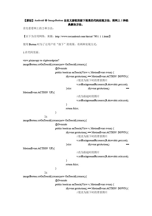
【原创】Android中ImageButton自定义按钮的按下效果的代码实现方法,附网上2种经典解决方法。
首先看看网上的2种方法:【以下为引用网络,来源:/thread-7931-1-1.html】使用Button时为了让用户有“按下”的效果,有两种实现方式:1.在代码里面。
view plaincopy to clipboardprint?imageButton.setOnTouchListener(new OnTouchListener(){@Overridepublic boolean onTouch(View v, MotionEvent event) {if(event.getAction() == MotionEvent.ACTION_DOWN){//更改为按下时的背景图片v.setBackgroundResource(R.drawable.pressed);}else if(event.getAction() == MotionEvent.ACTION_UP){//改为抬起时的图片v.setBackgroundResource(R.drawable.released);}return false;}});imageButton.setOnTouchListener(new OnTouchListener(){@Overridepublic boolean onTouch(View v, MotionEvent event) {if(event.getAction() == MotionEvent.ACTION_DOWN){//更改为按下时的背景图片v.setBackgroundResource(R.drawable.pressed);}else if(event.getAction() == MotionEvent.ACTION_UP){//改为抬起时的图片v.setBackgroundResource(R.drawable.released);}return false;}});imageButton.setOnTouchListener(new OnTouchListener(){@Overridepublic boolean onTouch(View v, MotionEvent event) {if(event.getAction() == MotionEvent.ACTION_DOWN){//更改为按下时的背景图片v.setBackgroundResource(R.drawable.pressed);}else if(event.getAction() == MotionEvent.ACTION_UP){//改为抬起时的图片v.setBackgroundResource(R.drawable.released);}return false;}});imageButton.setOnTouchListener(new OnTouchListener(){@Overridepublic boolean onTouch(View v, MotionEvent event) {if(event.getAction() == MotionEvent.ACTION_DOWN){//更改为按下时的背景图片v.setBackgroundResource(R.drawable.pressed);}else if(event.getAction() == MotionEvent.ACTION_UP){//改为抬起时的图片v.setBackgroundResource(R.drawable.released);}return false;}});2.用XML文件实现。
Android按钮单击事件的四种常用写法总结

Android 使用 Intent 传递数据的实现思路与代码 Android 不同 Activity 间数据的传递 Bundle 对象的应用 Android 系列之 Intent 传递对象的几种实例方法 Android 学习笔记--通过 Application 传递数据代码示例
} });
btn2.setOnClickListener(new OnClickListener() {
@Override public void onClick(View v) {
// TODO Auto-generated method stub Toast tst = Toast.makeText(TestButtonActivity.this, "222222222", Toast.LENGTH_SHORT); tst.show(); } }); } }
// 注意 这里没有 @Override 标签 public void onClick(View v) {
// TODO Auto-generated method stub switch (v.getId()) { case R.id.button1:
tst = Toast.makeText(this, "111111111", Toast.LENGTH_SHORT); tst.show(); break; case R.id.button2: tst = Toast.makeText(this, "222222222", Toast.LENGTH_SHORT); tst.show(); break; default: break; } } }
xml 文件代码如下:
- 1、下载文档前请自行甄别文档内容的完整性,平台不提供额外的编辑、内容补充、找答案等附加服务。
- 2、"仅部分预览"的文档,不可在线预览部分如存在完整性等问题,可反馈申请退款(可完整预览的文档不适用该条件!)。
- 3、如文档侵犯您的权益,请联系客服反馈,我们会尽快为您处理(人工客服工作时间:9:00-18:30)。
Android自定义Button按钮Android自定义Button按钮主要可以分成两种形式:1.通过自定MyButton类来继承Button,将所有效果在类中实现.2.通过xml文件来改变Button的样式和颜色.今天我就先讲通过xml文件,稍后封装自定义Button类再补上.TestcActivity[html]package com.example.blueapp;nimport android.app.Activity;nimport android.os.Bundle;npublic class TestcActivity extends Activity {nnnn @Overridennnn protected void onCreate(Bundle savedInstanceState) {nnnnnnnn // TODO Auto-generated method stubnnnnnnnn super.onCreate(savedInstanceState);nnnnnnnn setContentView(yout.testc);nnnn }n}npackage com.example.blueapp;import android.app.Activity;import android.os.Bundle;public class TestcActivity extends Activity {n@Overridenprotected void onCreate(Bundle savedInstanceState) {nn// TODO Auto-generated method stubnnsuper.onCreate(savedInstanceState);nnsetContentView(yout.testc);n}}testc.xml[html]<?xml version="1.0" encoding="utf-8"?>n<LinearLayout xmlns:android="/apk/res/android"nnnn android:layout_width="match_parent"nnnn android:layout_height="match_parent"nnnn android:orientation="vertical" >nnnnnnnnn <Buttonnnnnnnnnn android:layout_width="fill_parent"nnnnnnnn android:layout_height="wrap_content"nnnnnnnn android:textSize="20dp"nnnnnnnn android:text="测试按钮"nnnnnnnn android:background="@drawable/button_style"nnnnnnnn />nnnnnnnnn <Buttonnnnnnnnnn android:layout_width="fill_parent"nnnnnnnn android:layout_height="wrap_content"nnnnnnnn android:textSize="20dp"nnnnnnnn android:text="原始按钮"nnnnnnnn />n</LinearLayout>n<?xml version="1.0" encoding="utf-8"?><LinearLayout xmlns:android="/apk/res/android"nnn android:layout_width="match_parent"nnn android:layout_height="match_parent"nnn android:orientation="vertical" >nnnnnn <Buttonnnnnnnn android:layout_width="fill_parent"nnnnnnn android:layout_height="wrap_content"nnnnnnn android:textSize="20dp"nnnnnnn android:text="测试按钮"nnnnnnn android:background="@drawable/button_style"nnnnnnn />nnnnnn <Buttonnnnnnnn android:layout_width="fill_parent"nnnnnnn android:layout_height="wrap_content"nnnnnnn android:textSize="20dp"nnnnnnn android:text="原始按钮"nnnnnnn /></LinearLayout>button_style.xml[html]<?xml version="1.0" encoding="utf-8"?>nnn<selector xmlns:android="/apk/res/android">nnnnnn <item android:state_pressed="true">nnnnnnnnnn <shape>nnnnnnnnnnnnnn <gradient android:startColor="#0d76e1" android:endColor="#0d76e1"nn nnnnnnnnnnnnnnnn android:angle="270" />nnnnnnnnnnnnnn <stroke android:width="1dip" android:color="#f403c9" />nnnnnnnnnnnnnn <corners android:radius="2dp" />nnnnnnnnnnnnnn <padding android:left="10dp" android:top="10dp"nnnnnnnnnnnnnnnnnn android:right="10dp" android:bottom="10dp" />nnnnnnnnnn </shape>nnnnnn </item>nnnnnnnnnn <item android:state_focused="true">nnnnnnnnnn <shape>nnnnnnnnnnnnnn <gradient android:startColor="#ffc2b7" android:endColor="#ffc2b7"nn nnnnnnnnnnnnnnnn android:angle="270" />nnnnnnnnnnnnnn <stroke android:width="1dip" android:color="#f403c9" />nnnnnnnnnnnnnn <corners android:radius="2dp" />nnnnnnnnnnnnnn <padding android:left="10dp" android:top="10dp"nnnnnnnnnnnnnnnnnn android:right="10dp" android:bottom="10dp" />nnnnnnnnnn </shape>nnnnnn </item>nnnnnnnnnn <item>nnnnnnnnnn <shape>nnnnnnnnnnnnnn <gradient android:startColor="#000000" android:endColor="#ffffff"nn nnnnnnnnnnnnnnnn android:angle="180" />nnnnnnnnnnnnnn <stroke android:width="1dip" android:color="#f403c9" />nnnnnnnnnnnnnn <corners android:radius="5dip" />nnnnnnnnnnnnnn <padding android:left="10dp" android:top="10dp"nnnnnnnnnnnnnnnnnn android:right="10dp" android:bottom="10dp" />nnnnnnnnnn </shape>nnnnnn </item>nnn</selector>nnn<?xml version="1.0" encoding="utf-8"?>n<selector xmlns:android="/apk/res/android">nnnn <item android:state_pressed="true">nnnnnnnn <shape>nnnnnnnnnnnn <gradient android:startColor="#0d76e1" android:endColor="#0d76e1" nnnnnnnnnnnnnnnn android:angle="270" />nnnnnnnnnnnn <stroke android:width="1dip" android:color="#f403c9" />nnnnnnnnnnnn <corners android:radius="2dp" />nnnnnnnnnnnn <padding android:left="10dp" android:top="10dp"nnnnnnnnnnnnnnnn android:right="10dp" android:bottom="10dp" />nnnnnnnn </shape>nnnn </item>nnnnnn <item android:state_focused="true">nnnnnnnn <shape>nnnnnnnnnnnn <gradient android:startColor="#ffc2b7" android:endColor="#ffc2b7" nnnnnnnnnnnnnnnn android:angle="270" />nnnnnnnnnnnn <stroke android:width="1dip" android:color="#f403c9" />nnnnnnnnnnnn <corners android:radius="2dp" />nnnnnnnnnnnn <padding android:left="10dp" android:top="10dp"nnnnnnnnnnnnnnnn android:right="10dp" android:bottom="10dp" />nnnnnnnn </shape>nnnn </item>nnnnnn <item>nnnnnnnn <shape>nnnnnnnnnnnn <gradient android:startColor="#000000" android:endColor="#ffffff" nnnnnnnnnnnnnnnn android:angle="180" />nnnnnnnnnnnn <stroke android:width="1dip" android:color="#f403c9" />nnnnnnnnnnnn <corners android:radius="5dip" />nnnnnnnnnnnn <padding android:left="10dp" android:top="10dp"nnnnnnnnnnnnnnnn android:right="10dp" android:bottom="10dp" />nnnnnnnn </shape>nnnn </item>n</selector>nngradient 主体渐变startColor开始颜色,endColor结束颜色 ,angle开始渐变的角度(值只能为90的倍数,0时为左到右渐变,90时为下到上渐变,依次逆时针类推)stroke 边框 width 边框宽度,color 边框颜色corners 圆角 radius 半径,0为直角padding text值的相对位置。