雅思小作文范文 柱状图
雅思真题小作文柱形图

雅思真题小作文柱形图英文回答:The given bar chart provides a comparison of the average number of hours spent on various types of digital media by individuals in two different age groups: 18-24 and 55-64.The chart reveals that individuals in the 18-24 age group spend significantly more time on digital media than those in the 55-64 age group across all categories except watching television.Specifically, 18-24 year-olds spend an average of 3.5 hours per day on social media, compared to only 1.8 hours per day for 55-64 year-olds. Similarly, they spend an average of 2.8 hours per day on instant messaging, while55-64 year-olds spend only 1.4 hours per day on this activity. For playing video games, the difference is even more pronounced, with 18-24 year-olds spending an averageof 2.4 hours per day compared to just 0.8 hours per day for 55-64 year-olds.Interestingly, the trend reverses for watching television, with 55-64 year-olds spending an average of 2.2 hours per day on this activity, while 18-24 year-olds spend only 1.6 hours per day.Overall, the chart demonstrates a clear generational divide in digital media consumption, with younger individuals spending significantly more time on social media, instant messaging, and video games, while older individuals spend more time watching television.中文回答:根据给定的条形图,我们可以对18-24岁和55-64岁这两个年龄组的个人在不同类型数字媒体上花费的平均小时数进行比较。
雅思写作小作文范文 雅思写作柱状图bar chart 无报酬工作时间.doc

雅思写作小作文范文雅思写作柱状图bar chart 无报酬工作时间今天我们雅思写作小作文分范文的文章来研究下柱状图bar chart。
该图表按照所拥有的孩子的数量将婚后夫妇分成三类:没有孩子,有1到2个孩子,有3个以上孩子。
并在每个类别中都给出了男性和女性每周所做的无报酬工作的时间。
对比起来还是比较容易的。
小编搜集了一篇相关的高分范文,以供大家参考。
雅思写作小作文题目The diagram below shows the average hours of unpaid work per week done by people in different categories. (Unpaid work refers to such activities as childcare in the home, housework, and gardening.)Summarise the information by selecting and reporting the main features, and make comparisons where relevant.雅思写作小作文范文The given column graph shows information on the duration of unpaid works done by men and women of different categories.上面的柱状图给出的信息为不同类别的男性和女性所做的无报酬工作的持续时间。
As is presented in the illustration, married women who don’t have children do the unpaid-works (gardening, child care, and household works) 30 hours per week whereas married men do the similar unpaid jobs for about 18 hours per week. Women, this translation is from Laokaoya website, who have one or two children do such work for 50 hours/week but the men from the same category do only 17hours (approximately) each week. The women who have more than 3 kids seem to work the highest amount of unpaid works per week and that is nearly 60 hours. Surprisingly male from the same category work even less; amounting only 16 hours (approximately) of unpaid works.按照说明中所呈现的内容,结婚而没有孩子的女性每周所做没有报酬的工作(园艺,照顾孩子和整理家务)的时间为30小时。
雅思小作文范文柱状图
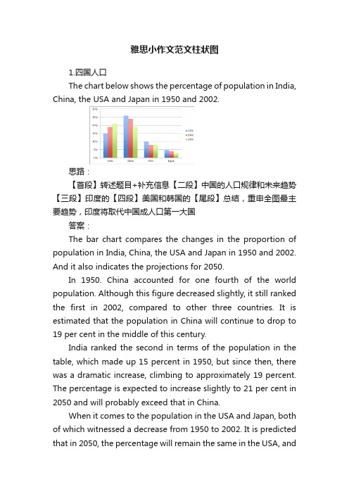
雅思小作文范文柱状图1.四国人口The chart below shows the percentage of population in India, China, the USA and Japan in 1950 and 2002.思路:【首段】转述题目+补充信息【二段】中国的人口规律和未来趋势【三段】印度的【四段】美国和韩国的【尾段】总结,重申全图最主要趋势,印度将取代中国成人口第一大国答案:The bar chart compares the changes in the proportion of population in India, China, the USA and Japan in 1950 and 2002. And it also indicates the projections for 2050.In 1950. China accounted for one fourth of the world population. Although this figure decreased slightly, it still ranked the first in 2002, compared to other three countries. It is estimated that the population in China will continue to drop to 19 per cent in the middle of this century.India ranked the second in terms of the population in the table, which made up 15 percent in 1950, but since then, there was a dramatic increase, climbing to approximately 19 percent. The percentage is expected to increase slightly to 21 per cent in 2050 and will probably exceed that in China.When it comes to the population in the USA and Japan, both of which witnessed a decrease from 1950 to 2002. It is predicted that in 2050, the percentage will remain the same in the USA, andin Japan, the percentage is likely to keep falling.Overall, it seems that India will become the country with the largest population although there is still a huge number of people in China.2.通勤工具Different modes of transport used to travel to and from work in one European city in 1960, 1980 and 2000.思路:1. 分段原则为:上升的一段,下降的一段,波动的一段。
雅思写作小作文范文 雅思写作柱状图bar chart 大胃王比赛.doc
雅思写作小作文范文雅思写作柱状图bar chart 大胃王比赛今天我们雅思写作小作文范文的文章来研究下柱状图bar chart。
这次的图表很有意思,是某地举办的吃热狗大赛。
选手要在15分钟内尽可能的吃热狗,数量多者获胜。
图表统计了从1980年到2010年获胜者的信息,包括其记录和国籍。
小编搜集了一篇相关的考官范文,以供大家参考。
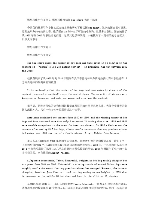
雅思写作小作文题目雅思写作小作文范文The bar chart shows the number of hot dogs and buns eaten in 15 minutes by the winners of ‘Nathan’s Hot Dog Eating Contest’ in Brooklyn, the USA between 1980 and 2010.柱状图展示了从1980年到2010年期间在美国布鲁克林举办的吃热狗大赛中获胜者在15分钟内吃掉的热狗和圆饼数量。
It is noticeable that the number of hot dogs and buns eaten by winners of the contest increased dramatically over the period shown. The majority of winners were American or Japanese, and only one woman had ever won the contest.很明显,获胜者所吃的热狗和圆饼数量在所展示的时间里急剧上升。
大部分获胜者为美国人或日本人。
只有一位女性曾经赢得过这个比赛。
Americans dominated the contest from 1980 to 1996, and the winning number of hot dogs and buns consumed rose from only 8 to around 21 during that time. 1983 and 1984 were notable exceptions to the trend for American winners. In 1983 a Mexican won the contest after eating 19.5 hot dogs, almost double the amount that any previous winner had eaten, and 1984 saw the only female winner, Birgit Felden from Germany.美国人在1980年到1996年期间主导该比赛。
雅思写作小作文范文 雅思写作柱状图bar chart 六种商品的花费.doc
雅思写作小作文范文雅思写作柱状图bar chart 六种商品的花费今天我们雅思写作大作文范文的文章来研究下柱状图bar chart。
该柱状图给出了英国,法国,德国和意大利等四国人口在六种消费品上的花费,包括电影、玩具、CD、香水、网球拍、个人音响等。
可以很明显的看出,英国人在这几方面的消费较高,而德国人的消费则较低。
小编搜集了一篇相关的高分范文,以供大家参考。
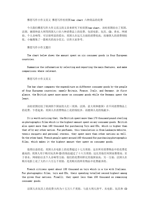
雅思写作小作文题目The chart below shows the amount spent on six consumer goods in four European countries.Summarise the information by selecting and reporting the main features, and make comparisons where relevant.雅思写作小作文范文The bar chart compares the expenditure on different consumer goods by the people of four European countries; namely Britain, France, Italy, and Germany. At first glance, the British spent more money on consumer goods while the Germans spent the least.该柱状图比较了欧洲四个国家的人们(英国,法国,意大利和德国)在不同消费物品上的花费。
乍看起来,英国人在消费物品上花的钱较多,而德国人花的钱最少。
It is worth noticing that, the British spent more than 170 thousand pound sterling on photographic films which is the highest amount spent on any consumer goods. British also spent more than 160 thousand for purchasing Toys and CDs, which is higher than that of by any other nation. For perfumes, this translation is from Laokaoya website, tennis racquets and personal stereos, they spent more than other nations as well. On the other hand, French people spent around 165 thousand for purchasing photographic films, which makes it the highest amount they spent on consumer goods.值得注意的是,英国人在电影上的花费超过十七万英镑,这在所有消费物品中的花费是最高的。
雅思写作小作文范文 雅思写作柱状图bar chart 奖牌数量.doc

雅思写作小作文范文雅思写作柱状图bar chart 金牌数量今天我们雅思写作小作文范文的文章来研究下柱状图bar chart。
该图表展示了12个不同的国家在奥林匹克运动会上获得的奖牌的数量,并用三种不同的颜色来标示金银铜牌。
很明显可以看出美国获得的奖牌数量远超其他国家,而苏联则排名第二。
雅思写作小作文题目The chart below shows the total number of Olympic medals won by twelve different countries.Summarise the information by selecting and reporting the main features, and make comparisons where relevant.雅思写作小作文范文The bar chart compares twelve countries in terms of the overall number of medals that they have won at the Olympic Games.该柱状图比较了12个国家在奥林匹克运动会上获得的奖牌的数量。
It is clear that the USA is by far the most successful Olympic medal-winning nation. It is also noticeable that the figures for gold, silver and bronze medals won by any particular country tend to be fairly similar.显然,美国到目前为止是最为成功的奥林匹克奖牌获得者。
也可以注意到,其他任何国家赢得金牌、银牌和铜牌数量相当相似。
The USA has won a total of around 2,300 Olympic medals, including approximately 900 gold medals, 750 silver, and 650 bronze. In second place on the all-time medals chart is the Soviet Union, with just over 1,000 medals. Again, the number of gold medals won by this country is slightly higher than the number of silver or bronze medals.美国赢得了大约2300枚奥运会奖牌,包括大约900枚金牌,750枚银牌和650枚铜牌。
(完整版)雅思写作-小作文范文-柱状图
柱状图C1T3题目The chart below shows the amount of money per week spent on fast foods in Britain. The graph shows the trends in consumption of fast foods.Write a report a university lecturer describing the information shown below.The chart shows that high income earners consumed considerably more fast foods than the other income groups, spending more than twice as much on hamburgers (43 pence per person per week) than on fish and chips or pizza (both under 20 pence). Average income earners also favored hamburgers, spending 33 pence per person per week, followed by fish and chips at 24 pence, then pizza at 11 pence. Low income earners appear to spend less than other income groups on fast foods, thoughfish and chip remains their most popular fast food, followed by hamburgers and then pizza.From the graph we can see that in 1970, fish and chips were twice as popular asburgers, pizza being at that time the least popular fast food. The consumption of hamburgers and pizza has risen steadily over the 20 year period to 1990 while the consumption of fish and chips has been in decline over that same period with a slight increase in popularity since 1985.分析:题目The chart below shows the amount of money per week spent on fast foods inBritain. The graph shows the trends in consumption of fast foods.两句话,两个图第一段The chart shows that high income earners consumed considerably more fastfoods than the other income groups, spending more than twice as much onhamburgers (43 pence per person per week) than on fish and chips or pizza(both under 20 pence).说明了高收入人群的两个特点,第一是消耗快餐最多,第二是人群中hamburger, fish and chips, pizza的特点spending more than twice as much on hamburgers than on fish and chip and chips or pizza 这是一句令人费解的句子,含义应为“消耗的汉堡是薯片或匹萨的比如两倍多”,应用的句型应当为典型的表示倍数关系的句型“n times as…as”,? This airplane flies two times as fast as that one. 这家飞机的飞行速度是那架的两倍。
雅思英语柱状图作文
雅思英语柱状图作文
英文回答:
The bar chart illustrates the number of books sold in a bookstore during the first six months of the year. In January, the store sold approximately 4,000 books. Sales rose steadily in the following months, reaching a peak of 6,500 books in March. After a slight dip in April, book sales rebounded in May and June, with the store selling
just over 6,000 books in each month. Overall, book sales showed a positive trend over the six-month period, indicating a healthy demand for reading materials.
中文回答:
图表显示了今年上半年一家书店售出的图书数量。
1 月份,该书店售出了约 4,000 本图书。
书籍销量在接下来的几个月中稳步上升,并在 3 月份达到 6,500 本的高峰。
4 月份销量略有下降,但5 月份和 6 月份销量回升,该书店每个月的销量均略高于 6,000
本。
总体而言,书籍销量在这六个月期间呈现积极趋势,表明对阅读材料有健康的需求。
雅思小作文柱形图真题
雅思小作文柱形图真题英文回答:The bar chart illustrates the percentage of people in different age groups who participated in various leisure activities in a particular country. Overall, it can be observed that younger people tend to engage in more physical activities, while older individuals prefer more sedentary leisure activities.Looking at the data in more detail, it is evident that the highest percentage of individuals participating in physical activities is in the 18-24 age group, with approximately 80% of them engaging in sports. This could be attributed to the fact that younger people are generally more energetic and physically active. For instance, many young adults enjoy playing football, basketball, or going to the gym to stay fit.In contrast, the percentage of people participating inphysical activities decreases as age increases. In the 45-54 age group, only around 50% of individuals are involved in sports. This decline could be due to various factors, such as physical limitations or work commitments. For example, middle-aged adults often have demanding jobs and less free time to dedicate to sports activities.Moving on to sedentary leisure activities, the highest percentage of individuals engaged in reading can be observed in the 55-64 age group, with approximately 70% of them reading books or magazines. This could be because older individuals have more leisure time and enjoy the relaxation and mental stimulation that reading provides. For instance, many retirees find pleasure in reading novels or keeping up with current affairs through newspapers.In conclusion, the bar chart demonstrates that younger people are more likely to participate in physical activities, while older individuals prefer sedentaryleisure activities such as reading. These findings can be attributed to factors such as age-related physical limitations, work commitments, and personal preferences. Itis important to note that these trends may vary across different countries and cultures.中文回答:这个柱状图展示了不同年龄段的人参与各种休闲活动的百分比。
雅思写作小作文范文 雅思写作柱状图bar chart 学习背后的原因.doc
雅思写作小作文范文雅思写作柱状图bar chart 学习背后的原因今天我们雅思写作小作文范文的文章来研究下柱状图bar chart。
第一张图展示了不同年龄段的人们选择进一步学习的理由,对比究竟是出于兴趣多一些还是出于职业考虑多一些。
第二张图给出了其资金来源的信息,比较是自费的多一些还是雇主支持的多一些。
小编搜集了一篇相应的考官范文,以供大家参考。
雅思写作小作文题目The charts below show the main reasons for study among students of different age groups and the amount of support they received from employers.Summarise the information by selecting and reporting the main features, and make comparisons where relevant.雅思写作小作文范文The bar charts compare students of different ages in terms of why they are studying and whether they are supported by an employer.柱状图比较了不同年龄学生学习的原因,以及他们是否被其雇主所资助。
It is clear that the proportion of students who study for career purposes is far higher among the younger age groups, while the oldest students are more likely to study for interest. Employer support is more commonly given to younger students.很明显,因为职业目的学习的学生比例在年轻人中远高于其他类别,而年纪最大的学生更多的是出于兴趣去学习。
- 1、下载文档前请自行甄别文档内容的完整性,平台不提供额外的编辑、内容补充、找答案等附加服务。
- 2、"仅部分预览"的文档,不可在线预览部分如存在完整性等问题,可反馈申请退款(可完整预览的文档不适用该条件!)。
- 3、如文档侵犯您的权益,请联系客服反馈,我们会尽快为您处理(人工客服工作时间:9:00-18:30)。
1.四国人口The chart below shows the percentage of population in India, China, the USA and Japan in 1950 and 2002.思路:【首段】转述题目+补充信息【二段】中国的人口规律和未来趋势【三段】印度的【四段】美国和韩国的【尾段】总结,重申全图最主要趋势,印度将取代中国成人口第一大国答案:The bar chart compares the changes in the proportion of population in India, China, the USA and Japan in 1950 and 2002. And it also indicates the projections for 2050.In 1950. China accounted for one fourth of the world population. Although this figure decreased slightly, it still ranked the first in 2002, compared to other three countries. It is estimated that the population in China will continue to drop to 19 per cent in the middle of this century.India ranked the second in terms of the population in the table, which made up 15 percent in 1950, but since then, there was a dramatic increase, climbing to approximately 19 percent. The percentage is expected to increase slightly to 21 per cent in 2050 and will probably exceed that in China.When it comes to the population in the USA and Japan, both of which witnessed a decrease from 1950 to 2002. It is predicted that in 2050, the percentage will remain the same in the USA, and in Japan, the percentage is likely to keep falling.Overall, it seems that India will become the country with the largest population although there is still a huge number of people in China.2.通勤工具Different modes of transport used to travel to and from work in one European city in 1960, 1980 and 2000.思路:1. 分段原则为:上升的一段,下降的一段,波动的一段。
2. 采用折现模式,重点描述数据的改变和趋势。
3. 注意一类数据的描述(Max, Min, 最大的改变等等)。
答案:The bar chart shows the changing patterns of transport use in a European city during the period from 1960 to 2000. In brief, the chart shows that the use of the car as a means of transport dramatically increased over the period shown, while the others fell.In detail, in 1960 the motor car was used least as a method of transport with only about 7% of the population using this method but car use grew steadily and strongly to finally reach about 37% of the population by 2000. This was a massive 5-fold increase in use.Over this same period, however, the popularity of walking, which had been the most popular means of transport with 35% of the population in 1960 having it as their preferred way of getting around, fell to 10%. Bicycle use also fell from a high of about 27% in 1960 to just 7% in 2000.On the other hand, bus use was more erratic being popular with almost 20% of the population in 1960 and rising to a peak of about 27% in 1980 before falling back to about 18% in 2000.(188)Life expectancy at birth in 7 countries worldwide.思路:1. 分段原则为:按照数据的大小对比分一段,女性比男性多分一段。
2. 注意描述一类数据(Max, Min, Avg)。
3. 类比模式下,应该重点描述数据的差异,可通过减法和除法进行比较。
eg.在美国,男女之间的寿命差异最大,为5年。
答案:This bar chart compares how long people can expect to live in seven different countries.We can see that in each of the seven countries people have a life expectancy of between63 years and 83 years. People will live longest in Canada at 83 years and the United States (81 years), while Bangladesh has the lowest life expectancy at just 63 years. Of the other countries, Turkey, Vietnam, Iran and India all have a similar level close to the average of 73 years.We should also note that women are expected to live longer than men in all these countries. On average, females will live approximately 4 years longer than men, although there are differences here. The greatest difference is in the United States (about 5 years),while in Iran females are expected to live only 2 years longer than men. However, the major exception is Bangladesh where both genders have the same life expectancy.Thus, we can see there are comparisons to be made in life expectancy both in geographical location and gender.(173)The numbers of male and female research students studying six computer science subjects at a US university in 2011.思路:1. 典型的静态柱状图,建议分段原则为:男多于女的一段,男少于女的一段,男女相等的一段;2. 注意重点描述关键数据,如:最大值,最小值,均值等。
3. 静态图形需强调数据的对比,如:倍数关系,大小关系等。
答案:The bar chart shows the gender distribution of students doing computer scientific research across a range of disciplines at a US university in 2011. In five of the six disciplines, males outnumbered females. Male students made up a particularly large proportion of the student group in subjects related to the study of programming objects: mathematics, programming, and engineering. The gender gap was particularly large in the field of mathematics, where there were five times as many male students as female students.Men and women were more equally represented in subjects related to the study of computer science: natural sciences, psychology, and linguistics. In natural science, there were nearly as many women (approximately 200) as men (approximately 240). This was also true of psychology. Linguistics was the only discipline in which women outnumbered men (roughly 110 women vs. 90 men). Overall, the chart shows that at this university, computer science subjects continue to be male-dominated; however, women have a significant presence in fields related to psychology and the computer sciences.(169)5.年龄结构The charts below compare the age structure of the populations of France and India in 1984.答案:The two charts compare the populations of France and India in terms of age distribution by gender in the year 1984.It is clear that the population of India was younger than that of France in 1984, with a noticeably larger proportion of people aged under 20. France, on the other hand, had a significantly larger percentage of elderly inhabitants.In India, close to 14% of people were aged 5 or under, and each five-year age bracket above this contained an increasingly smaller proportion of the population. France’s population, by contrast, was more evenly distributed across the age ranges, with similar figures (around 7% to 8% of all people) for each five-year cohort between the ages of 0 and 40. Somewhere between 10% and 15% of all French people were aged 70 or older, but the equivalent figure for India was only 2%.Looking more closely at gender, there was a noticeably higher proportion of French women than men in every cohort from age 50 upwards. For example, almost 3% of French 70- to 75-year-olds were women, while just under 2% were men. No significant gender differences can be seen on the Indian population chart.(199 words, band 9)。