雅思写作小作文范文 雅思写作柱状图bar chart 奖牌数量.doc
雅思真题小作文柱形图

雅思真题小作文柱形图英文回答:The given bar chart provides a comparison of the average number of hours spent on various types of digital media by individuals in two different age groups: 18-24 and 55-64.The chart reveals that individuals in the 18-24 age group spend significantly more time on digital media than those in the 55-64 age group across all categories except watching television.Specifically, 18-24 year-olds spend an average of 3.5 hours per day on social media, compared to only 1.8 hours per day for 55-64 year-olds. Similarly, they spend an average of 2.8 hours per day on instant messaging, while55-64 year-olds spend only 1.4 hours per day on this activity. For playing video games, the difference is even more pronounced, with 18-24 year-olds spending an averageof 2.4 hours per day compared to just 0.8 hours per day for 55-64 year-olds.Interestingly, the trend reverses for watching television, with 55-64 year-olds spending an average of 2.2 hours per day on this activity, while 18-24 year-olds spend only 1.6 hours per day.Overall, the chart demonstrates a clear generational divide in digital media consumption, with younger individuals spending significantly more time on social media, instant messaging, and video games, while older individuals spend more time watching television.中文回答:根据给定的条形图,我们可以对18-24岁和55-64岁这两个年龄组的个人在不同类型数字媒体上花费的平均小时数进行比较。
雅思写作小作文范文 雅思写作柱状图bar chart 无报酬工作时间.doc

雅思写作小作文范文雅思写作柱状图bar chart 无报酬工作时间今天我们雅思写作小作文分范文的文章来研究下柱状图bar chart。
该图表按照所拥有的孩子的数量将婚后夫妇分成三类:没有孩子,有1到2个孩子,有3个以上孩子。
并在每个类别中都给出了男性和女性每周所做的无报酬工作的时间。
对比起来还是比较容易的。
小编搜集了一篇相关的高分范文,以供大家参考。
雅思写作小作文题目The diagram below shows the average hours of unpaid work per week done by people in different categories. (Unpaid work refers to such activities as childcare in the home, housework, and gardening.)Summarise the information by selecting and reporting the main features, and make comparisons where relevant.雅思写作小作文范文The given column graph shows information on the duration of unpaid works done by men and women of different categories.上面的柱状图给出的信息为不同类别的男性和女性所做的无报酬工作的持续时间。
As is presented in the illustration, married women who don’t have children do the unpaid-works (gardening, child care, and household works) 30 hours per week whereas married men do the similar unpaid jobs for about 18 hours per week. Women, this translation is from Laokaoya website, who have one or two children do such work for 50 hours/week but the men from the same category do only 17hours (approximately) each week. The women who have more than 3 kids seem to work the highest amount of unpaid works per week and that is nearly 60 hours. Surprisingly male from the same category work even less; amounting only 16 hours (approximately) of unpaid works.按照说明中所呈现的内容,结婚而没有孩子的女性每周所做没有报酬的工作(园艺,照顾孩子和整理家务)的时间为30小时。
雅思小作文-柱图-奥运奖牌

主题:奥运奖牌题型:柱状图The chart below shows the total number of Olympic medals won by twelve different countries.满分范文:The bar chart compares twelve countries in terms of the overall number of medals that they have won at the Olympic Games.It is clear that the USA is by far the most successful Olympic medal winning nation. It is also noticeable that the figures for gold, silver and bronze medals won by any particular country tend to be fairly similar.The USA has won a total of around 2,300 Olympic medals, including approximately 900 gold medals, 750 silver and 650 bronze. In second place on the all-time medals chart is the Soviet Union, with just over 1,000 medals. Again, the number of gold medals won by this country is slightly higher than the number of silver or bronze medals.Only four other countries - the UK, France, Germany and Italy - have won more than 500 Olympic medals, all with similar proportions of each medal colour. Apart from the USA and the Soviet Union, China is the only other country with a noticeably higher proportion of gold medals (about 200) compared to silver and bronze (about 100 each).。
雅思写作小作文范文 雅思写作柱状图bar chart 大胃王比赛.doc
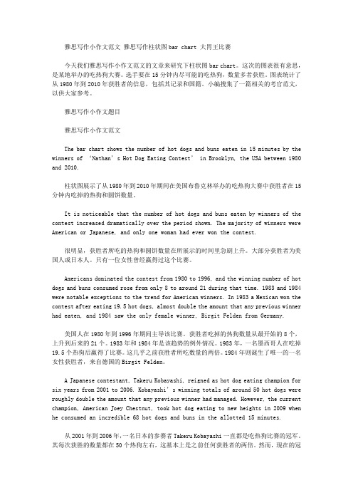
雅思写作小作文范文雅思写作柱状图bar chart 大胃王比赛今天我们雅思写作小作文范文的文章来研究下柱状图bar chart。
这次的图表很有意思,是某地举办的吃热狗大赛。
选手要在15分钟内尽可能的吃热狗,数量多者获胜。
图表统计了从1980年到2010年获胜者的信息,包括其记录和国籍。
小编搜集了一篇相关的考官范文,以供大家参考。
雅思写作小作文题目雅思写作小作文范文The bar chart shows the number of hot dogs and buns eaten in 15 minutes by the winners of ‘Nathan’s Hot Dog Eating Contest’ in Brooklyn, the USA between 1980 and 2010.柱状图展示了从1980年到2010年期间在美国布鲁克林举办的吃热狗大赛中获胜者在15分钟内吃掉的热狗和圆饼数量。
It is noticeable that the number of hot dogs and buns eaten by winners of the contest increased dramatically over the period shown. The majority of winners were American or Japanese, and only one woman had ever won the contest.很明显,获胜者所吃的热狗和圆饼数量在所展示的时间里急剧上升。
大部分获胜者为美国人或日本人。
只有一位女性曾经赢得过这个比赛。
Americans dominated the contest from 1980 to 1996, and the winning number of hot dogs and buns consumed rose from only 8 to around 21 during that time. 1983 and 1984 were notable exceptions to the trend for American winners. In 1983 a Mexican won the contest after eating 19.5 hot dogs, almost double the amount that any previous winner had eaten, and 1984 saw the only female winner, Birgit Felden from Germany.美国人在1980年到1996年期间主导该比赛。
雅思英语柱状图作文

雅思英语柱状图作文Title: Analyzing the Trends in [Your Topic] Through a Bar Chart.In this essay, we will delve into the intricacies of [Your Topic], examining the patterns and trends revealed through a bar chart. The chart presents valuable insights into the distribution and comparison of various categories, highlighting significant differences and similarities across the dataset.Firstly, let's take a moment to appreciate the simplicity yet effectiveness of the bar chart. It's a popular visualization tool that enables quickidentification of patterns and trends. In this case, the chart effectively illustrates the distribution of [specific data points] across [different categories or time periods]. The vertical bars represent the quantitative values, while the horizontal axis labels provide context and categorization.At first glance, the chart reveals some intriguing patterns. The tallest bar, representing [specific category or data point], stands out as the most prominent,indicating a significant concentration of [specific value or trend]. This is particularly noteworthy given the significant gap between this bar and the others, suggesting a clear leader in the dataset.Contrastingly, the shorter bars towards the left of the chart indicate lower concentrations or values in those categories. It's interesting to note that even though these categories may not be as dominant, they still play an important role in the overall distribution. They contribute to the diversity and balance of the dataset, providing valuable insights into the nuances of [Your Topic].When comparing the bars side by side, we can observe patterns and trends across categories. For instance, the steady increase in the heights of bars from left to right suggests a gradual growth or increase in [specific value or trend] over time. Conversely, a sudden dip in the barheights might indicate a sudden change or event that affected the distribution.The spacing between the bars also provides valuable insights. Wider gaps suggest larger disparities between categories, indicating that certain categories are more distinct and separate from others. Narrower gaps, on the other hand, suggest closer relationships or similarities between categories, indicating a more uniform distribution across the dataset.The color scheme chosen for the chart further enhances its readability and visual appeal. The contrasting colors make it easy to distinguish between different categories, while the neutral background does not distract from the main focus of the chart. This attention to detail ensures that the chart is both visually appealing and functionally effective.In conclusion, the bar chart presents a comprehensive overview of [Your Topic], revealing patterns and trendsthat would be difficult to discern from raw data. It allowsus to quickly identify the most prominent categories and values, while also providing insights into the relationships and similarities between different datasets. This analysis is crucial for understanding the nuances of [Your Topic] and making informed decisions based on empirical evidence.Moreover, the chart encourages further exploration and analysis. It acts as a starting point for deeper investigations into the factors that influence the distribution and trends observed. By examining the chart closely and asking pertinent questions, we can gain a deeper understanding of the underlying mechanisms and factors that shape [Your Topic].In summary, the bar chart is a powerful tool for visualizing and analyzing data. It enables us to identify patterns and trends, compare categories, and make informed decisions based on empirical evidence. By leveraging this tool effectively, we can gain a deeper understanding of [Your Topic] and use this knowledge to guide our future actions and decisions.。
雅思写作小作文范文雅思写作柱状图barchart医院急救对象.doc

雅思写作小作文范文雅思写作柱状图barchart医院急救对象.doc雅思写作小作文范文雅思写作柱状图bar chart 医院急救对象今天我们雅思写作小作文范文的文章来研究下柱状图bar chart。
该图表给出了六个年龄类别(5岁以下,5到15岁,16到44岁,45到64岁,65-74岁,以及75岁以上)的人群前往北爱尔兰医院急诊中心的数据。
并比较了这些数字在2016年12月和2017年12月的差别。
其中数据稍微有点多,比较考验大家分类比较的能力。
小编搜集了一篇相关的考官范文,以供参考。
雅思写作小作文题目The chart below shows figures for attendances at hospital emergency care departments in Northern Ireland by age group in December 2016 and December 2017.Summarise the information by selecting and reporting the main features, and make comparisons where relevant.雅思写作小作文范文The bar chart compares the number of visits made by people in six age categories to hospital emergency wards in Northern Ireland in the December of 2016 and 2017.该柱状图比较了2016年12月和2017年12月六个年龄类别的人前往北爱尔兰医院急救中心的数量。
It is clear that elderly people and the youngest children were the most frequent visitors to A&E (accident and emergency) departments. Also, there was a slight increase in the rate of emergency care attendances among all six age groups from December 2016 to December 2017.很明显,老年人和年龄最小的孩子是医院事故与急救部门最常接待的访客。
雅思Task1小作文柱形图范文:奥运奖牌分布

雅思Task1小作文柱形图范文:奥运奖牌分布The chart below shows the total number of Olympic medals won by twelve different countries.》》》点击查阅:托福考试提分攻略,平均提分5分哦!The bar chart compares twelve countries in terms of the overall number of medals that they have won at the Olympic Games.It is clear that the USA is by far the most successful Olympic medal winning nation. It is also noticeable that the figures for gold, silver and bronze medals won by any particular country tend to be fairly similar.The USA has won a total of around 2,300 Olympic medals, including approximately 900 gold medals, 750 silver and 650 bronze. In second place on the all-time medals chart is the Soviet Union, with just over 1,000 medals. Again, the number of gold medals won by this country is slightly higher than the number of silver or bronze medals.Only four other countries - the UK, France, Germany and Italy - have won more than 500 Olympic medals, all with similar proportions of each medal colour. Apart from the USA and the Soviet Union, China is the only other country with a noticeably higher proportion of gold medals (about 200) compared to silver and bronze (about 100 each).(178 words, band 9)雅思Task1小作文柱形图范文:奥运奖牌分布。
雅思写作小作文范文 雅思写作柱状图bar chart 影响工作表现的因素.doc
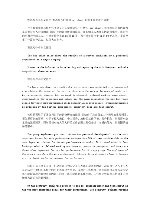
雅思写作小作文范文雅思写作柱状图bar chart 影响工作表现的因素今天我们雅思写作小作文范文的文章来研究下柱状图bar chart。
该图表展示的内容为某大型公司人力资源部门所进行的调查研究的结果,即影响工人表现的因素有哪些。
该研究的对象为两组工人,一组年龄分布在18到30岁,另一组年龄位于45到60岁之间。
小编搜集了一篇高分范文,以供大家参考。
雅思写作小作文题目The bar chart below shows the results of a survey conducted by a personnel department at a major company.Summarise the information by selecting and reporting the main features, and make comparisons where relevant.雅思写作小作文范文The bar graph shows the results of a survey which was conducted by a company and gives data on the important factors that determine the work performance of employees. As is observed, chances for personal development, relaxed working environment, opportunities for promotion and salary are the main motivating factors for young people for their work performance while comparatively aged people’s work performance is affected by the factors like money, competent boss and team spirit.该柱状图展示了某公司进行的调查研究的结果,并给出了决定员工工作表现的重要因素。
- 1、下载文档前请自行甄别文档内容的完整性,平台不提供额外的编辑、内容补充、找答案等附加服务。
- 2、"仅部分预览"的文档,不可在线预览部分如存在完整性等问题,可反馈申请退款(可完整预览的文档不适用该条件!)。
- 3、如文档侵犯您的权益,请联系客服反馈,我们会尽快为您处理(人工客服工作时间:9:00-18:30)。
雅思写作小作文范文雅思写作柱状图bar chart 金牌数量
今天我们雅思写作小作文范文的文章来研究下柱状图bar chart。
该图表展示了12个不同的国家在奥林匹克运动会上获得的奖牌的数量,并用三种不同的颜色来标示金银铜牌。
很明显可以看出美国获得的奖牌数量远超其他国家,而苏联则排名第二。
雅思写作小作文题目
The chart below shows the total number of Olympic medals won by twelve different countries.
Summarise the information by selecting and reporting the main features, and make comparisons where relevant.
雅思写作小作文范文
The bar chart compares twelve countries in terms of the overall number of medals that they have won at the Olympic Games.
该柱状图比较了12个国家在奥林匹克运动会上获得的奖牌的数量。
It is clear that the USA is by far the most successful Olympic medal-winning nation. It is also noticeable that the figures for gold, silver and bronze medals won by any particular country tend to be fairly similar.
显然,美国到目前为止是最为成功的奥林匹克奖牌获得者。
也可以注意到,其他任何国家赢得金牌、银牌和铜牌数量相当相似。
The USA has won a total of around 2,300 Olympic medals, including approximately 900 gold medals, 750 silver, and 650 bronze. In second place on the all-time medals chart is the Soviet Union, with just over 1,000 medals. Again, the number of gold medals won by this country is slightly higher than the number of silver or bronze medals.
美国赢得了大约2300枚奥运会奖牌,包括大约900枚金牌,750枚银牌和650枚铜牌。
在奖牌总计表格中排名第二的是苏联,数量刚刚超过1000。
同样的,该国家的金牌数量比银牌或者铜牌的数量要稍微高一些。
Only four other countries – the UK, France, Germany, and Italy – have won more than 500 Olympic medals, all with similar proportions of each medal color. Apart from the USA and the Soviet Union, China is the only other country with a noticeably higher proportion of gold medals (about 200) compared to silver and bronze (about 100 each). (178 words, band 9)
只有四个国家,英国、法国、德国和意大利,赢得了超过500枚奥运会奖牌。
每种奖牌的比例也基本一致。
除了美国和苏联之外,中国是唯一一个金牌(大约200枚)比例明显高于银牌和铜牌(每种大约100枚)比例的国家。
雅思写作小作文高分范文,快速提升写作成绩。