雅思小作文---TASK1图表题教学提纲
雅思写作任务1中的图表解释与描述

雅思写作任务1中的图表解释与描述在雅思写作考试中,任务1要求学生解释和描述图表。
图表类型可以是图表、表格、流程图或地图。
学生需要对图表中的数据进行解读,并用适当的词汇和句子来描述和解释。
图表解释和描述通常可以按照以下结构进行组织:1. 引言段:简要概述图表中的主题和数据类型。
最好使用一两句话来引出主题。
2. 总体描述:以全局的方式描述图表中的趋势或关键特征。
可以提到一些关键数字或明显的趋势。
3. 细节描述:对图表中的具体数据进行更详细的描述。
可以选择几个最重要或最显著的数据点进行描述,并用适当的比较和对比来增加分析的深度。
4. 结论段:总结整个图表的主要特点和趋势。
强调最重要的观察结果,并提供一些可能的解释或预测。
下面是一个例子来展示如何按照以上结构来写一篇图表解释和描述的文章:---引言段:本文将解释和描述一张关于全球食品浪费的柱状图。
图表展示了2000年至2015年之间,各大洲每年浪费的食物数量。
数据由联合国提供。
总体描述:总体来看,全球食品浪费数量在这个时间段内持续增长。
同时,发达国家浪费的食物要远远多于发展中国家。
细节描述:在2000年,发展中国家平均每年浪费大约2000万吨食物,而发达国家浪费数量高达8000万吨。
然而,在2015年,发展中国家的食品浪费增加到了3000万吨,而发达国家的浪费数量达到了1亿吨。
在这个时间段内,拉美地区的食品浪费率增长最快。
从2000年的500万吨增加到了2015年的1000万吨。
亚洲和欧洲的食品浪费也有显著增长,分别从2000年的1000万吨增加到了2015年的2000万吨和3000万吨。
结论段:从这些数据可以看出,全球食品浪费是一个严重的问题,尤其是在发达国家。
这可能是因为消费者的浪费行为和供应链中的问题所导致的。
为了减少食物浪费,我们需要通过教育和政策改变来提高人们的意识,并改进供应链的效率。
---以上是一个简单的范例,展示了如何按照结构来写一篇图表解释和描述的文章。
雅思图表作文写作技巧
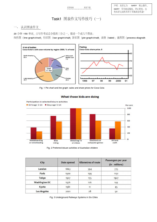
优秀资料欢迎下载Task1图表作文写作技巧(一)一、认识图表作文20分钟150单词,占写作考试总分值的三分之一,描述一个或几个图表。
线性图(line graph/chart );柱状图(bar graph/chart );饼状图(pie graph/chart );表格(table );流程图(process diagram )Fig. 1 Pie chart and line graph: sales and share prices for Coca-ColaFig. 2 Preferred leisure activities of Australian childrenFig. 3 Underground Railways Systems in Six Cities声明:本讲义为GARY 呕心制作,GARY 享有独家版权,禁止转发、出售本讲义或将其用于其他商业用途!二、图表作文审题要素1.描述对象整个图表的数据都是针对描述对象的。
图表的上方标题一般会指示描述对象。
弄清描述对象非常重要,因为在行文时,需要频繁地用到它。
如:sales of Coca Cola, share price of Coca Cola, the preferred leisure activities of Australian kids aged 5-14, wages growth rate。
2.描述单位对于有X轴(horizontal axis)和Y轴(vertical axis)的图表,描述单位一般在Y轴以符号的形式标明。
弄清描述单位对于数据的准确描述非常关键,把握不准的话就容易被当做跑题。
一般要弄清数字(number)和百分比(percentage; proportion)的区别。
另外,记住几个常用的单位缩写符号:$: dollarbn: billionm: million 或metrekm: kilometre%: percentage / proportion 区别:per cent,000s: thousand比如,第一页的描述单位:bottle / percentage (pie chart), dollar (line chart), percentage (bar chart) 三、图表作文标准结构Part 1 开头段,介绍写作目的,需包含四个要素:图表类型主要描述动词describe, show, present, depict, indicate, representcompare / make a comparison between …描述对象背景信息(地点+ 时间)例如:The line graph gives some detailed information about the wages growth rate of some country over adecade from 1993 to 2003.The pie charts below show the percentage of men and women who smoked in Australia during a 40-yearperiod, between 1960 and 2000.Part 2 主体段: 1 + N结构1: 一句话概括总趋势或总特征(general trend or feature)套句:… have shown striking changes/differences.N: N段(N≥1)细节描述(striking trends or features)Part 3 结尾段结尾段给出结论。
雅思图表小作文详解
Mexico
Surinam Jamaica Cuba
4,300
3,700 2,600 2,100
10.5
7.0 15.2 4.4
97
122 63 118
Sample Answer 1 It can be seen from the table that the Bahamas and Argentina had GDP of $13,000 and $9,100 per capita respectively and the adult illiteracy rates were 4.4 and 3.6 in the two countries. Brazil and Mexico had GDP of $4,900 and $4,300 per capita, and their adult illiteracy rates were 16.8 and 10.5. Surinam, Jamaica and Cuba had $3,700, $2,600, and $2,100 respectively, with the adult illiteracy rate at 7.0, 15.2, and 4.4. The table shows that another indicator, Newspaper Sales per 1,000 people had a huge number more than 100 of Argentina Surinam and Cuba. This was followed by the Bahamas 99, Mexico 97, Jamaica 63, and Brazil 40.
两种方案: 1.按照孩子年龄的区别来一一描述四个饼形,共分四段,每段中 进行母亲情况的比较; 2.按照母亲工作状况的区别描述,每段中进行孩子年龄的比较: 1)不工作的母亲; 2)兼职工作的母亲; 3)全职工作的母亲。
雅思小作文表格与段落组织
雅思A类写作TASK 1第四讲表格图与段落组织表格图可以分为两类,与时间段相关的表格图写法上要注意趋势的描述,但以数据分布为主的表格图,写作时要运用一些比较和对比结构,这点与饼状图相似,但是与饼状图不同之处在于表格图的写作需要处理大量的数据。
需要注意➢不要将所有的数据都呈现出来➢审题阶段要首先找出追重要的数据,如最大值,最小值,相等值等➢尽量归并数据,要根据已有知识来分类,例如看看是否可以找到发达国家与发达国家、女性就业的部门等等。
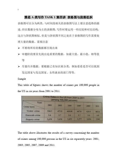
SampleThis table of figures shows the number of crimes per 100,000 people in the US in six years from 2001 to 2011.The table above illustrates the results of a survey concerning the number of crimes among 100,000 persons in the US in six separately years: 2001, 2003, 2005, 2007, 2009 and 2011.It is noticeable that although a decrease can be seen in all the three kinds of crimes, property crimes were considerably higher than the other two kinds of crimes.Of the six years, violent crime rate peaked at 504.5 per 100,000 persons in 2001, but from then on, it declined continuously and plunged to a bottom of 403.6 per 100,000 persons in the last year of 2011.Property crime rate follows similar pattern to violent crime rate. Over the eleven-year period, property crime rate continued to fall from 3658 in 2001 to 2941 in 2011.It seems that homicide rate is almost negligible, compared with the other kinds of crime rates. From 2001 to 2007, homicide rate fluctuated between 5.6 and 5.7 per 100,000 persons. From 2007 onwards, homicide rate experienced an obvious drop and hit a trough of 4.8 in 2011. Overall, crime rates in the US were on the decline during the period in question and reached an all-time low in 2011. Certainly the year 2011 was the safest year in this period.Task 1The table below give information about Favorite Pastimes in different countries.Summarise the information by selecting and reporting the main features, and make comparisons where relevant.Task 2The table gives information about students' opinions on different aspectsof courses they attended in a university in 2012.Summarise the information by selecting and reporting the main features, and make comparisons where relevant.Percentage of students rating aspects of their course as "very good".Task 3The table below shows the results of a survey to find out what members of a city sports club think about the club's activities, facilities and opening hours.Task 4Task 5The table below gives information about changes in modes of travel in England between 1985 and 2000.Summarize the information by selecting and reporting the main features, and make comparisons where relevant.Write at least 150 words.Task 1This table clearly presents and compares favorable pastimes in eight different countries. The pastimes, across the top of the table, are analyzed in relation to each country.As can be seen, about 60% of Canadians, Australians and Americans like watching television. On the other hand, this figure is quite low for China where only 15% of people watch television. Predictably, Americans like music at 23%, whereas only 2 to 5% of people in the other countries feel the same way. 20% of people in England enjoy sleeping as a pastime whereas in Canada and the USA, for example, the figure is only 2%. Interestingly, the Chinese like hobbies the most at 50%, as opposed to only 20% in France. It isn’t surprising that the highest percentage of beach-lovers is in Australia and the USA at 30%.It seems that pastimes of people of different nationalities may be influenced by a number of factors such as the socio-economic situation or the climate. These factors influence cultural differences between different nationalities and make cross-cultural experiences more interesting.Task 2The table shows how students feel about a variety of aspects of courses they took in university in 2012.Among the three given courses, the aspect of business earned more appreciation from the students than the other two. In terms of teaching quality and tutor support, the rating as "very good" reached 93% and 96% respectively, which were the highest compared with computing and maths. The percentage of satisfactory comments for course content and resources were also higher than average level.As a contrast, the rating for the aspect of computing as "very good" was lower than average concerning pre-course information (61%), tutor support (85%) and course content (69%). The students also did not think highly about the teaching quality and resourses.The number of students who were satisfied with the pre-course information of the maths course was slightly more than business and computing. However, the teaching quality was only recognized by 64% of the students, which were much less than those of business and computing. The situation was similar for resources.All in all, business was the most welcomed course among the students. Besides, among the five categories, students are more satisfied with the teaching quality and tutor support than the others. (203 words)Task 3The table compares the opinions of male and female club members about the services provided by a city sports club.We can see from the responses that the male members are generally happy or satisfied with the range of activities at the club, with only 5% dissatisfied. In contrast, however, only about two-thirds of female members were positive about the activity range and almost a third were dissatisfied. The genders were more in agreement about the club facilities. Only 14% of women and 10% of men were unhappy with these, and the majority (64 and 63% respectively) were very positive. Finally, the female respondents were much happier with the club opening hours than their male counterparts. Almost three-quarters of them were very satisfied with these and only 3% were unhappy, whereas nearly 40% of the men expressed their dissatisfaction.Overall, the table indicates that female members are most unhappy with the range of activities, while male members feel that opening hours are the least satisfactory aspect of the club.Task 4The table presents statistics of the subway systems in 6 cities in aspects ofage, length, and annual users.As can be seen in the table, the subway system in London which was opened in 1863 ranks the first in date opened. Immediately behind is the system in Paris with the opening year in 1900. They are followed by the systems in Tokyo (1927), Washington DC (1976), and Kyoto (1981). In the last place is the system in Los Angeles. It was opened in 2001, 138 years later than the system in London.A similar sequence can be seen in kilometers of route. The system in London again takes the lead with 394 kilometers and it is followed by its counterpart in Paris which is 195 kilometers shorter. The only difference occurs in the systems in Kyoto and Los Angeles. The latter is 17 kilometers longer than the former.Surprisingly, although the system in Tokyo is neither the oldest nor the longest, it is indeed the highest in passengers per year. The figure of it is 1927 million. By contrast, the system in Kyoto is the last in this category. It is 45 million, less than one-forty-second of its counterpart in Tokyo.Overall, the table shows introduction of the subway systems in the six cities. Among them, the system in London is both the longest and theoldest while that in Tokyo is the busiest.Task 5As can be seen from the table, walk and certain short-distance transportation, such as cycled and local bus tend to be less preferred. Of these, the local bus experienced the most dramatic decrease, from 429 miles to 274 miles within the 15-years period.By contrast, the long distance vehicle enjoyed a significant increase over the period, spanning from 1985 to 2000, although there exists some differences. To be more specific, the number of miles that car traveled was 3,199 in 1985 and rose by 50% to 4,806 in the subsequent years. The figure by long distance bus more than doubled during the same period (54 miles vs.124 miles), while the miles by taxi trebled which were 13 miles and 42 miles respectively. Likewise, the use of other, unspecified, forms of transport also increased.Overall, there is a considerable increase in total miles by all modes of transportation, compared with the data (4,740 miles) in 1985, with the increased use of cars possibly accounting for almost all of that increase.。
雅思作文写作Task 1第二课时—柱状图和饼状图
图表作文讲解2:柱状图和饼状图学生面授老师时间本次课时雅思写作第二课时教学思路1.作文简介、写作技巧2.实例讲解3.分析总结4.课后作业教学目标柱状图、饼状图知识点讲解基本特征和写作方法实例分析讲解重点写作技巧讲解范文学习柱状图和饼状图写作方法备考资料剑桥IELTS4-8教学详细内容:一、写作技巧详解1.柱状图特点➢柱状图是动态图表,切入点是描述趋势。
➢柱状图写作注重“比较”(找出similarity)和“对比”(找出difference),也就是说需要横向总结所有柱状图表的共性特征,也要分别描写各个柱子的个性特征。
➢两种写作方式:其一是对不同时间段内的数据进行比较,适合于数据代表的物体较少且时间界限明确的情况。
另外是对单独数据的全程描述,适合于描述数据对象很多且时间划定不清晰的情况。
2.饼状图特点饼形图与柱形图或者线形图所截然不同的是它没有了横轴与纵轴,而以饼形的分割来表示百分比,可以依照三步审题分析法来进行观察:➢观察共有几张饼状图,以及它们之间的关系是什么(一般说来,雅思图表题中极少见到单饼图);➢观察每张饼状图中有哪几个区域,以及各个区域分别代表什么;➢观察单个饼状图中各区域间的百分比差异,以及相同区域在各个饼状图间的百分比的比较或发展。
饼状图是所有图表题中最好写的一种,唯一值得注意的地方在于如何丰富百分比的表达和“占”的表达,要采取多样性的表达,如25%=a quarter of, 50%=half of, >50%=a/the majority of.描写饼状图中的比例构成就是饼状图图表作文的重点,但也应注意,这种描述并不是对图形的简单重复,对各项数据比例的描述应建立在归纳整理的基础上有条理地进行。
学生不仅要善于找数据,更重要的是要善于从数据或比例中升华出来,找到规律和本质。
常用词汇、句型及模板1.柱状图1)倍数的表达今年的产量是去年产量的两倍➢The output this year is two times(twice) more than last year’s.➢As much as 不可数名词 as many as 可数The books of this semester are two times as many as that of last semester. ➢ A is two times the amount of B不可数➢ A is two times the number of B可数2) 常用套句➢There was …in the number of A from …to … (over next years), which was followed by … and then… until…when there was … for the next … years.➢From…onwards, there was … in the number of A which then increased / decreased …at …% in …➢In …, the number reached (was) …%, but (30) years later there was …➢The number of A increased rapidly from … to … during the (five-year) period. ➢In the (three years) from … through…, the percentage of A was slightly larger / smaller than that of B.➢The graphs show a threefold increase in the number of A.➢Here is an upward trend in the number of A.➢… (year) witnessed / saw a sharp rise in A.2.饼状图1)常用词:percentage, proportion, make up, constitute, account for, take up, ..isdivided into…parts, consume the largest/smallest portion.2)例句:➢The graph, presented in a pie chart, shows the general trend in…..➢The percentage of A in … is more than twice tha n that of B.➢The biggest loss was to A area.➢There is not a great deal of difference between A and B.➢In general positions, females outnumber males.➢ A much greater percentage of men than women are found in managerial positions. ➢The profit of company A doubled from May to September.3)模板:➢The two pie charts describe ………………………➢The first point to note is …………………………➢Comparing the graphs, …………………………….➢The graphs also suggest that ………………………➢In conclusion, it can be seen from the data that …………………..4)饼状图作文模型The two pie charts illustrate the significant changes in people’s ways of communication from 1970 to 1995.The first graph shows that in 1975, the most popular way to communicate was letter writing, with the percentage of 50%. Others ___________________________, the figures are 32% and 18% respectively.It can be seen from the second graph that ways of communication changed a lot in two decades. By 1995, ______________________________. By contrast, ________________________________.Comparing the two pie charts, we can see that the use of the phones and computers during the same period had both risen considerably. However, letter writing became less popular among the people.In general, people inclined to use more modernized mediums to communicate with others, while the traditional way became less employed.The pie chart depicts the proportion of ___________________________. It consists of six segments, the largest one representing _________, which account for 26% of the total. _____________ takes up 21%, becoming the second largest.__________________________________. The rest proportions, 15% of all, constituting 5% and 10% respectively.From the chart it can be seen clearly that ________________________.二、实例分析分析思路:1.第一幅柱状图的描述单位是百万,即人数;第二幅则是百分比。
雅思小作文 折线图与趋势

雅思A类写作TASK 1第一讲折线图与趋势折线图和部分柱状图、饼状图以及表格通常用来显示某一段时间内事物的变化情况以及变化趋势,因此首先我们要先学习如何描述趋势变化。
总体来讲,趋势描写:(1)要总结事物变化的总体趋势;(2)要叙述事物某个时间段内的变化情况。
描写趋势六要素要素含义与难点例子事物要素指的是线条所代表的事物,常由名词、词组或代词体现Tourists, food方向要素上升/增加;下降/减少;保持平稳;反复波动;到达顶点;到达低谷(最基本的六种)Increase, decrease程度要素急剧地/突然地轻微的/逐渐的(主要有两类)Slightly,slowly数据要素难点为数据前所加介词的用法to,by,from...to..,between....and.. . From 50 miles to 200 miles时间要素难点为时间前所加介词的用法:in, on, at,from..to.., during, between..and...In January, at 6.00am连接要素句子间运用对比、比较、递进、增补、时间等连接手段Whereas, whenExample:The graph shows the sales of laptops in a company in 2010.趋势描写常用的词汇Peaked at A peak of FluctuatedaroundA fluctuation around Stood at Plateaued at Reached a plateau at剧烈的dramatically dramatic substantially substantial surprisingly surprising noticeably noticeable strikingly Striking considerably considerable remarkable remarkable obviously obvious enormously enormous significantly significant轻微的moderately moderate gradually gradual slightly Slight slowly slow steadily Steady minimally small最高点Arrived at a climax Reached a maximum number/amount ofHit a peak/peak at Soared/rocketed to a highest point of最低点Hit a historic low Touched/reached the bottom ofHit a trough Reached a lowest point of Exercise 1:1.There was an_______in the number of machines sold in 2012.2.The number of machines sold_________in 2012.3.The number of machines sold________steadily in 2012.4.2012 saw a steady ________in the number of machines sold.5.The number of machines sold_______in 2012.6.There was an obviously ________trend in the number of machines sold in 2012.7.The number of machines sold was_____________(on the .....) on the way up/on the up/on the riseExercise 2: Follow the pattern of Exercise 1 finish 7 sentences describing the chart below.1.__________________________________________________ ___________________________________________________2.__________________________________________________ ___________________________________________________3.__________________________________________________ ___________________________________________________4.__________________________________________________ ___________________________________________________5.__________________________________________________ ___________________________________________________6.__________________________________________________ ___________________________________________________7.__________________________________________________ ___________________________________________________●引入段的写法图表作文第一段要写的成功需要牢记以下几点:➢概括介绍图表的所有要素:图表类型、研究对象、数据形式、地区和时间等。
雅思图表写作
图表写作(Academic Module Writing Task One)一、图表作文整体写作策略图表类型曲线图(Line Graph)饼状图(Pie Chart)柱状图(Bar Chart)表格图(Table of Figures)混合图(Mixed Graphs)流程图(Flow Chart)地图(Maps)二、结构要求TF, CC & VSSSample: Writing Task One, Test Two, Cambridge IELTS 4You should spend about 2O minutes on this taskThe graph below shows the demand for electricity in England during typical days in winter and summer. The pie chart shows how electricity is used in an average English home. Summarize the information by selecting and reporting the main features, and make comparisons where relevant. Write at least 150 words.The line graphs compare the typical daily demands for electricity in winter and summer in England. As can be seen, the electricity consumption in winter almost doubles that in summer at any given moment of a day. The former waves between 30,000 and 45,000 units, while the latter fluctuates between 13,000 and 20,000 units. Their development trends see more similarities than differences. From 0 to 9 o’clock, both curves move generally downward to the lowest points of more than 30,000 units and 13,000 units, and from then on, the two lines go roughly upwards, respectively to the highest amount of 45,000 units at 21 o’clock and more than 20,000 units at 13 o’clock.The pie chart reflects an average household use of electricity in England. Heating for both room and water accounts for the biggest share of more than half. The other half of electricity is almost evenly used for three sections: ovens, kettles, washing machines; lighting, Tv, radio; and vacuum cleaners, food mixers, electric tools. The first section consumes a little bit higher of 17.5% while the rest two have an equal share of 15%.From the two charts, it is clear that electricity is in higher demand in winter in England.各段脉络:首段:四要素:图表研究的时间段、研究的对象和研究所采用的数据形式(是具体数字还是百分比)。
雅思task1写作模板
雅思task1写作模板雅思写作Task 1是许多考生感到挑战的部分,因为它要求考生在规定的时间内,对图表、表格或流程图进行分析,并以清晰、连贯的方式呈现出来。
以下是一个雅思Task 1写作模板,旨在帮助考生更好地组织文章结构,提高写作效率。
雅思Task 1写作模板:一、开头段落1.概括介绍:简要描述图表、表格或流程图的主题,说明要分析的内容。
Example: The table below presents data on the population of three countries from 2000 to 2010.2.主题句:明确指出文章要分析的主题。
Example: This report will focus on analyzing the changes in population of these countries over the given period.二、主体段落1.第一段:描述图表/表格/流程图中的第一个数据点或阶段。
a.主题句:指出要分析的数据点或阶段。
Example: The first stage of the process involves ...b.详细描述:对数据点或阶段进行详细描述,包括数据变化、比较等。
Example: In 2000, the population of Country A was 10 million, which accounted for 20% of the total population of the three countries.2.第二段:描述图表/表格/流程图中的第二个数据点或阶段。
a.主题句:指出要分析的数据点或阶段。
b.详细描述:对数据点或阶段进行详细描述,与第一段类似。
3.依次类推,描述其他数据点或阶段。
三、结尾段落1.总结句:总结文章分析的主要结果。
Example: In conclusion, the population of these three countries experienced significant changes from 2000 to 2010.2.指出可能的趋势或关联:如有必要,指出数据之间的趋势或关联。
- 1、下载文档前请自行甄别文档内容的完整性,平台不提供额外的编辑、内容补充、找答案等附加服务。
- 2、"仅部分预览"的文档,不可在线预览部分如存在完整性等问题,可反馈申请退款(可完整预览的文档不适用该条件!)。
- 3、如文档侵犯您的权益,请联系客服反馈,我们会尽快为您处理(人工客服工作时间:9:00-18:30)。
雅思小作文TASK1图表题规律
注意事项:
1.Task1是客观写作,要求客观真实。
2.客观性:不应该有任何图里没有而靠自己主观想象加入的成分。
结尾段针对图形做出的总结性结论也应该是根据图表的实际内容做出的符合逻辑的总结。
准确性:图表里面的数据介绍要力求精确,不能抄错数字。
但当一个特征点没有落在一个准确的坐标值上时,允许进行合理的目测或估计一个大概数值。
详尽性:要有层次感,并不需要把所有的数字都推到文章里。
3.类型
Table表格题
LineGraph线图
BarChart柱状图
PieChart饼状图
ProcessChart流程图
4.看图要注意单位,标题和图例。
5.对于多数小作文题,题中给出了几个图就对应的写出几个主体段。
题目里只给出一个图,根据图中包含几类图形元素写几个主体段。
图中只给了一个图,但图中所含图形元素很多,则分类。
题目中出现多线多柱多饼,用“对应提取法“,把每组里的对应元素提出来组织主体段。
6.时态和发生时间意义对应。
陈述永恒事实的句型,其主句的谓语动词必定用一般现在时。
若题目里没有出现时间,则全文都使用一般现在时。
7.结构
开头段(1~2句)改写原题
主体段1总体概括
具体介绍数字
主体段N总体概括
具体介绍数字
结尾段(1~2句)介绍总数(若图里并没有明确的给出总数,则省略)
结论(根据图里的数据得出有一定合理性的结论)
8.开头段的改写
题目中改写成
Show illustrate /compare
Proportion percentage
Information data
The number/amount of the figure for
Family household
Males men
Female women
Influence affect/effect
Categories kinds/types
Subway system underground railway/train system
Store shop
9.介绍数据或描述变化趋势的常用词。
动词:
表示上升:go up ; rise ; increase : grow ; experience a upward trend
表示急剧上升:jump ; shoot up ; surge ; soar (高涨)
表示下降: decline ; drop ; decrease : fall ; experience a downward trend;fall back 表示急剧下降:plummet; plunge
强调上升或下降的起点数值,重点数值:from…to…
强调上升或下降的幅度:by
表示由…组成:consist of ; be made up of ; be composed of ; be comprise of 表示波动:fluctuate/fluctuation (fluctuate between…and…)
表示稳定在一个水平上:remain stable at ; level off at ; hover at
表示经历了某种变化:see ;witness ; experience
表示达到最高点:peak at ; reach its peak at ; reach the highest level at
表示达到最低点:reach its lowest point/ level at
表示数量:reach ; stand at
表示所占份额(百分比/份额)account for ; represent ; make up ; constitute
表示对将来数字的预测:expect ; predict; project
表示变成原来数字的二倍/三倍:(almost/more than) double/triple ; increase twofold/tree fold
表示是另一事物的二倍/三倍:be twice/three times as high/long/fast/popular as 表示原有的差距缩小/扩大:The gap between…and…narrows/widens
表示原本少于但后来超过:exceed ; overtake
形容词
表示急剧:sharp ; dramatic; rapid; deep
表示持续:gradual ; consistent; steady ; continuous; slow
表示显著地,大幅度的: significant ; considerable; marked ; substantial; noticeable
表示幅度很小: slight ; minimal (语气很强,表示“极少的”)
表示大约:about ; around; approximately; just over/ under
表示分别:respectively(置于二组或多组数字后)
10.主体段写法
第1句话:概括该图的总体变化趋势(图中存在时间推移)/概括该图包含几个部分(图中不存在时间推移)
第X 句:具体介绍数据
(1)尽可能地按照有规则的顺序来介绍数据:
常规的线图:按从左到右的自然顺序介绍
常规的柱状图:若横轴有时间变化,按从左到右的自然顺序介绍
若横轴没有时间变化,则把各柱对应的数值从大到小排序介绍
常规的饼图:按所占份额从大到小排序来介绍
表格题:按行或按列的顺序依次介绍(把每行或每列的数值从大到小
介绍)
(2)并非要覆盖所有数字,不可省略关键数字(起始点,终止点,文化趋势,转折点,极值,交点,百分点)
11.修饰作文
合理的分段,有持续的描述,尽量相识的特征数字介绍
(1)比较意识:强调极值,对非极值进行适当对比
在第一句话的前半部分先定性地进行对比或类比,然后在该剧的后半部分用with+独立主格结构(在句子的后部附加另一事物的趋势或信息)/现在分词短语(句子后部仍然介绍句子前部主语的趋势或信息)/在括号里补充介绍数字来说明具体数字。
要能够清晰介绍趋势和数字
(2)表示时间的介词
In, from ,to , by (+一个具体的时间点,用于面熟某种变化趋势截止某一时间,过去完成时),during(强调发生在该期间),over (表示某种变化从某时期的开始至结束)
(3)It is clear/particularly noticeable that …(不宜在作文里过早出现)
(4)Interestingly,…/It is interesting to note that …(用于描述对比其他图并不是很明显的一个特点)
流程图
(出现频率:全年50场考试大概出现2-3次)
1.看图时必须仔细,不能漏掉任何一个细节。
2.可将流程图中的生词直接抄到文章。
3.多用表示顺序的单词,短语。
At the first stage of the process,…/First of all,…/ The process begins with
At the second/third /fourth stage , …
After that / Next / At the following stage /Subsequently / Afterwards
Then (不出现在句首,出现在被动语态里的be动词和过去分词之间)
At this stage /point ,…
Finally / Eventually(全过程很曲折)/At the final stage
4. 若流程图特别复杂,则合并成几个大步来写(题目会有细节暗示)
举例:
60%= three-fifths// three out of five
= a/the majority of
= a large/striking/ominant/leading portion/part/share/proportion/percentage/margin of
>80% (93%)= a lion’s share
5%= a minority of, a marginal/micro/slim/tiny/small-scaled/meagre portion
37.8%= maximum/comparatively a majority of (<50%的最大值)comparatively a minority of WRONG
7.3%
87%/76%/53%。