雅思小作文之图表作文
雅思小作文流程图类题目范文及解析

雅思小作文流程图类题目范文及解析雅思小作文流程图类题目范文及解析,一起来学习一下吧,下面我就和大家共享,来观赏一下吧。
雅思小作文流程图类题目范文及解析雅思小作文流程图类题目范文及解析为大家带来雅思小作文当中一类较有难度的图表——流程图类的小作文的范文以及解析。
流程图顾名思义就是对某一有时间和步骤先后挨次的行为进行步骤的拆解,并配上相应的文字和解说而生成的图表。
我们在处理流程图类图表作文是应当怎么写,请看下文。
上图来自网络主题:家居设计题型:流程图The diagrams below show some principles of house design for cool and for warm climates.满分范文:The diagrams show how house designs differ according to climate.这些图表显示房子的设计因气候而不同。
The most noticeable difference between houses designed for cool and warm climates is in the shape of the roof. The designs also differ with regard to the windows and the use of insulation.为凉快和暖和气候设计的房子之间最明显的区分是屋顶的外形。
在窗户和保温材料的使用方面,设计也有所不同。
We can see that the cool climate house has a high-angled roof, which allows sunlight to enter through the window. By contrast, the roof of the warm climate house has a peak in the middle and roof overhangs to shade the windows. Insulation and thermal building materials are used in cool climates to reduce heat loss, whereas insulation and reflective materials are used to keep the heat out in warm climates.我们可以看到凉快的气候房子有一个高角度的屋顶,它允许阳光通过窗户进入。
雅思作文图表题范文(热门3篇)

雅思作文图表题范文第1篇It is said that countries are becoming similar to each other because of the global spread of the same products, which are now available for purchase almost anywhere. I strongly believe that this modern development is largely detrimental to culture and traditions worldwide.A country’s history, language and ethos are all inextricably bound up in its manufactured artefacts. If the relentless advance of international brands into every corner of the world continues, these bland packages might one day completely oust the traditional objects of a nation, which would be a loss of richness and diversity in the world, as well as the sad disappearance of the manifestations of a place’s character. What would a Japanese tea ceremony be without its specially crafted teapot, or a Fijian kava ritual without its bowl made from a certain type of tree bark?Let us not forget either that traditional products, whether these be medicines, cosmetics, toy, clothes, utensils or food, provide employment for local people. The spread of multinational products can often bring in its wake a loss of jobs, as people urn to buying the new brand, perhaps thinking it more glamorous than the one they are used to. This eventually puts old-school craftspeople out of work.Finally, tourism numbers may also be affected, as travelers become disillusioned with finding every place just the same as the one they visited previously. To see the same products in shops the world over is boring, and does not impel visitors to open their wallets in the same way that trinkets or souvenirs unique to the particular area too.Some may argue that all people are entitled to have access to the same products, but I say that local objects suit local conditions best, and that faceless uniformity worldwide is an unwelcome and dreary prospect.Heres my full answer:The line graphs show the average monthly amount that parents in Britain spent on their children’s sporting activities and the number of British children who took part in three different sports from 2008 to is clear that parents spent more money each year on their children’s participation in sports over the six-year period. In terms of the number of children taking part, football was significantly more popular than athletics and 2008, British parents spent an average of around £20 per month on their children’s sporting activities. Parents’ spending on children’s sports increased gradually over the following six years, and by 2014 the average monthly amount had risen to just over £ at participation numbers, in 2008 approximately 8 million British children played football, while only 2 million children were enrolled in swimming clubs and less than 1 million practised athletics. The figures for football participation remained relatively stable over the following 6 years. By contrast, participation in swimming almost doubled, to nearly 4 million children, and there was a near fivefold increase in the number of children doing athletics.剑桥雅思6test1大作文范文,剑桥雅思6test1大作文task2高分范文+真题答案实感。
作文范文之雅思图表类英语作文模板
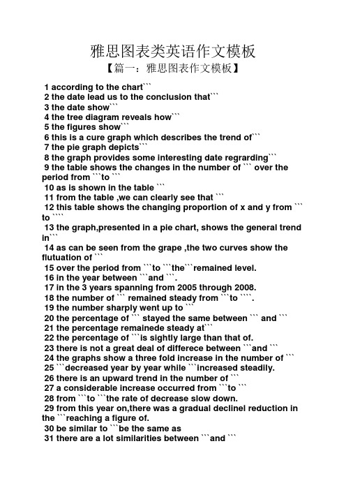
雅思图表类英语作文模板【篇一:雅思图表作文模板】1 according to the chart```2 the date lead us to the conclusion that```3 the date show```4 the tree diagram reveals how```5 the figures show```6 this is a cure graph which describes the trend of```7 the pie graph depicts```8 the graph provides some interesting date regrarding```9 the table shows the changes in the number of ``` over the period from ```to ```10 as is shown in the table ```11 from the table ,we can clearly see that ```12 this table shows the changing proportion of x and y from ``` to ````13 the graph,presented in a pie chart, shows the general trend in```14 as can be seen from the grape ,the two curves show the flutuation of ```15 over the period from ```to ```the```remained level.16 in the year between ```and ```.17 in the 3 years spanning from 2005 through 2008.18 the number of ``` remained steady from ```to ````.19 the number sharply went up to ```20 the percentage of ``` stayed the same between ``` and ```21 the percentage remainede steady at```22 the percentage of ```is sightly large than that of.23 there is not a great deal of differece between ```and ```24 the graphs show a three fold increase in the number of ```25 ```decreased year by year while ```increased steadily.26 there is an upward trend in the number of ```27 a considerable increase occurred from ```to ```28 from ```to ```the rate of decrease slow down.29 from this year on,there was a gradual declinel reduction in the ```reaching a figure of.30 be similar to ```be the same as31 there are a lot similarities between ```and ```32 the difference between x and y lies in ``para 1,两句话:第一句:this is a _____chart, which demonstrates the number of_____ from ____ to____. 如果两个图,则:there are two charts below. the _____ chart describes the number of_____, and the _____ chart illustrates the figure of ____. 第二句:(所有题目适用),from thechart we can see that the number of ______ variesconstantly/greatly in _____. )para 2, as we can see from the chart,/or it is clear from thechart that ____. 如果有两个图:则:the _____ chart shows that ______./or as we can see from the first chart, _______para 3, (如果两个图的话,) it is clear from the second chartthat ?para 4 结尾:from the figures/statistics above, we cansee/conclude/draw a conclusion that ?the bar chart indicates the current situation of the amount of money spent on fastfoods according to different income classes in britain.for those who belong to the high-income class, hamburgerhas been shown to beperson per week. by contrast fish and chips remain at a rather low level of about 16pence per person per week, and pizza, though attracts more expenses, accounts for 19pence per person per week, merely 3 pence more than that of fish and chips.as expected, low-income class spend much less in all 3 categories than high-incomeclass, with fish and chips at the top of the list at 15 pence per capital per week, andpizza at the bottom at a weekly expense of 8 pence per capital. the average income group resembles high-income class in hamburger consumptionat the largest amount of 33 per person every week, and low-income class in pizzaconsumption at the smallest amount of 11 per person every week, but amazingly, fishand chips consumed by this group leads all classes at a weekly expense of 25 penceper person.in conclusion, hamburgers, in general gain more welcome than other types of fastfood.para1. this is a table / chart / (line线状 bar柱状 pie饼状)graph which demonstrate / illustrate /reveal /depict /privide information about.............para2.(1)obvious /apparent from the graph is that ...rank thefirst/highest,while/whereas ....turn out tobe the lowest(2)it is exhibited/shown in the table that.....(3)it can be seen from the table that.....para3.(1)饼.柱图 a,which accounts for...%,ranks the first;then next is b with...%;followed byc,constituting...%;finally it comes d.e.fat...%...%and...%respectively(2)特殊变化(不变,增长或下降多的)(3)①it is worth mentioning that.... ②it must be pointed out that.... ③morestriking/suprising is that.... para4.to conclude /inconclusion/overall1. 最明显的原因__,因此___the most obvious reason for this phenomenon is that_____consequently, ____.2. 无论你喜欢与否,_____已经变得越来越流行,这是有原因的no matter you like it or not, aaa has become more and more popular and there are many reasonfor it.3. 对我们来说,改变这个不利的环境____是非常紧急的it’s an urgent task for us to change this unfavorable situation: ____.4. 这个图片会让你想起一些奇怪的东西,这种现象还是会继续存在这个社会the picture can reminds you of some strange, yet familiar phenomena existing in our society.5. 提供了大量的解决方案,一些人建议___,另一些人建议___a great number of solutions are being offered. some people suggest that ____. others argue that .6. 对于____,我们应该____confronted with aaa, we should take a serious of effective measures to cope with thesituation.7. 然而,___引起了许多为问题,however____ may cause some problems. first, it is__second, __. finally, ____. so, it is clear that__has its advantages and disadvantages.8. 虽然_____有一个__的非常大的好处,但是它不能完全__在__方面although _____ has a great advantage of _____, it cant compete with ____ in ____.9. _____也许更喜欢_____,但是_____忍受_____的不利之出_____may be preferable to ____, but it suffers from the disadvantages that___.10. _____的有利之处比____的有利之处要多,举例说明,_____the advantages of ______are much greater that thoseof____.for instance, ___.11.but i don’t think it is a very good way to solve ___. for instance, _____.worst of all,______.12.there are many ways to ______. first, _____. second, _____. third, ___.13.on the contrary, there are some people in favor of _____.14.they believe___. moreover, they think____. there are several measures for us to adopt. first,we can____, there are a number of advantages of ____. another solution is to _____.15.it is high time that something was done about it. for example,_____. in addition,_____. all these measures will certainly _.16. there are some other people, who______. their reasons are different, something for _____,sometimes for____, and sometimes simply for _____.17._____ is necessary and important to our country’s development and construction. first, ____.what’s more, ___. most important of all,___.18.however, if not managed properly, ____ can create many problems.sometimes ____.furthermore,_. therefore, ___ has been gaining public concern.19.有很多原因____,①there are probably many reasons for ____. first, ____.②second, ____. finally, ___.there are, i think, two main reasons for __. in the first place, ___. in the second place, __. therefore,③well, why is there ____? i think there might be two reasons. one is ___, and the other is _____.④why___? for one thing, ____. for another,____. perhaps the main reason is ___.⑤why_____? the first reason is that___. the second reason is ___. the third is__. for all this,the main cause of_____ is due to ____.20.it is no easy job to find the reasons for this tendency which involves several complicated factors. for some ___. for others ____.21. “why do _____?” many people often ask questions like this.22. in recent years, there is a general tendency to ___. according to a study, there is__. comparedwith __ last year. why _____?23.according to a survey, there is a growing number of ___. what brings this result? the mainreason rests with.24.①some people prefer to ___. in their opinion, ____. in addition, ____. nevertheless,nowadays, __ has become more and more common.②many people are inclined to____. in their opinion, ___.they believe that ___.25. today, there __, which have brought a lot of harms in our daily life. first, __ second, ____. what makes things worse is that ___.26.nowadays, ___ has become a problem we have to face. though it’s easier said than done, with the help of modern technology, we now have many means to solve it.27. 对于这个图,说明了_①the graph shows the general trend in _______.②according to the figures/numbers/statistics/percentages in the table/chart/bar graph/line graph, it can be seen that ___. obviously, ____, but why?③the figure indicates/shows/suggests/proves that___. there isa steady/rapid development/trend of _.④from the graph/chart, we know the statistics of __ and _. it can be seen easily that ___.⑤according to the two graphs presented, it can be observed that ___ in the left graph, __. at the same time, _ as the right graph shows.28. 现在我们经常听到_____,但是真的如此吗?①these days we are often told that ____. but is it true?②these days we often hear about ___. but is this really the case?29. 一位著名的作家曾经说过_____one of the great writers once said that _. now it still has a realistic significance.30. 回看历史,______的想法从来都没流行过,一方面_____另一方面______in our history, the idea that ____ never has been so popular. on one hand, ___, on the other hand,31. 人们中有许多像____不同的意见,一些人认为_______there are different opinions among people as to ____. some people suggest that __.32. 一些人认为__对_______来说在许多方面都是好的,然而,其他人不同意some people hold the opinion that _ is superior to __ in many ways: others, however, disagree with it.33. 现在虽然越来越多的人___,但仍有一些__的人,他们也许认为_____nowadays although more and more people __, still there are some who think __, they may think【篇二:雅思图表作文模板20篇下载】智课网ielts备考资料雅思图表作文模板20篇下载摘要:雅思图表作文模板20篇下载。
雅思图表小作文混合图范文

雅思图表小作文混合图范文雅思图表小作文混合图范文分享,今天就给大家带来了雅思图表小作文混合图范文,希望能够帮助到大家,下面就和大家分享,来欣赏一下吧。
雅思图表小作文混合图范文分享独居人口比例关于混合图题型(柱状图+饼状图):The bar chart below shows the proportions of English men and women of different ages who were living alone in 20XX. The pie chart compares the numbers of bedrooms in these one-person households(在英国20XX年,不同年龄段独居人口的男女比例,以及独居家庭的房间数统计)。
雅思图表小作文混合图9分范文:The two charts give information about single-occupant households in England in the year 20XX. The bar chart compares figures for occupants age and gender, and the pie chart shows data about the number of bedrooms in these homes.Overall, females made up a higher proportion of people living alone than males, and this difference is particularly noticeable in the older age categories. We can also see that the most common number of bedrooms in a single-occupant home was two.A significant majority of the people aged 65 or over who were living alone in England in 20XX were female. Women made up around 72% of single occupants aged 75 to 84, and 76% of those aged 85 or over. By contrast, among younger adults the figures for males were higher. For example, in the 35-49 age category, men accounted for nearly 65% of people living alone.In the same year, 35.4% of one-person households in England had two bedrooms, while one-bedroom and three-bedroom homes accounted for 28% and 29.8% of the total. Under 7% ofsingle-occupant homes had four or more bedrooms.(189 words, band 9)附雅思小作文simon考官推荐套路For the task 1 report, I aim for 9 sentences.这是他所擅长的图表作文4段9句大法,具体结构如下:1.Introduction: 1 sentence,Introduction段落,1句话介绍图表大意足矣2.Overview (summary): 2 sentences,Overview段,用2句话做图表信息的摘要3.First details paragraph: 3 sentences4.Second details paragraph: 3 sentences。
雅思图表作文万能模板
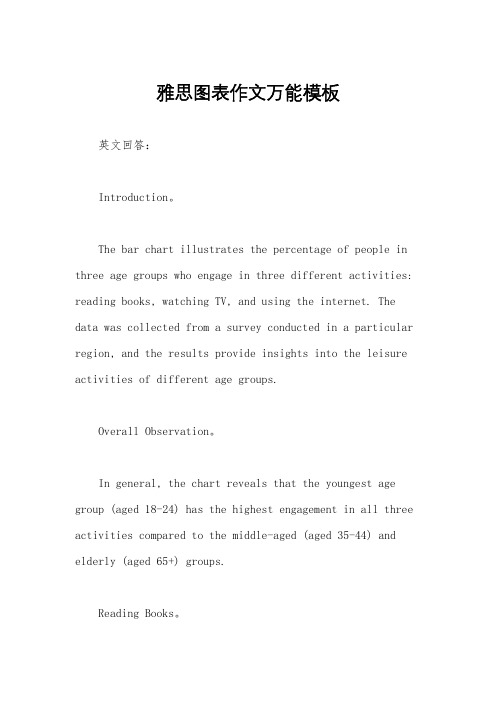
雅思图表作文万能模板英文回答:Introduction。
The bar chart illustrates the percentage of people in three age groups who engage in three different activities: reading books, watching TV, and using the internet. The data was collected from a survey conducted in a particular region, and the results provide insights into the leisure activities of different age groups.Overall Observation。
In general, the chart reveals that the youngest age group (aged 18-24) has the highest engagement in all three activities compared to the middle-aged (aged 35-44) and elderly (aged 65+) groups.Reading Books。
The youngest age group (aged 18-24) exhibits the highest percentage of readers, with 75% engaging in this activity. In contrast, the middle-aged group has a significantly lower percentage of readers (50%), and the elderly group has the lowest percentage (30%).Watching TV。
雅思写作小作文范文 雅思写作折线图(线状图) 美国肉类消耗量.doc

雅思写作小作文范文雅思写作折线图(线状图)美国肉类消耗量今天我们雅思写作小作文范文的文章来研究下折线图(线状图)。
该图表来自于华盛顿邮报的网站,数据相对于真正的雅思考试而言要更多一些。
因此如何挑选数据和进行对比就显得尤为重要。
小编搜集了一篇考官写的范文,以供大家参考。
雅思写作小作文题目雅思写作小作文范文The line graph shows changes in the per capita consumption of beef, pork, broilers, and turkey in the United States between 1955 and 2012.该折线图展示了1955年到2012年期间美国每人牛肉、猪肉、鸡肉和火鸡肉的消耗量。
It is noticeable that beef was by far the most popular of the four types of meat for the majority of the 57-year period. However, a considerable rise can be seen in the consumption of broilers, with figures eventually surpassing those for beef.很显然,牛肉在57年中的大多数时间都是四种肉类中最受欢迎的类型。
然而,鸡肉的消费量可以看到明显上升,并最终超过了牛肉的数量。
Between 1955 and 1976, US beef consumption rose from around 60 to a peak of 90 pounds per person per year. During the same period, consumption of broilers also rose, to nearly 30 pounds per person, while the figures for pork fluctuated between 50 and 40 pounds per person. Turkey was by far the least popular meat, with figures below 10 pounds per capita each year.在1955年到1976年期间,美国牛肉的消耗量从每人每年60磅,上涨到最高点每人每年90磅。
雅思小作文图表英文表达
雅思小作文图表英文表达The Interplay of Education and Economic Growth: A Comprehensive Examination of Statistical Data.Introduction:Education and economic growth have long been intertwined, with each influencing the other in a dynamic and multifaceted manner. The relationship between the two is often examined through statistical data, which provides valuable insights into the complex interplay between human capital and economic prosperity. This essay will delve into a comprehensive analysis of statistical data to explore the multifaceted relationship between education and economic growth.1. Education and Labor Productivity:One of the most direct ways in which education contributes to economic growth is through increased laborproductivity. Individuals with higher levels of education possess a greater stock of knowledge, skills, and cognitive abilities, which enables them to produce more output per unit of time. Statistical data reveals a strong positive correlation between educational attainment and labor productivity. Countries with higher levels of educational investment typically exhibit higher rates of economic growth, as their workforce is more skilled and capable of innovation and technological advancement.2. Education and Innovation:Education plays a crucial role in fostering innovation, which is the engine of economic growth in the modern knowledge-based economy. Individuals with higher levels of education are more likely to engage in research and development, develop new technologies, and create new products and services. Statistical data supports the notion that countries with highly educated populations are more likely to be leaders in innovation and technological advancements, leading to sustained economic growth.3. Education and Entrepreneurship:Education can also stimulate entrepreneurship, which is essential for creating new businesses and driving economic growth. Individuals with higher levels of education are more likely to have the skills and confidence to starttheir own businesses. Moreover, education provides access to networks and resources that can facilitate entrepreneurial ventures. Statistical data indicates a positive correlation between educational attainment and rates of business formation, suggesting that education plays a vital role in fostering a vibrant entrepreneurial ecosystem.4. Education and Income Inequality:While education can contribute to economic growth, it is important to consider its potential impact on income inequality. Statistical data often reveals a positive correlation between educational attainment and income. However, in some cases, highly educated individuals may capture a disproportionate share of the economic benefits,leading to widening income gaps. Policymakers mustcarefully navigate the relationship between education and income inequality to ensure that the benefits of economic growth are shared equitably across society.5. Education and Health:Education has a significant impact on health outcomes, which in turn can influence economic growth. Individuals with higher levels of education are more likely to engage in healthy behaviors, seek preventive care, and manage chronic conditions effectively. Statistical data reveals a strong correlation between educational attainment and improved health outcomes, which can lead to reduced healthcare costs, increased workforce participation, and higher levels of economic productivity.6. Education and Social Cohesion:Education also plays a vital role in social cohesion and stability, which are essential for sustainable economic growth. Individuals with higher levels of education aremore likely to be tolerant, cooperative, and engaged in their communities. Statistical data suggests that societies with high levels of educational attainment experience lower levels of crime, social unrest, and political instability, creating a more favorable environment for economic growth.7. Education and Gender Equality:Gender equality in education is crucial for both economic growth and social progress. Statistical data consistently demonstrates that investing in the education of girls and women leads to significant economic benefits. Educated women are more likely to participate in the workforce, earn higher incomes, and contribute to their families and communities. Moreover, gender equality in education promotes social inclusion, reduces poverty, and fosters a more just and equitable society.Conclusion:The statistical data presented in this essay provide compelling evidence of the multifaceted relationshipbetween education and economic growth. Education plays avital role in increasing labor productivity, fostering innovation, stimulating entrepreneurship, improving health outcomes, promoting social cohesion, and advancing gender equality. By investing in education, countries can reap the benefits of a skilled workforce, technological advancements, vibrant entrepreneurial ecosystems, and a more equitableand prosperous society.However, it is important to note that the relationship between education and economic growth is complex andcontext-specific. Policymakers must carefully consider the specific needs of their countries and tailor theireducation policies accordingly. Moreover, they must ensure that the benefits of economic growth are shared equitably across society to promote sustainable and inclusive development.。
雅思图表作文真题范文
雅思图表作文真题:柱状图:奥运奖牌The chart below shows the total number of Olympic medals won by twelve different countries.雅思小作文范文:The bar chart compares twelve countries in terms of the overall number of medals that they have won at the Olympic Games.It is clear that the USA is by far the most successful Olympic medal winning nation. It is also noticeable that the figures for gold, silver and bronze medals won by any particular country tend to be fairly similar.The USA has won a total of around 2,300 Olympic medals, including approximately 900 gold medals, 750 silver and 650 bronze. In second place on the all-time medals chart is the Soviet Union, with just over 1,000 medals. Again, the number of gold medals won by this country is slightly higher than the number of silver or bronze medals.Only four other countries - the UK, France, Germany and Italy - have won more than 500 Olympic medals, all with similar proportions of each medal colour. Apart from the USA and the Soviet Union, China is the only other country with a noticeably higher proportion of gold medals (about 200) compared to silver and bronze (about 100 each).(178 words, band 9)雅思图表作文真题:柱状图:学习动机The charts below show the main reasons for study among students of different groups and the amount of support they received from employers.参考雅思小作文范文The bar charts compare students of different ages in terms of why they are studying and whether they are supported by an employer.It is clear that the proportion of students who study for career purposes is far higher among the younger age groups, while the oldest students are more likely to study for interest. Employer support is more commonly given to younger students.Around 80% of students aged under 26 study to further their careers, whereas only 10% study purely out of interest. The gap between these two proportions narrows as students get older, and the figures for those in their forties are the same, at about 40%. Students aged over 49 overwhelmingly study for interest (70%) rather than for professional reasons (less than 20%).Just over 60% of students aged under 26 are supported by their employers. By contrast, the 30-39 age group is the most self-sufficient, with only 30% being given time off and help with fees. The figures rise slightly for students in their forties and for those aged 50 or more.(178 words, band 9)雅思图表作文真题:柱状图:The chart below shows numbers of incidents and injuries per 100 million passenger miles travelled (PMT) by transportation type in 2002.雅思小作文范文The bar chart compares the number of incidents and injuries for every 100 million passenger miles travelled on five different types of public transport in 2002.It is clear that the most incidents and injuries took place on demand-response vehicles. By contrast, commuter rail services recorded by far the lowest figures.A total of 225 incidents and 173 injuries, per 100 million passenger miles travelled, took place on demand-response transport services. These figures were nearly three times as high as those for the second highest category, bus services. There were 76 incidents and 66 people were injured on buses.Rail services experienced fewer problems. The number of incidents on light rail trains equalled the figure recorded for buses, but there were significantly fewer injuries, at only 39. Heavy rail services saw lower numbers of such events than light rail services, but commuter rail passengers were even less likely to experience problems. In fact, only 20 incidents and 17 injuries occurred on commuter trains.(165 words, band 9)雅思图表作文真题:柱状图:各地房价The chart below shows information about changes in average house prices in five different cities between 1990 and 2002 compared with the average house prices in 1989.雅思小作文范文:The bar chart compares the cost of an average house in five major cities over a period of 13 years from 1989.We can see that house prices fell overall between 1990 and 1995, but most of the cities saw rising prices between 1996 and 2002. London experienced by far the greatest changes in house prices over the 13-year period.Over the 5 years after 1989, the cost of average homes in Tokyo and London dropped by around 7%, while New York house prices went down by 5%. By contrast, prices rose by approximately 2% in both Madrid and Frankfurt.Between 1996 and 2002, London house prices jumped to around 12% above the 1989 average. Homebuyers in New York also had to pay significantly more, with prices rising to 5% above the 1989 average, but homes in Tokyo remained cheaper than they were in 1989. The cost of an average home in Madrid rose by a further 2%, while prices in Frankfurt remained stable. (165 words)雅思图表作文真题:饼状图:垃圾处理The pie charts below show how dangerous waste products are dealt with in three countries.雅思小作文范文:The charts compare Korea, Sweden and the UK in terms of the methods used in each country to dispose of harmful waste.It is clear that in both the UK and Sweden, the majority of dangerous waste products are buried underground. By contrast, most hazardous materials in the Republic of Korea are recycled.Looking at the information in more detail, we can see that 82% of the UK’s dangerous waste is put into landfill sites. This disposal technique is used for 55% of the harmful waste in Sweden and only 22% of similar waste in Korea. The latter country recycles 69% of hazardous materials, which is far more than the other two nations.While 25% of Sweden's dangerous waste is recycled, the UK does not recycle at all. Instead, it dumps waste at sea or treats it chemically. These two methods are not employed in Korea or Sweden, which favour incineration for 9% and 20% of dangerous waste respectively.(159)。
雅思写作八分经典范文背诵:图表作文(5)
The table below shows the consumer durables (telephone, refrigerator, etc.) owned in Britain from 1972 to 1983.Write a report for a university lecturer describing the information shown below.该图表展现的是1972-1983十一年间英国耐久消费品的拥有量。
The table indicates the consumer durables that were own in the UK over a period of 11 years from 1972 to 1983.从图表来看,英国八种耐久消费品在所标识时间段里的拥有量总体分为三种情况:中央暖气设备、电视、吸尘器、冰箱、电话、洗碗机呈现出各有特色的上升趋势;洗衣机呈现出总的上升,但中间有一次下降、放映机无从对比。
As can be seen from the table, the ownership of the eight above mentioned consumer durables in the UK during the designated period of time roughly revealed three different trends. Central heating, television, vacuum cleaner, refrigerator, telephone and dishwasher showed a trend of increase with different characteristics; Washing machine showed a trend of general rise with one fluctuation; Video had nothing to compare with.首先,中央暖气设备和电话一直处于上升态势。
雅思小作文---TASK1图表题
雅思小作文 T A S K 1 图表题规律注意事项:1 . Task1 是客观写作,要求客观真实。
2 . 客观性:不应该有任何图里没有而靠自己主观想象加入的成分。
结尾段针对图形做出的总结性结论也应该是根据图表的实际内容做出的符合逻辑的总结。
准确性:图表里面的数据介绍要力求精确,不能抄错数字。
但当一个特征点没有落在一个准确的坐标值上时,允许进行合理的目测或估计一个大概数值。
详尽性:要有层次感,并不需要把所有的数字都推到文章里。
3 . 类型Table 表格题Line Graph 线图Bar Chart 柱状图Pie Chart 饼状图Process Chart 流程图4 . 看图要注意单位,标题和图例。
5 . 对于多数小作文题,题中给出了几个图就对应的写出几个主体段。
题目里只给出一个图,根据图中包含几类图形元素写几个主体段。
图中只给了一个图,但图中所含图形元素很多,则分类。
题目中出现多线多柱多饼,用“对应提取法“,把每组里的对应元素提出来组织主体段。
6 . 时态和发生时间意义对应。
陈述永恒事实的句型,其主句的谓语动词必定用一般现在时。
若题目里没有出现时间,则全文都使用一般现在时。
7 . 结构开头段(1~2句)改写原题主体段1 总体概括具体介绍数字主体段N 总体概括具体介绍数字结尾段(1~2句)介绍总数(若图里并没有明确的给出总数,则省略)结论(根据图里的数据得出有一定合理性的结论)8 . 开头段的改写题目中ShowProportion InformationThe number/amount of FamilyMalesFemaleInfluence改写成illustrate /compare percentagedatathe figure for householdmenwomenaffect/effectCategories kinds/typesSubway system Storeunderground railway/train system shop9 . 介绍数据或描述变化趋势的常用词。
- 1、下载文档前请自行甄别文档内容的完整性,平台不提供额外的编辑、内容补充、找答案等附加服务。
- 2、"仅部分预览"的文档,不可在线预览部分如存在完整性等问题,可反馈申请退款(可完整预览的文档不适用该条件!)。
- 3、如文档侵犯您的权益,请联系客服反馈,我们会尽快为您处理(人工客服工作时间:9:00-18:30)。
二.雅思图表作文1.企业垃圾(线性图) 题目:The graph below shows the amounts of waste produced by three companies over a period of 15 years.范文:The line graph compares three companies in terms of their waste output between the years 2000 and 2015.It is clear that there were significant changes in the amounts of waste produced by all three companies shown on the graph. While companies A and B saw waste output fall over the 15-year period, the amount of waste produced by company C increased considerably.In 2000, company A produced 12 tonnes of waste, while companies B and C produced around 8 tonnes and 4 tonnes of waste material respectively. Over the following 5 years, the waste output of companies B and C rose by around 2 tonnes, but the figure for company A fell by approximately 1 tonne.From 2005 to 2015, company A cut waste production by roughly 3 tonnes, and company B reduced its waste by around 7 tonnes. By contrast, company C saw an increasein waste production of approximately 4 tonnes over the same 10-year period. By 2015, company C’s waste output had risen to 10 tonnes, while the respective amounts of waste from companies A and B had dropped to 8 tonnes and only 3 tonnes.(192 words, band 9)这条线图对三家公司的废物产出从2000年到2015年进行了比较。
很明显,图表上显示的这三家公司生产的垃圾量发生了重大变化。
虽然A公司和B公司在15年的时间里看到了废物的产量下降,但C公司生产的废物量却大幅增加。
2000年,A公司生产了12吨废物,而B公司和C公司分别生产了大约8吨和4吨废料。
在接下来的5年里,公司B和C的废料产量增加了大约2吨,但是公司A的产量下降了大约1吨。
从2005年到2015年,公司将废物产量减少了大约3吨,公司B减少了大约7吨的垃圾。
相比之下,C公司在同样的10年时间里,废物产量增加了大约4吨。
到2015年,C公司的废物产量已升至10吨,而A和B公司的垃圾量已降至8吨,仅为3吨。
2.游客分析(饼图) 题目:The chart below shows the results of a survey of people who visited four types of tourist attraction in Britain in the year 1999.范文:The pie chart compares figures for visitors to four categories of tourist attraction and to five different theme parks in Britain in 1999.It is clear that theme parks and museums / galleries were the two most popular types of tourist attraction in that year. Blackpool Pleasure Beach received by far the highest proportion of visitors in the theme park sector.Looking at the information in more detail, we can see that 38% of the surveyed visitors went to a theme park, and 37% of them went to a museum or gallery. By contrast, historic houses and monuments were visited byonly 16% of the sample, while wildlife parks and zooswere the least popular of the four types of tourist attraction, with only 9% of visitors.In the theme park sector, almost half of the people surveyed (47%) had been to Blackpool Pleasure Beach. Alton Towers was the second most popular amusement park, with 17% of the sample, followed by Pleasureland in Southport, with 16%. Finally, Chessington World of Adventures and Legoland Windsor had each welcomed 10% of the surveyed visitors.(181 words, band 9)这个饼状图比较了1999年英国的四类旅游景点和5个不同主题公园的游客人数。
很明显,主题公园和博物馆/画廊是那一年最受欢迎的两种旅游景点。
在主题公园中,黑潭快乐海滩获得的游客比例是最高的。
更详细地看这些信息,我们可以看到,38%的受访游客去了一个主题公园,其中37%的人去了博物馆或美术馆。
相比之下,只有16%的样本参观了历史建筑和纪念碑,而野生动物公园和动物园则是这四种旅游景点中最不受欢迎的,只有9%的游客。
在主题公园领域,几乎一半的被调查者(47%)曾经到过布莱克浦的快乐海滩。
奥尔顿塔是第二大最受欢迎的游乐园,有17%的样本,其次是在索斯波特的娱乐公园,占16%。
最后,查辛顿冒险世界和乐高和温莎的游客都欢迎10%的游客。
3.各地房价(饼图) 题目:The chart below shows information about changes in average house prices in five different cities between 1990 and 2002 compared withthe average house prices in 1989.范文:he bar chart compares the cost of an average house in five major cities over a period of 13 years from 1989.We can see that house prices fell overall between 1990 and 1995, but most of the cities saw rising pricesbetween 1996 and 2002. London experienced by far the greatest changes in house prices over the 13-year period.Over the 5 years after 1989, the cost of average homes in Tokyo and London dropped by around 7%, while New York house prices went down by 5%. By contrast, prices rose by approximately 2% in both Madrid and Frankfurt.Between 1996 and 2002, London house prices jumped to around 12% above the 1989 average. Homebuyers in New York also had to pay significantly more, with prices rising to 5% above the 1989 average, but homes in Tokyo remained cheaper than they were in 1989. The cost of an average home in Madrid rose by a further 2%, while prices in Frankfurt remained stable.(165 words)柱状图比较了从1989年开始的13年里,五个主要城市的平均房价。
我们可以看到,在1990年至1995年期间,房价总体下跌,但大多数城市在1996年至2002年期间房价上涨。
在过去的13年里,伦敦经历了房价的最大变化。
柱状图比较了从1989年开始的13年里,五个主要城市的平均房价。
在1989年之后的5年里,东京和伦敦的平均房价下跌了7%,而纽约房价下跌了5个百分点。
相比之下,马德里和法兰克福的房价都上涨了大约2个百分点。
从1996年到2002年,伦敦房价跳涨到比1989年平均水平高出12个百分点。
纽约的购房者也不得不支付更高的价格,房价比1989年的平均水平高出5%,但东京的房价仍然低于1989年的水平。