2020雅思线性图表作文模板「最新」
雅思作文line graph

雅思作文line graph英文回答:The line graph illustrates the changes in the number of international students studying in three differentcountries over a period of 10 years, from 2010 to 2020. Overall, there was a noticeable increase in the number of international students in all three countries during this period.In 2010, Country A had the highest number ofinternational students, with approximately 200,000. However, this number gradually declined over the next few years and reached its lowest point of around 150,000 in 2015. After that, there was a significant upward trend, and by 2020,the number of international students in Country A had surpassed its initial figure and reached approximately250,000.On the other hand, Country B started with a relativelylow number of international students in 2010, at around 50,000. However, there was a steady increase in the following years, and by 2015, the number had doubled to approximately 100,000. This positive trend continued, and by 2020, the number of international students in Country B had reached around 200,000.Country C had the smallest number of international students in 2010, at approximately 30,000. However, it experienced the most significant growth among the three countries. The number of international students in Country C increased rapidly, reaching around 100,000 in 2015. This growth continued, and by 2020, it had more than tripled to approximately 350,000.中文回答:这个折线图展示了在2010年到2020年期间,三个不同国家的国际学生数量的变化。
2020雅思小作文考官范文(线形图题型)
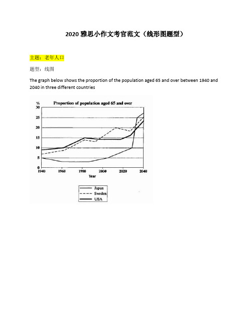
2020雅思小作文考官范文(线形图题型)主题:老年人口题型:线图The graph below shows the proportion of the population aged 65 and over between 1940 and 2040 in three different countries满分范文:The line graph compares the percentage of people aged 65 or more in three countries over a period of 100 years.It is clear that the proportion of elderly people increases in each country between 1940 and 2040. Japan is expected to see the most dramatic changes in its elderly population.In 1940, around 9% of Americans were aged 65 or over, compared to about 7% of Swedish people and 5% of Japanese people. The proportions of elderly people in the USA and Sweden rose gradually over the next 50 years, reaching just under 15% in 1990. By contrast, the figures for Japan remained below 5% until the early 2000s.Looking into the future, a sudden increase in the percentage of elderly people is predicted for Japan, with a jump of over 15% in just 10 years from 2030 to 2040. By 2040, it is thought that around 27% of the Japanese population will be 65 years old or more, while the figures for Sweden and the USA will be slightly lower, at about 25% and 23% respectively.主题:手机变迁题型:线图The line graph shows the average annual expenditures on cell phone and residential phone services between 2001 and 2010.范文:The line graph compares average yearly spending by Americans on mobile and landline phone services from 2001 to 2010.It is clear that spending on landline phones fell steadily over the 10-year period, while mobile phone expenditure rose quickly. The year 2006 marks the point at which expenditure on mobile services overtook that for residential phone services.In 2001, US consumers spent an average of nearly $700 on residential phone services, compared to only around $200 on cell phone services. Over the following five years, average yearly spending on landlines dropped by nearly $200. By contrast, expenditure on mobiles rose by approximately $300.In the year 2006, the average American paid out the same amount of money on both types of phone service, spending just over $500 on each. By 2010, expenditure on mobile phones had reached around $750, while the figure for spending on residential services had fallen to just over half this amount.主题:网络使用题型:线图The line graph below shows internet usage in different countries.范文:The line graph compares the percentage of people in three countries who used the Internet between 1999 and 2009.It is clear that the proportion of the population who used the Internet increased in each country over the period shown. Overall, a much larger percentage of Canadians and Americans had access to the Internet in comparison with Mexicans, and Canada experienced the fastest growth in Internet usage.In 1999, the proportion of people using the Internet in the USA was about 20%. The figures for Canada and Mexico were lower, at about 10% and 5% respectively. In 2005, Internet usage in both the USA and Canada rose to around 70% of the population, while the figure for Mexico reached just over 25%.By 2009, the percentage of Internet users was highest in Canada. Almost 100% of Canadians used the Internet, compared to about 80% of Americans and only 40% of Mexicans.。
作文范文之雅思图表类英语作文模板
雅思图表类英语作文模板【篇一:雅思图表作文模板】1 according to the chart```2 the date lead us to the conclusion that```3 the date show```4 the tree diagram reveals how```5 the figures show```6 this is a cure graph which describes the trend of```7 the pie graph depicts```8 the graph provides some interesting date regrarding```9 the table shows the changes in the number of ``` over the period from ```to ```10 as is shown in the table ```11 from the table ,we can clearly see that ```12 this table shows the changing proportion of x and y from ``` to ````13 the graph,presented in a pie chart, shows the general trend in```14 as can be seen from the grape ,the two curves show the flutuation of ```15 over the period from ```to ```the```remained level.16 in the year between ```and ```.17 in the 3 years spanning from 2005 through 2008.18 the number of ``` remained steady from ```to ````.19 the number sharply went up to ```20 the percentage of ``` stayed the same between ``` and ```21 the percentage remainede steady at```22 the percentage of ```is sightly large than that of.23 there is not a great deal of differece between ```and ```24 the graphs show a three fold increase in the number of ```25 ```decreased year by year while ```increased steadily.26 there is an upward trend in the number of ```27 a considerable increase occurred from ```to ```28 from ```to ```the rate of decrease slow down.29 from this year on,there was a gradual declinel reduction in the ```reaching a figure of.30 be similar to ```be the same as31 there are a lot similarities between ```and ```32 the difference between x and y lies in ``para 1,两句话:第一句:this is a _____chart, which demonstrates the number of_____ from ____ to____. 如果两个图,则:there are two charts below. the _____ chart describes the number of_____, and the _____ chart illustrates the figure of ____. 第二句:(所有题目适用),from thechart we can see that the number of ______ variesconstantly/greatly in _____. )para 2, as we can see from the chart,/or it is clear from thechart that ____. 如果有两个图:则:the _____ chart shows that ______./or as we can see from the first chart, _______para 3, (如果两个图的话,) it is clear from the second chartthat ?para 4 结尾:from the figures/statistics above, we cansee/conclude/draw a conclusion that ?the bar chart indicates the current situation of the amount of money spent on fastfoods according to different income classes in britain.for those who belong to the high-income class, hamburgerhas been shown to beperson per week. by contrast fish and chips remain at a rather low level of about 16pence per person per week, and pizza, though attracts more expenses, accounts for 19pence per person per week, merely 3 pence more than that of fish and chips.as expected, low-income class spend much less in all 3 categories than high-incomeclass, with fish and chips at the top of the list at 15 pence per capital per week, andpizza at the bottom at a weekly expense of 8 pence per capital. the average income group resembles high-income class in hamburger consumptionat the largest amount of 33 per person every week, and low-income class in pizzaconsumption at the smallest amount of 11 per person every week, but amazingly, fishand chips consumed by this group leads all classes at a weekly expense of 25 penceper person.in conclusion, hamburgers, in general gain more welcome than other types of fastfood.para1. this is a table / chart / (line线状 bar柱状 pie饼状)graph which demonstrate / illustrate /reveal /depict /privide information about.............para2.(1)obvious /apparent from the graph is that ...rank thefirst/highest,while/whereas ....turn out tobe the lowest(2)it is exhibited/shown in the table that.....(3)it can be seen from the table that.....para3.(1)饼.柱图 a,which accounts for...%,ranks the first;then next is b with...%;followed byc,constituting...%;finally it comes d.e.fat...%...%and...%respectively(2)特殊变化(不变,增长或下降多的)(3)①it is worth mentioning that.... ②it must be pointed out that.... ③morestriking/suprising is that.... para4.to conclude /inconclusion/overall1. 最明显的原因__,因此___the most obvious reason for this phenomenon is that_____consequently, ____.2. 无论你喜欢与否,_____已经变得越来越流行,这是有原因的no matter you like it or not, aaa has become more and more popular and there are many reasonfor it.3. 对我们来说,改变这个不利的环境____是非常紧急的it’s an urgent task for us to change this unfavorable situation: ____.4. 这个图片会让你想起一些奇怪的东西,这种现象还是会继续存在这个社会the picture can reminds you of some strange, yet familiar phenomena existing in our society.5. 提供了大量的解决方案,一些人建议___,另一些人建议___a great number of solutions are being offered. some people suggest that ____. others argue that .6. 对于____,我们应该____confronted with aaa, we should take a serious of effective measures to cope with thesituation.7. 然而,___引起了许多为问题,however____ may cause some problems. first, it is__second, __. finally, ____. so, it is clear that__has its advantages and disadvantages.8. 虽然_____有一个__的非常大的好处,但是它不能完全__在__方面although _____ has a great advantage of _____, it cant compete with ____ in ____.9. _____也许更喜欢_____,但是_____忍受_____的不利之出_____may be preferable to ____, but it suffers from the disadvantages that___.10. _____的有利之处比____的有利之处要多,举例说明,_____the advantages of ______are much greater that thoseof____.for instance, ___.11.but i don’t think it is a very good way to solve ___. for instance, _____.worst of all,______.12.there are many ways to ______. first, _____. second, _____. third, ___.13.on the contrary, there are some people in favor of _____.14.they believe___. moreover, they think____. there are several measures for us to adopt. first,we can____, there are a number of advantages of ____. another solution is to _____.15.it is high time that something was done about it. for example,_____. in addition,_____. all these measures will certainly _.16. there are some other people, who______. their reasons are different, something for _____,sometimes for____, and sometimes simply for _____.17._____ is necessary and important to our country’s development and construction. first, ____.what’s more, ___. most important of all,___.18.however, if not managed properly, ____ can create many problems.sometimes ____.furthermore,_. therefore, ___ has been gaining public concern.19.有很多原因____,①there are probably many reasons for ____. first, ____.②second, ____. finally, ___.there are, i think, two main reasons for __. in the first place, ___. in the second place, __. therefore,③well, why is there ____? i think there might be two reasons. one is ___, and the other is _____.④why___? for one thing, ____. for another,____. perhaps the main reason is ___.⑤why_____? the first reason is that___. the second reason is ___. the third is__. for all this,the main cause of_____ is due to ____.20.it is no easy job to find the reasons for this tendency which involves several complicated factors. for some ___. for others ____.21. “why do _____?” many people often ask questions like this.22. in recent years, there is a general tendency to ___. according to a study, there is__. comparedwith __ last year. why _____?23.according to a survey, there is a growing number of ___. what brings this result? the mainreason rests with.24.①some people prefer to ___. in their opinion, ____. in addition, ____. nevertheless,nowadays, __ has become more and more common.②many people are inclined to____. in their opinion, ___.they believe that ___.25. today, there __, which have brought a lot of harms in our daily life. first, __ second, ____. what makes things worse is that ___.26.nowadays, ___ has become a problem we have to face. though it’s easier said than done, with the help of modern technology, we now have many means to solve it.27. 对于这个图,说明了_①the graph shows the general trend in _______.②according to the figures/numbers/statistics/percentages in the table/chart/bar graph/line graph, it can be seen that ___. obviously, ____, but why?③the figure indicates/shows/suggests/proves that___. there isa steady/rapid development/trend of _.④from the graph/chart, we know the statistics of __ and _. it can be seen easily that ___.⑤according to the two graphs presented, it can be observed that ___ in the left graph, __. at the same time, _ as the right graph shows.28. 现在我们经常听到_____,但是真的如此吗?①these days we are often told that ____. but is it true?②these days we often hear about ___. but is this really the case?29. 一位著名的作家曾经说过_____one of the great writers once said that _. now it still has a realistic significance.30. 回看历史,______的想法从来都没流行过,一方面_____另一方面______in our history, the idea that ____ never has been so popular. on one hand, ___, on the other hand,31. 人们中有许多像____不同的意见,一些人认为_______there are different opinions among people as to ____. some people suggest that __.32. 一些人认为__对_______来说在许多方面都是好的,然而,其他人不同意some people hold the opinion that _ is superior to __ in many ways: others, however, disagree with it.33. 现在虽然越来越多的人___,但仍有一些__的人,他们也许认为_____nowadays although more and more people __, still there are some who think __, they may think【篇二:雅思图表作文模板20篇下载】智课网ielts备考资料雅思图表作文模板20篇下载摘要:雅思图表作文模板20篇下载。
作文范文之雅思作文线状图
雅思作文线状图【篇一:雅思小作文——线形图(line graphs)】智课网ielts备考资料雅思小作文——线形图(line graphs)摘要:线形图是雅思写作task 1 里常考的图形之一,其写作非常值得我们深入研究。
现专供以下学习材料,希望能对各位“雅友”的线形图写作带去一些启发和帮助。
线形图是雅思写作task 1 里常考的图形之一,其写作非常值得我们深入研究。
现专供以下学习材料,希望能对各位“雅友”的线形图写作带去一些启发和帮助。
line graphsline graphs are more popular than all other graphs combined because their visual characteristics reveal data trends clearly and these graphs are easy to create. line graphs, especially useful in the fields of statistics and science, are one of the most common tools used to present data.a line graph is a visual comparison of how two variables—shown on the x- and y-axes—are related or vary with each other. it shows related information by drawing a continuous line between all the points on a grid. for information on the shapes of line graphs, see the organizing data chapter.line graphs compare two variables: one is plotted along the x-axis (horizontal) and the other along the y-axis(vertical). the y-axis in a line graph usually indicates quantity (e.g., dollars, litres) or percentage, while the horizontal x-axis often measures units of time. as a result, the line graph is often viewed as a time series graph. for example, if you wanted to graph the height of a baseball pitch over time, you could measure the time variable along the x-axis, and the height along the y-axis.although they do not present specific data as well as tables do, line graphs are able to show relationships more clearly than tables do. line graphs can also depict multiple series which are usually the best candidate for time series data and frequency distribution.e graphs share a similar purpose. the column graph, however, reveals a change in magnitude, whereas the line graph is used to show a change in direction.in summary, line graphsshow specific values of data wellreveal trends and relationships between datacompare trends in different groups of a variablegraphs can give a distorted image of the data. if inconsistent scales on the axes of a line graph force data to appear in a certain way, then a graph can even reveal a trend that is entirely different from the one intended. this means that the intervals between adjacent points along the axis may be dissimilar, or that the same data charted in two graphs using different scales will appear different.example 1 – plotting a trend over timefigure 1 shows one obvious trend, the fluctuation in the labour force from january to july. the number of students at andrews high school who are members of the labour force is scaled using intervals on the y-axis, while the time variable is plotted on the x-axis.the number of students participating in the labour force was 252 in january, 252 in february, 255 in march, 256 in april, 282 in may, 290 in june and 319 in july. when examined further, the graph indicates that the labour forceparticipation of these students was at a plateau for the first four months covered by the graph (january to april), and for the next three months (may to july) the number increased steadily. figure 1. labour force participation in andrews high schoolexample 2 – comparing two related variablesfigure 2 is a single line graph comparing two items; in this instance, time is not a factor. the graph compares thenumber of dollars donated by the age of the donors. according to the trend in the graph, the older the donor, the more money he or she donates. the 17-year-old donors donate, on average, $84. for the 19-year-olds, the average donation increased by $26 to make the average donation of that age group $110.figure 2. average number of dollars donated at evergreen high school, by age of donorexample 3 – using correct scalewhen drawing a line, it is important that you use the correct scale. otherwise, the lines shape can give readers the wrong impression about the data. compare figure 3 with figure 4:figure 3. number of guilty crime offenders, grishamvillefigure 4. number of guilty crime offenders, grishamvilleusing a scale of 350 to 430 (figure 3) focuses on a small range of values. it does not accurately depict the trend in guilty crime offenders between january and may since it exaggerates that trend and does not relate it to the bigger picture. however, choosing a scale of 0 to 450 (figure 4) better displays how small the decline in the number of guilty crime offenders really was.example 4 – multiple line graphsa multiple line graph can effectively compare similar items over the same period of time (figure 5).figure 5. cell phone use in anytowne, 1996 to 2002figure 5 is an example of a very good graph. the message is clearly stated in the title, and each of the line graphs is properly labelled. it is easy to see from this graph that the total cell phone use has been rising steadily since 1996,except for a two-year period (1999 and 2000) where the numbers drop slightly. the pattern of use for women and men seems to be quite similar with very small discrepancies between them.相关字搜索:雅思【篇二:线状图】如何写好开头段1表示展示,显示的单词归纳1. show. to make sth. clear; to prove sth.证明,表明v. to say what sb./sth. is like 描写,描绘;叙述揭示;揭露;暴露;泄露4. display v. /displei/ to show signs of sth., especially a quality or feeling 显示;表现;显露5. illustrate v. to use pictures, photographs, diagrams, etc. ina book, etc. (用图、实例等)说明,阐明6.demonstrate v. to show sth. clearly by giving proof or evidence 显示,表露to show sb./sth., especially in a picture 展示;描述8. indicatev. to show that sth. is true or exists 表明;象征;暗示9.unfold v. to be gradually made known; to gradually make sth. known to other people显露,表露;呈现10. exhibit v. to show signs of sth?especially a quality or feeling 表尔,显出11. depict v. to show or represent sth. in a work of art such asa drawing or painting描绘,描画;描述12. outline 描绘以上动词在语义都接近,但需注意:它们后面所跟的宾语不同总结起来就是而担其它的一般只接名词宾语!对...进行分析the table gives a breakdown of different types of family who were living in poverty in australia in 2009.提供关于...的信息the chart gives information about post-school qualifications in terms of different levels of further education reached by men and women in australia in 2009.比较the charts compare the sources of electricity in australia and france in the years 1980....a glance at the graph provided reveals some striking similarities between chinese and us birth rates during the period 1920-2000.....5.given are two graphs concerning criminality in britain.其它替换词★number 丨nambs/数字★figure 丨figa/数字★percentage百分率,百分比the percentage of aged couples who lived in poverty in australia in 1999 was 4%. ★proportion 比例,比率this bar chart indicates the proportion of medical complaints of patients visiting therapists in australia in 2012.★rate 比例,比率;率the bar chart reveals different rates of post-school qualifications in australia in 2010. ★amount. /smaunt/数量,数额(一般与不可数名词连用)theres been a great amount of research into the subject.强化练习到尼泊尔的游客来自何处)in march 2010.有多少降雨)over a year,.(3) the chart gives 混合型汽车在全球的销售)between 2006 and 2009.不同交通方式)used by overseas visitors to travel in new zealand.少图书馆的书.) over this four-year period.售) in japan, the us and the rest of the world from 2006 to 2009.2.时间的连接词练习(二选一)1.the number of students who took spanish was 150 in/on 2010.2.according to the data, mandarin decreased during/at that period.3.since/from 2000, the trends have changed greatly.4.the chart shows the number of people going abroadfrom/between 2000 and 2010.5.in general, all the figures steadily increased over/from 1911 to 2011 .6.during the period 1980 and/to 1990, there was a gradual decrease.7.i have been learning japanese for/in two years now.8.the chart shows changes in irish school eollment figures over/at a 20-year period.9.on/in may 4,2012,in plain sight concluded its fifth and final season.10.the 12th china beijing international high-tech expo will be held in/on may.11.the number started a long decline from 1930onwards/afterwards.12.the period 1250 to/and 1350 is a period of religious and secular literature in english.13.the charts indicate how much a uk school spent on different costs in/for four separate years: 1981,1991,2001 and 2011.表示连续的时间段2. during the same period3. in the no. years spanning from 19xx through 19xx4. from then on= from this time onwards= in the subsequent years.句子翻译练习1.以上的线状图表明了在英国冬季和夏季的一天中用电的需求量。
最新雅思考试图表作文

图表作文模板
• This is a _____chart, which demonstrates the number of_____ from ____ to ____. 如果两个图,则: There are two charts below. The _____ chart describes the number of _____, and the _____ chart illustrates the figure of ____. • 第二句:(所有题目适用),From the chart we can see that the number of ______ varies constantly/ greatly in _____. • Para 2, As we can see from the chart,/or It is clear from the chart that ____. • 如果有两个图:则:the _____ chart shows that ______./or As we can see from the first chart, _______ • Para 3, (如果两个图的话,) It is clear from the second chart that … • Para 4 结尾:From the figures/statistics above, we can see/conclude/draw a conclusion that …
•
11.As is shown in the table...如表格所示...
•
•
12.As can be seen from the diagram, great changes have taken place in... 从图中可以看出,...发生了巨大变化。
雅思英语图表作文范文(必备3篇)

雅思英语图表作文范文第1篇A类雅思各类图表作文要点及范文一.曲线图解题关键1曲线图和柱状图都是动态图,解题的切入点在于描述趋势。
2在第二段的开头部分对整个曲线进行一个阶段式的总分类,使写作层次清晰,同时也方便考官阅卷。
接下来再分类描述每个阶段的specifictrend,同时导入数据作为分类的依据。
3趋势说明。
即,对曲线的连续变化进行说明,如上升、下降、波动、持平。
以时间为比较基础的应抓住“变化”:上升、下降、或是波动。
题中对两个或两个以上的变量进行描述时应在此基础上进行比较,如变量多于两个应进行分类或有侧重的比较。
4极点说明。
即对图表中最高的、最低的点单独进行说明。
不以时间为比较基础的应注意对极点的描述。
5交点说明。
即对图表当中多根曲线的交点进行对比说明。
6不要不做任何说明就机械地导入数据,这不符合雅思的考试目的。
曲线图常用词汇动词—九大运动趋势一:表示向上:increase,rise,improve,grow,ascend,mount,aggrandize,goup,climb, take off, jump,shoot up暴涨,soar,rocket, skyrocket雅思英语图表作文范文第2篇It is said that countries are becoming similar to each other because of the global spread of the same products, which are now available for purchase almost anywhere. I strongly believe that this modern development is largely detrimental to culture and traditions worldwide.A country’s history, language and ethos are all inextricably bound up in its manufactured artefacts. If the relentless advance of international brands into every corner of the world continues, these bland packages might one day completely oust the traditional objects of a nation, which would be a loss of richness and diversity in the world, as well as the sad disappearance of t he manifestations of a place’s character. What would a Japanese tea ceremony be without its specially crafted teapot, or a Fijian kava ritual without its bowl made from a certain type of tree bark?Let us not forget either that traditional products, whether these be medicines, cosmetics, toy, clothes, utensils or food, provide employment for local people. The spread of multinational products can often bring in its wake a loss of jobs, as people urn to buying the new brand,perhaps thinking it more glamorous than the one they are used to. This eventually puts old-school craftspeople out of work.Finally, tourism numbers may also be affected, as travelers become disillusioned with finding every place just the same as the one they visited previously. To see the same products in shops the world over is boring, and does not impel visitors to open their wallets in the same way that trinkets or souvenirs unique to the particular area too.Some may argue that all people are entitled to have access to the same products, but I say that local objects suit local conditions best, and that faceless uniformity worldwide is an unwelcome and dreary prospect.Heres my full answer:The line graphs show the average monthly amount that parents in Britain spent on their children’s s porting activities and the number of British children who took part in three different sports from 2008 to is clear that parents spent more money each year on their children’s participation in sports over the six-year period. In terms of the number of children taking part, football was significantly more popular than athletics and 2008, British parents spent an average of around £20 per month on their children’s sporting activities. Parents’ spending on children’s sports increased gradually over the followi ng six years, and by 2014 the average monthly amount had risen to just over £ at participation numbers, in 2008 approximately 8 million British children played football, while only 2 million children were enrolled in swimming clubs and less than 1 million practised athletics. The figures for football participation remained relatively stable over the following 6 years. By contrast, participation in swimming almost doubled, to nearly 4 million children, and there was a near fivefold increase in the number of children doing athletics.剑桥雅思6test1大作文范文,剑桥雅思6test1大作文task2高分范文+真题答案实感。
条形图雅思作文模板
条形图雅思作文模板英文回答:In terms of the bar chart, it illustrates the percentage of people in three different age groups who engage in physical activities regularly. The age groups are divided into 18-24, 25-34, and 35-44. From the chart, it is clear that the younger age group has the highest percentage of people who participate in physical activities, while the older age group has the lowest.To be more specific, the bar chart shows that 50% of people aged 18-24 engage in physical activities regularly. This is significantly higher than the percentages of the other two age groups. In the 25-34 age group, the percentage drops to 40%, and in the 35-44 age group, it further decreases to only 30%.The reasons behind these statistics can be explained by various factors. Firstly, the younger age group tends tohave more free time and energy to participate in physical activities. They may be students or young professionals who have fewer responsibilities and commitments. Additionally, this age group is more likely to prioritize their healthand fitness, as they are aware of the long-term benefits of regular exercise.On the other hand, the older age group faces different challenges when it comes to engaging in physical activities. They may have demanding jobs or family responsibilitiesthat limit their free time. Moreover, as people age, their bodies become less resilient, making it harder to engage in strenuous physical activities. This may explain why the percentage of people participating in physical activities decreases as the age group gets older.In conclusion, the bar chart clearly demonstrates that the younger age group has a higher percentage of people engaging in physical activities regularly compared to the older age groups. This can be attributed to various factors, including free time, energy levels, and awareness of the importance of fitness. It is important to encourage peopleof all age groups to prioritize their health and find waysto incorporate physical activities into their daily routines.中文回答:从这个条形图可以看出,它展示了三个不同年龄组中定期参与体育活动的人的百分比。
雅思图表类英语作文模板
雅思图表类英语作文模板英文回答:1. Introduce the chart/graph: Briefly describe the type of chart/graph, the data it presents, and the time period or geographical location it covers.2. Overall trend: State the general trend or pattern observed in the data. Use specific numbers or percentages to support your statement.3. Key features: Highlight the most important or noticeable features of the chart/graph, such as peaks, valleys, or changes over time.4. Possible reasons: Speculate on the reasons behind the trends or features you have identified. Consider external factors or events that may have influenced the data.5. Predictions or recommendations: Based on the data presented, make predictions about future trends or provide recommendations for action.中文回答:雅思图表类英语作文模板。
1. 图表介绍,简要描述图表类型、数据内容以及时间跨度或地理范围。
2. 总体趋势,陈述数据中观察到的总体趋势或模式。
雅思写作小作文范文 雅思写作折线图(线状图) 伦敦地铁乘客.doc
雅思写作小作文范文雅思写作折线图(线状图)伦敦地铁乘客今天我们雅思写作小作文范文的文章来研究下折线图(线状图)。
该图表展示了一天之中每个时间点使用伦敦地铁服务的乘客数量。
其中给出的数字很多,并且有明显的起伏变化。
比较考验我们选取数字进行比较的能力。
一般而言,需要说明的点有极值、变化趋势、以及最高和最低的比较等。
小编搜集了一篇相关的高分范文,以供大家参考。
雅思写作小作文题目The graph shows the Underground Station passenger numbers in London.Summarise the information by selecting and reporting the main features, and make comparisons where relevant.雅思写作小作文范文The provided line graph shows information about the numbers of people who use the underground station in London around the clock of a typical day. As is observed from the graph, the busiest times at the underground station are 8:00 am and 6:00 pm.上面提供的折线图按照时间展示了一天之中使用伦敦地铁服务的乘客数量。
可以从上述图标中看到,地铁站最忙的时间段为早上8点和下午6点。
The highest numbers of people use the station in the morning and more specifically at around 8:00 in the morning. A rapid growth can be observed between 6:00 am and 8:00 am in the morning when around 400 people use the station at around 7:30 am. This number then quickly drops to below 200 at around 10:00 am. This translation is from Laokaoya website. Again this number rises between 11:00 and 3:00 pm when around 300 people use the underground station with some fluctuations.早上的时候,使用地铁车站的人数量最多,更准确的硕士早上8点左右的时候。
雅思英语折线图作文模板
雅思英语折线图作文模板Line Graphs are commonly used in IELTS Academic Writing Task 1 to illustrate changes or trends over a period of time. In this article, we will discuss the structure and key points to include in an IELTS Line Graph essay. By following a proper template and using accurate and concise language, you can effectively convey the information presented in the graph.Introduction:The introduction should provide a general overview of the graph and its main features. It is important to paraphrase the task statement and mention the time frame of the data.Sample Introduction:The line graph illustrates the changes in [subject] over a period of [time frame]. The graph displays [X-axis] on the horizontal axis and [Y-axis] on the vertical axis. Overall, the graph shows fluctuations in [subject] with some notable trends.Body Paragraphs:The body paragraphs should present the key details and trends shown in the graph. It is crucial to provide accurate data and describe the main features of the graph in a logical order.Paragraph 1:Begin by describing the highest and lowest points on the graph, as well as any significant changes or trends. Use comparative language to show the differences between the data points.Sample Paragraph 1:The graph starts with [lowest point] in [year], followed by a steady increase to [highest point] in [year]. From [year] to [year], there was a gradual decline to [lowestpoint] in [year]. It is worth noting that the highest point was approximately [X units] higher than the lowest point.Paragraph 2:Focus on the overall trend by describing the general pattern of the graph. Mention any peaks, dips, or plateaus that occur throughout the given time frame.Sample Paragraph 2:Throughout the period shown, there was a fluctuating trend in [subject]. There were noticeable peaks in [year] and [year], followed by a sharp decline in [year]. After that, there was a gradual increase until [year], where the trend plateaued. This pattern suggests a cyclical nature in the data.Paragraph 3:Analyze any specific details or changes that are evident in the graph. Use comparative language to highlight the differences between the data points.Sample Paragraph 3:In terms of [specific detail], there was a significant increase from [year] to [year], with a peak of [highest point] in [year]. However, there was a sharp decrease in [year], resulting in a drop of approximately [X units]. This decline was followed by a gradual recovery until [year], where the data stabilized.Conclusion:The conclusion should summarize the main points discussed in the body paragraphs and provide a final observation or prediction based on the graph.Sample Conclusion:In conclusion, the line graph demonstrates the fluctuations in [subject] over [time frame]. The data shows a cyclical pattern with peaks in [year] and [year], as well as asharp decline in [year]. Based on the information provided, it can be predicted that [subject] will continue to fluctuate in the future.Overall, by following this template and using accurate and concise language, you can effectively write an IELTS Line Graph essay. Remember to analyze the main features of the graph, describe the trends and changes, and provide a logical conclusion based on the given information. Practice writing essays using different line graphs to improve your skills and familiarity with this task type.。
- 1、下载文档前请自行甄别文档内容的完整性,平台不提供额外的编辑、内容补充、找答案等附加服务。
- 2、"仅部分预览"的文档,不可在线预览部分如存在完整性等问题,可反馈申请退款(可完整预览的文档不适用该条件!)。
- 3、如文档侵犯您的权益,请联系客服反馈,我们会尽快为您处理(人工客服工作时间:9:00-18:30)。
2020雅思线性图表作文模板「最新」雅思小作文模板--线状图
1.先(上升/下降)后(下降/上升),之后便平稳
According to the data ,the years from tosaw/winess a rise/climb/drop in the number/rate/percentage/proportion of 对象 from数据to数据,which was followed by a rapid decrease/reduce/increase over the ** years.
2.对峰值和低谷的描述
Also it can be noticed that in ** year ,the number/percentage reached the buttom . However/on the contrary,**year saw the peak during this period.
时间点,when the number/percentage reached(amounted to)to a peak of / a high point at
3.趋势相同描述
The proportion/number of 对象 in the xx and xx are similar and follow the same trend.In ** the figures were xx% and xx% respectively,rising to xx% and xx% respectively in **,after dipping to xx% and xx% respectively in **.(总体的趋势介绍)Thereafter,分开介绍即可
4.对未来的表述以及转换词
is projected to as to
is expected to as for
is forcasted to is estimated to
5. 对波动的描述
as can be seen from the graph,the two curves show the flutuation of
如图所示,两条曲线描述了的波动情况。
fluctuated dramatically between xx% and xx% during period .
此外,在描述过程中还有很多的conjunctional words/sentences,最常用的固定搭配如下:
并列: as well as(句首/中), also, as well(句尾), either, neither, too, moreover, furthermore,in addition, additionally, besides, whats more,apart from
举例:for example,for instance,to illustrate,as an illustration,in particular,particularly, especially
事实: as a matter of fact, in fact, actually,as long as, so long as
雷同/近似:similarly, likewise(句首/尾), at the same time, equally
转折: however, whereas, nevertheless,nonetheless, though, although, even though, while,yet, on the contrary, contrarily, in contrast,conversely, on the other hand, unlikely, instead (of), in spite of, despite of。