雅思小作文考官范文(精选6篇)
雅思ct小的优秀作文

雅思ct小作文
《雅思 ct 小作文》
哎呀呀,今天我想来聊聊我去动物园的一次经历,这可跟雅思 ct 有点关系呢。
那天我兴高采烈地去了动物园,一进去就直奔我最喜欢的猴子区域。
哇塞,那些猴子可太有意思啦!它们在树上跳来跳去,还互相打闹。
我就站在那儿,像个小傻瓜似的一直盯着它们看。
有一只小猴子特别调皮,它一会儿抓抓自己的屁股,一会儿又去抢其他猴子手里的食物。
我当时就在想,这小猴子咋这么逗呢!看着看着,我突然发现这猴子的动作和表情特别丰富,就好像在跟我说话一样。
我就开始琢磨,这要是让我用英语描述出来,不就是雅思作文里能写的嘛。
比如说那只小猴子抓屁股的样子,我可以写“He was scratching his bottom in a funny way”,哈哈,多形象呀!还有它抢食物的那股劲头,我可以说“It was snatching food with such enthusiasm”。
哎呀,就这么观察着这些猴子,我感觉我能写出好多好多有趣的描述呢。
从动物园回来后,我还一直想着那些可爱的猴子,它们真的给我带来了好多欢乐和灵感呀。
我觉得呀,生活中的这些小细节真的很重要,就像雅思ct 一样,需要我们去仔细观察和体会。
下次我再去动物园,肯定还能发现更多好玩的事情,到时候又能给我的雅思作文添彩啦!哈哈!
怎么样,这就是我的动物园小经历,和雅思 ct 也有点关系吧,希望你们也能喜欢呀!。
雅思考官34篇小作文范文精选(1)
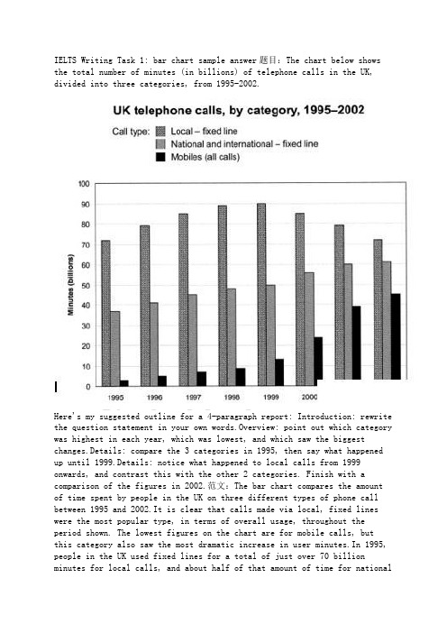
IELTS Writing Task 1: bar chart sample answer题目:The chart below shows the total number of minutes (in billions) of telephone calls in the UK, divided into three categories, from 1995-2002.Here's my suggested outline for a 4-paragraph report: Introduction: rewrite the question statement in your own words.Overview: point out which category was highest in each year, which was lowest, and which saw the biggest changes.Details: compare the 3 categories in 1995, then say what happened up until 1999.Details: notice what happened to local calls from 1999 onwards, and contrast this with the other 2 categories. Finish with a comparison of the figures in 2002.范文:The bar chart compares the amount of time spent by people in the UK on three different types of phone call between 1995 and 2002.It is clear that calls made via local, fixed lines were the most popular type, in terms of overall usage, throughout the period shown. The lowest figures on the chart are for mobile calls, butthis category also saw the most dramatic increase in user minutes.In 1995, people in the UK used fixed lines for a total of just over 70 billion minutes for local calls, and about half of that amount of time for nationalor international calls. By contrast, mobile phones were only used for around 4 billion minutes. Over the following four years, the figures forall three types of phone call increased steadily.By 1999, the amount of time spent on local calls using landlines had reached a peak at 90 billion minutes. Subsequently, the figure for this category fell, but the rise in the other two types of phone call continued. In 2002, the number of minutes of national / international landline calls passed 60 billion, while the figure for mobiles rose to around 45 billion minutes.(197 words, band9)IELTS Writing Task 1: 'living alone' charts题目:The bar chart below shows the proportions of English men and women of different ages who were living alone in 2011. The pie chart compares the numbers of bedrooms in these one-person households.Living alone in England by age and gender, 2011Number of bedrooms in one-person households (England, 2011)范文:The two charts give information about single-occupant households in England in the year 2011. The bar chart compares figures for occupants' age and gender, and the pie chart shows data about the number of bedrooms in thesehomes.Overall, females made up a higher proportion of people living alone than males, and this difference is particularly noticeable in the older age categories. We can also see that the most common number of bedrooms in a single-occupant home was two.A significant majority of the people aged 65 or over who were living alone in England in 2011 were female. Women made up around 72% of single occupants aged 75 to 84, and 76% of those aged 85 or over. By contrast, among younger adults the figures for males were higher.For example, in the 35-49 age category, men accounted for nearly 65% of people living alone.In the same year, 35.4% of one-person households in England had two bedrooms, while one-bedroom and three-bedroom homes accounted for 28% and 29.8% of the total. Under 7% of single-occupant homes had four or more bedrooms.(189 words, band 9)>>>>Tip<<<Notice that I was forced to leave out some of the information from the bar chart. This is normal when you only have 20 minutes; examiners expect you to select some key figures, not to try to include everything.。
雅思写作考官范文 Simon17篇
1701.02.03.04.05.06.07.08.09.10.11.12.13.14.15.16.17.1. Many people prefer to watch foreign films rather than locally produced films. Why could this be? Should governments give more financial support to local film industries?It is true that foreign films are more popular in many countries than domestically produced films. There could be several reasons why this is the case, and I believe that governments should promote local film-making by subsidising the industry.There are various reasons why many people find foreign films more enjoyable than thefilms produced in their own countries. Firstly, the established film industries in certain countries have huge budgets for action, special effects and to shoot scenes in spectacular locations. Hollywood blockbusters like ‘Avatar’ or the James Bond films are examples of such productions and the global appeal that they have. Another reason why these big-budget films are so successful is that they often star the most famous actors and actresses, and they are made by the most accomplished producers and directors. The poor quality, low-budget filmmaking in many countries suffers in comparison.In my view, governments should support local film industries financially. In every country, there may be talented amateur film-makers who just need to be given the opportunity to prove themselves. To compete with big-budget productions from overseas, these people need money to pay for film crews, actors and a host of other costs related to producing high-quality films. If governments did help with these costs, they would see an increase in employment in the film industry, income from film sales, and perhaps even a rise in tourist numbers. New Zealand, for example, has seen an increase in tourism related to the 'Lord of the Rings' films, which were partly funded by government subsidies.In conclusion, I believe that increased financial support could help to raise the quality of locally made films and allow them to compete with the foreign productions that currently dominate the market.(295 words, band 9)2. Foreign visitors should pay more than local visitors for cultural and historical attractions. To what extent do you agree or disagree with this opinion?It is sometimes argued that tourists from overseas should be charged more than local residents to visit important sites and monuments. I completely disagree with this idea. The argument in favour of higher prices for foreign tourists would be that cultural or historical attractions often depend on state subsidies to keep them going, which means that the resident population already pays money to these sites through the tax system. However, I believe this to be a very shortsighted view. Foreign tourists contribute to the economy of the host country with the money they spend on a wide range of goods and services, including food, souvenirs, accommodation and travel. The governments and inhabitants of every country should be happy to subsidise important tourist sites and encourage people from the rest of the world to visit them.If travellers realised that they would have to pay more to visit historical and cultural attractions in a particular nation, they would perhaps decide not to go to that country on holiday. To take the UK as an example, the tourism industry and many related jobs rely on visitors coming to the country to see places like Windsor Castle or Saint Paul’s Cathedral. These two sites charge the same price regardless of nationality, and this helps to promote the nation’s cultural heritage. If overseas tourists stopped coming due to higher prices, there would be a risk of insufficient funding for the maintenance of these important buildings.In conclusion, I believe that every effort should be made to attract tourists from overseas, and it would be counterproductive to make them pay more than local residents.(269 words, band 9)3. Nowadays animal experiments are widely used to develop new medicines and to test the safety of other products. Some people argue that these experiments should be banned because it is morally wrong to cause animals to suffer, while others are in favour of them because of their benefits to humanity.Discuss both views and give your own opinion.It is true that medicines and other products are routinely tested on animals before they are cleared for human use. While I tend towards the viewpoint that animal testing is morally wrong, I would have to support a limited amount of animal experimentation for the development of medicines.On the one hand, there are clear ethical arguments against animal experimentation. To use a common example of this practice, laboratory mice may be given an illness so that the effectiveness of a new drug can be measured. Opponents of such research argue that humans have no right to subject animals to this kind of trauma, and that the lives of all creatures should be respected. They believe that the benefits to humans do not justify the suffering caused, and that scientists should use alternative methods of research.On the other hand, reliable alternatives to animal experimentation may not always be available. Supporters of the use of animals in medical research believe that a certain amount of suffering on the part of mice or rats can be justified if human lives are saved. They argue that opponents of such research might feel differently if a member of their own families needed a medical treatment that had been developed through the use of animal experimentation. Personally, I agree with the banning of animal testing for non-medical products, but I feel that it may be a necessary evil where new drugs and medical procedures are concerned.In conclusion, it seems to me that it would be wrong to ban testing on animals for vital medical research until equally effective alternatives have been developed.(270 words, band 9)4. Some people think that all teenagers should be required to do unpaid work in their free time to help the local community. They believe this would benefit both the individual teenager and society as a whole.Do you agree or disagree?;Many young people work on a volunteer basis, and this can only be beneficial for both the individual and society as a whole. However, I do not agree that we should therefore force all teenagers to do unpaid work.Most young people are already under enough pressure with their studies, without being given the added responsibility of working in their spare time. School is just as demanding as a full-time job, and teachers expect their students to do homework and exam revision on top of attending lessons every day. When young people do have some free time, we should encourage them to enjoy it with their friends or to spend it doing sports and other leisure activities. They have many years of work ahead of them when they finish their studies.At the same time, I do not believe that society has anything to gain from obliging young people to do unpaid work. In fact, I would argue that it goes against the values of a free and fair society to force a group of people to do something against their will. Doing this can only lead to resentment amongst young people, who would feel that they were being used, and parents, who would not want to be told how to raise their children. Currently, nobody is forced to volunteer, and this is surely the best system.In conclusion, teenagers may choose to work for free and help others, but in my opinion we should not make this compulsory.(250 words, band 9)5. There are many different types of music in the world today. Why do we need music? Is the traditional music of a country more important than the international music that is heard everywhere nowadays?It is true that a rich variety of musical styles can be found around the world. Music is a vital part of all human cultures for a range of reasons, and I would argue that traditional music is more important than modern, international music.Music is something that accompanies all of us throughout our lives. As children, we are taught songs by our parents and teachers as a means of learning language, or simply as a form of enjoyment. Children delight in singing with others, and it would appear that the act of singing in a group creates a connection between participants, regardless of their age. Later in life, people’s musical preferences develop, and we come to see our favourite songs as part of our life stories. Music both expresses and arouses emotions in a way that words alone cannot. In short, it is difficult to imagine life without it.In my opinion, traditional music should be valued over the international music that has become so popular. International pop music is often catchy and fun, but it is essentially a commercial product that is marketed and sold by business people. Traditional music, by contrast, expresses the culture, customs and history of a country. Traditional styles, such as ...(example)..., connect us to the past and form part of our cultural identity. It would be a real pity if pop music became so predominant that these national styles disappeared.In conclusion, music is a necessary part of human existence, and I believe that traditional music should be given more importance than international music.(261 words, band 9)6. Some people regard video games as harmless fun, or even as a useful educational tool. Others, however, believe that videos games are having an adverse effect on the people who play them. In your opinion, do the drawbacks of video games outweigh the benefits?Many people, and children in particular, enjoy playing computer games. While I accept that these games can sometimes have a positive effect on the user, I believe that they are more likely to have a harmful impact.On the one hand, video games can be both entertaining and educational. Users, or gamers, are transported into virtual worlds which are often more exciting and engaging than real-life pastimes. From an educational perspective, these games encourage imagination and creativity, as well as concentration, logical thinking and problem solving, all of which are useful skills outside the gaming context. Furthermore, it has been shown that computer simulation games can improve users’ motor skills and help to prepare them for real-world tasks, such as flying a plane.However, I would argue that these benefits are outweighed by the drawbacks. Gaming can be highly addictive because users are constantly given scores, new targets and frequent rewards to keep them playing. Many children now spend hours each day trying to progress through the levels of a game or to get a higher score than their friends. This type of addiction can have effects ranging from lack of sleep to problems at school, when homework is sacrificed for a few more hours on the computer or console. The rise in obesity in recent years has also been linked in part to the sedentary lifestyle and lack of exercise that often accompany gaming addiction.In conclusion, it seems to me that the potential dangers of video games are moresignificant than the possible benefits.(258 words, band 9)7. In the developed world, average life expectancy is increasing. What problems will this cause for individuals and society? Suggest some measures that could be taken to reduce the impact of ageing populations.It is true that people in industrialised nations can expect to live longer than ever before. Although there will undoubtedly be some negative consequences of this trend, societies can take steps to mitigate these potential problems.As people live longer and the populations of developed countries grow older, several related problems can be anticipated. The main issue is that there will obviously be more people of retirement age who will be eligible to receive a pension. The proportion of younger, working adults will be smaller, and governments will therefore receive less money in taxes in relation to the size of the population. In other words, an ageing population will mean a greater tax burden for working adults. Further pressures will include a rise in the demand for healthcare, and the fact young adults will increasingly have to look after their elderly relatives.There are several actions that governments could take to solve the problems described above. Firstly, a simple solution would be to increase the retirement age for working adults, perhaps from 65 to 70. Nowadays, people of this age tend to be healthy enough to continue a productive working life. A second measure would be for governments to encourage immigration in order to increase the number of working adults who pay taxes. Finally, money from national budgets will need to be taken from other areas and spent on vital healthcare, accommodation and transport facilities for the rising numbers of older citizens.In conclusion, various measures can be taken to tackle the problems that are certain to arise as the populations of countries grow older.(265 words, band 9)8. We cannot help everyone in the world that needs help, so we should only be concerned with our own communities and countries.To what extent do you agree or disagree with this statement?;Some people believe that we should not help people in other countries as long as there are problems in our own society. I disagree with this view because I believe that we should try to help as many people as possible.On the one hand, I accept that it is important to help our neighbours and fellow citizens. In most communities there are people who are impoverished or disadvantaged in some way. It is possible to find homeless people, for example, in even the wealthiest of cities, and for those who are concerned about this problem, there are usually opportunities to volunteer time or give money to support these people. In the UK, people can help in a variety of ways, from donating clothing to serving free food in a soup kitchen. As the problems are on our doorstep, and there are obvious ways to help, I can understand why some people feel that we should prioritise local charity.At the same time, I believe that we have an obligation to help those who live beyond our national borders. In some countries the problems that people face are much more serious than those in our own communities, and it is often even easier to help. For example, when children are dying from curable diseases in African countries, governments and individuals in richer countries can save lives simply by paying for vaccines that already exist. A small donation to an international charity might have a much greater impact than helping in our local area.In conclusion, it is true that we cannot help everyone, but in my opinion national boundaries should not stop us from helping those who are in need.(280 words, band 9)9. Universities should accept equal numbers of male and female students in every subject. To what extent do you agree or disagree?In my opinion, men and women should have the same educational opportunities. However, I do not agree with the idea of accepting equal proportions of each gender in every university subject.Having the same number of men and women on all degree courses is simply unrealistic. Student numbers on any course depend on the applications that the institution receives. If a university decided to fill courses with equal numbers of males and females, it would need enough applicants of each gender. In reality, many courses are more popular with one gender than the other, and it would not be practical to aim for equal proportions. For example, nursing courses tend to attract more female applicants, and it would be difficult to fill these courses if fifty per cent of the places needed to go to males.Apart from the practical concerns expressed above, I also believe that it would be unfair to base admission to university courses on gender. Universities should continue to select the best candidates for each course according to their qualifications. In this way, both men and women have the same opportunities, and applicants know that they will be successful if they work hard to achieve good grades at school. If a female student is the best candidate for a place on a course, it is surely wrong to reject her in favour of a male student with lower grades or fewer qualifications.In conclusion, the selection of university students should be based on merit, and it would be both impractical and unfair to change to a selection procedure based on gender.(265 words, band 9)10. Some people think that museums should be enjoyable places to entertain people, while others believe that the purpose of museums is to educate.Discuss both views and give you own opinion.People have different views about the role and function of museums. In my opinion, museums can and should be both entertaining and educational.On the one hand, it can be argued that the main role of a museum is to entertain. Museums are tourist attractions, and their aim is to exhibit a collection of interesting objects that many people will want to see. The average visitor may become bored if he or she has to read or listen to too much educational content, so museums often put more of an emphasis on enjoyment rather than learning. This type of museum is designed to be visually spectacular, and may have interactive activities or even games as part of its exhibitions.On the other hand, some people argue that museums should focus on education. The aim of any exhibition should be to teach visitors something that they did not previously know. Usually this means that the history behind the museum’s exhibits needs to be explained, and this can be done in various ways. Some museums employ professional guides to talk to their visitors, while other museums offer headsets so that visitors can listen to detailed commentary about the exhibition. In this way, museums can play an important role in teaching people about history, culture, science and many other aspects of life.In conclusion, it seems to me that a good museum should be able to offer an interesting, enjoyable and educational experience so that people can have fun and learn something at the same time.(253 words, band 911. Some people believe that studying at university or college is the best route to a successful career, while others believe that it is better to get a job straight after school. Discuss both views and give your opinion.When they finish school, teenagers face the dilemma of whether to get a job or continue their education. While there are some benefits to getting a job straight after school, I would argue that it is better to go to college or university.The option to start work straight after school is attractive for several reasons. Many young people want to start earning money as soon as possible. In this way, they can become independent, and they will be able to afford their own house or start a family. In terms of their career, young people who decide to find work, rather than continue their studies, may progress more quickly. They will have the chance to gain real experience and learn practical skills related to their chosen profession. This may lead to promotions and a successful career.On the other hand, I believe that it is more beneficial for students to continue their studies. Firstly, academic qualifications are required in many professions. For example, it is impossible to become a doctor, teacher or lawyer without having the relevant degree. As a result, university graduates have access to more and better job opportunities, and they tend to earn higher salaries than those with fewer qualifications. Secondly, the job market is becoming increasingly competitive, and sometimes there are hundreds of applicants for one position in a company. Young people who do not have qualifications from a university or college will not be able to compete.For the reasons mentioned above, it seems to me that students are more likely to be successful in their careers if they continue their studies beyond school level.(271 words, band 9)12. Happiness is considered very important in life. Why is it difficult to define? What factors are important in achieving happiness?It is no doubt true that the majority of people would like to be happy in their lives. While the personal nature of happiness makes it difficult to describe, there do seem to be some common needs that we all share with regard to experiencing or achieving happiness. Happiness is difficult to define because it means something different to each individual person. Nobody can fully understand or experience another person’s feelings, and we all have our own particular passions from which we take pleasure. Some people, for example, derive a sense of sat isfaction from earning money or achieving success, whereas for others, health and family are much more important. At the same time, a range of other feelings, from excitement to peacefulness, may be associated with the idea of happiness, and the same person may therefore feel happy in a variety of different ways.Although it seems almost impossible to give a precise definition of happiness, most people would agree that there are some basic preconditions to achieving it. Firstly, it is hard for a person to be happy if he or she does not have a safe place to live and enough food to eat. Our basic survival needs must surely be met before we can lead a pleasant life. Secondly, the greatest joy in life is usually found in shared experiences with family and friends, and it is rare to find a person who is content to live in complete isolation. Other key factors could be individual freedom and a sense of purpose in life.In conclusion, happiness is difficult to define because it is particular to each individual, but I believe that our basic needs for shelter, food and company need to be fulfilled before we can experience it.(292 words, band 9)13. Wild animals have no place in the 21st century, so protecting them is a waste of resources. To what extent do you agree or disagree?Some people argue that it is pointless to spend money on the protection of wild animals because we humans have no need for them. I completely disagree with this point of view. In my opinion, it is absurd to argue that wild animals have no place in the 21st century. I do not believe that planet Earth exists only for the benefit of humans, and there is nothing special about this particular century that means that we suddenly have the right to allow or encourage the extinction of any species. Furthermore, there is no compelling reason why we should let animals die out. We do not need to exploit or destroy every last square metre of land in order to feed or accommodate the world’s population. There is plenty of room for us to exist side by side with wild animals, and this should be our aim.I also disagree with the idea that protecting animals is a waste of resources. It is usually the protection of natural habitats that ensures the survival of wild animals, and most scientists agree that these habitats are also crucial for human survival. For example, rainforests produce oxygen, absorb carbon dioxide and stabilise the Earth’s climate. If we destroyed these areas, the costs of managing the resulting changes to our planet would far outweigh the costs of conservation. By protecting wild animals and their habitats, we maintain the natural balance of all life on Earth.In conclusion, we have no right to decide whether or not wild animals should exist, and I believe that we should do everything we can to protect them.(269 words, band 9)14. As well as making money, businesses also have social responsibilities. To what extent do you agree or disagree?Businesses have always sought to make a profit, but it is becoming increasingly common to hear people talk about the social obligations that companies have. I completely agree with the idea that businesses should do more for society than simply make money.On the one hand, I accept that businesses must make money in order to survive in a competitive world. It seems logical that the priority of any company should be to cover its running costs, such as employees’ wages and payments for buildings and utilities. On top of these costs, companies also need to invest in improvements and innovations if they wish to remain successful. If a company is unable to pay its bills or meet the changing needs of customers, any concerns about social responsibilities become irrelevant. In other words, a company can only make a positive contribution to society if it is in good financial health.On the other hand, companies should not be run with the sole aim of maximising profit; they have a wider role to play in society. One social obligation that owners and managers have is to treat their employees well, rather than exploiting them. For example, they could pay a “living wage” to ensure that workers have a good quality of life. I also like the idea that businesses could use a proportion of their profits to support local charities, environmental projects or education initiatives. Finally, instead of trying to minimise their tax payments by using accounting loopholes, I believe that company bosses should be happy to contribute to society through the tax system.In conclusion, I believe that companies should place as much importance on their social responsibilities as they do on their financial objectives.(285 words, band 9)15. In some countries, many more people are choosing to live alone nowadays than in the past. Do you think this is a positive or negative development?In recent years it has become far more normal for people to live alone, particularly in large cities in the developed world. In my opinion, this trend could have both positive and negative consequences in equal measure.The rise in one-person households can be seen as positive for both personal and broader economic reasons. On an individual level, people who choose to live alone may become more independent and self-reliant than those who live with family members. A young adult who lives alone, for example, will need to learn to cook, clean, pay bills and manage his or her budget, all of which are valuable life skills; an increase in the number of such individuals can certainly be seen as a positive development. From an economic perspective, the trend towards living alone will result in greater demand for housing. This is likely to benefit the construction industry, estate agents and a whole host of other companies that rely on homeowners to buy their products or services.However, the personal and economic arguments given above can be considered from the opposite angle. Firstly, rather than the positive feeling of increased independence, people who live alone may experience feelings of loneliness, isolation and worry. They miss out on the emotional support and daily conver sat ion that family or flatmates can provide, and they must bear the weight of all household bills and responsibilities; in this sense, perhaps the trend towards living alone is a negative one. Secondly, from the financial point of view, a rise in demand for housing is likely to push up property prices and rents. While this may benefit some businesses, the general population, including those who live alone, will be faced with rising living costs.In conclusion, the increase in one-person households will have both beneficial and detrimental effects on individuals and on the economy.(band 9)16. Some people think that all university students should study whatever they like. Others believe that they should only be allowed to study subjects that will be useful in the future, such as those related to science and technology. Discuss both these views and give your own opinion.People have different views about how much choice students should have with regard to what they can study at university. While some argue that it would be better for students to be forced into certain key subject areas, I believe that everyone should be able to study the course of their choice.There are various reasons why people believe that universities should only offer subjects that will be useful in the future. They may assert that university courses like medicine, engineering and information technology are more likely to be beneficial than certain art degrees. From a personal perspective, it can be argued that these courses provide more job opportunities, career progression, better salaries, and therefore an improved quality of life for students who take them. On the societal level, by forcing people to choose particular university subjects, governments can ensure that any knowledge and skill gaps in the economy are covered. Finally, a focus on technology in higher education could lead to new inventions, economic growth, and greater future prosperity.In spite of these arguments, I believe that university students should be free to choose their preferred areas of study. In my opinion, society will benefit more if our students are passionate about what they are learning. Besides, nobody can really predict which areas of knowledge will be most useful to society in the future, and it may be that employers begin to value creative thinking skills above practical or technical skills. If this were the case, perhaps we would need more students of art, history and philosophy than of science or technology.In conclusion, although it might seem sensible for universities to focus only on the most useful subjects, I personally prefer the current system in which people have the right to study whatever they like.(297 words, band 9)。
Simon考官A类雅思写作小作文范文-汇总

A类雅思写作小作文共计41篇,篇篇9分,完整覆盖了雅思a类小作文的pie,bar,line,table, diagram, map, combination7大题型,范文皆雅思前考官英国曼城人simon的手笔,此人行文风格推崇简洁明快,适合烤鸭研读模仿。
他的雅思小作文几乎都是4段式,字数一般在160左右。
一、柱状图(10)_________________________________________ 31. 柱状图:年龄分布 ___________________________________ 32. 柱状图:电子游戏 ___________________________________ 43. 柱状图:奥运奖牌 ___________________________________ 54. 柱状图:学习动机 ___________________________________ 55. 柱状图:交通事故 ___________________________________ 76. 柱状图:各地房价 ___________________________________ 77. 柱状图:日常消费 ___________________________________ 99. 柱状图:网聊耗时 __________________________________ 1110. 柱状图:电话耗时 _________________________________ 12二、饼图(4)___________________________________________ 131. 饼图-垃圾处理 _____________________________________ 132. 饼图:三地用水 ____________________________________ 153. 饼图:服务问卷 ____________________________________ 154. 饼图:游客分析 ____________________________________ 16三、流程图(8)_________________________________________ 171. 流程图:房屋保护 __________________________________ 172. 流程图:太阳能发电 ________________________________ 185. 流程图:房屋设计 __________________________________ 216. 流程图:水循环 ____________________________________ 237. 流程图:天气预报 __________________________________ 238. 流程图:三文鱼一生 ________________________________ 25四、表格(7)___________________________________________ 261. 表格:垃圾制造 ____________________________________ 262. 表格:骑车上班 ____________________________________ 273. 表格:消费开支 ____________________________________ 274. 表格:贫困家庭 ____________________________________ 285. 表格:地下铁 ______________________________________ 296. 表格:手机用途 ____________________________________ 30五、地图(3)___________________________________________ 331. 地图:村庄变迁 ____________________________________ 332. 地图:超市变迁 ____________________________________ 343. 地图:学校变迁 ____________________________________ 35六、线图(5)___________________________________________ 361. 线图:手机变迁 ____________________________________ 362. 线图:老龄人口 ____________________________________ 373. 线图:价格变动 ____________________________________ 384. 线图:企业垃圾 ____________________________________ 395. 线图:网络人口 ____________________________________ 40七、混合图(5)_________________________________________ 411. 混合图:温度与降水 ________________________________ 412. 混合图:英国移民 __________________________________ 423. 混合图:水消耗 ____________________________________ 434. 混合图:运动开支 __________________________________ 445. 混合图:独居人口 __________________________________ 45一、柱状图(10)1. 柱状图:年龄分布The charts below compare the age structure of the populations of France and India in 1984.The two charts compare the populations of France and India in terms of age distribution by gender in the year 1984.It is clear that the population of India was younger than that of France in 1984, with a noticeably larger proportion of people aged under 20. France, on the other hand, had a significantly larger percentage of elderly inhabitants.In India, close to 14% of people were aged 5 or under, and each five-year age bracket above this contained an increasingly smaller proportion of the population. France’s population, by contrast, was more evenly distributed across the age ranges, with similar figures (around 7% to 8% of all people) for each five-year cohort between the ages of 0 and 40. Somewhere between 10% and 15% of all French people were aged 70 or older, but the equivalent figure for India was only 2%.Looking more closely at gender, there was a noticeably higher proportion of French women than men in every cohort from age 50 upwards. For example, almost 3% of French 70- to 75-year-olds were women, while just under 2% were men. No significant gender differences can be seen on the Indian population chart.(199 words, band 9)2. 柱状图:电子游戏The bar graph shows the global sales (in billions of dollars) of different types of digital games between 2000 and 2006.The bar chart compares the turnover in dollars from sales of video games for four different platforms, namely mobile phones, online, consoles and handheld devices, from 2000 to 2006.It is clear that sales of games for three out of the four platforms rose each year, leading to a significant rise in total global turnover over the 7-year period. Sales figures for handheld games were at least twice as high as those for any other platform in almost every year.In 2000, worldwide sales of handheld games stood at around $11 billion, while console games earned just under $6 billion. No figures are given for mobile or online games in that year. Over the next 3 years, sales of handheld video games rose by about $4 billion, but the figure for consoles decreased by $2 billion. Mobile phone and online games started to become popular, with sales reaching around $3 billion in 2003.In 2006, sales of handheld, online and mobile games reached peaks of 17, 9 and 7 billion dollars respectively. By contrast, turnover from console games dropped to its lowest point, at around $2.5 billion.(187)3. 柱状图:奥运奖牌The chart below shows the total number of Olympic medals won by twelve different countries.范文:The bar chart compares twelve countries in terms of the overall number of medals that they have won at the Olympic Games.It is clear that the USA is by far the most successful Olympic medal winning nation. It is also noticeable that the figures for gold, silver and bronze medals won by any particular country tend to be fairly similar.The USA has won a total of around 2,300 Olympic medals, including approximately 900 gold medals, 750 silver and 650 bronze. In second place on the all-time medals chart is the Soviet Union, with just over 1,000 medals. Again, the number of gold medals won by this country is slightly higher than the number of silver or bronze medals.Only four other countries - the UK, France, Germany and Italy - have won more than 500 Olympic medals, all with similar proportions of each medal colour. Apart from the USA and the Soviet Union, China is the only other country with a noticeably higher proportion of gold medals (about 200) compared to silver and bronze (about 100 each).(178 words, band 9)4. 柱状图:学习动机The charts below show the main reasons for study among students of different groups and the amount of support they received from employers.参考范文The bar charts compare students of different ages in terms of why they are studying and whether they are supported by an employer.It is clear that the proportion of students who study for career purposes is far higher among the younger age groups, while the oldest students are more likely to study for interest. Employer support is more commonly given to younger students.Around 80% of students aged under 26 study to further their careers, whereas only 10% study purely out of interest. The gap between these two proportions narrows as students get older, and the figures for those in their forties are the same, at about 40%. Students aged over 49 overwhelmingly study for interest (70%) rather than for professional reasons (less than 20%).Just over 60% of students aged under 26 are supported by their employers. By contrast, the 30-39 age group is the most self-sufficient, with only 30% being given time off and help with fees. The figures rise slightly for students in their forties and for those aged 50 or more.(178 words, band 9)5. 柱状图:交通事故The chart below shows numbers of incidents and injuries per 100 million passenger miles travelled (PMT) by transportation type in 2002.范文The bar chart compares the number of incidents and injuries for every 100 million passenger miles travelled on five different types of public transport in 2002.It is clear that the most incidents and injuries took place on demand-response vehicles. By contrast, commuter rail services recorded by far the lowest figures.A total of 225 incidents and 173 injuries, per 100 million passenger miles travelled, took place on demand-response transport services. These figures were nearly three times as high as those for the second highest category, bus services. There were 76 incidents and 66 people were injured on buses.Rail services experienced fewer problems. The number of incidents on light rail trains equalled the figure recorded for buses, but there were significantly fewer injuries, at only 39. Heavy rail services saw lower numbers of such events than light rail services, but commuter rail passengers were even less likely to experience problems. In fact, only 20 incidents and 17 injuries occurred on commuter trains.(165 words, band 9)6. 柱状图:各地房价The chart below shows information about changes in average house prices in five different cities between 1990 and 2002 compared with the average house prices in 1989.范文:The bar chart compares the cost of an average house in five major cities over a period of 13 years from 1989.We can see that house prices fell overall between 1990 and 1995, but most of the cities saw rising prices between 1996 and 2002. London experienced by far the greatest changes in house prices over the 13-year period.Over the 5 years after 1989, the cost of average homes in Tokyo and London dropped by around 7%, while New York house prices went down by 5%. By contrast, prices rose by approximately 2% in both Madrid and Frankfurt.Between 1996 and 2002, London house prices jumped to around 12% above the 1989 average. Homebuyers in New York also had to pay significantly more, with prices rising to 5% above the 1989 average, but homes in Tokyo remained cheaper than they were in 1989. The cost of an average home in Madrid rose by a further 2%, while prices in Frankfurt remainedstable.(165 words)7. 柱状图:日常消费The bar chart below shows money spent on consumer goods in different countries.范文:The bar chart compares consumer spending on six different items in Germany, Italy, France and Britain.It is clear that British people spent significantly more money than people in the other three countries on all six goods. Of the six items, consumers spent the most money on photographic film.People in Britain spent just over £170,000 on photographic film, which is the highest figureshown on the chart. By contrast, Germans were the lowest overall spenders, with roughly the same figures (just under £150,000) for each of the six products.The figures for spending on toys were the same in both France and Italy, at nearly £160,000. However, while French people spent more than Italians on photographic film and CDs, Italians paid out more for personal stereos, tennis racquets and perfumes. The amount spent by French people on tennis racquets, around £145,000, is the lowest figure shown on the chart.(150)8. 柱状图:教育水平The charts below show the levels of participation in education and science in developing and industrialised countries in 1980 and 1990.The three bar charts show average years of schooling, numbers of scientists and technicians, and research and development spending in developing and developed countries. Figures are given for 1980 and 1990.It is clear from the charts that the figures for developed countries are much higher than those for developing nations. Also, the charts show an overall increase in participation in education and science from 1980 to 1990.People in developing nations attended school for an average of around 3 years, with only a slight increase in years of schooling from 1980 to 1990. On the other hand, the figure for industrialised countries rose from nearly 9 years of schooling in 1980 to nearly 11 years in 1990.From 1980 to 1990, the number of scientists and technicians in industrialised countries almost doubled to about 70 per 1000 people. Spending on research and development also saw rapid growth in these countries, reaching $350 billion in 1990. By contrast, the number of science workers in developing countries remained below 20 per 1000 people, and research spending fell from about $50 billion to only $25 billion.(184 words)9. 柱状图:网聊耗时The chart below shows the amount of time that 10 to 15-year-olds spend chatting on the Internet and playing on games consoles on an average school day in the UK.IntroductionThe bar chart compares the time spent by 10 to 15-year-olds in the UK on two activities, namely chatting online and playing computer games.OverviewOverall, we can see that playing computer games is marginally more popular than chatting on the Internet. However, completely different trends can be seen if we look at the specific figures for boys and girls.Boys aged between 10 and 15 clearly favour playing on games consoles over chatting online. According to the chart, while 85% of boys play computer games every day, only 55% chat online daily. Furthermore, the majority of boys play on their consoles for more than one hour each day, and 10% do this activity for four hours or more.By contrast, girls prefer chatting online. Close to 70% of 10 to 15-year-old girls engage in online conversation each day, compared to about 50% of this cohort who play computer games. Of the girls who do play on consoles, most of them play for less than an hour, whereas most girls who chat online do so for more than one hour, and nearly 10% chat for four hours or more.(188)10. 柱状图:电话耗时The chart below shows the total number of minutes (in billions) of telephone calls in the UK, divided into three categories, from 1995-2002.提纲:Introduction: rewrite the question statement in your own words.Overview: point out which category was highest in each year, which was lowest, and which saw the biggest changes.Details: compare the 3 categories in 1995, then say what happened up until 1999.Details: notice what happened to local calls from 1999 onwards, and contrast this with the other 2 categories. Finish with a comparison of the figures in 2002.范文:The bar chart compares the amount of time spent by people in the UK on three different types of phone call between 1995 and 2002.It is clear that calls made via local, fixed lines were the most popular type, in terms of overall usage, throughout the period shown. The lowest figures on the chart are for mobile calls, but this category also saw the most dramatic increase in user minutes.In 1995, people in the UK used fixed lines for a total of just over 70 billion minutes for local calls, and about half of that amount of time for national or international calls. By contrast, mobile phones were only used for around 4 billion minutes. Over the following four years, the figures for all three types of phone call increased steadily.By 1999, the amount of time spent on local calls using landlines had reached a peak at 90 billion minutes. Subsequently, the figure for this category fell, but the rise in the other two types of phone call continued. In 2002, the number of minutes of national / international landline calls passed 60 billion, while the figure for mobiles rose to around 45 billion minutes.(197 words, band 9)二、饼图(4)1. 饼图-垃圾处理The pie charts below show how dangerous waste products are dealt with in three countries.范文:The charts compare Korea, Sweden and the UK in terms of the methods used in each country to dispose of harmful waste.It is clear that in both the UK and Sweden, the majority of dangerous waste products are buried underground. By contrast, most hazardous materials in the Republic of Korea are recycled.Looking at the information in more detail, we can see that 82% of the UK’s dangerous waste is put into landfill sites. This disposal technique is used for 55% of the harmful waste in Sweden and only 22% of similar waste in Korea. The latter country recycles 69% of hazardous materials, which is far more than the other two nations.While 25% of Sweden's dangerous waste is recycled, the UK does not recycle at all. Instead, it dumps waste at sea or treats it chemically. These two methods are not employed in Korea or Sweden, which favour incineration for 9% and 20% of dangerous waste respectively.(159)2. 饼图:三地用水The pie charts below compare water usage in San Diego, California and the rest of the world.范文The pie charts give information about the water used for residential, industrial and agricultural purposes in San Diego County, California, and the world as a whole.It is noticeable that more water is consumed by homes than by industry or agriculture in the two American regions. By contrast, agriculture accounts for the vast majority of water used worldwide.In San Diego County and California State, residential water consumption accounts for 60% and 39% of total water usage. By contrast, a mere 8% of the water used globally goes to homes. The opposite trend can be seen when we look at water consumption for agriculture. This accounts for a massive 69% of global water use, but only 17% and 28% of water usage in San Diego and California respectively.Such dramatic differences are not seen when we compare the figures for industrial water use. The same proportion of water (23%) is used by industry in San Diego and worldwide, while the figure for California is 10% higher, at 33%.(168 words, band 9)3. 饼图:服务问卷The charts below show the results of a questionnaire that asked visitors to the Parkway Hotel how they rated the hotel's customer service. The same questionnaire was given to 100 guests in the years 2005 and 2010.范文The pie charts compare visitors’ responses to a survey about customer service at the Parkway Hotel in 2005 and in 2010.It is clear that overall customer satisfaction increased considerably from 2005 to 2010. While most hotel guests rated customer service as satisfactory or poor in 2005, a clear majority described the hotel’s service as good or excellent in 2010.Looking at the positive responses first, in 2005 only 5% of the hotel’s visitors rated its customer service as excellent, but this figure rose to 28% in 2010. Furthermore, while only 14% of guests described customer service in the hotel as good in 2005, almost three times as many people gave this rating five years later.With regard to negative feedback, the proportion of guests who considered the hotel’s customer service to be poor fell from 21% in 2005 to only 12% in 2010. Similarly, the proportion of people who thought customer service was very poor dropped from 15% to only 4% over the 5-year period. Finally, a fall in the number of ‘satisfactory’ ratings in 2010 reflects the fact that more people gave positive responses to the survey in that year.(193 words, band 9)4. 饼图:游客分析The chart below shows the results of a survey of people who visited four types of tourist attraction in Britain in the year 1999.范文The pie chart compares figures for visitors to four categories of tourist attraction and to five different theme parks in Britain in 1999.It is clear that theme parks and museums / galleries were the two most popular types of tourist attraction in that year. Blackpool Pleasure Beach received by far the highest proportion of visitors in the theme park sector.Looking at the information in more detail, we can see that 38% of the surveyed visitors went to a theme park, and 37% of them went to a museum or gallery. By contrast, historic houses and monuments were visited by only 16% of the sample, while wildlife parks and zoos were the least popular of the four types of tourist attraction, with only 9% of visitors.In the theme park sector, almost half of the people surveyed (47%) had been to Blackpool Pleasure Beach. Alton Towers was the second most popular amusement park, with 17% of the sample, followed by Pleasureland in Southport, with 16%. Finally, Chessington World of Adventures and Legoland Windsor had each welcomed 10% of the surveyed visitors.(181 words, band 9)三、流程图(8)1. 流程图:房屋保护The diagrams below show how houses can be protected in areas which are prone to flooding.范文The diagrams compare two different methods of defence for homes which are at risk of being flooded.The key difference between the diagrams is that they show flood protection with and without a stopbank. In either case, the at-risk home is raised on stilts above ground level.The first diagram shows how a stopbank acts as a flood barrier to stop river water from flooding homes. The stopbank is a small mound of land next to the river that is higher than the 100-year flood level, and prevents the river from bursting its banks. Nearby houses can be built on stilts to prevent flooding from rainwater, and a floodgate beneath the stopbank can be opened to allow this ‘ponding’ to drain off into the river.When there is no stopbank, as shown in the second diagram, there will be nothing to stop the river from flooding. In this case, the solution is to put buildings on stilts. The height of the stilts is measured so that the floor of the house is 300mm above the 100-year flood level. This measurement is called the ‘freeboard’.(184)2. 流程图:太阳能发电The diagram below shows how solar panels can be used to provide electricity for domestic use.范文The picture illustrates the process of producing electricity in a home using solar panels.It is clear that there are five distinct stages in this process, beginning with the capture of energy from sunlight. The final two steps show how domestic electricity is connected to the external power supply.At the first stage in the process, solar panels on the roof of a normal house take energy from the sun and convert it into DC current. Next, this current is passed to an inverter, which changes it to AC current and regulates the supply of electricity. At stage three, electricity is supplied to the home from an electrical panel.At the fourth step shown on the diagram, a utility meter in the home is responsible for sending any extra electric power outside the house into the grid. Finally, if the solar panels do not provide enough energy for the household, electricity will flow from the utility grid into the home through the meter.(163)3. 流程图:废纸回收9. The chart below shows the process of waste paper recycling.The flow chart shows how waste paper is recycled. It is clear that there are six distinct stages in this process, from the initial collection of waste paper to the eventual production of usable paper.At the first stage in the paper recycling process, waste paper is collected either from paper banks, where members of the public leave their used paper, or directly from businesses. This paper is then sorted by hand and separated according to its grade, with any paper that is not suitable for recycling being removed. Next, the graded paper is transported to a paper mill.Stages four and five of the process both involve cleaning. The paper is cleaned and pulped, and foreign objects such as staples are taken out. Following this, all remnants of ink and glue are removed from the paper at the de-inking stage. Finally, the pulp can be processed in a paper making machine, which makes the end product: usable paper.(160 words, band 9)4. 流程图:蜜蜂一生The diagram shows the life cycle of the honey bee. Two things to consider are:范文The diagram illustrates the various stages in the life of a honey bee. We can see that the complete life cycle lasts between 34 and 36 days. It is also noticeable that there are five main stages in the development of the honey bee, from egg to mature adult insect.The life cycle of the honey bee begins when the female adult lays an egg; the female typically lays one or two eggs every 3 days. Between 9 and 10 days later, each egg hatches and the immature insect, or nymph, appears.During the third stage of the life cycle, the nymph grows in size and sheds its skin three times. This moulting first takes place 5 days after the egg hatches, then 7 days later, and again another 9 days later. After a total of 30 to 31 days from the start of the cycle, the young adult honey bee emerges from its final moulting stage, and in the space of only 4 days it reaches full maturity.(169 words, band 9)5. 流程图:房屋设计The diagrams below show some principles of house design for cool and for warm climates.范文:The diagrams show how house designs differ according to climate.The most noticeable difference between houses designed for cool and warm climates is in the shape of the roof. The designs also differ with regard to the windows and the use of insulation.We can see that the cool climate house has a high-angled roof, which allows sunlight to enter through the window. By contrast, the roof of the warm climate house has a peak in the middle and roof overhangs to shade the windows. Insulation and thermal building materials are used in cool climates to reduce heat loss, whereas insulation and reflective materials are used to keep the heat out in warm climates.Finally, the cool climate house has one window which faces the direction of the sun, while the warm climate house has windows on two sides which are shaded from the sun. By opening the two windows at night, the house designed for warm climates can be ventilated.(162 words, band 9)6. 流程图:水循环The diagram below shows the water cycle, which is the continuous movement of water on, above and below the surface of the Earth.范文The picture illustrates the way in which water passes from ocean to air to land during the natural process known as the water cycle.Three main stages are shown on the diagram. Ocean water evaporates, falls as rain, and eventually runs back into the oceans again.Beginning at the evaporation stage, we can see that 80% of water vapour in the air comes from the oceans. Heat from the sun causes water to evaporate, and water vapour condenses to form clouds. At the second stage, labelled ‘precipitation’ on the diagram, water falls as rain or snow.At the third stage in the cycle, rainwater may take various paths. Some of it may fall into lakes or return to the oceans via ‘surface runoff’. Otherwise, rainwater may filter through the ground, reaching the impervious layer of the earth. Salt water intrusion is shown to take place just before groundwater passes into the oceans to complete the cycle.(156 words, band 9)7. 流程图:天气预报The diagram shows the process of weather forecast by Australian Bureau of Meteorology范文The figure illustrates the process used by the Australian Bureau of Meteorology to forecast the weather.There are four stages in the process, beginning with the collection of information about the weather. This information is then analysed, prepared for presentation, and finally broadcast to the public.Looking at the first and second stages of the process, there are three ways of collecting weather data and three ways of analysing it. Firstly, incoming information can be received by satellite and presented for analysis as a satellite photo. The same data can also be passed to a radar station and presented on a radar screen or synoptic chart. Secondly, incoming information may be collected directly by radar and analysed on a radar screen or synoptic chart. Finally, drifting buoys also receive data which can be shown on a synoptic chart.At the third stage of the process, the weather broadcast is prepared on computers. Finally, itis delivered to the public on television, on the radio, or as a recorded telephone announcement.(170)8. 流程图:三文鱼一生The diagram below shows the life cycle of a salmon, from egg to adult fish.范文The diagram illustrates the stages in the life of the salmon, from birth to maturity.It is clear that there are six* main stages as the salmon develops from egg to mature adult. We can also see that salmon spend time in three distinct locations during the cycle, moving from river to estuary to ocean and then back upstream.Salmon begin their lives in rivers where the adult fish lay and incubate their eggs. After emerging from eggs, the young salmon spend the next stage of their lives being reared in freshwater areas. Then, at some point in their development, the fish swim downstream to river estuaries where rearing continues.。
剑桥雅思考官范文

剑桥雅思考官范文Well, let me tell you about this amazing trip I had. It was to Thailand, you know, that place full of all kinds of wonders.I landed in Bangkok first. Oh my god, the moment I stepped out of the airport, it was like being hit by a wave of heat and chaos, but in a really exciting way. The traffic was just crazy. There were tuk tuks zoomingaround everywhere. They look like these little three wheeled buggies, and the drivers are always trying to get you to take a ride with them. I hopped on one and it was like being on a rollercoaster, zipping in and out of the traffic.The food in Thailand is out of this world. I mean, I'm a big foodie and this place was like a paradise for me. There were street stalls everywhere selling things like pad thai. It's this delicious noodle dish with peanuts and lime and all sorts of goodness. And the mango sticky rice, that waslike a little slice of heaven. The mango was so ripe and sweet, and the sticky rice was just the perfect complement.Then I went to the beaches in Phuket. The water was so clear, like a giant blue mirror. I could see all the colorful fish swimming around justby looking down from my boat. I tried snorkeling for the first time. At first, I was a bit scared, you know, thinking about all those fish and what if something bites me. But once I put my face in the water, it was like entering a whole new world. There were these beautiful coral reefs, all shapes and colors, and the fish were just swimming around me like theydidn't care I was there. It was an incredible feeling.The people in Thailand are also super friendly. They always have asmile on their face. Even when there was a bit of a language barrier, wecould still communicate with gestures and a few broken English words. I remember asking a local where the nearest temple was, and he not only told me but actually walked me part of the way there.All in all, it was a trip that I'll never forget. It had a bit of everything adventure, great food, beautiful scenery and lovely people. Ican't wait to go back there again someday.I'm going to talk about my grandpa. He's one of the most interesting people I've ever known.My grandpa looks like a character out of an old fashioned movie. He's got this big, bushy white mustache that he twirls around when he's thinking. His eyes are always twinkling with mischief or kindness, depending on the situation. He's not a very tall man, but he has this big presence, you know.He's a real jack of all trades. He can fix just about anything around the house. I remember when our old clock stopped working. Everyone was thinking we should just buy a new one, but not grandpa. He got his toolbox out, which is this big, rusty box full of all kinds of strange looking tools. He spent the whole afternoon tinkering with the clock, and by theend of the day, it was ticking away as good as new.Grandpa also has a great sense of humor. He loves to tell jokes, especially those old fashioned ones that make you groan and laugh at the same time. For example, he'll say, “Why don't scientists trust atoms? Because they make up everything.” And then he'll laugh this big bellylaugh that's really contagious.He's also really into gardening. His garden is like a little piece of paradise. There are all kinds of flowers and vegetables growing there. In the spring, it's full of colorful tulips and daffodils. And in the summer,he has these huge tomatoes and cucumbers. He spends hours out there, watering the plants, talking to them as if they can understand him. He says that if you talk nicely to your plants, they'll grow better.My grandpa is also a bit of a storyteller. He'll sit us down on the porch and start telling us stories about his youth. How he used to travel around on his old bicycle, exploring the countryside. He'll tell us about the adventures he had, like the time he got caught in a thunderstorm while out in the fields and had to take shelter in an old barn. His stories are always full of details and they make you feel like you were there with him.All in all, my grandpa is an amazing person. He's full of life, knowledge and love, and I'm really lucky to have him in my life.。
雅思小作文范文10篇

雅思小作文范文10篇英文回答:1. Write a letter to your friend describing your new house.Dear [Friend's Name],。
I hope this letter finds you well. I'm writing to you today to tell you all about my new house! I'm so excited to finally have a place of my own, and I know you're going to love it too.The house is located in a quiet neighborhood, and it's just a short walk from the beach. It's a two-story house with three bedrooms and two bathrooms. The kitchen is spacious and has all the appliances I need. The living room is cozy and has a fireplace. The backyard is fenced in and has a patio and a fire pit.I've been living in the house for about a month now, and I'm really starting to feel at home. I love cooking in the kitchen, and I've been spending a lot of time reading in the living room. The backyard is perfect for entertaining, and I've already had a few friends over for BBQs.I know you're coming to visit next month, and I can't wait to show you my new house. I think you're going to love it as much as I do.Love,。
考官Simon雅思小作文范文(22篇)
The line graph compares average yearly spending by Americans on mobile and landline phone services from 2001 to 2010.It is clear that spending on landline phones fell steadily over the 10-year period, while mobile phone expenditure rose quickly. The year 2006 marks the point at which expenditure on mobile services overtook that for residential phone services.In 2001, US consumers spent an average of nearly $700 on residential phone services, compared to only around $200 on cell phone services. Over the following five years, average yearly spending on landlines dropped by nearly $200. By contrast, expenditure on mobiles rose by approximately $300.In the year 2006, the average American paid out the same amount of money on both types of phone service, spending just over $500 on each. By 2010, expenditure on mobile phones had reached around $750, while the figure for spending on residential services had fallen to just over half this amount.The diagram illustrates the various stages in the life of a honey bee. We can see that the complete life cycle lasts between 34 and 36 days. It is also noticeable that there are five main stages in the development of the honey bee, from egg to mature adult insect.The life cycle of the honey bee begins when the female adult lays an egg; the female typically lays one or two eggs every 3 days. Between 9 and 10 days later, each egg hatches and the immature insect, or nymph, appears.During the third stage of the life cycle, the nymph grows in size and sheds its skin three times. This moulting first takes place 5 days after the egg hatches, then 7 days later, and again another 9 days later. After a total of 30 to 31 days from the start of the cycle, the young adult honey bee emerges from its final moulting stage, and in the space of only 4 days it reaches full maturity.(169 words, band 9)The chart compares average figures for temperature and precipitation over the course of a calendar year in Kolkata.It is noticeable that monthly figures for precipitation in Kolkata vary considerably, whereas monthly temperatures remain relatively stable. Rainfall is highest from July to August, while temperatures are highest in April and May.Between the months of January and May, average temperatures in Kolkata rise from their lowest point at around 20°C to a peak of just over 30°C. Average rainfall in the city also rises over the same period, from approximately 20mm of rain in January to 100mm in May.While temperatures stay roughly the same for the next four months, the amount of rainfall more than doubles between May and June. Figures for precipitation remain above 250mm from June to September, peaking at around 330mm in July. The final three months of the year see a dramatic fall in precipitation, to a low of about 10mm in December, and a steady drop in temperatures back to the January average. (173 words, band 9)Posted by Simon in IELTSThe bar charts compare students of different ages in terms of why they are studying and whether they are supported by an employer.It is clear that the proportion of students who study for career purposes is far higher among the younger age groups, while the oldest students are more likely to study for interest. Employer support is more commonly given to younger students.Around 80% of students aged under 26 study to further their careers, whereas only 10% study purely out of interest. The gap between these two proportions narrows as students get older, and the figures for those in their forties are the same, at about 40%. Students aged over 49 overwhelmingly study for interest (70%) rather than for professional reasons (less than 20%).Just over 60% of students aged under 26 are supported by their employers. By contrast, the 30-39 age group is the most self-sufficient, with only 30% being given time off and help with fees. The figures rise slightly for students in their forties and for those aged 50 or more.(178 words, band 9)The bar chart compares the number of incidents and injuries for every 100 million passenger miles travelled on five different types of public transport in 2002.It is clear that the most incidents and injuries took place on demand-response vehicles. By contrast, commuter rail services recorded by far the lowest figures.A total of 225 incidents and 173 injuries, per 100 million passenger miles travelled, took place on demand-response transport services. These figures were nearly three times as high as those for the second highest category, bus services. There were 76 incidents and 66 people were injured on buses.Rail services experienced fewer problems. The number of incidents on light rail trains equalled the figure recorded for buses, but there were significantly fewer injuries, at only 39. Heavy rail services saw lower numbers of such events than light rail services, but commuter rail passengers were even less likely to experience problems. In fact, only 20 incidents and 17 injuries occurred on commuter trains.(165 words, band 9)The line graph compares the percentage of people aged 65 or more in three countries over a period of 100 years.It is clear that the proportion of elderly people increases in each country between 1940 and 2040. Japan is expected to see the most dramatic changes in its elderly population.In 1940, around 9% of Americans were aged 65 or over, compared to about 7% of Swedish people and 5% of Japanese people. The proportions of elderly people in the USA and Sweden rose gradually over the next 50 years, reaching just under 15% in 1990. By contrast, the figures for Japan remained below 5% until the early 2000s. Looking into the future, a sudden increase in the percentage of elderly people is predicted for Japan, with a jump of over 15% in just 10 years from 2030 to 2040. By 2040, it is thought that around 27% of the Japanese population will be 65 years oldor more, while the figures for Sweden and the USA will be slightly lower, at about 25% and 23% respectively.(178 words, band 9)The table shows percentages of consumer expenditure for three categories of products and services in five countries in 2002.It is clear that the largest proportion of consumer spending in each country went on food, drinks and tobacco. On the other hand, the leisure/education category has the lowest percentages in the table.Out of the five countries, consumer spending on food, drinks and tobacco was noticeably higher in Turkey, at 32.14%, and Ireland, at nearly 29%. The proportion of spending on leisure and education was also highest in Turkey, at 4.35%, while expenditure on clothing and footwear was significantly higher in Italy, at 9%, than in any of the other countries.It can be seen that Sweden had the lowest percentages of national consumer expenditure for food/drinks/tobacco and for clothing/footwear, at nearly 16% and just over 5% respectively. Spain had slightly higher figures for these categories, but the lowest figure for leisure/education, at only 1.98%.The charts compare the amount of water used for agriculture, industry and homes around the world, and water use in Brazil and the Democratic Republic of Congo.It is clear that global water needs rose significantly between 1900 and 2000, and that agriculture accounted for the largest proportion of water used. We can also see that water consumption was considerably higher in Brazil than in the Congo.In 1900, around 500km³ of water was used by the agriculture sector worldwide. The figures for industrial and domestic water consumption stood at around one fifth of that amount. By 2000, global water use for agriculture had increased to around 3000km³, industrial water use had risen to just under half that amount, and domestic consumption had reached approximately 500km³.In the year 2000, the populations of Brazil and the Congo were 176 million and 5.2 million respectively. Water consumption per person in Brazil, at 359m³, was much higher than that in the Congo, at only 8m³, and this could be explained by the fact that Brazil had 265 times more irrigated land.(184 words, band 9)The bar chart compares the cost of an average house in five major cities over a period of 13 years from 1989.We can see that house prices fell overall between 1990 and 1995, but most of the cities saw rising prices between 1996 and 2002. London experienced by far the greatest changes in house prices over the 13-year period.Over the 5 years after 1989, the cost of average homes in Tokyo and London dropped by around 7%, while New York house prices went down by 5%. By contrast, prices rose by approximately 2% in both Madrid and Frankfurt.Between 1996 and 2002, London house prices jumped to around 12% above the 1989 average. Homebuyers in New York also had to pay significantly more, with prices rising to 5% above the 1989 average, but homes in Tokyo remained cheaper than they were in 1989. The cost of an average home in Madrid rose by a further 2%, while prices in Frankfurt remained stable.(165 words)The table gives information about poverty rates among six types of household in Australia in the year 1999.It is noticeable that levels of poverty were higher for single people than for couples, and people with children were more likely to be poor than those without. Poverty rates were considerably lower among elderly people.Overall, 11% of Australians, or 1,837,000 people, were living in poverty in 1999. Aged people were the least likely to be poor, with poverty levels of 6% and 4% for single aged people and aged couples respectively.Just over one fifth of single parents were living in poverty, whereas only 12% of parents living with a partner were classed as poor. The same pattern can be seen for people with no children: while 19% of single people in this group were living below the poverty line, the figure for couples was much lower, at only 7%.(150 words, band 9)The map shows two potential locations (S1 and S2) for a new supermarket in a town called Garlsdon.The main difference between the two sites is that S1 is outside the town, whereas S2 is in the town centre. The sites can also be compared in terms of access by road or rail, and their positions relative to three smaller towns.Looking at the information in more detail, S1 is in the countryside to the north west of Garlsdon, but it is close to the residential area of the town. S2 is also close to the housing area, which surrounds the town centre.There are main roads from Hindon, Bransdon and Cransdon to Garlsdon town centre, but this is a no traffic zone, so there would be no access to S2 by car. By contrast, S1 lies on the main road to Hindon, but it would be more difficult to reach from Bransdon and Cransdon. Both supermarket sites are close to the railway that runs through Garlsdon from Hindon to Cransdon.The bar chart compares consumer spending on six different items in Germany, Italy, France and Britain.It is clear that British people spent significantly more money than people in the other three countries on all six goods. Of the six items, consumers spent the most money on photographic film.People in Britain spent just over £170,000 on photographic film, which is the highest figure shown on the chart. By contrast, Germans were the lowest overall spenders, with roughly the same figures (just under £150,000) for each of the six products. The figures for spending on toys were the same in both France and Italy, at nearly £160,000. However, while French people spent more than Italians on photographic film and CDs, Italians paid out more for personal stereos, tennis racquets and perfumes. The amount spent by French people on tennis racquets, around £145,000, is the lowest figure shown on the chart.The diagrams show how house designs differ according to climate.The most noticeable difference between houses designed for cool and warm climates is in the shape of the roof. The designs also differ with regard to the windows and the use of insulation.We can see that the cool climate house has a high-angled roof, which allows sunlight to enter through the window. By contrast, the roof of the warm climate house has a peak in the middle and roof overhangs to shade the windows. Insulation and thermal building materials are used in cool climates to reduce heat loss, whereas insulation and reflective materials are used to keep the heat out in warm climates.Finally, the cool climate house has one window which faces the direction of the sun, while the warm climate house has windows on two sides which are shaded from the sun. By opening the two windows at night, the house designed for warm climates can be ventilated.(162 words, band 9)The picture illustrates the way in which water passes from ocean to air to land during the natural process known as the water cycle.Three main stages are shown on the diagram. Ocean water evaporates, falls as rain, and eventually runs back into the oceans again.Beginning at the evaporation stage, we can see that 80% of water vapour in the air comes from the oceans. Heat from the sun causes water to evaporate, and water vapour condenses to form clouds. At the second stage, labelled ‘precipitation’ on the diagram, water falls as rain or snow.At the third stage in the cycle, rainwater may take various paths. Some of it may fall in to lakes or return to the oceans via ‘surface runoff’. Otherwise, rainwater may filter through the ground, reaching the impervious layer of the earth. Salt water intrusion is shown to take place just before groundwater passes into the oceans to complete the cycle.(156 words, band 9)The first picture shows the layout of an art gallery, and the second shows some proposed changes to the gallery space.It is clear that significant changes will be made in terms of the use of floor space in the gallery. There will be a completely new entrance and more space for exhibitions. At present, visitors enter the gallery through doors which lead into a lobby. However, the plan is to move the entrance to the Parkinson Court side of the building, and visitors will walk straight into the exhibition area. In place of the lobby and office areas, which are shown on the existing plan, the new gallery plan shows an education area and a small storage area.The permanent exhibition space in the redeveloped gallery will be about twice as large as it is now because it will occupy the area that is now used for temporary exhibitions. There will also be a new room for special exhibitions. This room is shown in red on the existing plan and is not currently part of the gallery.(178 words, band 9)The table shows data about the underground rail networks in six major cities.The table compares the six networks in terms of their age, size and the number of people who use them each year. It is clear that the three oldest underground systems are larger and serve significantly more passengers than the newer systems. The London underground is the oldest system, having opened in 1863. It is also the largest system, with 394 kilometres of route. The second largest system, in Paris, is only about half the size of the London underground, with 199 kilometres of route. However, it serves more people per year. While only third in terms of size, the Tokyo system is easily the most used, with 1927 million passengers per year.Of the three newer networks, the Washington DC underground is the most extensive, with 126 kilometres of route, compared to only 11 kilometres and 28 kilometres for the Kyoto and Los Angeles systems. The Los Angeles network is the newest, having opened in 2001, while the Kyoto network is the smallest and serves only 45 million passengers per year.(185 words)Cambridge IELTS book 7, page 101:The pie charts compare the amount of electricity produced using five different sources of fuel in two countries over two separate years.Total electricity production increased dramatically from 1980 to 2000 in both Australia and France. While the totals for both countries were similar, there were big differences in the fuel sources used.Coal was used to produce 50 of the total 100 units of electricity in Australia in 1980, rising to 130 out of 170 units in 2000. By contrast, nuclear power became the most important fuel source in France in 2000, producing almost 75% of the country’s electricity.Australia depended on hydro power for just under 25% of its electricity in both years, but the amount of electricity produced using this type of power fell from 5 to only 2 units in France. Oil, on the other hand, remained a relatively important fuel source in France, but its use declined in Australia. Both countries relied on natural gas for electricity production significantly more in 1980 than in 2000.(170 words)The chart gives information about UK immigration, emigration and net migration between 1999 and 2008.Both immigration and emigration rates rose over the period shown, but the figures for immigration were significantly higher. Net migration peaked in 2004 and 2007.In 1999, over 450,000 people came to live in the UK, while the number of people who emigrated stood at just under 300,000. The figure for net migration was around 160,000, and it remained at a similar level until 2003. From 1999 to 2004, the immigration rate rose by nearly 150,000 people, but there was a much smaller rise in emigration. Net migration peaked at almost 250,000 people in 2004.After 2004, the rate of immigration remained high, but the number of people emigrating fluctuated. Emigration fell suddenly in 2007, before peaking at about 420,000 people in 2008. As a result, the net migration figure rose to around 240,000 in 2007, but fell back to around 160,000 in 2008.It is clear from the charts that the figures for developed countries are much higher than those for developing nations. Also, the charts show an overall increase in participation in education and science from 1980 to 1990.People in developing nations attended school for an average of around 3 years, with only a slight increase in years of schooling from 1980 to 1990. On the other hand, the figure for industrialised countries rose from nearly 9 years of schooling in 1980 to nearly 11 years in 1990.From 1980 to 1990, the number of scientists and technicians in industrialised countries almost doubled to about 70 per 1000 people. Spending on research and development also saw rapid growth in these countries, reaching $350 billion in 1990. By contrast, the number of science workers in developing countries remained below 20 per 1000 people, and research spending fell from about $50 billion to only $25 billion.(187 words)The diagram below shows how the Australian Bureau of Meteorology collectsup-to-the-minute information on the weather in order to produce reliable forecasts.The figure illustrates the process used by the Australian Bureau of Meteorology to forecast the weather.There are four stages in the process, beginning with the collection of information about the weather. This information is then analysed, prepared for presentation, and finally broadcast to the public.Looking at the first and second stages of the process, there are three ways of collecting weather data and three ways of analysing it. Firstly, incoming information can be received by satellite and presented for analysis as a satellite photo. The same data can also be passed to a radar station and presented on a radar screen or synoptic chart. Secondly, incoming information may be collected directly by radar and analysed on a radar screen or synoptic chart. Finally, drifting buoys also receive data which can be shown on a synoptic chart.At the third stage of the process, the weather broadcast is prepared on computers. Finally, it is delivered to the public on television, on the radio, or as a recorded telephoneannouncement.The line graph compares the percentage of people in three countries who used the Internet between 1999 and 2009.It is clear that the proportion of the population who used the Internet increased in each country over the period shown. Overall, a much larger percentage of Canadians and Americans had access to the Internet in comparison with Mexicans, and Canada experienced the fastest growth in Internet usage.In 1999, the proportion of people using the Internet in the USA was about 20%. The figures for Canada and Mexico were lower, at about 10% and 5% respectively. In 2005, Internet usage in both the USA and Canada rose to around 70% of the population, while the figure for Mexico reached just over 25%.By 2009, the percentage of Internet users was highest in Canada. Almost 100% of Canadians used the Internet, compared to about 80% of Americans and only 40% of Mexicans.The map shows the growth of a village called Chorleywood between 1868 and 1994.It is clear that the village grew as the transport infrastructure was improved. Four periods of development are shown on the map, and each of the populated areas is near to the main roads, the railway or the motorway.From 1868 to 1883, Chorleywood covered a small area next to one of the main roads. Chorleywood Park and Golf Course is now located next to this original village area. The village grew along the main road to the south between 1883 and 1922, and in 1909 a railway line was built crossing this area from west to east. Chorleywood station is in this part of the village.The expansion of Chorleywood continued to the east and west alongside the railway line until 1970. At that time, a motorway was built to the east of the village, and from 1970 to 1994, further development of the village took place around motorway intersections with the railway and one of the main roads.。
雅思写作考官范文
雅思写作考官范文范文:In recent years, the issue of environmental protection has become increasingly important. Some people argue that individuals should be responsible for protecting the environment, while others believe that it is thegovernment's duty. In my opinion, both individuals and the government should take responsibility for protecting the environment.On the one hand, individuals play a crucial role in environmental protection. Each person can contribute to the conservation of the environment by making small changes in their daily lives. For example, people can reduce their carbon footprint by using public transportation instead of driving cars, recycling waste, and conserving energy at home. Furthermore, individuals can raise awareness about environmental issues and encourage others to take action.By making conscious choices and adopting sustainable habits,individuals can make a significant impact on the environment.On the other hand, the government also plays a key role in environmental protection. It is the government's responsibility to create and enforce laws and regulations that promote environmental conservation. For instance, the government can implement policies to reduce air and water pollution, protect natural habitats, and promote renewable energy sources. Additionally, the government should invest in environmental education and research to develop sustainable solutions for environmental problems. By taking decisive action, the government can lead the way in preserving the environment for future generations.In conclusion, both individuals and the government have a vital role to play in protecting the environment. While individuals can make a difference through their everyday choices and actions, the government must also take responsibility for creating and enforcing policies that promote environmental conservation. By working together, we can ensure a sustainable future for our planet.。
雅思考官范文
雅思考官范文
作为一名雅思考官,我的任务是评估考生的英语口语能力。
在此过程中,我们遵循着严格的评分标准和流程,以确保公正和客观性。
在考试结束后,我会根据考生的表现进行评分。
评分标准主要包括发音、词汇、语法、流畅度和逻辑性等方面。
其中,发音是最基础的一项要求,因为只有清晰的发音才能让别人听懂你的意思。
词汇和语法也十分重要,因为他们直接关系到你是否能够用正确的语言表达出自己的想法。
同时,流畅度和逻辑性则是考察你是否能够自如地表达自己,以及是否能够将复杂的观点清晰地呈现出来。
除了以上的评分标准,我们还会注意考生的态度和表现。
例如,是否有礼貌、是否有信心、是否能够与考官进行良好的互动等等。
这些方面虽然不是直接影响得分,但是对于整个考试过程的顺利进行非常重要。
对于每位考生,我都会认真地听取他们的回答并做出公正的评判。
如果考生表现出色,我会给予鼓励和赞扬;如果考生表现不佳,我会尽可能地指出问题并提供建议以便他们改进。
在任何情况下,我们都会保持专业和客观,以确保每位考生都能够得到公正的评价和对待。
总之,作为一名雅思考官,我的职责是评估英语口语能力,并根据严格的评分标准进行评分。
同时,我们也会注意考生的态度和表现,以确保整个考试过程的公正性和顺利性。
雅思考官范文集-小作文
雅思写作考官范文集TASK 1柱状图1. The chart bel ow shows the total number of minutes (in billions) of telephone calls in the UK, divid ed into three categories, from 1995—2002.The chart shows the time spent by UK residents on different types of telephone calls between 1995 and 2002.Local fixed line calls were the highest throughout the period, rising from 72 billion minutes in 1995 to just under 90 billion in 1998. After peaking at 90 billion the following year, these calls had fallen back to the 1995 figure by 2002.National and international fixed line calls grew steadily from 38 billion to 61 billion at the end of the period in question, though the growth slowed over the last two years.There was a dramatic increase in mobile calls from 2 billion to 46 billion minutes. This rise was particularly noticeable between 1999 and 2002, during which time the use of mobile phones tripled.To sum up, although local fixed line calls were still the most popular in 2002, the gap between the three categories had narrowed considerably over the second half of the period in question.2. The chart below shows the percentage of male and female teachersin six different types of educational setting in the UK in 2010. Summarise the information by selecting and reporting the main features, and make comparisons where relevant.The bar chart gives information about the gender of teachers in six types of educational institutions in the UK in 2010. It shows what percentage of teachers was male and what percentage was female.Women dominated the teaching profession in primary education, but less so at lower and upper secondary education. It was particularly true of nursery school, where the share of female teachers was above 95%. Similarly one-sided was the situation in primary school, where over 90% of teachers were also female.At secondary and upper secondary level this pattern was less pronounced, where there were nearly equal proportions of male and female teachers. On the other hand, male teachers outnumbered female teachers in high-level education, where the proportion of men was twice that for women.Overall, the higher the level of education, the more male teachers dominated, and the reverse occurred with respect to female teachers.曲线图1. Write a report for a university lecturer d escribing the information in the graph.• You shoul d write at l east 150 words.• You shoul d spend about 20 minutes on this task.Consumption of Fast Food in the UKThe graph shows changes in the amount of fast food consumed in the UK between 1970 and 1990. Several trends are apparent. First, Britons are eating more and more fast food. Secondly, the type of fast food has changed.In 1970, the most popular fast food was fish and chips. Over 300g were consumed each week. By 1990, however, this had fallen to just over 200g -a 50% drop. Consumption of other fast foods such as pizza and hamburgers increased, however. The amount of pizza eaten shot up from about 20g a week to more than 270g, overtaking fish and chips in the late 1980s. Hamburger consumption also increased, rising from about 80g in 1970 to almost 300g in 1990.Accompanying this change in the choice of foods was an increase in the amount of fast food consumed. In 1970, British consumers ate about 450g a week of fast food. In 1990, on the other hand, this had more than doubled, to 1000g.2. The line graph below gives information on cinema attendance in the UK. Write a report for a university lecturer d escribing the information given.• You should write at l east 150 words.• You should spend about 20 minutes on this task.The given line graph illustrates information on the percentage of people who went to the movies in the United Kingdom between 1990 and 2010. The people's attendance is divided into four different age groups.Overall, younger people seemed to, and are predicted to, be more active in movie going than their older counterparts. However, all four age groups showed a gradual increase in attendance numbers during the given period, except for a slight drop between 1995 and 2000.To be specific, a larger percentage of people between the ages of 24 and 34 went to, and are expected to, go to the cinema than those in any other age group. Approximately 51% of the respondents from this age group are expected to attend movies in 2010 compared with only 38% in 1990. Even in the group that had the smallest number of movie goers, those between the ages of 44 and 54, there was an increase of 6% in their attendance.。
- 1、下载文档前请自行甄别文档内容的完整性,平台不提供额外的编辑、内容补充、找答案等附加服务。
- 2、"仅部分预览"的文档,不可在线预览部分如存在完整性等问题,可反馈申请退款(可完整预览的文档不适用该条件!)。
- 3、如文档侵犯您的权益,请联系客服反馈,我们会尽快为您处理(人工客服工作时间:9:00-18:30)。
雅思小作文考官范文(精选6篇)(经典版)编制人:__________________审核人:__________________审批人:__________________编制单位:__________________编制时间:____年____月____日序言下载提示:该文档是本店铺精心编制而成的,希望大家下载后,能够帮助大家解决实际问题。
文档下载后可定制修改,请根据实际需要进行调整和使用,谢谢!并且,本店铺为大家提供各种类型的经典范文,如工作总结、工作计划、合同协议、条据文书、策划方案、句子大全、作文大全、诗词歌赋、教案资料、其他范文等等,想了解不同范文格式和写法,敬请关注!Download tips: This document is carefully compiled by this editor. I hope that after you download it, it can help you solve practical problems. The document can be customized and modified after downloading, please adjust and use it according to actual needs, thank you!Moreover, our store provides various types of classic sample essays for everyone, such as work summaries, work plans, contract agreements, doctrinal documents, planning plans, complete sentences, complete compositions, poems, songs, teaching materials, and other sample essays. If you want to learn about different sample formats and writing methods, please stay tuned!雅思小作文考官范文(精选6篇)雅思小作文考官范文第1篇第一段:复述文章主题+引出论点典型的大作文文章开篇,中规中矩,不失为实战中最好用也是最稳妥的写法。
词汇学习:on the face of sth.从表面看句子学习:文中:It is true that many parents purchase a multitude of playthings for their offspring.“purchase a multitude”-可用来直接替换三俗词”have different views towards”用法完全一致。
另文中:Whether or not this is a good thing for the child,is a moot point.“moot”一次解释为有争议的,悬而未决的。
此处用法可以完美替代通俗句型whether …, is widely debated.第二段:主题句+理由分析此写法常见于各类考官范文,主题句直接清晰的点明此段论述主题,然后围绕此主题进行展开。
玩具有助于孩子身体,智力的发展同时兼具教育意义相关词句学习:optimum brain development 开发大脑hand-eye coordination 眼手协调colour recognition 颜色识别sth.Is designed to be educational as well as fun 寓教于乐speed children’s acquisition of numbers or the alphabet 加速孩子对数字和字母的认知第三段:主题句+理由分析此段结构同第二段,依旧是常见的正文段写作结构。
而且从篇幅上看此段为考官的立场所在,玩具的弊大于利。
所以笔者在此在此强调,一般双边分析的文章建议大家以第三段来奠定文章基调。
理由整理:spoil their children 宠坏孩子concentration span may suffer 集中力下降too many tempting objects 诱惑太多become targets of envy from classmates 被妒忌be dangerous for infants to suck on or ingest 有误事的风险词汇学习:multiple 许多,可替换“many”detrimental 有害的,可替换“harmful”pitfall 缺点,可替换“drawback”be perceived as 被认为,可替换“be regard as”句子学习:文中:For one,wealthy parents might spoil their son or daughter by showering him/her with toys, resulting in a negative effect on the child’s character.句中考官形象的使用了shower 一次写出了给孩子提供了大量的玩具。
shower sb.with sth.可替换“give sb.a large number of …”,同时考官用了resulting in 一词的非谓语结构引导结果。
此写法笔者在前几期的文章中反复强调的重点句型。
第四段:陈述观点。
句子学习:It is clear then that this situation is not as straightforward as it first appears.此句几乎可以算是万能句,表示情况并不如看起来那么简单。
几乎可以用于各种雅思与论文中。
以上就是小站老师为雅思考生们带来剑桥雅思10G类写作考官范文解析,希望能给雅思考生们带来帮助,不过雅思写作的唯一提升方法就是多写哦。
雅思小作文考官范文第2篇是的,所有剑桥后面的考官范文都是雅思写作最好的作文范本范文如下:happiness is very difficult to define,because it means so many different things to different some people link happiness to wealth and material success,others think it lies in emotions and loving personal others think that spiritual paths,rather than either the material world or relationships with people,are the only way to true people interpret happiness for themselves in so many differen ways,it is difficult to give any definition that is ture for there are different kinds of happiness for different individuals then the first step in achieving it would be to have a degree of person needs to know who he or she is before being able to know what it is that makes him or her course,factors such as loving relationships,good health,the skill to earn a living and a peaceful environment all contribute to our happiness thisdoes not mean that people without these conditions cannot be think an ability to keep clear perspectives in life is a more essential factor in achieving that i mean an ability to have a clear sense of what is important in our lives(the welfare of our families,the quality of our relationships,making other people happy,etc.)and what is not(a problem at work,getting annoyed about trivial things,etc.).全是手工输入的哦,希望对你有所帮助雅思小作文考官范文第3篇in terms of 在某方面…substantial difference in 在…方面存在巨大差异。
substantial可以替换big,significant等词汇。
by contrast 相比之下。
用于连接不同的情况。
marginally 少许地,轻微地。
可以用在比较级之前用于修饰程度。
outnumber(在数量上)压到,比…多。
可以用于替换比较级。
counterpart 对应的事物/人。
可以用来指代句子中之前已经提到的主语或者宾语的对应对象,如这篇文章就用了female counterparts来与前面的men对应。
constitute 构成。
可以与make up, consist, represent等代表比例的词替换。
雅思小作文考官范文第4篇Task achievement1.文章基本呈现了图表中的所有数字。
为了避免数字过多的情况,同一学位水平中男女所占比例只出现了一个(总和为100%)。
不影响我们对图表的认知。
2.文章结尾处总结了图表的整体特点,即文章来自老烤鸭雅思男性在高等学位和低等学位所占比例较多,而女性则在本科阶段所占比例较多。
3.文章对数据进行了合理对比。
主体段一开始先指出男女差异最大的类别。
然后将剩余类别按照男性多于女性或者女性多于男性进行分类比较。
Coherence and Cohesion1.文章逻辑结构合理。
分组之间没有出现重复的情况,而且点出了最大的差异所在。