Image-J-对Western-Blot进行灰度分析
ImageJ分析western步骤
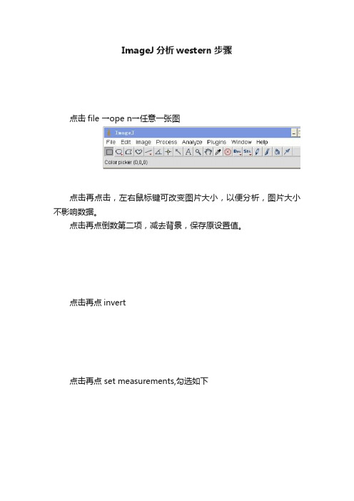
ImageJ分析western步骤
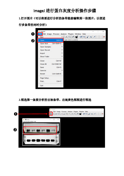
点击file →ope n→任意一张图
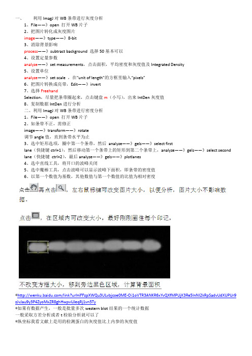
点击再点击,左右鼠标键可改变图片大小,以便分析,图片大小不影响数据。
点击再点倒数第二项,减去背景,保存原设置值。
点击再点invert
点击再点 set measurements,勾选如下
Ok确定
Mean Gray Value:平灰度值
Integrated Density:总灰度值
点击,在区域内可改变大小,最好刚刚圈住每个印记,
不改变方框大小,移到旁边黑色区域,计算背景面积
点击,measure
再把方框移到每个组别,仍点击
所有值将会依次出现,
如果中间改变方框大小,那么必须再重新将方框移到黑色区域,计算背景面积。
所有印记的真实值=系统出现值-同样方框下的背景值。
用imagej进行WB定量分析
ImagJ是一款简单的图像处理与分析软件,可以用来进行WB定量分析。
一、利用ImagJ对WB条带进行灰度分析1、File——》open 打开WB片子2、把图片转化成灰度图片image——》type——》8-bit3、消除背景影响process——》subtract background 选择50基本可以4、设置定量参数analyze——》set measurements,点击面积,平均密度和灰度值及Integrated Density 5、设置单位analyze——》set scale ,在“unit of length”的方框里输入“pixels”6、把图片转换成亮带,Edit——》invert7、选择FreehandSelection,尽量把条带圈起来,点击键盘m,出来IntDen灰度值当测定完所有条带,选结果中的“Edit ”的“SelectAll”,然后复制数据“IntDen”到Excel表即可进行分析8、复制数据IntDen进行分析二、利用ImagJ对WB条带进行密度分析1、File——》open 打开WB片子2、如条带不正,需修正image——》transform——》rotate调节angle值,直到条带水平为止3、选中矩形选项,圈中第一个条带,然后 analyze——》gels——》select firstlane(快捷键ctrl+1),然后移动第一个条带上的矩形到第二个条带上,analyze——》gels——》select secondlane(快捷键 ctrl+2),最后analyze——》gels——》plotlanes4、选中直线工具,将开口的波峰关闭5、选中魔棒工具,点击波峰可以显示波峰下面积,即条带的密度值6、以第一个数值为基数,其他数值与第一个数值的比值为相对密度The protocol of imageJ for quantitative analysis of Western blotting:- open an image- transfer the image to 8-bitsimage → type: 8 bits- Process → substract background 50- analyze → set measurements: pick area, mean gray value, inte grated density. - analyze → set scale, fill “unit of length” with “pixels”- switch the image to bright bandsedit → invert- freehand selection, choose the target area on the image . a band), type a “m” for measurement, then we get the result from a new window.- after measuring all of the bands, pick the “edit” of the result window. “select all”, copy the integrated density values to excel to analyze.The integrated density means that the area value multiplies the mean gray value. For Western blotting analysis the integrated density is very important, because the area and gray value both of them have meaning for Western blotting bands.。
使用ImageJ分析Western Blot Imagej 使用
使用ImageJ分析Western Blot2011-11-29 20:13:54| 分类:Bioinformatics | 标签:|字号大中小订阅Analyzing gels and western blots with ImageJ2011-07-29 18:02 来源:丁香园点击次数:496 关键词:ImageJ数据分析分享到:收藏夹腾讯微博新浪微博开心网The following information is an updated version of a method for using ImageJ to analyze western blots from a now-deprecated older page. Don’t use the altern ate methods discussed on the old page, as they are subject to way too much user bias.A pdf copy of this page is available.ImageJ (/ij/index.html) can be used to compare the density (aka intensity) of bands on an agar gel or western blot. This tutorial assumes that you have carried your gel or blot through the visualization step, so that you have a digital image of your gel in .tif, .jpg, .png or other image formats (.tif would be the preferred format to retain the maximum amount of info rmation in the original image). If you are scanning x-ray film on a flatbed scanner, make sure yo u use a scanner with the ability to scan transparencies (i.e. film). See the references at the end of this tutorial for a discussion of the various ways that you can screw this step up.The method outlined here uses the Gel Analysis method outlined in the ImageJ documentation: Gel Analysis. You may prefer to use it instead of the methods I outline below. There should be very little difference between the results obtained from the various methods. This version of the t utorial was created using ImageJ 1.42q on a Windows 7 64-bit install.1. Open the image file using File>Open in ImageJ.2. The gel analysis routine requires the image to be a gray-scale image. The simplest method to convert to grayscale is to go to Image>Type>8-bit. Your image should look like Figure 1.3. Choose the Rectangular Selections tool from the ImageJ toolbar. Draw a rectangle around the first lane. ImageJ assumes that your lanes run vertically (so individual bands are horizontal), so your rectangle should be tall and narrow to enclose a single lane. If you draw a rectangle that is short and wide, ImageJ will switch to assuming the lanes run horizontally (individual bands arevertical), leading to much confusion.4. After drawing the rectangle over your first lane, press the 1 key or go to Analyze>Gels>Select First Lane to set the rectangle in place. The 1st lane will now be highlighted and have a 1 in t he middle of it.5. Use your mouse to click and hold in the middle of the rectangle on the 1st lane and drag it over to the next lane. You can also use the arrow keys to move the rectangle, though this is sl ower. Center the rectangle over the lane left-to-right, but don’t worry ab out lining it up perfectly o n the same vertical axis. Image-J will automatically align the rectangle on the same vertical axis as the 1st rectangle in the next step.6. Press 2 or go to Analyze>Gels>Select Next Lane to set the rectangle in place over the 2nd l ane. A 2 will appear in the lane when the rectangle is placed.7. Repeat Steps 5 + 6 for each subsequent lane on the gel, pressing 2 each time to set the re ctangle in place (Figure 3).8. After you have set the rectangle in place on the last lane (by pressing 2), press 3, or go to Analyze>Gels>Plot Lanes to draw a profile plot of each lane.9. The profile plot represents the relative density of the contents of the rectangle over each lane. The rectangles are arranged top to bottom on the profile plot. In the example western blot imag e, the peaks in the profile plot (Figure 4) correspond to the dark bands in the original image (Fi gure 3). Because there were four lanes selected, there are four sections in the profile plot. Highe r peaks represent darker bands. Wider peaks represent bands that cover a wider size range on t he original gel.10. Images of real gels or western blots will always have some background signal, so the peaks don’t reach down to the baseline of the profile plot. Figure 5 shows a peak from a real blot wh ere there was some background noise, so the peak appears to float above the baseline of the p rofile plot. It will be necessary to close off the peak so that we can measure its size.11. Choose the Straight Line selection tool from the ImageJ toolbar (Figure 6). For each peak yo u want to analyze in the profile plot, draw a line across the base of the peak to enclose the pe ak (Figure 5). This step requires some subjective judgment on your part to decide where the pea k ends and the background noise begins.12. Note that if you have many lanes highlighted, the later lanes will be hidden at the bottom of the profile plot window. To see these lanes, press and hold the space bar, and use the mouse to click and drag the profile plot upwards.13. When each peak has been closed off at the base with the Straight Line selection tool, select the Wand tool from the ImageJ toolbar (Figure 8).14. Using the spacebar and mouse, drag the profile plot back down until you are back at the fir st lane. With the Wand tool, click inside the peak (Figure 9). Repeat this for each peak as you go down the profile plot. For each peak that you highlight, measurements should pop up in the Results window that appears.15. When all of the peaks have been highlighted, go to Analyze>Gels>Label Peaks. This labels each peak with its size, expressed as a percentage of the total size of all of the highlighted pea ks.16. The values from the Results window (Figure 10) can be moved to a spreadsheet program by selecting Edit>Copy All in the Results window. Paste the values into a spreadsheet.Note: If you accidentally click in the wrong place with the Wand, the program still records that cli cked area as a peak, and it will factor into the total area used to calculate the percentage value s. Obviously this will skew your results if you click in areas that aren’t peaks. If you do happen t o click in the wrong place, simple go to Analyze>Gel>Label Peaks to plot the current results, whi ch displays the incorrect values, but more importantly resets the counter for the Results window.Go back to the profile plot and begin clicking inside the peaks again, starting with the 1st peak of interest. The Results window should clear and begin showing your new values. When you’re s ure you’ve click in all of the correct peaks without accidentally clicking in any wrong areas, you can go back to Analyze>Gels>Label Peaks and get the correct results.Data analysisWith your data pasted into a spreadsheet, you can now calculate the relative density of the peaks. As a reminder, the values calculated by ImageJ are essentially arbitrary numbers, they only have meaning within the context of the set of peaks that you selected on the single gel image you’ve been working on. They do not have units of μg of protein or any other real-world units that you can think of. The normal procedure is to express the density of the selected bands relative to some standard band that you alsoselected during this process.1. Place your data in a spreadsheet. One of the peaks should be your standard. In this example we’ll usethe 1st peak as the standard.2. In a new column next to the Percent column, divide the Percent value for each sample by the Percentvalue for the standard (the 1st peak in this case, 26.666).3. The resulting column of values is a measure of the relative density of each peak, compared to thestandard, which will obviously have a relative density of 1.4. In this example, the 2nd lane has a higher Relative Density (1.86), which corresponds well with the size and darkness of that band in the original image (Figure 1). Recall that these data are for the upperrow of bands on the original western blot image.5. If you want to compare the density of samples on multiple gels or blots, you will need to use the samestandard sample on every gel to provide a common reference when you calculate Relative Density values. See the sections below for more detailed discussion of these requirements.6. In order to test for significant differences between treatments in an experiment, all of your gels or blots will need to be scanned and quantified using this method, and the values will be expressed in terms of Relative Density, or you can treat Relative Density as a fold-change value (i.e. a Relative Density difference of 2 between a control and treatment would indicate a 2-fold change in expression). If you will be using analysis of variance techniques to test your data, you may need to ensure that your RelativeDensity values are normally distributed and that there is homogeneity of variance among the differenttreatments.7. It should be noted here that some researchers make the extra effort to include a set of serial dilutionsof a known standard on each blot. Using the serial dilution curve and the quantification techniques outlined above, it should be possible to express your sample bands in terms of picograms or nanogramsof protein.A more involved example using loading-controls.We’ll use Figure 12 as a representative western blot. On this blot, we will pretend that we loaded four replicate samples of protein (four pipette loads out of the same vial of homogenate), so we expect the densities in each lane to be equivalent. The upper row of bars will represent our protein of interest. The lower set of bars will represent our loading-control protein, which is meant to ensure that an equal amount of total protein was loaded in each lane. This loading-control protein is a protein that is presumably expressed at a constant level regardless of the treatment applied to the original organisms, such as actin (though many people will question the assertion that actin will be expressed equivalentlyacross treatments).Looking at Figure 12, we had hoped to load equivalent amounts of total protein in each lane, but after running the western blot, the size and intensity of the lower bars in each lane varies quite a lot. The two left lanes appear equivalent, but the 3rd lane has half the density (gray value) compared to lanes 1+2, while lane 4 has half the density and half the size compared to lanes 1+2. Because our loading controls are so different, the density values of the upper set of bands may not be directly comparable.We’ll use ImageJ’s gel analysis routine to quantify the density and size of the bl ots, and use the results from our loading-controls (lower bands) to scale the values for our protein of interest (upper bands).1. Open the western blot image in ImageJ.2. Make sure that the image is in 8-bit mode: go to Image>Type>8-bit.3. Use the rectangle tool to draw a box around the entire 1st lane (both upper and lower bars included.4. Press “1″ to set the rectangle. A “1″ should appear in the middle of the rectangle.5. Click and hold in the middle of the rectangle and drag it over the 2nd lane.6. Press “2″ to set the rectangle for lane 2. A “2″ should appear in the middle of the re ctangle.7. Repeat steps 5 + 6 for each subsequent lane, pressing “2″ to set the rectangle over each subsequentlane (see Figure 13).8. When you hav e placed the last lane (and pressed “2″ to set it in place), you can press “3″ to produce aplot of the selected lanes (see Figure 14).9. The profile plot essentially represents the average density value across a set of horizontal slic es of each lane. Darker blots will have higher peaks, and blots that cover a larger size range (k D) will have wider peaks. In our example western blot, the bands are perfect rectangles, but you will notice some slope in the profile plot peaks, as ImageJ is applying a bit of averaging of den sity values as it moves from top to bottom of each lane. As a result, the sharp transition from p erfect white to perfect black on the bands of lane 1 is translated into a slight slope on the profil e plot due to the averaging.10. On our idealized western blot used here, there is no background noise, so the peak reachesall the way down to the baseline of the profile plot. In real western blots, there will be some ba ckground noise (the background will not be perfectly white), so the peaks won’t reach the baselin e of the profile plot (see figure 5 above). As a result, each plot will need to have a line drawn across the base of the peak to close it off.11. Choose the Straight Line selection tool from the ImageJ toolbar. For each peak you want to analyze in the profile plot, draw a line across the base of the peak to enclose the peak (Figure7). This step requires some subjective judgment on your part to decide where the peak ends and the background noise begins.12. When each peak of interest is closed off with the straight line tool, switch to the Wand tool. We will use the wand tool to highlight each peak of interest so that Image-J can calculate its rel ative area+density.13. We will start by highlighting the loading-control bands (lower row) on our example western bl ot. Beginning at the top of the profile plot, use the wand to click inside the 1st peak (Figure 15). The peak should be highlighted after you click on it. Continue clicking on the loading-control pe aks for the other lanes. If a lane is not visible at the bottom of the profile plot, hold down the s pace bar and click-and-drag the profile plot upwards to reveal the remaining lanes.14. When the loading control peak for each lane has been highlighted with the wand, go to Anal yze>Gel>Label Peaks. Each highlighted peak will be labeled with its relative size expressed as a percentage of the total area of all the highlighted peaks. You can go to the Results window an d choose Edit>Copy All to copy the results for placement in a spreadsheet.15. Repeat steps 13 + 14 for the real sample peaks now. We are selecting these peaks separat ely from the loading-control peaks so that those areas are not factored into the calculation of the density of our proteins-of-interest. As before, use the Wand tool to click inside the area of the p eak in the 1st lane, then continue clicking inside the peaks of the remaining lanes. When finishe d, go to Analyze>Gel>Label Peaks to show the results. Copy the results to a spreadsheet alongs ide the data for the loading-control bands (Figure 17).Data Analysis with loading-control bands1. With all of the relative density values now in the spreadsheet, we can calculate the relative a mounts of protein on the western blot. Remember that the “Area” and “Percent” values returned by ImageJ are expressed as relative values, based only on the peaks that you highlighted on th e gel. Start the analysis by calculating Relative Density values for each of the loading-standard b ands. In this case, we’ll pretend that Lane 1 is our control that we want to compare the other 3 lanes to. Divide the Percent value for each lane by the Percent value in the control (Lane 1 he re) to get a set of density values that is relative to the amount of protein in Lane 1′s loading-control band (Figure 18).2. Next we’ll calculate the Relative Density values for our sample protein bands (upper row on the example western blot). We carry out a similar calculation as step 1, dividing the Percent value in each row by the Percent value of our control’s protein band (Lane 1 here).Note: Recall that because some of our loading-control bands were wildly different on the original western blot, we can’t simply use the Relative Density values from our Samples calculated in Ste p 2 as the final results. Now it is necessary to scale the Relative Density values for the Sample s by the Relative Density of the corresponding loading-control bands for each lane. We do this b ased on the assumption that the proportional differences in the Relative Densities of the loading-control bands represent the proportional differences in amounts of total protein we loaded on the gel. In our example western blot, we have evidence of massively different amounts of total prot ein in each sample (poor pipetting practice, probably).3. The final step is to scale our Sample Relative Densities using the Relative Densities of the lo ading-controls. On the spreadsheet, divide the Sample Relative Density of each lane by the loadi ng-control Relative Density for that same lane.9. The profile plot essentially represents the average density value across a set of horizontal slic es of each lane. Darker blots will have higher peaks, and blots that cover a larger size range (k D) will have wider peaks. In our example western blot, the bands are perfect rectangles, but you will notice some slope in the profile plot peaks, as ImageJ is applying a bit of averaging of den sity values as it moves from top to bottom of each lane. As a result, the sharp transition from p erfect white to perfect black on the bands of lane 1 is translated into a slight slope on the profil e plot due to the averaging.10. On our idealized western blot used here, there is no background noise, so the peak reaches all the way down to the baseline of the profile plot. In real western blots, there will be some ba ckground noise (the backg round will not be perfectly white), so the peaks won’t reach the baselin e of the profile plot (see figure 5 above). As a result, each plot will need to have a line drawn across the base of the peak to close it off.11. Choose the Straight Line selection tool from the ImageJ toolbar. For each peak you want to analyze in the profile plot, draw a line across the base of the peak to enclose the peak (Figure7). This step requires some subjective judgment on your part to decide where the peak ends and the background noise begins.12. When each peak of interest is closed off with the straight line tool, switch to the Wand tool. We will use the wand tool to highlight each peak of interest so that Image-J can calculate its rel ative area+density.13. We will start by highlighting the loading-control bands (lower row) on our example western bl ot. Beginning at the top of the profile plot, use the wand to click inside the 1st peak (Figure 15). The peak should be highlighted after you click on it. Continue clicking on the loading-control pe aks for the other lanes. If a lane is not visible at the bottom of the profile plot, hold down the space bar and click-and-drag the profile plot upwards to reveal the remaining lanes.14. When the loading control peak for each lane has been highlighted with the wand, go to Anal yze>Gel>Label Peaks. Each highlighted peak will be labeled with its relative size expressed as a percentage of the total area of all the highlighted peaks. You can go to the Results window an d choose Edit>Copy All to copy the results for placement in a spreadsheet.15. Repeat steps 13 + 14 for the real sample peaks now. We are selecting these peaks separat ely from the loading-control peaks so that those areas are not factored into the calculation of the density of our proteins-of-interest. As before, use the Wand tool to click inside the area of the p eak in the 1st lane, then continue clicking inside the peaks of the remaining lanes. When finishe d, go to Analyze>Gel>Label Peaks to show the results. Copy the results to a spreadsheet alongs ide the data for the loading-control bands (Figure 17).Data Analysis with loading-control bands1. With all of the relative density values now in the spreadsheet, we can calculate the relative a mounts of protein on the western blot. Remember that the “Area” and “Percent” values returned by ImageJ are expressed as relative values, based only on the peaks that you highlighted on th e gel. Start the analysis by calculating Relative Density values for each of the loading-standard b ands. In this case, we’ll pretend that Lane 1 is our control that we want to compare the other 3 lanes to. Divide the Percent value for each lane by the Percent value in the control (Lane 1 he re) to g et a set of density values that is relative to the amount of protein in Lane 1′s loading-co ntrol band (Figure 18).2. Next we’ll calculate the Relati ve Density values for our sample protein bands (upper row on the example western blot). We carry out a similar calculation as step 1, dividing the Percent value in each row by the Percent value of our control’s protein band (Lane 1 here).Note: Recall that because some of our loading-control bands were wildly different on the original western blot, we can’t simply use the Relative Density values from o ur Samples calculated in Ste p 2 as the final results. Now it is necessary to scale the Relative Density values for the Sample s by the Relative Density of the corresponding loading-control bands for each lane. We do this b ased on the assumption that the proportional differences in the Relative Densities of the loading-control bands represent the proportional differences in amounts of total protein we loaded on the gel. In our example western blot, we have evidence of massively different amounts of total prot ein in each sample (poor pipetting practice, probably).3. The final step is to scale our Sample Relative Densities using the Relative Densities of the lo ading-controls. On the spreadsheet, divide the Sample Relative Density of each lane by the loadi ng-control Relative Density for that same lane.9. The profile plot essentially represents the average density value across a set of horizontal slic es of each lane. Darker blots will have higher peaks, and blots that cover a larger size range (k D) will have wider peaks. In our example western blot, the bands are perfect rectangles, but you will notice some slope in the profile plot peaks, as ImageJ is applying a bit of averaging of den sity values as it moves from top to bottom of each lane. As a result, the sharp transition from p erfect white to perfect black on the bands of lane 1 is translated into a slight slope on the profil e plot due to the averaging.10. On our idealized western blot used here, there is no background noise, so the peak reaches all the way down to the baseline of the profile plot. In real western blots, there will be some ba ckground noise (the background will not be perfectly white), so the peaks won’t reach the baselin e of the profile plot (see figure 5 above). As a result, each plot will need to have a line drawn across the base of the peak to close it off.11. Choose the Straight Line selection tool from the ImageJ toolbar. For each peak you want to analyze in the profile plot, draw a line across the base of the peak to enclose the peak (Figure7). This step requires some subjective judgment on your part to decide where the peak ends and the background noise begins.12. When each peak of interest is closed off with the straight line tool, switch to the Wand tool. We will use the wand tool to highlight each peak of interest so that Image-J can calculate its rel ative area+density.13. We will start by highlighting the loading-control bands (lower row) on our example western bl ot. Beginning at the top of the profile plot, use the wand to click inside the 1st peak (Figure 15). The peak should be highlighted after you click on it. Continue clicking on the loading-control pe aks for the other lanes. If a lane is not visible at the bottom of the profile plot, hold down the s pace bar and click-and-drag the profile plot upwards to reveal the remaining lanes.14. When the loading control peak for each lane has been highlighted with the wand, go to Anal yze>Gel>Label Peaks. Each highlighted peak will be labeled with its relative size expressed as a percentage of the total area of all the highlighted peaks. You can go to the Results window an d choose Edit>Copy All to copy the results for placement in a spreadsheet.15. Repeat steps 13 + 14 for the real sample peaks now. We are selecting these peaks separat ely from the loading-control peaks so that those areas are not factored into the calculation of the density of our proteins-of-interest. As before, use the Wand tool to click inside the area of the p eak in the 1st lane, then continue clicking inside the peaks of the remaining lanes. When finishe d, go to Analyze>Gel>Label Peaks to show the results. Copy the results to a spreadsheet alongs ide the data for the loading-control bands (Figure 17).Data Analysis with loading-control bands1. With all of the relative density values now in the spreadsheet, we can calculate the relative a mounts of pro tein on the western blot. Remember that the “Area” and “Percent” values returned by ImageJ are expressed as relative values, based only on the peaks that you highlighted on th e gel. Start the analysis by calculating Relative Density values for each of the loading-standard b ands. In this case, we’ll pretend that Lane 1 is our control that we want to compare the other 3 lanes to. Divide the Percent value for each lane by the Percent value in the control (Lane 1 he re) to get a set of density values that is rel ative to the amount of protein in Lane 1′s loading-co ntrol band (Figure 18).2. Next we’ll calculate the Relative Density values for our sample prote in bands (upper row on the example western blot). We carry out a similar calculation as step 1, dividing the Percent value in each row by the Percent value of our control’s protein band (Lane 1 here).Note: Recall that because some of our loading-control bands were wildly different on the original western blot, we can’t simply use the Relative Density values from our Samples calculated in Ste p 2 as the final results. Now it is necessary to scale the Relative Density values for the Sample s by the Relative Density of the corresponding loading-control bands for each lane. We do this b ased on the assumption that the proportional differences in the Relative Densities of the loading-control bands represent the proportional differences in amounts of total protein we loaded on the gel. In our example western blot, we have evidence of massively different amounts of total prot ein in each sample (poor pipetting practice, probably).3. The final step is to scale our Sample Relative Densities using the Relative Densities of the lo ading-controls. On the spreadsheet, divide the Sample Relative Density of each lane by the loadi ng-control Relative Density for that same lane.9. The profile plot essentially represents the average density value across a set of horizontal slic es of each lane. Darker blots will have higher peaks, and blots that cover a larger size range (k D) will have wider peaks. In our example western blot, the bands are perfect rectangles, but you will notice some slope in the profile plot peaks, as ImageJ is applying a bit of averaging of den sity values as it moves from top to bottom of each lane. As a result, the sharp transition from p erfect white to perfect black on the bands of lane 1 is translated into a slight slope on the profil e plot due to the averaging.10. On our idealized western blot used here, there is no background noise, so the peak reaches all the way down to the baseline of the profile plot. In real western blots, there will be some ba ckground noise (the background will not be perfectly white), so the peaks won’t reach the baselin e of the profile plot (see figure 5 above). As a result, each plot will need to have a line drawn across the base of the peak to close it off.11. Choose the Straight Line selection tool from the ImageJ toolbar. For each peak you want to analyze in the profile plot, draw a line across the base of the peak to enclose the peak (Figure7). This step requires some subjective judgment on your part to decide where the peak ends and the background noise begins.12. When each peak of interest is closed off with the straight line tool, switch to the Wand tool. We will use the wand tool to highlight each peak of interest so that Image-J can calculate its rel ative area+density.13. We will start by highlighting the loading-control bands (lower row) on our example western bl ot. Beginning at the top of the profile plot, use the wand to click inside the 1st peak (Figure 15). The peak should be highlighted after you click on it. Continue clicking on the loading-control pe aks for the other lanes. If a lane is not visible at the bottom of the profile plot, hold down the s pace bar and click-and-drag the profile plot upwards to reveal the remaining lanes.。
ImagJWB定量分析
一、利用ImagJ对WB条带进行灰度分析1、File——》open 打开WB片子2、把图片转化成灰度图片image——》type——》8-bit3、消除背景影响process——》subtract background 选择50基本可以4、设置定量参数analyze——》set measurements,点击面积,平均密度和灰度值及Integrated Density5、设置单位analyze——》set scale ,在“unit of length”的方框里输入“pixels”6、把图片转换成亮带,Edit——》invert7、选择FreehandSelection,尽量把条带圈起来,点击键盘m(小写),出来IntDen灰度值8、复制数据IntDen进行分析二、利用ImagJ对WB条带进行密度分析1、File——》open 打开WB片子2、如条带不正,需修正image——》transform——》rotate调节angle值,直到条带水平为止3、选中矩形选项,圈中第一个条带,然后analyze——》gels——》select firstlane(快捷键ctrl+1),然后移动第一个条带上的矩形到第二个条带上,analyze——》gels——》select second lane(快捷键ctrl+2),最后analyze——》gels——》plotlanes4、选中直线工具,将开口的波峰关闭5、选中魔棒工具,点击波峰可以显示波峰下面积,即条带的密度值6、以第一个数值为基数,其他数值与第一个数值的比值为相对密度*/link?url=iFFzpXWQu3ULvbjcoe0ME-Oi1oVTR3ANKR6xYvQXfMPUjK3Re5lnNI2kRpSadvUdXUPUr9 zJvJau9y3P4ZyoMxZR8ghHwpvUJeqRj1vn5Ty*如果有数据产生,一般是批量多次western blot结果的一个统计数据一般采取方差分析或者t检验分析就可以了*纵坐标我看文献上是用的检测蛋白的灰度值比上内参的灰度值。
image j蛋白灰度分析步骤
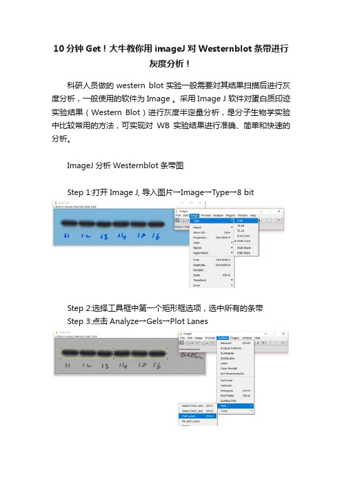
❷ ❷ 1.打开图片(可以将要进行分析的条带提前编辑到一张图片,以便进
行多条带的同时分析)
2.框选第一条要分析的目标条带,出现黄色框框进行框选
❶
❶
ImageJ 进行蛋白灰度分析操作步骤
3.将选出的条带设置为第一条要分析的条带
❶
❷
❸
4.框选下一条蛋白条带区域,操作位直接用鼠标左键移动第一条黄色框至下一条要分析的条带处
5.将框选的第二条条带设置为要进行分析的区域(如果有更多条带分析,则重复第二条带的操作步骤)
❶
❷
❸6.点击Plot Lanes,跳转至下一步
7.选择直线工具,画出各条带永道的封闭面积,然后使用魔术棒点击各条带灰度封闭取峰图,
得到result 框中定量灰度结果。
❶
❷
❸。
10分钟Get!大牛教你用imageJ对Westernblot条带进行灰度分析!
10分钟Get!大牛教你用imageJ对Westernblot条带进行
灰度分析!
科研人员做的western blot实验一般需要对其结果扫描后进行灰度分析,一般使用的软件为Image 。
采用Image J 软件对蛋白质印迹实验结果(Western Blot)进行灰度半定量分析,是分子生物学实验中比较常用的方法,可实现对WB实验结果进行准确、简单和快速的分析。
ImageJ分析Westernblot条带图
Step 1:打开Image J, 导入图片→Image→Type→8 bit
Step 2:选择工具框中第一个矩形框选项,选中所有的条带
Step 3:点击Analyze→Gels→Plot Lanes
Step 4:选用工具框中的直线工具,将开口波峰封闭
Step 5:选用工具框中的魔棒工具,点击相应的波峰,相应area值
ImageJ分析Westernblot条带图
Step 1:打开Image J, 导入图片。
Image→Type→8 bit
Step 2:扣除背景P→rocess→Subtract Background→选择50 pixels和Lightbackground
Step 3:设定参数→Analyze→Set Measures→按照下图勾选参数
Step 4:设定参数→Analyze→Set scale→unit of length选项改为pixels
Step 5:图像分割→Edit→Invert→选用椭圆或自定义工具选中条带
Step 6:Analyze→Measure→得到 IntDen值Step 7:重复Step5、6,得到所有条带的IntDen值
以上实用干货来源于课程
30分钟精通Image J图片处理。
WB灰度值测定
Image J测到了WB条带灰度值关于用Image J量化westernblot条带灰度值,在网上一直盛传着两种操作方法,然鹅~小伙伴们却一直不确定到底哪种才是正确的测量灰度方法,甚至将灰度与光密度弄混淆。
今天咱们一起就这个机会学习下,请先看看你是用以下那种方法测量灰度值?以下是两种方法的具体操作。
方法一:1、打开Image J软件→左上角file→Open 选择自己的条带图片(事先把条带摆正)2、把图片转化成灰度图片:Image→type→8—bit3、第一个矩形工具→选上所有条带4、analyze→Gels→select first lane→Gels→plot lanes(在这第四步也可以分开选取,如:框选第一个条带→analyze→Gels→select firstlane→将第一个框拖移到余下条带→Gels→select nextlane)5、选中直线工具,将开口波峰关闭6、选中魔棒工具(正数第七个),点击波峰,就得出所有area值。
方法二1、打开Image J软件→左上角file→Open 选择自己的条带图片(事先条带弄正)2、把图片转化成灰度图片:Image→type→8—bit3、扣除背景:Process→Subtract Background→50pixels 并勾选Light Background5、设定参数:Analyze→set measurement→勾选Area、Mean gray value、Min & max gray value、Integrated density6、Analyze→set scale→unit of length选项里改为pixels,确定6、图像分割。
Edit→Invert→选中椭圆圈(手残党首选)/不规则圆圈(心灵手巧党义无反顾),手动圈上单个条带7、Analyze→Measurement即得到Intden,重复6、7步就得到所有Intden值小伙伴们,你们是哪种方法呢?首先先把结论说出来,其实两者得出的area和Intden严格来说都不是灰度值,前者是面积而后者是光密度值,但用来量化WB条带都是OK的。
使用ImageJ分析Western
使用ImageJ 分析Western Blot (2013-04-16 21:40:31)转载▼标签: imagejwesterndnaThe following information is an updated version of a method for using ImageJ to analyze western blots from a now-deprecated older page. Don’t use the alternate methods discussed on the old page, as they are subject to way too much user bias.A pdf copy of this page is available.ImageJ (/ij/index.html ) can be used to compare the density (aka intensity) of bands on an agar gel or western blot. This tutorial assumes that you have carried your gel or blot through the visualization step, so that you have a digital image of your gel in .tif, .jpg, .png or other image formats (.tif would be the preferred format to retain the maximum amount of information in the original image). If you are scanning x-ray film on a flatbed scanner, make sure you use a scanner with the ability to scan transparencies (i.e. film). See the references at the end of this tutorial for a discussion of the various ways that you can screw this step up.The method outlined here uses the Gel Analysis method outlined in the ImageJdocumentation: Gel Analysis. You may prefer to use it instead of the methods I outline below. There should be very little difference between the results obtained from the various methods. This version of the tutorial was created using ImageJ 1.42q on a Windows 7 64-bit install.1. Open the image file using File>Open in ImageJ.2. The gel analysis routine requires the image to be a gray-scale image. The simplest method to convert to grayscale is to go to Image>Type>8-bit. Your image should look like Figure 1.3. Choose the Rectangular Selections tool from the ImageJ toolbar. Draw a rectangle around the first lane. ImageJ assumes that your lanes run vertically (so individual bands arehorizontal), so your rectangle should be tall and narrow to enclose a single lane. If you draw a rectangle that is short and wide, ImageJ will switch to assuming the lanes run horizontally(individual bands are vertical), leading to much confusion.4. After drawing the rectangle over your first lane, press the 1 key or go toAnalyze>Gels>Select First Lane to set the rectangle in place. The 1st lane will now be highlighted and have a 1 in the middle of it.5. Use your mouse to click and hold in the middle of the rectangle on the 1st lane and drag it over to the next lane. You can also use the arrow keys to move the rectangle, though this is slower. Center the rectangle over the lane left-to-right, but don’t worry about lining it up perfectly on the same vertical axis. Image-J will automatically align the rectangle on the same vertical axis as the 1st rectangle in the next step.6. Press 2 or go to Analyze>Gels>Select Next Lane to set the rectangle in place over the 2nd lane. A 2 will appear in the lane when the rectangle is placed.7. Repeat Steps 5 + 6 for each subsequent lane on the gel, pressing 2 each time to set the rectangle in place (Figure 3).8. After you have set the rectangle in place on the last lane (by pressing 2), press 3, or go to Analyze>Gels>Plot Lanes to draw a profile plot of each lane.9. The profile plot represents the relative density of the contents of the rectangle over each lane. The rectangles are arranged top to bottom on the profile plot. In the example western blot image, the peaks in the profile plot (Figure 4) correspond to the dark bands in the original image (Figure 3). Because there were four lanes selected, there are four sections in the profile plot. Higher peaks represent darker bands. Wider peaks represent bands that cover a wider size range on the original gel.10. Images of real gels or western blots will always have some background signal, so the peaks don’t reach down to the baseline of the profile plot. Figure 5 shows a peak from a real blot where there was some background noise, so the peak appears to float above the baseline of the profile plot. It will be necessary to close off the peak so that we can measure its size.11. Choose the Straight Line selection tool from the ImageJ toolbar (Figure 6). For each peak you want to analyze in the profile plot, draw a line across the base of the peak to enclose the peak (Figure 5). This step requires some subjective judgment on your part to decide where the peak ends and the background noise begins.12. Note that if you have many lanes highlighted, the later lanes will be hidden at the bottom of the profile plot window. To see these lanes, press and hold the space bar, and use the mouse to click and drag the profile plot upwards.13. When each peak has been closed off at the base with the Straight Line selection tool, select the Wand tool from the ImageJ toolbar (Figure 8).14. Using the spacebar and mouse, drag the profile plot back down until you are back at the first lane. With the Wand tool, click inside the peak (Figure 9). Repeat this for each peak as you go down the profile plot. For each peak that you highlight, measurements should pop up in the Results window that appears.15. When all of the peaks have been highlighted, go to Analyze>Gels>Label Peaks. This labels each peak with its size, expressed as a percentage of the total size of all of the highlighted peaks.16. The values from the Results window (Figure 10) can be moved to a spreadsheet program by selecting Edit>Copy All in the Results window. Paste the values into a spreadsheet.Note: If you accidentally click in the wrong place with the Wand, the program still records that clicked area as a peak, and it will factor into the total area used to calculate the percentage values. Obviously this will skew your results if you click in areas that aren’t peaks. If you do happen to click in the wrong place, simple go to Analyze>Gel>Label Peaks to plot the current results, which displays the incorrect values, but more importantly resets the counter for theResults window. Go back to the profile plot and begin clicking inside the peaks again, starting with the 1st peak of interest. The Results window should clear and begin showing your new values. When you’re sure you’ve click in all of the correct peaks without accidentally clicking in any wrong areas, you can go back to Analyze>Gels>Label Peaks and get the correct results. Data analysisWith your data pasted into a spreadsheet, you can now calculate the relative density of the peaks. As a reminder, the values calculated by ImageJ are essentially arbitrary numbers, they only have meaning within the context of the set of peaks that you selected on the single gel image you’ve been working on. They do not have units of μg of protein or any other real-world units that you can think of. The normal procedure is to express the density of the selected bands relative to some standard band that you also selected during this process.1. Place your data in a spreadsheet. One of the peaks should be your standard. In this example we’ll use the 1st peak as the standard.2. In a new column next to the Percent column, divide the Percent value for each sample by the Percent value for the standard (the 1st peak in this case, 26.666).3. The resulting column of values is a measure of the relative density of each peak, compared to the standard, which will obviously have a relative density of 1.4. In this example, the 2nd lane has a higher Relative Density (1.86), which corresponds well with the size and darkness of that band in the original image (Figure 1). Recall that these data are for the upper row of bands on the original western blot image.5. If you want to compare the density of samples on multiple gels or blots, you will need to use the same standard sample on every gel to provide a common reference when you calculate Relative Density values. See the sections below for more detailed discussion of these requirements.6. In order to test for significant differences between treatments in an experiment, all of your gels or blots will need to be scanned and quantified using this method, and the values will be expressed in terms of Relative Density, or you can treat Relative Density as a fold-change value (i.e. a Relative Density difference of 2 between a control and treatment wouldindicate a 2-fold change in expression). If you will be using analysis of variance techniques to test your data, you may need to ensure that your Relative Density values are normally distributed and that there is homogeneity of variance among the different treatments.7. It should be noted here that some researchers make the extra effort to include a set of serial dilutions of a known standard on each blot. Using the serial dilution curve and the quantification techniques outlined above, it should be possible to express your sample bands in terms of picograms or nanograms of protein.A more involved example using loading-controls.We’ll use Figure 12 as a representative western blot. On this blot, we will pretend that we loaded four replicate samples of protein (four pipette loads out of the same vial of homogenate), so we expect the densities in each lane to be equivalent. The upper row of bars will represent our protein of interest. The lower set of bars will represent our loading-control protein, which is meant to ensure that an equal amount of total protein was loaded in each lane. This loading-control protein is a protein that is presumably expressed at a constant level regardless of the treatment applied to the original organisms, such as actin (though many people will question the assertion that actin will be expressed equivalently across treatments).Looking at Figure 12, we had hoped to load equivalent amounts of total protein in each lane, but after running the western blot, the size and intensity of the lower bars in each lane varies quite a lot. The two left lanes appear equivalent, but the 3rd lane has half the density (gray value) compared to lanes 1+2, while lane 4 has half the density and half the size compared to lanes 1+2. Because our loading controls are so different, the density values of the upper set of bands may not be directly comparable.We’ll use ImageJ’s gel analysis routine to quantify the density and size of the blots, and use the results from our loading-controls (lower bands) to scale the values for our protein of interest (upper bands).1. Open the western blot image in ImageJ.2. Make sure that the image is in 8-bit mode: go to Image>Type>8-bit.3. Use the rectangle tool to draw a box around the entire 1st lane (both upper and lower bars included.4. Press “1″ to set the rectangle. A “1″ should appear in the middle of the rectangle.5. Click and hold in the middle of the rectangle and drag it over the 2nd lane.6. Press “2″ to set the rectangle for lane 2. A “2″ should appear in the middle of the rectangle.7. Repeat steps 5 + 6 for each subsequent lane, pressing “2″ to set the rectangle over each subsequent lane (see Figure 13).8. When you have placed the last lane (and pressed “2″ to set it in place), you can press “3″ to produce a plot of the selected lanes (see Figure 14).9. The profile plot essentially represents the average density value across a set of horizontal slices of each lane. Darker blots will have higher peaks, and blots that cover a larger size range (kD) will have wider peaks. In our example western blot, the bands are perfect rectangles, but you will notice some slope in the profile plot peaks, as ImageJ is applying a bit of averaging of density values as it moves from top to bottom of each lane. As a result, the sharp transition from perfect white to perfect black on the bands of lane 1 is translated into a slight slope on the profile plot due to the averaging.10. On our idealized western blot used here, there is no background noise, so the peak reaches all the way down to the baseline of the profile plot. In real western blots, there will be some background noise (the background will not be perfectly white), so the peaks won’t reach the baseline of the profile plot (see figure 5 above). As a result, each plot will need to have a line drawn across the base of the peak to close it off.11. Choose the Straight Line selection tool from the ImageJ toolbar. For each peak you want to analyze in the profile plot, draw a line across the base of the peak to enclose the peak (Figure 7). This step requires some subjective judgment on your part to decide where the peak ends and the background noise begins.12. When each peak of interest is closed off with the straight line tool, switch to the Wand tool. We will use the wand tool to highlight each peak of interest so that Image-J can calculate its relative area+density.13. We will start by highlighting the loading-control bands (lower row) on our example western blot. Beginning at the top of the profile plot, use the wand to click inside the 1st peak (Figure 15). The peak should be highlighted after you click on it. Continue clicking on the loading-control peaks for the other lanes. If a lane is not visible at the bottom of the profile plot, hold down the space bar and click-and-drag the profile plot upwards to reveal the remaining lanes.14. When the loading control peak for each lane has been highlighted with the wand, go to Analyze>Gel>Label Peaks. Each highlighted peak will be labeled with its relative size expressed as a percentage of the total area of all the highlighted peaks. You can go to the Results window and choose Edit>Copy All to copy the results for placement in a spreadsheet.15. Repeat steps 13 + 14 for the real sample peaks now. We are selecting these peaks separately from the loading-control peaks so that those areas are not factored into the calculation of the density of our proteins-of-interest. As before, use the Wand tool to click inside the area of the peak in the 1st lane, then continue clicking inside the peaks of the remaining lanes. When finished, go to Analyze>Gel>Label Peaks to show the results. Copy the results to a spreadsheet alongside the data for the loading-control bands (Figure 17).Data Analysis with loading-control bands1. With all of the relative density values now in the spreadsheet, we can calculate the relative amounts of protein on the western blot. Remember that the “Area” and “Percent” values returned by ImageJ are expressed as relative values, based only on the peaks that you highlighted on the gel. Start the analysis by calculating Relative Density values for each of the loading-standard bands. In this case, we’ll pretend that Lane 1 is our contr ol that we want to compare the other 3 lanes to. Divide the Percent value for each lane by the Percent value in the control (Lane 1 here) to get a set of density values that is relative to the amount of protein in Lane 1′s loading-control band (Figure 18).2. Next we’ll calculate the Relative Density values for our sample protein bands (upper row on the example western blot). We carry out a similar calculation as step 1, dividing the Percent value in each row by the Percent value of our control’s protein band (Lane 1 here).Note: Recall that because some of our loading-control bands were wildly different on the original western blot, we can’t simply use the Relative Density values from our Samples calculated in Step 2 as the final results. Now it is necessary to scale the Relative Density values for the Samples by the Relative Density of the corresponding loading-control bands for each lane. We do this based on the assumption that the proportional differences in the Relative Densities of the loading-control bands represent the proportional differences in amounts of total protein we loaded on the gel. In our example western blot, we have evidence of massively different amounts of total protein in each sample (poor pipetting practice, probably).3. The final step is to scale our Sample Relative Densities using the Relative Densities of the loading-controls. On the spreadsheet, divide the Sample Relative Density of each lane by the loading-control Relative Density for that same lane.9. The profile plot essentially represents the average density value across a set of horizontal slices of each lane. Darker blots will have higher peaks, and blots that cover a larger size range (kD) will have wider peaks. In our example western blot, the bands are perfect rectangles, but you will notice some slope in the profile plot peaks, as ImageJ is applying a bit of averaging of density values as it moves from top to bottom of each lane. As a result, the sharp transition from perfect white to perfect black on the bands of lane 1 is translated into a slight slope on the profile plot due to the averaging.10. On our idealized western blot used here, there is no background noise, so the peak reaches all the way down to the baseline of the profile plot. In real western blots, there will be some background noise (the background will not be perfectly white), so the peaks won’t reach the baseline of the profile plot (see figure 5 above). As a result, each plot will need to have a line drawn across the base of the peak to close it off.11. Choose the Straight Line selection tool from the ImageJ toolbar. For each peak you want to analyze in the profile plot, draw a line across the base of the peak to enclose the peak (Figure 7). This step requires some subjective judgment on your part to decide where the peak ends and the background noise begins.12. When each peak of interest is closed off with the straight line tool, switch to the Wand tool. We will use the wand tool to highlight each peak of interest so that Image-J can calculate its relative area+density.13. We will start by highlighting the loading-control bands (lower row) on our example western blot. Beginning at the top of the profile plot, use the wand to click inside the 1st peak (Figure 15). The peak should be highlighted after you click on it. Continue clicking on the loading-control peaks for the other lanes. If a lane is not visible at the bottom of the profile plot, hold down the space bar and click-and-drag the profile plot upwards to reveal theremaining lanes.14. When the loading control peak for each lane has been highlighted with the wand, go to Analyze>Gel>Label Peaks. Each highlighted peak will be labeled with its relative size expressed as a percentage of the total area of all the highlighted peaks. You can go to the Results window and choose Edit>Copy All to copy the results for placement in a spreadsheet.15. Repeat steps 13 + 14 for the real sample peaks now. We are selecting these peaks separately from the loading-control peaks so that those areas are not factored into the calculation of the density of our proteins-of-interest. As before, use the Wand tool to click inside the area of the peak in the 1st lane, then continue clicking inside the peaks of the remaining lanes. When finished, go to Analyze>Gel>Label Peaks to show the results. Copy the results to a spreadsheet alongside the data for the loading-control bands (Figure 17).。
干货▎ImageJ分析WesternBlot蛋白条带灰度值
干货▎ImageJ分析WesternBlot蛋白条带灰度值聊点学术,一键关注“你已经是个成熟的条带了,要学会自己分析!”“连Western blot都没学好,又让我学Image J,我......”This is the dividing line.Image J分析蛋白条带灰度值首先解释一下,为什么要分析灰度值?灰度的概念是使用黑色调表示物体,即用黑色为基准色,不同的饱和度的黑色来显示图像。
采用ECL发光时,蛋白条带发出的荧光会曝光在胶片上,留下的黑色条带。
然而胶片扫描后为蓝色背景、黑色条带,这并不是单纯的黑灰白颜色。
因此,我们首先得在Photoshop 中将整张图片去色,使彩色图片变成黑白图片,形成近灰色背景、黑色条带的图片类型。
此时,条带的深浅和面积综合代表着蛋白的量。
灰度值分析自然就成为我们的首选。
延伸说一下,免疫组织化学染色(IHC)结果本身为近白色背景、棕黄色阳性表达,这时我们就不能直接用灰度反映阳性表达强弱了,而是积分吸光度,也就是咱们常说的平均光密度(IOD)。
如果你真的想用灰度计算IHC结果,显然你需要将图片转为灰度图再计算。
此处不表。
分析图文步骤如下:Image J软件界面↓1. 图片转换为黑白图:首先使用Photoshop打开胶片扫描图片,点击“图像>调整>去色”,将彩色图片转化为黑白图片,并使用裁剪工具将目标条带裁剪至合适大小后另存图片。
2.打开Image J软件:2.1.打开图片文件:File>Open;将图片转化为8bit类型:Image>Type>8-bit。
(此步骤的目的是为了将图片的每个像素用8bit表示,这样的话,整个图片的灰度将分为256个级别,即黑、灰、白的像素模式;若保留原始的16bit格式或RGB格式,图片灰度级别会呈指数增长,并有其它颜色混入,造成计算误差。
)2.2.将整张图片背景灰度均一化,消除图片背景影响:Process>Subtract Background,默认数值为50即可。
用ImageJ对Western DNA和Blot图片灰度分析
用ImageJ对W estern Blot图片灰度分析教程收集于互联网来源中生网The good news is that even if you don't have access t o a photo editing program such as Photoshop, you can now do all the same analyses using free programs. My favorite option is the freely available ImageJ from the National Institut es of Health.The homepage for ImageJ is here: /ij/index.html wherein you can find links t o the download, document ation, additional plugins and so on.Once ImageJ is inst alled, open it up and open your scanned film file. We'll start the ImageJ section by duplicating the method outlined above for Phot oshop.1. Open your file.2. Under Image>Type click on 8-bit t o convert the image to grayscale.3. Go to the menu Process>Subt ract Background. Try a rolling ball radius of 50. This removes some of the background coloration from your image.4. Go to Analyze>Set Measurements, and click the boxes for Area, Mean Gray Value, and Int egrated D ensit y.5. Go to Analyze>Set Scale, and ent er "pixels" in the box next t o Unit of length.6. Go to Edit>Invert (or hit Ct rl+Shift+I) t o invert the colors on the image. Now the dark areas are light, and the light areas are dark. As outlined above, this has the benefit of making the measured values for bands increase with increasing prot ein expression.7. Choose the F reehand Selection tool from the t ool palette.8. Draw a line around the boundary of your first band. As above, you need to use your own judgement aboutwhere t he edges of the band are, and what is simply background noise.9. Hit the m key to take a measurement of the enclose area that you select ed. The Result s window should pop up, and each of the measurements you select ed in step 4 should appear. Not e that the Integrated Density column is simply the Area and Mean Gray Value columns multiplied together.10. Use the Freehand Selection tool to select the next band, and press m to take the measurement. Repeat this for each of you bands, including the st andard.11. When you are finished, you can go to the Edit menu in the Results window, and choose Copy All. You can then paste the results into a spreadsheet for lat er use.教你使用ImageJ分析电泳条带灰度比-ImageJ使用教程ImageJ这套软件可以自动帮你你计算细胞数,也可以定量分析DNA电泳或是Western blot条带。
- 1、下载文档前请自行甄别文档内容的完整性,平台不提供额外的编辑、内容补充、找答案等附加服务。
- 2、"仅部分预览"的文档,不可在线预览部分如存在完整性等问题,可反馈申请退款(可完整预览的文档不适用该条件!)。
- 3、如文档侵犯您的权益,请联系客服反馈,我们会尽快为您处理(人工客服工作时间:9:00-18:30)。
Image J 对Western blot 条带进行灰度分析
Image J软件:Windows 版本
第一步:软件安装
1.下载地址:/ij/download.html
2.下载windows 32位带Java版本,双击软件安装。
第二步:界面介绍
1.软件界面
第三步:图片分析
1.下图为样板图片
2.导入图片:File> Open> Sample1.jpg
图片导入后,Sample1.jpg在新的窗口中打开
3.图片类型设置:Image> Type> 8 bit
4.去除图片背景:Process> Subtract Background> …
4.1Subtract Background 窗口:Rolling ball radius 设为50 pixels,
勾选light background,可选preview,点击“OK”确定
5.工具栏:选择“矩形选框”
6.最大化“Sample1.jpg”窗口,便于矩形选择,矩形选择第一个泳道
7.标记“矩形选框”为1:矩形选择后,调整矩形至合适大小,按下数字键
“1”,或者Analyze> Gels> Select Fist Lane。
8.选择“泳道2”:拖动“1”的矩形框,会出现两个矩形选框,拖动矩形框
至泳道2,调整位置,并按下数字键“2”,Image J 会自动调整大小使“矩形框2”与“矩形框1”保持同一水平。
9.继续拖动,会出项新的“矩形选框”,调增至泳道3,并按下数字键“2”
(注意:是按下数字键“2”),重复9至6个泳道全部选择。
10.所有泳道选择后,按下数字键“3”,出现分析图谱。
11.“直线”封闭峰:工具栏选择“直线”,从起峰处至落峰处。
11.计算峰值:工具栏> Wand(tracing) tool,点下刚才封闭的区域,峰值结
果出现在新的窗口中。
计算结果:
12.其他泳道,以此类推,本文原创,如有疑问或建议,欢迎Email 。