雅思作文写作Task-1第二课时—柱状图和饼状图
雅思小作文范文柱状图
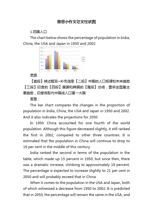
雅思小作文范文柱状图1.四国人口The chart below shows the percentage of population in India, China, the USA and Japan in 1950 and 2002.思路:【首段】转述题目+补充信息【二段】中国的人口规律和未来趋势【三段】印度的【四段】美国和韩国的【尾段】总结,重申全图最主要趋势,印度将取代中国成人口第一大国答案:The bar chart compares the changes in the proportion of population in India, China, the USA and Japan in 1950 and 2002. And it also indicates the projections for 2050.In 1950. China accounted for one fourth of the world population. Although this figure decreased slightly, it still ranked the first in 2002, compared to other three countries. It is estimated that the population in China will continue to drop to 19 per cent in the middle of this century.India ranked the second in terms of the population in the table, which made up 15 percent in 1950, but since then, there was a dramatic increase, climbing to approximately 19 percent. The percentage is expected to increase slightly to 21 per cent in 2050 and will probably exceed that in China.When it comes to the population in the USA and Japan, both of which witnessed a decrease from 1950 to 2002. It is predicted that in 2050, the percentage will remain the same in the USA, andin Japan, the percentage is likely to keep falling.Overall, it seems that India will become the country with the largest population although there is still a huge number of people in China.2.通勤工具Different modes of transport used to travel to and from work in one European city in 1960, 1980 and 2000.思路:1. 分段原则为:上升的一段,下降的一段,波动的一段。
雅思小作文专题讲座(二)

范文解析(线状图)
The graph illustrates changes in the amounts of beef, lamb, chicken and fish consumed in a particular European country between 1979 and 2004. In 1979 beef was by far the most popular of these foods, with about 225 grams consumed per person per week. Lamb and chicken were eaten in similar quantities (around 150 grams), while much less fish was consumed (just over 50 grams).
Overall, the graph shows how the consumption of chicken increased dramatically while the popularity of these other foods decreased over the past period.
雅思小作文范文精讲
柱状图 饼状图 线状图
LOGO
范文示例(柱状图) The charts below give information about USA marriage and divorce rates between 1970 and 2000 and the marital status of adult Americans in two of the years Summarize the information by selecting and reporting the main features, and make comparisons where relevant.
饼状图和柱状图英语作文

饼状图和柱状图英语作文英文回答:Bar charts and pie charts are two of the most common types of graphs used to visualize data. Both types of charts have their own advantages and disadvantages, and the best choice for a particular situation will depend on the data being presented and the desired outcome.Bar charts are used to compare the values of different categories. Each category is represented by a vertical bar, and the length of the bar corresponds to the value of the category. Bar charts are easy to read and understand, and they can be used to compare a large number of categories. However, bar charts can be misleading if the categories are not evenly spaced, and they can be difficult to compare if the values are very different.Pie charts are used to show the relative proportions of different categories. Each category is represented by aslice of the pie, and the size of the slice corresponds to the proportion of the category. Pie charts are easy to read and understand, and they can be used to show the relative importance of different categories. However, pie charts can be misleading if the categories are not evenly spaced, and they can be difficult to compare if the values are very different.In general, bar charts are better for comparing the values of different categories, while pie charts are better for showing the relative proportions of different categories. However, the best choice for a particular situation will depend on the data being presented and the desired outcome.中文回答:柱状图和饼状图是两种最常用的图表类型,用于可视化数据。
雅思小作文之图表作文
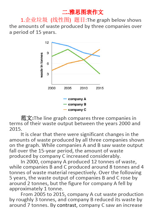
二.雅思图表作文1.企业垃圾(线性图) 题目:The graph below shows the amounts of waste produced by three companies over a period of 15 years.范文:The line graph compares three companies in terms of their waste output between the years 2000 and 2015.It is clear that there were significant changes in the amounts of waste produced by all three companies shown on the graph. While companies A and B saw waste output fall over the 15-year period, the amount of waste produced by company C increased considerably.In 2000, company A produced 12 tonnes of waste, while companies B and C produced around 8 tonnes and 4 tonnes of waste material respectively. Over the following 5 years, the waste output of companies B and C rose by around 2 tonnes, but the figure for company A fell by approximately 1 tonne.From 2005 to 2015, company A cut waste production by roughly 3 tonnes, and company B reduced its waste by around 7 tonnes. By contrast, company C saw an increasein waste production of approximately 4 tonnes over the same 10-year period. By 2015, company C’s waste output had risen to 10 tonnes, while the respective amounts of waste from companies A and B had dropped to 8 tonnes and only 3 tonnes.(192 words, band 9)这条线图对三家公司的废物产出从2000年到2015年进行了比较。
雅思写作-小作文范文-柱状图

柱状图C1T3题目The chart below shows the amount of money per week spent on fast foods in Britain. The graph shows the trends in consumption of fast foods.Write a report a university lecturer describing the information shown below.The chart shows that high income earners consumed considerably more fast foods than the other income groups, spending more than twice as much on hamburgers (43 pence per person per week) than on fish and chips or pizza (both under 20 pence). Average income earners also favored hamburgers, spending 33 pence per person per week, followed by fish and chips at 24 pence, then pizza at 11 pence. Low income earners appear to spend less than other income groups on fast foods, though fish andchip remains their most popular fast food, followed by hamburgers and then pizza. From the graph we can see that in 1970, fish and chips were twice as popular as burgers, pizza being at that time the least popular fast food. The consumption of hamburgers and pizza has risen steadily over the 20 year period to 1990 while the consumption of fish and chips has been in decline over that same period with a slight increase in popularity since 1985.分析:题目The chart below shows the amount of money per week spent on fast foods in Britain. The graph shows the trends in consumption of fast foods.两句话,两个图第一段The chart shows that high income earners consumed considerably more fast foods than the other income groups, spending more than twice as much on hamburgers (43 pence per person per week) than on fish and chips or pizza (both under 20 pence).•说明了高收入人群的两个特点,第一是消耗快餐最多,第二是人群中hamburger, fish and chips, pizza的特点•spending more than twice as much on hamburgers than on fish and chip and chips or pizza 这是一句令人费解的句子,含义应为“消耗的汉堡是薯片或匹萨的两倍多”,应用的句型应当为典型的表示倍数关系的句型“n times as…as”,比如✓This airplane flies two times as fast as that one. 这家飞机的飞行速度是那架的两倍。
雅思小作文模板
第 1 页中公留学无忧,让留学更简单小作文模板素材雅思小作文很多人不要模板, 拒绝套用雅思作文模板。
但是对于初试者, 或者目 标分是雅思 6 分的学生而言, 作文模板是必要而且也确实有效的。
关键是要有逻 辑性。
只要具备一定的逻辑性,模板一样会非常出彩!雅思小作文总体分为两种: 线状图/饼状图/柱状图/柱状图/表格题/地图题/流程 图万能开头与结尾模板:(6.0 分以下均可适用,6.5 分以上参考使用) 开头1.This graph/pie chart/table/bar chart reflects the (rate/percentage/proportion/number … ) of ( 对 象 ) in(place/country) from …to …2.According to the figure , it is not spurring findings that there was/were 总体趋势的描述(the overall trend tended to indicate …/the general trend is …/其他) 结尾1.In conclude , the overall trend tended to illustrate ……during this XX year period2.the data/statistics/figures lead us to the conclusion that ……这些数 据资料令我们得出结论……按题型类别:(提供很多句式请自选)①线状图1.先(上升/下降)后(下降/上升),之后便平稳(1)According to the data , the years from … to … saw/witness a rise/climb/drop in the number/rate/percentage/proportion of 对象 from 数据 to 数据,which was followed by a rapid decrease/reduce/increase over the **years.(2)The number/rate…dropped/went up again from…in ** year to…in ** year第 1 页第 2 页中公留学无忧,让留学更简单and then went up gradually until ** year ,when there was a leveling off/leveling out at 数据 for 一段时间。
柱形图和饼状图的英语作文

柱形图和饼状图的英语作文The Utility and Applications of Bar Charts and Pie Charts.In the realm of data visualization, bar charts and pie charts stand as two of the most fundamental and widely used tools. Each serves a distinct purpose in communicating complex information in a simple, intuitive manner. Bar charts excel at showing comparisons between categories, while pie charts are ideal for depicting the proportional distribution of data.Bar charts are effectively employed when comparing numerical values across different categories. They are particularly useful in identifying patterns, trends, and outliers. For instance, in a business context, a bar chart could be used to compare sales figures for different products over a specific period. Each bar represents a product, and its height or length corresponds to the sales figure. This allows for quick identification of whichproducts are performing well and which ones may require additional attention.The versatility of bar charts extends to their ability to handle various types of data, including absolute values, relative values, and even trends over time. By grouping bars together, it becomes possible to compare multiple sets of data side by side. For example, a bar chart could show the sales figures for different regions within the same company, or it could compare sales across multiple companies within the same industry.Pie charts, on the other hand, are ideal forvisualizing the proportional distribution of data. They are often used to represent a whole divided into itsconstituent parts. Each slice of the pie corresponds to a particular category, and its size relative to the whole pie indicates its proportion. Pie charts are particularly effective at highlighting the relative importance of each category without the need for complex numerical calculations.In the context of market research, for instance, a pie chart could depict the market share held by different competitors in a given industry. The slices would represent the individual companies, and their sizes would indicate their respective market shares. Such a visualization makes it easy to identify the market leader, as well as any potential challengers.Pie charts are also useful in scenarios where the sum of all parts equals a fixed value, such as in budget allocation or time management. By dividing a pie intoslices representing different expenses or activities, it becomes possible to quickly identify where the majority of resources are being allocated. This information can then be used to make informed decisions about reallocating resources or prioritizing certain areas.When choosing between a bar chart and a pie chart, itis important to consider the nature of the data being presented and the message that needs to be communicated. Bar charts are generally more effective at showing comparisons and trends, while pie charts excel at depictingproportional relationships. By understanding the strengths and limitations of each tool, it becomes possible to select the most appropriate visualization for a given dataset.In conclusion, bar charts and pie charts are invaluable tools for data visualization. Each has its own unique strengths and applications, and together they provide a comprehensive toolbox for communicating complex information in a clear and understandable manner. By mastering these fundamental visualization techniques, individuals and organizations can more effectively convey their data-driven insights and make informed decisions based on accurate and visually engaging representations of their data.。
饼状图和柱状图英语作文

饼状图和柱状图英语作文英文回答:Pie charts and bar charts are two types of data visualization tools that are commonly used to represent categorical and numerical data, respectively. Each type of chart has its own strengths and weaknesses, and the choice of which chart to use depends on the specific data and the purpose of the visualization.Pie charts are circular graphs that are divided into sectors, with each sector representing a category of data. The size of each sector is proportional to the value of the corresponding category. Pie charts are simple to create and interpret, and they are effective at showing the relative proportions of different categories. However, pie charts can be misleading if the data is not evenly distributed, as the larger sectors will appear to be more significant than they actually are.Bar charts are rectangular graphs that display data ina series of vertical or horizontal bars. Each barrepresents a category of data, and the height or length of the bar is proportional to the value of the corresponding category. Bar charts are easy to read and compare, and they are effective at showing trends and relationships over time. However, bar charts can be cluttered if there are a large number of categories, and they can be difficult tointerpret if the data is not evenly distributed.中文回答:饼状图是一种圆形图表,分为若干扇形,每个扇形代表一类数据。
- 1、下载文档前请自行甄别文档内容的完整性,平台不提供额外的编辑、内容补充、找答案等附加服务。
- 2、"仅部分预览"的文档,不可在线预览部分如存在完整性等问题,可反馈申请退款(可完整预览的文档不适用该条件!)。
- 3、如文档侵犯您的权益,请联系客服反馈,我们会尽快为您处理(人工客服工作时间:9:00-18:30)。
图表作文讲解2:柱状图和饼状图
分析思路:
1.第一幅柱状图的描述单位是百万,即人数;第二幅则是百分比。
2.第二幅柱状图仅显示了1970年和2000年的信息,而第一幅柱状图显示了1970、1980、
1990、2000年的信息。
3.由第一幅柱状图可以看出,从1980年到2000年,结婚人数和离婚人数的变化趋势相似。
4.从第二幅图可以看出,在2000年,结婚和寡居的成年人的比例有所降低而从未结婚过
和离婚的比例则有所上升。
范文分析
One chart①shows the number of marriages and divorces in the USA in 1970, 1980, 1990 and 2000.The other②shows the marital status of adult Americans in 1970 and 2000. 首段概述图表信息,对题目进行改写,注意动词的用法和时态。
➢描述类的常用词有:show/describe/illustrate/demonstrate/indicate;
分析思路
1.四个饼状图可以分为两组,一组是澳大利亚,一组是法国;
2.饼状图由五部分组成:coal, oil, natural gas, hydro power, nuclear power;
3.图中的时间是1980年和2000年
4.单位是units
范文分析
The charts①compare the sources of electricity in Australia and France in the years 1980 and 2000. Between these years electricity production almost②doubled, ③rising from 100 units to 170 in Australia, and from 90 to 180 units in France.
①对比:compare
②翻番:double
③从多少增长到多少:rise from……to……
In 1980 Australia used coal as the main electricity source (50 units) and the①remainder was produced from natural gas, hydro power (each producing 20 units) and oil (which produced only 10 units). By 2000, coal had become the fuel for more than 75% of electricity produced and only hydro②continued to be another significant
2.饼状图。