jquery-easyui说明文档
jQuery EasyUI API手册

[键入公司名称][键入文档标题] [键入文档副标题]龙士荣[选取日期]DocumentationEach component of easyui has properties, methods and events. Users can extend them easily.PropertiesThe properties is defined in jQuery.fn.{plugin}.defaults. For example, the dialog's properties is defined in jQuery.fn.dialog.defaults.EventsThe events(callback functions) is defined in jQuery.fn.{plugin}.defaults also.MethodsThe calling method syntax: $('selector').plugin('method', parameter);Where:∙selector is the jquery object selector.∙plugin is the plugin name.∙method is the existing method corresponding to the plugin.∙parameter is the parameter object, can be a object, string, ...The methods is defined in jQuery.fn.{plugin}.methods. Each method has two parameters: jq and param. The first parameter 'jq' is required, which refers to that jQuery object. The second parameter 'param' refers to the really parameter that pass through the method. For example, to extend a method named 'mymove' for the dialog component, the code looks like this:Now you can call 'mymove' method to move the dialog to specified position:Getting Started with jQuery EasyUIDownload the library and include EasyUI CSS and JavaScript files on your page.Once you've included the EasyUI necessary files, you can define an EasyUI component from markup or using JavaScript. For example, to define a panel with collapsible functionality, you can write the HTML code like this:2 / 81When creating a component from markup, the 'data-options' attribute can be used to support HTML5 compliant attribute names since version 1.3. So you can rewrite the code above as:The code below shows how to create a combobox that bind 'onSelect' event.1 Base1.1 Parser3 / 81UsagePropertiesEventsMethods1.2 EasyLoader UsageLoad EasyUI moduleLoad script from an absolute urlLoad script from relative urlProperties5 / 81Defined locales∙af∙bg∙ca∙cs∙cz∙da∙de∙en∙es∙fr∙nl∙tr∙zh_CN∙zh_TW EventsMethods1.3 DraggableOverride defaults with $.fn.draggable.defaults.Usage ExampleCreate a draggable element from markup.Create a draggable element using javascript.7 / 81Properties8 / 81EventsMethods1.4 DroppableOverride defaults with $.fn.droppable.defaults.Usage ExampleCreate a droppable area from markup.9 / 81Create a droppable area using javascript.PropertiesEventsMethods10 / 811.5 ResizableOverride defaults with $.fn.resizable.defaults.Usage ExampleCreate resizable object from markup.Create resizable object using javascript.Properties11 / 81EventsMethods12 / 811.6 PaginationOverride defaults with $.fn.pagination.defaults.The pagination allows the user to navigate data by page. It supports configurable options for page navigation and page length choices. The user can add customize buttons on right of pagination to enhance its functionality.DependencieslinkbuttonUsage ExampleCreate pagination from markup.Create pagination using javascript.13 / 81Let's create ajax pagination with panel and pagination plugins. When the user select a new page, the panel will display the corresponding content of specified page.The panel on top display the first page content by default. When the user navigate the page, the 'onSelectPage' event will be triggered, in which we call 'refresh' method for the content panel to load new page content with a new URL parameter.Properties14 / 8116 / 81EventsMethods1.7 SearchBoxExtend from $.fn.textbox.defaults. Override defaults with $.fn.searchbox.defaults.18 / 81The searchbox prompt the user to enter search value. It can combine a menu that allows the user to select different searching category. The searching action will be executed when the user press ENTER key or click the search button on the right of component.Dependencies∙textbox∙menubuttonUsage ExampleCreate SearchBox1. Create from markup. Add 'easyui-searchbox' class to <input/> markup.19 / 812. Create programatically.Properties20 / 81Methods21 / 811.8 ProgressBarOverride defaults with $.fn.progressbar.defaults.The progressbar provides a feedback of showing progress of an long-running operation. The progress can be updated to let the user know that some operation is currently executing.22 / 81DependenciesnoneUsage ExampleCreate ProgressBarThe ProgressBar component can be created from html markup or programatically. Creation from markup is even easier. Add 'easyui-progressbar' class to <div/> markup.Create ProgressBar using javascript.Get or Set ValueWe get the current value and set a new value for this component.PropertiesEventsMethods24 / 811.9 TooltipOverride defaults with $.fn.tooltip.defaults.When a user move the mouse pointer over an element, a tooltip message window appears to display additional information. The tooltip content can contain any html elements that come from the page or via ajax.Usage ExampleCreate Tooltip1. Create tooltip from markup, add 'easyui-tooltip' class to the element, no javascript code is needed.25 / 812. Create tooltip using javascript.Properties26 / 81EventsMethods27 / 812 Layout2.1 PanelOverride defaults with $.fn.panel.defaults.The panel is used as a container for other contents. It is the base component for building other components such as layout, tabs, accordion, etc. It also provides built-in collapsible, closable, maximizable and minimizable behavior and other customized behavior. Panels can be easily embedded into any position of web page.1 Usage ExampleCreate Panel1. Create Panel via markup28 / 81Creation from markup is even easier. Add 'easyui-panel' class to <div/> markup.2. Create Panel programaticallyLet's create panel with tools on top right.29 / 81Move PanelCall 'move' method to move panel to a new positionLoad ContentLet's load the panel content via ajax and show some message when loaded successfully.2 Properties30 / 8131 / 8132 / 8133 / 8134 / 813 Events35 / 814 Methods36 / 8137 / 812.2 TabsOverride defaults with $.fn.tabs.defaults.The tabs display a collection of panel. It shows only one tab panel at a time. Each tab panel has the header title and some mini button tools, including close button and other customized buttons.Dependencies∙panel∙linkbuttonUsage Example38 / 81Create tabs1. Create tabs via markupCreate tabs from markup is even easier, we don't need to write any JavaScript code. Remember to add 'easyui-tabs' class to <div> markup. Each tab panel is created via sub <div> markup, the usage is same as panel.2. Create tabs programaticallyNow we create tabs programatically, we catch the 'onSelect' event also.39 / 81Add new tab panelAdd a new tab panel with mini tools, the mini tools icon(8x8) is placed before the close button.Get the selected TabProperties40 / 8141 / 81Events43 / 81Methods44 / 8145 / 81Tab PanelThe tab panel properties is defined in panel component, below is some common properties.46 / 81Some added properties.2.1 AccordionOverride defaults with $.fn.accordion.defaults.The accordion allows you to provide multiple panels and display one or more at a time. Each panel has built-in support for expanding and collapsing. Clicking on a panel header to expand or collapse that panel body. The panel content can be loaded via ajax by specifying a 'href' property. Users can define a panel to be selected. If it is not specified, then the first panel is taken by default.Dependencies47 / 81panelUsage ExampleCreate AccordionCreate accordion via markup, add 'easyui-accordion' class to <div/> markup.We can change or recreate accordion later and modify some features.48 / 81Refresh Accordion Panel ContentCall 'getSelected' method to get the current panel and then we can call 'refresh' method of panel to load new content.Container OptionsPanel OptionsThe accordion panel options is inhirited from panel, below is the addition properties:49 / 81。
jquery-easyui教程和api
教程概述这个教程的目的是说明如何使用easyui框架容易的创建网页。
首先,你需要包含一些js和css文件:<link rel="stylesheet"type="text/css"href="../themes/default/easyui.css"><script type="text/javascript"src="../jquery-1.4.2.min.js"></script><script type="text/javascript"src="../jquery.easyui.min.js"></script>easyui预定义了一些图标css,这些css类可以显示图片背景(16×16)。
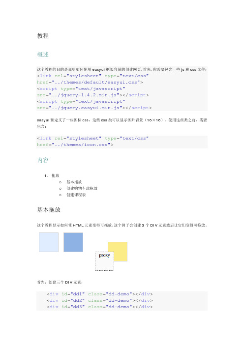
使用这些类之前,需要包含:<link rel="stylesheet"type="text/css"href="../themes/icon.css">内容1.拖放o基本拖放o创建购物车式拖放o创建课程表基本拖放这个教程显示如何使HTML元素变得可拖放。
这个例子会创建3个DIV元素然后让它们变得可拖放。
首先,创建三个DIV元素:<div id="dd1"class="dd-demo"></div><div id="dd2"class="dd-demo"></div><div id="dd3"class="dd-demo"></div>让第一个DIV元素可拖放,使用默认的拖放样式。
easyui参考文档(jquery)
目录1Accordion(可折叠标签) (3)1.1实例 (3)1.2参数 (4)2DateBox(日期框) (4)2.1实例 (4)2.2参数 (7)2.3事件 (7)2.4方法 (7)3ComboBox(组合框) (7)3.1实例 (7)3.2参数 (9)3.3事件 (10)3.4方法 (10)4Dialog(对话框) (10)4.1实例 (10)4.2参数 (12)4.3事件 (13)4.4方法 (13)5Messager(提示框) (13)5.1实例 (13)5.2方法 (16)5.3扩展 (17)6NumberBox(数字框) (17)6.1实例 (17)6.2参数 (18)7ValidateBox(验证框) (18)7.1实例 (18)7.2参数 (20)7.3方法 (20)7.4扩展 (20)8Pagination(分页) (21)8.1实例 (21)8.2参数 (22)8.3事件 (23)9Window(窗口) (23)9.1实例 (23)9.2参数 (26)9.3事件 (26)9.4方法 (26)10Panel(面板) (26)10.1实例 (26)10.2参数 (28)10.3事件 (29)10.4方法 (29)11Tabs(标签) (30)11.1实例 (30)11.2参数 (32)11.3事件 (32)11.4方法 (33)11.5标签面板属性 (33)12Tree(树) (33)12.1实例 (33)12.2参数 (36)12.3事件 (37)12.4方法 (37)13Layout(布局) (38)13.1实例 (38)13.2参数 (39)13.3方法 (39)14Datagrid(数据表) (39)14.1实例 (40)14.2参数 (43)14.3Column参数 (44)14.4事件 (45)14.5方法 (46)1Accordion(可折叠标签)1.1实例1.1.1代码<html><head><meta http-equiv="Content-Type"content="text/html; charset=UTF-8"><title>jQuery EasyUI</title><link rel="stylesheet"type="text/css"href="../themes/default/easyui.css"><link rel="stylesheet"type="text/css"href="../themes/icon.css"><script type="text/javascript"src="../jquery-1.4.2.min.js"></script><script type="text/javascript"src="../jquery.easyui.min.js"></script><script type="text/javascript">$( function() {$('#aa').accordion( {width : 400,height : 200,fit : false});});</script></head><body><div id="aa"border="true"><div title="Title1"icon="icon-save" style="overflow: auto; padding: 10px;"> <h3style="color: #0099FF;">Accordion for jQuery</h3><p>Accordion is a part of easyui framework for jQuery. It lets you define your accordion component on web page more easily.</p></div><div title="Title2"icon="icon-reload"selected="true"style="padding: 10px;">content2</div><div title="Title3">content3</div></div></body></html>1.1.2效果图1.1.3 扩展实例html代码中<div id="aa"border="true">此行也可写成<div id="aa" class="easyui-accordion" style="width:300px;height:200px;" fit="false" border="false">,并且将js代码全部去掉,效果图是一样的。
jquery_easyui_cn文档

jquery_easyui_cn文档目录1 Accordion(可折叠标签) 21.1 实例 21.2 参数 32 DateBox(日期框) 42.1 实例 42.2 参数 62.3 事件 62.4 方法 63 ComboBox(组合框) 73.1 实例 73.2 参数 93.3 事件 93.4 方法 94 Dialog(对话框) 104.1 实例 104.2 参数 124.3 事件 124.4 方法 125 Messager(提示框) 125.1 实例 125.2 方法 155.3 扩展 166 NumberBox(数字框) 166.1 实例 166.2 参数 177 ValidateBox(验证框) 187.1 实例 187.2 参数 207.3 方法 207.4 扩展 208 Pagination(分页) 208.1 实例 208.2 参数 228.3 事件 239 Window(窗口) 23 9.1 实例 239.2 参数 259.3 事件 269.4 方法 2610 Panel(面板) 26 10.1 实例 2610.2 参数 2810.3 事件 2910.4 方法 2911 Tabs(标签) 3011.1 实例 3011.2 参数 3211.3 事件 3211.4 方法 3311.5 标签面板属性 3312 Tree(树) 3312.1 实例 3312.2 参数 3612.3 事件 3712.4 方法 3713 Layout(布局) 38 13.1 实例 3813.2 参数 3913.3 方法 3914 Datagrid(数据表) 39 14.1 实例 3914.2 参数 4314.3 Column参数 4414.4 事件 4514.5 方法 46Accordion(可折叠标签)实例代码$(function(){$(''#aa'').accordion({width:400,height:200,fit:false});});AccordionforjQueryAccordionisapartofeasyuiframeworkforjQuery.Itletsyoudefineyouraccordioncomponentonwebpagemoreeasily.style="padding:10px;">content2content3效果图1.1.3扩展实例html代码中此行也可写成,并且将js代码全部去掉,效果图是一样的。
JqueryEasyUI的添加,修改,删除,查询等基本操作介绍
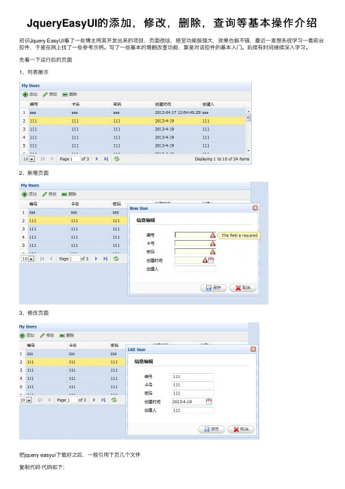
JqueryEasyUI的添加,修改,删除,查询等基本操作介绍初识Jquery EasyUI看了⼀些博主⽤其开发出来的项⽬,页⾯很炫,感觉功能挺强⼤,效果也挺不错,最近⼀直想系统学习⼀套前台控件,于是在⽹上找了⼀些参考⽰例。
写了⼀些基本的增删改查功能,算是对该控件的基本⼊门。
后续有时间继续深⼊学习。
先看⼀下运⾏后的页⾯1、列表展⽰2、新增页⾯3、修改页⾯把jquery easyui下载好之后,⼀般引⽤下页⼏个⽂件复制代码代码如下:<link href="/Resources/easyui/css/default.css" rel="stylesheet" type="text/css" /><link href="/Resources/easyui/js/themes/default/easyui.css" rel="stylesheet"type="text/css" />//页⾯图标样式<link href="/Resources/easyui/js/themes/icon.css" rel="stylesheet" type="text/css" /><script src="/Resources/easyui/js/jquery-1.7.2.min.js" type="text/javascript"></script>//jquery easyui主要的js<script src="/Resources/easyui/js/jquery.easyui.min.js" type="text/javascript"></script>⾸先是列表展⽰数据复制代码代码如下:<table id="dg" title="My Users" class="easyui-datagrid" style="width: 700px; height: 250px"url="/GetJson/CreateJson.aspx" toolbar="#toolbar" pagination="true" rownumbers="true"fitcolumns="true" singleselect="true"><thead><tr><th field="AccountCode" width="50">编号</th><th field="AccountName" width="50">卡名</th><th field="AccountPwd" width="50">密码</th><th field="CreateTime" width="50">创建时间</th><th field="CreateName" width="50">创建⼈</th></tr></thead></table>jquery easyui是⽤datagrid对数据进⾏展⽰的,所以class要选择easyui-datagrid;url是本列表的⼀个json格式的数据来源toobar后⾯跟着的"#toobar"是列表的⼀个⼯具栏,本⽰例在列表上显⽰的是添加,修改,删除功能按钮对数据进⾏操作。
jQueryEasyUI菜单与按钮详解

jQueryEasyUI菜单与按钮详解EasyUI 简介easyui是⼀种基于jQuery的⽤户界⾯插件集合。
easyui为创建现代化,互动,JavaScript应⽤程序,提供必要的功能。
使⽤easyui你不需要写很多代码,你只需要通过编写⼀些简单HTML标记,就可以定义⽤户界⾯。
easyui是个完美⽀持HTML5⽹页的完整框架。
easyui节省您⽹页开发的时间和规模。
easyui很简单但功能强⼤的。
代码如下:<html><head><meta http-equiv="Content-Type" content="text/html; charset=utf-8"><title>5、easyui 菜单与按钮</title><link rel="stylesheet" type="text/css" href="../../../ui/jquery-easyui-1.4.5/themes/default/easyui.css"><link rel="stylesheet" type="text/css" href="../../../ui/jquery-easyui-1.4.5/themes/icon.css"><link rel="stylesheet" type="text/css" href="../../../ui/jquery-easyui-1.4.5/themes/color.css"><script src="../../../ui/jquery-easyui-1.4.5/jquery.min.js"></script><script src="../../../ui/jquery-easyui-1.4.5/jquery.easyui.min.js"></script><script src="../../../ui/jquery-easyui-1.4.5/locale/easyui-lang-zh_CN.js"></script><script src="../../../js/crud/bus_pubuser.js"></script><script>$(function(){$(document).bind('contextmenu',function(e){$('#mm').menu('show', {left : e.pageY,top : e.pageX});return false;});});</script><script>$(function(){$(".dsbtn").linkbutton('disable');});</script></head><body><!--开始创建简单的菜单--><!--菜单默认是不显⽰的需要在javascript中调⽤显⽰--><div id="mm" class="easyui-menu" style="width: 150px;height: 120px;"><div>新建</div><div><span>打开</span><div style="width:150px;height: 120px;"><div>Word</div><div>Excel</div><div>PowerPoint</div></div></div><div data-options="iconCls:'icon-save'">保存</div><div class="menu-sep"></div><div>退出</div></div><!--结束创建简单的菜单--><!--开始创建链接按钮(Link Button)--><!--链接按钮(Link Button)实则是使⽤ <a> 元素来创建的。
jqueryeasyui中文帮助文档
jqueryeasyui中文帮助文档Base基础Documentation文档每个easyui组件都有特性(property)、方法(method)和事件(event),用户可以很容易地扩展它们。
特性特性在jQuery.fn.{plugin}.defaults里定义。
例如,dialog的特性在jQuery.fn.dialog.defaults里定义。
事件事件(回调函数)也在jQuery.fn.{plugin}.defaults里定义。
方法方法在jQuery.fn.{plugin}.methods里定义。
每个方法有两个参数:jq和param。
第一个参数'jq'是必须的,它是指jQuery对象。
第二个参数'param' 是指传递给方法的真正的参数。
例如,给dialog组件扩展一个名叫'mymove' 的方法,代码看起来就像这样:1. $.extend($.fn.dialog.methods, {2. mymove: function(jq, newposition){3. return jq.each(function(){4. $(this).dialog('move', newposition);5. });6. }7. });现在你可以调用'mymove'方法把dialog移动到一个指定的位置:1. $('#dd').dialog('mymove', {2. left: 200,3. top: 1004. });Parser 解析器1.$.parser.parse(); // 解析整个页面2.$.parser.parse('#cc'); // 解析某个具体节点特性事件EasyLoader 加载器用法1. easyloader.base = '../'; // 设置easyui的基本路径2. easyloader.load('messager', function(){ // 加载指定的模块3. $.messager.alert('Title', 'load ok');4. });定义的语言环境afbgcacsdadeenfrnlzh_CNzh_TW事件Draggable 可拖拽用$.fn.draggable.defaults重写默认的defaults。
EASYUI框架说明
EASYUI框架说明技术框架概述jQuery EasyUI framework help you build your web page easily.∙easyui is a collection of user-interface plugin based on jQuery.∙easyui provides essential functionality for building modem, interactive, javascript applications.∙using easyui you don't need to write many javascript code, you usually defines user-interface by writing some HTML markup.∙complete framework for HTML5 web page.∙easyui save your time and scales while developing your products.∙easyui is very easy but powerful.EASYUI具备两种方式为我们的界面提供支持:1.使用HTML的原生标签来声明控件:<div class="easyui-dialog" style="width:400px;height:200px"data-options="title:'MyDialog',collapsible:true,iconCls:'icon-ok',onOpen:function(){}"> dialog content.</div>2.用JS脚本来创建控件:<input id="cc" style="width:200px" />$('#cc').combobox({url: ...,required: true,valueField: 'id',textField: 'text'});参考文档1)jquery.EasyUI-1.3.1 API.chm整合DWREASYUI默认采用URL加载JSON数据,通过改写每个控件的LOADER方法,实现DWR方法的调用。
jquery_easyui_详细说明文档资料讲解
j q u e r y_e a s y u i_详细说明文档目录div easyui-window ...................................................................................... window窗口样式 (3)div easyui-panel ................................................................................................................ 面板 (3)a easyui-linkbutton ....................................................................................... 链接类型的按钮 (4)input/textarea easyui-validatebox .............................................................................. 字段验证 (4)ul easyui-tree ........................................................................................................... 树形结构 (5)table easyui-datagrid ......................................................................................................... 表格 (6)div easyui-tabs ........................................................................................................... tab容器 (7)div menu-sep ....................................................................................................... 菜单分隔线 (8)a easyui-splitbutton ....................................................................................................... 菜单列 (8)div easyui-accordion ...................................................................................... 手风琴式下拉框 (8)select easyui-combobox ......................................................................................... 组合下拉框 (8)select easyui-combotree ........................................................................................ 组合树形框 (9)body[div] easyui-layout ..................................................................................................... 布局 (9)div easyui-menu ............................................................................................................... 菜单 (9)a easyui-menubutton ................................................................................................ 菜单按钮. (10)input easyui-numberbox ........................................................................................ 数字输入框. (10)window ............................................................................................................ window窗口. (10).tree ....................................................................................................................... 树形结构. (10).datagrid ......................................................................................................................... 表格. (10).combobox .......................................................................................................... 组合下拉框. (10).combotree ......................................................................................................... 组合树形框. (10).dialog ........................................................................................................................ 对话框. (10).draggable ................................................................................................... 可自由拖动的块. (11).linkbutton .............................................................................................................. 链式按钮. (11).messager ................................................................................................................... 消息框. (11).pagination .......................................................................................................... 页码工具条. (12)CSS类定义:div easyui-window window窗口样式属性如下:1)modal:是否生成模态窗口。
jquery-easyui中文详细说明文档完整
Jquery easyui 使用说明1. Layout 布局 (1)1.1. 样图 (1)1.2. 示例代码 (2)2. tabs面板 (3)2.1. 样图 (3)2.2. 示例代码 (3)3. jQuery EasyUI 提示框(Messager)用法 (5)3.1. 样图 (5)3.2. 示例代码 (5)4. 分页(Pagination)用法 (6)4.1. 样图 (7)4.2. 示例代码 (7)5. jQuery EasyUI 对话框(Dialog)用法 (8)5.1. 示例图片 (8)5.2. 示例代码 (8)6. jQuery EasyUI 窗口(Window)用法 (9)6.1. 样图 (10)6.2. 示例代码 (10)7. jQuery EasyUI 验证框(V alidateBox)用法 (11)7.1. 样图 (11)7.2. 示例代码 (11)8. jQuery EasyUI 数字框(NumberBox)用法 (13)8.1. 样图 (13)8.2. 示例代码 (13)9. DataGrid (13)yout 布局1.1. 样图UsageMarkup在div 里面加载布局的方法:class="easyui-layout"布局面板必需要有一个'center' 面板.1.2. 示例代码<div id="cc" style="width:600px;height:400px;" class="easyui-layout"><div region="north" title="North Title" split="true" style="height:100px;"></div><div region="south" title="South Title" split="true" style="height:100px;"></div><div region="east" icon="icon-reload" title="East" split="true" style="width:100px;"></div><div region="west" split="true" title="West" style="width:100px;"></div><div region="center" title="center title" style="padding:5px;background:#eee;"></div></div>jQuery$('#cc').layout(options);DependenciespanelresizableOptionsLayout Panel Options所有属性都是放在<div/>标签里面null标题名字,当写了名字后将会产生折叠图标false booleanTrue时,面板间将产生一个拖动条可改变面板间大小在面板头部显示图标的CSSnull 将在布局面板中产生一个图标如:icon="icon-reload"fit="true" 自动改变大小Methods2.tabs面板2.1. 样图2.2. 示例代码在<div/>标签里使用方法class="easyui-tabs"UsageMarkup<div id="tt" style="width:500px;height:250px;" class="easyui-tabs"><div title="Tab1" style="padding:20px;display:none;">tab1</div><div title="Tab2" closable="true" style="overflow:auto;padding:20px;display:none;"> tab2</div><div title="Tab3" icon="icon-reload" closable="true" style="padding:20px;display:none;"> tab3</div></div>jQueryTo create a tabs container$('#tt').tabs(options);To add a tab panel:$('#tt').tabs('add',{title:'New Tab',content:'Tab Body',closable:true});DependenciesnoneOptionsTabs ContainerOverride defaults with $.fn.tabs.defaults.PropertiesEvents方法标签面板属性3.jQuery EasyUI 提示框(Messager)用法jQuery EasyUI 提示框(Messager)不仅重写了window默认的alert,confirm和prompt,而且还增加一些在页面右下角显示的提示框。
- 1、下载文档前请自行甄别文档内容的完整性,平台不提供额外的编辑、内容补充、找答案等附加服务。
- 2、"仅部分预览"的文档,不可在线预览部分如存在完整性等问题,可反馈申请退款(可完整预览的文档不适用该条件!)。
- 3、如文档侵犯您的权益,请联系客服反馈,我们会尽快为您处理(人工客服工作时间:9:00-18:30)。
Jquery easyui 使用说明1. Layout 布局 (1)1.1. 样图 (1)1.2. 示例代码 (2)2. tabs面板 (3)2.1. 样图 (3)2.2. 示例代码 (3)3. jQuery EasyUI 提示框(Messager)用法 (5)3.1. 样图 (5)3.2. 示例代码 (6)4. 分页(Pagination)用法 (7)4.1. 样图 (7)4.2. 示例代码 (7)5. jQuery EasyUI 对话框(Dialog)用法 (9)5.1. 示例图片 (9)5.2. 示例代码 (9)6. jQuery EasyUI 窗口(Window)用法 (10)6.1. 样图 (10)6.2. 示例代码 (11)7. jQuery EasyUI 验证框(ValidateBox)用法 (12)7.1. 样图 (12)7.2. 示例代码 (12)8. jQuery EasyUI 数字框(NumberBox)用法 (13)8.1. 样图 (14)8.2. 示例代码 (14)9. DataGrid (14)yout 布局1.1. 样图UsageMarkup在div 里面加载布局的方法:class="easyui-layout"布局面板必需要有一个'center' 面板.1.2. 示例代码<div id="cc" style="width:600px;height:400px;" class="easyui-layout"><div region="north" title="North Title" split="true" style="height:100px;"></div><div region="south" title="South Title" split="true" style="height:100px;"></div><div region="east" icon="icon-reload" title="East" split="true" style="width:100px;"></div> <div region="west" split="true" title="West" style="width:100px;"></div><div region="center" title="center title" style="padding:5px;background:#eee;"></div></div>jQuery$('#cc').layout(options);DependenciespanelresizableOptionsLayout Panel Options所有属性都是放在<div/>标签里面标题名字,当写了名字后将会产生面板间将产生一个fit="true" 自动改变大小Methods2.tabs面板2.1. 样图2.2. 示例代码在<div/>标签里使用方法class="easyui-tabs"UsageMarkup<div id="tt" style="width:500px;height:250px;" class="easyui-tabs"><div title="Tab1" style="padding:20px;display:none;">tab1</div><div title="Tab2" closable="true" style="overflow:auto;padding:20px;display:none;"> tab2</div><div title="Tab3" icon="icon-reload" closable="true" style="padding:20px;display:none;"> tab3</div></div>jQueryTo create a tabs container$('#tt').tabs(options);To add a tab panel:$('#tt').tabs('add',{title:'New Tab',content:'Tab Body',closable:true});DependenciesnoneOptionsTabs ContainerOverride defaults with $.fn.tabs.defaults. PropertiesEvents方法标签面板属性3.jQuery EasyUI 提示框(Messager)用法jQuery EasyUI 提示框(Messager)不仅重写了window默认的alert,confirm和prompt,而且还增加一些在页面右下角显示的提示框。
3.1. 样图jQuery EasyUI 提示框(Messager)不仅强大,而且也不用任何的HTML代码,只需要按照《jQuery EasyUI框架使用文档》包含必要文件后,在$(function(){ }); 里插入下面的代码即可:3.2. 示例代码1.$.messager.show()2.$.messager.alert('My Title','事件已经触发');Messager需要依存于以下的这些组件:* 可拖放(Draggable)* 调整大小(Resizable)* 面板(panel)* 窗口(window)* 链接按钮(linkbutton)上面只是一个小例子,下面来看一下具体的选项和方法:方法4. 分页(Pagination)用法在web 开发中,经常会遇到分页的需求,如果靠我们手写代码,可能代码又多 ,样式又不好看,下面介绍一下jQuery easyUI 分页功能,非常的方便简单,下面看一下4.1. 样图4.2. 示例代码1. <div id="pp" style="background:#efefef;border:1px solid#ccc;"></div>然后按照《jQuery EasyUI 框架使用文档》包含必要文件后,只要在$(function(){ }); 里插入下面的代码即可:1. $('#pp').pagination(options);下面来介绍Pagination 的具体用法,首先来看属性:事件5.jQuery EasyUI 对话框(Dialog)用法jQuery EasyUI 对话框(Dialog)用法与EasyUI的窗口用法极为相似,最终的效果图也只与窗口的效果图差几个按钮,下面看一下EasyUI的对话框效果图:5.1. 示例图片5.2. 示例代码(很多属性可以和Window的用法依洋,在标记语言中定义,比如说:icon, title 等等)1.<div id="dd" title="My Dialog"style="width:400px;height:200px;">2. Dialog Content.3.</div>然后按照《jQuery EasyUI框架使用文档》包含必要文件后,只要在$(function(){ }); 里插入下面的代码即可:1.$('#dd').dialog(options);Window需要依存于以下的三个组件:* 可拖放(Draggable)* 调整大小(Resizable)* 面板(panel)* 窗口(window)* 链接按钮(linkbutton)下面来介绍Window的具体用法,首先来看属性大多数的属性和窗口(Window)的属性是相同的,下面列出一些 Dialog私有的属性:事件Dialog的事件和窗口(Window)的事件相同,可以参考《jQuery EasyUI 窗口(Window)用法》方法除了”header”和”body”以外,Dialog的函数方法和窗口(Window)的相同,同样也可以参考《jQuery EasyUI 窗口(Window)用法》6.jQuery EasyUI 窗口(Window)用法jQuery EasyUI 窗口(Window)的主要用法和面板(panel)用法差不多,首先来看一下jQuery EasyUI 窗口(Window)在页面里显示的效果是这样的:6.1. 样图6.2. 示例代码(很多Window的属性可以在标记语言中定义,比如说:icon, title等等)1.<div id="win" icon="icon-save" title="My Window">2. Window Content3.</div>然后按照《jQuery EasyUI框架使用文档》包含必要文件后,只要在$(function(){ }); 里插入下面的代码即可:生成一个Window:1.$('#win').window(options);打开一个Window:1.$('#win').window('open');Window需要依存于以下的三个组件:* 可拖放(Draggable)* 调整大小(Resizable)* 面板(panel)下面来介绍Window的具体用法,首先来看属性大多数的属性和面板(panel)的属性是相同的,下面列出一些Window私有的属性:Window也重写了Panel里的一些属性事件Window的事件和面板(panel)的事件相同,可以参考《jQuery EasyUI 面板(Panel)用法》方法除了”header”和”body”以外,Window的函数方法和面板(panel)的相同,同样也可以参考《jQuery EasyUI 面板(Panel)用法》7.jQuery EasyUI 验证框(ValidateBox)用法jQuery EasyUI 验证框(ValidateBox)在表单的验证方面给我们提供了很方便的方法,下面来介绍一下验证框(ValidateBox)的详细用法:7.1. 样图7.2. 示例代码1.<input id="vv" required="true" validType="email">然后按照《jQuery EasyUI框架使用文档》包含必要文件后,只要在$(function(){ }); 里插入下面的代码即可:1.$('#vv').validatebox(options)下面介绍一下验证规则:验证规则是通过使用属性“required”和”validType”来定义的,已经实施的规则如下:∙email: 匹配电子邮件正则表达式规则∙url: 匹配URL正则表达式规则∙length[0,100]: 允许字符串长度的范围当然也可以自定义验证规则,重写$.fn.validatebox.defaults.rules 可以定义一个校验器的功能和无效的显示消息。