雅思写作小作文范文 雅思写作饼状图pie chart 电力来源.doc
2019-2020-雅思写作范文:饼状图范文-优秀word范文 (1页)

2019-2020-雅思写作范文:饼状图范文-优秀word范文本文部分内容来自网络整理,本司不为其真实性负责,如有异议或侵权请及时联系,本司将立即删除!== 本文为word格式,下载后可方便编辑和修改! ==雅思写作范文:饼状图范文下面雅思为大家整理了雅思写作范文:饼状图范文,供考生们参考,以下是详细内容。
This is a pie chart that shows the proportion of the meal soldin a supermarket . The total meat sold in the supermarket isclassified into six types as follows : chicken , pork , beef , lamb , fish and others .Overall , chicken has the largest proportion , which accountsfor 40%; while others has the smallest percentage , at 2%.As can be seen in the pie chart , chicken , which makes up 40%,is the most popular among the total meat sold , then next is porkwith 20%, followed by beef , constituting 18%; and finally come lamb , fish and others at 15%, 5% and 2% respectively , It should be noted that the sale of pork is half as much as that of chicken . And it is also interesting to note that the sale of chicken is 20 times as much as that of others .It can be concluded from the pie chart that chicken is most commonly bought meat while others is the least commonly bought meat .以上就是雅思为大家整理的雅思写作范文:饼状图范文,非常实用。
雅思哥雅思小作文3饼状图
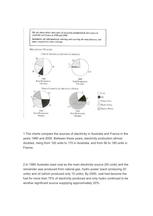
1.The charts compare the sources of electricity in Australia and France in the years 1980 and 2000. Between these years, electricity production almost doubled, rising from 100 units to 170 in Australia, and from 90 to 180 units in France.2.In 1980 Australia used coal as the main electricity source (50 units) and the remainder was produced from natural gas, hydro power (each producing 20 units) and oil (which produced only 10 units). By 2000, coal had become the fuel for more than 75% of electricity produced and only hydro continued to be another significant source supplying approximately 20%.3.In contrast, France used coal as a source for only 25 units of electricity in 1980, which was matched by natural gas. The remaining 40 units were produced largely from oil and nuclear power, with hydro contributing only 5 units. But by 2000, nuclear power, which was not used at all in Australia, had developed into the main source, producing almost 75% of electricity, at 126 units, while coal and oil together produced only 50 units. Other sources wereno longer significant.4.Overall, it is clear that by 2000 these two countries relied on different principal fuel sources: Australia relied on coal and France on nuclear power.分析:第一段:1 The charts compare the sources of electricity in Australia and France in the years 1980 and 2000Compare是“对比”,因为本文有两个国家四幅图,所以用compare就比较合适。
雅思写作task 1 饼状图 Pie Chart
练习
• 女生的数量大约是男生的三倍 • The number of girls is about 3 times that of boys • The number of girls is about 3 times as high as boys • The number of girls is about twice higher than boys
P3
• Accommodation and food were the two biggest items of expenditure. Altogether they constituted around 60% of the total students’ expenditure in all the three countries. • The difference is that in country A and B accommodation spending exceeded food spending, while the reverse was true for country C. • 比较较大/最大
P4
• Overall, it is clear that by 2000 these two countries relied on different principal fuel sources: Australia relied on coal and France on nuclear power.
P1
• The charts compare the sources of electricity in Australia and France in the years 1980 and 2000. • Between these years electricity production almost doubled, rising from 100 units to 170 in Australia, and from 90 to 180 units in France. • 三倍triple 四倍quadruple n/adj/v • fourfold adj/adv
雅思小作文piechart

According to the second pie chart, it clearly shows that heating and air conditioning account for the largest proportion (62%) in the residential energy use while the small appliances makes up the least proportion (10%). The heating water and miscellaneous ( including cooking) constitutes 15% and 13% respectively.
约数表达: the majority of, most of, a minority of , just over…, slightly more than…,less than…, nearly half…
确切数字表达
分数与百分比的转化:one third, two fifths,one tenth
Body之单饼
可先按照扇形面积大小从大到小排列数据。主体段在 描写各个扇形数据的时候,要注意详略,即最大和第 二大的扇形要重点描述。
Lexical Resources
百分比的表达: percentage,proportion, share a large/ substantial proportion of, a significant percentage of
OR
The two pie charts illustrate the distributional situation of labor force from 16 years old to 65 in two different years in the UK.
雅思小作文范文-饼图

The two graphs show the main sources of energy in the USA in the 1980s and the 1990s.思路:1. 采用折线模式描述2. 注意重点数据的选取(max, min)3. 注意分段原则:一段写上升,一段写下降,一段写保持不变。
答案:The two graphs show that oil was the major energy source in the USA in both 1980 and 1990 and that coal, natural gas and hydroelectric power remained in much the same proportions. On the other hand, there was a dramatic rise in nuclear power, which doubled its percentage over the ten years.Oil supplied the largest percentage of energy, although the percentage decreased from 42% in 1980 to 33% in 1990. Coal in 1990 was the second largest source of energy, increasing its proportion to 27% from 22% in the previous decade. Natural gas, the second largest source in 1980 at 26%, decreased its share very slightly to provide 25% of America’s energy ten years later. There was no change in the percentage supplied by hydroelectric power which remained at 5% of the total energy used. Nuclear power the greatest change: in 1990 it was 10%, twice that of the 1980s.In conclusion, during the decade, the structure of energy resources remained, and the proportion of 3 aspects varied a lot, except natural gas and hydroelectric power.(180)Information on UAE government spending in 2000. The total budget was AED 315 billion.思路:1. 分段原则较为灵活,可以分,也可以不分;2. 注意数据的描述顺序为:从大到小;3. 描述的过程中注意数据的对比:大小关系,倍数关系等;答案:The graph tells us about the budget of the UAE government in 2000. In general, the most important targets were social security, health, and education.The biggest slice of the pie chart is taken up by social security including pensions, employment assistance and other benefits which made up slightly under one-third of total expenditure. Health and personal social services was the second highest budget cost. Hospital and medical services accounted for AED 53 billion, or about 15% of the budget. Education cost UAE AED 38 billion which comprises almost 12% of the whole budget. The government spent about seven percent of revenue on debt, and roughly similar amounts went towards defence (AED 22 billion) and law and order (AED 17 billion). Spending on housing, transport and industry totalled AED 37 billion. Finally, other expenditure accounted for AED 23 billion.All in all, the bulk of UAE government spending goes on social welfare and health. However, education, defence, and law and order are also major areas of spending.(167)3.消费模式The pie charts show changes in U.S. spending patterns between 1966 and 1996.思路:1. 主要采用折线模式,重点描述数据的改变和趋势2. 留意极值(MAX, MIN)的描述3. 分段的原则可为:上升的一段,下降的一段,保持不变的一段。
IELTS writing pie_chart 雅思写作 饼图

The pie charts provide some information relevant to the proportion of employment in 6 main categories in U.K. in 1992.Overall, for female, manual pattern made up more proportion than non-manual with a 69 percent employee rate while for male the two patterns nearly accounted for equal proportion, with 48 percent in manual.More specific, managerial and professional, clerical or related and other manual contributed asubstantial part of all female employee, at 87 percent. However, for male employee managerial and professional, craft or similar and other manual had a significant percentage in the pie chart, at 86 percent.Apparently, managerial and professional and other manual had a great proportion in all employed persons. And the biggest difference between two genders was in clerical or related pattern and craft or similar pattern because only 6 percent of men chosen clerical or related pattern while there were approximately 5 times of women chosen it. When there were a quarter of man do craft or similar pattern, just 3 percent female did these.There were some small percentages of both men and women who employed in other non-manual job, craft or similar job, respectively in 9 percent and 3 percent. As for male employee, clerical or related and other non-manual jobs share the same small proportion with 6 percent. General laborers pattern is the least popular job pattern with only 1 percent women chosen it and 2 percent men chosen .。
雅思小作文piechart

约数表达: the majority of, most of, a minority of , just over…, slightly more than…,less than…, nearly half…
确切数字表达分数与百分比的转化:one third, two fifths,one tenth常见表达:a quarter, a half
Pie Chart
单击添加副标题
单击此处添加文本具体内容,简明扼要地阐述你的观点
图表‘口诀’
20 mins150 words静态饼图与动态饼图
Overview
先审题,在看图
01
几张饼,几种馅
02
哪个馅儿多,哪个馅儿少
03
数字,比率,变化
04
写作步骤
Conclusion
Body: describe the graph in details
ORThe two pie charts illustrate the distributional situation of labor force from 16 years old to 65 in two different years in the UK.
01
02
注意:
若遇到饼图中有总数的描述,宜在开头先写,for example:
01
02
According to the second pie chart, it clearly shows that heating and air conditioning account for the largest proportion (62%) in the residential energy use while the small appliances makes up the least proportion (10%). The heating water and miscellaneous ( including cooking) constitutes 15% and 13% respectively.
雅思饼状写作

饼图写作一.饼图Pie Chart的审题过程1. 看文字信息(找出描述对象的谓语的同义词)2. 标题审图标出:中间类/第二大相等/相类似剩余类小的标出:中间类/第二大相等/相类似剩余类小的无变化的/第二大/中间类相等/相类似3. 改写开头段饼图特有本质:The pie chart/graph compares the…….The pie chart/graph shows the comparison ofE.g.:The pie charts shows units of electricity production by fuel source in Australia and France in 1980 and 2000.= The charts compare the source of electricity production by five different sources in Australia and Francein the year 1980 and 2000.二.写作顺序:一个图:(静态描写)先找极端数据的,最大的,再找中间类或第二大的、同类或相类似的,最后看剩余类,即,小的或微不足道的一类的。
两个图:(静态对比描写+ 动态变化描写)1.先写第一个图(静态描述:最大,中间同类,剩余类),再写另一个图,进行对比(动态变化:上升/增长为最大的,下降的为最小,保持不变的或中间类或相等相似类)。
三.饼图写作模板(Body段)一个图:①极端类(最大/多)②中间类(同类/相类似). ③剩余类(小的/微不足道)。
范文E.g.:1.Social skills and education constitute comparatively a majority of their main fields of study, with6.5% and 5.6% respectively, while 2.24%, 1.84% and 2.10% are shared by ad., science and computer.The remaining percentages are in moderation, with 5.53% for science and 7.4% for ads.2.Coal makes up the maximal portion/ the majority of the source/was the biggest instrument of thesources of energy, with 47%, while Nuclear accounted for a tiny share, with only 1%. Furthermore, 28% altogether of the energy was shared by Oil and Hydro. The remaining 24% was due to Natural Gas.结尾1.Through the charts, we can easily draw the conclusion that the new source of energy, particularlyNuclear was given full play while the traditional ones, though still dominant, reached their bottleneck/ceiling to some extent.2.Overall, it is clear that by 2000 these two countries relied on different principal fuel source: Australiarelied on coal and Franc on nuclear power.两个图:一段(静态):①最大的②中间类(同类/相类似). ③剩余类(小的/微不足道)二段(动态):However,①上升/增长为最大的②下降为最小的③保持不变的或中间类或相等相似类)。
- 1、下载文档前请自行甄别文档内容的完整性,平台不提供额外的编辑、内容补充、找答案等附加服务。
- 2、"仅部分预览"的文档,不可在线预览部分如存在完整性等问题,可反馈申请退款(可完整预览的文档不适用该条件!)。
- 3、如文档侵犯您的权益,请联系客服反馈,我们会尽快为您处理(人工客服工作时间:9:00-18:30)。
雅思写作小作文范文雅思写作饼状图pie chart 电力来源
今天我们雅思写作小作文范文的文章来研究下饼状图pie chart。
该图表展示了1980年和2000年,澳大利亚和法国在发电过程中使用的不同燃料的状况。
具体燃料类型有:煤,石油,天然气,水能和核能。
需要注意的是,该饼状图中的数字并不表示百分比,而是赋予了具体的数字。
小编搜集了一篇相关的考官范文,以供大家参考。
雅思写作小作文题目
The pie charts below show units of electricity production by fuel source in Australia and France in 1980 and 2000.
Summarise the information by selecting and reporting the main features, and make comparisons where relevant.
雅思写作小作文范文
The pie charts compare the amount of electricity produced using five different sources of fuel in two countries over two separate years.
该饼状图比较了两个国家在不同的年份使用五种不同燃料来源所产生的电能数量。
Total electricity production increased dramatically from 1980 to 2000 in both Australia and France. While the totals for both countries were similar, there were big differences in the fuel sources used.
从1980年到2000年,澳大利亚和法国的电能总产量都急剧上升。
虽然两个国家的总量比较相似,但在其所使用的燃料上存在巨大差异。
Coal was used to produce 50 of the total 100 units of electricity in Australia in 1980, rising to 130 out of 170 units in 2000. By contrast, nuclear power became the most important fuel source in France in 2000, producing almost 75% of the country’s electricity.
1980年,澳大利亚总计100单位的电力中,用煤发电占到其中的50单位。
这一数字在2000年上升到130单位(总量为170单位)。
相比之下,核能在2000年的法国成为最主要的燃料来源,产生整个国家电力的百分之75左右。
Australia depended on hydro power for just under 25% of its electricity in both years, but the amount of electricity produced using this type of power fell from 5 to only 2 units in France. Oil, on the other hand, remained a relatively important fuel source in France, but its use declined in Australia. Both countries relied on natural gas for electricity production significantly more in 1980 than in 2000.
在这两年中,澳大利亚的水力发电量不到总发电量的百分之25。
但法国使用该能源产生的电力数量从5单位降到了2单位。
另一方面,石油仍然是法国电力的重要来源之一,但其使用量在澳大利亚有所下降。
两个国家在1980年利用天然气发电的数量都明显比2000年要多。
雅思写作小作文高分范文,快速提升写作成绩。