修改BUTTON背景颜色
tkinter库button的用法

tkinter库button的用法Tkinter库是Python的一个标准图形用户界面(GUI)库,其中的Button类提供了创建和操作按钮的方法。
通过Button类,我们可以在图形界面中插入按钮,为其添加文本、图标或者响应事件。
要使用Button类,首先需要导入Tkinter库:```from tkinter import *```然后,我们可以创建一个按钮并设置其相关属性:```# 创建主窗口root = Tk()# 定义按钮的点击事件处理函数def button_click():# 处理按钮点击事件print("按钮被点击了")# 创建按钮button = Button(root, text="点击我", command=button_click)# 设置按钮大小和位置button.pack()# 开启主事件循环root.mainloop()```在上面的代码中,我们首先创建了一个主窗口 `root`,然后定义了一个名为`button_click()` 的事件处理函数,该函数用于处理按钮的点击事件。
接下来,我们使用Button类创建了一个按钮,并将其文字设置为 "点击我",并指定了按钮被点击时要调用的事件处理函数 `button_click`。
最后,通过调用 `button.pack()` 方法将按钮显示在主窗口中。
当我们运行上述代码时,会弹出一个图形界面窗口,其中包含一个带有 "点击我" 文本的按钮。
当点击按钮时,会在控制台中输出 "按钮被点击了"。
除了设置按钮文本和点击事件处理函数,Button类还提供了一些其他常用的属性和方法,例如:- `button.config(text="新的文本")`:修改按钮的文本内容。
- `button.config(state=DISABLED)`:设置按钮为禁用状态,即不可点击。
button标签的用法
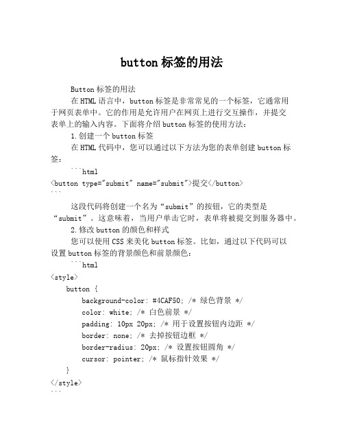
button标签的用法Button标签的用法在HTML语言中,button标签是非常常见的一个标签,它通常用于网页表单中。
它的作用是允许用户在网页上进行交互操作,并提交表单上的输入内容。
下面将介绍button标签的使用方法:1.创建一个button标签在HTML代码中,您可以通过以下方法为您的表单创建button标签:```html<button type="submit" name="submit">提交</button>```这段代码将创建一个名为“submit”的按钮,它的类型是“submit”。
这意味着,当用户单击它时,表单将被提交到服务器中。
2.修改button的颜色和样式您可以使用CSS来美化button标签。
比如,通过以下代码可以设置button标签的背景颜色和前景颜色:```html<style>button {background-color: #4CAF50; /* 绿色背景 */color: white; /* 白色前景 */padding: 10px 20px; /* 用于设置按钮内边距 */border: none; /* 去掉按钮边框 */border-radius: 20px; /* 设置按钮圆角 */cursor: pointer; /* 鼠标指针效果 */}</style>```3.设置button标签的文本内容您可以使用button标签的属性来设置按钮文本的内容。
例如:```html<button type="submit" name="submit">提交</button>```在这个例子中,“提交”是按钮的文本内容。
4.禁用button标签在某些情况下,您可能需要禁用一个button标签。
例如,在必填字段为空时,禁用提交按钮可以防止用户无效提交表单。
(完整word版)修改BUTTON背景颜色
//定义色彩const COLORREF CLOUDBLUE = RGB(128, 184, 223);const COLORREF WHITE = RGB(255, 255, 255);const COLORREF BLACK = RGB(1, 1, 1);const COLORREF DKGRAY = RGB(128, 128, 128);const COLORREF LTGRAY = RGB(192, 192, 192);const COLORREF YELLOW = RGB(255, 255, 0);const COLORREF DKYELLOW = RGB(128, 128, 0);const COLORREF RED = RGB(255, 0, 0);const COLORREF DKRED = RGB(128, 0, 0);const COLORREF BLUE = RGB(0, 0, 255);const COLORREF DKBLUE = RGB(0, 0, 128);const COLORREF CYAN = RGB(0, 255, 255);const COLORREF DKCYAN = RGB(0, 128, 128);const COLORREF GREEN = RGB(0, 255, 0);const COLORREF DKGREEN = RGB(0, 128, 0);const COLORREF MAGENTA = RGB(255, 0, 255);const COLORREF DKMAGENTA = RGB(128, 0, 128);//在.h文件定义彩色按钮CColorButton m_btnUp;//在.cpp文件调用函数着色VERIFY(m_btnUp.Attach(IDC_BUTTON1, this, RED, WHITE, DKRED));//CColorButton 类原型//colorbtn.h#ifndef __COLORBTN_H__#define __COLORBTN_H__class CColorButton : public CButton{DECLARE_DYNAMIC(CColorButton)public:CColorButton();virtual ~CColorButton();BOOL Attach(const UINT nID, CWnd* pParent,const COLORREF BGColor = RGB(192, 192, 192), // gray buttonconst COLORREF FGColor = RGB(1, 1, 1), // black textconst COLORREF DisabledColor = RGB(128, 128, 128), // dark gray disabled textconst UINT nBevel = 2);protected:virtual void DrawItem(LPDRAWITEMSTRUCT lpDIS);void DrawFrame(CDC *DC, CRect R, int Inset);void DrawFilledRect(CDC *DC, CRect R, COLORREF color);void DrawLine(CDC *DC, CRect EndPoints, COLORREF color); void DrawLine(CDC *DC, long left, long top, long right, long bottom, COLORREF color);void DrawButtonText(CDC *DC, CRect R, const char *Buf, COLORREF TextColor);COLORREF GetFGColor() { return m_fg; }COLORREF GetBGColor() { return m_bg; }COLORREF GetDisabledColor() { return m_disabled; } UINT GetBevel() { return m_bevel; }private:COLORREF m_fg, m_bg, m_disabled;UINT m_bevel;};#endif//colorbtn.cpp#include "stdafx.h "#include "colorbtn.h "#ifdef _DEBUG#undef THIS_FILEstatic char BASED_CODE THIS_FILE[] = __FILE__;#endif#ifdef CColorButton#undef CColorButton CColorButton#endifIMPLEMENT_DYNAMIC(CColorButton, CButton)CColorButton::CColorButton(){#if (_MFC_VER < 0x0250)hwndOwner = NULL;#endif}CColorButton::~CColorButton(){}BOOL CColorButton::Attach(const UINT nID, CWnd* pParent, cons t COLORREF BGColor, const COLORREF FGColor, const COLORREF DisabledColor, const UINT nBevel){if (!SubclassDlgItem(nID, pParent))return FALSE;m_fg = FGColor;m_bg = BGColor;m_disabled = DisabledColor;m_bevel = nBevel;return TRUE;}void CColorButton::DrawItem(LPDRAWITEMSTRUCT lpDIS){CDC* pDC = CDC::FromHandle(lpDIS-> hDC);UINT state = lpDIS-> itemState;CRect focusRect, btnRect;focusRect.CopyRect(&lpDIS-> rcItem);btnRect.CopyRect(&lpDIS-> rcItem);focusRect.left += 4;focusRect.right -= 4;focusRect.top += 4;focusRect.bottom -= 4;const int bufSize = 512;TCHAR buffer[bufSize];GetWindowText(buffer, bufSize);DrawFilledRect(pDC, btnRect, GetBGColor());DrawFrame(pDC, btnRect, GetBevel());DrawButtonText(pDC, btnRect, buffer, GetFGColor());if (state & ODS_FOCUS) {DrawFocusRect(lpDIS-> hDC, (LPRECT)&focusRect);if (state & ODS_SELECTED){DrawFilledRect(pDC, btnRect, GetBGColor());DrawFrame(pDC, btnRect, -1);DrawButtonText(pDC, btnRect, buffer, GetFGColor()); DrawFocusRect(lpDIS-> hDC, (LPRECT)&focusRect);}}else if (state & ODS_DISABLED) {DrawButtonText(pDC, btnRect, buffer, GetDisabledColor());}}void CColorButton::DrawFrame(CDC *DC, CRect R, int Inset) {COLORREF dark, light, tlColor, brColor;int i, m, width;width = (Inset < 0)? -Inset : Inset;for (i = 0; i < width; i += 1) {m = 255 / (i + 2);dark = PALETTERGB(m, m, m);m = 192 + (63 / (i + 1));light = PALETTERGB(m, m, m);if ( width == 1 ) {light = RGB(255, 255, 255);dark = RGB(128, 128, 128);}if ( Inset < 0 ) {tlColor = dark;brColor = light;}else {tlColor = light;brColor = dark;DrawLine(DC, R.left, R.top, R.right, R.top, tlColor); // Across topDrawLine(DC, R.left, R.top, R.left, R.bottom, tlColor); // Down leftif ( (Inset < 0) && (i == width - 1) && (wi dth > 1) ) {DrawLine(DC, R.left + 1, R.bottom - 1, R.right, R.botto m - 1, RGB(1, 1, 1));// Across bottomDrawLine(DC, R.right - 1, R.top + 1, R.right - 1, R.bottom, RGB(1, 1, 1)); // Down right}else {DrawLine(DC, R.left + 1, R.bottom - 1, R.right, R.botto m - 1, brColor); // Across bottomDrawLine(DC, R.right - 1, R.top + 1, R.right - 1, R.bottom, brColor); // Down right}InflateRect(R, -1, -1);}}void CColorButton::DrawFilledRect(CDC *DC, CRect R, COLORREF color){CBrush B;B.CreateSolidBrush(color);DC-> FillRect(R, &B);}void CColorButton::DrawLine(CDC *DC, CRect EndPoints, COLORREF color){CPen newPen;newPen.CreatePen(PS_SOLID, 1, color);CPen *oldPen = DC-> SelectObject(&newPen);DC-> MoveTo(EndPoints.left, EndPoints.top);DC-> LineTo(EndPoints.right, EndPoints.bottom);DC-> SelectObject(oldPen);newPen.DeleteObject();void CColorButton::DrawLine(CDC *DC, long left, long top, long right, long bottom, COLORREF color){CPen newPen;newPen.CreatePen(PS_SOLID, 1, color);CPen *oldPen = DC-> SelectObject(&newPen);DC-> MoveTo(left, top);DC-> LineTo(right, bottom);DC-> SelectObject(oldPen);newPen.DeleteObject();}void CColorButton::DrawButtonText(CDC *DC, CRect R, const cha r *Buf, COLORREF TextColor){COLORREF prevColor = DC-> SetTextColor(TextColor);DC-> SetBkMode(TRANSPARENT);DC->DrawText(Buf, strlen(Buf), R, DT_CENTER and DT_VCENTER and DT_SINGLELINE);DC-> SetTextColor(prevColor);}能够实现的代码:要想修改CButton类按钮背景颜色和文字颜色,必须利用自绘方法对按钮进行重新绘制。
WPF自定义控件与样式-自定义按钮(Button)

WPF⾃定义控件与样式-⾃定义按钮(Button)⼀、前⾔程序界⾯上的按钮多种多样,常⽤的就这⼏种:普通按钮、图标按钮、⽂字按钮、图⽚⽂字混合按钮。
本⽂章记录了不同样式类型的按钮实现⽅法。
⼆、固定样式的按钮固定样式的按钮⼀般在临时使⽤时或程序的样式⽐较固定时才会使⽤,按钮整体样式不需要做⼤的改动。
2.1 普通按钮-扁平化风格先看效果:定义Button的样式,详见代码:<Style x:Key="BtnInfoStyle" TargetType="Button"><Setter Property="Width" Value="70"/><Setter Property="Height" Value="25"/><Setter Property="Foreground" Value="White"/><Setter Property="BorderThickness" Value="0"/><Setter Property="Background" Value="#43a9c7"/><Setter Property="Template"><Setter.Value><ControlTemplate TargetType="Button"><Border x:Name="border" Background="{TemplateBinding Background}" BorderBrush="{TemplateBinding BorderBrush}" BorderThickness="{TemplateBinding BorderThickness}" SnapsToDevicePixels <TextBlock Text="{TemplateBinding Content}" Foreground="{TemplateBinding Foreground}" VerticalAlignment="Center" HorizontalAlignment="Center"/></Border><ControlTemplate.Triggers><Trigger Property="IsMouseOver" Value="True"><Setter TargetName="border" Property="Background" Value="#2f96b4"/></Trigger><Trigger Property="IsPressed" Value="True"><Setter TargetName="border" Property="Background" Value="#2a89a4"/></Trigger></ControlTemplate.Triggers></ControlTemplate></Setter.Value></Setter></Style>引⽤⽅法:<Grid Background="White"><StackPanel Orientation="Horizontal" Margin="10" VerticalAlignment="Top"><Button Style="{StaticResource BtnInfoStyle}" Content="信息" Margin="5 0"/></Grid>上述代码实现了Button按钮的扁平化样式,如果你想调整颜⾊风格,通过修改Background的值可实现默认颜⾊,⿏标经过颜⾊以及⿏标按下颜⾊。
uibutton setbackgroundimage 实现原理-概述说明以及解释

uibutton setbackgroundimage 实现原理-概述说明以及解释1.引言1.1 概述UIButton是iOS开发中常用的控件之一,用于实现用户交互和触发事件。
在UIButton的使用过程中,我们经常会用到setBackgroundImage 方法来设置按钮的背景图片。
这个方法的作用是将指定的图片设置为按钮的背景,使按钮在不同状态下具有不同的外观。
为了深入了解setBackgroundImage方法的实现原理,我们需要先对UIButton类进行介绍。
UIButton是UIKit框架中的一个类,继承自UIControl类,因此具有了一些基本的控件功能,比如触摸事件的处理和状态的管理。
除了基本的功能,UIButton还可以显示图片、文字以及两者的组合作为按钮的内容。
setBackgroundImage方法是UIButton类中用于设置按钮背景图片的方法。
通过调用这个方法,我们可以为按钮的不同状态设置不同的背景图片,包括普通状态、高亮状态、选中状态和禁用状态等。
这样,当按钮处于不同状态时,其背景图片就会随之改变,从而实现了按钮外观的变化。
setBackgroundImage方法的实现原理主要涉及到图片的加载和设置。
当我们调用这个方法时,系统会根据传入的图片参数,首先进行适当的图片解码处理,然后将解码后的图片设置为按钮的背景。
在设置背景图片之前,系统还会对图片进行拉伸或平铺等操作,以适应按钮的大小和样式。
总的来说,setBackgroundImage方法的实现原理是通过加载和设置图片,实现了按钮不同状态下背景图片的切换。
这为我们在应用开发中提供了丰富的选择和灵活的操作方式,使得按钮的外观可以根据需求进行定制和变化。
在接下来的文章内容中,我们将详细介绍和解析setBackgroundImage方法的具体实现和应用场景。
1.2 文章结构文章结构部分的内容应该对整篇文章的结构进行介绍和概述,给读者一个整体的把握。
[教学设计]用VB改变按钮的颜色
![[教学设计]用VB改变按钮的颜色](https://img.taocdn.com/s3/m/37b18900876fb84ae45c3b3567ec102de2bddf8a.png)
用VB改变按钮的颜色用VB改变按钮的颜色設置command1的style=1然後設置它的backcolor 為你想要的顏色不能直接通过属性框修改按钮中文本的颜色根本没有foreColor属性下边是一个参考方法首先请把要改的按钮的Style设置为1在工程中添加以下模块(Module):Module modExtButton.basOption Explicit'========================================================== ========' modExtButton.bas'' 本模块可让你改变命令按钮的文本颜色。
' 使用方法:'' - 在设计时将文本的Style设为Graphical.'' - 随意设定背景色和图象属性.'' - 在Form_Load中调用 SetButton :' SetButton Command1.hWnd, vbBlue' (你可以任意次的调用该过程甚至不必先调用 RemoveButton.)'' - 在Form_Unload中调用 RemoveButton :' RemoveButton Command1.hWnd''========================================================== ========Private Type RECTLeft As LongTop As LongRight As LongBottom As LongEnd TypePrivate Declare Function GetParent Lib "user32" _(ByVal hWnd As Long) As LongPrivate Declare Function GetWindowLong Lib "user32" Alias _"GetWindowLongA" (ByVal hWnd As Long, _ByVal nIndex As Long) As LongPrivate Declare Function SetWindowLong Lib "user32" Alias _"SetWindowLongA" (ByVal hWnd As Long, ByVal nIndex As Long, _ByVal dwNewLong As Long) As LongPrivate Const GWL_WNDPROC = (-4)Private Declare Function GetProp Lib "user32" Alias "GetPropA"_(ByVal hWnd As Long, ByVal lpString As String) As LongPrivate Declare Function SetProp Lib "user32" Alias "SetPropA" _(ByVal hWnd As Long, ByVal lpString As String, _ByVal hData As Long) As LongPrivate Declare Function RemoveProp Lib "user32" Alias _"RemovePropA" (ByVal hWnd As Long, _ByVal lpString As String) As LongPrivate Declare Function CallWindowProc Lib "user32" Alias _ "CallWindowProcA" (ByVal lpPrevWndFunc As Long, _ByVal hWnd As Long, ByVal Msg As Long, ByVal wParam As Long, _ByVal lParam As Long) As LongPrivate Declare Sub CopyMemory Lib "kernel32" Alias "RtlMoveMemory" _(Destination As Any, Source As Any, ByVal Length As Long)'Owner draw constantsPrivate Const ODT_BUTTON = 4Private Const ODS_SELECTED = &H1'Window messages we're usingPrivate Const WM_DESTROY = &H2Private Const WM_DRAWITEM = &H2BPrivate Type DRAWITEMSTRUCTCtlType As LongCtlID As LongitemID As LongitemAction As LongitemState As LonghwndItem As LonghDC As LongrcItem As RECTitemData As LongEnd TypePrivate Declare Function GetWindowText Lib "user32" Alias _"GetWindowTextA" (ByVal hWnd As Long, ByVal lpString As String, _ByVal cch As Long) As Long'Various GDI painting-related functionsPrivate Declare Function DrawText Lib "user32" Alias "DrawTextA" _(ByVal hDC As Long, ByVal lpStr As String, ByVal nCount As Long, _lpRect As RECT, ByVal wFormat As Long) As LongPrivate Declare Function SetTextColor Lib "gdi32" (ByVal hDC As Long, _ByVal crColor As Long) As LongPrivate Declare Function SetBkMode Lib "gdi32" (ByVal hDC As Long, _ByVal nBkMode As Long) As LongPrivate Const TRANSPARENT = 1Private Const DT_CENTER = &H1Public Enum TextVAlignsDT_VCENTER = &H4DT_BOTTOM = &H8End EnumPrivate Const DT_SINGLELINE = &H20Private Sub DrawButton(ByVal hWnd As Long, ByVal hDC As Long, _rct As RECT, ByVal nState As Long)Dim s As StringDim va As TextVAlignsva = GetProp(hWnd, "VBTVAlign")'Prepare DC for drawingSetBkMode hDC, TRANSPARENTSetTextColor hDC, GetProp(hWnd, "VBTForeColor")'Prepare a text buffers = String$(255, 0)'What should we print on the button?GetWindowText hWnd, s, 255'Trim off nullss = Left$(s, InStr(s, Chr$(0)) - 1)If va = DT_BOTTOM Then'Adjust specially for VB's CommandButton controlrct.Bottom = rct.Bottom - 4End IfIf (nState And ODS_SELECTED) = ODS_SELECTED Then'Button is in down state - offset'the textrct.Left = rct.Left + 1rct.Right = rct.Right + 1rct.Bottom = rct.Bottom + 1rct.Top = rct.Top + 1End IfDrawText hDC, s, Len(s), rct, DT_CENTER Or DT_SINGLELINE _ Or vaEnd SubPublic Function ExtButtonProc(ByVal hWnd As Long, _ByVal wMsg As Long, ByVal wParam As Long, _ByVal lParam As Long) As LongDim lOldProc As LongDim di As DRAWITEMSTRUCTlOldProc = GetProp(hWnd, "ExtBtnProc")ExtButtonProc = CallWindowProc(lOldProc, hWnd, wMsg, wParam, lParam)If wMsg = WM_DRAWITEM ThenCopyMemory di, ByVal lParam, Len(di)If di.CtlType = ODT_BUTTON ThenIf GetProp(di.hwndItem, "VBTCustom") = 1 ThenDrawButton di.hwndItem, di.hDC, di.rcItem, _di.itemStateEnd IfEnd IfElseIf wMsg = WM_DESTROY ThenExtButtonUnSubclass hWndEnd IfEnd FunctionPublic Sub ExtButtonSubclass(hWndForm As Long)Dim l As Longl = GetProp(hWndForm, "ExtBtnProc")If l <> 0 Then'Already subclassedExit SubEnd IfSetProp hWndForm, "ExtBtnProc", _GetWindowLong(hWndForm, GWL_WNDPROC)SetWindowLong hWndForm, GWL_WNDPROC, AddressOf ExtButtonProc End SubPublic Sub ExtButtonUnSubclass(hWndForm As Long)Dim l As Longl = GetProp(hWndForm, "ExtBtnProc")If l = 0 Then'Isn't subclassedExit SubEnd IfSetWindowLong hWndForm, GWL_WNDPROC, lRemoveProp hWndForm, "ExtBtnProc"End SubPublic Sub SetButton(ByVal hWnd As Long, _ByVal lForeColor As Long, _Optional ByVal VAlign As TextVAligns = DT_VCENTER)Dim hWndParent As LonghWndParent = GetParent(hWnd)If GetProp(hWndParent, "ExtBtnProc") = 0 ThenExtButtonSubclass hWndParentEnd IfSetProp hWnd, "VBTCustom", 1SetProp hWnd, "VBTForeColor", lForeColorSetProp hWnd, "VBTVAlign", VAlignEnd SubPublic Sub RemoveButton(ByVal hWnd As Long)RemoveProp hWnd, "VBTCustom"RemoveProp hWnd, "VBTForeColor"RemoveProp hWnd, "VBTVAlign"End Sub然后回到FORM中:添加CommandButton,不必更改它们的名称,将它们的Style设为Graphical,给第3个按钮设置一幅图片。
qt style用法
qt style用法在Qt 中,可以通过样式表(Style Sheets)来设置和修改控件的外观。
样式表是一种基于CSS 的语法,允许你为Qt 应用程序中的控件指定样式。
以下是一些关于Qt 样式表的基本用法:1. 在控件上应用样式表:使用`setStyleSheet` 方法将样式表应用到控件上。
```cppQPushButton* button = new QPushButton("Click me");button->setStyleSheet("background-color: lightblue; color: black;");```上述代码将创建一个按钮,并为其设置背景颜色为浅蓝色,文本颜色为黑色。
2. 选择器和属性:使用选择器和属性来选择特定的控件和设置它们的样式。
```cpp// 选择所有QPushButtonQPushButton {background-color: lightblue;color: black;}// 选择具有"important" 样式类的QPushButtonQPushButton[styleClass="important"] {font-weight: bold;}```这里的`styleClass` 是一个自定义属性,你可以在代码中使用`setProperty` 方法设置。
3. 伪状态和伪元素:使用伪状态(如`:hover`、`:checked`)和伪元素(如`::indicator`、`::sub-control`)来设置控件的不同状态下的样式。
```cpp// 悬停状态下的QPushButtonQPushButton:hover {background-color: darkblue;color: white;}// 选中状态下的QCheckBoxQCheckBox:checked {color: green;}```4. 全局样式表:在整个应用程序中应用全局样式表。
javascript实现点击点击按钮改变网页背景颜色
javascript实现点击点击按钮改变网页背景颜色源代码如下,页面中放了三个按钮,每当点击某一个按钮后,网页背景将会变成相对应的颜色。
(原创:转载请注明出处-“编程大海”)<html><head><title>test</title><script type="text/javascript" src="js/3.js"></script><script>function changeRed(){var d=document.getElementById('tt');d.style.backgroundColor="red";}function changeGreen(){var d=document.getElementById('tt');d.style.backgroundColor="green";}function changeYellow(){var d=document.getElementById('tt');d.style.backgroundColor="yellow";}</script></head><body id="tt"><input type="button" value="红色背景" onclick="changeRed()"/><input type="button" value="绿色背景" onclick="changeGreen()"/><input type="button" value="黄色背景" onclick="changeYellow()"/></body></html>。
SwiftUIButton使用教程
SwiftUIButton使⽤教程⼀.UIButton基本操作1.创建按钮let btn: UIButton = UIButton()//没有样式let btns:UIButton =UIButton(type: UIButtonType)//有样式let button = UIButton(frame:CGRect(x:10, y:150, width:100, height:30))//简化创建⽅式UIButtonType有以下类型public enum UIButtonType : Int {case custom // no button type@available(iOS 7.0, *)case system // standard system buttoncase detailDisclosurecase infoLightcase infoDarkcase contactAddpublic static var roundedRect: UIButtonType { get } // Deprecated, use UIButtonTypeSystem instead}//使⽤let btn: UIButton = UIButton(type: .Custom)UIButton状态类型/**Normal (默认状态)Highlighted (⾼亮状态)点击按钮不放Disabled (使能状态)就是是否可⽤状态-->禁⽤的状态才会显现Selected (选中状态)通过selected属性设置*/2、UIButton设置字内容和颜⾊//显⽰⽂字button1.setTitle("普通状态", for: .normal)button1.setTitle("⾼粱状态", for: .highlighted)button1.setTitle("禁⽤状态", for: .disabled)//显⽰⽂字颜⾊button1.setTitleColor(UIColor.red, for: .normal)button1.setTitleColor(UIColor.blue, for: .highlighted)button1.setTitleColor(UIColor.cyan, for: .selected)button1.setTitleColor(UIColor.cyan, for: .disabled)//阴影⽂字颜⾊设置button1.setTitleShadowColor(UIColor.cyan, for: .normal)button1.setTitleShadowColor(UIColor.green, for: .highlighted)button1.setTitleShadowColor(UIColor.brown, for: .disabled)button1.setTitleShadowColor(UIColor.darkGray, for: .selected)3.UIButton设置背景颜⾊和背景图⽚//背景颜⾊button2.backgroundColor = UIColor.orange//背景图⽚button4.setBackgroundImage(UIImage(named:"XXX"), for: .normal)4.UIButton设置字体⼤⼩button.titleLabel?.font = UIFont.systemFont(ofSize: 12)5.禁⽤UIButtonbutton.isEnabled = falsebutton.isEnabled = true6.设置圆⾓yer.cornerRadius = 5yer.masksToBounds = true7.设置边框宽度/颜⾊yer.borderWidth = 2yer.borderColor = UIColor.red.cgColor8.设置背景图⽚为圆⾓buttonImage.setImage(UIImage(named:"1") , forState: UIControlState.Normal)//设置背景图⽚为圆⾓buttonImage.imageView?.layer.cornerRadius = 50默认情况下按钮会被渲染成单⼀颜⾊;系统蓝button.setImage(UIImage(named:"icon1"),forState:.Normal) //设置图标button.adjustsImageWhenHighlighted=false //使触摸模式下按钮也不会变暗(半透明)button.adjustsImageWhenDisabled=false //使禁⽤模式下按钮也不会变暗(半透明)也可以设置成保留图标原来的颜⾊let iconImage = UIImage(named:"icon2")?.withRenderingMode(.alwaysOriginal)button.setImage(iconImage, for:.normal) //设置图标button.adjustsImageWhenHighlighted = false //使触摸模式下按钮也不会变暗(半透明)button.adjustsImageWhenDisabled = false //使禁⽤模式下按钮也不会变暗(半透明)9.UIButton上图⽚和⽂字调整UIButton上添加图⽚和⽂字,有时需要我们调整⽅向为逆时针⽅向,上、左、下、右依次去设置的btn.imageEdgeInsets =UIEdgeInsetsMake(top: CGFloat, left: CGFloat, bottom: CGFloat, right: CGFloat)btn.titleEdgeInsets =UIEdgeInsetsMake(top: CGFloat, left: CGFloat, bottom: CGFloat, right: CGFloat)实例如下://创建⼀个图⽚⼀个⽂字的按钮let btn2: UIButton = UIButton(type: .Custom)btn2.frame = CGRectMake(50, 100, 120, 35)btn2.setImage(UIImage(named: "1"), forState: .Normal)btn2.backgroundColor = UIColor.blackColor()btn2.titleLabel?.font = UIFont.systemFontOfSize(20)btn2.imageView?.contentMode = UIViewContentMode.ScaleAspectFitbtn2.setTitle("图⽚按钮", forState: .Normal)//偏移量,分别为上下左右btn2.imageEdgeInsets = UIEdgeInsetsMake(0, -50, 0, 0)btn2.titleEdgeInsets = UIEdgeInsetsMake(0, -80, 0, 5)btn2.setTitleColor(UIColor.whiteColor(), forState: .Normal)btn2.adjustsImageWhenHighlighted = falseself.view.addSubview(btn2)10.添加按钮的点击事件按钮的触摸时间有以下类型touchDown:单点触摸按下事件,点触屏幕touchDownRepeat:多点触摸按下事件,点触计数⼤于1,按下第2、3或第4根⼿指的时候touchDragInside:触摸在控件内拖动时touchDragOutside:触摸在控件外拖动时touchDragEnter:触摸从控件之外拖动到内部时touchDragExit:触摸从控件内部拖动到外部时touchUpInside:在控件之内触摸并抬起事件touchUpOutside:在控件之外触摸抬起事件touchCancel:触摸取消事件,即⼀次触摸因为放上太多⼿指⽽被取消,或者电话打断button1.addTarget(self,action:#selector(methodName), for: .touchUpInside)button1.addTarget(self, action:#selector(someMethod(button:)), for:.touchUpInside)//上func methodName() {print("tapped")}//下func someMethod(button:UIButton) {print("你是谁啊,其实就是⼀个按钮")}⼆.⾃定义操作1.UIButton的图⽚⽂字布局创建⼀个按钮且其同时拥有⽂字和图⽚属性,会按照系统的默认样式(左图⽚,右⽂字)显⽰。
setbackgroundrole用法
setbackgroundrole用法SetBackgroundRole用法Qt是一个跨平台的GUI应用程序开发框架,提供了许多方便开发的接口和工具。
其中,setBackgroundRole是一个常用的函数,用于设置widget的背景颜色。
I. setBackgroudRole函数介绍QPalette是一个用于管理控件颜色的类,其中包括了三个不同的颜色组:Button,Window,和Text。
setBackgroudRole函数就是用于设置控件的背景色的颜色组件。
其函数原型为:voidQWidget::setBackgroundRole(QPalette::ColorRole role);II. setBackgroundRole函数实例1.设置窗口背景颜色为白色在构造函数中添加以下代码:setAutoFillBackground(true);// 设置背景自动填充QPalette palette = this -> palette();// 获取当前调色板palette.setColor(QPalette::Window, Qt::white);// 设置窗口颜色为白色this -> setPalette(palette);// 最终设置调色板2.设置窗口背景颜色为指定颜色在构造函数中添加以下代码:setAutoFillBackground(true);// 设置背景自动填充QPalette palette = this -> palette();// 获取当前调色板palette.setColor(QPalette::Window, QColor(87, 96, 111));// 设置窗口颜色为指定颜色this -> setPalette(palette);// 最终设置调色板3.设置部件背景颜色为指定颜色在部件构造函数中添加以下代码:setAutoFillBackground(true);// 设置背景自动填充QPalette palette = this -> palette();// 获取当前调色板palette.setColor(QPalette::Button, QColor(207, 229, 218));// 设置部件背景颜色为指定颜色this -> setPalette(palette);III. setBackgroundRole函数总结setBackgroudRole函数是一个方便设置背景颜色的函数,使用简单。
- 1、下载文档前请自行甄别文档内容的完整性,平台不提供额外的编辑、内容补充、找答案等附加服务。
- 2、"仅部分预览"的文档,不可在线预览部分如存在完整性等问题,可反馈申请退款(可完整预览的文档不适用该条件!)。
- 3、如文档侵犯您的权益,请联系客服反馈,我们会尽快为您处理(人工客服工作时间:9:00-18:30)。
//定义色彩const COLORREF CLOUDBLUE = RGB(128, 184, 223);const COLORREF WHITE = RGB(255, 255, 255);const COLORREF BLACK = RGB(1, 1, 1);const COLORREF DKGRAY = RGB(128, 128, 128);const COLORREF LTGRAY = RGB(192, 192, 192);const COLORREF YELLOW = RGB(255, 255, 0);const COLORREF DKYELLOW = RGB(128, 128, 0);const COLORREF RED = RGB(255, 0, 0);const COLORREF DKRED = RGB(128, 0, 0);const COLORREF BLUE = RGB(0, 0, 255);const COLORREF DKBLUE = RGB(0, 0, 128);const COLORREF CYAN = RGB(0, 255, 255);const COLORREF DKCYAN = RGB(0, 128, 128);const COLORREF GREEN = RGB(0, 255, 0);const COLORREF DKGREEN = RGB(0, 128, 0);const COLORREF MAGENTA = RGB(255, 0, 255);const COLORREF DKMAGENTA = RGB(128, 0, 128);//在.h文件定义彩色按钮CColorButton m_btnUp;//在.cpp文件调用函数着色VERIFY(m_btnUp.Attach(IDC_BUTTON1, this, RED, WHITE, DKRED));//CColorButton 类原型//colorbtn.h#ifndef __COLORBTN_H__#define __COLORBTN_H__class CColorButton : public CButton{DECLARE_DYNAMIC(CColorButton)public:CColorButton();virtual ~CColorButton();BOOL Attach(const UINT nID, CWnd* pParent,const COLORREF BGColor = RGB(192, 192, 192), // gray button const COLORREF FGColor = RGB(1, 1, 1), // black textconst COLORREF DisabledColor = RGB(128, 128, 128), // dark gray disabled textconst UINT nBevel = 2);protected:virtual void DrawItem(LPDRAWITEMSTRUCT lpDIS);void DrawFrame(CDC *DC, CRect R, int Inset);void DrawFilledRect(CDC *DC, CRect R, COLORREF color);void DrawLine(CDC *DC, CRect EndPoints, COLORREF color);void DrawLine(CDC *DC, long left, long top, long right, long bottom, COLORREF color);void DrawButtonText(CDC *DC, CRect R, const char *Buf, COLORREF TextColor);COLORREF GetFGColor() { return m_fg; }COLORREF GetBGColor() { return m_bg; }COLORREF GetDisabledColor() { return m_disabled; }UINT GetBevel() { return m_bevel; }private:COLORREF m_fg, m_bg, m_disabled;UINT m_bevel;};#endif//colorbtn.cpp#include "stdafx.h "#include "colorbtn.h "#ifdef _DEBUG#undef THIS_FILEstatic char BASED_CODE THIS_FILE[] = __FILE__;#endif#ifdef CColorButton#undef CColorButton CColorButton#endifIMPLEMENT_DYNAMIC(CColorButton, CButton)CColorButton::CColorButton(){#if (_MFC_VER < 0x0250)hwndOwner = NULL;#endif}CColorButton::~CColorButton(){}BOOL CColorButton::Attach(const UINT nID, CWnd* pParent, const COLORREF BGColor, const COLORREF FGColor, const COLORREF DisabledColor, const UINT nBevel){if (!SubclassDlgItem(nID, pParent))return FALSE;m_fg = FGColor;m_bg = BGColor;m_disabled = DisabledColor;m_bevel = nBevel;return TRUE;}void CColorButton::DrawItem(LPDRAWITEMSTRUCT lpDIS){CDC* pDC = CDC::FromHandle(lpDIS-> hDC);UINT state = lpDIS-> itemState;CRect focusRect, btnRect;focusRect.CopyRect(&lpDIS-> rcItem);btnRect.CopyRect(&lpDIS-> rcItem);focusRect.left += 4;focusRect.right -= 4;focusRect.top += 4;focusRect.bottom -= 4;const int bufSize = 512;TCHAR buffer[bufSize];GetWindowText(buffer, bufSize);DrawFilledRect(pDC, btnRect, GetBGColor());DrawFrame(pDC, btnRect, GetBevel());DrawButtonText(pDC, btnRect, buffer, GetFGColor());if (state & ODS_FOCUS) {DrawFocusRect(lpDIS-> hDC, (LPRECT)&focusRect);if (state & ODS_SELECTED){DrawFilledRect(pDC, btnRect, GetBGColor());DrawFrame(pDC, btnRect, -1);DrawButtonText(pDC, btnRect, buffer, GetFGColor()); DrawFocusRect(lpDIS-> hDC, (LPRECT)&focusRect);}}else if (state & ODS_DISABLED) {DrawButtonText(pDC, btnRect, buffer, GetDisabledColor()); }}void CColorButton::DrawFrame(CDC *DC, CRect R, int Inset) {COLORREF dark, light, tlColor, brColor;int i, m, width;width = (Inset < 0)? -Inset : Inset;for (i = 0; i < width; i += 1) {m = 255 / (i + 2);dark = PALETTERGB(m, m, m);m = 192 + (63 / (i + 1));light = PALETTERGB(m, m, m);if ( width == 1 ) {light = RGB(255, 255, 255);dark = RGB(128, 128, 128);}if ( Inset < 0 ) {tlColor = dark;brColor = light;}else {tlColor = light;brColor = dark;}DrawLine(DC, R.left, R.top, R.right, R.top, tlColor); // Across topDrawLine(DC, R.left, R.top, R.left, R.bottom, tlColor); // Down leftif ( (Inset < 0) && (i == width - 1) && (width > 1) ) {DrawLine(DC, R.left + 1, R.bottom - 1, R.right, R.bottom - 1, RGB(1, 1, 1));// Across bottomDrawLine(DC, R.right - 1, R.top + 1, R.right - 1, R.bottom, RGB(1, 1, 1)); // Down right}else {DrawLine(DC, R.left + 1, R.bottom - 1, R.right, R.bottom - 1, brColor); // Across bottomDrawLine(DC, R.right - 1, R.top + 1, R.right - 1, R.bottom, brColor); // Down right}InflateRect(R, -1, -1);}}void CColorButton::DrawFilledRect(CDC *DC, CRect R, COLORREF color){CBrush B;B.CreateSolidBrush(color);DC-> FillRect(R, &B);}void CColorButton::DrawLine(CDC *DC, CRect EndPoints, COLORREF color){CPen newPen;newPen.CreatePen(PS_SOLID, 1, color);CPen *oldPen = DC-> SelectObject(&newPen);DC-> MoveTo(EndPoints.left, EndPoints.top);DC-> LineTo(EndPoints.right, EndPoints.bottom);DC-> SelectObject(oldPen);newPen.DeleteObject();}void CColorButton::DrawLine(CDC *DC, long left, long top, long right, long bottom, COLORREF color){CPen newPen;newPen.CreatePen(PS_SOLID, 1, color);CPen *oldPen = DC-> SelectObject(&newPen);DC-> MoveTo(left, top);DC-> LineTo(right, bottom);DC-> SelectObject(oldPen);newPen.DeleteObject();}void CColorButton::DrawButtonText(CDC *DC, CRect R, const char *Buf, COLORREF TextColor){COLORREF prevColor = DC-> SetTextColor(TextColor);DC-> SetBkMode(TRANSPARENT);DC-> DrawText(Buf, strlen(Buf), R, DT_CENTER and DT_VCENTER and DT_SINGLELINE);DC-> SetTextColor(prevColor);}能够实现的代码:要想修改CButton类按钮背景颜色和文字颜色,必须利用自绘方法对按钮进行重新绘制。