WPF自定义控件与样式(12)
WPF自定义控件与样式(13)-自定义窗体Window自适应内容大小消息框MessageBox
WPF⾃定义控件与样式(13)-⾃定义窗体Window⾃适应内容⼤⼩消息框MessageBox⼀.前⾔ 申明:WPF⾃定义控件与样式是⼀个系列⽂章,前后是有些关联的,但⼤多是按照由简到繁的顺序逐步发布的等,若有不明⽩的地⽅可以参考本系列前⾯的⽂章,⽂末附有部分⽂章链接。
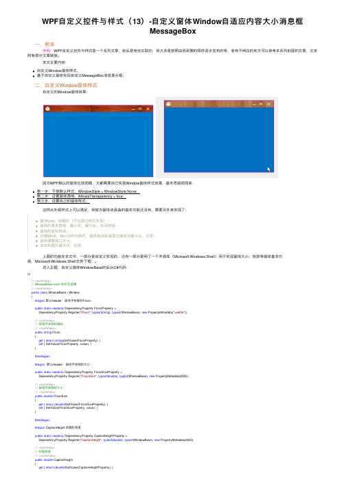
本⽂主要内容:⾃定义Window窗体样式;基于⾃定义窗体实现⾃定义MessageBox消息提⽰框;⼆.⾃定义Window窗体样式 ⾃定义的Window窗体效果: 因为WPF默认的窗体⽐较简陋,⼤都需要⾃⼰实现Window窗体样式效果,基本思路很简单:第⼀步:⼲掉默认样式:WindowStyle = WindowStyle.None;第⼆步:设置窗体透明:AllowsTransparency = true;第三步:设置⾃⼰的窗体样式; 这样从外观样式上可以满⾜,但做为窗体该具备的基本功能还没有,需要另外来实现了:窗体Icon、标题栏(可以通过样式实现);窗体的基本按钮:最⼩化、最⼤化、关闭按钮;窗体的⿏标拖动;好像Win8、Win10的功能吧,窗体拖动到桌⾯边缘⾃动最⼤化、还原;⿏标调整窗⼝⼤⼩;双击标题栏最⼤化、还原; 上⾯的功能在本⽂中,⼀部分是⾃定义实现的,还有⼀部分是⽤了⼀个开源库(Microsoft.Windows.Shell)⽤于实现窗体⼤⼩、拖放等窗体基本功能,Microsoft.Windows.Shell⽂件下载:。
进⼊正题,⾃定义窗体WindowBase的后台C#代码:///<summary>/// WindowBase.xaml 的交互逻辑///</summary>public class WindowBase : Window{#region默认Header:窗体字体图标FIconpublic static readonly DependencyProperty FIconProperty =DependencyProperty.Register("FIcon", typeof(string), typeof(WindowBase), new PropertyMetadata("\ue62e"));///<summary>///按钮字体图标编码///</summary>public string FIcon{get { return (string)GetValue(FIconProperty); }set { SetValue(FIconProperty, value); }}#endregion#region默认Header:窗体字体图标⼤⼩public static readonly DependencyProperty FIconSizeProperty =DependencyProperty.Register("FIconSize", typeof(double), typeof(WindowBase), new PropertyMetadata(20D));///<summary>///按钮字体图标⼤⼩///</summary>public double FIconSize{get { return (double)GetValue(FIconSizeProperty); }set { SetValue(FIconSizeProperty, value); }}#endregion#region CaptionHeight 标题栏⾼度public static readonly DependencyProperty CaptionHeightProperty =DependencyProperty.Register("CaptionHeight", typeof(double), typeof(WindowBase), new PropertyMetadata(26D));///<summary>///标题⾼度///</summary>public double CaptionHeight{get { return (double)GetValue(CaptionHeightProperty); }SetValue(CaptionHeightProperty, value);//this._WC.CaptionHeight = value;}}#endregion#region CaptionBackground 标题栏背景⾊public static readonly DependencyProperty CaptionBackgroundProperty = DependencyProperty.Register("CaptionBackground", typeof(Brush), typeof(WindowBase), new PropertyMetadata(null));public Brush CaptionBackground{get { return (Brush)GetValue(CaptionBackgroundProperty); }set { SetValue(CaptionBackgroundProperty, value); }}#endregion#region CaptionForeground 标题栏前景景⾊public static readonly DependencyProperty CaptionForegroundProperty = DependencyProperty.Register("CaptionForeground", typeof(Brush), typeof(WindowBase), new PropertyMetadata(null));public Brush CaptionForeground{get { return (Brush)GetValue(CaptionForegroundProperty); }set { SetValue(CaptionForegroundProperty, value); }}#endregion#region Header 标题栏内容模板,以提⾼默认模板,可⾃定义public static readonly DependencyProperty HeaderProperty = DependencyProperty.Register("Header", typeof(ControlTemplate), typeof(WindowBase), new PropertyMetadata(null));public ControlTemplate Header{get { return (ControlTemplate)GetValue(HeaderProperty); }set { SetValue(HeaderProperty, value); }}#endregion#region MaxboxEnable 是否显⽰最⼤化按钮public static readonly DependencyProperty MaxboxEnableProperty = DependencyProperty.Register("MaxboxEnable", typeof(bool), typeof(WindowBase), new PropertyMetadata(true));public bool MaxboxEnable{get { return (bool)GetValue(MaxboxEnableProperty); }set { SetValue(MaxboxEnableProperty, value); }}#endregion#region MinboxEnable 是否显⽰最⼩化按钮public static readonly DependencyProperty MinboxEnableProperty = DependencyProperty.Register("MinboxEnable", typeof(bool), typeof(WindowBase), new PropertyMetadata(true));public bool MinboxEnable{get { return (bool)GetValue(MinboxEnableProperty); }set { SetValue(MinboxEnableProperty, value); }}#endregionpublic WindowBase(){this.WindowStyle = WindowStyle.None;this.AllowsTransparency = true;this.WindowStartupLocation = WindowStartupLocation.CenterScreen;this.Style = this.FindResource("DefaultWindowStyle") as Style;this.Icon = Images.CreateImageSourceFromImage(Properties.Resources.logo);//12=6+6//Margin=6,Border.Effect.BlueRadius=6this.MaxHeight = SystemParameters.WorkArea.Height + 12 + 2;//bind commandthis.BindCommand(SystemCommands.CloseWindowCommand, this.CloseCommand_Execute);this.BindCommand(ApplicationCommands.Close, this.CloseCommand_Execute);this.BindCommand(SystemCommands.MaximizeWindowCommand, this.MaxCommand_Execute);this.BindCommand(SystemCommands.MinimizeWindowCommand, this.MinCommand_Execute);}private void CloseCommand_Execute(object sender, ExecutedRoutedEventArgs e){SystemCommands.CloseWindow(this);}private void MaxCommand_Execute(object sender, ExecutedRoutedEventArgs e){this.WindowState = this.WindowState == WindowState.Maximized ? WindowState.Normal : WindowState.Maximized;e.Handled = true;}private void MinCommand_Execute(object sender, ExecutedRoutedEventArgs e){this.WindowState = WindowState.Minimized;e.Handled = true;}protected override void OnMouseLeftButtonDown(MouseButtonEventArgs e){base.OnMouseLeftButtonDown(e);if (e.ButtonState == MouseButtonState.Pressed){this.DragMove();}View Code 绑定命令的扩展⽅法:///<summary>///绑定命令和命令事件到宿主UI///</summary>public static void BindCommand(this UIElement @ui, ICommand com, Action<object, ExecutedRoutedEventArgs> call){var bind = new CommandBinding(com);bind.Executed += new ExecutedRoutedEventHandler(call);@mandBindings.Add(bind);} WindowBase的样式有两个,⼀个是基础样式BaseWindowStyle,可以⾃定义头部标题栏,提供更多定制需求。
WPF自定义控件与样式-自定义按钮(Button)

WPF⾃定义控件与样式-⾃定义按钮(Button)⼀、前⾔程序界⾯上的按钮多种多样,常⽤的就这⼏种:普通按钮、图标按钮、⽂字按钮、图⽚⽂字混合按钮。
本⽂章记录了不同样式类型的按钮实现⽅法。
⼆、固定样式的按钮固定样式的按钮⼀般在临时使⽤时或程序的样式⽐较固定时才会使⽤,按钮整体样式不需要做⼤的改动。
2.1 普通按钮-扁平化风格先看效果:定义Button的样式,详见代码:<Style x:Key="BtnInfoStyle" TargetType="Button"><Setter Property="Width" Value="70"/><Setter Property="Height" Value="25"/><Setter Property="Foreground" Value="White"/><Setter Property="BorderThickness" Value="0"/><Setter Property="Background" Value="#43a9c7"/><Setter Property="Template"><Setter.Value><ControlTemplate TargetType="Button"><Border x:Name="border" Background="{TemplateBinding Background}" BorderBrush="{TemplateBinding BorderBrush}" BorderThickness="{TemplateBinding BorderThickness}" SnapsToDevicePixels <TextBlock Text="{TemplateBinding Content}" Foreground="{TemplateBinding Foreground}" VerticalAlignment="Center" HorizontalAlignment="Center"/></Border><ControlTemplate.Triggers><Trigger Property="IsMouseOver" Value="True"><Setter TargetName="border" Property="Background" Value="#2f96b4"/></Trigger><Trigger Property="IsPressed" Value="True"><Setter TargetName="border" Property="Background" Value="#2a89a4"/></Trigger></ControlTemplate.Triggers></ControlTemplate></Setter.Value></Setter></Style>引⽤⽅法:<Grid Background="White"><StackPanel Orientation="Horizontal" Margin="10" VerticalAlignment="Top"><Button Style="{StaticResource BtnInfoStyle}" Content="信息" Margin="5 0"/></Grid>上述代码实现了Button按钮的扁平化样式,如果你想调整颜⾊风格,通过修改Background的值可实现默认颜⾊,⿏标经过颜⾊以及⿏标按下颜⾊。
wpf templatebinding用法 -回复

wpf templatebinding用法-回复WPF TemplateBinding用法指的是在WPF应用程序中,通过使用TemplateBinding将控件的属性与其模板中的其他元素绑定在一起。
它为我们提供了一种简单而强大的方式来创建可重用且灵活的用户界面。
TemplateBinding的作用是将控件的属性值绑定到其模板中的其他元素,以便在改变属性的同时,可以动态更新模板中的内容。
这种绑定机制使得我们可以根据控件的不同状态或者其他条件来改变其外观或者行为,从而满足不同的用户需求。
那么我们接下来一步一步地来回答关于WPF TemplateBinding用法的问题。
第一步:导入命名空间在开始使用TemplateBinding之前,我们需要导入WPF的命名空间。
一般情况下,我们需要在XAML文件的根元素中添加命名空间的引用。
例如:xaml<Window x:Class="WpfApp.MainWindow"xmlns="xmlns:x="xmlns:local="clr-namespace:WpfApp"Title="MainWindow" Height="450" Width="800">这里的local命名空间是我们的项目命名空间,用于引用自定义的控件和样式。
第二步:创建自定义控件接下来,我们需要创建一个自定义的控件,并在其模板中使用TemplateBinding。
这个自定义控件可以是任意的控件,比如Button、TextBlock等。
这里以Button为例,代码如下:csharppublic class CustomButton : Button{static CustomButton(){DefaultStyleKeyProperty.OverrideMetadata(typeof(CustomButton), new FrameworkPropertyMetadata(typeof(CustomButton)));}}在上述代码中,我们创建了一个名为CustomButton的自定义控件,并使用了静态构造函数来设置默认样式。
wpf自定义控件(包含依赖属性以及事件)

wpf⾃定义控件(包含依赖属性以及事件)创建了这个依赖属性,就可以直接在对应的控件中使⽤了,就像是button中⼀开始就内置的width等属性⼀样,这个在设计⾃定义控件的时候⽤的尤其多下⾯讲的是⾃定义分页控件代码:<UserControl x:Class="WPFDataGridPaging.Pager"xmlns="/winfx/2006/xaml/presentation"xmlns:x="/winfx/2006/xaml"xmlns:mc="/markup-compatibility/2006"xmlns:d="/expression/blend/2008"xmlns:local="clr-namespace:WPFDataGridPaging"mc:Ignorable="d"d:DesignHeight="30" d:DesignWidth="220"><UserControl.Resources><Style TargetType="{x:Type Button}"><Setter Property="Width" Value="22"/><Setter Property="Height" Value="22"/></Style></UserControl.Resources><Grid><StackPanel Orientation="Horizontal"><Button x:Name="FirstPageButton" Margin="5,0" Click="FirstPageButton_Click"><Path Width="7" Height="10" Data="M0,0L0,10 M0,5L6,2 6,8 0,5" Stroke="Black" StrokeThickness="1"Fill="Black" VerticalAlignment="Center" HorizontalAlignment="Center"/></Button><Button x:Name="PreviousPageButton" Margin="0,0,5,0" Click="PreviousPageButton_Click"><Path Width="8" Height="8" Data="M0,4L8,0 8,8z" Stroke="Black" Fill="Black" VerticalAlignment="Center" HorizontalAlignment="Center"/></Button><TextBlock VerticalAlignment="Center"><Run Text="第"/><Run x:Name="rCurrent" Text="0"/><Run Text="页"/></TextBlock><Button Margin="5,0" x:Name="NextPageButton" Click="NextPageButton_Click"><Path Width="8" Height="8" Data="M0,4L8,0 8,8z" Stroke="Black" Fill="Black" VerticalAlignment="Center" HorizontalAlignment="Center"><Path.RenderTransform><RotateTransform Angle="180" CenterX="4" CenterY="4"/></Path.RenderTransform></Path></Button><Button Margin="0,0,5,0" x:Name="LastPageButton" Click="LastPageButton_Click"><Path x:Name="MainPath" Width="7" Height="10" Data="M0,0L0,10 M0,5 L6,2 6,8 0,5"Stroke="Black" StrokeThickness="1" Fill="Black" VerticalAlignment="Center" HorizontalAlignment="Center"><Path.RenderTransform><RotateTransform Angle="180" CenterX="3" CenterY="5"/></Path.RenderTransform></Path></Button><TextBlock VerticalAlignment="Center"><Run Text="共"/><Run x:Name="rTotal" Text="0"/><Run Text="页"/></TextBlock></StackPanel></Grid></UserControl>界⾯:后台代码:public partial class Pager : UserControl{#region声明事件和依赖属性public static RoutedEvent FirstPageEvent;public static RoutedEvent PreviousPageEvent;public static RoutedEvent NextPageEvent;public static RoutedEvent LastPageEvent;public static readonly DependencyProperty CurrentPageProperty;public static readonly DependencyProperty TotalPageProperty;#endregionpublic string CurrentPage{get { return (string)GetValue(CurrentPageProperty); }set { SetValue(CurrentPageProperty, value); }}public string TotalPage{get { return (string)GetValue(TotalPageProperty); }set { SetValue(TotalPageProperty, value); }}public Pager(){InitializeComponent();}static Pager(){#region注册事件以及依赖属性//注册FirstPageEvent事件,事件的拥有者是Pager,路由事件的名称是FirstPage,这是唯⼀的FirstPageEvent = EventManager.RegisterRoutedEvent("FirstPage", RoutingStrategy.Direct,typeof(RoutedEventHandler), typeof(Pager));PreviousPageEvent = EventManager.RegisterRoutedEvent("PreviousPage", RoutingStrategy.Direct,typeof(RoutedEventHandler), typeof(Pager));NextPageEvent = EventManager.RegisterRoutedEvent("NextPage", RoutingStrategy.Direct,typeof(RoutedEventHandler), typeof(Pager));LastPageEvent = EventManager.RegisterRoutedEvent("LastPage", RoutingStrategy.Direct,typeof(RoutedEventHandler), typeof(Pager));//注册⾃定义的依赖属性CurrentPageProperty = DependencyProperty.Register("CurrentPage",typeof(string), typeof(Pager), new PropertyMetadata(string.Empty, new PropertyChangedCallback(OnCurrentPageChanged))); TotalPageProperty = DependencyProperty.Register("TotalPage",typeof(string), typeof(Pager), new PropertyMetadata(string.Empty, new PropertyChangedCallback(OnTotalPageChanged)));#endregion}public event RoutedEventHandler FirstPage{add { AddHandler(FirstPageEvent, value); }remove { RemoveHandler(FirstPageEvent, value); }}public event RoutedEventHandler PreviousPage{add { AddHandler(PreviousPageEvent, value); }remove { RemoveHandler(PreviousPageEvent, value); }}public event RoutedEventHandler NextPage{add { AddHandler(NextPageEvent, value); }remove { RemoveHandler(NextPageEvent, value); }}public event RoutedEventHandler LastPage{add { AddHandler(LastPageEvent, value); }remove { RemoveHandler(LastPageEvent, value); }}///<summary>///依赖属性回调⽅法///</summary>///<param name="d"></param>///<param name="e"></param>public static void OnTotalPageChanged(DependencyObject d, DependencyPropertyChangedEventArgs e){Pager p = d as Pager;if (p != null){Run rTotal = (Run)p.FindName("rTotal");rTotal.Text = (string)e.NewValue;}}private static void OnCurrentPageChanged(DependencyObject d, DependencyPropertyChangedEventArgs e){Pager p = d as Pager;if (p != null){Run rCurrrent = (Run)p.FindName("rCurrent");rCurrrent.Text = (string)e.NewValue;}}private void FirstPageButton_Click(object sender, RoutedEventArgs e){RaiseEvent(new RoutedEventArgs(FirstPageEvent, this));}private void PreviousPageButton_Click(object sender, RoutedEventArgs e){RaiseEvent(new RoutedEventArgs(PreviousPageEvent, this));}private void NextPageButton_Click(object sender, RoutedEventArgs e){RaiseEvent(new RoutedEventArgs(NextPageEvent, this));}private void LastPageButton_Click(object sender, RoutedEventArgs e){RaiseEvent(new RoutedEventArgs(LastPageEvent, this));}}上⾯就是⾃定义的⼀个分页控件,如果我们想要使⽤这个控件,如下:<Window x:Class="WPFDataGridPaging.MainWindow"xmlns="/winfx/2006/xaml/presentation"xmlns:x="/winfx/2006/xaml"xmlns:d="/expression/blend/2008"xmlns:mc="/markup-compatibility/2006"xmlns:i="/expression/2010/interactivity"xmlns:local="clr-namespace:WPFDataGridPaging"mc:Ignorable="d"Title="MainWindow" Height="350" Width="525"><Grid><Grid.RowDefinitions><RowDefinition Height="*"/><RowDefinition Height="Auto"/></Grid.RowDefinitions><DataGrid Grid.Row="0" ItemsSource="{Binding FakeSource}" AutoGenerateColumns="False" CanUserAddRows="False"> <DataGrid.Columns><DataGridTextColumn Header="Item Id" Binding="{Binding Id}" Width="80"/><DataGridTextColumn Header="Item Name" Binding="{Binding ItemName}" Width="180"/></DataGrid.Columns></DataGrid><!-- TotalPage 和CurrentPage就是在Pager中⾃定义的依赖属性,可以在这⾥直接来⽤--><local:Pager TotalPage="{Binding TotalPage}"CurrentPage="{Binding CurrentPage, Mode=TwoWay}"HorizontalAlignment="Center"Grid.Row="1"><i:Interaction.Triggers><!--EventName="FirstPage" 这⾥FirstPage就是前⾯注册事件的时候默认的事件名称,必须要唯⼀ --><i:EventTrigger EventName="FirstPage"><i:InvokeCommandAction Command="{Binding FirstPageCommand}"/></i:EventTrigger><i:EventTrigger EventName="PreviousPage"><i:InvokeCommandAction Command="{Binding PreviousPageCommand}"/></i:EventTrigger><i:EventTrigger EventName="NextPage"><i:InvokeCommandAction Command="{Binding NextPageCommand}"/></i:EventTrigger><i:EventTrigger EventName="LastPage"><i:InvokeCommandAction Command="{Binding LastPageCommand}"/></i:EventTrigger></i:Interaction.Triggers></local:Pager></Grid></Window>界⾯:后台代码:///<summary>/// Interaction logic for MainWindow.xaml///</summary>public partial class MainWindow : Window{public MainWindow(){InitializeComponent();//这⾥⼀定要注意,⼀定要将模型加到上下⽂中,要不然依赖属性和事件都不会触发,在实际开发中是不可能⼀打开 //界⾯就开始加载出来数据的,所以可以通过ObservableCollection形式绑定表格数据,//⽽需要绑定事件和依赖属性的需要将其绑定到上下⽂中DataContext = new MainViewModel();}}MainViewModel:public class MainViewModel : ViewModel{private ICommand _firstPageCommand;public ICommand FirstPageCommand{get{return _firstPageCommand;}set{_firstPageCommand = value;}}private ICommand _previousPageCommand;public ICommand PreviousPageCommand{get{return _previousPageCommand;}set{_previousPageCommand = value;}}private ICommand _nextPageCommand;public ICommand NextPageCommand{get{return _nextPageCommand;}set{_nextPageCommand = value;}}private ICommand _lastPageCommand;public ICommand LastPageCommand{get{return _lastPageCommand;}set{_lastPageCommand = value;}}private int _pageSize;public int PageSize{get{return _pageSize;}set{if(_pageSize != value){_pageSize = value;OnPropertyChanged("PageSize"); }}}private int _currentPage;public int CurrentPage{get{return _currentPage;}set{if(_currentPage != value){_currentPage = value;OnPropertyChanged("CurrentPage"); }}}private int _totalPage;public int TotalPage{get{return _totalPage;}set{if(_totalPage != value){_totalPage = value;OnPropertyChanged("TotalPage"); }}}///<summary>/// ObservableCollection表⽰⼀个动态数据集合,它可在添加、删除项⽬或刷新整个列表时提供通知。
WPF设置样式的几种方式

WPF设置样式的⼏种⽅式第⼀种⽅式是直接使⽤Setter来进⾏,可以对Background等进⾏设置。
<Window.Resources><Style TargetType="Button"><Setter Property="Background" Value="Red"/></Style></Window.Resources>第⼆种是直接将⽐较复杂⼀点的Style放置到Window.Resources中:<Window.Resources><LinearGradientBrush x:Key="CheckedState" StartPoint="0,0" EndPoint="0,1"><GradientStop Color="#FFE7E1E1" Offset="0"/><GradientStop Color="black" Offset="1"/><GradientStop Color="gray" Offset="0.581"/></LinearGradientBrush></Window.Resources>使⽤的时候,直接利⽤ Background=”{StaticResource CheckedState}”即可。
第三种是利⽤Template⽅式来进⾏,这种可以进⾏⽐较复杂的样式制作:<Windowxmlns="/winfx/2006/xaml/presentation"xmlns:x="/winfx/2006/xaml"x:Class="WpfApplication4.MainWindow"x:Name="Window"Title="MainWindow"Width="640" Height="480"><Window.Resources><LinearGradientBrush x:Key="CheckedState" StartPoint="0,0" EndPoint="0,1"><GradientStop Color="#FFE7E1E1" Offset="0"/><GradientStop Color="black" Offset="1"/><GradientStop Color="gray" Offset="0.581"/></LinearGradientBrush><LinearGradientBrush x:Key="UnCheckedState" StartPoint="0,0" EndPoint="0,1"><GradientStop Color="#FFE7E1E1" Offset="0"/><GradientStop Color="gray" Offset="1"/><GradientStop Color="gray" Offset="0.581"/></LinearGradientBrush><Style TargetType="TabItem"><Setter Property="Template"><Setter.Value><ControlTemplate TargetType="TabItem"><Grid><Border Name="Border" BorderThickness="1" BorderBrush="Gray" Background="{StaticResource UnCheckedState}" Width="80" Height="25" Margin="0,0,1,0" CornerRadius="4,4,0,0"><Grid><ContentPresenter x:Name="ContentSite"VerticalAlignment="Center"HorizontalAlignment="Center"ContentSource="Header"Margin="12,2,12,2"RecognizesAccessKey="True"/></Grid></Border></Grid><ControlTemplate.Triggers><Trigger Property="IsSelected" Value="True"><Setter Property="Panel.ZIndex" Value="100"/><Setter TargetName="Border" Property="Background" Value="{StaticResource CheckedState}"/><Setter TargetName="Border" Property="BorderThickness" Value="1,1,1,0"/></Trigger><Trigger Property="IsEnabled" Value="False"><Setter TargetName="Border" Property="Background" Value="{StaticResource DisabledBackgroundBrush}"/><Setter TargetName="Border" Property="BorderBrush" Value="{StaticResource DisabledBorderBrush}"/><Setter Property="Foreground" Value="{StaticResource DisabledForegroundBrush}"/></Trigger></ControlTemplate.Triggers></ControlTemplate></Setter.Value></Setter></Style></Window.Resources><Grid x:Name="LayoutRoot"><TabControl Margin="0,0,0,116"><TabControl.Resources><Style TargetType="TabPanel"><Setter Property="HorizontalAlignment" Value="Center"/></Style></TabControl.Resources><TabItem Header="TabItem">TabItem</TabItem><TabItem Header="My Item">My Item</TabItem><TabItem Header="My Database">My Database</TabItem><TabItem Header="TabItem"></TabItem><TabItem Header="TabItem"></TabItem><TabItem Header="TabItem"></TabItem></TabControl></Grid></Window>当然,制作出来的效果也就是好看⼀些,显⽰效果如下:。
在WPF中自定义控件
承,打造 CustomControl 时其会为从 System.Windows.Controls.Control 继承.但实际情况下,也许我们从他们的衍生类别开始继承会得到更多的好处(更好的重 用已 有的逻辑),比如你的控件拥有更多的类似于 Button 的某些特性,那么从 Button 开始继承就比从 Control 继承少写很多代码.
二,UserControl 还是 CustomControl? 要在 WPF 中自定义一个控件,使用 UserControl 与 CustomControl 都是 不错的选择(除此之外,还有更多选择,比如打造一个自定义的面板,但这不在本文
的讨论范围),他们的区别在于: UserControl,其更像 WinForm 中自定义控件的开发风格,在开发上更简单快速,几乎可以简单地理解为:利用设计器来将多个已有控件作为子元素来拼凑
在 VS 中右键单击你的项目,点击"添加新项目",在出现的选择列表中选择"UserControl",VS 会自动为你生成一个*.xaml 文件以及其对应 的后台代码文件
2
(*.cs 或其它). 值得注意的是,自动生成的代码中,你的控件是继承于 erControl 类的,这对应你的控件而 言并不一定是最恰当的基 类,你可以修改它,但注意你应该同时修改*.cs 文件和*.xaml 文件中的基类,而不只是修改*.cs 文件,否则当生成项目时会 报错"不是继承于同一基类".修改 *.xaml 文件的方法是:将该文件的第一行和最后一行的"UserControl" 改成与你认为恰当的基类名称.
wpfdevelopers 用法

目录一、wpfdevelopers 简介二、wpfdevelopers 的基本用法1. 创建wpfdevelopers 窗体2. 设置wpfdevelopers 窗体样式3. 添加控件和布局4. 数据绑定和事件处理三、wpfdevelopers 的高级用法1. 自定义控件和模板2. 动画和效果3. 多线程和异步操作四、wpfdevelopers 的优势和局限性五、总结一、wpfdevelopers 简介wpfdevelopers(Windows Presentation Foundation)是微软推出的一种用于创建桌面应用程序的技术框架,它基于.NET框架,采用XAML(Extensible Application Markup Language)作为界面设计语言。
wpfdevelopers 提供了丰富的图形和多媒体功能,支持复杂的界面布局和数据绑定,使开发人员能够轻松创建具有吸引力和交互性的应用程序。
二、wpfdevelopers 的基本用法1. 创建wpfdevelopers 窗体要使用wpfdevelopers 开发应用程序,首先需要创建一个wpfdevelopers 窗体。
可以通过Visual Studio等集成开发环境来创建wpfdevelopers 项目,并在项目中添加wpfdevelopers 窗体。
wpfdevelopers 窗体继承自Window类,可以在XAML文件中定义窗体的外观和布局,也可以在Code-behind文件中编写窗体的行为和逻辑。
以下是一个简单的wpfdevelopers 窗体的XAML代码:```<Window x:Class="MyWpfApp.M本人nWindow"xmlns="网络协议xxx"xmlns:x="网络协议xxx"Title="MyWpfApp" Height="350" Width="525"><Grid><!-- 在这里添加控件和布局 --></Grid></Window>```2. 设置wpfdevelopers 窗体样式wpfdevelopers 提供了丰富的样式和模板功能,可以通过样式来统一窗体和控件的外观,也可以通过模板来自定义控件的外观和行为。
wpf 关闭窗体按钮的样式

wpf 关闭窗体按钮的样式在WPF(Windows Presentation Foundation)中,关闭窗体按钮的样式通常可以通过自定义Window的ControlTemplate或使用XAML样式来实现。
这里我将详细解释如何自定义关闭按钮的样式,以确保其与您的应用程序的整体设计相协调。
首先,您可以通过编辑Window的ControlTemplate来更改关闭按钮的外观。
在XAML 中,您可以为Window定义一个样式,并在其中设置ControlTemplate。
在这个模板中,您可以找到表示关闭按钮的部分,并对其进行自定义。
例如,您可以更改关闭按钮的形状、颜色和大小。
您可以使用Path元素来定义按钮的形状,并使用Stroke和Fill属性来设置其颜色和填充。
您还可以添加鼠标悬停和点击时的视觉效果,以提供更好的用户体验。
另外,如果您想要更加灵活地控制关闭按钮的样式,您可以考虑使用自定义控件。
您可以创建一个继承自Button的控件,并在其中定义自己的样式和行为。
然后,您可以将这个自定义控件添加到Window的ControlTemplate中,以替换默认的关闭按钮。
除了样式之外,您还可以考虑添加一些动画效果来增强关闭按钮的交互性。
例如,当鼠标悬停在按钮上时,您可以使用Storyboard来创建一个平滑的动画效果,以改变按钮的大小、颜色或形状。
总之,在WPF中自定义关闭窗体按钮的样式需要一定的XAML和样式设计知识。
通过编辑Window的ControlTemplate或使用自定义控件,您可以实现高度个性化的关闭按钮样式,以提升您的应用程序的用户界面体验。
记得在自定义样式时考虑可访问性和用户体验,确保按钮的功能性和易用性。
- 1、下载文档前请自行甄别文档内容的完整性,平台不提供额外的编辑、内容补充、找答案等附加服务。
- 2、"仅部分预览"的文档,不可在线预览部分如存在完整性等问题,可反馈申请退款(可完整预览的文档不适用该条件!)。
- 3、如文档侵犯您的权益,请联系客服反馈,我们会尽快为您处理(人工客服工作时间:9:00-18:30)。
WPF自定义控件与样式(12)WPF自定义控件与样式(12)-缩略图ThumbnailImage /gif动画图/图片列表时间2015-12-01 09:21:00博客园-原创精华区原文/anding/p/5009120.html主题WPFBitmap一.前言申明:WPF自定义控件与样式是一个系列文章,前后是有些关联的,但大多是按照由简到繁的顺序逐步发布的等,若有不明白的地方可以参考本系列前面的文章,文末附有部分文章链接。
本文主要针对WPF项目开发中图片的各种使用问题,经过总结,把一些经验分享一下。
内容包括:WPF常用图像数据源ImageSource的创建;自定义缩略图控件ThumbnailImage,支持网络图片、大图片、图片异步加载等特性;动态图片gif播放控件;图片列表样式,支持大数据量的虚拟化;二.WPF常用图像数据源ImageSource的创建<Image Source="../Images/qq.png"></Image>这是一个普通Image控件的使用,Source的数据类型是ImageSource,在XAML中可以使用文件绝对路径或相对路径,ImageSource是一个抽象类,我们一般使用BitmapSource、BitmapImage等。
但在实际项目中,有各种各样的需求,比如:从Bitmap创建ImageSource对象;从数据流byte[]创建ImageSource对象;从System.Drawing.Image创建ImageSource对象;从一个大图片文件创建一个指定大小的ImageSource对象;2.1 从System.Drawing.Image创建指定大小ImageSource 对象/// <summary>/// 使用System.Drawing.Image创建WPF使用的ImageSource类型缩略图(不放大小图)/// </summary>/// <paramname="sourceImage">System.Drawing.Image 对象</param>/// <param name="width">指定宽度</param> /// <param name="height">指定高度</param> public static ImageSource CreateImageSourceThumbnia(System.Drawing.Image sourceImage, double width, double height){if (sourceImage == null) return null;double rw = width / sourceImage.Width;double rh = height / sourceImage.Height;var aspect = (float)Math.Min(rw, rh);int w = sourceImage.Width, h = sourceImage.Height;if (aspect < 1){w = (int)Math.Round(sourceImage.Width * aspect); h = (int)Math.Round(sourceImage.Height * aspect);}Bitmap sourceBmp = new Bitmap(sourceImage, w, h); IntPtr hBitmap = sourceBmp.GetHbitmap(); BitmapSource bitmapSource =Imaging.CreateBitmapSourceFromHBitmap(hBitmap, IntPtr.Zero, Int32Rect.Empty,BitmapSizeOptions.FromEmptyOptions()); bitmapSource.Freeze();System.Utility.Win32.Win32.DeleteObject(hBitmap); sourceImage.Dispose();sourceBmp.Dispose();return bitmapSource;}2.2 从一个大图片文件创建一个指定大小的ImageSource对象/// <summary>/// 创建WPF使用的ImageSource类型缩略图(不放大小图)/// </summary>/// <param name="fileName">本地图片路径</param>/// <param name="width">指定宽度</param>/// <param name="height">指定高度</param> public static ImageSource CreateImageSourceThumbnia(string fileName, double width, double height){System.Drawing.Image sourceImage =System.Drawing.Image.FromFile(fileName);double rw = width / sourceImage.Width;double rh = height / sourceImage.Height;var aspect = (float)Math.Min(rw, rh);int w = sourceImage.Width, h = sourceImage.Height;if (aspect < 1){w = (int)Math.Round(sourceImage.Width * aspect); h = (int)Math.Round(sourceImage.Height * aspect);}Bitmap sourceBmp = new Bitmap(sourceImage, w, h); IntPtr hBitmap = sourceBmp.GetHbitmap(); BitmapSource bitmapSource =Imaging.CreateBitmapSourceFromHBitmap(hBitmap, IntPtr.Zero, Int32Rect.Empty,BitmapSizeOptions.FromEmptyOptions()); bitmapSource.Freeze();System.Utility.Win32.Win32.DeleteObject(hBitmap); sourceImage.Dispose();sourceBmp.Dispose();return bitmapSource;}2.3 从Bitmap创建指定大小的ImageSource对象/// <summary>/// 从一个Bitmap创建ImageSource/// </summary>/// <param name="image">Bitmap对象</param>/// <returns></returns>public static ImageSource CreateImageSourceFromImage(Bitmap image){if (image == null) return null;try{IntPtr ptr = image.GetHbitmap();BitmapSource bs =Imaging.CreateBitmapSourceFromHBitmap(ptr, IntPtr.Zero, Int32Rect.Empty,BitmapSizeOptions.FromEmptyOptions());bs.Freeze();image.Dispose();System.Utility.Win32.Win32.DeleteObject(ptr);return bs;}catch (Exception){return null;}}2.4 从数据流byte[]创建指定大小的ImageSource对象/// <summary>/// 从数据流创建缩略图/// </summary>public static ImageSource CreateImageSourceThumbnia(byte[] data, double width, double height){using (Stream stream = new MemoryStream(data, true)) {using (Image img = Image.FromStream(stream)){return CreateImageSourceThumbnia(img, width, height);}}}三.自定义缩略图控件ThumbnailImage ThumbnailImage控件的主要解决的问题:为了能扩展支持多种类型的缩略图,设计了一个简单的模式,用VS自带的工具生成的代码视图:3.1 多种类型的缩略图扩展首先定义一个图片类型枚举:/// <summary>/// 缩略图数据源源类型/// </summary>public enum EnumThumbnail{Image,Vedio,WebImage,Auto,FileX,}然后定义了一个接口,生成图片数据源ImageSource/// <summary>/// 缩略图创建服务接口/// </summary>public interface IThumbnailProvider{/// <summary>/// 创建缩略图。