雅思写作题:图表描述
[雅思]3种常见雅思图表作文
![[雅思]3种常见雅思图表作文](https://img.taocdn.com/s3/m/beb24afc2f60ddccdb38a0c7.png)
1.柱状图:柱状图本质上就是前三种图的柱状形式,下面我们通过一个图来进行掩饰。
这张图看起来像三张饼图,等于四根曲线图,可以使用总分句,还等于一个3×4的表格题。
我们在写的时候可以使用一些表格题的写作方法,比如:This was the similarcase with the trend of foot.其实我们讲,考试中虽然有4种图,但题型本质上就分动态图和静态图,动态图最好使用曲线图的整体写作模式,就是All trends加天龙八部的微观和宏观结合,静态图则是静态表格的写作模式,通常用纯比较的写作模式。
所以我们在写作中要记住,语言不用新学了,完全借鉴前三种中的句型。
柱状图特殊的要求一,对类比和反比非常重视,因为它主要是向前三种图借鉴,也就是它不再强调每一种题型的要求,它不必强调趋势或者数字,它对每个图的当中共性和差异的开发是比较重视,所以柱状图中的文字性的部分可以多一些。
二,柱状图对语法的要去很高,很多柱状图属于静态图,这样写作的时候要求主语和句型的多样性。
三,它要求我们掌握一个概念,即隐藏特征的概念,它是柱状图特有的,后来引入到其他图,所谓隐藏特征即隐藏在数据背后的客观性事实,首先它是不明显的,要看你个人的分析能力,第二它是客观性事实,千万不要夹杂个人观点,如果在雅思中发表个人观点,一定5分以下。
另外隐藏特征要在结尾段写,它有自己的默认格式:What is worth mentioning is that since…, it indicates the fact that…,这个应该算高分的最后一击。
雅思Task1的高分关键在于:一,变化多端的wording,句式和体系,这就说明了你词汇的词汇的使用能力,包括句型的变化,这个用的好的话,5分是一定的;二,清晰宏观的分类,all trends的总分句;三,7.5分以上需要有力得体的隐藏特征,这是一个加分,找不到不扣分,找到有0.5分的加分。
剑桥雅思18写作范文
剑桥雅思18写作范文本文为您提供剑桥雅思18写作范文,旨在帮助您更好地了解考试要求和提高写作水平。
第一部分:图表描述范文一:Pie ChartsThe given pie charts illustrate the reasons why people in a particular country chose to travel abroad in the year2017. The information is divided into two categories:personal and business travel.According to the charts,personal travel accounted for the majority,with73%of respondents citing this as their reason for going abroad.Within this category,the main motivation for traveling was to'relax and take a break'at 39%.Visiting family and friends,as well as exploring new cultures,were also popular reasons at22%and12% respectively.On the other hand,only27%of the respondents traveled for business purposes.In terms of business travel,'attending conferences and meetings'was the most common reason at15%,closely followed by'visiting clients and partners'at12%.'Training and professional development'and'international assignments' accounted for8%and7%respectively.Overall,the pie charts demonstrate that the majority of people traveled abroad for personal reasons,mainly to relax and explore new cultures.However,a significant portion also traveled for business purposes,attending conferences and visiting clients.第二部分:图表分析范文二:Line GraphsThe given line graphs compare the average monthly household spending on three different categories in the United Kingdom from2010to2015.The first graph shows the trends in spending on food and drink,with a slight increase from around£200in2010to approximately£250in2015.Despite minor fluctuations,the overall trend shows a steady rise during the period.The second graph displays the changes in spending on clothing and footwear.It demonstrates a more significant increase,starting at around£100in2010and rising to nearly£150in2015.Like the previous graph,it shows some fluctuations,but the overall trend is upward.Finally,the third graph presents the variations in household spending on recreation and culture.It exhibits a similar pattern to the previous graphs,with an initialfigure of approximately£100in2010,which steadily increases to reach nearly£125in2015.In conclusion,the line graphs show that household spending on food and drink,clothing and footwear,as well as recreation and culture,all experienced an upward trend from 2010to2015.This reflects an overall increase in the average monthly expenditure in these areas.第三部分:图表讨论范文三:Bar ChartsThe provided bar charts compare the age distribution of the population in two countries:Country A and Country B.The data is categorized into five different age groups:0-14,15-24,25-64,65-79,and80+.In Country A,the age group with the highest percentageis25-64,representing over50%of the population.The0-14age group comprises around25%of the population,while the remaining three age groups each account for less than10%.On the other hand,in Country B,the age groupdistribution is more evenly spread.The25-64age group still holds the majority,but it is followed closely by the0-14 age group,both at around30%.The15-24and65-79age groups both make up approximately15%of the population,while the 80+age group has the smallest percentage at around10%.Overall,the bar charts reveal that the population age distribution in Country A is more concentrated in theworking-age group(25-64),while Country B has a more balanced distribution across all age groups,particularly with a larger portion of young people(0-14).第四部分:图表总结范文四:TableThe provided table presents the percentage of households in a particular country who own different types of electronic devices in the year2018.According to the table,the highest ownership percentage is for mobile phones,with a staggering98%of households having this device.It is followed by televisions,which are present in92%of puters,both desktops and laptops,have relatively lower ownership rates at75%and68% respectively.Other devices included in the table are tablets,with55% ownership,while gaming consoles and smart speakers have the lowest ownership percentages,both at32%.In conclusion,the table demonstrates that mobile phones and televisions are the most commonly owned electronic devices in households,with computers,tablets,gamingconsoles,and smart speakers following behind in terms of ownership rates.本文为您提供的剑桥雅思18写作范文履行了任务要求,采用准确、生动、简洁的语言表达,并且没有出现与主题无关的内容。
雅思英语图表作文范文(必备3篇)

雅思英语图表作文范文第1篇A类雅思各类图表作文要点及范文一.曲线图解题关键1曲线图和柱状图都是动态图,解题的切入点在于描述趋势。
2在第二段的开头部分对整个曲线进行一个阶段式的总分类,使写作层次清晰,同时也方便考官阅卷。
接下来再分类描述每个阶段的specifictrend,同时导入数据作为分类的依据。
3趋势说明。
即,对曲线的连续变化进行说明,如上升、下降、波动、持平。
以时间为比较基础的应抓住“变化”:上升、下降、或是波动。
题中对两个或两个以上的变量进行描述时应在此基础上进行比较,如变量多于两个应进行分类或有侧重的比较。
4极点说明。
即对图表中最高的、最低的点单独进行说明。
不以时间为比较基础的应注意对极点的描述。
5交点说明。
即对图表当中多根曲线的交点进行对比说明。
6不要不做任何说明就机械地导入数据,这不符合雅思的考试目的。
曲线图常用词汇动词—九大运动趋势一:表示向上:increase,rise,improve,grow,ascend,mount,aggrandize,goup,climb, take off, jump,shoot up暴涨,soar,rocket, skyrocket雅思英语图表作文范文第2篇It is said that countries are becoming similar to each other because of the global spread of the same products, which are now available for purchase almost anywhere. I strongly believe that this modern development is largely detrimental to culture and traditions worldwide.A country’s history, language and ethos are all inextricably bound up in its manufactured artefacts. If the relentless advance of international brands into every corner of the world continues, these bland packages might one day completely oust the traditional objects of a nation, which would be a loss of richness and diversity in the world, as well as the sad disappearance of t he manifestations of a place’s character. What would a Japanese tea ceremony be without its specially crafted teapot, or a Fijian kava ritual without its bowl made from a certain type of tree bark?Let us not forget either that traditional products, whether these be medicines, cosmetics, toy, clothes, utensils or food, provide employment for local people. The spread of multinational products can often bring in its wake a loss of jobs, as people urn to buying the new brand,perhaps thinking it more glamorous than the one they are used to. This eventually puts old-school craftspeople out of work.Finally, tourism numbers may also be affected, as travelers become disillusioned with finding every place just the same as the one they visited previously. To see the same products in shops the world over is boring, and does not impel visitors to open their wallets in the same way that trinkets or souvenirs unique to the particular area too.Some may argue that all people are entitled to have access to the same products, but I say that local objects suit local conditions best, and that faceless uniformity worldwide is an unwelcome and dreary prospect.Heres my full answer:The line graphs show the average monthly amount that parents in Britain spent on their children’s s porting activities and the number of British children who took part in three different sports from 2008 to is clear that parents spent more money each year on their children’s participation in sports over the six-year period. In terms of the number of children taking part, football was significantly more popular than athletics and 2008, British parents spent an average of around £20 per month on their children’s sporting activities. Parents’ spending on children’s sports increased gradually over the followi ng six years, and by 2014 the average monthly amount had risen to just over £ at participation numbers, in 2008 approximately 8 million British children played football, while only 2 million children were enrolled in swimming clubs and less than 1 million practised athletics. The figures for football participation remained relatively stable over the following 6 years. By contrast, participation in swimming almost doubled, to nearly 4 million children, and there was a near fivefold increase in the number of children doing athletics.剑桥雅思6test1大作文范文,剑桥雅思6test1大作文task2高分范文+真题答案实感。
雅思图表作文——条形图写作
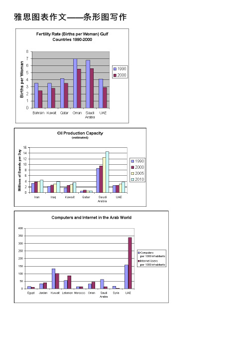
雅思图表作⽂——条形图写作Fertility RatesThe chart shows striking changes in the fertility rate of women in six Gulf countries –Saudi Arabia, the UAE, Oman, Qatar, Kuwait and Bahrain between 1990 and 2000.In the ten year period, there was a decline in the number of births per woman in all countries. The biggest declines were in two countries which had low fertility rates at the start of the decade, Bahrain and the UAE.Fertility rates vary greatly between the six countries. Oman and Saudi Arabia had the highest rates, with over seven births per woman in 1990. This compared with around 4 births per woman in Bahrain and the UAE, and just 3.75 in KuwaitBy 2000, the rate had fallen below three births per woman in Kuwait, Bahrain and the UAE, with a drop of over 25% in a decade in the UAE. However, in Saudi Arabia and Oman, the rates fell by just 20%, from 7.0 to 5.5.In summary, there were major decreases in birth rates in all countries, but some countries in the region have double the fertility rate of others.Oil Production CapacityThe graph shows Oil Production Capacity in millions of barrels per day for selected Gulf countries. There are several features in this graph.The most significant feature is that oil production will increase sharply in almost all the countries shown. Kuwait and Iraq are both expected to double their output between 1990 and 2010, with Kuwait’s production rising from 1.8 million barrels per day (bpd) in 1990 to 3.8 in 2010. Iran will also increase its output by a slightly smaller amount. After remaining steady at 2.5 million bpd from 1990 to 2000, the UAE’s output is expected to approach 4.0 million bpd in 2010. Only Qatar’s production is predictedto fall, 0.8 million bpd after a slight rise in 2000.However, the greatest increase will be from Saudi Arabia. In 1990, its output capacity at 8.5 million bpd exceeded the combined production of Iran, Iraq and Kuwait. Thislead is expected to continue with a 75% increase in production to 14.5 million bpd 2010.In summary, while most of the countries are expected to show increases, Saudi Arabia will maintain and strengthen its position as the major producer.Computers & Internet in the Arab WorldThe chart shows striking differences in the level of computer andInternet penetration in the Arab world.The UAE and Kuwait are by far the most computerized countries, with Lebanon a distant third. The UAE has over 150 computers for every 1000 inhabitants, compared to Kuwait’s 130 and Lebanon’s 60.In contrast, countries such as Egypt,Morocco and Syria have less than 20 computers per 1000 inhabitants.There are also great differences in Internet use and availability. The UAE has by far the highest proportion of users, with more than one-third of its population using the Internet. Kuwait and Lebanon are second and third again, with 100 users per thousand in Kuwait and 80 in Lebanon. In some countries the number using the Internetis negligible: Saudi Arabia has less than 20 users per thousand, and there are fewer than 5 users per thousand in Syria.One unusual feature of the graph is that Internet use does not seem to be directly related to the number of computers. In several countries (the UAE, Lebanon, Jordan and Oman), there are more Internet users per thousand people than computers. However, in other countries, such as Kuwait, Saudi Arabia and Syria, the number of Internet users is lower than the number of computers.In summary, there are major differences between computer use and Internet use in the Arab world, but the UAE clearly leads the area in both number of computers and number of internet users per capita.Coffee ProductionThe graph shows coffee exports for the top 12 countries in the world in 2010 and 2011. Overall, the biggest producers by far are Brazil and Vietnam, and there has not been much change in the ranking of the top producers in the last two years. Almost every country in the graph produced more coffee in 2011 than in 2010. Brazil was the largest producer. It increased exports from 30,000,000 bags in 2010 to almost35,000,000 in 2011. Vietnam was the second largest producer, and it also increased its output from under 14,000,000 bags to about 17,000,000. Colombia, Indonesia and India exported almost the same amount, at between 6 and 8 million bags, and then a large group of countries including Peru, Guatemala, Honduras, Ethipia, Uganda and Mexico produced about 3 or 4 million bags in both years.Only two countries in the graph exported less in 2011. They were Indonesia and Coted’Ivoire. In Cote d’Ivoire, production fell by 50%, fro m 2 million bags to 1 million.。
雅思写作备考中的图表数据描述与分析方法

雅思写作备考中的图表数据描述与分析方法在雅思写作备考中,图表数据的描述与分析方法是一个关键的技巧。
图表数据描述与分析旨在帮助考生清晰地传达图表中的信息,并展示对数据的深入理解。
本文将介绍一些有效的方法来描述和分析雅思写作中的图表数据。
一、图表数据描述1. 描述整体趋势:首先,我们可以描述图表中呈现的整体趋势。
可以使用类似于“总体来看”、“总体趋势是”等短语来引出描述。
例如,如果图表显示了过去几年某个城市的人口变化情况,可以说“总体来看,该城市的人口在近几年稳定增长”。
2. 细节描述:接下来,我们需要针对图表中的具体数据进行描述。
可以使用具体的数字、比例或百分比等来描述。
例如,如果图表显示了某个国家不同年龄段的人口比例,可以说“18至30岁年龄段的人口占总人口的30%,是各个年龄段中的最高比例”。
3. 时间和地点描述:如果图表中涉及到时间和地点的变化,我们也需要对其进行描述。
可以使用时间词和地点词来具体说明。
例如,如果图表显示了某个地区不同月份的降水量情况,可以说“6月份的降水量最高,为100毫米”。
二、图表数据分析1. 找出关键信息:在分析图表数据时,需要从中挑选出关键的信息。
这些关键信息可能是特殊的数据点、变化的趋势或者与主题相关的数据。
通过找出这些关键信息,可以帮助我们进行更有针对性的分析。
2. 建立对比:图表数据可以提供不同变量之间的比较基础。
在分析时,可以通过对比不同变量的数据来突出差异和相似之处。
例如,如果图表显示了不同国家的能源消耗量,可以对比两个或多个国家之间的差异并分析原因。
3. 确定影响因素:对图表数据进行深入分析时,需要确定可能影响数据变化的因素。
这些因素可能是经济因素、政治因素、社会因素等。
通过分析这些因素与数据的关系,可以深入理解数据的背后含义。
4. 展望未来趋势:在分析图表数据时,考生可以尝试根据已有数据预测未来的趋势。
这要求考生具备一定的推理能力和对数据的深入理解。
通过展望未来,可以增加文章的可读性和独特性。
雅思英语柱状图作文
雅思英语柱状图作文
英文回答:
The bar chart illustrates the number of books sold in a bookstore during the first six months of the year. In January, the store sold approximately 4,000 books. Sales rose steadily in the following months, reaching a peak of 6,500 books in March. After a slight dip in April, book sales rebounded in May and June, with the store selling
just over 6,000 books in each month. Overall, book sales showed a positive trend over the six-month period, indicating a healthy demand for reading materials.
中文回答:
图表显示了今年上半年一家书店售出的图书数量。
1 月份,该书店售出了约 4,000 本图书。
书籍销量在接下来的几个月中稳步上升,并在 3 月份达到 6,500 本的高峰。
4 月份销量略有下降,但5 月份和 6 月份销量回升,该书店每个月的销量均略高于 6,000
本。
总体而言,书籍销量在这六个月期间呈现积极趋势,表明对阅读材料有健康的需求。
雅思写作八分经典范文背诵:图表作文(5)
The table below shows the consumer durables (telephone, refrigerator, etc.) owned in Britain from 1972 to 1983.Write a report for a university lecturer describing the information shown below.该图表展现的是1972-1983十一年间英国耐久消费品的拥有量。
The table indicates the consumer durables that were own in the UK over a period of 11 years from 1972 to 1983.从图表来看,英国八种耐久消费品在所标识时间段里的拥有量总体分为三种情况:中央暖气设备、电视、吸尘器、冰箱、电话、洗碗机呈现出各有特色的上升趋势;洗衣机呈现出总的上升,但中间有一次下降、放映机无从对比。
As can be seen from the table, the ownership of the eight above mentioned consumer durables in the UK during the designated period of time roughly revealed three different trends. Central heating, television, vacuum cleaner, refrigerator, telephone and dishwasher showed a trend of increase with different characteristics; Washing machine showed a trend of general rise with one fluctuation; Video had nothing to compare with.首先,中央暖气设备和电话一直处于上升态势。
雅思小作文---TASK1图表题

雅思小作文 T A S K 1 图表题规律注意事项:1 . Task1 是客观写作,要求客观真实。
2 . 客观性:不应该有任何图里没有而靠自己主观想象加入的成分。
结尾段针对图形做出的总结性结论也应该是根据图表的实际内容做出的符合逻辑的总结。
准确性:图表里面的数据介绍要力求精确,不能抄错数字。
但当一个特征点没有落在一个准确的坐标值上时,允许进行合理的目测或估计一个大概数值。
详尽性:要有层次感,并不需要把所有的数字都推到文章里。
3 . 类型Table 表格题Line Graph 线图Bar Chart 柱状图Pie Chart 饼状图Process Chart 流程图4 . 看图要注意单位,标题和图例。
5 . 对于多数小作文题,题中给出了几个图就对应的写出几个主体段。
题目里只给出一个图,根据图中包含几类图形元素写几个主体段。
图中只给了一个图,但图中所含图形元素很多,则分类。
题目中出现多线多柱多饼,用“对应提取法“,把每组里的对应元素提出来组织主体段。
6 . 时态和发生时间意义对应。
陈述永恒事实的句型,其主句的谓语动词必定用一般现在时。
若题目里没有出现时间,则全文都使用一般现在时。
7 . 结构开头段(1~2句)改写原题主体段1 总体概括具体介绍数字主体段N 总体概括具体介绍数字结尾段(1~2句)介绍总数(若图里并没有明确的给出总数,则省略)结论(根据图里的数据得出有一定合理性的结论)8 . 开头段的改写题目中ShowProportion InformationThe number/amount of FamilyMalesFemaleInfluence改写成illustrate /compare percentagedatathe figure for householdmenwomenaffect/effectCategories kinds/typesSubway system Storeunderground railway/train system shop9 . 介绍数据或描述变化趋势的常用词。
- 1、下载文档前请自行甄别文档内容的完整性,平台不提供额外的编辑、内容补充、找答案等附加服务。
- 2、"仅部分预览"的文档,不可在线预览部分如存在完整性等问题,可反馈申请退款(可完整预览的文档不适用该条件!)。
- 3、如文档侵犯您的权益,请联系客服反馈,我们会尽快为您处理(人工客服工作时间:9:00-18:30)。
Gross Domestic Product in the UK
- Free online IELTS Advice
- Free online IELTS Advice
Bar Chart Model Answer
The bar chart illustrates the gross domestic product generated from the IT and Service Industry in the UK from 1992 to 2000. It is measured in percentages. Overall, it can be seen that both increased as a percentage of GDP, but IT remained at a higher rate throughout this time. At the beginning of the period, in 1992, the Service Industry accounted for 4 per cent of GDP, whereas IT exceeded this, at just over 6 per cent. Over the next four years, the levels became more similar, with both components standing between 6 and just over 8 per cent. IT was still higher overall. However, over the following four years, the patterns of the two components were noticeably different. The percentage of GDP from IT increased quite sharply to 12 in 1996 and then nearly 15 in 2000 , while the Service Industry stayed nearly the same, increasing to only 8 per cent. At the end of the period, the percentage of GDP from IT was almost twice that of the Service Industry. Words 174
- Free online IELTS Advice
- Free online IELTS Advice
IELTSould spend about 20 minutes on this task. The chart shows components of GDP in the UK from 1992 to 2000. Summarize the information by selecting and reporting the main features and make comparisons where relevant. Write at least 150 words.