雅思小作文 表格
(完整版)剑桥雅思小作文表格及其他类的写法归纳
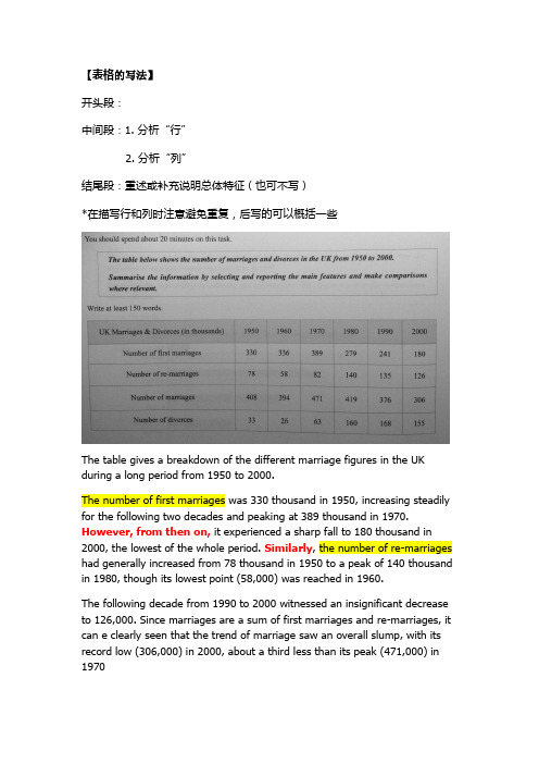
【表格的写法】开头段:中间段:1. 分析“行”2. 分析“列”结尾段:重述或补充说明总体特征(也可不写)*在描写行和列时注意避免重复,后写的可以概括一些The table gives a breakdown of the different marriage figures in the UK during a long period from 1950 to 2000.The number of first marriages was 330 thousand in 1950, increasing steadily for the following two decades and peaking at 389 thousand in 1970. However, from then on, it experienced a sharp fall to 180 thousand in 2000, the lowest of the whole period. Similarly, the number of re-marriages had generally increased from 78 thousand in 1950 to a peak of 140 thousand in 1980, though its lowest point (58,000) was reached in 1960.The following decade from 1990 to 2000 witnessed an insignificant decrease to 126,000. Since marriages are a sum of first marriages and re-marriages, it can e clearly seen that the trend of marriage saw an overall slump, with its record low (306,000) in 2000, about a third less than its peak (471,000) in 1970In contrast to the general downward trend of marriages, divorces had nearly tripled from 33 thousand in 1950 to 168 thousand in 1990. Despite a slight decline, the year 2000 also witnessed a high of 155 thousand.Generally speaking, the number of marriages has been descending, or even plummeted in the last decades whereas that of divorces soared surprisingly by four times.【饼图的写法】对饼状图数据进行分析之后,可将题目分为有时间跨度的动态图,和没有时间跨度的静态对比图。
雅思小作文题型整理
雅思小作文(图表题)题型归纳一.t able 表格题1.剑2 (1)4.剑5(4)6.剑7(1)二.Line graph线图(含直线和曲线图)1.剑3(4)You should spend about 20 minutes on this task.The graph below shows the unemployment rates in the US and Japanbetween March 1993 and March 1999.Write a report for a university lecturer describing the information shownbelow.You should write at least 150 words.You should spend about 20 minutes on this task.The graph below shows the proportion of the population aged 65 and overbetween 1940 and 2040 in three different countries.Summarize the information by selecting and reporting the main features,and make comparisons where relevant.Write at least 150 words.You should spend about 20 minutes on this task.The graph below shows the consumption of fish and some different kinds of meatin a European country between 1979-2004.Summarize the information by selecting and reporting the main features, andmake comparisons where relevant.Write at least 150 words.You should spend about 20 minutes on this task.The graph below shows the quantities of goods transported in the UK between 1974 and 2002 by four different modes of transport.Summarize the information by selecting and reporting the main features, and make comparisons where relevant.Write at least 150 words.5.剑9(4)三.Bar chart 柱状图You should spend about 20 minutes on this task.The chart below shows the amount of leisure time enjoyed by men and women of different employment status.Write a report for a university lecturer describing the information shown below.Write at least 150 words.Leisure time in a typical week: by sex and employment status,1998-99You should spend about 20 minutes on this task.The table below shows the figures for imprisonment in five countries between 1930 and 1980.Write a report for a university lecturer describing the information shown below.You should write at least 150 words.You should spend about 20 minutes on this task.The chart below shows the amount spent on six consumer goods in fourEuropean countries.Write a report for a university lecturer describing the information shown below. You should write at least 150 words.You should spend about 20 minutes on this task.The charts below show the level of participation in education and sciencein developing and industrialized countries in 1980 and 1990Write a report for a university lecturer describing the information shown below. You should write at least 150 words.5.剑4(3)You should spend about 20 minutes on this task.The chart below shows the different levels of post-school qualifications inAustralia and the proportion of men and women who held them in 1999.Summarize the information by selecting and reporting the main features,and make comparisons where relevant.You should write at least 150 words.You should spend about 20 minutes on this task.The charts below show the main reasons for study among students ofdifferent age groups and the amount of support they received from employers.Summarize the information by selecting and reporting the main features,and make comparisons where relevant.You should write at least 150 words.You should spend about 20 minutes on this task.The charts below give information about USA marriages and divorce ratesbetween 1970 and 2000, and the marital status of adult Americans in twoof the years.Summarize the information by selecting and reporting the main features,and make comparisons where relevant.You should write at least 150 words.You should spend about 20 minutes on this task.The chart below shows information about changes in average house prices in fivedifferent cities between 1990 and 2002 compared with the average house prices in 1989.Summarize the information by selecting and reporting the main features, and makecomparisons where relevant.You should write at least 150 words.四.Pie chart饼图1.剑7(4)2.剑8(2)3.剑9(3)五.流程图1.剑1(2)You should spend about 20 minutes on this task.The diagrams below show the life cycle of the silkworm and the stages inthe production of silk cloth.Summarize the information by selecting and reporting the main features,and make comparisons where relevant.Write at least 150 words.六.混合图。
2021雅思小作文-表格Table攻略及范文汇总

表格题写作要点:1表格与饼图一样,都是静态图。
切入点在描述分配;2表格题考查列举数字的能力和方法。
通过举一些有代表性的数据来说明问题;3横向比较。
介绍横向各个数据的区别、变化和趋势;4纵向比较。
介绍纵向各个数据的区别、变化和趋势;5不需要将每一个数据分别说明,突出强调数据最大值和最小值;6对比时要总结出数据对比最悬殊的和最小的。
表格类作文常用词汇noticeable trend 明显趋势pronounced adj. 明显的significant changes一些较大变化rank n. vt. vi. 列为,排列,等级distribute vt. 分布,区别unequally adv. 不平等地average n.vt.vi.adj.corresponding adj. 相应的,通讯的represent vt. 阐述,表现overall adj.in the case of adv. 在...的情况下in terms of / in respect of / regarding 在...方面.5.2 表格描述比例1) _____ accounts for (takes up) 20%of all. _____占总数的20%。
2) On the top of the list is _____, which accounts for 70%.比例最高的是_____,占70%。
3) At the bottom of the list is _____,which takes up 20%only.比例最低的是_____,仅占20%。
4) A ranks first,followed by B at 20%and C at 15%.A占比例最大,其次是B 占20%及C占15%。
5) The figure reached the highest/lowest point in _____. 数据在_____时候达到最高点(最低点)。
雅思图表写作范例(中小学校)
4
教育类B
TASK 2饼型图题:
You should spend about 20 minutes on this task.
The two pie charts below show the percentage of the Earth’s surface area and the percentage of the two world’s population for the seven continents.
Write a report describing the information shown below.
about the graph. Overall, the number of (mobile phone) owners has risen considerably since 1995. In some countries the figure has more than doubled over the five years.
7
教育类B
饼型图:model answer
Asia also has the largest population with a half of the world’s people living there. In contrast, Antarctica has no permanent inhabitants. Europe has a population next to that of Asia in size, and an area slightly bigger than that of Oceania, becoming the most densely populated region on the earth. Here the striking fact about the distribution of the world’s
英语考试作文-24日雅思写作小作文范文:柱状图+表格
英语考试作文24日雅思写作小作文范文:柱状图+表格2018年5月的最后一场雅思考试已经结束,一起来回顾本场雅思考试的小作文吧。
本场雅思写作小作文题目为:The chart and table show the population size and life expectancy of three countries.题型为柱状图与表格题混合模式。
总体来说难度不大,建议考生将柱状图与表格的数据分开描述,并注意时态。
雅思小作文真题: The chart and table show the population size and life expectancy of three countries.Summarize the information by selecting key features and making comparison where is relevant.小作文范文解析:改题目属于柱状图和表格的混合型,要求描述三个国家在过去和将来人口数量和寿命的变化趋势。
建议把柱状图和表格分开来写,柱状图按照国家主体进行描述在,注意时态。
而寿命都是上升,国家之间也要对比。
范文共计9句话。
雅思小作文范文: The bar chart and the table illustrate variations in the demographic size and life span in 1950, 2000 and projections for 2050 in three countries including China, the United States and Spain.It is striking to note that China is always the most populous country, with its population accounting for more than 400 million in 1950. After 5 decades, this figure tripled and then is projected to keep rising to almost 1600 million in 2050. Meanwhile, a similar trend could be spotted in American population, quadrupling to nearly 400 million over the centenary. The Spanish remained the least and the most stable at around 80 million.As reflected from table, Life expectancy in all the countries is on a rise especially in China where it is projected to double from the initial 40.1 to 79 in 2050. Also noticeable is life of the Spanish is mostly the longest one, growing from 69 to 82.8 years old over this period except in 2000 when it was surpassed by that of Americans who lived 79 years old. American people will also enjoy rising longevity, approaching 82 years old.In summary, the Chinese always tremendously outnumber Americans and the Spanish and life span is predictedto improve and become almost equal in these countries.范文原创自小站老师Alice.Hua 字数 213 words以上就是2018年4月24日雅思写作真题范文,。
雅思小作文表格图实例分析完整版

雅思小作文表格图实例分析HEN system office room 【HEN16H-HENS2AHENS8Q8-HENH1688】雅思小作文表格图实例分析朗阁海外考试研究中心表格图是雅思小作文的常考图形之一,也是烤鸭们在备考时必须要准备的一类题型。
那么烤鸭们具体应该如何准备表格图呢?下面,朗阁海外考试研究中心的专家将以一道具体的实例,就这一题型的解题思路和步骤做出详尽的分析和解答。
The table below shows personal savings as a percentage of personal income for selected countries in 1989, 1999 and 2009.Personal savings as a percentage of personal income一、审题,决定大体写作方式首先,读题目,了解到这幅表格图是关于“几个国家的人民个人收入中存款的百分比”以及三个时间点(据此,正文部分描述存款率是时态基调为过去时)。
表格上方的title和题目表述一样,没有额外信息,因此,读一遍即可。
然后,审具体表格,决定大致写作方向和方式,即分段方式。
表格的审图需要注意以下几个方面:横轴,纵轴和总体数据特征。
此图中的横纵轴分别是时间和7个研究对象——7个国家。
横纵轴中间有一栏为时间,那说明,此图原则上应该按曲线图原理来写——即,描述7个国家存款率上升或下降趋势;但是,经过下一步对表格中数据总体特征的总结发现:7个国家的存款率在这一段时间内总体呈现下降趋势。
这一发现说明,如果继续按照曲线图原理描述,文章会非常单调,而且对比的空间也不大;相反,同一年份里,几个国家之间的差距很大。
因此,正文部分应该按时间分成三个段落,对比同一时间内,7个国家之间的存款率的高低。
最后,审题的最后一关是总结表格中数据的明显特征。
正文主要是从时间角度,纵向对比几个国家。
但是,我们同时也需要反方向观察和对比,也就是,几个国家内部不同时间内存款率的起伏。
雅思表格table写作模板

雅思表格table写作模板table表格图是雅思小作文考试中最主要的提醒之一,也是大家在备考的必须要准备的图形。
那么我们该怎么写呢?下面小编就为大家整理了雅思表格table写作模板,希望能给大家一些帮助和借鉴。
雅思图表写作模板-统计表table雅思小作文表格图写作技巧1. Paraphrasing the introduction.转述开头段。
2. Writing an overview.写出概述。
3. Make sure which tense and what grammar will be used?确定本篇小作文的时态。
4. What information stands out?找出图中数据极值(最大,最小)5. Grouping the information.信息分组。
7分以上范文1.The table below gives information about languages with the most native speakers.Languages with the most native speakersThe table illustrates the number of native speakers of six languages as well as the number of speakers of these languages as an additional language. It is noticeable that the number of speakers of Mandarin Chinese is strikingly higher than the other languages.People who speak Mandarin largely speak it as a first language (900 million). In comparison to this only 190 million people speak Mandarin Chinese as an additional language. What is remarkable about English speakers is that the number of speakers of English as an additional language is higher than that of native speakers of English (603 and 339 million respectively).While the total number of Hindi speakers (490 million) is roughly equal to that of Spanish speakers (420 million); when itcomes to speaking these languages as an additional language the number for Hindi is much higher (120 million) than that for Spanish (70 million).Native speakers of Arabic and Portuguese are similar in number with 206 million and 203 million respectively. However, the number of Arabic speakers as an additional language (24 million) is almost 2.5 times larger than speakers of Portuguese as an additional language.雅思写作表格图模板分享题目一:The table below shows the monthly expenditure of an average Australian family in 1991 and 2001. Summarize the information by selecting and reporting the main features, and make comparisons where relevant.下表显示了1991年和2001年澳大利亚普通家庭的月支出。
雅思小作文---TASK1图表题

雅思小作文 T A S K 1 图表题规律注意事项:1 . Task1 是客观写作,要求客观真实。
2 . 客观性:不应该有任何图里没有而靠自己主观想象加入的成分。
结尾段针对图形做出的总结性结论也应该是根据图表的实际内容做出的符合逻辑的总结。
准确性:图表里面的数据介绍要力求精确,不能抄错数字。
但当一个特征点没有落在一个准确的坐标值上时,允许进行合理的目测或估计一个大概数值。
详尽性:要有层次感,并不需要把所有的数字都推到文章里。
3 . 类型Table 表格题Line Graph 线图Bar Chart 柱状图Pie Chart 饼状图Process Chart 流程图4 . 看图要注意单位,标题和图例。
5 . 对于多数小作文题,题中给出了几个图就对应的写出几个主体段。
题目里只给出一个图,根据图中包含几类图形元素写几个主体段。
图中只给了一个图,但图中所含图形元素很多,则分类。
题目中出现多线多柱多饼,用“对应提取法“,把每组里的对应元素提出来组织主体段。
6 . 时态和发生时间意义对应。
陈述永恒事实的句型,其主句的谓语动词必定用一般现在时。
若题目里没有出现时间,则全文都使用一般现在时。
7 . 结构开头段(1~2句)改写原题主体段1 总体概括具体介绍数字主体段N 总体概括具体介绍数字结尾段(1~2句)介绍总数(若图里并没有明确的给出总数,则省略)结论(根据图里的数据得出有一定合理性的结论)8 . 开头段的改写题目中ShowProportion InformationThe number/amount of FamilyMalesFemaleInfluence改写成illustrate /compare percentagedatathe figure for householdmenwomenaffect/effectCategories kinds/typesSubway system Storeunderground railway/train system shop9 . 介绍数据或描述变化趋势的常用词。
- 1、下载文档前请自行甄别文档内容的完整性,平台不提供额外的编辑、内容补充、找答案等附加服务。
- 2、"仅部分预览"的文档,不可在线预览部分如存在完整性等问题,可反馈申请退款(可完整预览的文档不适用该条件!)。
- 3、如文档侵犯您的权益,请联系客服反馈,我们会尽快为您处理(人工客服工作时间:9:00-18:30)。
对于不同时间同一事物的比较
• 先相减/相除,后分组
• 哪些是增加,哪些是减少 • 幅度大的与幅度小的分组
• 增加的 Car, Long distance bus, Train, Taxi • 幅度大的 Car +1607 • 减少的 Walking, Bicycle, Local bus • 幅度大的 Local bus -155
P2
• The travel modes which gained popularity in the period included cars, long distance buses, trains, taxis and others. • Cars remained top among the modes in the 15 years, with its average miles increasing considerably from 3,199 in 1985 to 4,806 in 2000. • Long distance buses and taxis seemed to be warmly welcomed by travelers, so average miles travelled in the two modes almost tripled
• The third part is passengers per year in millions. • More exactly, the top three are Tokyo (1927), Paris (1191) and London (775). • Underground railway system in Washington DC’s has 144 millions passengers per year. • Systems in Los Angeles’s and Kyoto’s carry fewer passengers per year (50 and 45, respectively).
• As for the size of the railway system, London still ranks the first, meaning it has the longest subway system (384 kilometers) among the six cities, which is roughly twice as large as the system in Paris. (最长) • By contrast, subway system in Kyoto is shorter (11 kilometers) than the others even thought it opened in relatively recent year. (最短) • The kilometers of route in Tokyo, Washington DC and Los Angeles are 155, 126 and 28 differently. 排长长
P2
• In terms of Date opened, London has the most time-honored (1863) subway system among the six cities while subway system in Los Angeles is the newest one opened in 2001. (最老,最新) • Systems in Paris and Tokyo are opened in 1900 and 1927, respectively. 时间顺序 • After that, systems in Washington DC and Kyoto are opened in 1976 and 1981 differently.
P4
• Overall, the number of miles travelled by the average per person rose from 4,740 miles in 1985 to 6,475 miles in 2000, with the increase of cars accounting for almost all of e demonstrates how different modes of travel changed in England in 15 years spanning from 1985 to 2000. 题目改写 • In general, the modes are classified into two kinds in terms of average miles travelled per person per year: one enjoyed rising popularity while the other decreasing. • 不同点
P3
• Travels by walking, bicycles and local buses lost travelers’ favor in the one and a half decade. • Average travelling distance by local buses suffered the biggest decrease, dropping from 429 to 274, while the number of miles by walking and bikes fell mildly from 255 to 237 and from 51 to 41 respectively.
各自为战
• The table below gives information about underground railway systems in six cities. 剑5P98
• 排高高
• 称重重 • 来比较
P1
• The table demonstrates the data regarding the subway system in six cities, including Date opened, kilometers of route and passengers per year (in millions)
• Thus, it can be clearly seen from the table that the subway systems in Tokyo and Paris serves for more passengers whereas the systems in Los Angeles and Kyoto carry fewer passengers mainly because of the short route.
表格 Table
• 过于抽象 • 数字(比例)太多,难以取舍 • 趋势不明显
今昔对比
• The table below gives information about changes in modes of travel in England between 1985 and 2000. 剑6P52