雅思写作 表格图和柱状图
[雅思]3种常见雅思图表作文
![[雅思]3种常见雅思图表作文](https://uimg.taocdn.com/beb24afc2f60ddccdb38a0c7.webp)
1.柱状图:柱状图本质上就是前三种图的柱状形式,下面我们通过一个图来进行掩饰。
这张图看起来像三张饼图,等于四根曲线图,可以使用总分句,还等于一个3×4的表格题。
我们在写的时候可以使用一些表格题的写作方法,比如:This was the similarcase with the trend of foot.其实我们讲,考试中虽然有4种图,但题型本质上就分动态图和静态图,动态图最好使用曲线图的整体写作模式,就是All trends加天龙八部的微观和宏观结合,静态图则是静态表格的写作模式,通常用纯比较的写作模式。
所以我们在写作中要记住,语言不用新学了,完全借鉴前三种中的句型。
柱状图特殊的要求一,对类比和反比非常重视,因为它主要是向前三种图借鉴,也就是它不再强调每一种题型的要求,它不必强调趋势或者数字,它对每个图的当中共性和差异的开发是比较重视,所以柱状图中的文字性的部分可以多一些。
二,柱状图对语法的要去很高,很多柱状图属于静态图,这样写作的时候要求主语和句型的多样性。
三,它要求我们掌握一个概念,即隐藏特征的概念,它是柱状图特有的,后来引入到其他图,所谓隐藏特征即隐藏在数据背后的客观性事实,首先它是不明显的,要看你个人的分析能力,第二它是客观性事实,千万不要夹杂个人观点,如果在雅思中发表个人观点,一定5分以下。
另外隐藏特征要在结尾段写,它有自己的默认格式:What is worth mentioning is that since…, it indicates the fact that…,这个应该算高分的最后一击。
雅思Task1的高分关键在于:一,变化多端的wording,句式和体系,这就说明了你词汇的词汇的使用能力,包括句型的变化,这个用的好的话,5分是一定的;二,清晰宏观的分类,all trends的总分句;三,7.5分以上需要有力得体的隐藏特征,这是一个加分,找不到不扣分,找到有0.5分的加分。
雅思小作文各种图题、表格题技巧总结
雅思小作文各种图题、表格题技巧总结雅思作文Task 1受图表内容的限制,遣词造句的要求非常有限,只需针对考试,把核心表达用准用熟即可,所谓博大不如精深。
下面是威学教育雅思教研组总结的雅思小作文线图题、柱形图题、饼图题、表格题以及流程图等的写作总结!线图、柱状图、饼图,表格题介绍段introduction介绍段内容几乎完全不用创新,就是对题目文字部分的第二段做改写,paraphrase the rubric.所谓改写,要么换词,要么换句式。
例如:(I4-100)The charts below give information about travel to and from the UK and most popular countries for UK residents to visit.换词(1) 图 The charts图:chart, graph(雅思写作中完全等价,无差别)线:line / curve chart柱图:bar / column graph饼:pie chart表:table / statistics / figures(2) 动词“表明”give information about介绍段是客观描述,用一般现在时态,give information about 虽然在这篇作文中最好不再用,但是informal learning,随手学到的东东,留作其它文章再用。
替换的词语和结构很多,比如我常用的show /illustrate / demonstrate/compare,大家也可以选几个自己喜欢并且拼写准确的形成风格。
第二段其余部分的替换因题而异,比如travel换成visitthe UK换成Britain(注意不是England,英格兰只是Britain的一部分)popular换成fashionablecountry换成nationUK residents to visit换成UK tourists不过随着练习作文数量的增加,你会惊喜的发现,雅思图表作文,连描述的对象都是类似的。
英语考试作文-雅思写作小作文模版:柱状图
英语考试作文雅思写作小作文模版:柱状图雅思小作文模板――柱状图柱状图(1as can be seen from the diagram, great changes have taken place in……从图中可以看出,……发生了巨大变化。
2.from the table/chart/diagram/figure, we can see clearly that……or it is clear/apparent from the chart that……从图表我们可以很清楚(明显)看到……)和线型图写法一致,并且结合饼状图来写!表格题1. 找出最大值,最小值,以及一般值2. 进行分析比较,找出近似值和相差很大的数值常用句式 1.a is nearly /more than…times as much/many/large as b.(a是b的…倍。
) / the table shows the changes in the number of……over the period from……to……该表格描述了在……年之……年间……数量的变化。
2. be the same as…(与…相同)3.表原因的句子:(1). cause-effect (较常用) :XXX lead to / bring about / result in/ account for … (一个句子/shared the same tendency), therefore / thus / hence / as a result / consequently / (and) so …(2). effect-cause (较常用)XXX be caused by / result from / be the result of / be the effect of / be the consequence of …(一个句子/shared the same tendency), because …it is adj. that …it is unimaginable that …it is undeniable that …it is interesting to discover that …4.与饼状题类似。
雅思小作文范文-柱状图
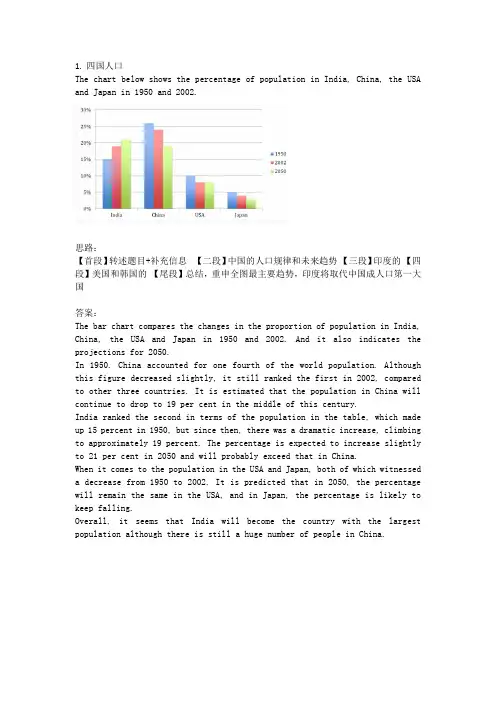
1.四国人口The chart below shows the percentage of population in India, China, the USA and Japan in 1950 and 2002.思路:【首段】转述题目+补充信息【二段】中国的人口规律和未来趋势【三段】印度的【四段】美国和韩国的【尾段】总结,重申全图最主要趋势,印度将取代中国成人口第一大国答案:The bar chart compares the changes in the proportion of population in India, China, the USA and Japan in 1950 and 2002. And it also indicates the projections for 2050.In 1950. China accounted for one fourth of the world population. Although this figure decreased slightly, it still ranked the first in 2002, compared to other three countries. It is estimated that the population in China will continue to drop to 19 per cent in the middle of this century.India ranked the second in terms of the population in the table, which made up 15 percent in 1950, but since then, there was a dramatic increase, climbing to approximately 19 percent. The percentage is expected to increase slightly to 21 per cent in 2050 and will probably exceed that in China.When it comes to the population in the USA and Japan, both of which witnessed a decrease from 1950 to 2002. It is predicted that in 2050, the percentage will remain the same in the USA, and in Japan, the percentage is likely to keep falling.Overall, it seems that India will become the country with the largest population although there is still a huge number of people in China.2.通勤工具Different modes of transport used to travel to and from work in one European city in 1960, 1980 and 2000.思路:1. 分段原则为:上升的一段,下降的一段,波动的一段。
雅思小作文技巧及范文
雅思小作文写作技巧及范文一.图表类型饼状图,直方图或柱形图趋势曲线图表格图流程图或过程图程序图二.解题技巧A. 表格图1 横向比较: 介绍横向各个数据的区别,变化和趋势2 纵向比较:介绍横向各个数据的区别,变化和趋势3 无需将每一个数据分别说明,突出强调数据最大值和最小值,对比时要总结出数据对比最悬殊的和最小的说明:考察例举数字的能力和方法。
注意怎样通过举一些有代表性的数据来有效地说明问题。
B. 曲线图1 极点说明: 对图表当中最高的,最低的点要单独进行说明2 趋势说明: 对图表当中曲线的连续变化进行说明,如上升,下降,波动,持平3 交点说明: 对图表当中多根曲线的交点进行对比说明说明:关键是把握好曲线的走向和趋势,学会 general classification, 即在第二段的开头部分对整个曲线进行一个阶段式的总分类,使写作层次清晰。
接下来在分类描述每个阶段的 specific trend, 同时导入数据作为你分类的依据。
注意不要不做任何说明就机械性的导入数据!可以使用一些比较 native 的单词和短语来描述 trend。
C. 饼状图1 介绍各扇面及总体的关系2 各个扇面之间的比较,同类扇面在不同时间,不同地点的比较3 重点突出特点最明显的扇面:最大的,最小的,互相成倍的D. 柱状图1. 比较 : similarity2.对比 : difference)3.横向总结所有柱状图表的共性特征 & 分别描写各个柱子的个性特征E.流程图1.首先说明:做什么工作的过程,目的是什么 2.准备工作 3.按时间/过程先后描述4.结果 5.简单总结说明:注意流程图里的“因果关系” 或每一流程的“承前启后” 关系;表达每一流程的主体内容,阐明这种关系;揭示其内在联系或规律;最后,给予简要归纳和总结。
F. 实物/器具工作过程 1.实物的名称,功能 2.基本结构 3.工作过程 4.简单总结G. 综合图1 不求甚解,不拘泥于细节2 分门别类,分段落详细介绍各个图表3 不画蛇添足,主观臆断或猜测图表之间的关系三.写作结构框架结构1.开头:该图阐述的是______ 的______.共有以下几个部分组成。
雅思写作-小作文范文-柱状图
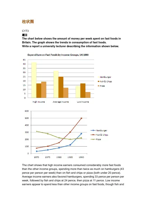
柱状图C1T3题目The chart below shows the amount of money per week spent on fast foods in Britain. The graph shows the trends in consumption of fast foods.Write a report a university lecturer describing the information shown below.The chart shows that high income earners consumed considerably more fast foods than the other income groups, spending more than twice as much on hamburgers (43 pence per person per week) than on fish and chips or pizza (both under 20 pence). Average income earners also favored hamburgers, spending 33 pence per person per week, followed by fish and chips at 24 pence, then pizza at 11 pence. Low income earners appear to spend less than other income groups on fast foods, though fish andchip remains their most popular fast food, followed by hamburgers and then pizza. From the graph we can see that in 1970, fish and chips were twice as popular as burgers, pizza being at that time the least popular fast food. The consumption of hamburgers and pizza has risen steadily over the 20 year period to 1990 while the consumption of fish and chips has been in decline over that same period with a slight increase in popularity since 1985.分析:题目The chart below shows the amount of money per week spent on fast foods in Britain. The graph shows the trends in consumption of fast foods.两句话,两个图第一段The chart shows that high income earners consumed considerably more fast foods than the other income groups, spending more than twice as much on hamburgers (43 pence per person per week) than on fish and chips or pizza (both under 20 pence).•说明了高收入人群的两个特点,第一是消耗快餐最多,第二是人群中hamburger, fish and chips, pizza的特点•spending more than twice as much on hamburgers than on fish and chip and chips or pizza 这是一句令人费解的句子,含义应为“消耗的汉堡是薯片或匹萨的两倍多”,应用的句型应当为典型的表示倍数关系的句型“n times as…as”,比如✓This airplane flies two times as fast as that one. 这家飞机的飞行速度是那架的两倍。
雅思英语图表作文范文(必备3篇)
雅思英语图表作文范文第1篇A类雅思各类图表作文要点及范文一.曲线图解题关键1曲线图和柱状图都是动态图,解题的切入点在于描述趋势。
2在第二段的开头部分对整个曲线进行一个阶段式的总分类,使写作层次清晰,同时也方便考官阅卷。
接下来再分类描述每个阶段的specifictrend,同时导入数据作为分类的依据。
3趋势说明。
即,对曲线的连续变化进行说明,如上升、下降、波动、持平。
以时间为比较基础的应抓住“变化”:上升、下降、或是波动。
题中对两个或两个以上的变量进行描述时应在此基础上进行比较,如变量多于两个应进行分类或有侧重的比较。
4极点说明。
即对图表中最高的、最低的点单独进行说明。
不以时间为比较基础的应注意对极点的描述。
5交点说明。
即对图表当中多根曲线的交点进行对比说明。
6不要不做任何说明就机械地导入数据,这不符合雅思的考试目的。
曲线图常用词汇动词—九大运动趋势一:表示向上:increase,rise,improve,grow,ascend,mount,aggrandize,goup,climb, take off, jump,shoot up暴涨,soar,rocket, skyrocket雅思英语图表作文范文第2篇It is said that countries are becoming similar to each other because of the global spread of the same products, which are now available for purchase almost anywhere. I strongly believe that this modern development is largely detrimental to culture and traditions worldwide.A country’s history, language and ethos are all inextricably bound up in its manufactured artefacts. If the relentless advance of international brands into every corner of the world continues, these bland packages might one day completely oust the traditional objects of a nation, which would be a loss of richness and diversity in the world, as well as the sad disappearance of t he manifestations of a place’s character. What would a Japanese tea ceremony be without its specially crafted teapot, or a Fijian kava ritual without its bowl made from a certain type of tree bark?Let us not forget either that traditional products, whether these be medicines, cosmetics, toy, clothes, utensils or food, provide employment for local people. The spread of multinational products can often bring in its wake a loss of jobs, as people urn to buying the new brand,perhaps thinking it more glamorous than the one they are used to. This eventually puts old-school craftspeople out of work.Finally, tourism numbers may also be affected, as travelers become disillusioned with finding every place just the same as the one they visited previously. To see the same products in shops the world over is boring, and does not impel visitors to open their wallets in the same way that trinkets or souvenirs unique to the particular area too.Some may argue that all people are entitled to have access to the same products, but I say that local objects suit local conditions best, and that faceless uniformity worldwide is an unwelcome and dreary prospect.Heres my full answer:The line graphs show the average monthly amount that parents in Britain spent on their children’s s porting activities and the number of British children who took part in three different sports from 2008 to is clear that parents spent more money each year on their children’s participation in sports over the six-year period. In terms of the number of children taking part, football was significantly more popular than athletics and 2008, British parents spent an average of around £20 per month on their children’s sporting activities. Parents’ spending on children’s sports increased gradually over the followi ng six years, and by 2014 the average monthly amount had risen to just over £ at participation numbers, in 2008 approximately 8 million British children played football, while only 2 million children were enrolled in swimming clubs and less than 1 million practised athletics. The figures for football participation remained relatively stable over the following 6 years. By contrast, participation in swimming almost doubled, to nearly 4 million children, and there was a near fivefold increase in the number of children doing athletics.剑桥雅思6test1大作文范文,剑桥雅思6test1大作文task2高分范文+真题答案实感。
雅思写作小作文范文 雅思写作柱状图bar chart 就业率.doc
雅思写作小作文范文雅思写作柱状图bar chart 就业率今天我们雅思写作小作文范文的文章来研究下柱状图bar chart。
该图表给出了六个个国家(澳大利亚,瑞士,冰岛,美国,英国,新西兰)在1995年和2005年这两年里男性和女性的就业情况。
虽然图中数据不少,但类别比较明确,比较起来也相当方便,整体难度不大。
小编搜集了一篇相关的高分范文,以供大家参考。
雅思写作小作文题目The graph below shows information on employment rates across 6 countries in 1995 and 2005.Summarise the information by selecting and reporting the main features, and make comparisons where relevant.雅思写作小作文范文The supplied bar graph compares the employment rates between men and female in 6 different countries for the years 1995 and 2005. As is observed from the given data, the employment rate among men was higher than that of females in all of the given six countries and the overall employment conditions in Iceland, Switzerland was comparatively better than the other four countries.题目中所给出的柱状图比较了6个不同国家1995年和2005年男女之间就业率的差别。
雅思写作小作文范文 雅思写作柱状图bar chart 奖牌数量.doc
雅思写作小作文范文雅思写作柱状图bar chart 金牌数量今天我们雅思写作小作文范文的文章来研究下柱状图bar chart。
该图表展示了12个不同的国家在奥林匹克运动会上获得的奖牌的数量,并用三种不同的颜色来标示金银铜牌。
很明显可以看出美国获得的奖牌数量远超其他国家,而苏联则排名第二。
雅思写作小作文题目The chart below shows the total number of Olympic medals won by twelve different countries.Summarise the information by selecting and reporting the main features, and make comparisons where relevant.雅思写作小作文范文The bar chart compares twelve countries in terms of the overall number of medals that they have won at the Olympic Games.该柱状图比较了12个国家在奥林匹克运动会上获得的奖牌的数量。
It is clear that the USA is by far the most successful Olympic medal-winning nation. It is also noticeable that the figures for gold, silver and bronze medals won by any particular country tend to be fairly similar.显然,美国到目前为止是最为成功的奥林匹克奖牌获得者。
也可以注意到,其他任何国家赢得金牌、银牌和铜牌数量相当相似。
The USA has won a total of around 2,300 Olympic medals, including approximately 900 gold medals, 750 silver, and 650 bronze. In second place on the all-time medals chart is the Soviet Union, with just over 1,000 medals. Again, the number of gold medals won by this country is slightly higher than the number of silver or bronze medals.美国赢得了大约2300枚奥运会奖牌,包括大约900枚金牌,750枚银牌和650枚铜牌。
英语考试作文-24日雅思写作小作文范文:柱状图+表格
英语考试作文24日雅思写作小作文范文:柱状图+表格2018年5月的最后一场雅思考试已经结束,一起来回顾本场雅思考试的小作文吧。
本场雅思写作小作文题目为:The chart and table show the population size and life expectancy of three countries.题型为柱状图与表格题混合模式。
总体来说难度不大,建议考生将柱状图与表格的数据分开描述,并注意时态。
雅思小作文真题: The chart and table show the population size and life expectancy of three countries.Summarize the information by selecting key features and making comparison where is relevant.小作文范文解析:改题目属于柱状图和表格的混合型,要求描述三个国家在过去和将来人口数量和寿命的变化趋势。
建议把柱状图和表格分开来写,柱状图按照国家主体进行描述在,注意时态。
而寿命都是上升,国家之间也要对比。
范文共计9句话。
雅思小作文范文: The bar chart and the table illustrate variations in the demographic size and life span in 1950, 2000 and projections for 2050 in three countries including China, the United States and Spain.It is striking to note that China is always the most populous country, with its population accounting for more than 400 million in 1950. After 5 decades, this figure tripled and then is projected to keep rising to almost 1600 million in 2050. Meanwhile, a similar trend could be spotted in American population, quadrupling to nearly 400 million over the centenary. The Spanish remained the least and the most stable at around 80 million.As reflected from table, Life expectancy in all the countries is on a rise especially in China where it is projected to double from the initial 40.1 to 79 in 2050. Also noticeable is life of the Spanish is mostly the longest one, growing from 69 to 82.8 years old over this period except in 2000 when it was surpassed by that of Americans who lived 79 years old. American people will also enjoy rising longevity, approaching 82 years old.In summary, the Chinese always tremendously outnumber Americans and the Spanish and life span is predictedto improve and become almost equal in these countries.范文原创自小站老师Alice.Hua 字数 213 words以上就是2018年4月24日雅思写作真题范文,。
- 1、下载文档前请自行甄别文档内容的完整性,平台不提供额外的编辑、内容补充、找答案等附加服务。
- 2、"仅部分预览"的文档,不可在线预览部分如存在完整性等问题,可反馈申请退款(可完整预览的文档不适用该条件!)。
- 3、如文档侵犯您的权益,请联系客服反馈,我们会尽快为您处理(人工客服工作时间:9:00-18:30)。
1. 表格图讲解及范例
Hours of leisure time spent every year in U.K.
Age Group sports Teens 130 20s 60 30s 50 40s 30 50s 10
Individual sports
Going to the cinema Watching TV Going to the pub
1. 表格图讲解及范例
The above figures demonstrate some evident patterns in
that teens are more involved in group activities and TV
watching. People in twenties, thirties and forties are more interested in cinema and pub entertainment while the
•You should write at least 150 words.
•You should spend about 20 minutes on this task.
2. 柱状图讲解及范例
2. 柱状图讲解及范例
The graph shows the number of mobile phones and landlines per 100 users for provided countries. Overall, most of the countries included in the graph have more mobile phones subscribers than landlines.
In conclusion, it seems that mobile phone use is higher in Europe than in North America.
2. 柱状图讲解及范例
Homework:
剑六Test4小作文(柱状图)
3. 混合图讲解及范例
以柱状图和曲线图为例说明: 第一段可以改写题目,也可以分开写: The bar chart describes ......while the line graph illustrates... . 第二段:写柱状图。第一句概括。剩下的写两三句,具体描 述柱状图所包括的细节。 第三段:写曲线图。同上。 第四段:总结两幅图所包含的相似点。用你的常识总结一下。
1. 表格图讲解及范例
As is shown in the table, teens spend more hours in group
activities, with other age groups spending hours in such activities
in a descending order till it is only ten hours for people in fifties. The hours for individual sports, notably, poses a contrary trend
seniors prefer individual sports and pub entertainment. The
figures well accord with the characteristics of each age group.
1. 表格图讲解及范例
Homework: 剑七Test1小作文(表格图)
2) 句式: 定语从句,With结构, 非谓语
2. 柱状图讲解及范例
例题
The chart shows the number of mobile phones and landlines
per 100 people in selected countries.
Write a report for a university lecturer describing the information given.
雅思写作专业二级
表格图 柱状图 混合图
目录
1
表格图讲解及范例
2
柱状图讲解及范例
混合图讲解及范例
3
1. 表格图讲解及范例
解题步骤和分析方法 审题: 1)看清题目要求 2)详细分析表格,确定分类标准 3)确定数字的变化或者对比特点 所需分析数据:递减顺序,递增顺序,最大值,最小 值,相似值,大小差落结构和安排
引言段:用一两句话,改写题目,说出该图的事项、地点、时间。 正文段:分别从大到小分析、叙述各柱状图的数据。 结论段:用一到两句话做小结。 注: 任何图表题,看图形时也要先看文字说明,包括标题、标注和单 位,且不要加任何主观臆断性词语:I think, In my opinion
2. 柱状图讲解及范例
1)表达: The bar chart illustrates/shows/reflects/demonstrates/
represents that…
As is shown in the bar chart that Displayed in the bar chart is/are….
It can be concluded from the bar chart that…
The bar chart presents the general trend in… This bar chart displays the numbers of…
The number of … increased by %…
where the seniors spend more hours than the younger
generations (90 hours for people in fifties versus 40 for teens). As for cinema events, people in their forties, twenties and
40
30 800 20
45
100 200 200
56
80 150 300
80
120 270 400
90
20 40 120
1. 表格图讲解及范例
The table below gives information about the number of h o u r s s p e n t by different age groups o n various entertainments in the UK every year.
3. 混合图讲解及范例
例题
The graph and table below give information about water use worldwide and water consumption in two different countries. Summarize the information by selecting and reporting the main features, and make comparisons where relevant. •You should write at least 150 words. •You should spend about 20 minutes on this task.
of landlines in the graph is in Denmark, with about 90 per 100 people. In contrast, the lowest figures for fixed lines
are in Italy and the UK.
2. 柱状图讲解及范例
more landlines than mobile phones.
2. 柱状图讲解及范例
However, in some countries, the number of landlines is higher
than the number of mobile phones. One example is the USA,
2. 柱状图讲解及范例
Most European countries have high mobile phone use. The
biggest users of mobile phones are the Italians, with 88
cell phones per 100 people. For example, Italy has twice as many mobile phones as landlines, with 88 mobiles per
where the number of mobiles, at 50 per 100 people, is much lower than the number of landlines, at almost 70 per hundred.
A similar pattern can be seen in Canada. The highest number
hundred people compared to 45 for landlines. Mobile phone
use is low in Canada, with fewer than 40 phones per 100 people. And Denmark is also unusual because it has slightly
The number of… dropped by %…
2. 柱状图讲解及范例
As can be seen clearly from the bar chart, the fluctuation of…took place Over the period from…to…,the…remained level. a considerable increase occurred from …to … the difference between X and Y lies in