雅思小作文柱状图解析
雅思写作小作文范文 雅思写作柱状图bar chart 上下班交通方式.doc
雅思写作小作文范文雅思写作柱状图bar chart 上下班交通方式今天我们雅思写作小作文范文的文章来研究下柱状图bar chart。
该图表给出了1960年,1980年,以及2000年欧洲某个城市人们上下班所使用的交通方式的数据。
从中可以看出,在这些年里,汽车的使用率大幅增加,而公共汽车的使用率则大幅下降。
火车和地铁的使用率变化不大。
小编搜集了一篇相关的高分范文,以供大家参考。
雅思写作小作文题目The graph below shows the different modes of transport used to travel to and from work in one European city in 1960, 1980 and 2000.Summarise the information by selecting and reporting the main features, and make comparisons where relevant.雅思写作小作文范文The given bar graph shows data on the type of transportation used to go to work and to return from the work in three different years. As is noticed from the given data, private car has become the most popular mode of transportation for the office goers and over time the popularity of bus has decreased.上述的柱状图展示了三个不同年份里人们上下班所使用的交通方式的相关数据。
可以从给出的数据中看出来,私人汽车对于上班族来说已经成为最受欢迎的交通方式,而随着时间的流逝,公共汽车的受欢迎程度有所降低。
雅思小作文范文 柱状图
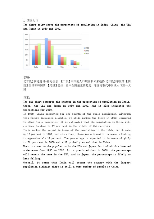
1.四国人口The chart below shows the percentage of population in India, China, the USA and Japan in 1950 and 2002.思路:【首段】转述题目+补充信息【二段】中国的人口规律和未来趋势【三段】印度的【四段】美国和韩国的【尾段】总结,重申全图最主要趋势,印度将取代中国成人口第一大国答案:The bar chart compares the changes in the proportion of population in India, China, the USA and Japan in 1950 and 2002. And it also indicates the projections for 2050.In 1950. China accounted for one fourth of the world population. Although this figure decreased slightly, it still ranked the first in 2002, compared to other three countries. It is estimated that the population in China will continue to drop to 19 per cent in the middle of this century.India ranked the second in terms of the population in the table, which made up 15 percent in 1950, but since then, there was a dramatic increase, climbing to approximately 19 percent. The percentage is expected to increase slightly to 21 per cent in 2050 and will probably exceed that in China.When it comes to the population in the USA and Japan, both of which witnessed a decrease from 1950 to 2002. It is predicted that in 2050, the percentage will remain the same in the USA, and in Japan, the percentage is likely to keep falling.Overall, it seems that India will become the country with the largest population although there is still a huge number of people in China.2.通勤工具Different modes of transport used to travel to and from work in one European city in 1960, 1980 and 2000.思路:1. 分段原则为:上升的一段,下降的一段,波动的一段。
雅思柱状图模板解析

对两者进行比较的词汇
副词的使用 1. 几乎一样多的小孩和成人看古代历史相关的电视节目。
Nearly as many children as adults watch TV programmes about ancient history. 2. 过去更多的人居住在乡村而不是城镇。
P2
• The number of people using trains at first rose from just under 20% in 1960 to about 26% in 1980, but then fell back to about 23% in 2000.
P3
• Use of the tube was relatively stable, falling from around 27% of commuters in 1960 to 22% in 1980, but climbing back to reach 25% by ther hand, the use of cars increased steadily from just over 5% in 1960 to 23% in 1980, reaching almost 40% by 2000, whereas the popularity of buses has declined since 1960, falling from just under 35% in 1960 to 27% in 1980 and only 15% in 2000.
雅思作文真题解析及范文分享

雅思作文真题解析及范文分享为了让大家更好的备考雅思写作,我给大家整理了雅思作文真题,下面我就和大家共享,来观赏一下吧。
2022年11月1日雅思小作文真题解析及范文:柱状图小作文题目是:The chart below shows the average time 16-22-year olds spent on playing video games in four different countries between 1992 and 2022.Summarize the details. Select and report the main features and make comparisons where relevant.范文解析该柱状图难度中等偏下,数字相对较少,共有8个数字。
让我们先来看一下3w(when, where, what)。
When是过去的两个年份1992和2022,切记用过去时态。
Where为四个国家,what为16-22岁的年轻人花费在视频嬉戏上的时间。
可以看出when和where两个变量,要求我们描述这十年间的变化趋势和国家之间的静态对比。
所以考生可以根据时间为主线去分段,也可以根据国家去分段。
雅思小作文真题范文:The bar chart compares the amount of time spent on video games on average by youngsters aged between 16-22 years old from four countriesin two years 1992 and 2022.该柱状图对比了1992年至2022年期间,来自四个国家、年龄在16岁至22岁之间的青少年平均花在电子嬉戏上的时间。
It is evident that in 1992, the largest amount of time (85 hours) allocated to video games was from young people in country B. This was narrowly followed by country C and country A where respectively 78 hours and 76 hours were spent while it took the minimal hours for thisage group to play video games in country D, standing at merely 50.很明显,在1992年,最大的时间(85小时)安排给视频嬉戏是年轻人的国家。
雅思写作小作文之柱状图详解
雅思写作小作文之柱状图详解雅思写作小作文之柱状图详解,小作文一般都是图表作文,常见的类型主要有表格图、曲线图、柱状图、饼状图和画图题,虽然种类比拟多,但是每个题型都有自己的规律,给大家搜集了雅思写作小作文题型的详细内容希望能够给大家带来帮助!从雅思写作小作文历年题型来看柱图和线图是每月常考的题型,有时候可能会有连考或者是交替考的趋势,饼图和表格题也是相对频率较高的题型,画图题那么是围绕在流程图或者是地图题上面,不管考取哪一种题型,要求都是一样的。
经常在考试的时候图表看懂了但是数据比拟凌乱,找不出明显的特征,或者是找到了特诊但是不知道用什么样的思路来把它描述的清楚一些。
一般情况下单柱子的小作文试题比拟简单,主要是分析一下横纵轴上的内容即可,如果是以时间为横轴的话,主要是写纵轴上的趋势,如果是以组为横轴,那就直接进行对柱子进行描述即可。
但是多数情况下雅思小作文柱状图是以多柱子的形式出现的,这个时候就要针对横纵轴之间的对应关系逐个分析。
如果柱子的个数比拟少的时候可以全局部析,但是要是柱子的个数比拟多的情况下就要着重找几个柱子进行分析。
雅思写作小作文范文分享:1. The chart and graph below give information about sales and shareprices for Coca-Cola.Write a report for a university lecturer describing the information shownbelow.· You should write at least 150 words.· You should spend about 20 minutes on this task.Model answer:The pie chart shows the worldwide distribution of sales of Coca-Cola in theyear and the graph shows the change in share prices between 1996 and.In the year , Coca-Cola sold a total of 17.1 billion cases of their fizzy drinkproduct worldwide. The largest consumer was North America, where 30.4 percent of the total volume was purchased. The second largest consumer wasLatin America. Europe and Asia purchased 20.5 and 16.4 per cent of the totalvolume respectively, while Africa and the Middle East remained fairly smallconsumers at 7 per cent of the total volume of sales.Since 1996, share prices for Coca-Cola have fluctuated. In that year, shareswere valued at approximately $35. Between 1996 and 1997, however, pricesrose significantly to $70 per share. They dipped a little in mid-1997 and thenpeaked at $80 per share in mid-98. From then until their value fellconsistently but there was a slight rise in mid-.2. The chart below gives information about global sales of gamessoftware, CDs and DVD or video.Write a report for a university lecturer describing the information.· You should write at least 150 words.· You should spend about 20 minutes on this task.Model answer:The chart shows the changes in the sales of video material / DVDs, gamessoftware and CDs around the world in billions of dollars over a three-yearperiod. It can be seen that the sales of videos / DVDs and games softwarehave increased, while the sales of CDs have gone down slightly.Between and , the sale of videos and DVDs rose by approximately13 billion dollars. In , just under 20 billion dollars worth of these itemswere sold, but in , this figure had risen to a little over 30 billion dollars.The sales of games software also rose during this period, but less sharply.Sales increased from about 13 billion dollars in to just under 20 billiondollars three years later. By contrast, during the same time period, the sale ofCDs fell from 35 billion dollars in to about 32.5 billion dollars in .3. The graphs below show the types of music albums purchased bypeople in Britain according to s3x and age.Write a report for a university lecturer describing the information shownbelow.· You should write at least 150 words.· You should spend about 20 minutes on this task.Model answer:The three graphs provide an overview of the types of music people purchase inthe UK. At first glance we see that classical music is far less popular than popor rock music.While slightly more women than men buy pop music, the rock market isdominated by men with 30% buying rock, compared to 17% of women. Fromthe first graph we see that interest in pop music is steady from age 16 to 44with 20% of the population continuing to buy pop CDs after the age of 45.The interest in rock music reaches its peak among the 25 to 34 year olds,though it never sells as well as pop. Interest also drops off after the age of 35with an even sharper fall from age 45 onwards, a pattern which is the oppositeto the classical music graph.雅思写作小作文之柱状图详解的详细内容就是这些,包括了详细的范文以及写作技巧和注意点,希望对雅思考试有所帮助,更多雅思最新资讯请继续关注雅思频道。
雅思作文写作Task 1第二课时—柱状图和饼状图
图表作文讲解2:柱状图和饼状图学生面授老师时间本次课时雅思写作第二课时教学思路1.作文简介、写作技巧2.实例讲解3.分析总结4.课后作业教学目标柱状图、饼状图知识点讲解基本特征和写作方法实例分析讲解重点写作技巧讲解范文学习柱状图和饼状图写作方法备考资料剑桥IELTS4-8教学详细内容:一、写作技巧详解1.柱状图特点➢柱状图是动态图表,切入点是描述趋势。
➢柱状图写作注重“比较”(找出similarity)和“对比”(找出difference),也就是说需要横向总结所有柱状图表的共性特征,也要分别描写各个柱子的个性特征。
➢两种写作方式:其一是对不同时间段内的数据进行比较,适合于数据代表的物体较少且时间界限明确的情况。
另外是对单独数据的全程描述,适合于描述数据对象很多且时间划定不清晰的情况。
2.饼状图特点饼形图与柱形图或者线形图所截然不同的是它没有了横轴与纵轴,而以饼形的分割来表示百分比,可以依照三步审题分析法来进行观察:➢观察共有几张饼状图,以及它们之间的关系是什么(一般说来,雅思图表题中极少见到单饼图);➢观察每张饼状图中有哪几个区域,以及各个区域分别代表什么;➢观察单个饼状图中各区域间的百分比差异,以及相同区域在各个饼状图间的百分比的比较或发展。
饼状图是所有图表题中最好写的一种,唯一值得注意的地方在于如何丰富百分比的表达和“占”的表达,要采取多样性的表达,如25%=a quarter of, 50%=half of, >50%=a/the majority of.描写饼状图中的比例构成就是饼状图图表作文的重点,但也应注意,这种描述并不是对图形的简单重复,对各项数据比例的描述应建立在归纳整理的基础上有条理地进行。
学生不仅要善于找数据,更重要的是要善于从数据或比例中升华出来,找到规律和本质。
常用词汇、句型及模板1.柱状图1)倍数的表达今年的产量是去年产量的两倍➢The output this year is two times(twice) more than last year’s.➢As much as 不可数名词 as many as 可数The books of this semester are two times as many as that of last semester. ➢ A is two times the amount of B不可数➢ A is two times the number of B可数2) 常用套句➢There was …in the number of A from …to … (over next years), which was followed by … and then… until…when there was … for the next … years.➢From…onwards, there was … in the number of A which then increased / decreased …at …% in …➢In …, the number reached (was) …%, but (30) years later there was …➢The number of A increased rapidly from … to … during the (five-year) period. ➢In the (three years) from … through…, the percentage of A was slightly larger / smaller than that of B.➢The graphs show a threefold increase in the number of A.➢Here is an upward trend in the number of A.➢… (year) witnessed / saw a sharp rise in A.2.饼状图1)常用词:percentage, proportion, make up, constitute, account for, take up, ..isdivided into…parts, consume the largest/smallest portion.2)例句:➢The graph, presented in a pie chart, shows the general trend in…..➢The percentage of A in … is more than twice tha n that of B.➢The biggest loss was to A area.➢There is not a great deal of difference between A and B.➢In general positions, females outnumber males.➢ A much greater percentage of men than women are found in managerial positions. ➢The profit of company A doubled from May to September.3)模板:➢The two pie charts describe ………………………➢The first point to note is …………………………➢Comparing the graphs, …………………………….➢The graphs also suggest that ………………………➢In conclusion, it can be seen from the data that …………………..4)饼状图作文模型The two pie charts illustrate the significant changes in people’s ways of communication from 1970 to 1995.The first graph shows that in 1975, the most popular way to communicate was letter writing, with the percentage of 50%. Others ___________________________, the figures are 32% and 18% respectively.It can be seen from the second graph that ways of communication changed a lot in two decades. By 1995, ______________________________. By contrast, ________________________________.Comparing the two pie charts, we can see that the use of the phones and computers during the same period had both risen considerably. However, letter writing became less popular among the people.In general, people inclined to use more modernized mediums to communicate with others, while the traditional way became less employed.The pie chart depicts the proportion of ___________________________. It consists of six segments, the largest one representing _________, which account for 26% of the total. _____________ takes up 21%, becoming the second largest.__________________________________. The rest proportions, 15% of all, constituting 5% and 10% respectively.From the chart it can be seen clearly that ________________________.二、实例分析分析思路:1.第一幅柱状图的描述单位是百万,即人数;第二幅则是百分比。
雅思写作小作文范文 雅思写作柱状图bar chart 奖牌数量.doc
雅思写作小作文范文雅思写作柱状图bar chart 金牌数量今天我们雅思写作小作文范文的文章来研究下柱状图bar chart。
该图表展示了12个不同的国家在奥林匹克运动会上获得的奖牌的数量,并用三种不同的颜色来标示金银铜牌。
很明显可以看出美国获得的奖牌数量远超其他国家,而苏联则排名第二。
雅思写作小作文题目The chart below shows the total number of Olympic medals won by twelve different countries.Summarise the information by selecting and reporting the main features, and make comparisons where relevant.雅思写作小作文范文The bar chart compares twelve countries in terms of the overall number of medals that they have won at the Olympic Games.该柱状图比较了12个国家在奥林匹克运动会上获得的奖牌的数量。
It is clear that the USA is by far the most successful Olympic medal-winning nation. It is also noticeable that the figures for gold, silver and bronze medals won by any particular country tend to be fairly similar.显然,美国到目前为止是最为成功的奥林匹克奖牌获得者。
也可以注意到,其他任何国家赢得金牌、银牌和铜牌数量相当相似。
The USA has won a total of around 2,300 Olympic medals, including approximately 900 gold medals, 750 silver, and 650 bronze. In second place on the all-time medals chart is the Soviet Union, with just over 1,000 medals. Again, the number of gold medals won by this country is slightly higher than the number of silver or bronze medals.美国赢得了大约2300枚奥运会奖牌,包括大约900枚金牌,750枚银牌和650枚铜牌。
雅思写作小作文范文 雅思写作柱状图bar chart 影响工作表现的因素.doc
雅思写作小作文范文雅思写作柱状图bar chart 影响工作表现的因素今天我们雅思写作小作文范文的文章来研究下柱状图bar chart。
该图表展示的内容为某大型公司人力资源部门所进行的调查研究的结果,即影响工人表现的因素有哪些。
该研究的对象为两组工人,一组年龄分布在18到30岁,另一组年龄位于45到60岁之间。
小编搜集了一篇高分范文,以供大家参考。
雅思写作小作文题目The bar chart below shows the results of a survey conducted by a personnel department at a major company.Summarise the information by selecting and reporting the main features, and make comparisons where relevant.雅思写作小作文范文The bar graph shows the results of a survey which was conducted by a company and gives data on the important factors that determine the work performance of employees. As is observed, chances for personal development, relaxed working environment, opportunities for promotion and salary are the main motivating factors for young people for their work performance while comparatively aged people’s work performance is affected by the factors like money, competent boss and team spirit.该柱状图展示了某公司进行的调查研究的结果,并给出了决定员工工作表现的重要因素。
雅思作文写作Task 1第二课时—柱状图和饼状图
图表作文讲解2:柱状图和饼状图学生面授老师时间本次课时雅思写作第二课时教学思路1.作文简介、写作技巧2.实例讲解3.分析总结4.课后作业教学目标柱状图、饼状图知识点讲解基本特征和写作方法实例分析讲解重点写作技巧讲解范文学习柱状图和饼状图写作方法备考资料剑桥IELTS4-8教学详细内容:一、写作技巧详解1.柱状图特点➢柱状图是动态图表,切入点是描述趋势。
➢柱状图写作注重“比较”(找出similarity)和“对比”(找出difference),也就是说需要横向总结所有柱状图表的共性特征,也要分别描写各个柱子的个性特征。
➢两种写作方式:其一是对不同时间段内的数据进行比较,适合于数据代表的物体较少且时间界限明确的情况。
另外是对单独数据的全程描述,适合于描述数据对象很多且时间划定不清晰的情况。
2.饼状图特点饼形图与柱形图或者线形图所截然不同的是它没有了横轴与纵轴,而以饼形的分割来表示百分比,可以依照三步审题分析法来进行观察:➢观察共有几张饼状图,以及它们之间的关系是什么(一般说来,雅思图表题中极少见到单饼图);➢观察每张饼状图中有哪几个区域,以及各个区域分别代表什么;➢观察单个饼状图中各区域间的百分比差异,以及相同区域在各个饼状图间的百分比的比较或发展。
饼状图是所有图表题中最好写的一种,唯一值得注意的地方在于如何丰富百分比的表达和“占”的表达,要采取多样性的表达,如25%=a quarter of, 50%=half of, >50%=a/the majority of.描写饼状图中的比例构成就是饼状图图表作文的重点,但也应注意,这种描述并不是对图形的简单重复,对各项数据比例的描述应建立在归纳整理的基础上有条理地进行。
学生不仅要善于找数据,更重要的是要善于从数据或比例中升华出来,找到规律和本质。
常用词汇、句型及模板1.柱状图1)倍数的表达今年的产量是去年产量的两倍➢The output this year is two times(twice) more than last year’s.➢As much as 不可数名词 as many as 可数The books of this semester are two times as many as that of last semester. ➢ A is two times the amount of B不可数➢ A is two times the number of B可数2) 常用套句➢There was …in the number of A from …to … (over next years), which was followed by … and then… until…when there was … for the next … years.➢From…onwards, there was … in the number of A which then increased / decreased …at …% in …➢In …, the number reached (was) …%, but (30) years later there was …➢The number of A increased rapidly from … to … during the (five-year) period. ➢In the (three years) from … through…, the percentage of A was slightly larger / smaller than that of B.➢The graphs show a threefold increase in the number of A.➢Here is an upward trend in the number of A.➢… (year) witnessed / saw a sharp rise in A.2.饼状图1)常用词:percentage, proportion, make up, constitute, account for, take up, ..isdivided into…parts, consume the largest/smallest portion.2)例句:➢The graph, presented in a pie chart, shows the general trend in…..➢The percentage of A in … is more than twice tha n that of B.➢The biggest loss was to A area.➢There is not a great deal of difference between A and B.➢In general positions, females outnumber males.➢ A much greater percentage of men than women are found in managerial positions. ➢The profit of company A doubled from May to September.3)模板:➢The two pie charts describe ………………………➢The first point to note is …………………………➢Comparing the graphs, …………………………….➢The graphs also suggest that ………………………➢In conclusion, it can be seen from the data that …………………..4)饼状图作文模型The two pie charts illustrate the significant changes in people’s ways of communication from 1970 to 1995.The first graph shows that in 1975, the most popular way to communicate was letter writing, with the percentage of 50%. Others ___________________________, the figures are 32% and 18% respectively.It can be seen from the second graph that ways of communication changed a lot in two decades. By 1995, ______________________________. By contrast, ________________________________.Comparing the two pie charts, we can see that the use of the phones and computers during the same period had both risen considerably. However, letter writing became less popular among the people.In general, people inclined to use more modernized mediums to communicate with others, while the traditional way became less employed.The pie chart depicts the proportion of ___________________________. It consists of six segments, the largest one representing _________, which account for 26% of the total. _____________ takes up 21%, becoming the second largest.__________________________________. The rest proportions, 15% of all, constituting 5% and 10% respectively.From the chart it can be seen clearly that ________________________.二、实例分析分析思路:1.第一幅柱状图的描述单位是百万,即人数;第二幅则是百分比。
(完整word版)雅思小作文柱状图Bar类解析
雅思小作文柱状图Bar类解析关于柱状图我们主要分两种写法:1。
如果横轴有明显的时间推移的话,烤鸭们应连接柱子顶点,重在描述柱子的升降起伏,写法类似于线状图。
2.如果无时间推移,则写法和饼状图一样.即按照各比较对象所占比例的高低写,同时要注意各所占比例之间的比较。
可以用到的词汇有:1.表示“占多少”的动词Account forTake upMake upContribute toHaveRepresent2.表示“最高级”和“比较级”第一/最小the largest/biggest proportion of第二the second/next largest/expensive(+ 形容词的最高级)第三followed closely by最低/最小the smallest percent of all3。
表示“相同比例”即在饼状图中遇到了比例相同或者差不多的饼,如有A B两个比较对象.A accounts for the same percentage asB .The proportion of A is as high as BA andB contributed equally/evenly to (all )在观察柱形图的时候首先要留意横轴的数据,若横轴为时间轴或者是年龄趋势,那么我们在主体段写作时候的基本思路就为从左到右;若横轴数据为具体专有名词诸如地点,交通工具等时,主体段的写作思路就可能是按照柱形的长度排列。
本文根据上述的分析做以下的总结:一、按照横轴从左到右排列数据:1. 两根柱且趋势截然相反在这种写法中,我们要注意观察2根柱的上升/下降的幅度。
以下我们就来看一个例子:The charts below show the main reasons for study among students of different age groups and the amount of support they received from employers。
- 1、下载文档前请自行甄别文档内容的完整性,平台不提供额外的编辑、内容补充、找答案等附加服务。
- 2、"仅部分预览"的文档,不可在线预览部分如存在完整性等问题,可反馈申请退款(可完整预览的文档不适用该条件!)。
- 3、如文档侵犯您的权益,请联系客服反馈,我们会尽快为您处理(人工客服工作时间:9:00-18:30)。
• more than/ fewer than
1. There are more boys (67%) than girls (33%) in Class A.
2. Class A has fewer gilrs than boys.
3. Boys take up more percentage than girls in Class A.
• However the proportion of men and women with heart attacks rises dramatically between 45 and 64, with over half a million per year. Over 420,000 men a year in this age group have heart attacks. The incidence amongst women increases - women have one heart attack for every three men in this age group.
• The graph shows the changing patterns in commuting by train, car, tube or bus for commuters in London in the years 1960, 1980 and 2000.
• The number of people using trains at first rose from just under 20% in 1960 to about 26% in 1980, but then fell back to about 23% in 2000.
• Over the age of 65, the number of men suffering heart attacks only increases slightly. However there is a huge increase in the number of women with heart attacks - they comprise over 40% of all victims.
• The percentage of boys is larger/ greater/ higher than that of girls in Class A (67% and 33% respectively).
outnumber/ exceed/ surpass/ excel
• Boys outnumber girls in Class A. • The number of boys exceeds that of
• Use of the tube has been relatively stable, falling from around 27% of commuters in 1960 to 22% in 1980, but climbing back to reach 25% by 2000.
make up; account for; occupy...
number/ percentage
• The number of boys is larger/ greater/ higher than that of girls in Class A.
• The percentage of boys(67%) is larger/ greater/ higher than that of girls(33%) in Class A.
• In conclusion, men are more likely to be the victims of heart attacks at all ages, but women are increasingly likely over the age of 65.
The graph below shows the different modes of transport used to travel to and from work in one European city in 1960, 1980 and 2000.
Task one Bar chart
柱状图主体段写法
• 将图表中相似的趋势分别捏合成一段 描述。
• 第一句:比较图表中相对比的两个部 分的所有比例得出一个总体结论。
• 第二句以后:详细解释这一总体趋势 。
language for comparisons
Percentage of girl and boy students in Class A
girls in Class A. • There are almost/ nealy/ roughly twice
as many boys as girlschart below shows information about
Heart Attacks by Age and Gender in USA.
Summarise the information by selecting and reporting the main features, and make comparisons where relevant. You should write at least 150 words. You should spend about 20 minutes on this task.
• The graph shows how age and gender influence the frequency of heart attacks in the US.
• Less than 6% of all heart attacks occur in the 29-44 age group. The number of women who suffer heart attacks in this group is negligible - only 3000 per year, compared to 123,000 men.