雅思小作文柱状图Bar类解析
雅思小作文柱状图解析

• The graph shows the changing patterns in commuting by train, car, tube or bus for commuters in London in the years 1960, 1980 and 2000.
• The number of people using trains at first rose from just under 20% in 1960 to about 26% in 1980, but then fell back to about 23% in 2000.
• However the proportion of men and women with heart attacks rises dramatically between 45 and 64, with over half a million per year. Over 420,000 men a year in this age group have heart attacks. The incidence amongst women increases - women have one heart attack for every three men in this age group.
In summary, while most of the countries are expected to show increases, Saudi Arabia will maintain and strengthen its position as the major producer.
The charts below show the main reasons for study among students of different age groups and the amount of support they received from employers.
雅思写作小作文范文 雅思写作柱状图bar chart 无报酬工作时间.doc
雅思写作小作文范文雅思写作柱状图bar chart 无报酬工作时间今天我们雅思写作小作文分范文的文章来研究下柱状图bar chart。
该图表按照所拥有的孩子的数量将婚后夫妇分成三类:没有孩子,有1到2个孩子,有3个以上孩子。
并在每个类别中都给出了男性和女性每周所做的无报酬工作的时间。
对比起来还是比较容易的。
小编搜集了一篇相关的高分范文,以供大家参考。
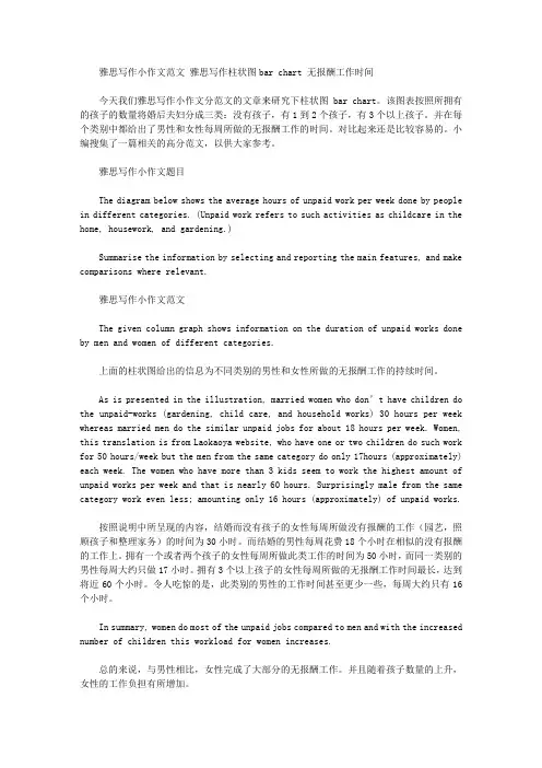
雅思写作小作文题目The diagram below shows the average hours of unpaid work per week done by people in different categories. (Unpaid work refers to such activities as childcare in the home, housework, and gardening.)Summarise the information by selecting and reporting the main features, and make comparisons where relevant.雅思写作小作文范文The given column graph shows information on the duration of unpaid works done by men and women of different categories.上面的柱状图给出的信息为不同类别的男性和女性所做的无报酬工作的持续时间。
As is presented in the illustration, married women who don’t have children do the unpaid-works (gardening, child care, and household works) 30 hours per week whereas married men do the similar unpaid jobs for about 18 hours per week. Women, this translation is from Laokaoya website, who have one or two children do such work for 50 hours/week but the men from the same category do only 17hours (approximately) each week. The women who have more than 3 kids seem to work the highest amount of unpaid works per week and that is nearly 60 hours. Surprisingly male from the same category work even less; amounting only 16 hours (approximately) of unpaid works.按照说明中所呈现的内容,结婚而没有孩子的女性每周所做没有报酬的工作(园艺,照顾孩子和整理家务)的时间为30小时。
雅思小作文范文 柱状图
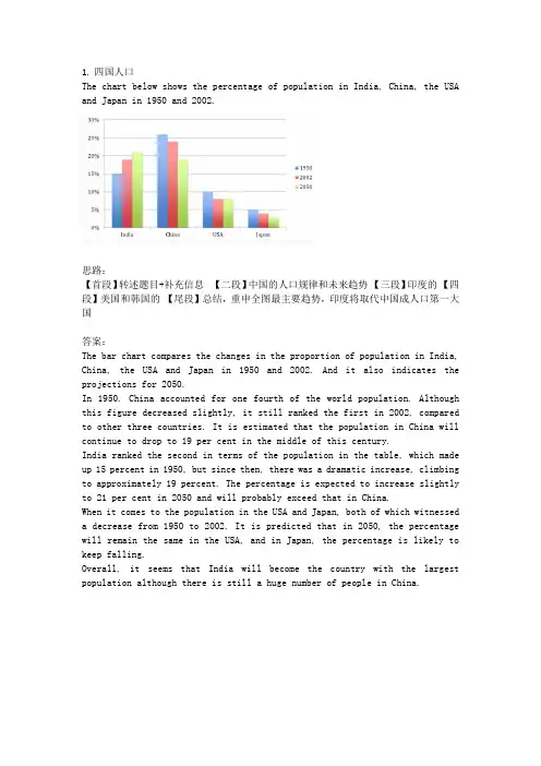
1.四国人口The chart below shows the percentage of population in India, China, the USA and Japan in 1950 and 2002.思路:【首段】转述题目+补充信息【二段】中国的人口规律和未来趋势【三段】印度的【四段】美国和韩国的【尾段】总结,重申全图最主要趋势,印度将取代中国成人口第一大国答案:The bar chart compares the changes in the proportion of population in India, China, the USA and Japan in 1950 and 2002. And it also indicates the projections for 2050.In 1950. China accounted for one fourth of the world population. Although this figure decreased slightly, it still ranked the first in 2002, compared to other three countries. It is estimated that the population in China will continue to drop to 19 per cent in the middle of this century.India ranked the second in terms of the population in the table, which made up 15 percent in 1950, but since then, there was a dramatic increase, climbing to approximately 19 percent. The percentage is expected to increase slightly to 21 per cent in 2050 and will probably exceed that in China.When it comes to the population in the USA and Japan, both of which witnessed a decrease from 1950 to 2002. It is predicted that in 2050, the percentage will remain the same in the USA, and in Japan, the percentage is likely to keep falling.Overall, it seems that India will become the country with the largest population although there is still a huge number of people in China.2.通勤工具Different modes of transport used to travel to and from work in one European city in 1960, 1980 and 2000.思路:1. 分段原则为:上升的一段,下降的一段,波动的一段。
雅思柱状图模板解析

对两者进行比较的词汇
副词的使用 1. 几乎一样多的小孩和成人看古代历史相关的电视节目。
Nearly as many children as adults watch TV programmes about ancient history. 2. 过去更多的人居住在乡村而不是城镇。
P2
• The number of people using trains at first rose from just under 20% in 1960 to about 26% in 1980, but then fell back to about 23% in 2000.
P3
• Use of the tube was relatively stable, falling from around 27% of commuters in 1960 to 22% in 1980, but climbing back to reach 25% by ther hand, the use of cars increased steadily from just over 5% in 1960 to 23% in 1980, reaching almost 40% by 2000, whereas the popularity of buses has declined since 1960, falling from just under 35% in 1960 to 27% in 1980 and only 15% in 2000.
雅思作文真题解析及范文分享
雅思作文真题解析及范文分享为了让大家更好的备考雅思写作,我给大家整理了雅思作文真题,下面我就和大家共享,来观赏一下吧。
2022年11月1日雅思小作文真题解析及范文:柱状图小作文题目是:The chart below shows the average time 16-22-year olds spent on playing video games in four different countries between 1992 and 2022.Summarize the details. Select and report the main features and make comparisons where relevant.范文解析该柱状图难度中等偏下,数字相对较少,共有8个数字。
让我们先来看一下3w(when, where, what)。
When是过去的两个年份1992和2022,切记用过去时态。
Where为四个国家,what为16-22岁的年轻人花费在视频嬉戏上的时间。
可以看出when和where两个变量,要求我们描述这十年间的变化趋势和国家之间的静态对比。
所以考生可以根据时间为主线去分段,也可以根据国家去分段。
雅思小作文真题范文:The bar chart compares the amount of time spent on video games on average by youngsters aged between 16-22 years old from four countriesin two years 1992 and 2022.该柱状图对比了1992年至2022年期间,来自四个国家、年龄在16岁至22岁之间的青少年平均花在电子嬉戏上的时间。
It is evident that in 1992, the largest amount of time (85 hours) allocated to video games was from young people in country B. This was narrowly followed by country C and country A where respectively 78 hours and 76 hours were spent while it took the minimal hours for thisage group to play video games in country D, standing at merely 50.很明显,在1992年,最大的时间(85小时)安排给视频嬉戏是年轻人的国家。
雅思写作小作文范文雅思写作柱状图barchart医院急救对象.doc

雅思写作小作文范文雅思写作柱状图barchart医院急救对象.doc雅思写作小作文范文雅思写作柱状图bar chart 医院急救对象今天我们雅思写作小作文范文的文章来研究下柱状图bar chart。
该图表给出了六个年龄类别(5岁以下,5到15岁,16到44岁,45到64岁,65-74岁,以及75岁以上)的人群前往北爱尔兰医院急诊中心的数据。
并比较了这些数字在2016年12月和2017年12月的差别。
其中数据稍微有点多,比较考验大家分类比较的能力。
小编搜集了一篇相关的考官范文,以供参考。
雅思写作小作文题目The chart below shows figures for attendances at hospital emergency care departments in Northern Ireland by age group in December 2016 and December 2017.Summarise the information by selecting and reporting the main features, and make comparisons where relevant.雅思写作小作文范文The bar chart compares the number of visits made by people in six age categories to hospital emergency wards in Northern Ireland in the December of 2016 and 2017.该柱状图比较了2016年12月和2017年12月六个年龄类别的人前往北爱尔兰医院急救中心的数量。
It is clear that elderly people and the youngest children were the most frequent visitors to A&E (accident and emergency) departments. Also, there was a slight increase in the rate of emergency care attendances among all six age groups from December 2016 to December 2017.很明显,老年人和年龄最小的孩子是医院事故与急救部门最常接待的访客。
雅思小作文-柱状图
雅思小作文–柱状图题目1:The chart below contains information provided by Australia’s tertiary institutions about the percentage of male and female students enrolled in different subjects in 1995.Summarize the information by selecting and reporting the main features, and make comparisons where relevant.范文:1/ 4题目2:The chart below contains information about USA marriage and divorce rates between 1970 and 2000, and the marital status of adult Americans in two of the years.Summarize the information by selecting and reporting the main features, and make comparisons where relevant.2/ 4读图:动态图【因为有时间】,需要描述变化趋势These two graphs illustrate the change of marital status of American between 1970 and 2000.【改写题目】According to the first graph,there were 2.5m marriages in both 1970 and 1980, and then this figure decreased gradually during the next two decades, reaching to 2m in 2000. By comparison, the number of divorces first increased from 1m in 1970 to around 1.4 in 1980 and then slowly declined back to 1m in 2000.【分类描述第一幅柱状图,时态:一般过去时】As can be seen from the second bar chart,the percentage of married American adults dropped by more than 10% , from 70% in 1970 to less than 60% in 2000. Meanwhile, the percentage of adult Americans who were never married increased from about 15% in 1970 to20% in 2000, and despite still less than 10% , the proportion of divorced adults significantly went up from 1970 to 2000. Moreover, the percentages of the widowed in 1970 and 2000 accounted for less than 10% respectively, and showed a slight drop.【分类描述第二幅柱状图,时态:一般过去时】In conclusion, marital status of Americans in 2000 was not as optimistic as that of three decades ago. (1781.如果有两幅图表,则分成2段分别一一描述2.表示数值上升下降的常用句式有:•The number of …dropped from … to …•The percentage of …increased from about … to less than…•The proportion of … significantly went up from … to …3.切忌没有结论。
雅思写作小作文范文 雅思写作柱状图bar chart 奖牌数量.doc
雅思写作小作文范文雅思写作柱状图bar chart 金牌数量今天我们雅思写作小作文范文的文章来研究下柱状图bar chart。
该图表展示了12个不同的国家在奥林匹克运动会上获得的奖牌的数量,并用三种不同的颜色来标示金银铜牌。
很明显可以看出美国获得的奖牌数量远超其他国家,而苏联则排名第二。
雅思写作小作文题目The chart below shows the total number of Olympic medals won by twelve different countries.Summarise the information by selecting and reporting the main features, and make comparisons where relevant.雅思写作小作文范文The bar chart compares twelve countries in terms of the overall number of medals that they have won at the Olympic Games.该柱状图比较了12个国家在奥林匹克运动会上获得的奖牌的数量。
It is clear that the USA is by far the most successful Olympic medal-winning nation. It is also noticeable that the figures for gold, silver and bronze medals won by any particular country tend to be fairly similar.显然,美国到目前为止是最为成功的奥林匹克奖牌获得者。
也可以注意到,其他任何国家赢得金牌、银牌和铜牌数量相当相似。
The USA has won a total of around 2,300 Olympic medals, including approximately 900 gold medals, 750 silver, and 650 bronze. In second place on the all-time medals chart is the Soviet Union, with just over 1,000 medals. Again, the number of gold medals won by this country is slightly higher than the number of silver or bronze medals.美国赢得了大约2300枚奥运会奖牌,包括大约900枚金牌,750枚银牌和650枚铜牌。
(完整word版)雅思小作文柱状图Bar类解析
雅思小作文柱状图Bar类解析关于柱状图我们主要分两种写法:1。
如果横轴有明显的时间推移的话,烤鸭们应连接柱子顶点,重在描述柱子的升降起伏,写法类似于线状图。
2.如果无时间推移,则写法和饼状图一样.即按照各比较对象所占比例的高低写,同时要注意各所占比例之间的比较。
可以用到的词汇有:1.表示“占多少”的动词Account forTake upMake upContribute toHaveRepresent2.表示“最高级”和“比较级”第一/最小the largest/biggest proportion of第二the second/next largest/expensive(+ 形容词的最高级)第三followed closely by最低/最小the smallest percent of all3。
表示“相同比例”即在饼状图中遇到了比例相同或者差不多的饼,如有A B两个比较对象.A accounts for the same percentage asB .The proportion of A is as high as BA andB contributed equally/evenly to (all )在观察柱形图的时候首先要留意横轴的数据,若横轴为时间轴或者是年龄趋势,那么我们在主体段写作时候的基本思路就为从左到右;若横轴数据为具体专有名词诸如地点,交通工具等时,主体段的写作思路就可能是按照柱形的长度排列。
本文根据上述的分析做以下的总结:一、按照横轴从左到右排列数据:1. 两根柱且趋势截然相反在这种写法中,我们要注意观察2根柱的上升/下降的幅度。
以下我们就来看一个例子:The charts below show the main reasons for study among students of different age groups and the amount of support they received from employers。
柱状图描述 英文作文
柱状图描述英文作文英文:When it comes to describing a bar chart, there are a few key things to keep in mind. First, it's important to understand what the chart is showing. In general, a bar chart is used to display data in a way that makes it easy to compare different values. Each bar represents adifferent category or group, and the height of the bar corresponds to the amount of data in that category.For example, let's say you're looking at a bar chart that shows the sales of different products over the course of a year. Each bar would represent a different product, and the height of the bar would correspond to the amount of sales for that product. By looking at the chart, you could quickly see which products were the most popular and which ones were less successful.Another important thing to consider when describing abar chart is the scale of the chart. This refers to the range of values that are represented on the chart. For example, if the chart only goes up to 100, then any values above 100 won't be shown. It's important to keep this in mind when interpreting the data, as it can affect how you understand the chart.Overall, a bar chart is a useful tool for displaying data in a way that's easy to understand. By paying attention to the categories, the scale, and the overall layout of the chart, you can quickly get a sense of what the data is telling you.中文:描述柱状图时,有几个关键点需要注意。
- 1、下载文档前请自行甄别文档内容的完整性,平台不提供额外的编辑、内容补充、找答案等附加服务。
- 2、"仅部分预览"的文档,不可在线预览部分如存在完整性等问题,可反馈申请退款(可完整预览的文档不适用该条件!)。
- 3、如文档侵犯您的权益,请联系客服反馈,我们会尽快为您处理(人工客服工作时间:9:00-18:30)。
雅思小作文柱状图Bar类解析关于柱状图我们主要分两种写法:1.如果横轴有明显的时间推移的话,烤鸭们应连接柱子顶点,重在描述柱子的升降起伏,写法类似于线状图。
2.如果无时间推移,则写法和饼状图一样。
即按照各比较对象所占比例的高低写,同时要注意各所占比例之间的比较。
可以用到的词汇有:1.表示“占多少”的动词Account forTake upMake upContribute toHaveRepresent2.表示“最高级”和“比较级”第一/最小the largest/biggest proportion of第二the second/next largest/expensive(+ 形容词的最高级)第三followed closely by最低/最小the smallest percent of all3.表示“相同比例”即在饼状图中遇到了比例相同或者差不多的饼,如有A B两个比较对象。
A accounts for the same percentage asB .The proportion of A is as high as BA andB contributed equally/evenly to (all )在观察柱形图的时候首先要留意横轴的数据,若横轴为时间轴或者是年龄趋势,那么我们在主体段写作时候的基本思路就为从左到右;若横轴数据为具体专有名词诸如地点,交通工具等时,主体段的写作思路就可能是按照柱形的长度排列。
本文根据上述的分析做以下的总结:一、按照横轴从左到右排列数据:1. 两根柱且趋势截然相反在这种写法中,我们要注意观察2根柱的上升/下降的幅度。
以下我们就来看一个例子:The charts below show the main reasons for study among students of different age groups and the amount of support they received from employers.Write a report for a university lecturer describing the information below.You should write at least 150 words.You should spend about 20 minutes on this task.The first graph shows that there is a gradual decrease in study for career reasons with age. Nearly 80% of students under 26 years, study for their career. This percentage gradually declines by approximately15% every decade. Only 40% of 40-49yr olds and 18% of over 49yr olds studied for career reasons in late adulthood.Conversely, the first graph also shows that study stemming from interest increases with age.There are only 10% of under 26yr olds studying out of interest. The percentage increases slowly till the beginning of the fourth decade, and increases dramatically in late adulthood. Nearly same number of 40-49yrolds study for career and interest. However 70% of over 49yr olds study for interest in comparison to 18% studying for career reasons in that age group.在第一幅柱状图中,我们可以看到,蓝色和红色的2根柱呈现出截然相反的变化趋势,因此,我们在排列数据时可以分别描述各自的上升/下降幅度,见划线第一个句子。
这2根柱的变化幅度相对都是比较均匀的,我们在计算幅度时可以简单的将最大和最小值相减,然后除以区间数,就能得出大约的幅度,在描述时只要在幅度前加上表示大约的副词即可。
从句型角度,我们可以选择主谓结构的简单句来实现对变化幅度的描写,见划线第一个句子。
接下来,我们在描述第2根柱形变化的时候,要特别注意选择的句型在逻辑关系上和第一根柱变化幅度间的联系,见划线第二个句子。
2. 三根以上柱形且多种趋势:应对这样的柱形图,我们可以先描写最长的那根柱的数据,也可以将最长的2根柱的数据放在一起描写。
以下我们就来看一个例子:The graph shows Internet Usage in Taiwan by Age Group, 1998-2000.Summarize the information by selecting and reporting the main features, and make comparisons where relevant.The graph shows changes in the age profile of Internet users in Taiwan between 1998 and 2000.The main users of the Internet in Taiwan are young adults between 16 and 30 years old. In 1998, they accounted for more than half of all users. In 1999 the number dropped slightly to 45%, but even in 2000 they were the biggest group.The second biggest group of users is aged between 31 and 50. They made up 41% in 1998, falling slightly to 37% in 2000. When combined with the 16-30 age group, over 94% of users in 1998 were between 16 and 50.However this number is dropping steadily as more children and older users log on. In 1999, the number of children online quadrupled from 2% to 8%, and it continued to increase in 2000. There were similar increases for older users, rising from 4% in 1998 to 10% in 2000.In summary, while adults between 16 and 50 still represent the great majority of Internet users in Taiwan, their share is declining as more children and older users join the web.在第一个主体段中,作者先从最长的红色柱形入手,见划线句子。
然后在第二个主体段中继续描写蓝色柱形的数据。
在句型选择上我们发现2段首句都使用了主系表的简单句,选择的主语也是类似,因此从高分角度来讲,我们可以将第2个主体段首句的主语换成原先的表语,即31岁至50岁年龄组,效果会更好。
此外,我们还可以从描写柱形的整体趋势作为突破口,如:You should spend about 20 minutes on this task.The table below shows the figures for imprisonment in five countries between 1930 and 1980. Write a report for a university, lecturer describing the information shown below. You should write at least 150 words.The bar graph shows that the figures for imprisonment in the five countries mentioned indicate no overall pattern of increase or decrease. In fact there is considerable fluctuation from country to country.In Great Britain the numbers in prison have increased steadily from 30 000 in 1930 to 80,000 in 1980. On the other hand in Australia, and particularly in New Zealand the numbers fell markedly from 1930 to 1940. Since then they have increased gradually, apart from in 1980 when the numbers in prison in New Zealand fell by about 30,000 from the 1970 total. Canada is the only country in which the numbers in prison have decreased over the period 1930 to 1980, although there have been fluctuations in this trend. The figures for the United States indicate the greatest number of prisoners compared to the other four countries but population size needs to be taken into account in this analysis.The prison population in the United States increased rapidly from 1970 to 1980 and this must be a worrying trend.从图中我们发现,每个国家的数据变化都是不同的,有升有降,没有一个有规律的总体趋势,这时候,我们可以用划线句子的写法在一开始就描述数据的总体情况。