雅思小作文混合图表
雅思写作小作文范文 雅思写作混合图 温度与降水.doc

雅思写作小作文范文雅思写作混合图温度与降水今天我们雅思写作小作文范文的文章来研究下雅思写作混合图。
该图表为柱状图和折线图的组合。
其中柱状图展示了某个城市一月到十二月的降水量,折线图展示了在此期间温度的变化。
两者的趋势并不完全一致。
小编搜集了一篇相应的范文,大家参考下考官是如何选取数据并进行比较的。
雅思写作小作文题目The climograph below shows average monthly temperatures and rainfall in the city of Kolkata.Summarise the information by selecting and reporting the main features, and make comparisons where relevant.雅思写作小作文范文The chart compares average figures for temperature and precipitation over the course of a calendar year in Kolkata.该图表比较了加尔各答一年中气温和降雨量的平均数据。
It is noticeable that monthly figures for precipitation in Kolkata vary considerably, whereas monthly temperatures remain relatively stable. Rainfall is highest from July to August, while temperatures are highest in April and May.很明显,加尔各答每个月降水量的数据差别很大。
而每个月的温度则保持相对稳定。
从7月到8月,降雨量最高,而四月和五月的温度则最高。
Between the months of January and May, average temperatures in Kolkata rise from their lowest point at around 20°C to a peak of just over 30°C. Average rainfall in the city also rises over the same period, from approximately 20mm of rain in January to 100mm in May.在一月和五月期间,加尔各答的平均温度从最低的20度左右,上升到顶峰的刚刚超过30度。
雅思写作 表格图和柱状图

1. 表格图讲解及范例
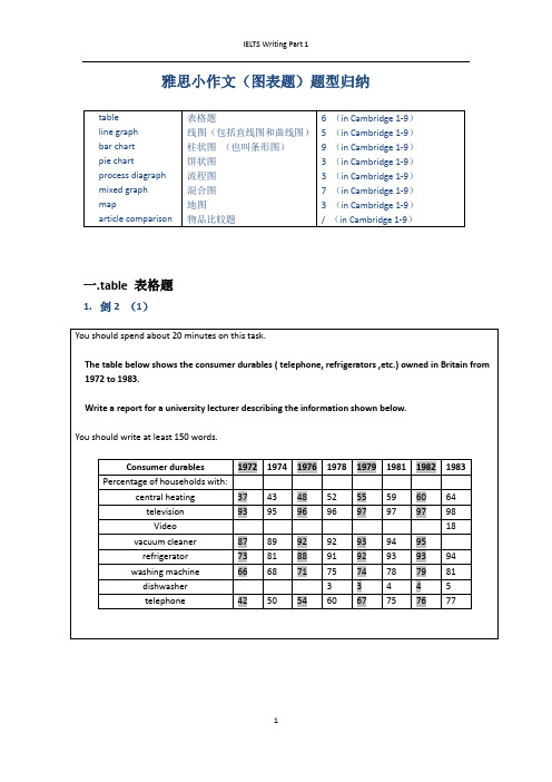
Hours of leisure time spent every year in U.K.
Age Group sports Teens 130 20s 60 30s 50 40s 30 50s 10
Individual sports
Going to the cinema Watching TV Going to the pub
1. 表格图讲解及范例
The above figures demonstrate some evident patterns in
that teens are more involved in group activities and TV
watching. People in twenties, thirties and forties are more interested in cinema and pub entertainment while the
•You should write at least 150 words.
•You should spend about 20 minutes on this task.
2. 柱状图讲解及范例
2. 柱状图讲解及范例
The graph shows the number of mobile phones and landlines per 100 users for provided countries. Overall, most of the countries included in the graph have more mobile phones subscribers than landlines.
In conclusion, it seems that mobile phone use is higher in Europe than in North America.
雅思A类小作文范文 Employment 混合图类
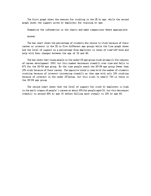
The first graph shows the reasons for studying in the UK by age, while the second graph shows the support given by employers for training by age.Summarise the information in the charts and make comparisons where appropriate.AnswerThe bar chart shows the percentage of students who choose to study because of their career or interest in the UK in five different age groups while the line graph shows how the level of support as a percentage from employers in terms of time-off work and help with fees changes between the age of 20 and 60.The bar shows that young people in the under-25 age group study primarily for reasons of career development (80%) but this number decreases steadily over time and falls to 67% for the 30-39 age group. By the time people reach the 50-59 age group fewer than 20% study because of their career. The opposite trend is seen with the number of students studying because of interest increasing steadily as they age with only 20% studying because of interest in the under 25?group, but this rises to nearly 70% in those in the 50-59 age group.The second chart shows that the level of support for study by employers is high in the early stages of people’s career at about 80% for people aged 20, but this decreases steadily to around 60% by age 40 before falling more steeply to 20% by age 60.。
雅思小作文混合图表

To sum up, the consumption of the three above mentioned fast foods in Britain showed certain rises and falls as illustrated in the chart and graph over the designated 20 years.
The chart shows the number of mobile phones and landlines per 100 people in selected countries.
The chart below shows the amount of money per week spent on fast foods in Britain. The graph shows the trends in consumption of fast foods.
The bar chart demonstrates how much money was spent on fast food per week in the UK, while the line chart reveals the trend of fast food consumption over the same period of time.
Average income earners also favored hamburgers, spending 33 pence per person per week, followed by fish and chips with 24 pence, then pizza with 11 pence.
写作套路
第一段:介绍图形。图一,…. 图二,….. 第二段:描写第一副图(各组里的排序比较) 第三段:描写第二幅图(综述 ,交点,各项趋
雅思小作文题型整理
雅思小作文(图表题)题型归纳一.t able 表格题1.剑2 (1)4.剑5(4)6.剑7(1)二.Line graph线图(含直线和曲线图)1.剑3(4)You should spend about 20 minutes on this task.The graph below shows the unemployment rates in the US and Japanbetween March 1993 and March 1999.Write a report for a university lecturer describing the information shownbelow.You should write at least 150 words.You should spend about 20 minutes on this task.The graph below shows the proportion of the population aged 65 and overbetween 1940 and 2040 in three different countries.Summarize the information by selecting and reporting the main features,and make comparisons where relevant.Write at least 150 words.You should spend about 20 minutes on this task.The graph below shows the consumption of fish and some different kinds of meatin a European country between 1979-2004.Summarize the information by selecting and reporting the main features, andmake comparisons where relevant.Write at least 150 words.You should spend about 20 minutes on this task.The graph below shows the quantities of goods transported in the UK between 1974 and 2002 by four different modes of transport.Summarize the information by selecting and reporting the main features, and make comparisons where relevant.Write at least 150 words.5.剑9(4)三.Bar chart 柱状图You should spend about 20 minutes on this task.The chart below shows the amount of leisure time enjoyed by men and women of different employment status.Write a report for a university lecturer describing the information shown below.Write at least 150 words.Leisure time in a typical week: by sex and employment status,1998-99You should spend about 20 minutes on this task.The table below shows the figures for imprisonment in five countries between 1930 and 1980.Write a report for a university lecturer describing the information shown below.You should write at least 150 words.You should spend about 20 minutes on this task.The chart below shows the amount spent on six consumer goods in fourEuropean countries.Write a report for a university lecturer describing the information shown below. You should write at least 150 words.You should spend about 20 minutes on this task.The charts below show the level of participation in education and sciencein developing and industrialized countries in 1980 and 1990Write a report for a university lecturer describing the information shown below. You should write at least 150 words.5.剑4(3)You should spend about 20 minutes on this task.The chart below shows the different levels of post-school qualifications inAustralia and the proportion of men and women who held them in 1999.Summarize the information by selecting and reporting the main features,and make comparisons where relevant.You should write at least 150 words.You should spend about 20 minutes on this task.The charts below show the main reasons for study among students ofdifferent age groups and the amount of support they received from employers.Summarize the information by selecting and reporting the main features,and make comparisons where relevant.You should write at least 150 words.You should spend about 20 minutes on this task.The charts below give information about USA marriages and divorce ratesbetween 1970 and 2000, and the marital status of adult Americans in twoof the years.Summarize the information by selecting and reporting the main features,and make comparisons where relevant.You should write at least 150 words.You should spend about 20 minutes on this task.The chart below shows information about changes in average house prices in fivedifferent cities between 1990 and 2002 compared with the average house prices in 1989.Summarize the information by selecting and reporting the main features, and makecomparisons where relevant.You should write at least 150 words.四.Pie chart饼图1.剑7(4)2.剑8(2)3.剑9(3)五.流程图1.剑1(2)You should spend about 20 minutes on this task.The diagrams below show the life cycle of the silkworm and the stages inthe production of silk cloth.Summarize the information by selecting and reporting the main features,and make comparisons where relevant.Write at least 150 words.六.混合图。
雅思英语图表作文范文(必备3篇)

雅思英语图表作文范文第1篇A类雅思各类图表作文要点及范文一.曲线图解题关键1曲线图和柱状图都是动态图,解题的切入点在于描述趋势。
2在第二段的开头部分对整个曲线进行一个阶段式的总分类,使写作层次清晰,同时也方便考官阅卷。
接下来再分类描述每个阶段的specifictrend,同时导入数据作为分类的依据。
3趋势说明。
即,对曲线的连续变化进行说明,如上升、下降、波动、持平。
以时间为比较基础的应抓住“变化”:上升、下降、或是波动。
题中对两个或两个以上的变量进行描述时应在此基础上进行比较,如变量多于两个应进行分类或有侧重的比较。
4极点说明。
即对图表中最高的、最低的点单独进行说明。
不以时间为比较基础的应注意对极点的描述。
5交点说明。
即对图表当中多根曲线的交点进行对比说明。
6不要不做任何说明就机械地导入数据,这不符合雅思的考试目的。
曲线图常用词汇动词—九大运动趋势一:表示向上:increase,rise,improve,grow,ascend,mount,aggrandize,goup,climb, take off, jump,shoot up暴涨,soar,rocket, skyrocket雅思英语图表作文范文第2篇It is said that countries are becoming similar to each other because of the global spread of the same products, which are now available for purchase almost anywhere. I strongly believe that this modern development is largely detrimental to culture and traditions worldwide.A country’s history, language and ethos are all inextricably bound up in its manufactured artefacts. If the relentless advance of international brands into every corner of the world continues, these bland packages might one day completely oust the traditional objects of a nation, which would be a loss of richness and diversity in the world, as well as the sad disappearance of t he manifestations of a place’s character. What would a Japanese tea ceremony be without its specially crafted teapot, or a Fijian kava ritual without its bowl made from a certain type of tree bark?Let us not forget either that traditional products, whether these be medicines, cosmetics, toy, clothes, utensils or food, provide employment for local people. The spread of multinational products can often bring in its wake a loss of jobs, as people urn to buying the new brand,perhaps thinking it more glamorous than the one they are used to. This eventually puts old-school craftspeople out of work.Finally, tourism numbers may also be affected, as travelers become disillusioned with finding every place just the same as the one they visited previously. To see the same products in shops the world over is boring, and does not impel visitors to open their wallets in the same way that trinkets or souvenirs unique to the particular area too.Some may argue that all people are entitled to have access to the same products, but I say that local objects suit local conditions best, and that faceless uniformity worldwide is an unwelcome and dreary prospect.Heres my full answer:The line graphs show the average monthly amount that parents in Britain spent on their children’s s porting activities and the number of British children who took part in three different sports from 2008 to is clear that parents spent more money each year on their children’s participation in sports over the six-year period. In terms of the number of children taking part, football was significantly more popular than athletics and 2008, British parents spent an average of around £20 per month on their children’s sporting activities. Parents’ spending on children’s sports increased gradually over the followi ng six years, and by 2014 the average monthly amount had risen to just over £ at participation numbers, in 2008 approximately 8 million British children played football, while only 2 million children were enrolled in swimming clubs and less than 1 million practised athletics. The figures for football participation remained relatively stable over the following 6 years. By contrast, participation in swimming almost doubled, to nearly 4 million children, and there was a near fivefold increase in the number of children doing athletics.剑桥雅思6test1大作文范文,剑桥雅思6test1大作文task2高分范文+真题答案实感。
雅思图表小作文混合图范文

雅思图表小作文混合图范文雅思图表小作文混合图范文分享独居人口比例关于混合图题型(柱状图+饼状图):The bar chart below shows the proportions of English men and women of different ages who were living alone in 2011. The pie chart compares the numbers of bedrooms in these one-person households(在英国2011年,不同年龄段独居人口的男女比例,以及独居家庭的房间数统计)。
雅思图表小作文混合图9分范文:The two charts give information about single-occupant households in England in the year 2011. The bar chart compares figures for occupants' age and gender, and the pie chart shows data about the number of bedrooms in these homes.Overall, females made up a higher proportion of people living alone than males, and this difference is particularly noticeable in the older age categories. We can also see that the most common number of bedrooms in a single-occupant home was two.A significant majority of the people aged 65 or over who were living alone in England in 2011 were female. Women made up around 72% of single occupants aged 75 to 84, and 76% of those aged 85 or over. By contrast, among younger adults the figures for males were higher. For example, in the 35-49 age category, men accounted for nearly 65% of people living alone.In the same year, 35.4% of one-person households in England had two bedrooms, while one-bedroom and three-bedroom homes accounted for 28% and 29.8% of the total. Under 7% of single-occupant homes had four or more bedrooms.(189 words, band 9)附雅思小作文simon考官推荐套路For the task 1 report, I aim for 9 sentences.这是他所擅长的图表作文4段9句大法,具体结构如下:1.Introduction: 1 sentence,Introduction段落,1句话介绍图表大意足矣2.Overview (summary): 2 sentences,Overview段,用2句话做图表信息的摘要3.First 'details' paragraph: 3 sentences4.Second 'details' paragraph: 3 sentences。
雅思写作小作文范文 雅思写作混合图 国际移民.doc

雅思写作小作文范文雅思写作混合图国际移民今天我们雅思写作小作文范文的文章来研究下混合图。
该图表由两条折线和一些柱状图构成,涵盖从1999年到2008年这10年的时间。
其中最上方的折线表示每年移居到英国的人口数量。
第二条折线表示每年离开英国的人口数量。
柱状图则表示每年的净人口流入量,即流入量减去流出量的差值。
小编搜集了一篇相关的考官范文,以供大家参考。
雅思写作小作文题目雅思写作小作文范文The chart gives information about UK immigration, emigration and net migration between 1999 and 2008.该图表给出了英国在1999年和2008年期间移民进来,移民出去以及净移民人口的相关数据。
Both immigration and emigration rates rose over the period shown, but the figures for immigration were significantly higher. Net migration peaked in 2004 and 2007.移民进入英国和移民离开英国的数字在上述时间段都有所增长。
但移民进来的人数要明显更高一些。
净流入人口在2004年和2007年达到顶峰。
In 1999, over 450,000 people came to live in the UK, while the number of people who emigrated stood at just under 300,000. The figure for net migration was around 160,000, and it remained at a similar level until 2003. From 1999 to 2004, the immigration rate rose by nearly 150,000 people, but there was a much smaller rise in emigration. Net migration peaked at almost 250,000 people in 2004.1999年,超过450000的人来到英国,而选择离开英国的人数还不到300000。
- 1、下载文档前请自行甄别文档内容的完整性,平台不提供额外的编辑、内容补充、找答案等附加服务。
- 2、"仅部分预览"的文档,不可在线预览部分如存在完整性等问题,可反馈申请退款(可完整预览的文档不适用该条件!)。
- 3、如文档侵犯您的权益,请联系客服反馈,我们会尽快为您处理(人工客服工作时间:9:00-18:30)。
Momo Chen
The graph below shows radio and television audiences throughout the day in 1992.
The following two pie charts illustrate the energy use in the U.S.A. Write a report for a university lecturer describing the information given in the pie charts below.
In contrast, the second possible site (S2) locates in town centre, where three main roads stretch to three different district. It seems that the people living in Hindon, Bransdon and Cransdon can arrive at the town centre easily. However, there is no traffic zone. In other words, they cannot park their cars near the supermarket. Fortunately, the railway across there might bring some customers to this place.
题目:The table below gives information about underground railway systems in six cities
The table below shows the figures for imprisonment in five countries between 1930 and 1980.
The map indicates two possibilities about where a new supermarket(S) will be built in the Garlsdon.
In the first case (S1), the supermarket is planned to be set up in the northwest of the town in countryside. This site is close to Hindon with the population of 10,000 and housing area. In addition, there are railways and a main road passing by the site, which means the people in Bransdon and Cransdon can go shopping in that place conveniently.
Low income earners appear to spend less than other income groups on fast foods, though fish and chips remains their most popular fast food, followed by hamburgers and then pizza.
图二,….. 第二段:描写第一副图(各组里的排序比较) 第三段:描写第二幅图(综述 ,交点,各项趋
势) 第四段:总结(可省)
The bar chart demonstrates the amount of money spent on fast food in Britain each week. The graph illustrates the changes of expenditure on fast food.
Write a report for a university lecturer describing the information shown below.
The graph below shows the different modes of transport used to travel to and from work in one European city in 1960, 1980 and 2000.
From the graph we can see that in 1970, pizza was the most popular fast food. However, the consumption of pizza was surpassed by that of the other two fast foods in the middle of this period of time. The consumption of hamburgers and pizza has risen steadily over the 20 year period to 1990 while the consumption of fish and chips has been in decline over that same period with a slight increase in popularity since 1985.
The chart shows the number of mobile phones and landlines per 100 people in selected countries.
The chart below shows the amount of money per week spent on fast foods in Britain. The graph shows the trends in consumption of fast foods.
To sum up, the consumption of the three above mentioned fast foods in Britain showed certain rises and falls as illustrated in the chart and graph over the designated 20 years.
The bar chart shows that high income earners
consumed considerably more fast foods than the other income groups, spending more than twice as much on hamburgers(43 pence per person per week) than on fish&chips (17 pence) and pizza(19 pence). Average income group also favored
The bar chart demonstrates how much money was spent on fast food per week in the UK, while the line chart reveals the trend of fast food consumption over the same period of time.
pence.
From the line chart we can see that in 1970, pizza was the most popular fast food, followed by fish&chips and hamburgers. However, the consumption of pizza was surpassed by that of the other two fast foods in the middle of this period of time./ However, the consumption of pizza was surpassed by that of hamburgers in 1982 and fish&chips in1987. The consumption of hamburgers and fish&chips rose steadily over the 20 year period from 1970 to 1990 while the consumption of pizza declined over the same period of time with a slight increase in popularity after 1985.
Average income earners also favored hamburgers, spending 33 pence per person per week, followed by fish and chips with 24 pence, then pizza with 11 pence.
In conclusion/ To sum up, both the bar chart and the line chart illustrate the changes in the consumption of the three above mentioned fast foods in Britain.
The bar chart shows how much money was spent on fast foods per week in the UK over a span of 20 years from 1970 to 1990 while the graph reveals the trend of fast food consumption over the same period of time.